
How Can We Help?
FAQ's
Getting Started
New to Wavity? Learn the best practices in getting your Workspace set up for success
Features
Solution is typically custom-built or configured to solve a specific customer problem.
Solutions
Solution is typically custom-built or configured to solve a specific customer problem.
Advanced Search
Search features by Text
Admin Guide: How to Add and Customize Theme in Customer Portal?
- Wavity allows administrators to create and fully customize themes in the Customer Self-Service Portal to match their organization’s branding and design requirements.
- Note: Only users with Admin privileges can add or edit themes in the Customer Portal.
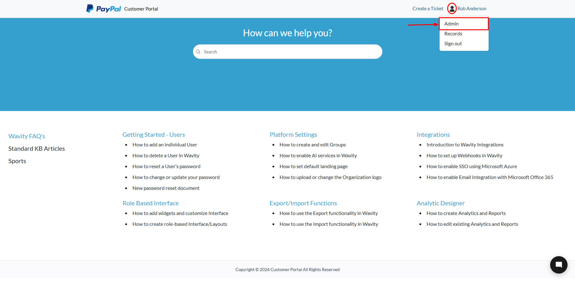
Access the Customer Portal Admin Settings
- Log in to your portal. Click the Customer Portal icon located at the top of the screen.
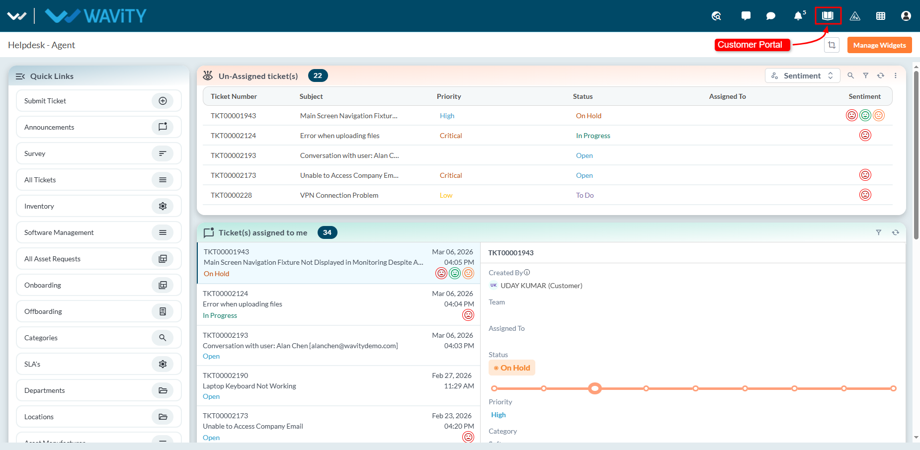
- Click Admin under your profile to open the Admin Control Panel.
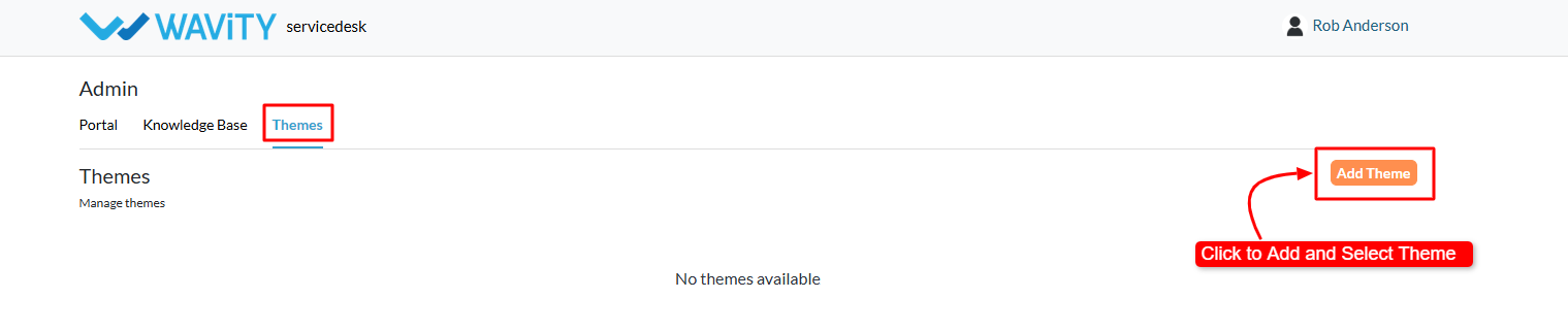
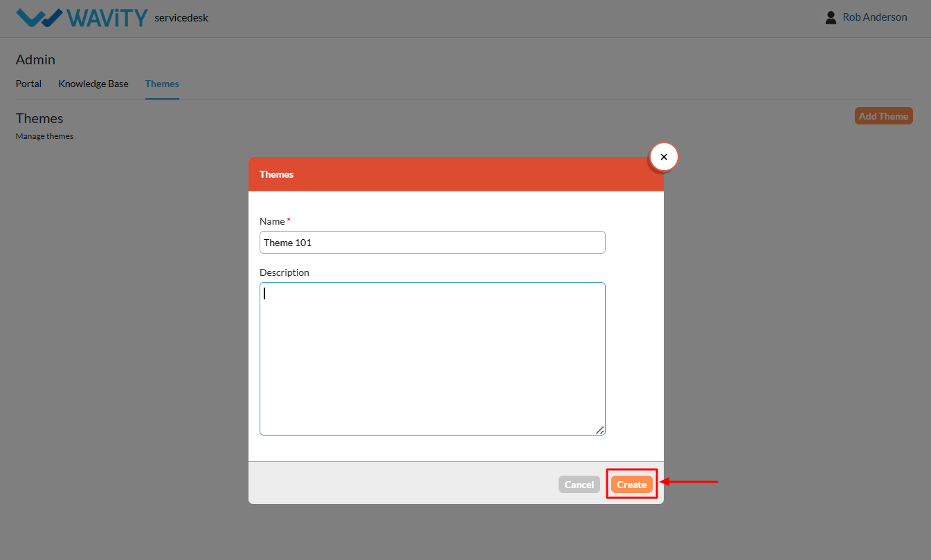
Add a New Theme
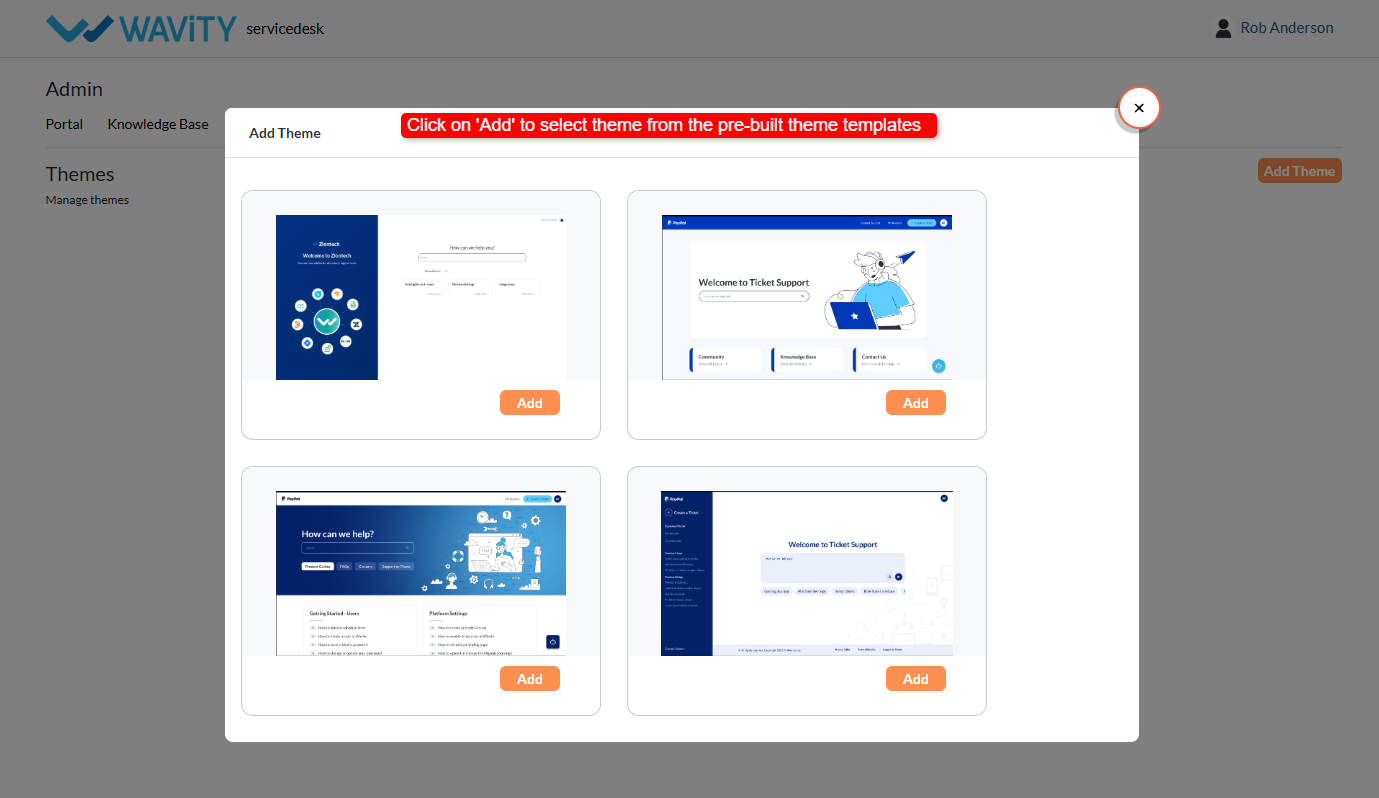
- In the Themes section, click Add Theme.
- Select the theme template you want to apply to your portal.
- Enter the following details such as Name: Provide a name for the theme & Description: Add a brief description (optional).
- Click Create to add the theme.
Theme Customization
- Your new theme is now created and available for customization.
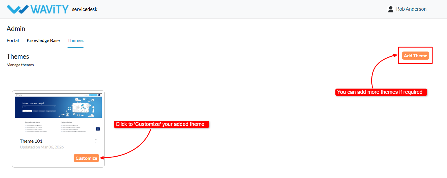
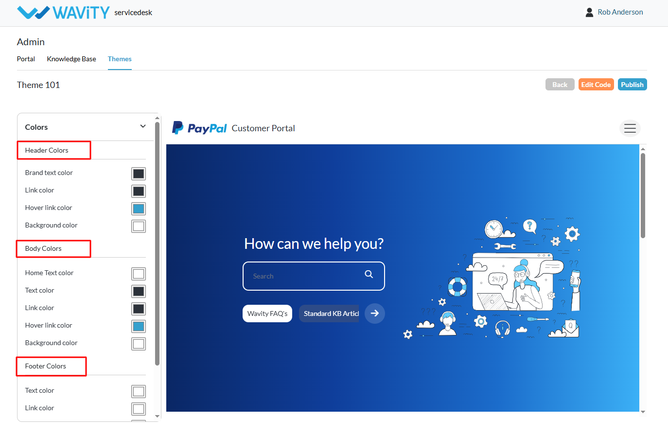
- Click Colors in the theme settings.
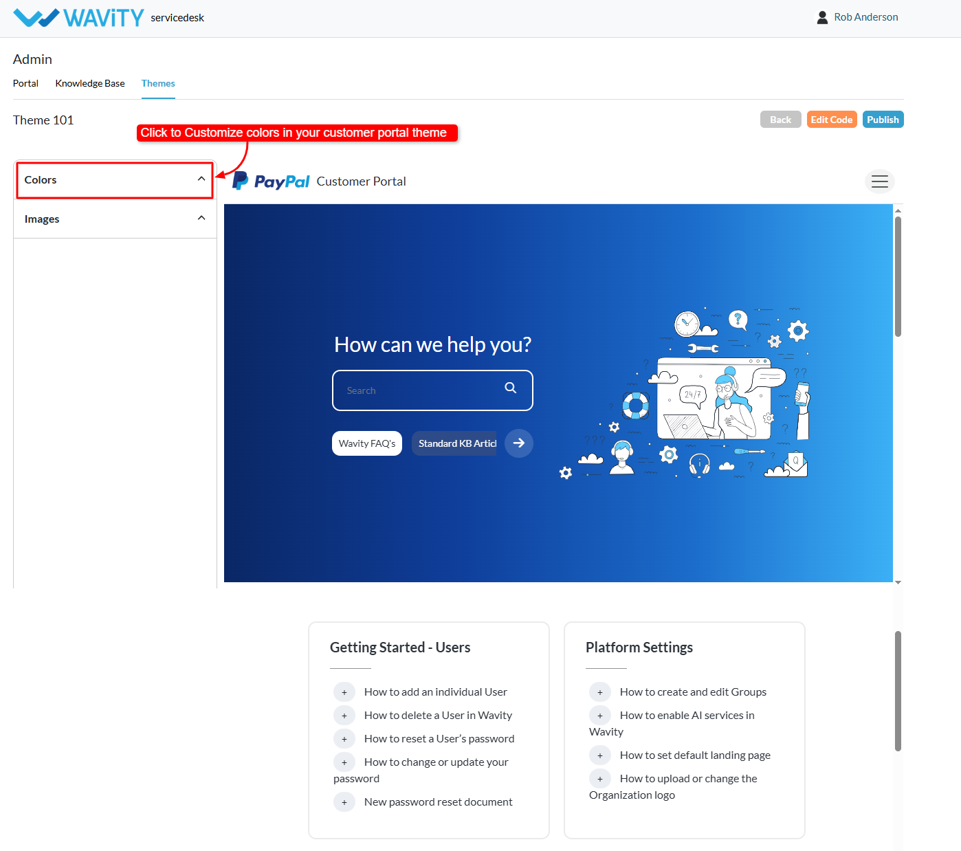
- Customize different color elements of the portal, including: Header colors, Body colors, Footer colors, Text colors, Background colors, Link colors and many more. You can adjust these settings to align with your organization’s branding.
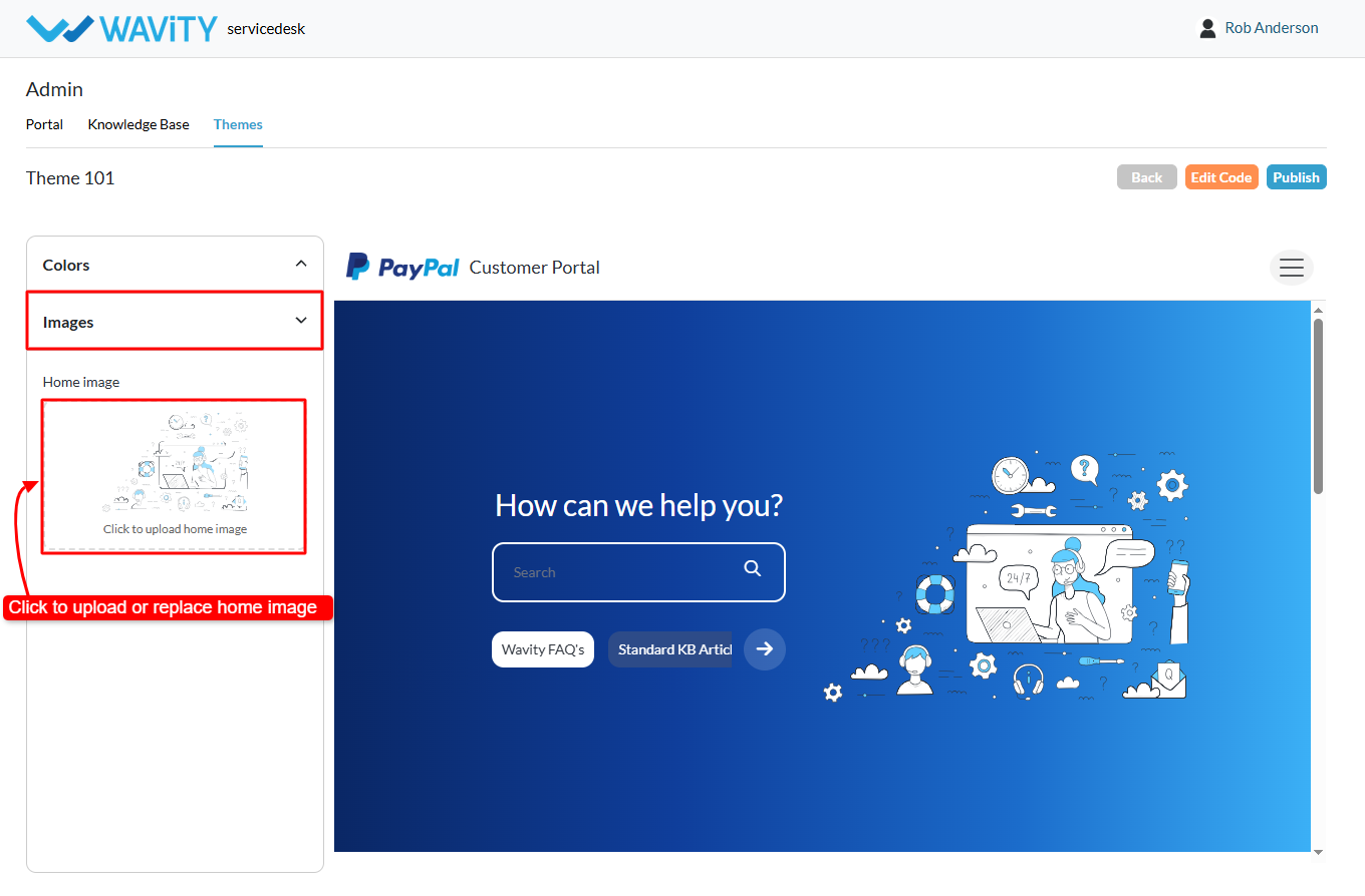
- Click Images in the theme customization options.
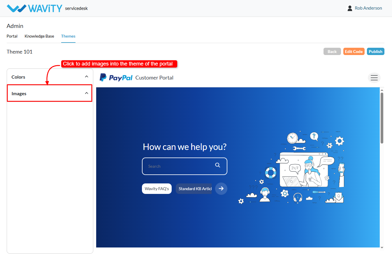
- You can now upload or replace home images in the portal.
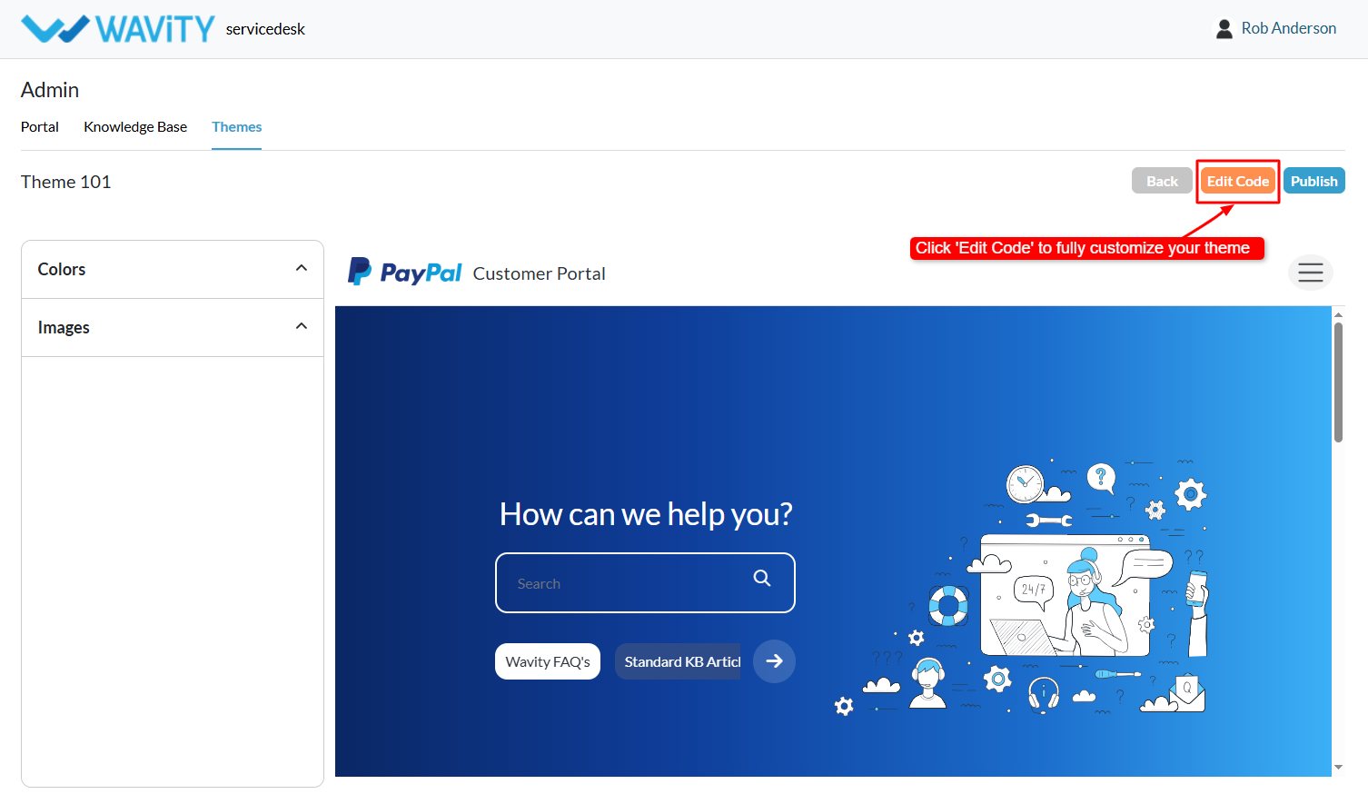
- For deeper customization: Click Edit Code. Administrators can modify the theme’s code to implement advanced design according to specific requirements.
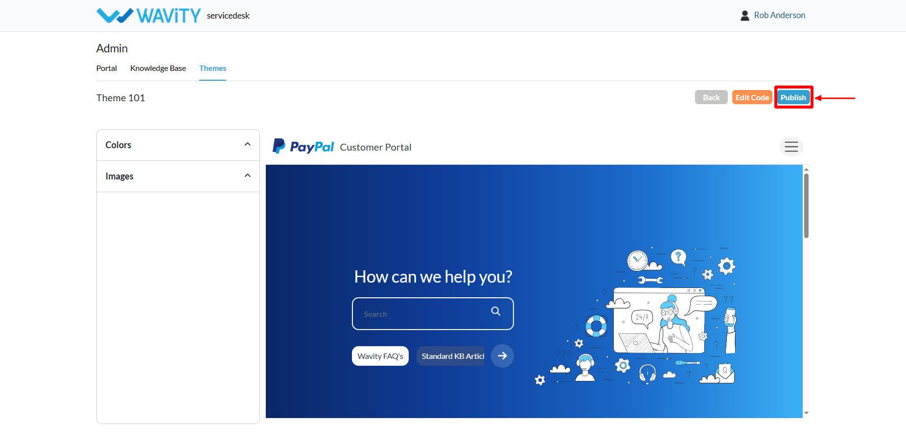
- Once all changes are complete: Click Publish. The new theme will be applied to the Customer Self-Service Portal.
Agent Guide: Responding with Knowledge Base Articles in Conversational UI
- In the Wavity platform, agents can utilize Knowledge Base articles to respond to requester (end-user) queries directly through the Conversational UI.
- Agents handling requester queries can easily access and use Knowledge Base articles to provide accurate and consistent responses.
- If Knowledge Base articles are published in the Customer Portal, they will automatically appear in the Conversational UI.
- To create Knowledge Base articles in the Customer Portal, visit: Creating a Knowledge Base Article | Wavity
- Agents can log in with their credentials to access the Agent Interface.
- From the interface, select the “Column” widget (Conversational UI).
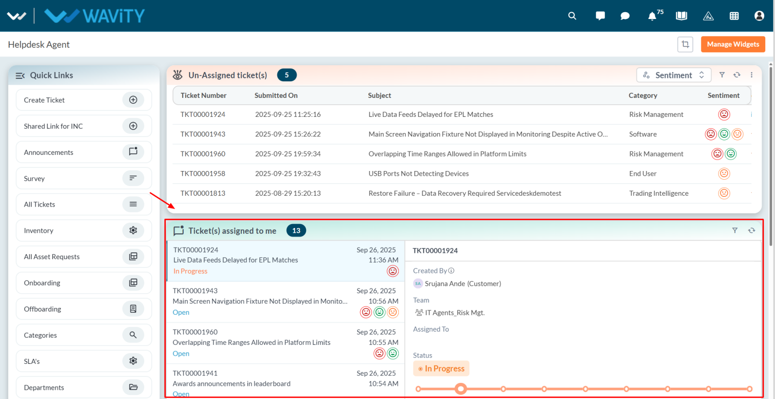
- In the Conversational UI, agents can reply directly to requester queries.
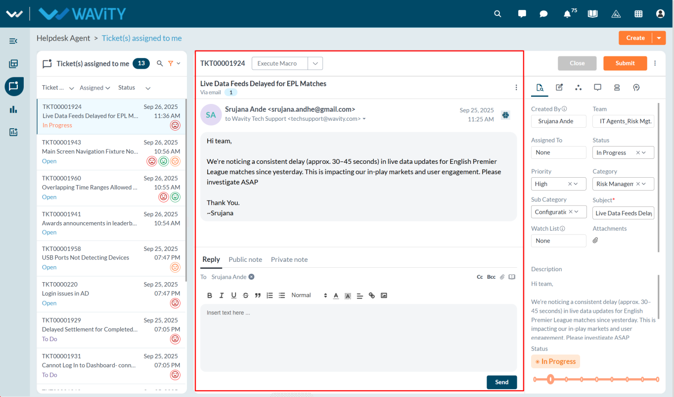
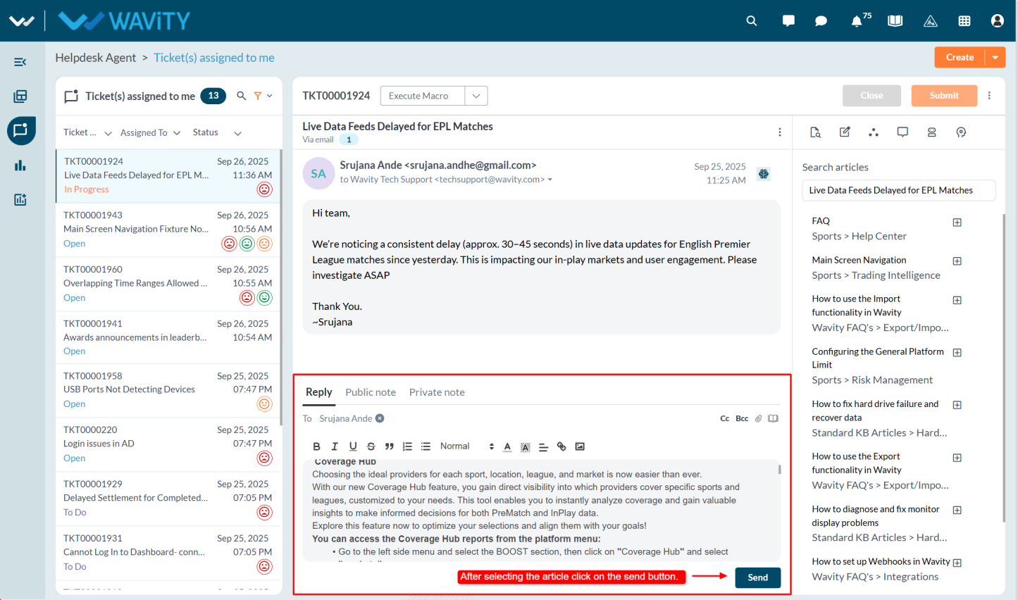
- Click the “Book” icon to view all available Knowledge Base articles on the right side, which can help in resolving the requester’s issue.
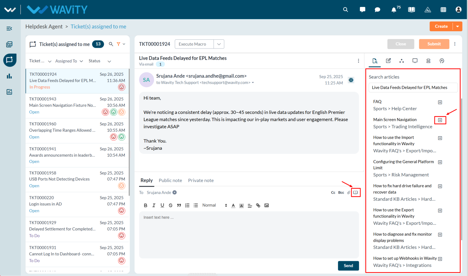
- Click the “Plus” icon to insert a selected article into the reply box.
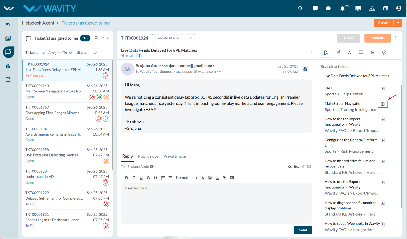
- Once added, the article content will appear in the reply box. Click the “Send” button to share it with the requester, helping them resolve their query efficiently.
Admin Guide: Managing the Order of Interfaces and Solutions
- In the Wavity platform, interfaces and solutions can be arranged or rearranged as needed.The process is simple and user-friendly.
- Only Admin have the privilege to manage the order of interfaces and solutions.
- An Admin logs in with their credentials and navigates to the appropriate interface.
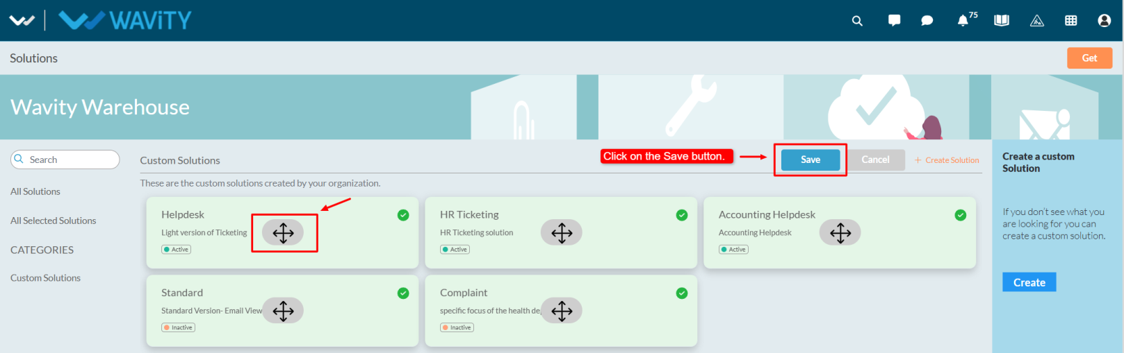
- Click on the Solution icon and select More from Wavity.
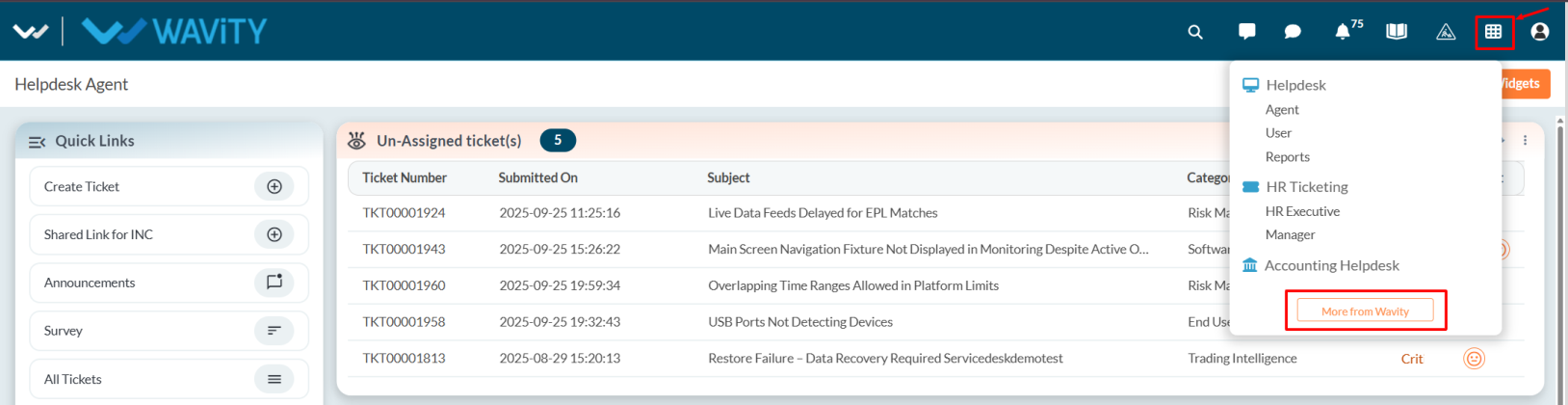
- Choose the desired solution, click on the three-dot menu, and select Edit.
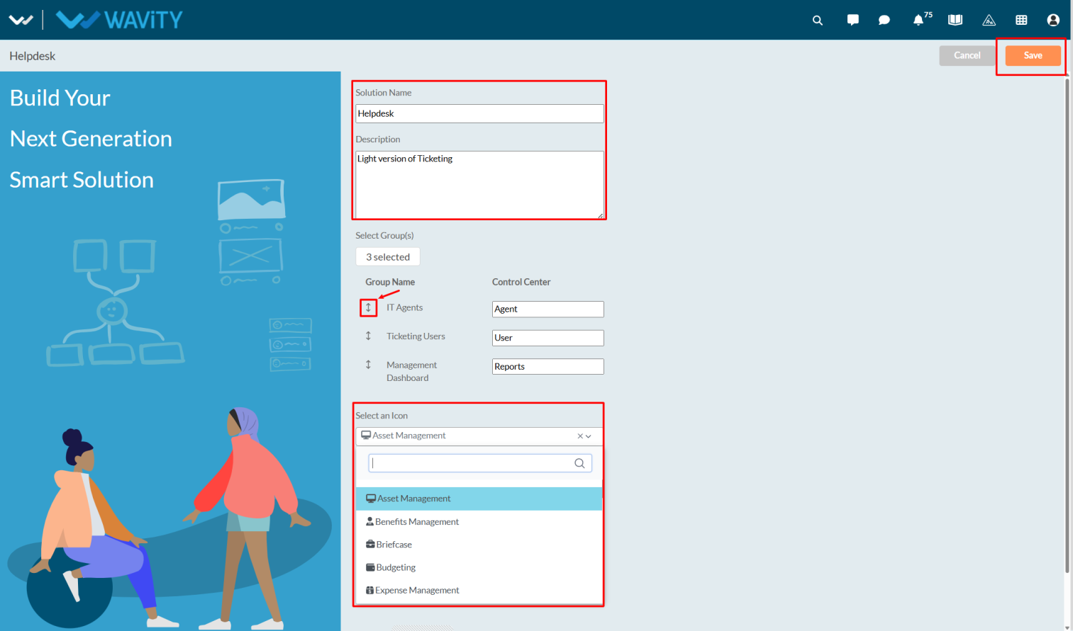
- This opens the solution edit page, where the Admin can view the solution name, description, and groups.
- Using the vertical resize cursor, the Admin can drag and reorder the interface as required.
- The solution icon symbol can also be edited from the dropdown options.
- Once the rearrangement is complete, click Save to apply changes.
- To reorder solutions, select Edit Solution Order.
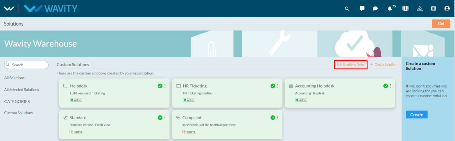
- Drag and drop the solutions left, right, up, or down according to preference.
- Click Save to confirm the new arrangement.
- The updated solution order will then be visible under the Solution icon.
Admin Guide: Configuring Scope Filters for Widgets
- In the Wavity platform, enabling scope filters is a simple and straightforward process.
- Scope filters restrict agents from selecting or modifying filters in the widget or links. When scope filters are disabled, agents can access and apply filters to view tickets.

- Only the Admin has permission to enable scope filters. Click on Manage Widgets from the settings.

- Select the desired widget where you want to enable the scope filter.
- By default, the scope filter option is disabled. Check the Scope Filter box to enable it, and then click Save to apply the changes.
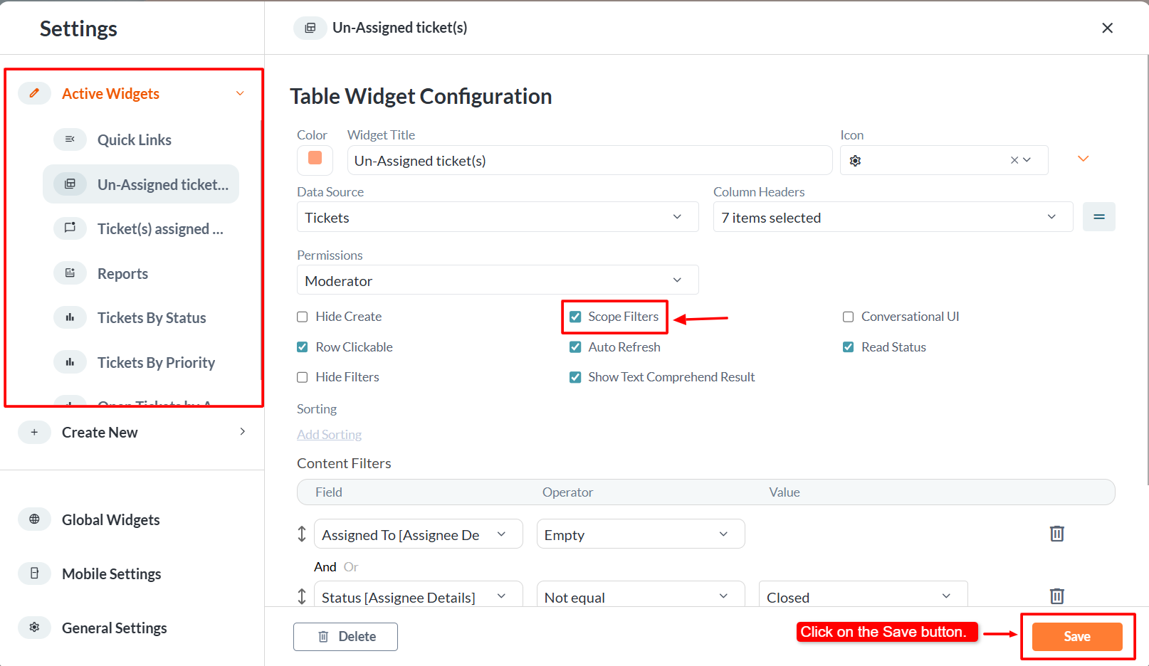
- Once enabled, the Admin will notice that the filter icon is no longer visible in the widget.

Customer Portal Configuration: Enabling Ticket Resolution by End Users
- In the Customer Portal, end users can be allowed to close their tickets and provide a final comment before submission.
- Only the Admin has the access to enable the Mark as Solved feature in the Customer Portal.
- An Admin user should log in with their credentials and navigate to the appropriate interface.
- Note: In the General Settings, under the Ticketing tab, ensure the application is properly mapped. When configuring the Ticket Status, make sure to map it correctly with the appropriate field. For the Resolved status, map it to the Closed or Resolved option from the dropdown as required.

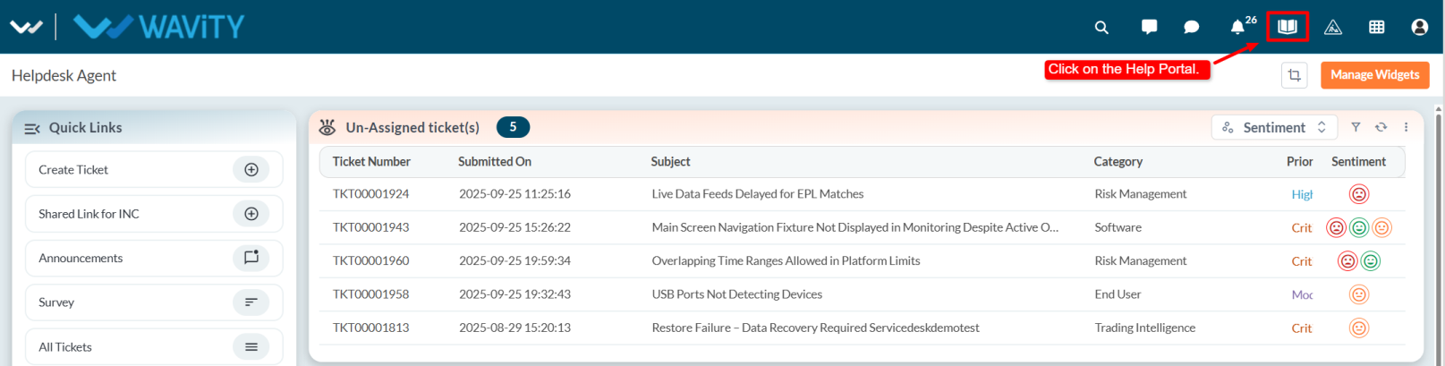
- Click on the Help Portal where users can view all Knowledge Base articles.
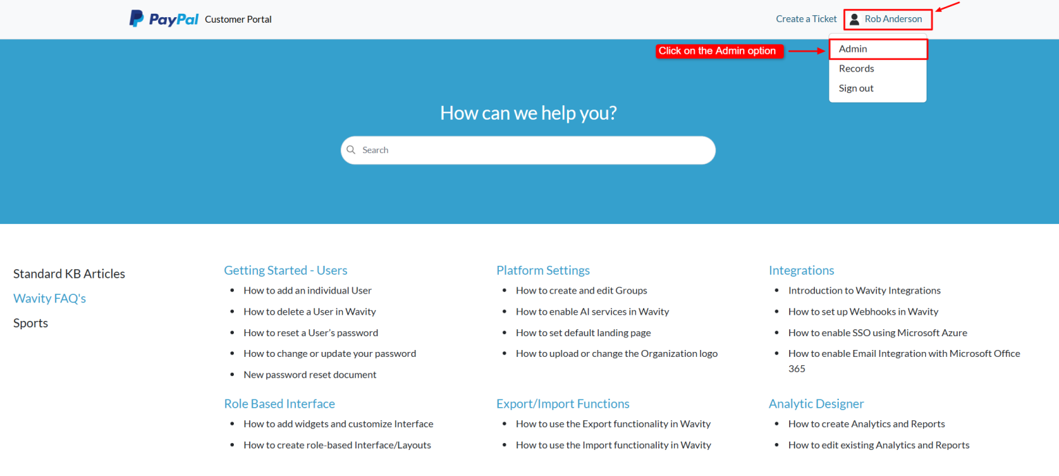
- Click on the profile name and select Admin from the dropdown options.
- Go to the Forms tab and select the form for which you want to enable this option. Then click on the Edit button (or click on the three dots and choose Edit).
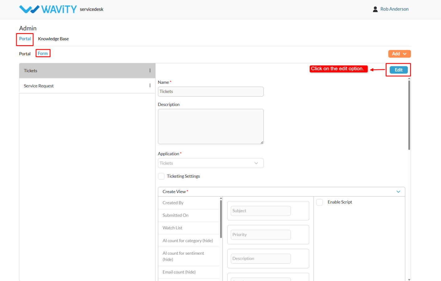
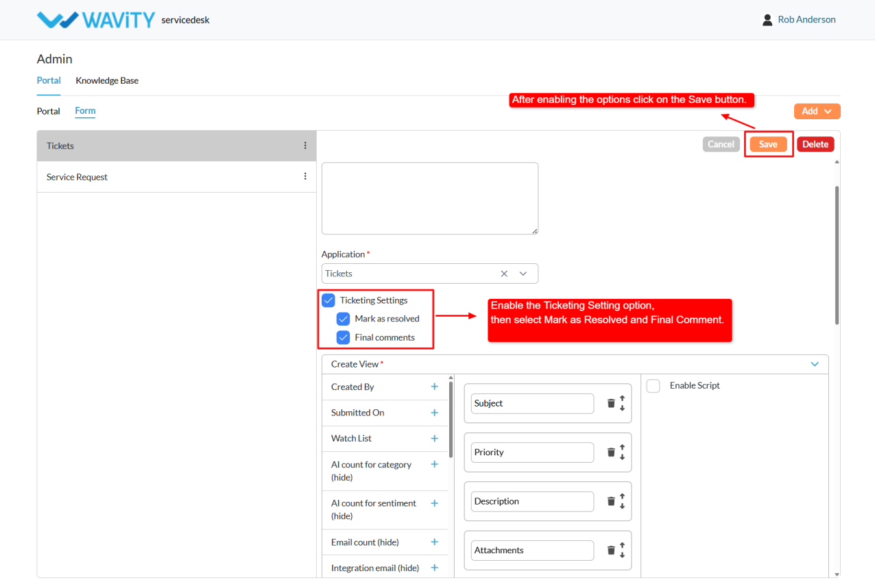
- Enable the Ticketing Settings option and Mark as Resolved option and Final Comment option (if required)
- After enabling, click on the Save button.
- Return to the Articles page by selecting Wavity logo.
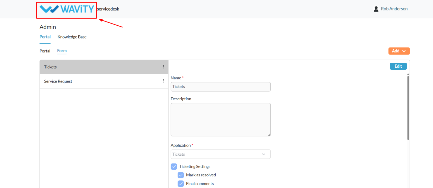
- Click on the profile name again, and select Records from the dropdown options.

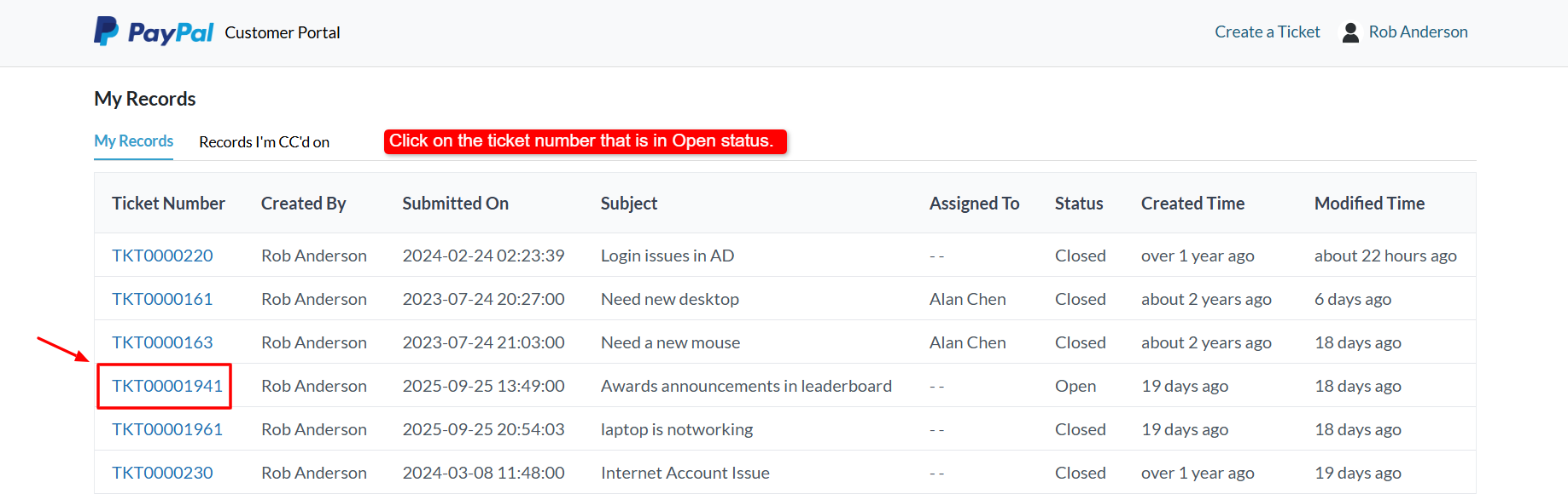
- This will navigate to My Records, where users can view the list of all tickets created by the currently logged-in user.
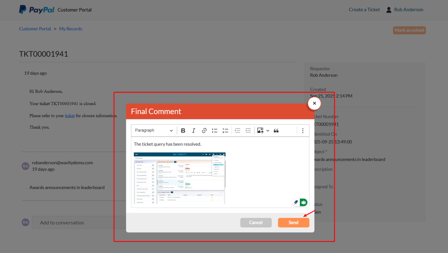
- Select any Open Ticket (the Mark as Solved button will not appear for closed tickets).
- Click the Mark as Solved button.

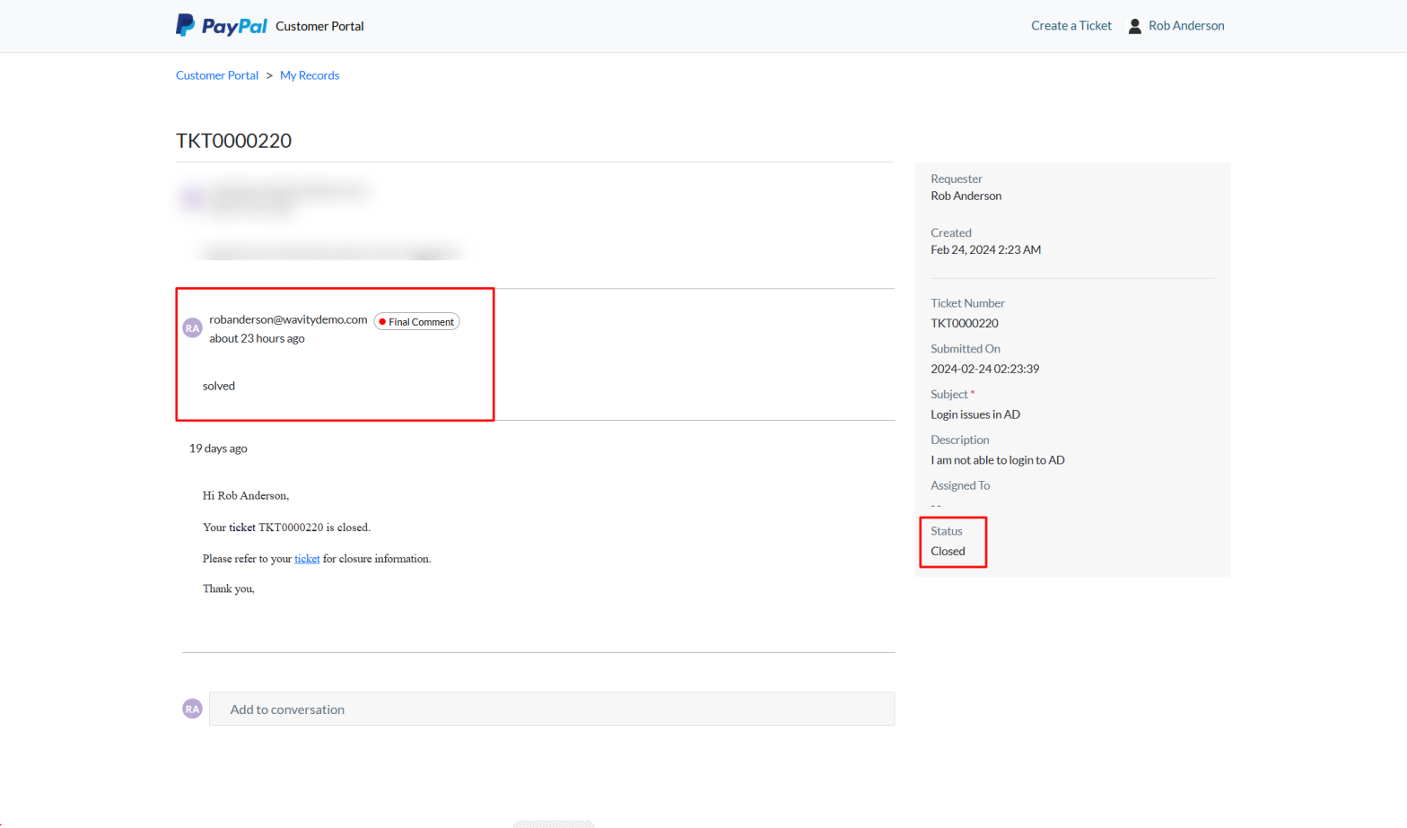
- A Final Comment pop-up will appear, allowing the end user to add their closing remarks or attach any relevant images. After entering the comment, click Send.
- The comment will be added to the conversation, and the ticket status will automatically update to Closed.
Admin Guide: Setting Up Public and Private Notes Notifications
- Agents in Wavity can send notifications to other agents when they add Private or Public notes.
- Setting up these notifications is straightforward and user-friendly.
- Public Notes: Visible to all users on the platform.
- Private Notes: Visible only to agents.

- Only Admin have access to configure Public and Private Notes notifications.
- Log in with your admin credentials.
- Click the Profile icon, choose the General option, and then select the Ticketing tab.

- In General, Map the application where you want to enable private and public notes.

- After from the Profile dropdown, select Design Tools.
- In the Apps tab, view all applications. Select the desired application, click the three dots, and choose wBots.
- Click the Settings icon, select Advanced Settings, navigate to the Data tab, scroll down, and enable the Public and Private Notes options.

- Go to the Wbots creation page for the same application where you enabled the public and private notes by selecting Wbots option from the three dots menu. Click on the Create button.

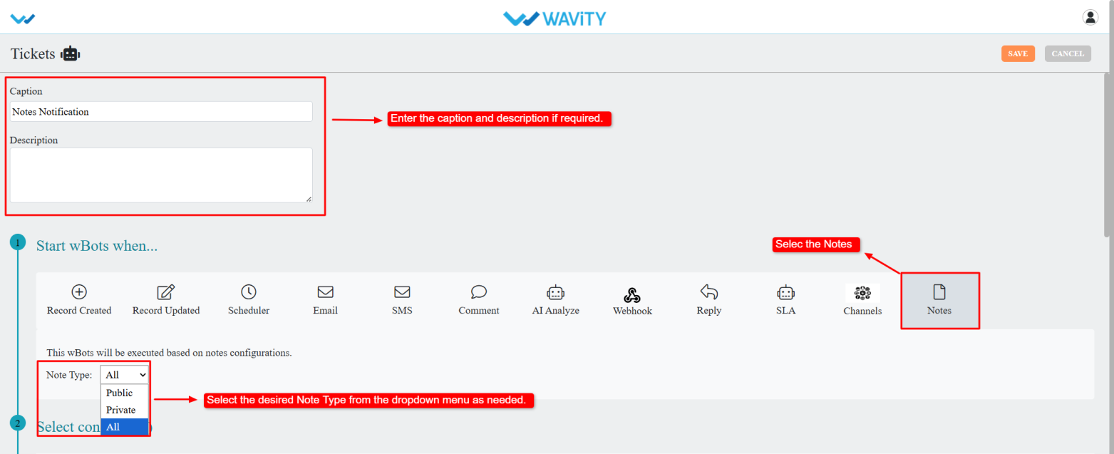
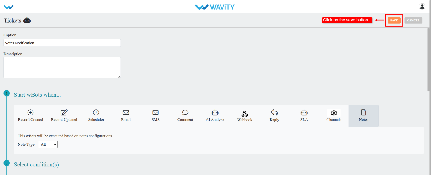
- Enter a caption and description.
- Under Start wBots When, select Notes.
- Choose the note type: Public, Private, or All. The wBot will trigger based on the selected type.
- Define conditions as required.
- Select the notification action and choose the notification type.
- In Recipients, select the form field from the dropdown.

- Enter the subject and the description in the description box; add details so agents can identify ticket information.

- Admin can add notes information in notifications by clicking the question mark beside content.
- Copy Wavity_Conversation_Note from the reserved text section and paste it into the description box. Save the body.

- After entering all required details, click Save.
- Whenever agents add private or public notes, the system will send notifications to the configured users via wBots.
Admin Guide: Setting Up Custom Auto ID Numbers
- In the Wavity platform, users can configure the Auto ID Number as needed, and the setup process is simple and user-friendly.
- Only Admin have permission to configure the Custom Auto ID.
- Admin must log in with their credentials and navigate to their respective interface.
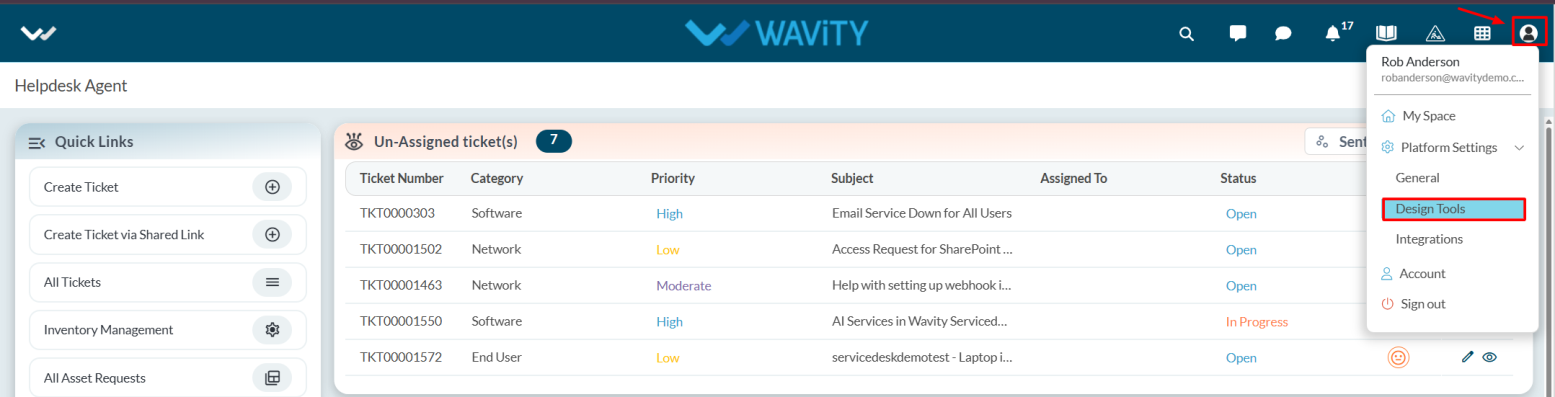
- Click on the Profile icon and select Design Tools from the dropdown menu.

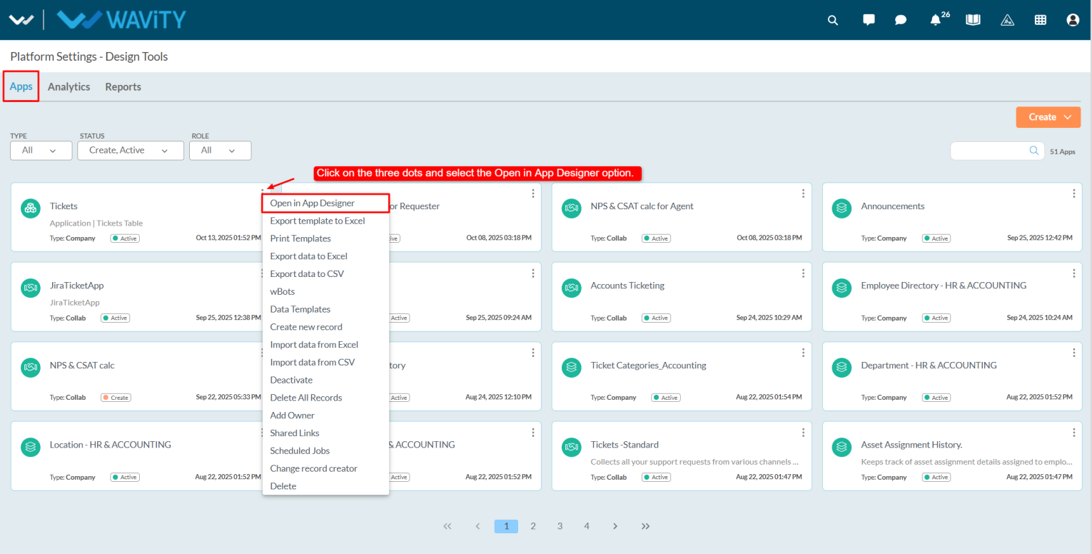
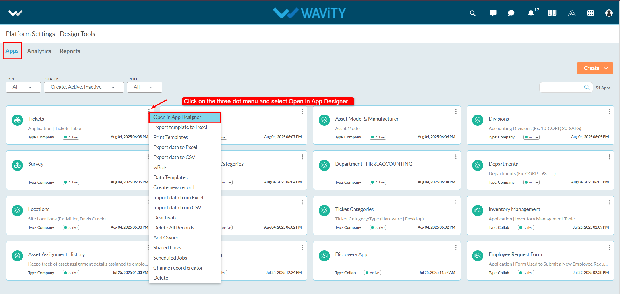
- Choose the desired application, click on the three dots (⋮), and select Open in App Designer.

- Select the Auto ID data control and click on the Settings icon.
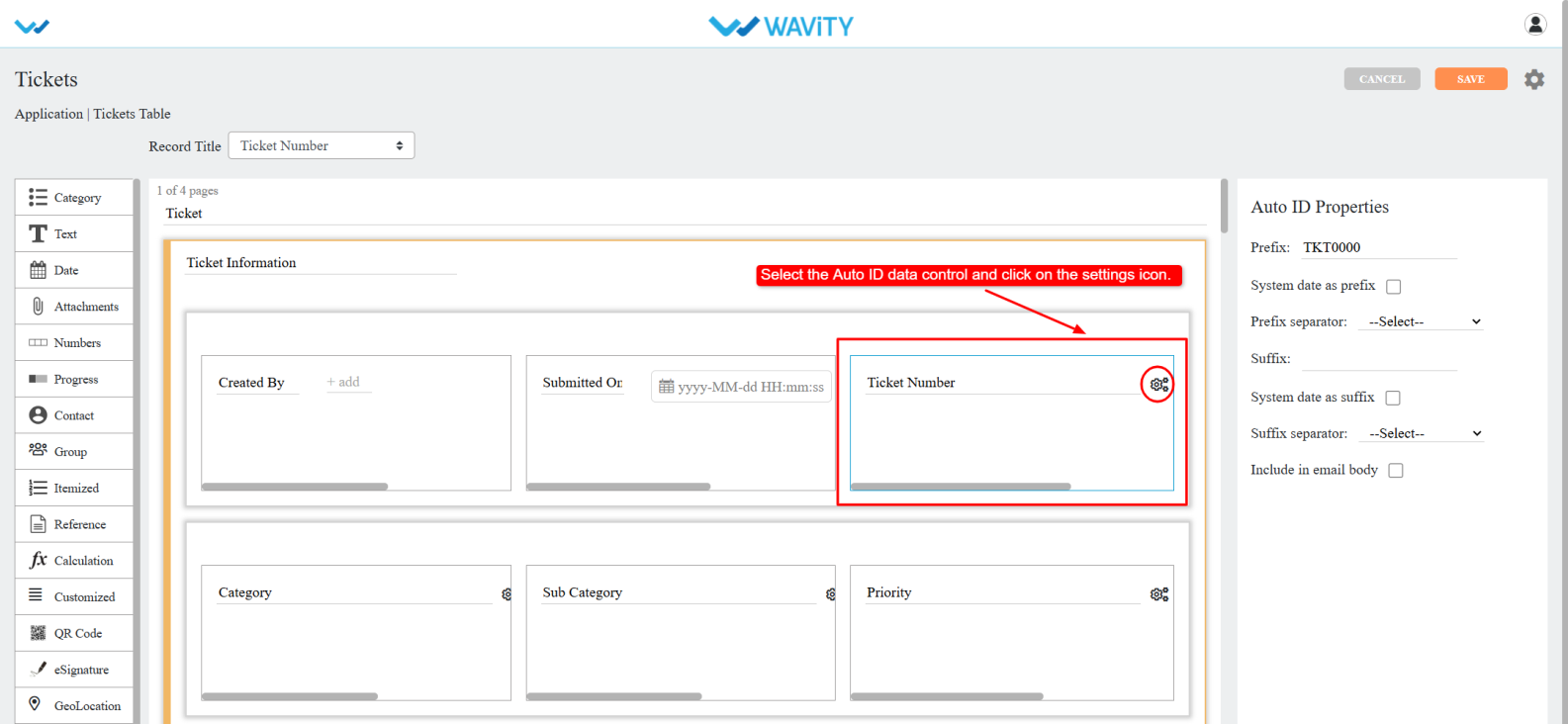
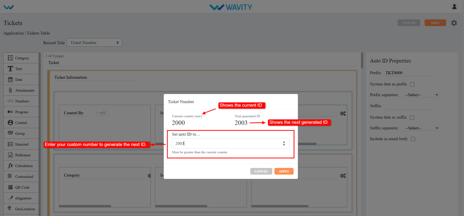
- The Current Counter (raw) displays the current ID number, while the Next Generated ID shows the next ID number that will be generated.
- In the Set Next ID field, enter the desired number (it must be greater than the current counter). After entering the custom number.
- Click Apply. A confirmation popup will appear, click OK to confirm.
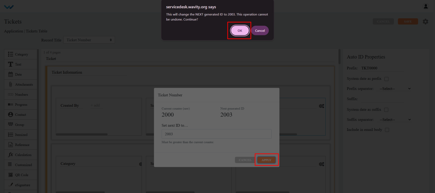
- Save the designer. The Ticket ID will now be generated based on the custom number entered in the Set next ID to field.
How to Use AI to Create New Knowledge Base Articles
- The Wavity Platform includes a powerful AI-driven feature that supports the Self-Evolving Knowledge Base. This allows AI to continuously analyze ticket data, identify content gaps, and assist Admins in creating new Knowledge Base articles.
- Go to the Customer Portal: From the main interface, click on the Customer Portal icon.

- Accessing the AI Knowledge Base Gap Analysis: Only Admin users have access to this feature.
- Access the Admin Console: Click on the profile icon, then select Admin to access administrative settings.

- Navigate to Knowledge Analysis: In the Admin Console, go to Knowledge Base > Knowledge Analysis.

- Start a New Analysis Run: You’ll see a list of previous analysis runs. Click Start New Analysis Run to begin.

Running the AI Analysis Process
- Step 1: Load Ticket Data: Click Load Ticket Data to fetch and display existing tickets from the platform.

- Step 2: Run AI Ticket Analysis: Click Run AI Ticket Analysis. AI will review ticket data and generate a list of common or high-frequency user questions.

- Step 3: Run Gap Analysis: Click Run GAP Analysis. This step identifies gaps in the existing Knowledge Base by comparing it with common ticket topics. Each result includes: gap score and disposition indicating whether a gap exists.

Creating and Publishing AI-Generated Articles
- Generate Draft Articles: Based on the gap analysis, the system will offer draft Knowledge Base articles. Click Generate Draft to create them.

- Edit and Customize Content:
- Modify the article title, category, subcategory, and access type.
- Use the Additional Content text box to enter more context or instructions, then click Regenerate to update the draft accordingly.
- Publish the Article: Once satisfied with the content, click Publish to Knowledge Base. The article will now be available in the customer portal for users.

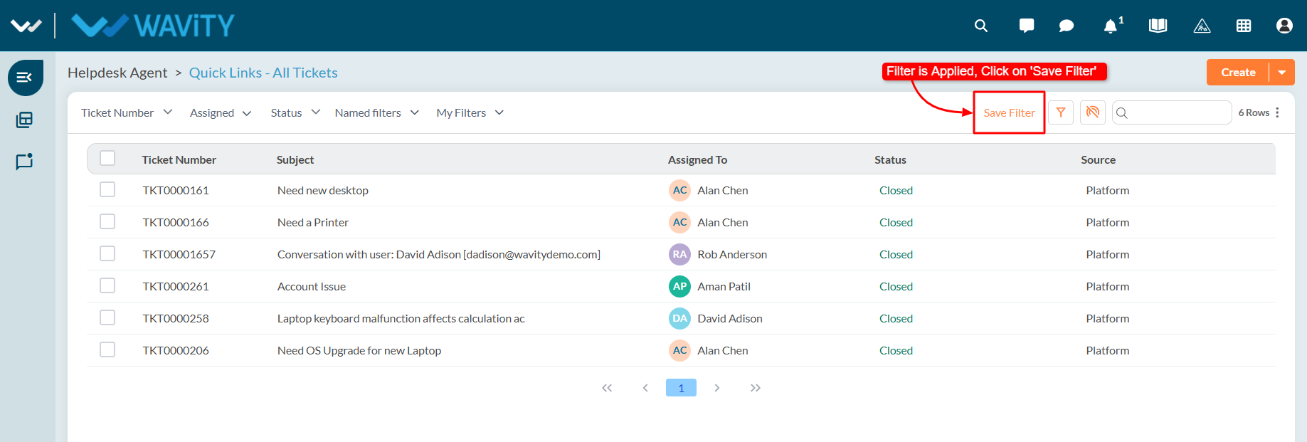
How to Create and Save a New Filter
- The Wavity Platform offers a My Filters feature, allowing users and groups to create custom filters based on specific conditions. These filters can be saved and reused with a single click, eliminating the need to reapply filters repeatedly. Use filters to quickly view specific sets of data such as tickets, tasks, or other module entries based on your defined criteria.
- You can apply filtering on listing pages such as All Tickets, Tasks, or other modules. Navigate to a listing page (e.g., click "All Tickets" from the Quick Links section).

- Open the Filter Panel: Click the Filter icon to open the filter configuration panel.

- Define Filter Criteria
- Select a Field: Choose the data field you want to filter by (e.g., Status, Priority).

- Choose an Operator: Select an operator (e.g., equals, contains, greater than).
- For more understanding on advanced filters, refer following link: How To Apply Advanced Filters? | Wavity

- Enter/Select a Value: Based on the field, select or enter the appropriate value.

- Add Conditions (Optional): Use AND / OR to combine multiple filter conditions.

- Use the delete icon to remove any condition you no longer need.
- Apply the Filter: Once your conditions are set, click Apply Filters to see the filtered results.

Save the Filter for Reuse
- Click on Save Filter after applying the desired filters.
- Enter a Filter Name and an optional Description.

- Select the Groups who should have access to this filter.

- Click Save to store the filter for future use.

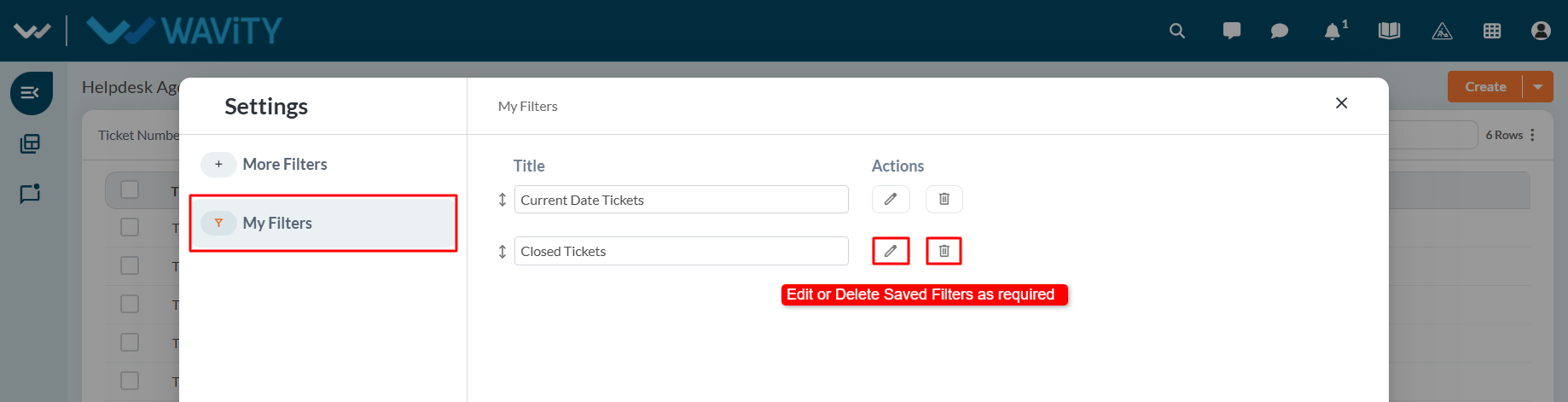
Accessing Saved Filters
- Your saved filters will appear in the My Filters dropdown list. Click on any saved filter to apply it instantly.

- Click the Filter icon again to open the filter panel. You can also choose to edit or delete saved filters as needed.
- This feature simplifies data management by letting you quickly switch between frequently used views. Perfect for teams who need to track and monitor specific data sets efficiently.
How to Use the AI Chat Assistant
- The Wavity Platform includes an AI Chat Assistant feature that helps both Agents and End Users by providing intelligent suggestions and support related to tickets.
- Open a Ticket: Navigate to your interface and click on any ticket you want assistance with.

- Access the AI Chat Assistant: Click the AI Chat Assistant icon located within the ticket view.

- Enter Your Query: In the message input box, type your question or request for assistance. The AI Assistant will analyze the context of the ticket and provide relevant suggestions or answers.

- View the AI Response: The AI Chat Assistant will respond directly within the chat interface, offering helpful information based on your query.
- In the example below, the user asked a question related to the ticket, and the AI Assistant responded with a helpful suggestion.

How to Use the Sorting feature
- The Wavity Platform provides a sorting feature that allows users to organize data in either increasing (ascending) or decreasing (descending) order for easier navigation and quick access to the information you need.
- Widget Data Sorting: You can sort data directly within a widget by clicking on a field/column header. Clicking once will sort the data in increasing order; clicking again will toggle it to decreasing order.
- A sorting icon next to the field name indicates the current sort order.

- In the example below, sorting is applied in decreasing order. The arrow icon beside the column reflects the applied sort direction.

- Sorting on Listing Pages: You can also apply sorting on listing pages such as All Tickets, Tasks, or other modules. Navigate to a listing page (e.g., click "All Tickets" from the Quick Links section).
- Click on any column header (e.g., Ticket ID, Submitted Time, Status, Priority, etc.).

- The data will be sorted in increasing order. Up Arrow = Increasing Order (A–Z / 0–9).

- Click the same column header again to sort in decreasing order. Down Arrow = Decreasing Order (Z–A / 9–0).
- This feature is useful for quickly organizing large data sets, finding top or recent entries, and streamlining your workflow within the platform.

How to Use AI-Recommended Article Insertion
- The Wavity Platform offers an AI-powered feature that assists Agents by suggesting relevant Knowledge Base (KB) articles based on the content of a ticket. Agents can quickly insert these suggested articles directly into their responses to end users.
- Open a Ticket: Navigate to your interface and click on any ticket for which you need assistance.

- Access AI Article Suggestions: Click on the Knowledge Base Articles icon within the ticket view.

- View Suggested Articles: A list of AI-recommended Knowledge Base articles will appear, generated based on the ticket’s title and content.
- Insert an Article into Your Reply: Click the ‘+’ icon next to the relevant article. This will automatically insert the article into the reply box.

- Send the Response: Review or edit the reply as needed, then send it to the end user. The suggested article will be included as part of your response.
- In the example below, the AI-suggested article was inserted directly into the reply box, allowing the Agent to quickly share helpful information with the end user.

How to use Live Chat as an Agent?
- Wavity offers a Live Chat feature, enabling real-time communication between end users (employees or customers) and IT support staff or service agents. Users can ask questions, report issues, or request help through a chat interface and receive prompt responses.
- Agents can activate Online mode by clicking the Live Chat icon on the interface.
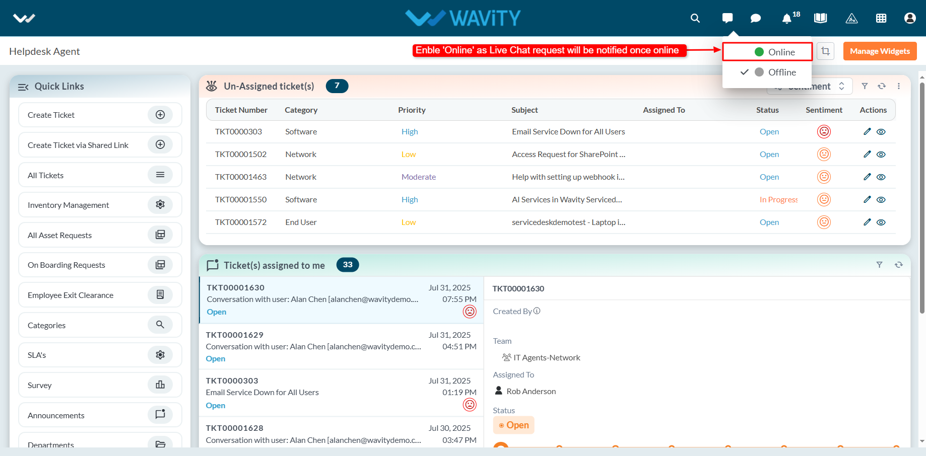
- When Online mode is enabled, the Live Chat icon turns green, indicating the agent is available to receive chat requests.

- When an end user initiates a Live Chat request, the agent receives a notification and can choose to accept it. Upon acceptance, the agent can begin a real-time chat session with the user.
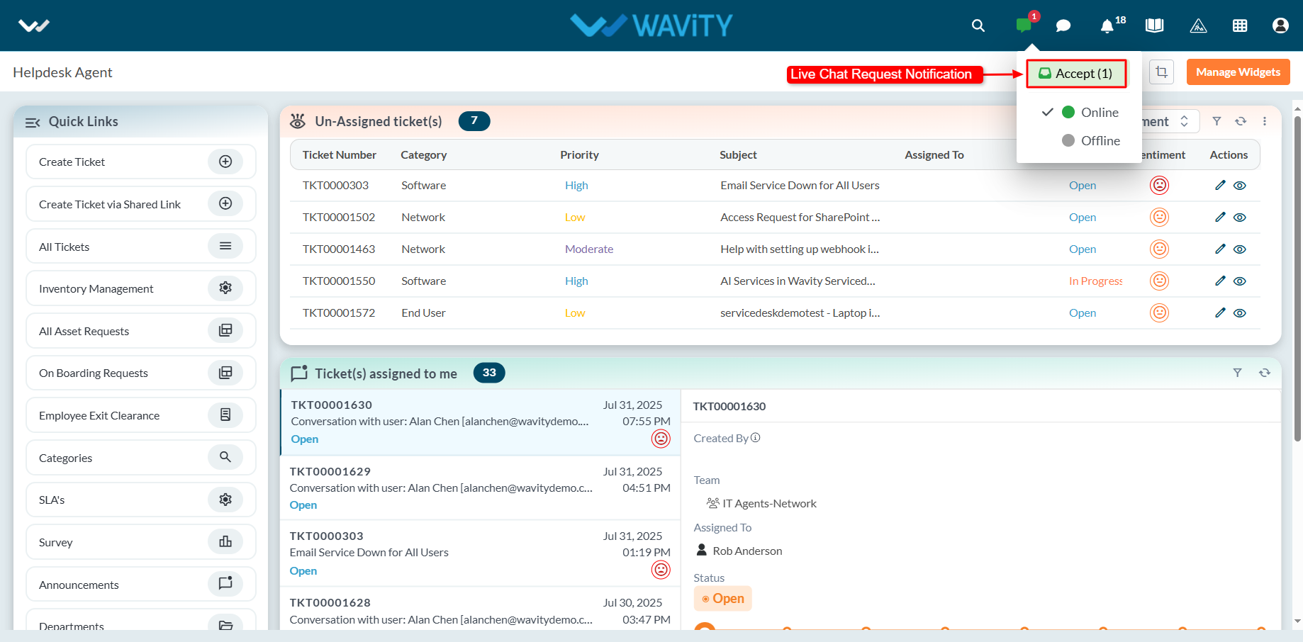
- A new ticket or incident is automatically generated, capturing details such as the ticket ID, requester information, and communication channel.
- Agents can use the message box to interact with the user throughout the session.
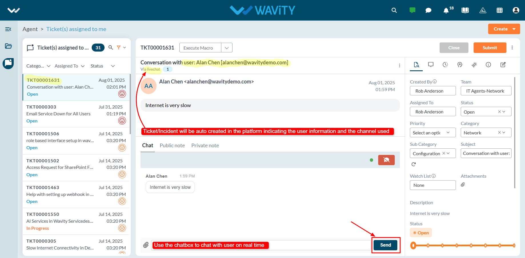
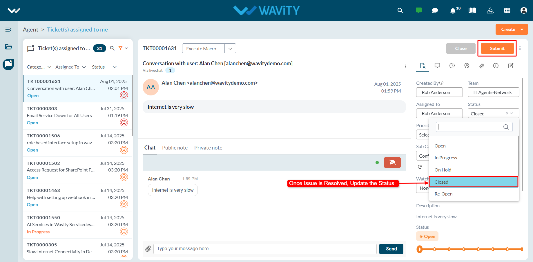
- Once the issue is resolved, the agent can update the ticket status and click the Submit button to close the ticket or incident.
Adding Custom Attributes – General Settings
- Custom attributes are user-defined fields added to customer details within the Wavity platform to capture specific information retrieved from external systems through integrations such as Open APIs and Rest API’s.
- Adding custom attributes in Wavity is a straightforward process and can be easily configured based on business requirements.
- If you need to move custom attributes from external systems, they can be added and retrieved in Wavity using Open API and Rest API integrations.
- Only admin will have access to add and manage custom attributes in the Wavity platform.
- Click on the Profile icon and select General from the available options.
- You will be directed to the General Settings page.
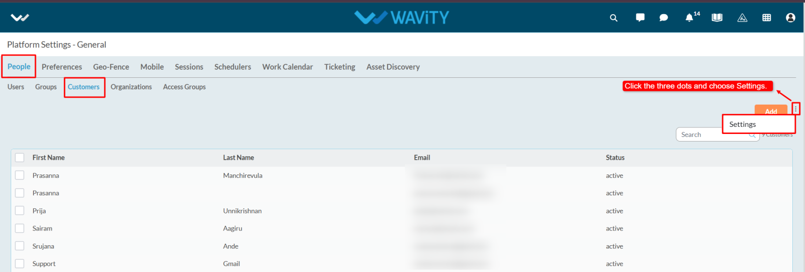
- Navigate to the People tab, select Customers, and click on the three-dot menu and select settings next to the Add button.
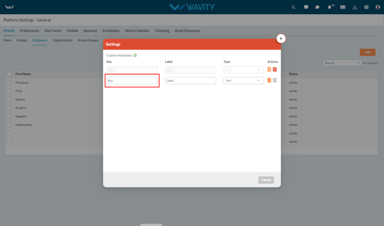
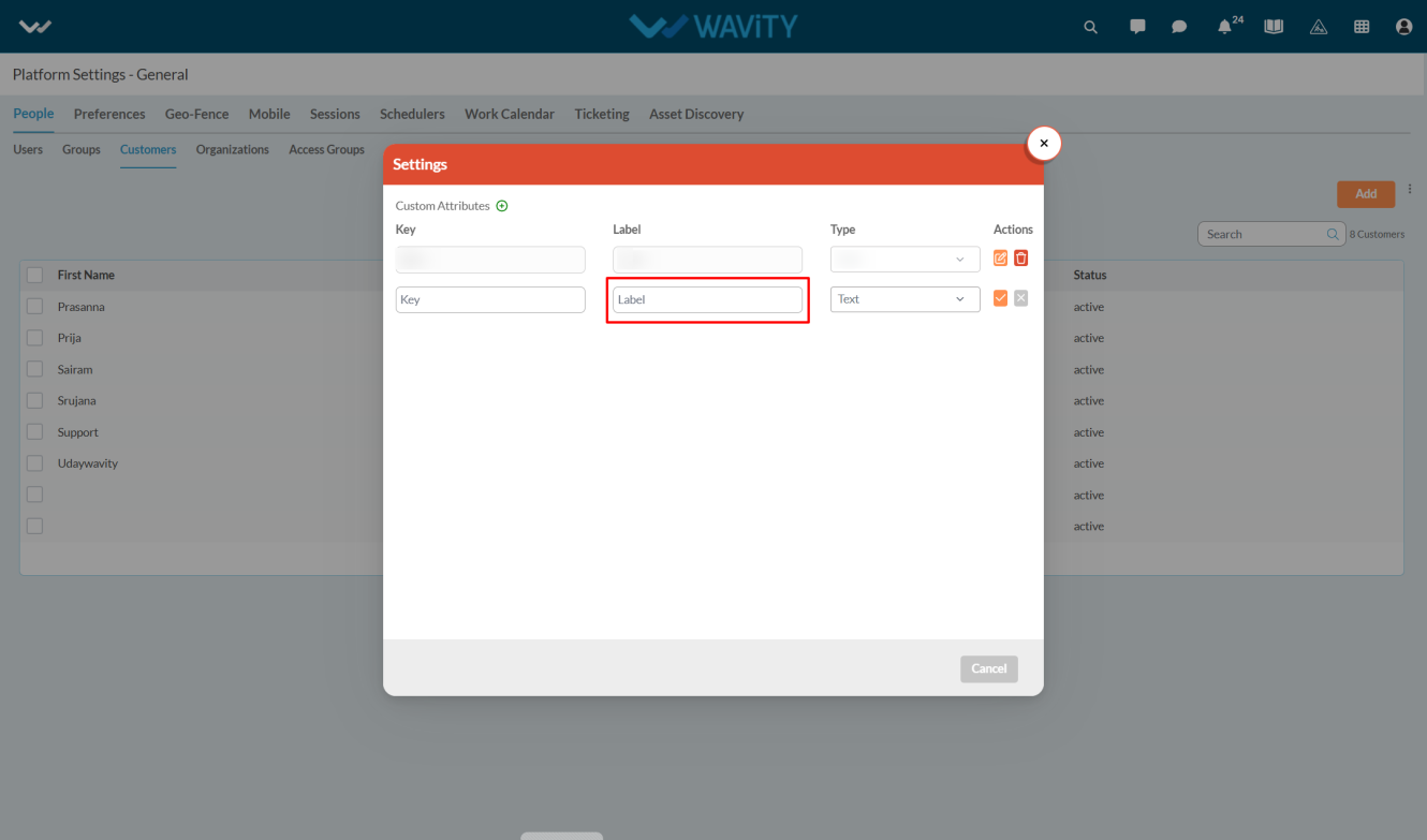
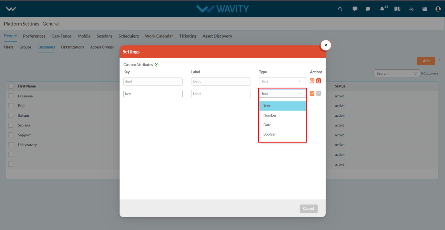
- Click on the Add icon.
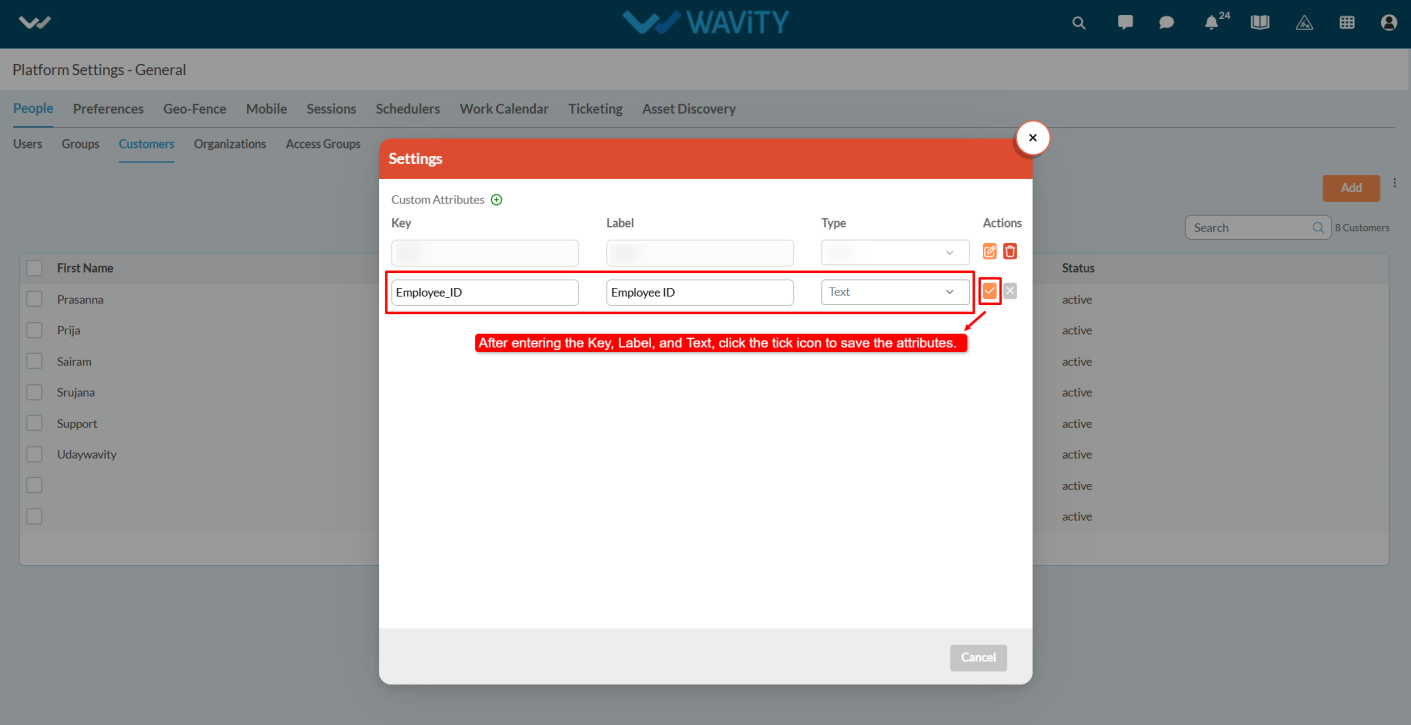
- We can view the Key, Label and Type.
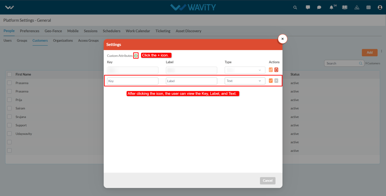
- Key is a unique identifier used internally to reference the custom attribute. It should follow a consistent naming convention (e.g., customer_type, contract _end date) and must not contain spaces or special characters.
- Enter the Label, which is the display name shown to users on the interface. It should be clear, user-friendly, and descriptive (e.g., Customer Type, Contract End Date).
- Enter the Type which defines the format or input method for the custom attribute. Common types include Text, Number, and Date, Boolean.
- Click on the save option to save the attributes.
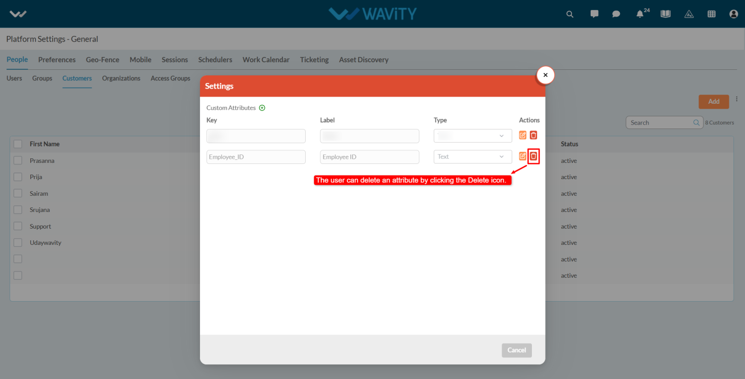
- You can delete attributes by clicking the delete option.
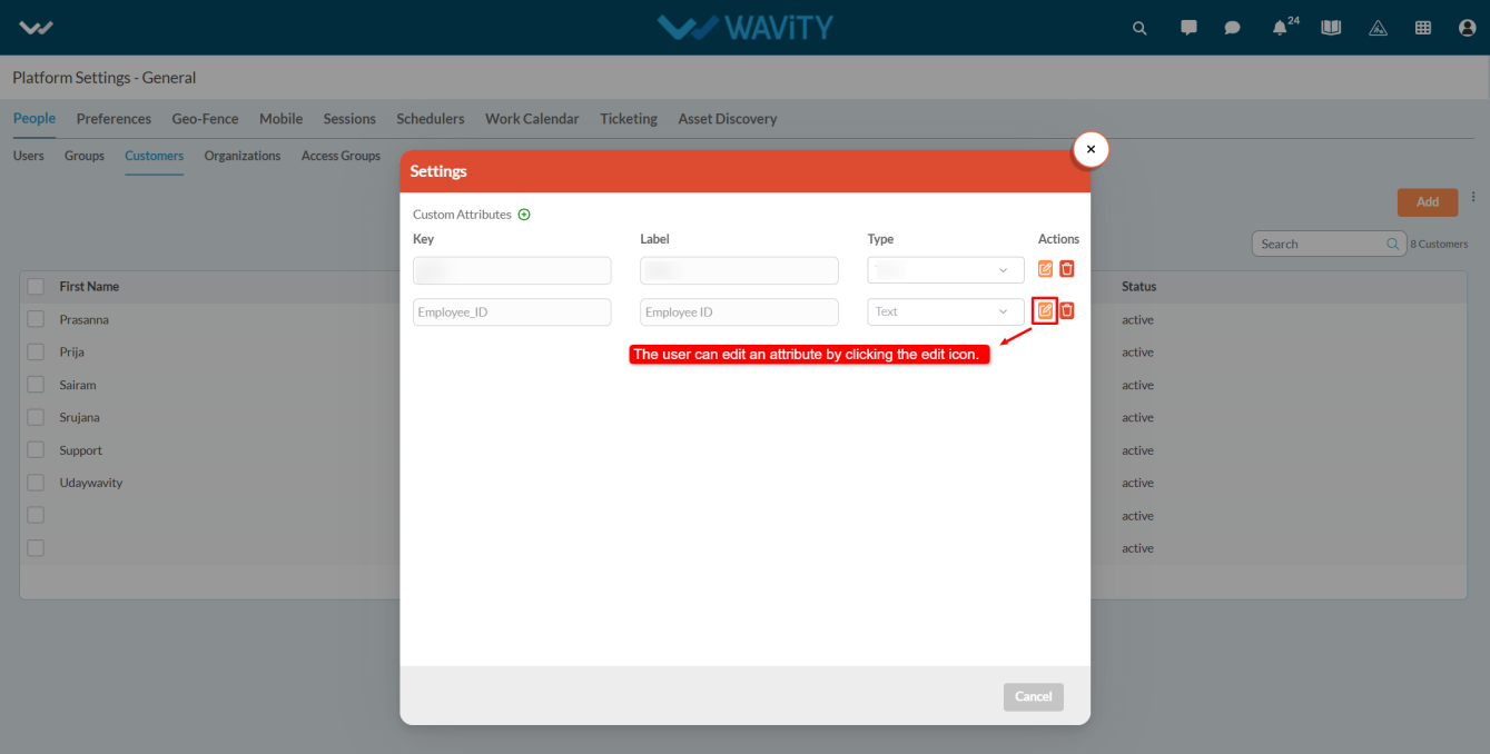
- If you want to edit the attributes click on the edit option.
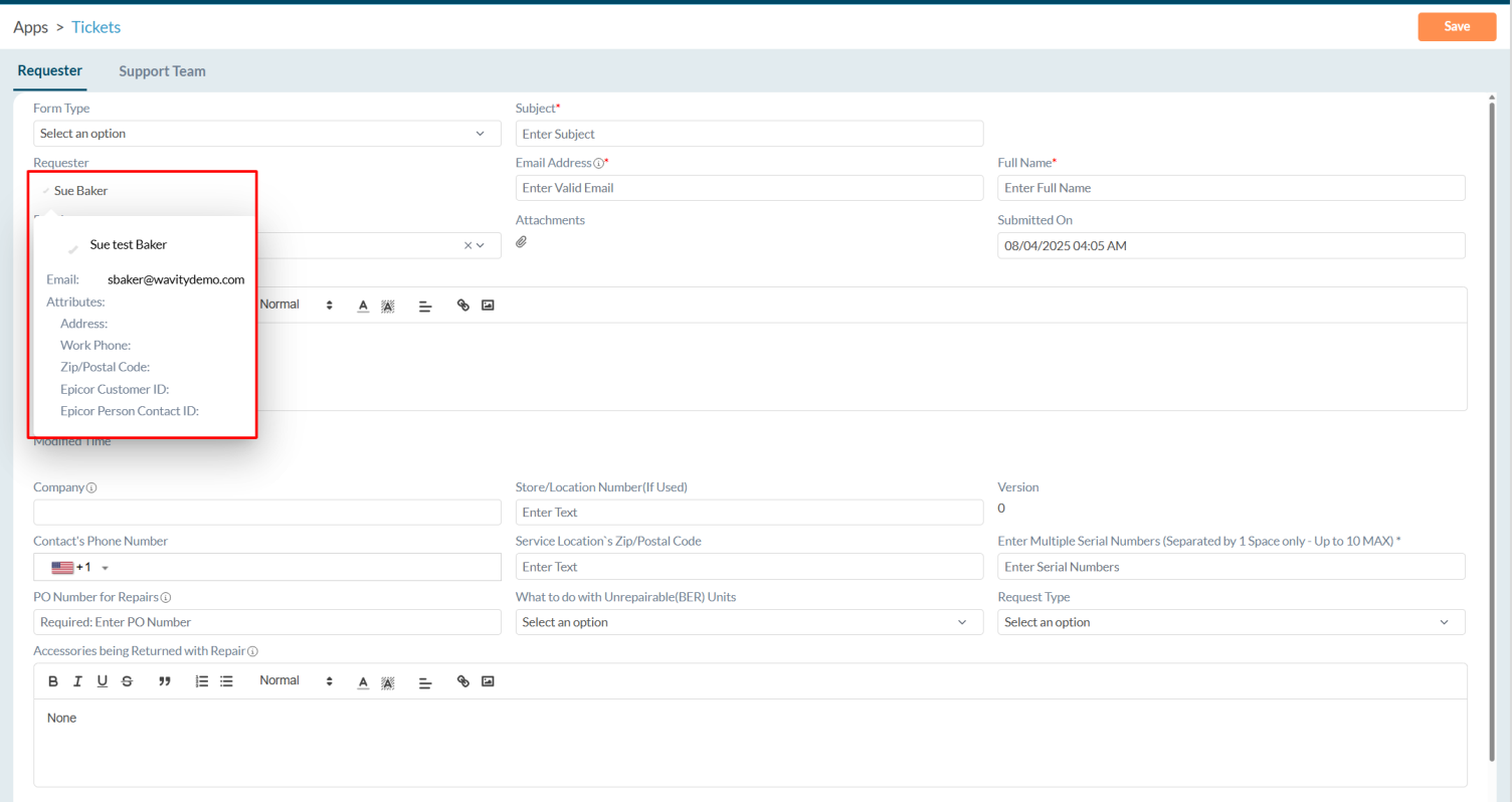
- After Adding custom attributes and integrated with Open API’s user can view the attributes whenever they click on the user’s profile icon.
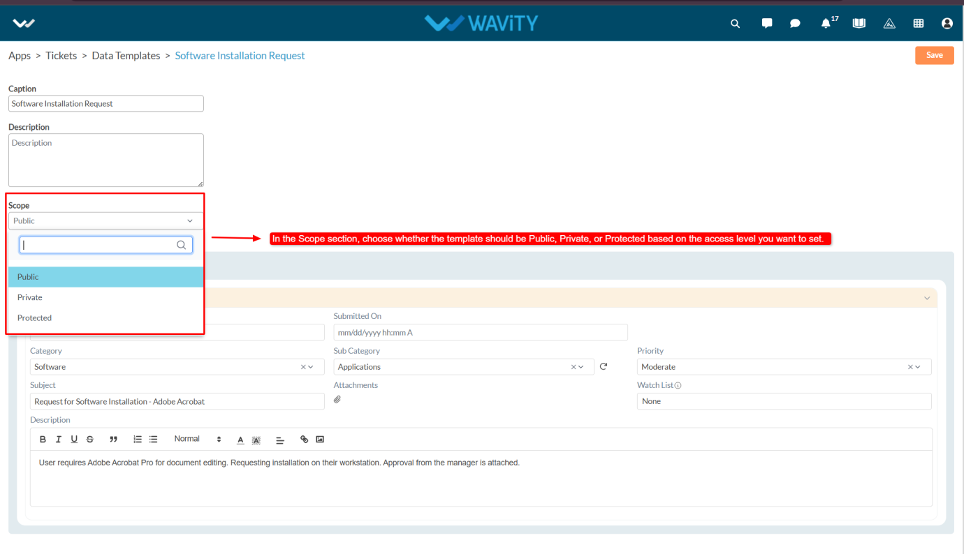
Creating Data Templates in App Designer
- In Wavity, Data Templates are pre-defined forms that allow end users to quickly fill out information with a single click, minimizing manual effort.
- Creating a Data Template is a simple and straightforward process; only admin will have access to create Data Templates.
- Click on the Profile icon and select Design Tools.

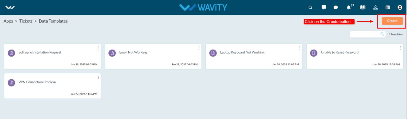
- You will be redirected to the Design Tools page. Under the App tab, choose the application where you want to create the Data Template. Click on the three dots and select Data Templates.
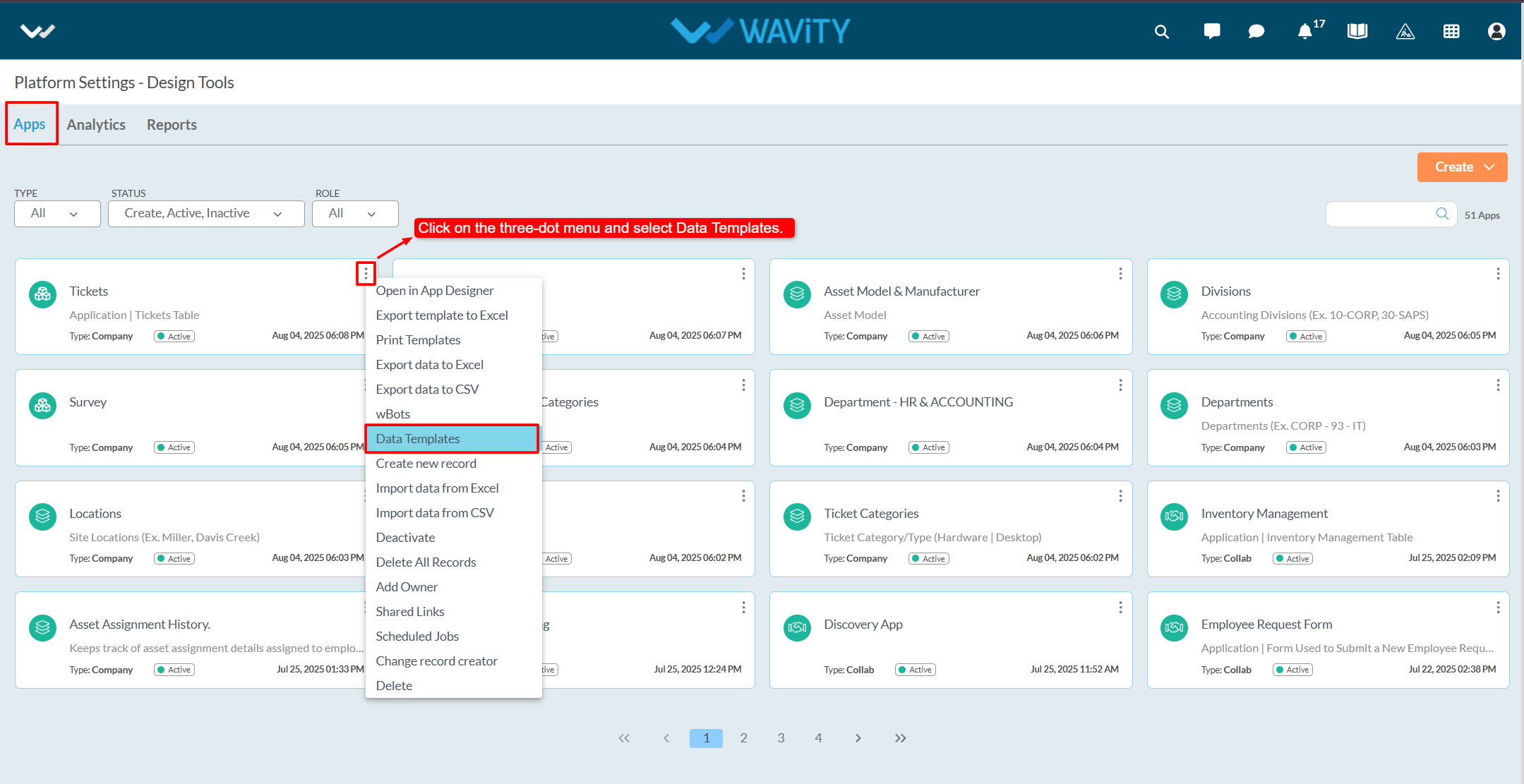
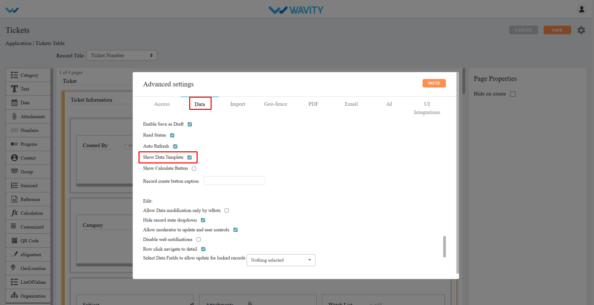
- Make sure that the "Show Data Template" option is enabled in the Advanced Settings.
- Click on the Create button.
- Enter the Caption and Description as required.
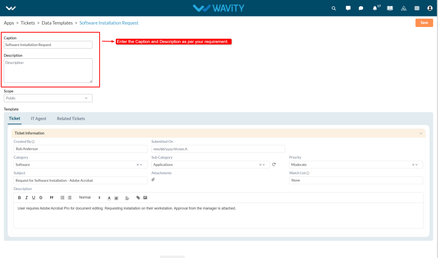
- In the Scope section, choose whether the template should be Public, Private, or protected based on the access level you want to set.
- Public: Accessible to all users.
- Private: Accessible only to the admin who created the template. If one admin creates a template, only they can view it—other admins will not have access to that template.
- Protected: Accessible only to selected users or groups.
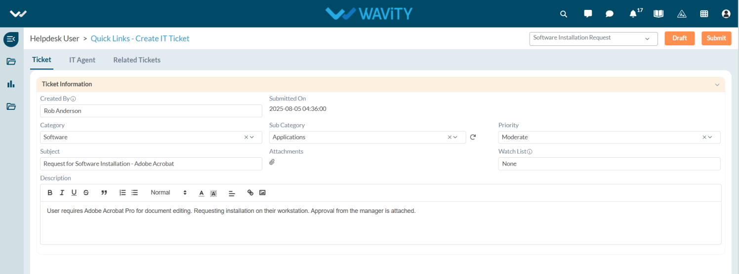
- Fill in the Template such as Category, Subcategory, Priority ,subject and description.
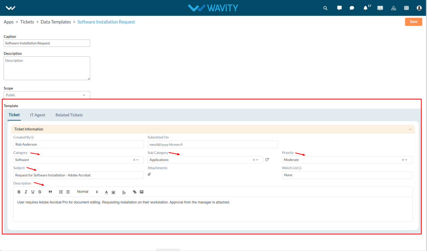
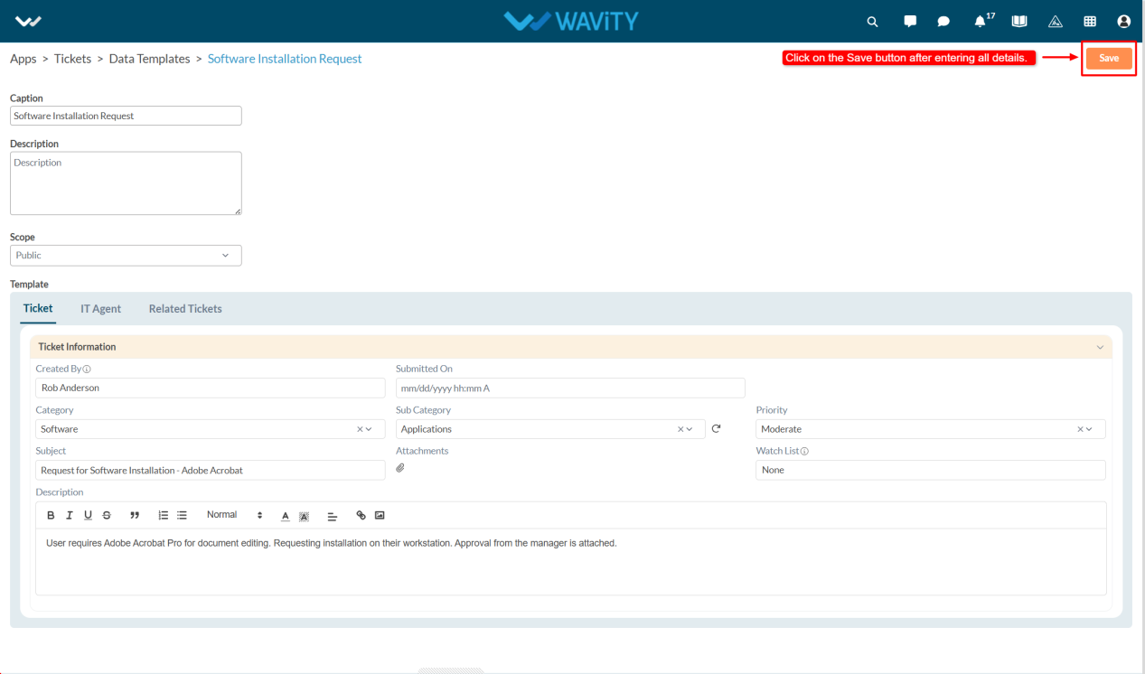
- After entering the required details and selecting the form, click on the Save button to create the Data Template.
- When navigating to the Ticket Creation page, users will see the available Data Templates at the top. Users can select a template.
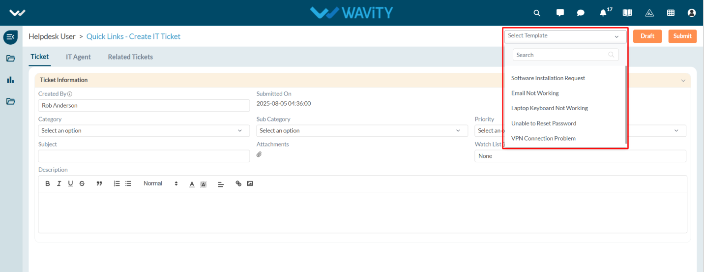
- Click Yes to apply it.
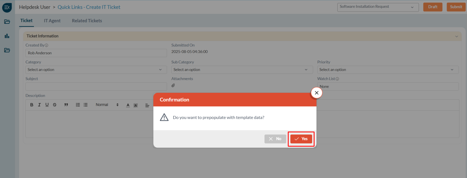
- The form fields will be automatically filled based on the selected template.
Configuring the Close Field in Conversational UI
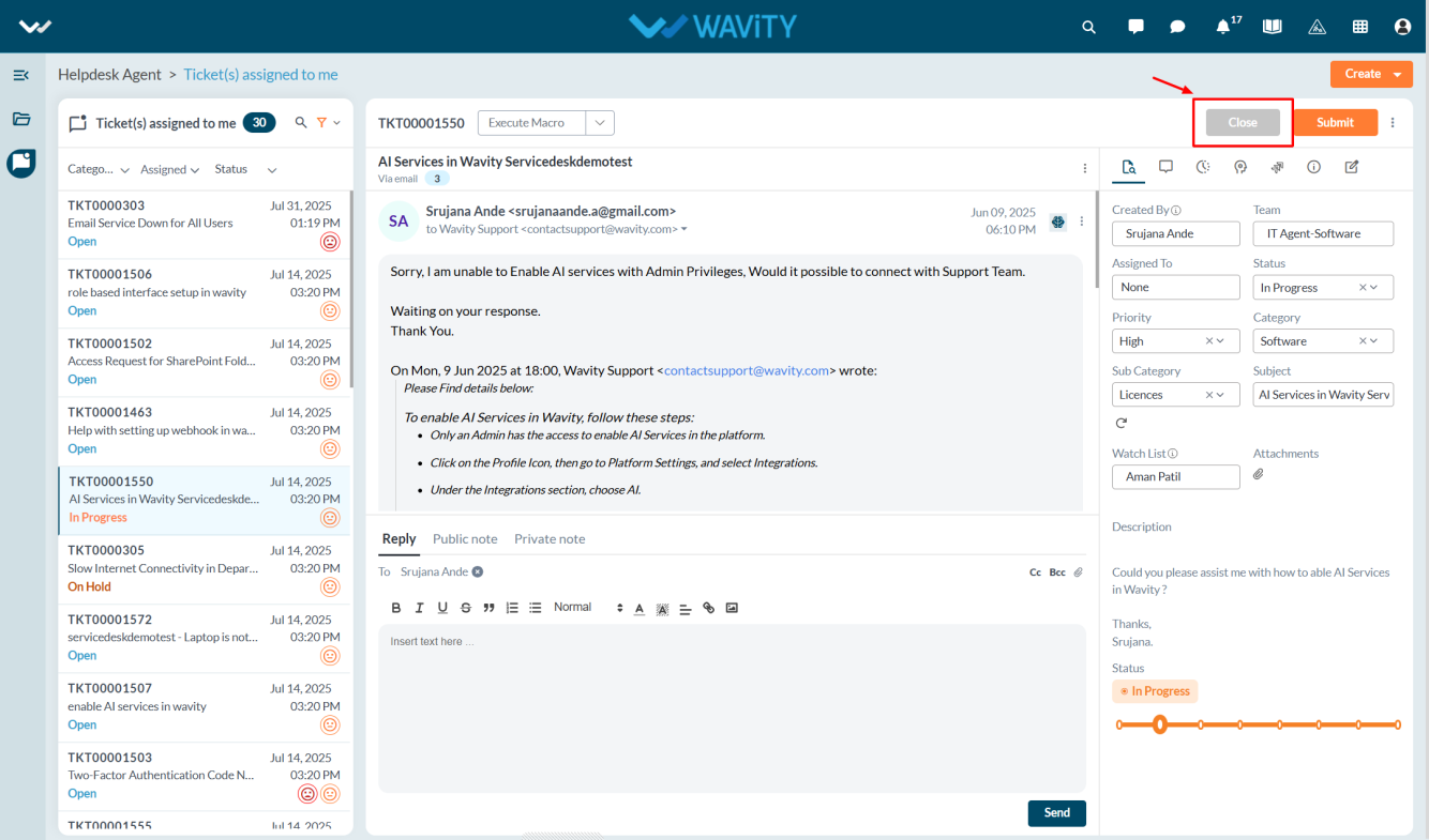
- In Wavity, admin can configure the Close field to appear in the Conversational UI, allowing agents to update and close tickets with a single click.
- Only users with Admin access can perform this configuration.
- Click on the Profile icon and select Design Tools.
- You will be redirected to the Design Tools page, where under the App tab, you can select the desired application and click the three dots to choose Open App Designer.
- Click on the Settings icon, and then select Advanced Settings.

- Go to the Data tab and scroll down to the bottom section.
- Select the Close Field from the dropdown.
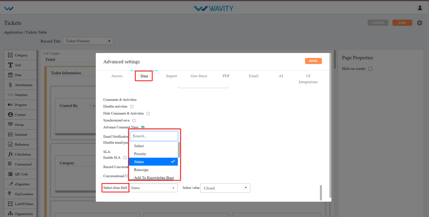
- Choose the status value you want to assign when closing the ticket (e.g., “Closed” or “Resolved”). Click Done.
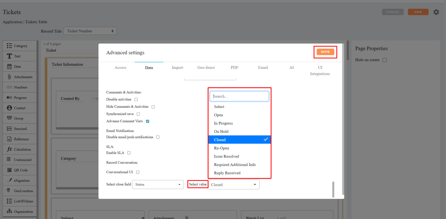
- Click Apply, and then click Save again to confirm and apply the changes.

- Once configured, the Close button will be visible in the Conversational UI, enabling agents to close tickets with a single click.
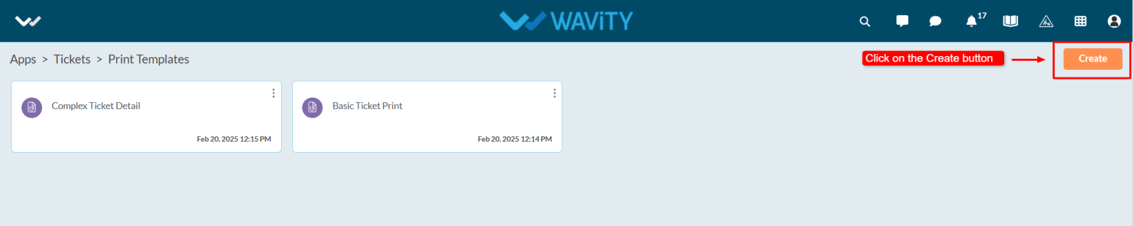
Creating Print Templates in App Designer
- In Wavity, users can print tickets by selecting specific form fields they want to include in the printout.
- Only users with Admin access can create a Print Template.
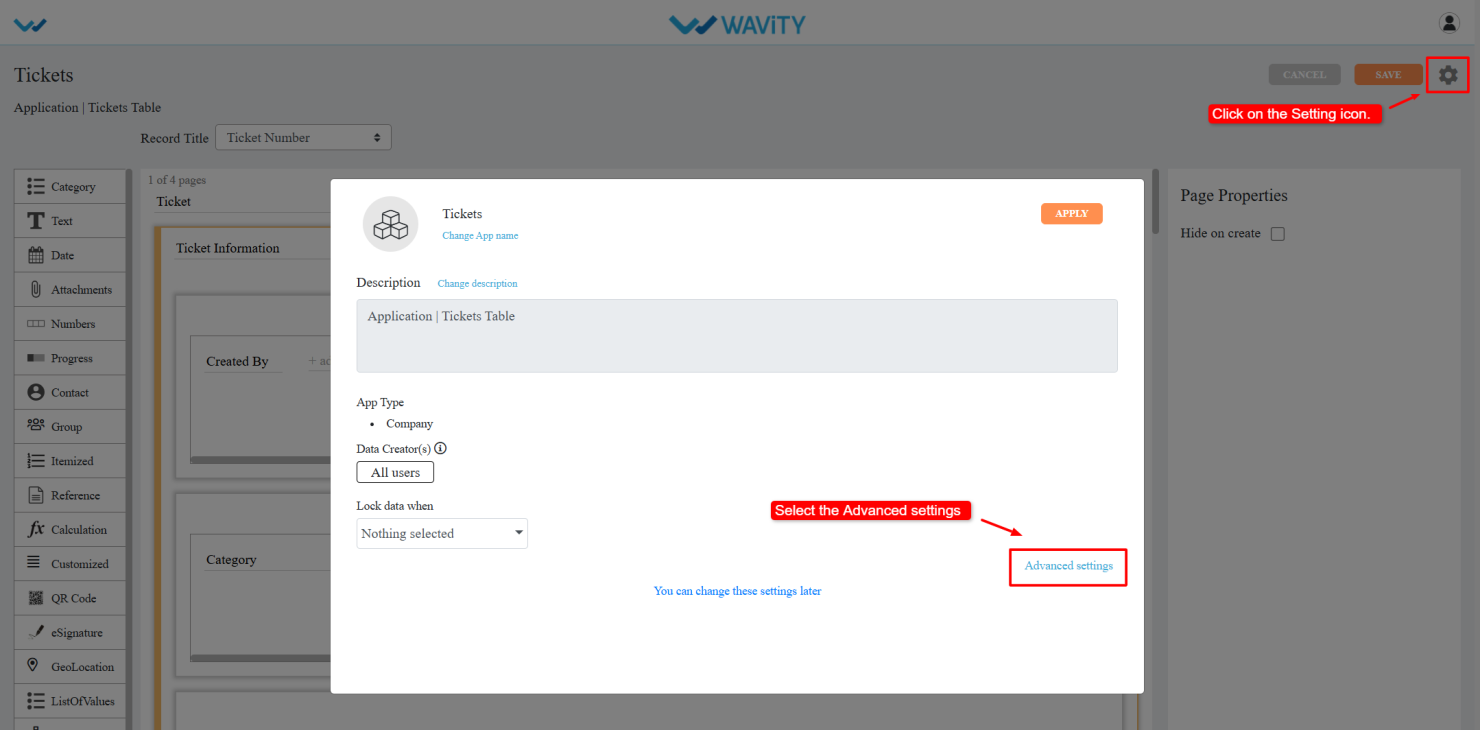
- Click on the Profile icon and select Design Tools.
- You will be redirected to the Design Tools page, where under the App tab, you can select the desired application, click the three dots, and choose Print Template.
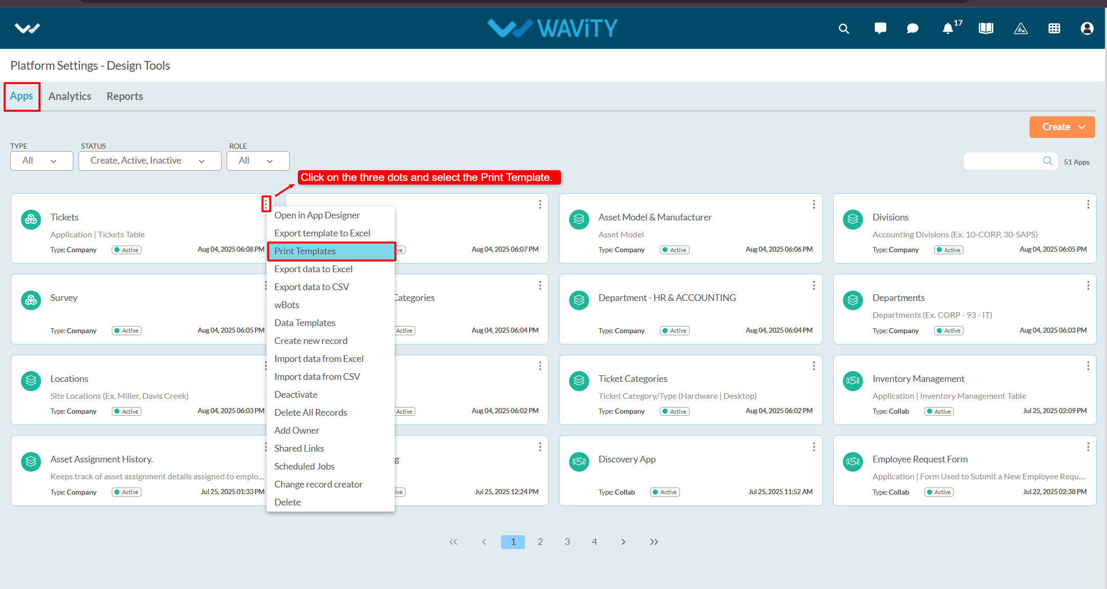
- Click on the Create button.
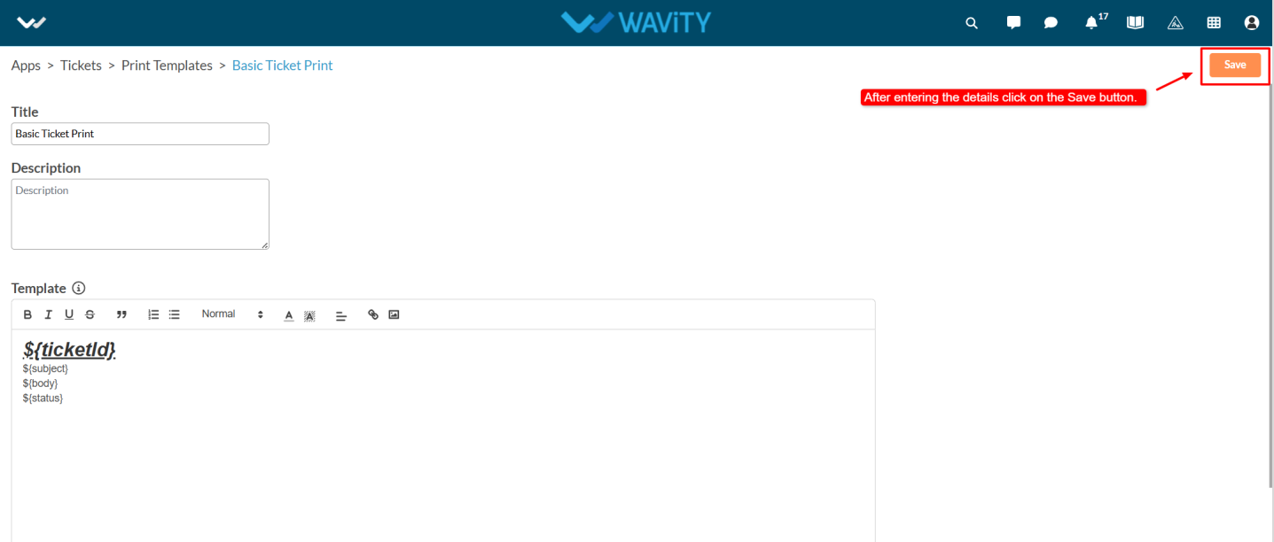
- Enter the Title and Description as per your requirements.
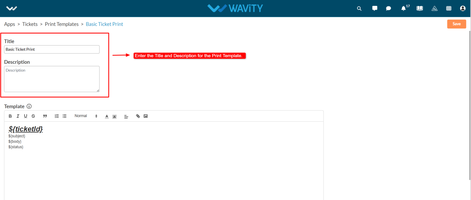
- Content can dynamically use data from application records.
- To identify which parts of the content should be replaced with application data, use a unique identifier.
- Wrap the identifier with ${} syntax. For example :${ name} – Here, the key name will be replaced with the corresponding value from the application record.
- Note: Keys must only contain alphabets and numbers. No spaces or special characters are allowed.
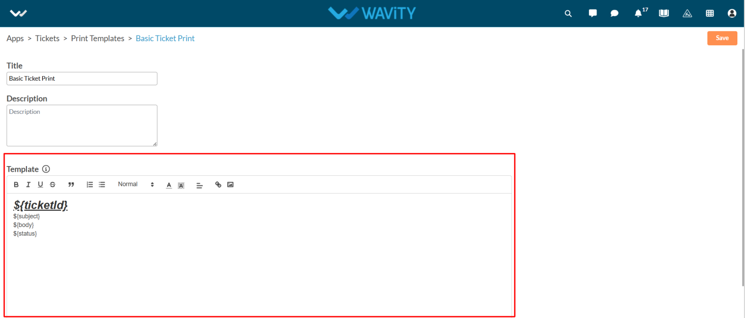
- Mention the form fields to be included in the printable version of the ticket in the Template box. After entering the details, click the Create button to save the template.
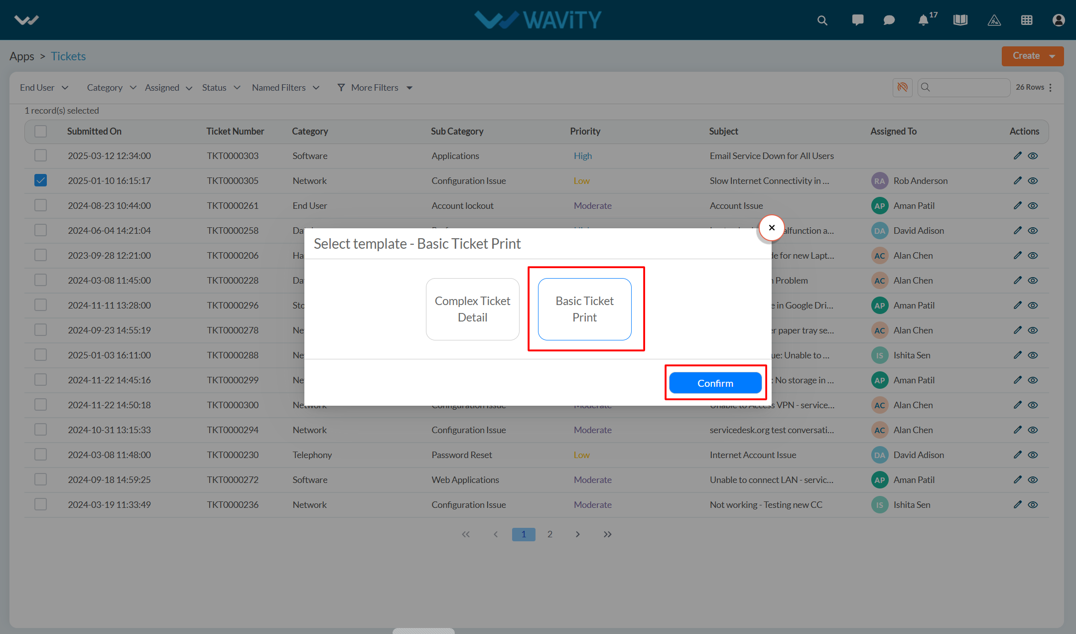
- Select any ticket from the application, then click on the three-dot menu and choose Print with Template.
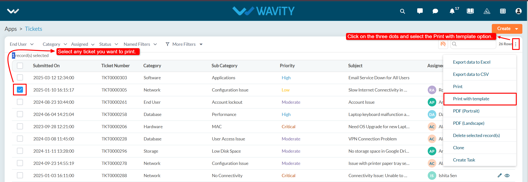
- From the options of available templates, select the desired one and click Confirm.
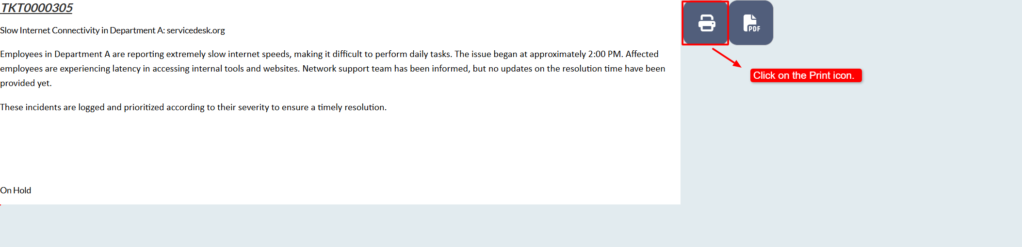
- You will see a Print Preview of the ticket.
- Click on the Print icon to print the ticket.
Enabling Row Clickable for Quick Links
- Enabling row clickable for quick links is a straightforward process in the Wavity platform.
- This functionality can only be enabled by users with Admin access.
- Click on the Profile icon and select Design Tools.
- You will be redirected to the Design Tools page. Under the App tab, choose the application, where you want to enable the row clickable feature. Click the three dots and select Open App Designer.
- Click on the Settings icon, and then select Advanced Settings.
- Navigate to the Data tab and scroll down to the Edit section.
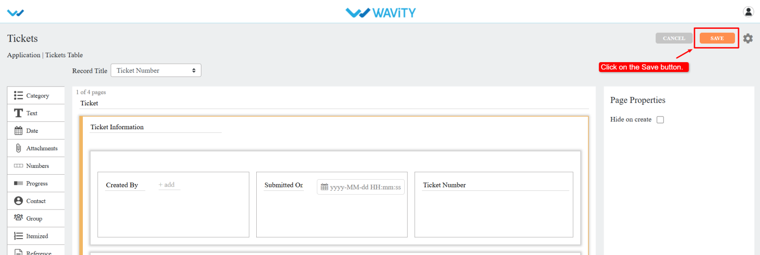
- Enable the "Row click navigate to detail" option and click Done.
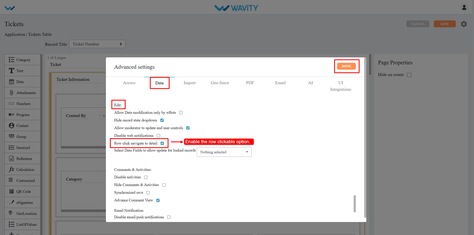
- Click Apply, and then again click Save to confirm and apply the changes.
- The selected quick link will now support row click navigation.
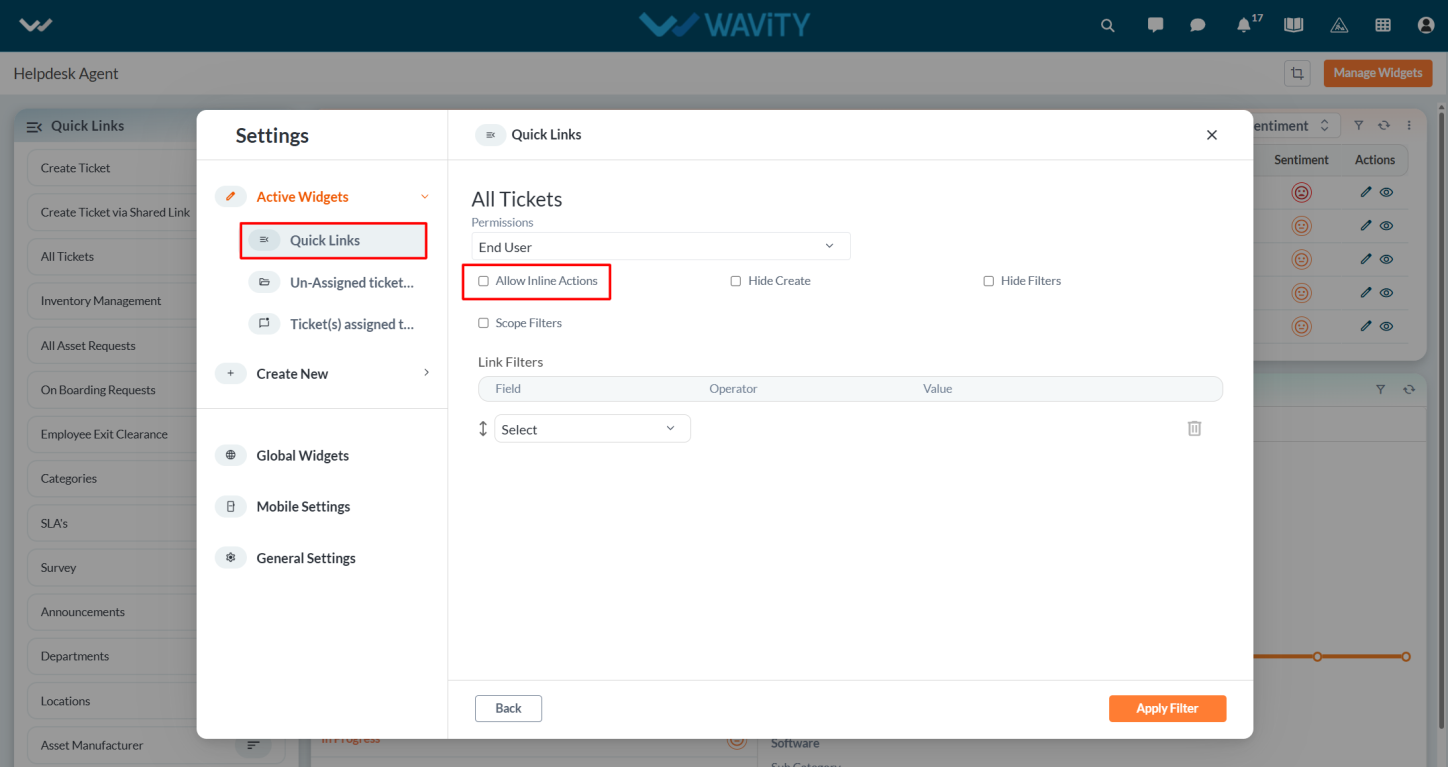
- Note: Ensure the "Allow inline action" option is disabled in quick link.
- To enable row clickable for other quick links, open each respective application in the App Designer and repeat the above steps.
How to Enable Jira Integration
- Wavity platform offers seamless integration with Jira, allowing users to create Jira issues directly from within the Wavity interface and link existing Jira issues to relevant records or workflows. This integration supports bi-directional data synchronization, ensuring that issue records and critical information remain consistent and up to date across both platforms.
- Only Admin of your company can setup or enable Jira integration
- Navigate to the Integrations settings: Go to Profile > Integrations in the Wavity platform.

- On the Integrations page, locate the Jira section. Enable the integration by checking the “Link Jira Instance” option.

- Provide your Jira instance name and click the Save button.

- A confirmation popup will appear. Click Continue to proceed.

- A new window will open from Atlassian Jira. Log in with your Jira account or choose the account you wish to link.

- Authorize Wavity: From the dropdown, select the Wavity app and click Accept to authorize the connection.

- Jira instance is now linked as shown in below image.

- Using Jira Integration within Wavity: Open any record using the Conversational UI widget.
- Click the Jira icon on the right side to view Jira integration options.

- You can execute the following actions:
- Create Issue – Push or copy the Wavity record into Jira as a new issue.
- Link Issue – Import an existing Jira issue into Wavity and link it to the relevant records.
- View Linked Issues – All linked issues will appear in the Jira section of the record for easy access and tracking.

How to Enable Microsoft Teams Integration
The Wavity-Microsoft Teams integration brings your internal and support teams together, enabling seamless and efficient cross-team collaboration. With this integration, you can manage support tasks directly within Microsoft Teams, making it easier to stay informed and respond quickly.
Key Features
Once integrated, you can perform the following actions within Microsoft Teams:
- Create, view, and update support tickets without leaving Microsoft Teams.
- Receive instant alerts from Wavity in Teams for ticket assignments, priority changes, customer replies, and notes (public or private).
- Access customer details easily, respond to queries, and add internal (private) or external (public) notes.
- Automate ticket workflows based on defined conditions (e.g., priority, subject) and receive real-time notifications in Teams channels when tickets are created or updated.
How to Set Up and Use Microsoft Teams with Wavity
To get started with the Wavity-Microsoft Teams integration, follow these steps to install the required apps in both Wavity and Microsoft Teams.
Step 1: Install the Microsoft Teams App on Wavity
- Navigate to: Platform Settings > Integration > Microsoft Teams
- Click on “Download Wavity Teams Package.” A ZIP package file will be downloaded to your system.

Step 2: Add the Wavity App in Microsoft Teams
- After downloading the ZIP package from Wavity, have your Microsoft Teams Administrator upload it within Teams. Navigate to: Apps > Manage Your Apps, then upload the ZIP package.

- Once uploaded, search for “Wavity” in Teams.

- Click on “Wavity”, then click “Add” as shown below:

- You’ll be prompted to enter your Wavity credentials:
- Username/Email ID
- Password
- Tenant Name
- Domain of your current Wavity Platform

- After submitting your credentials, you’ll be logged into the Wavity App within Microsoft Teams:

What You Can Do Within Microsoft Teams
Once integrated, your team can:
- Create, manage, and close support tickets within the Teams chat interface.
- Communicate with agents in real-time for quicker issue resolution.
- Receive real-time alerts and updates from Wavity on ticket status, priority changes, customer replies, and new notes.
How to use Kanban Projects in Wavity
- Wavity provides Kanban Project Management where teams can visualize workflows and tasks using customizable chords allowing for real-time tracking of tasks, stages and priorities. It helps streamline collaboration, limit work-in-progress, and improve overall efficiency through continuous delivery.
- Any user within the platform can create or edit existing projects, provided the Projects feature is enabled for your tenant.
- From the interface, click on ‘Projects’ icon.

- Click on ‘3 dots’ icon and select Edit to edit existing project.

- If needed, update the project title, description and project permissions from the dropdown.

- Now, Click on the title of an existing project to open it.

- As shown in below image, You can use drag and drop to re-arrange stages within the project. Also, Click on task ‘Title’ to view or update existing tasks.

- Similarly, You can use drag and drop to re-arrange tasks within the project.

Creation of Tasks in Kanban Projects
- Wavity provides Kanban Project Management where teams can visualize workflows and tasks using customizable chords allowing for real-time tracking of tasks, stages and priorities. It helps streamline collaboration, limit work-in-progress, and improve overall efficiency through continuous delivery.
- Any user within the platform can create or edit existing projects, provided the Projects feature is enabled for your tenant.
- From the interface, click on ‘Projects’ icon.
- Click on the title of an existing project to open it.

- Click on the ‘+’ icon on any of the stages to create a new task.

- Click on New Task.

- While creating the task, you can enter the following details:
- Task Title – Enter a clear and concise name for the task.
- Description – Provide details or context about what the task involves.
- Checklists – Add a list of sub-tasks or action items to track progress.
- Due Dates – Set a deadline by which the task should be completed.
- Reminder Date – Choose a date to receive a reminder before the task is due.
- Start Date – Specify when work on the task is expected to begin.
- Priority – Indicate the urgency or importance of the task (e.g., High, Medium, Low).
- Owner and Assignee – Assign responsibility by selecting who owns and will carry out the task.
- References – Link to related documents, files, or resources.
- Labels – Tag the task with keywords or categories for better organization and filtering.
- Fill in the required details and click Create to add the task.

- A visual example of a completed task is provided in the image below for reference.

Creation of Stages in Kanban Projects
- Wavity provides Kanban Project Management where teams can visualize workflows and tasks using customizable chords allowing for real-time tracking of tasks, stages and priorities. It helps streamline collaboration, limit work-in-progress, and improve overall efficiency through continuous delivery.
- Any user within the platform can create or edit existing projects, provided the Projects feature is enabled for your tenant.
- From the interface, click on ‘Projects’ icon.
- Click on the title of an existing project to open it.
- You can edit the title of stages by using the pen icon as shown in the image below.

- To add additional stages, Click on ‘Add Column’

- Provide the Stage/Column title and click on Create.

- After adding stages, use the drag-and-drop feature to rearrange them based on your workflow.

How to Create a Kanban Project in Wavity
- Wavity provides Kanban Project Management where teams can visualize workflows and tasks using customizable boards allowing for real-time tracking of tasks, stages and priorities. It helps streamline collaboration, limit work-in-progress, and improve overall efficiency through continuous delivery.
- Any user within the platform can create or edit existing projects, provided the Projects feature is enabled for your tenant.
- Click on the ‘Projects’ icon from the main interface.
- Click on ‘Create’ button dropdown.

- Click on ‘New Project’.

- Provide the Project title and description.

- Use the dropdowns to set permissions for Owners, Users & Groups. Also, you can select the data source application for mapping application data.

- Once the project is created, click on the three-dot menu (⋮) to: Edit, Update, Clone or Delete the project.

Updating Kanban Projects
- Wavity provides Kanban Project Management where teams can visualize workflows and tasks using customizable chords allowing for real-time tracking of tasks, stages and priorities. It helps streamline collaboration, limit work-in-progress, and improve overall efficiency through continuous delivery.
- Any user within the platform can create or edit existing projects, provided the Projects feature is enabled for your tenant.
- From the interface, click on ‘Projects’ icon.
- Click on ‘3 dots’ icon and select Edit to edit existing project.
- If needed, update the project title, description and project permissions from the dropdown.
- Now, Click on the title of an existing project to open it.
- Update stage details such as names or order as required.

- You can also edit existing tasks or add new tasks directly within the stages.

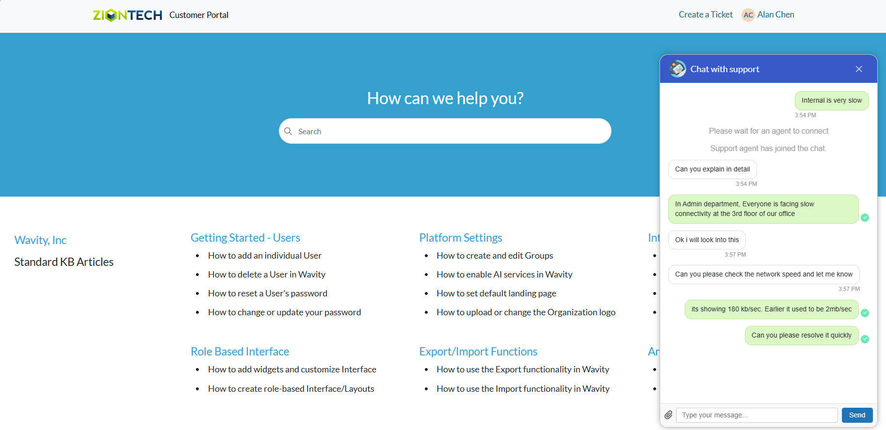
Live Chat: Talk to a Support Agent Instantly
- Wavity provides Live Chat which is a real-time communication tool that allows users to interact with IT support staff or service agents instantly. This feature enables users (such as employees or customers) to ask questions, report issues, or request assistance through a chat interface, and receive quick responses
- Users can access the Live chat via the Customer Portal URL or directly through the interface.
- From the interface, click on Customer portal icon.

- Click on AI Chatbot Icon.
- To use Live chat: Click on ‘Talk to an Agent’.

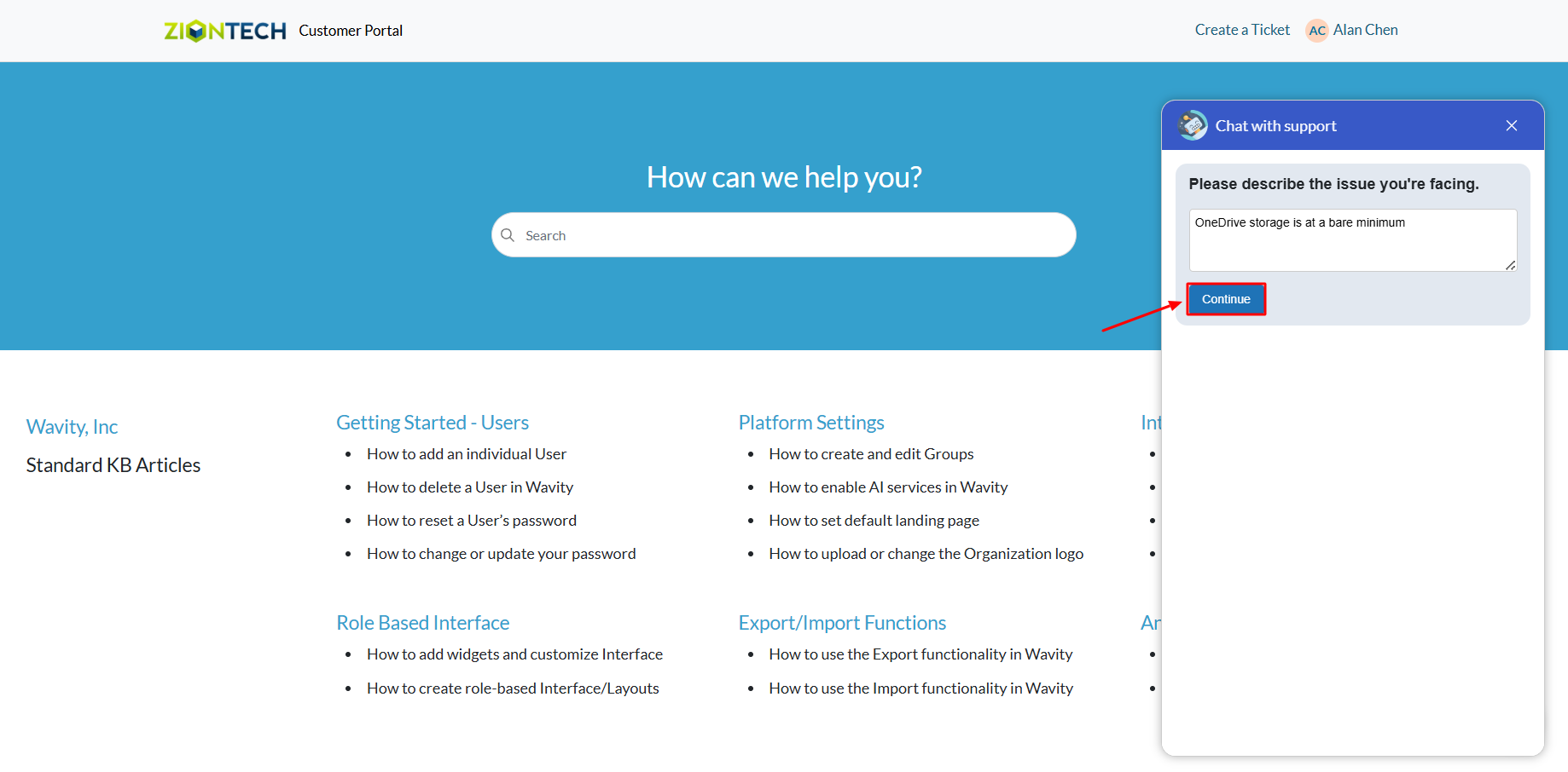
- Describe your issue in the message box.
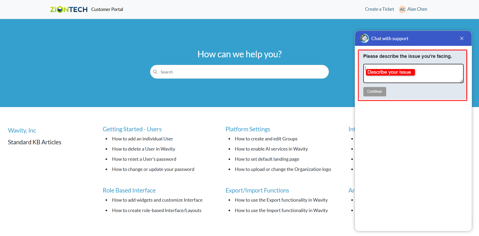
- Click on Submit after entering your message.
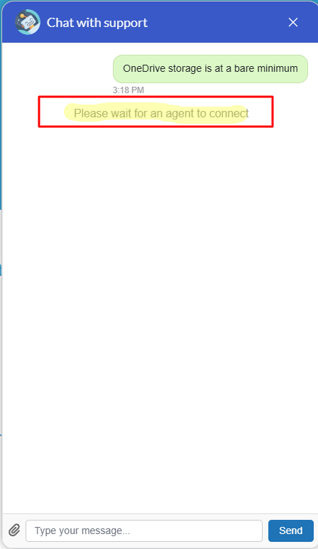
- If an agent is online in the Wavity platform, the chatbot will display a message: “Please wait for an agent to connect.”
- Once an agent connects, the chatbot will notify you that a support agent has joined the chat.
- You can now communicate in real time with the agent to explain your issue and receive assistance.
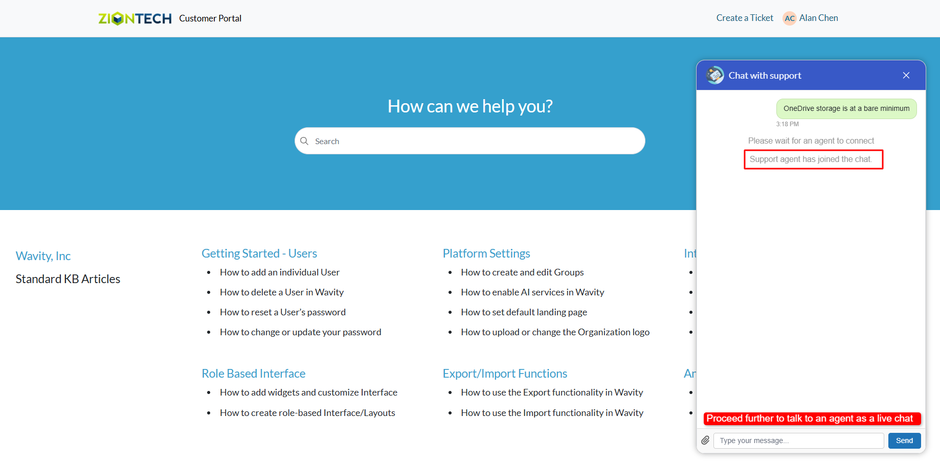
- An example of a live chat conversation is shown below for your reference.
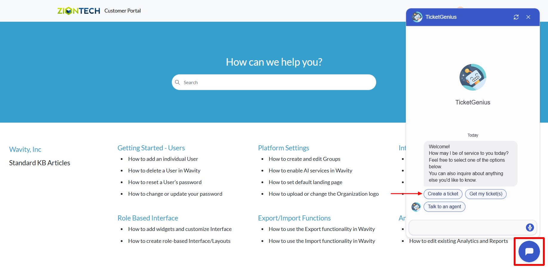
Creating a Ticket Using the Wavity Chatbot
- Wavity provides an AI-powered chatbot with guided conversations offers tailored, context-aware responses to both agents and customers. By leveraging natural language processing, the chatbot can engage in meaningful interactions, help customers resolve issues, and assist agents with troubleshooting and information retrieval.
- Users can access the chatbot via the Customer Portal URL or directly through the interface.
- From the interface, click on Customer portal icon.
- Click on the AI Chatbot Icon as shown in below image.
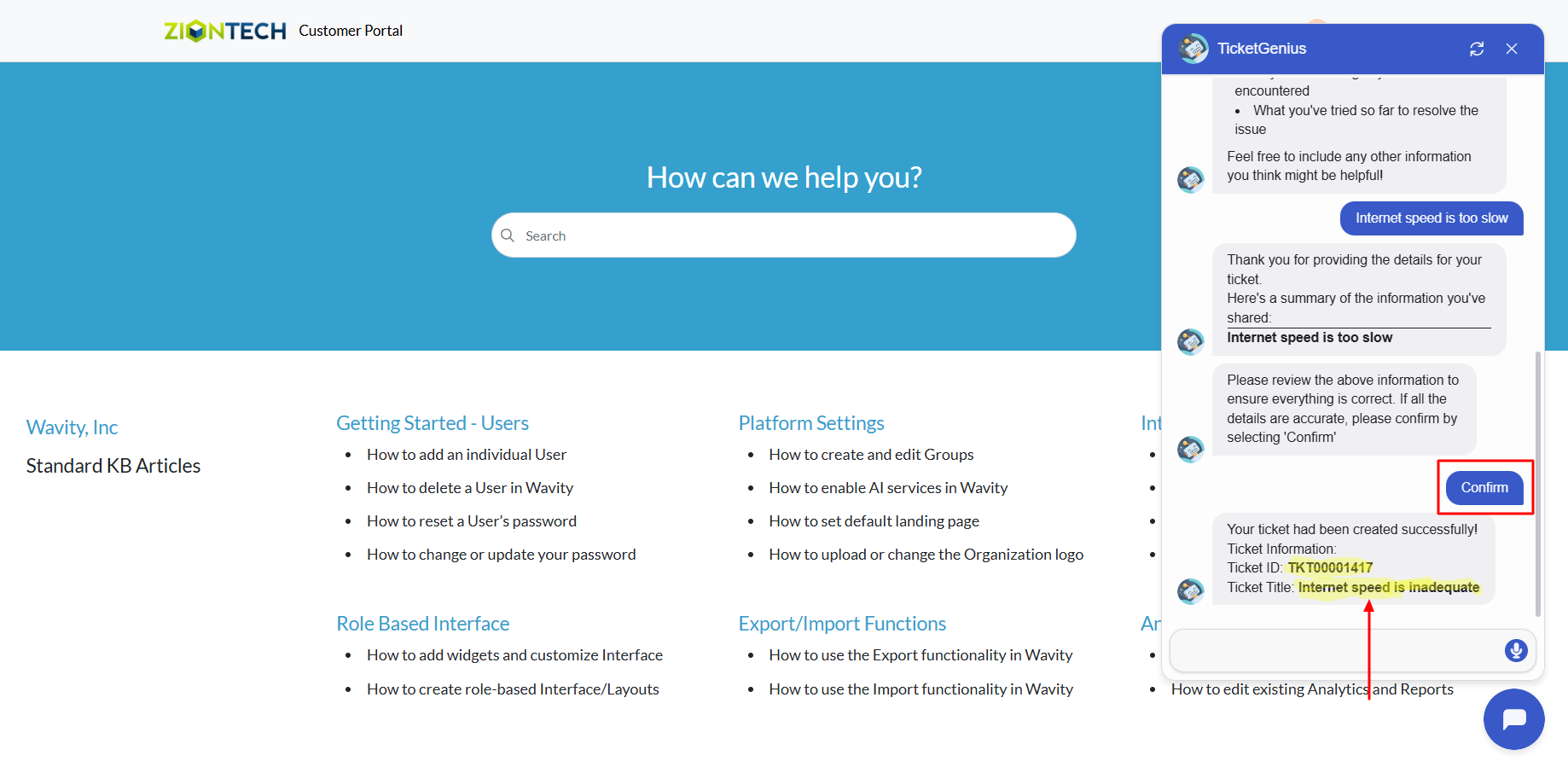
- To create a ticket using the chatbot, click on ‘Create a Ticket’.
- Provide a brief description of the issue when prompted.
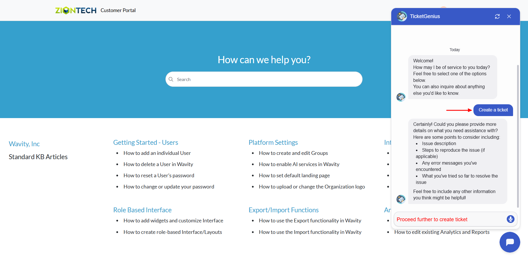
- Click on ‘Confirm’ to complete ticket creation in Wavity.
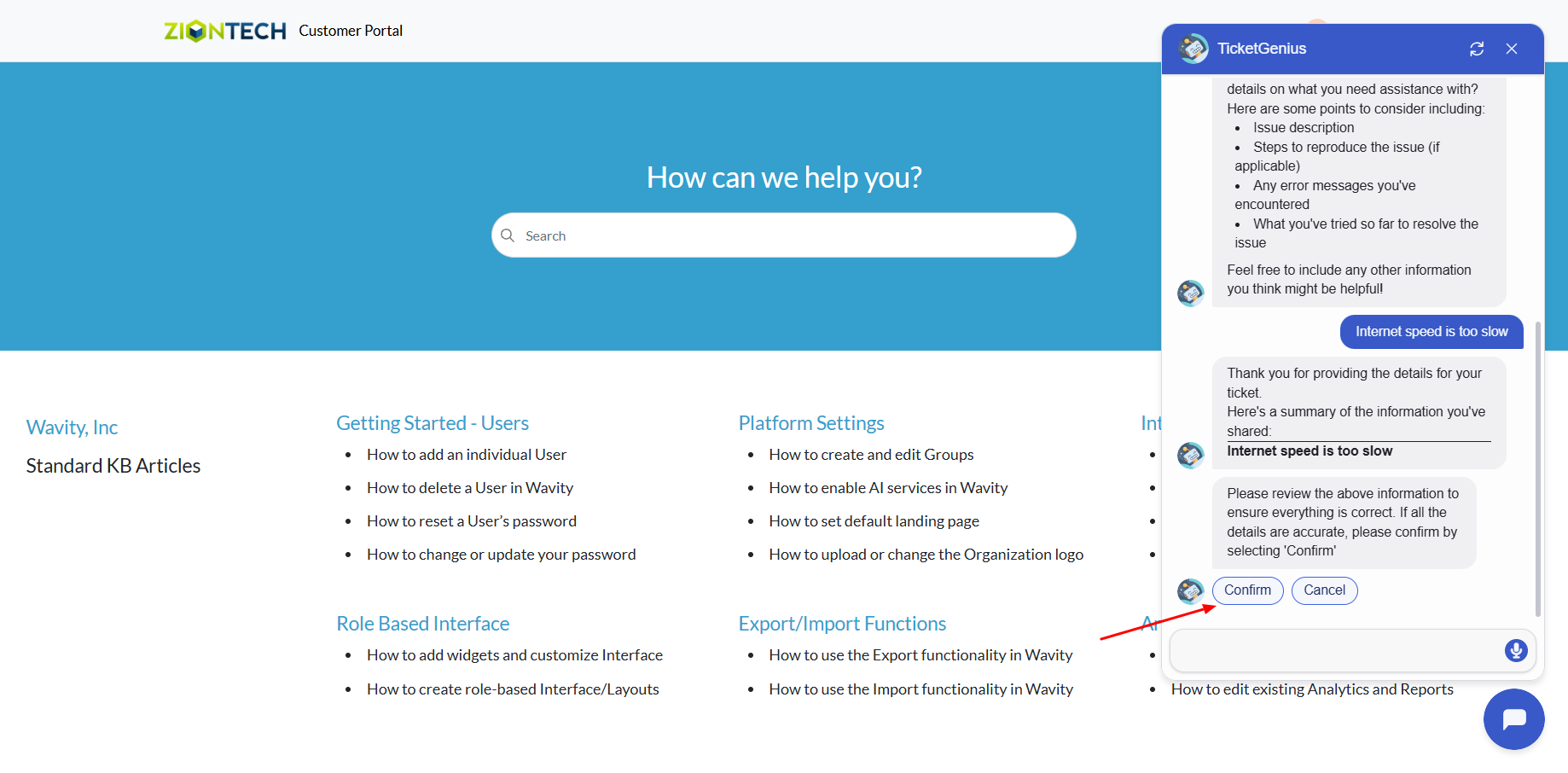
- A confirmation message will appear displaying the ticket ID and ticket title.
Retrieving and Managing Tickets via Wavity Chatbot
- Wavity provides an AI-powered chatbot with guided conversations offers tailored, context-aware responses to both agents and customers. By leveraging natural language processing, the chatbot can engage in meaningful interactions, help customers resolve issues, and assist agents with troubleshooting and information retrieval.
- Users can access the chatbot via the Customer Portal URL or directly through the interface.
- From the interface, click on Customer portal icon.
- Click on the AI Chatbot Icon as shown in below image.
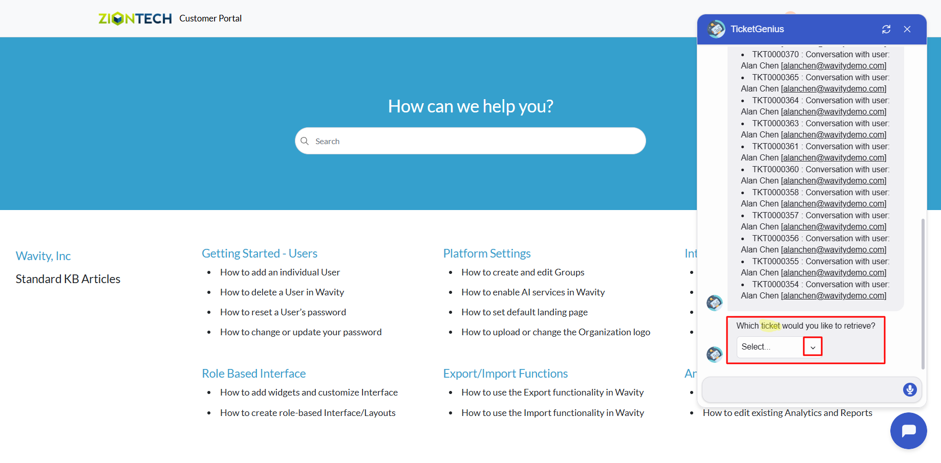
- Click on ‘Get my tickets’ to retrieve your tickets.
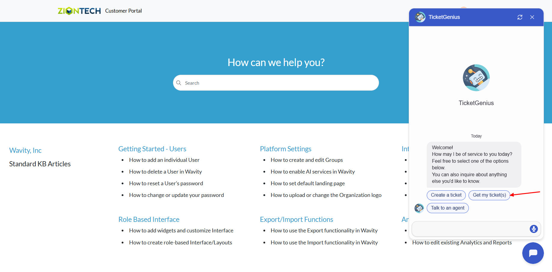
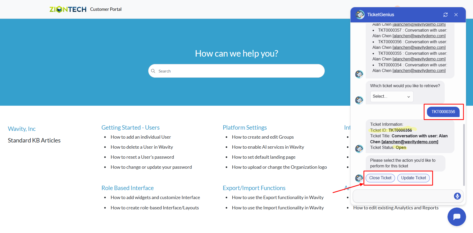
- A list of tickets created by you will be displayed. Select the ticket ID from the dropdown to view details.
- You can now update or close the ticket if needed.
AI Chatbot Assistance: Ask and Receive Summarized Responses
- Wavity provides an AI-powered chatbot with guided conversations offers tailored, context-aware responses to both agents and customers. By leveraging natural language processing, the chatbot can engage in meaningful interactions, help customers resolve issues, and assist agents with troubleshooting and information retrieval.
- Users can access the chatbot via the Customer Portal URL or directly through the interface.
- From the interface, click on Customer portal icon.
- Click on the AI Chatbot Icon as shown in below image.
- Type and submit any query you have to the chatbot.
- The chatbot will respond to your query. If your admin has enabled knowledge base syncing, it will check for relevant articles and provide a summarized answer for quick reference.
Chatbot Usage for External Users
- Wavity provides an AI-powered chatbot with guided conversations offers tailored, context-aware responses to both agents and customers. By leveraging natural language processing, the chatbot can engage in meaningful interactions, help customers resolve issues, and assist agents with troubleshooting and information retrieval.
- A public user (external user) can access the chatbot only via the Customer Portal URL.
- Click on the AI Chatbot icon from the Customer Portal (as shown in the image).
- You can now ask your query directly in the chatbot.
- The chatbot will respond with an appropriate answer.
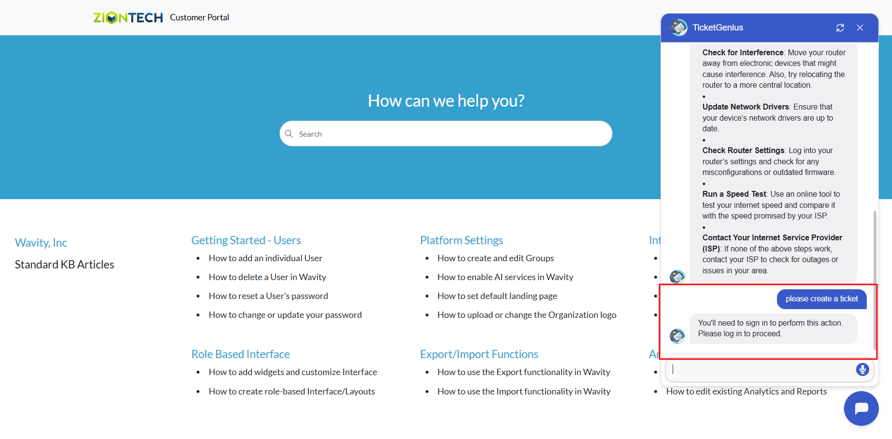
- If you need to create a ticket for your issue:
- You may be required to sign in to the portal.
- If your administrator has allowed public users to create tickets without logging in, the chatbot will prompt you to enter your details to proceed.
Creating a Link Widget in Wavity
- Widgets in Wavity are interactive components or visual elements within a user interface (UI) that provide users with specific functionalities, data visualizations, or quick access to information and actions.
- Widgets can be added/edited to interfaces/dashboards in Wavity platform. This feature allows you to customize dashboards based on your requirements. For more details on creation of dashboards, please refer the following link: How To Create Role-Based Interface/Dashboards/Layouts | Wavity
- A Link Widget serves as a shortcut that connects users to specific forms or lists within an application. It acts as a quick link that can either open a new form (for data entry) or display existing records from the linked application. It’s designed for ease of access and seamless navigation within the Wavity platform.
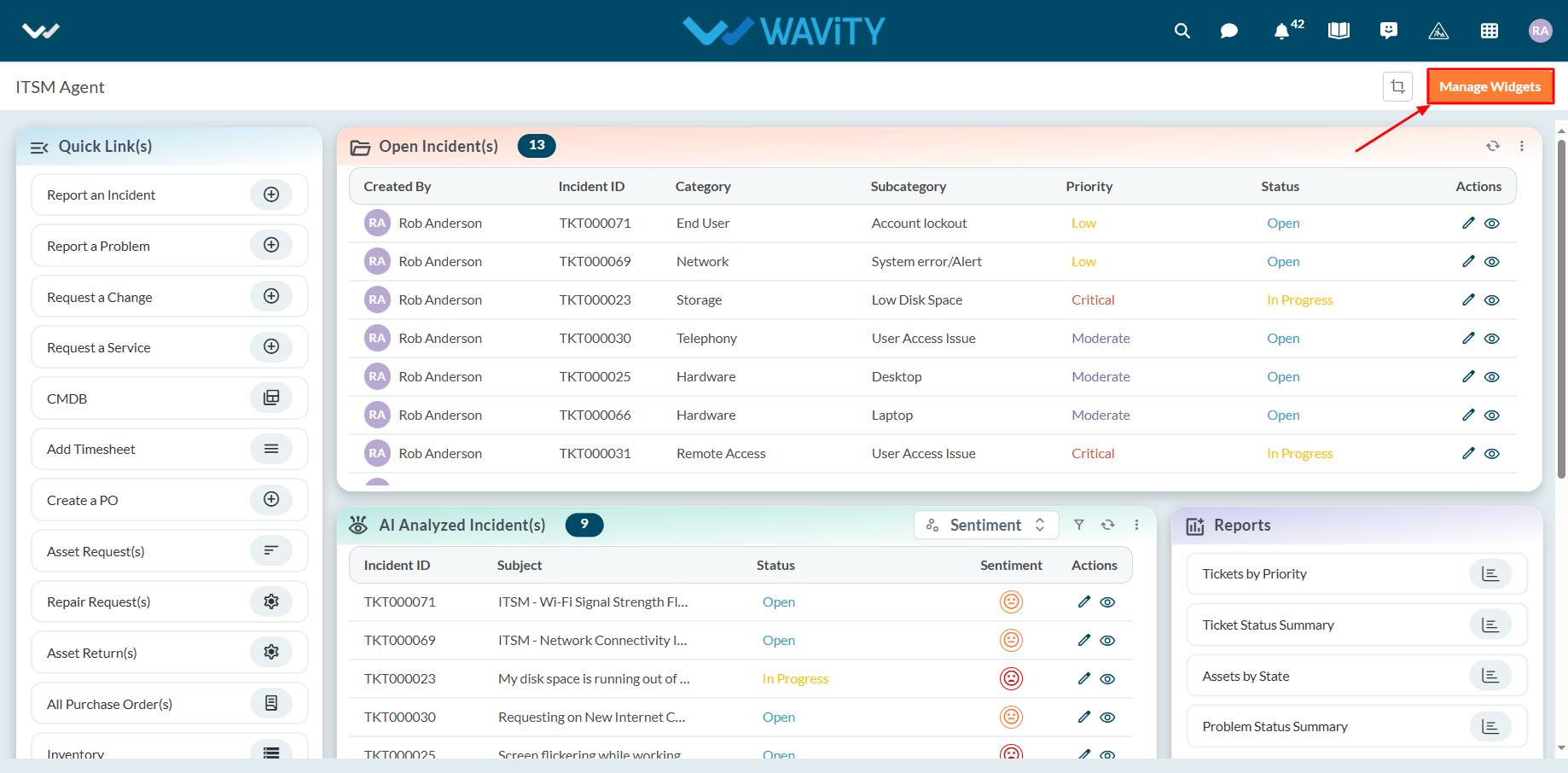
- Only an Admin of your organization has the access to create or update widgets in Wavity.
- To create a new Link widget: Click on “Manage Widget”.
- The Widget Settings pop-up will be displayed. As shown in the image below, all existing active widgets in the layout are listed. To create a new widget, click the ‘Create New’ button.
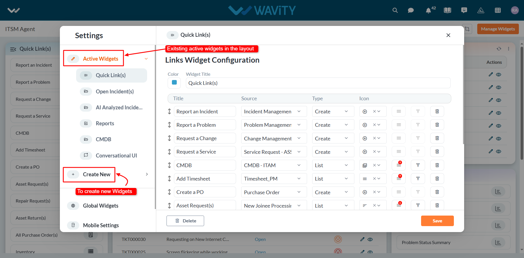
- You can create various types of widgets such as Reports, Analytics, Table, Links, Bulletin & Columns in the layout.
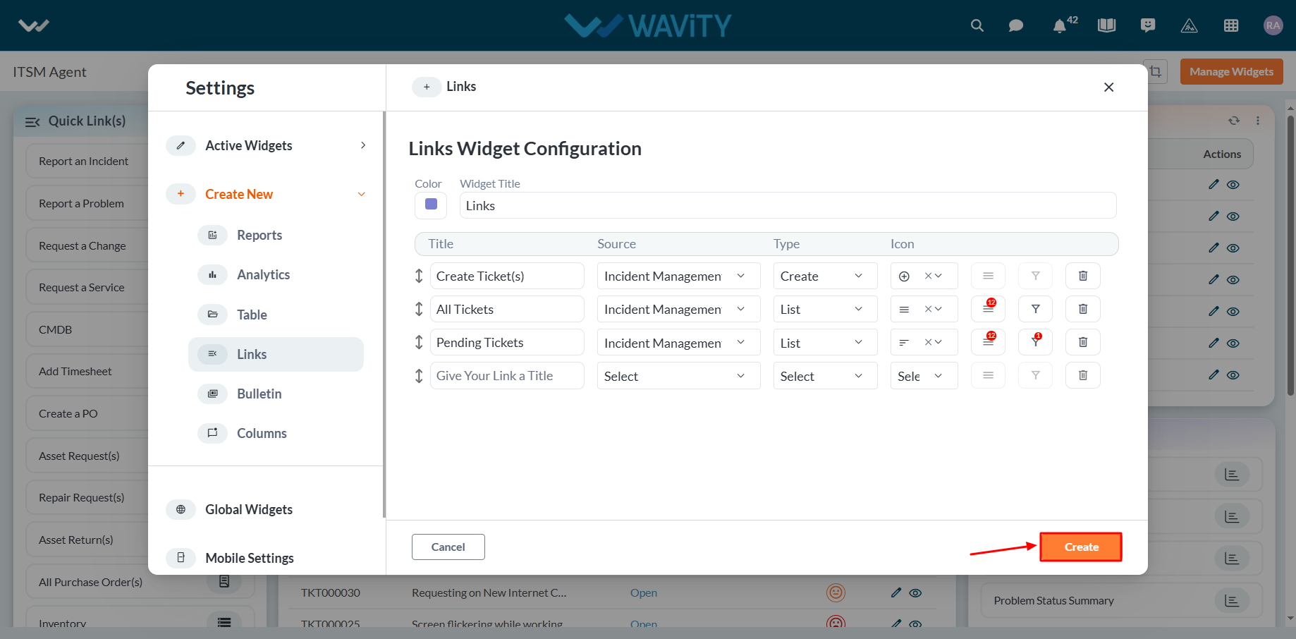
- To create a new link widget, click on "Links".
- Choose a color for the widget to customize its appearance.
- Enter a title for the widget to identify it clearly.

- Provide a title for the individual link, as shown below. Then, select the appropriate data source or application from which the data will be displayed.
- Choose the type of view to display in the widget when the title link is clicked:
- Selecting "Create" will open a new form with fields to be filled out.
- Selecting "List" will display all existing records from the selected data source or application/forms.
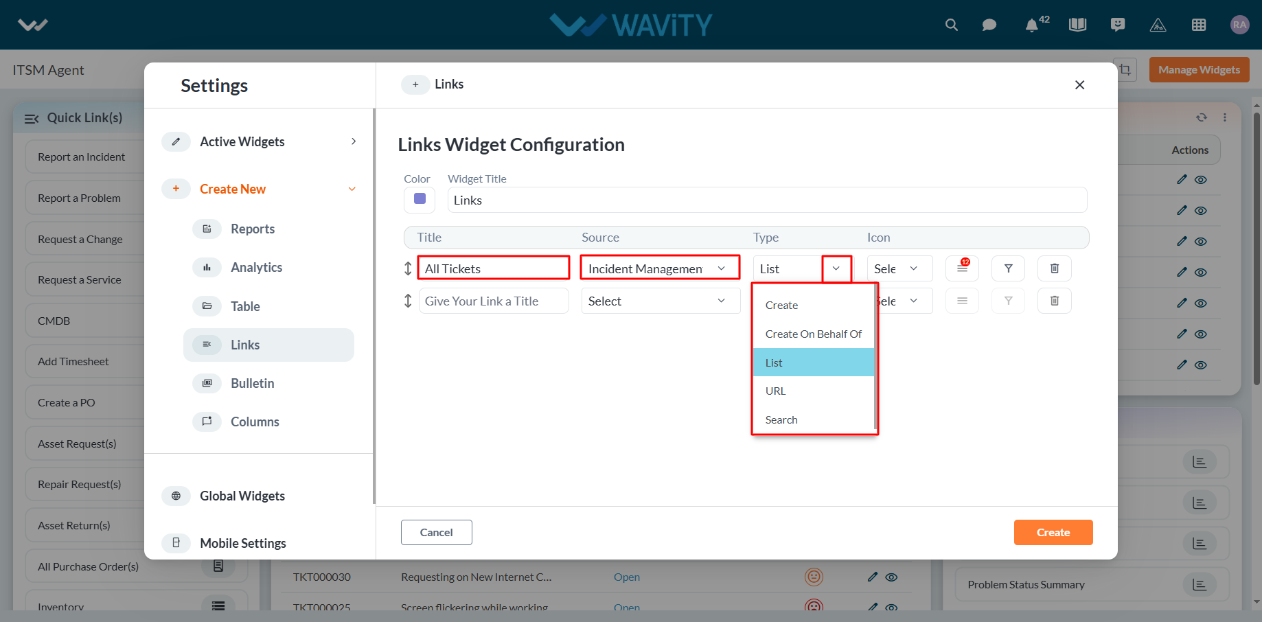
- Select the icon from the dropdown as shown in below image.

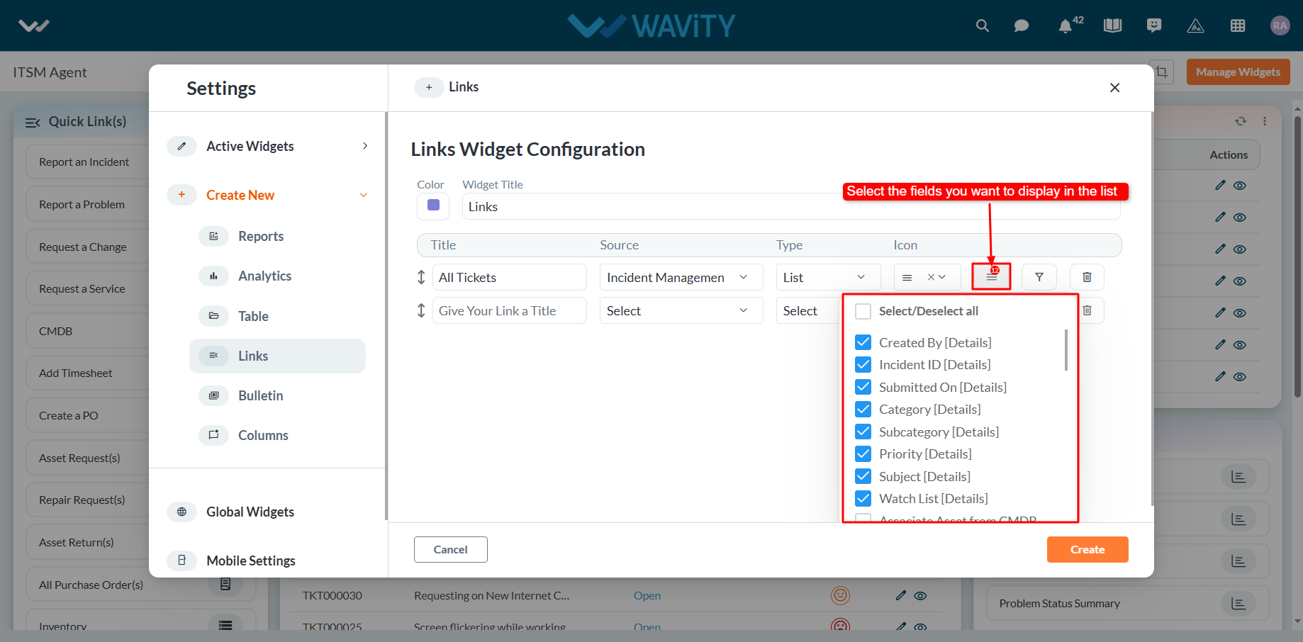
- Select the ‘Box’ icon to select the form fields as per your requirements. You can select or deselect any of the fields asper your requirement. Only the selected data fields will be displayed after clicking the link.
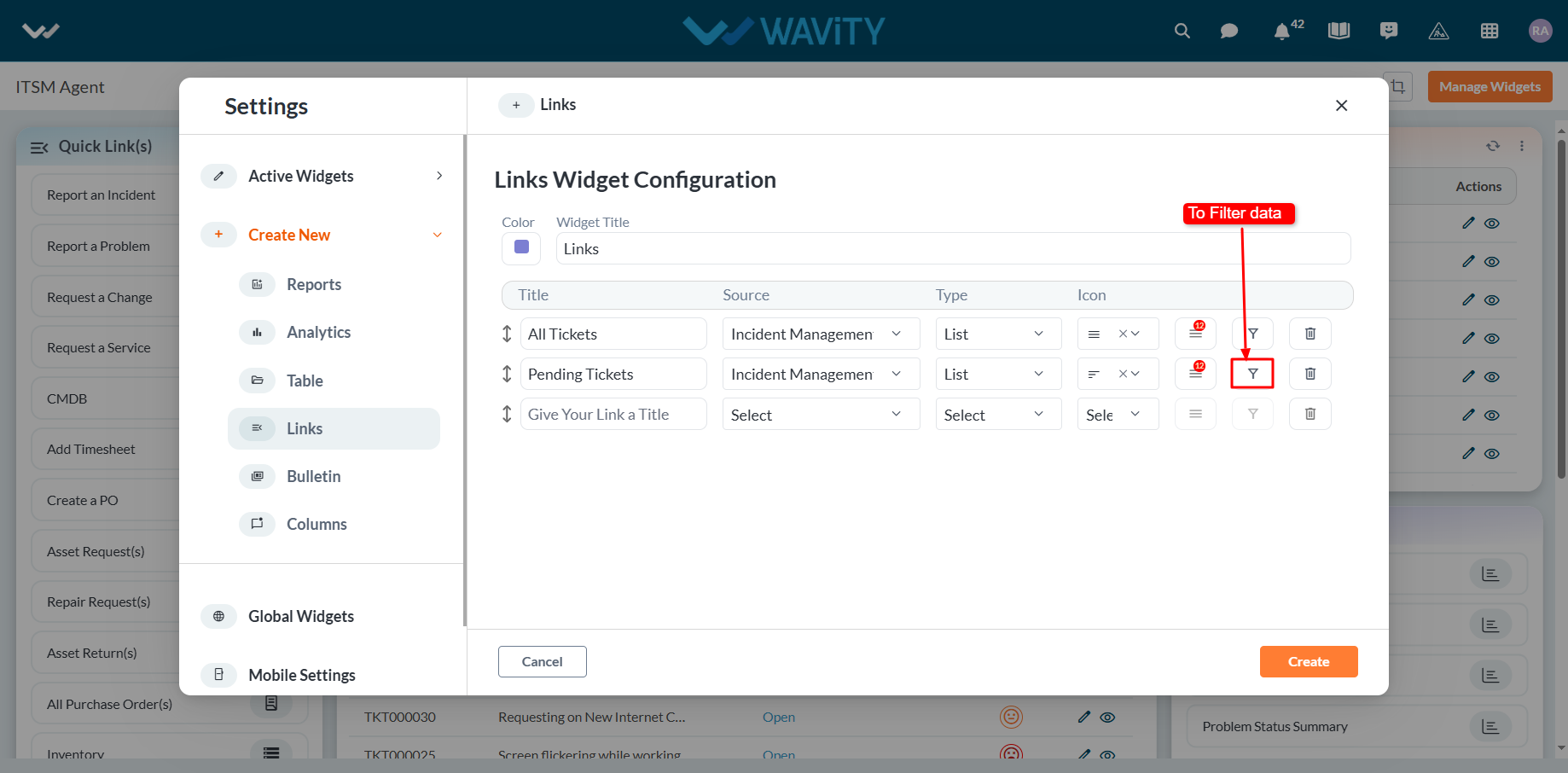
- Similarly, you can add more links as needed. To apply a filter, click the ‘Filter’ icon.
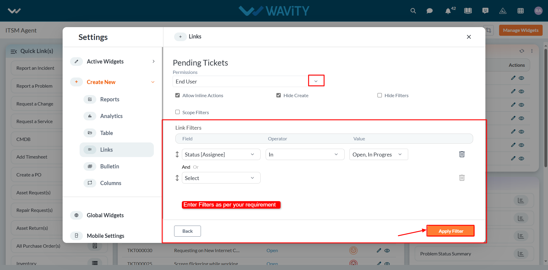
- Under Permissions, select the appropriate user category such as End User, Approver, Manager, or Moderator, as shown below. Only users in the selected category will be able to view or edit the link to the data source application.
- Choose the field from the data source application that you want to filter. You can apply various operators such as Equal, Not Equal, In, Empty, and Not Empty.
- Based on the selected field, all corresponding values will be displayed in the Value dropdown. Select the required value to apply the filter.
- To add more complex filtering conditions, you can use the "And" and "Or" functions: Enabling "And" will apply the filter only if all conditions are met. Enabling "Or" will apply the filter if any condition is met.
- Finally, click the "Apply Filters" button, as shown below.
- Click on “Create” button to create a new link widget.
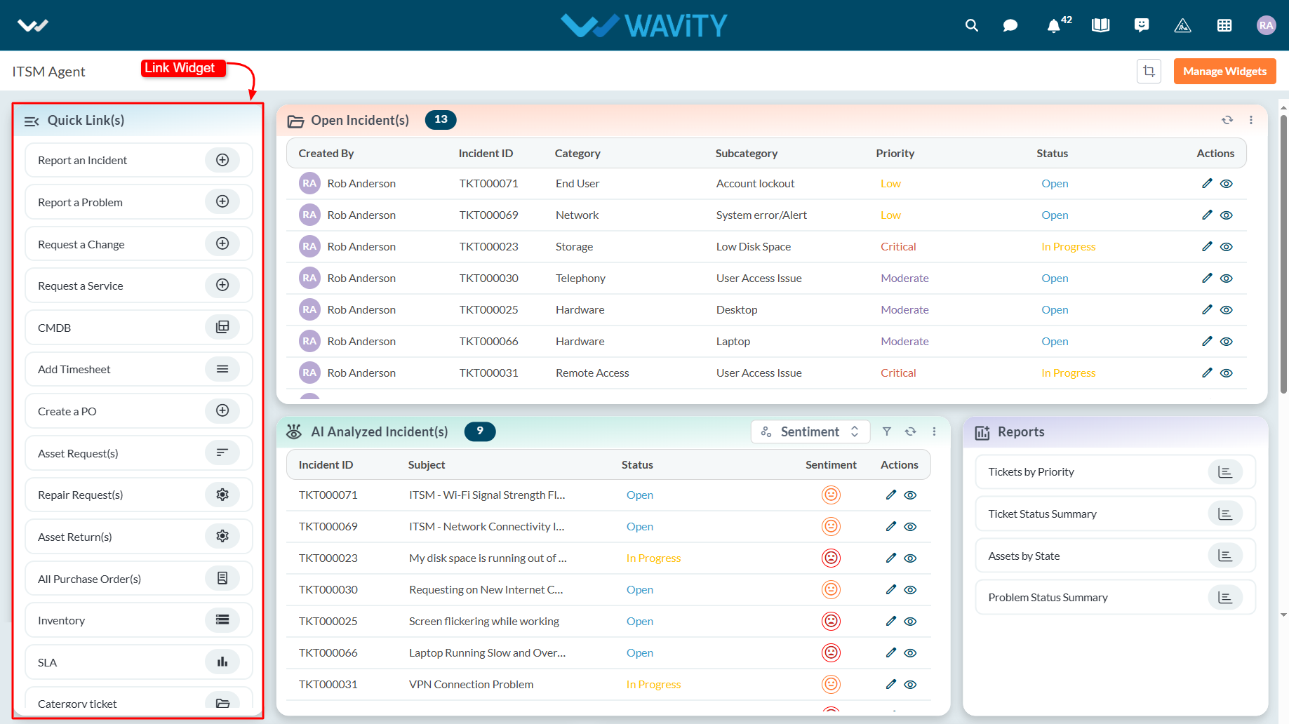
- An example of a link widget is shown below for your reference.
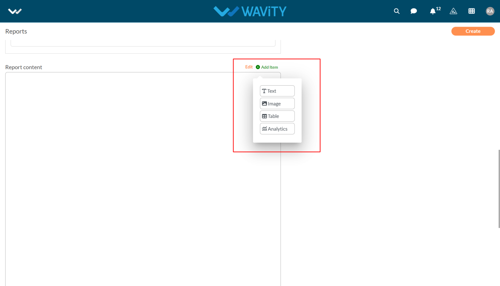
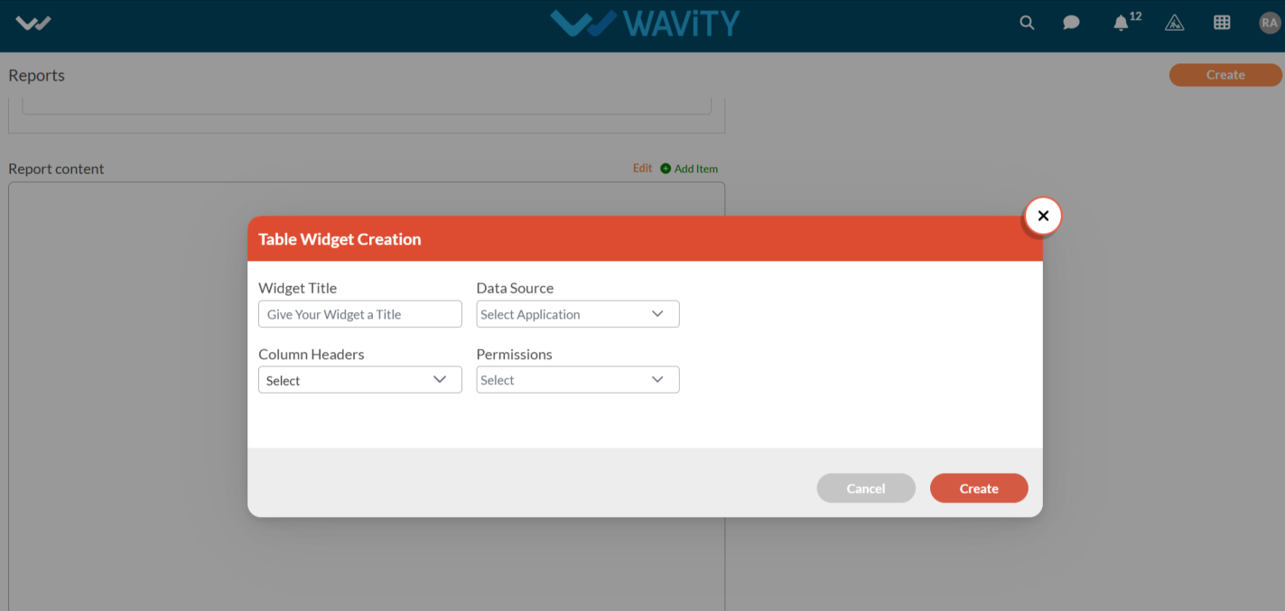
Creating a Table Widget in Wavity
- Widgets in Wavity are interactive components or visual elements within a user interface (UI) that provide users with specific functionalities, data visualizations, or quick access to information and actions.
- Widgets can be added/edited to interfaces/dashboards in Wavity platform. This feature allows you to customize dashboards based on your requirements. For more details on creation of dashboards, please refer the following link: How To Create Role-Based Interface/Dashboards/Layouts | Wavity
- A Table Widget in Wavity mirrors the functionality of an app but is used specifically to display data within a dashboard or interface. It pulls information directly from the associated application and presents it in a tabular format, tailored to your chosen fields.
- Only an Admin of your organization has the access to create or update widgets in Wavity.
- To create a new table widget: Click on “Manage Widget”.

- The Widget Settings pop-up will be displayed. As shown in the image below, all existing active widgets in the layout are listed. To create a new widget, click the ‘Create New’ button.

- You can create various types of widgets such as Reports, Analytics, Table, Links, Bulletin & Columns in the layout.
- To create a new table widget, click on "Table".
- Choose a color for the widget to customize its appearance.
- Enter a title for the widget to identify it clearly.

- Select the appropriate data source or application from which the data will be displayed.

- Select the fields you want to display in the table widget by selecting column headers from the dropdown.

- Under Permissions, select the appropriate user category such as End User, Approver, Manager, or Moderator, as shown below. Only users in the selected category will be able to view or edit the records.

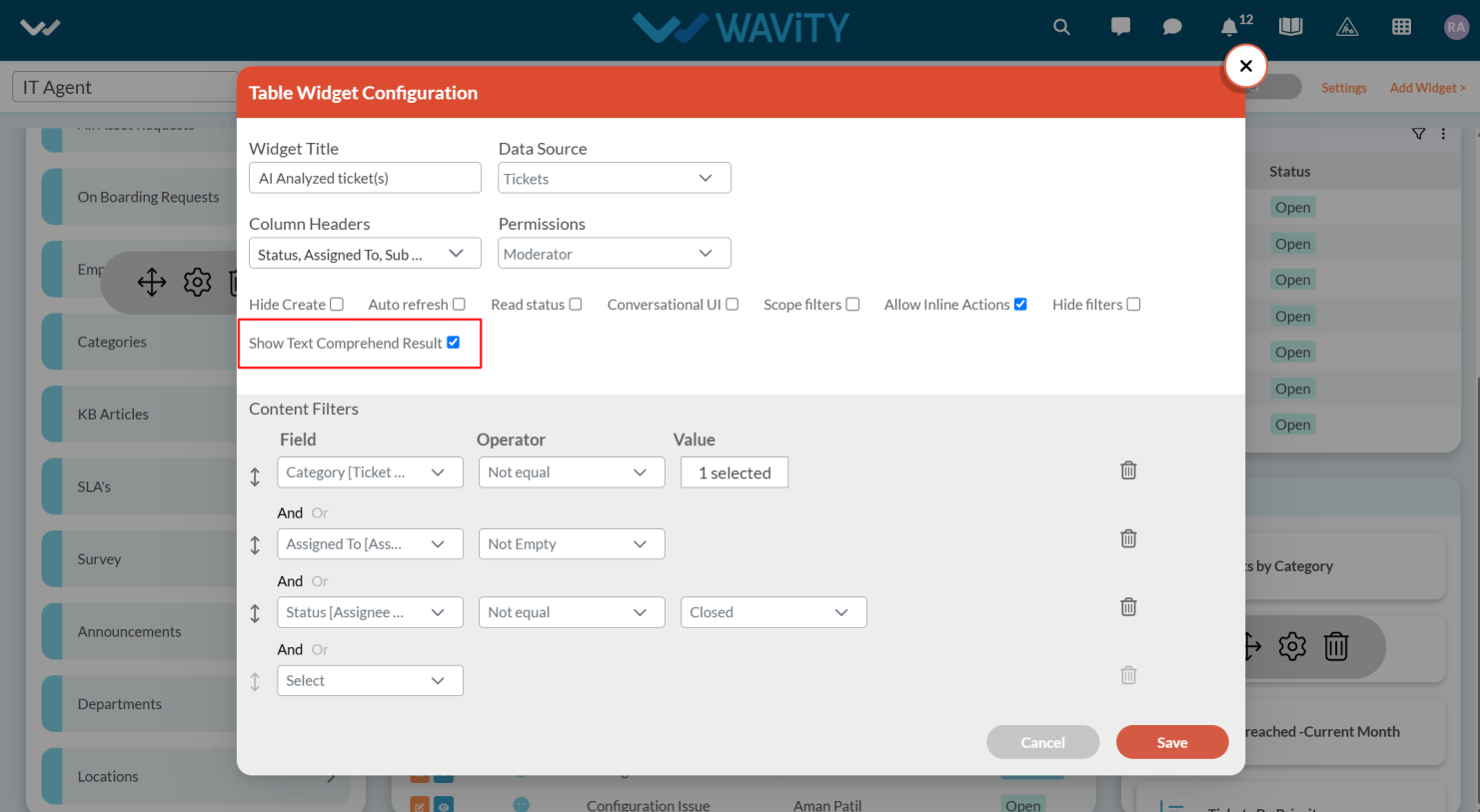
- Select the features you need by checking or unchecking the options below. Common features available in Table widgets include:
- Row Clickable: Enables users to click on any row to open the corresponding record.
- Auto Refresh: Automatically updates the data within the table at specified intervals.
- Read Status: Displays unread records in bold for easy identification.
- Conversational UI: Presents records in a conversational format, allowing users to reply interactively and also enables using macros (predefined responses).
- Show Text Comprehend Result: Displays records with AI-driven sentiment analysis.

- Choose the field from the data source application that you want to filter. You can apply various operators such as Equal, Not Equal, In, Empty, and Not Empty.
- Based on the selected field, all corresponding values will be displayed in the Value dropdown. Select the required value to apply the filter.
- To add more complex filtering conditions, you can use the "And" and "Or" functions: Enabling "And" will apply the filter only if all conditions are met. Enabling "Or" will apply the filter if any condition is met.
- Finally, Click on ‘Create’ to create a new table widget.

- An example of a table widget is shown below for your reference.

Creating a Report Widget in Wavity
- Widgets in Wavity are interactive components or visual elements within a user interface (UI) that provide users with specific functionalities, data visualizations, or quick access to information and actions.
- Widgets can be added/edited to interfaces/dashboards in Wavity platform. This feature allows you to customize dashboards based on your requirements. For more details on creation of dashboards, please refer the following link: How To Create Role-Based Interface/Dashboards/Layouts | Wavity
- A Report Widget allows you to display clickable links of existing analytics or reports directly on your interface.
- Only an Admin of your organization has the access to create or update widgets in Wavity.
- To create a new report widget: Click on “Manage Widget”.
- The Widget Settings pop-up will be displayed. As shown in the image below, all existing active widgets in the layout are listed. To create a new widget, click the ‘Create New’ button.
- You can create various types of widgets such as Reports, Analytics, Table, Links, Bulletin & Columns in the layout.
- To create a new report widget, click on "Reports".
- Choose a color for the widget to customize its appearance.
- Enter a title for the widget to identify it clearly.

- Provide a Reports Title—this is the clickable text users will see in the interface.
- Choose the Source Application of existing analytics from which the widget will display those analytics
- Choose the User Category (e.g., End User, Approver, Manager, Moderator) to define who can view or interact with the Report Widget. Permissions are based on the selected data source application.
- Once all configurations are set: Click Create to generate a new Reports Widget or Click Save to update an existing one.

- Here is an example of how the reports widget will look like in the interface.

Creating an Analytics Widget in Wavity
- Widgets in Wavity are interactive components or visual elements within a user interface (UI) that provide users with specific functionalities, data visualizations, or quick access to information and actions.
- Widgets can be added/edited to interfaces/dashboards in Wavity platform. This feature allows you to customize dashboards based on your requirements. For more details on creation of dashboards, please refer the following link: How To Create Role-Based Interface/Dashboards/Layouts | Wavity
- An Analytics Widget is used to display pre-built analytics or visual reports from a specific application directly on your interface. It provides users with a quick snapshot of meaningful data insights, helping them make informed decisions without leaving the dashboard.
- Only an Admin of your organization has the access to create or update widgets in Wavity.
- To create a new analytics widget: Click on “Manage Widget”.
- The Widget Settings pop-up will be displayed. As shown in the image below, all existing active widgets in the layout are listed. To create a new widget, click the ‘Create New’ button.
- You can create various types of widgets such as Reports, Analytics, Table, Links, Bulletin & Columns in the layout.
- To create a new table widget, click on "Analytics".
- Choose a color for the widget to customize its appearance.
- Enter a title for the widget to identify it clearly.

- Choose the Application from which the widget will pull existing analytics.

- Select the specific Analytics item you want to display from that application.
- Choose the User Category (e.g., End User, Approver, Manager, Moderator) to define who can view or interact with the Analytics Widget. Permissions are based on the selected data source application.
- Once all configurations are set: Click Create to generate a new Analytics Widget or Click Save to update an existing one.

- Here’s an illustration of how an Analytics Widget will appear in the interface:

Creating Global Widgets in Wavity
- Widgets in Wavity are interactive components or visual elements within a user interface (UI) that provide users with specific functionalities, data visualizations, or quick access to information and actions.
- Widgets can be added/edited to interfaces/dashboards in Wavity platform. This feature allows you to customize dashboards based on your requirements. For more details on creation of dashboards, please refer the following link: How To Create Role-Based Interface/Dashboards/Layouts | Wavity
- Global Widgets are pre-defined widgets available to all users in Wavity, providing universal functionality across the platform. These widgets enhance platform-wide visibility and collaboration.
- Administrator of your company can add/ edit/ delete the widgets at any point of time. Click on “Manage Widget” from the layout.

- The Widget Settings pop-up will be displayed. As shown in the image below, all existing active widgets in the layout are listed. To create a new widget, click the ‘Create New’ button.
- You can create various types of widgets such as Reports, Analytics, Table, Links, Bulletin & Columns in the layout.

- You can add a global widget if needed by simply toggling the Global Widget switch on or off.
- Global widgets are as follows:
- Activities: Displays all platform activities including who performed the action, what was done, and when. Helps track engagement and updates across the system.
- Calendar: Shows events and schedules pulled from the linked calendar based on your Integration with your Google Calendar or Outlook Calendar.
- Drives: Displays files stored in the connected drive accounts directly in the interface based on your Integration with your Google Drive or OneDrive.
- Messages: A built-in messaging tool enabling real-time communication among users within Wavity.

Creating a Bulletin Widget in Wavity
- Widgets in Wavity are interactive components or visual elements within a user interface (UI) that provide users with specific functionalities, data visualizations, or quick access to information and actions.
- Widgets can be added/edited to interfaces/dashboards in Wavity platform. This feature allows you to customize dashboards based on your requirements. For more details on creation of dashboards, please refer the following link: How To Create Role-Based Interface/Dashboards/Layouts | Wavity
- A Bulletin Widget displays time-bound messages—similar to announcements—within the interface. These messages scroll across the top of the screen and are shown based on their configured start and end dates. It’s an ideal tool for sharing important updates or alerts with users.
- Only an Admin of your organization has the access to create or update widgets in Wavity.
- To create a new bulletin widget: Click on “Manage Widget”.
- The Widget Settings pop-up will be displayed. As shown in the image below, all existing active widgets in the layout are listed. To create a new widget, click the ‘Create New’ button.
- You can create various types of widgets such as Reports, Analytics, Table, Links, Bulletin & Columns in the layout.
- To create a new bulletin widget, click on "Bulletin".
- Choose a color for the widget to customize its appearance.
- Choose the Application that contains the bulletin messages.

- Select the message, start date and end date from the dropdown
- These messages must include a start date and end date to define the display period.
- Once all configurations are set: Click Create to generate a new Bulletin Widget or Click Save to update an existing one.
- After saving, the Bulletin Widget will scroll the selected messages at the top of the interface during the specified time frame—just like a news ticker or announcement bar.

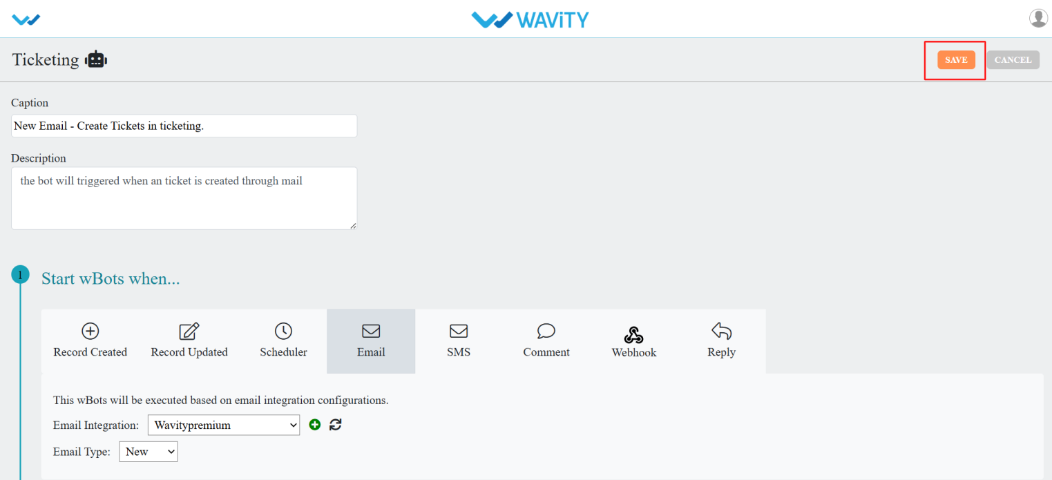
Email Ticketing with Wbots: Setup and Configuration Guide
- WBots (Wavity Bots) allow you to automate workflows within hours, extending automation capabilities both within and beyond your organization. With WBots, you can seamlessly move data between applications based on the conditions you define.
- In Wavity, tickets can be created via Email. To enable this functionality, you must integrate your Email with the Wavity platform.
- For integration steps, click on the link: How To Enable Email Integration with Microsoft Office 365 | Wavity
- For Email Ticketing, we need to configure the Wbot.
- Click on the Profile icon.

- Open Design Tools.
- Go to the Apps, pick the app you want, and click on the three dots.
- From the three-dot menu, choose Wbots.
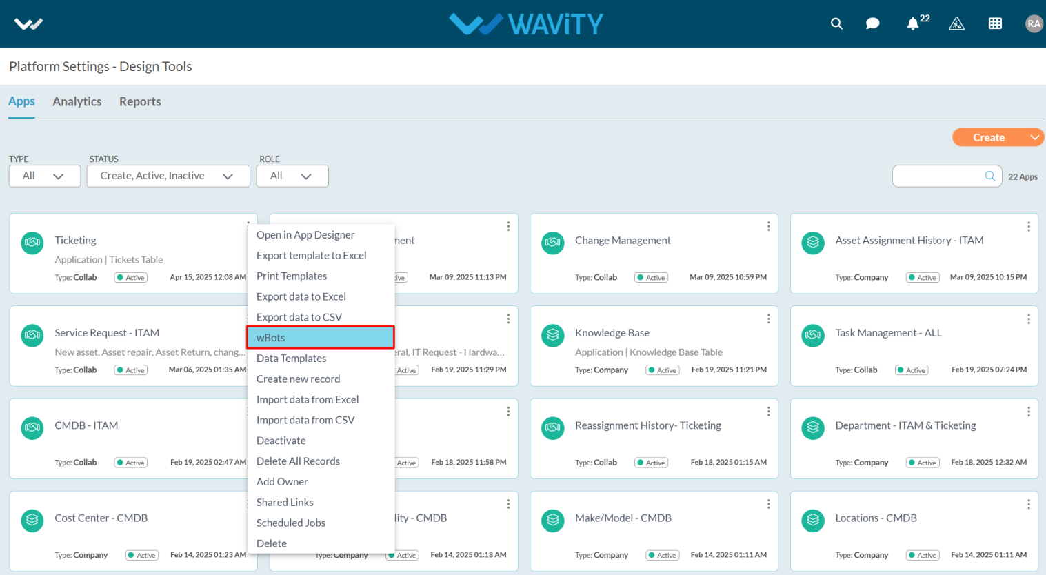
- After selecting the Wbots option, you will be directed to the Wbots Configuration page.
- Click on the Create button.

- Provide a Caption and Description to help easily identify the bot.
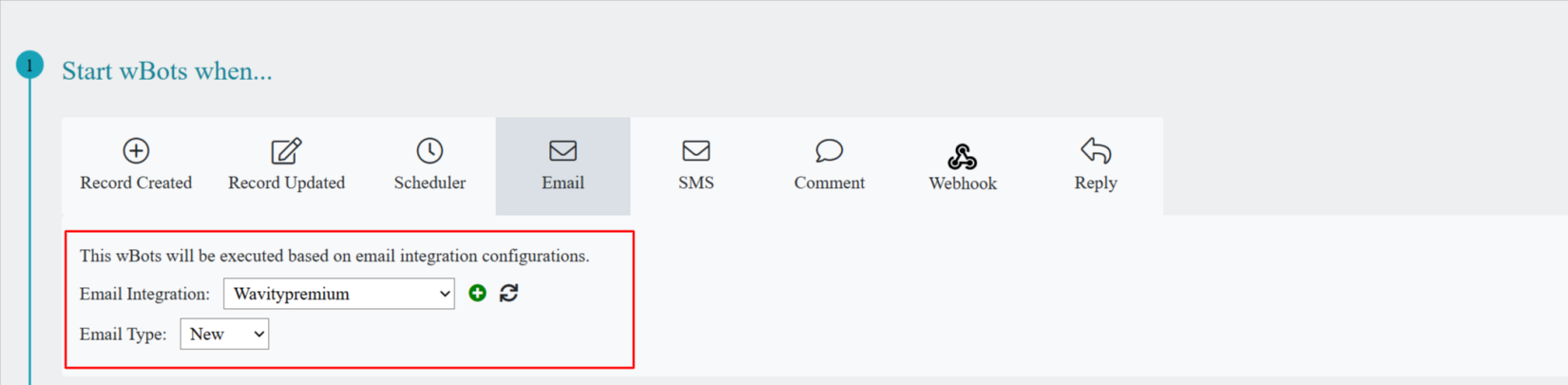
- In Start wBots when, select the email.
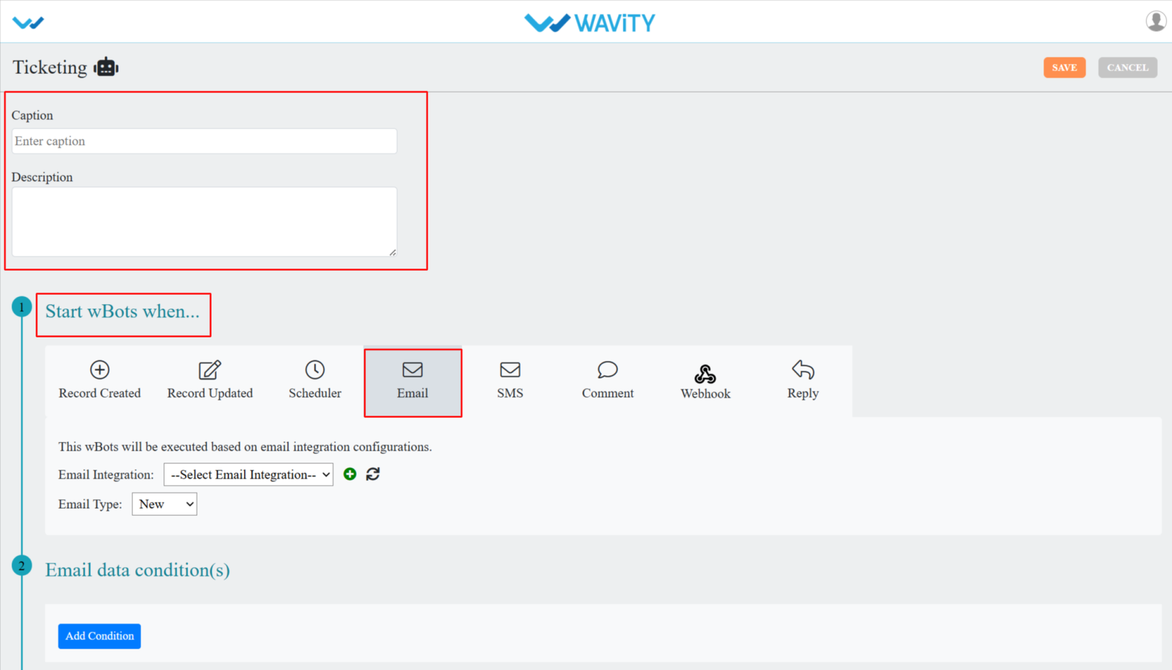
- Select your Email integration and Email type as New.
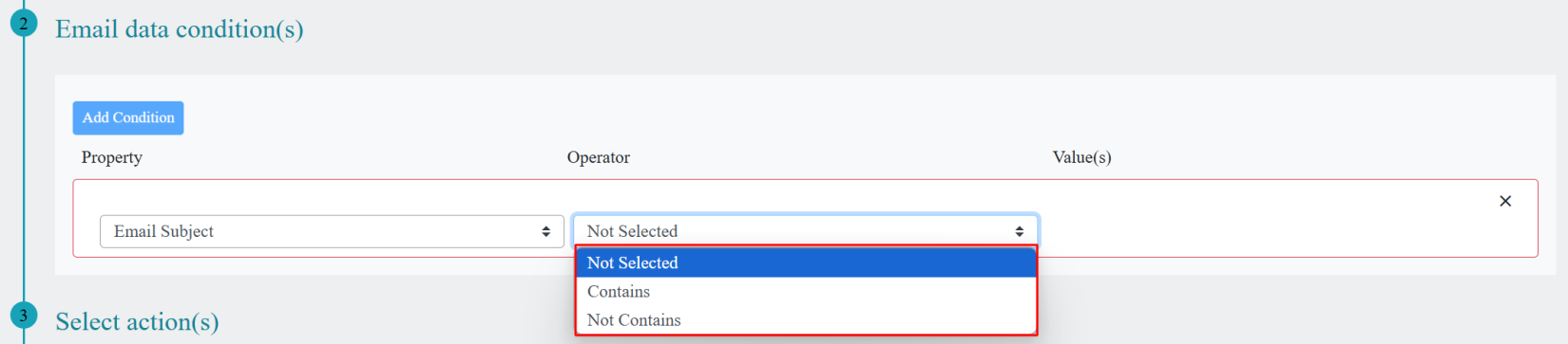
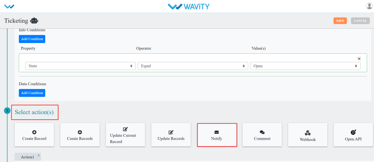
- Email Data Condition is considered important, as it determines when the bot will be triggered and a ticket will be created.
- Set an Email Data Condition to trigger the WBot based on your specified criteria.
- You need to select the property as per your requirement whether Email subject, Email body and Email sender.
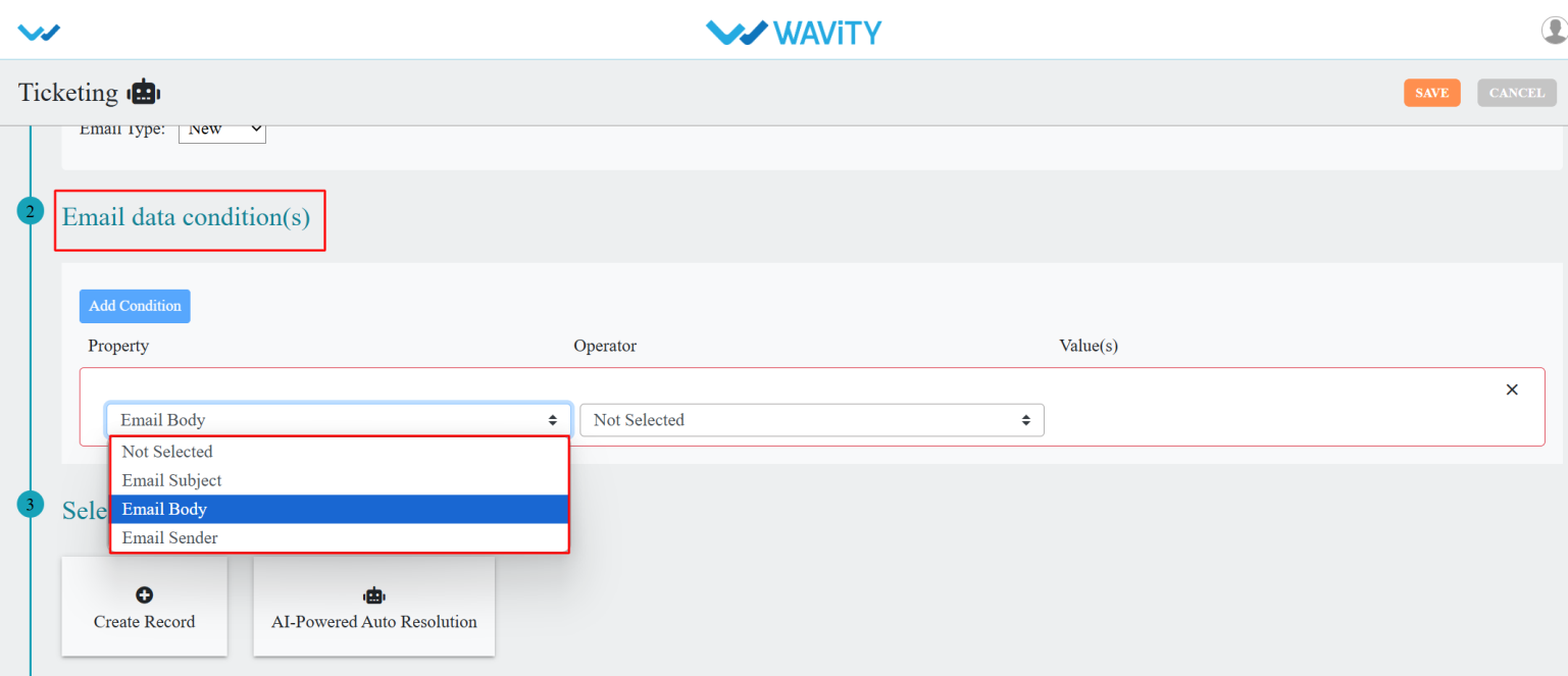
- Select the operator from the dropdown’s option.
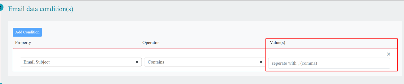
- Enter the value in value(s) field.
- In the Value(s) field, enter a Keyword. When the end user creates a ticket via email, the bot will detect this keyword and trigger the ticket creation process.
- In the Select action(s) section, click on Create Record and choose the options based on your requirements.
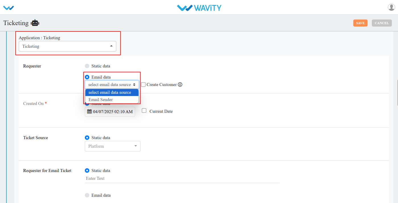
- Select the application where the record should be created via email.
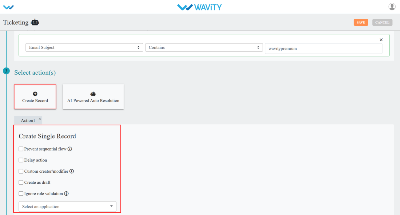
- Select required the details as per your requirement.
- After selecting the actions, click on the save button.
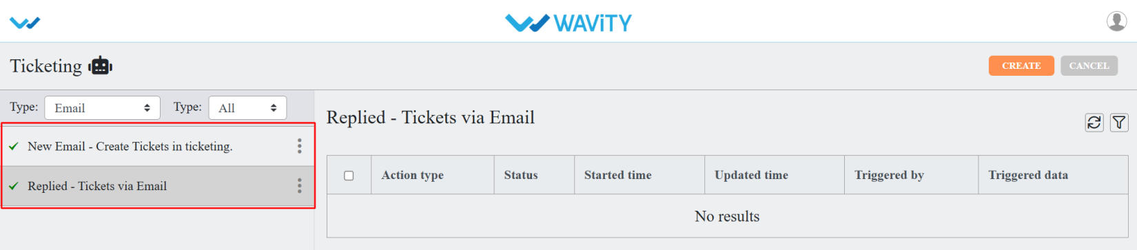
- You can see the Wbot is in active mode.
Guide to Notification Types and Configuration
- In the Wavity platform, when a ticket is created or updated, notifications are delivered through Wbots.
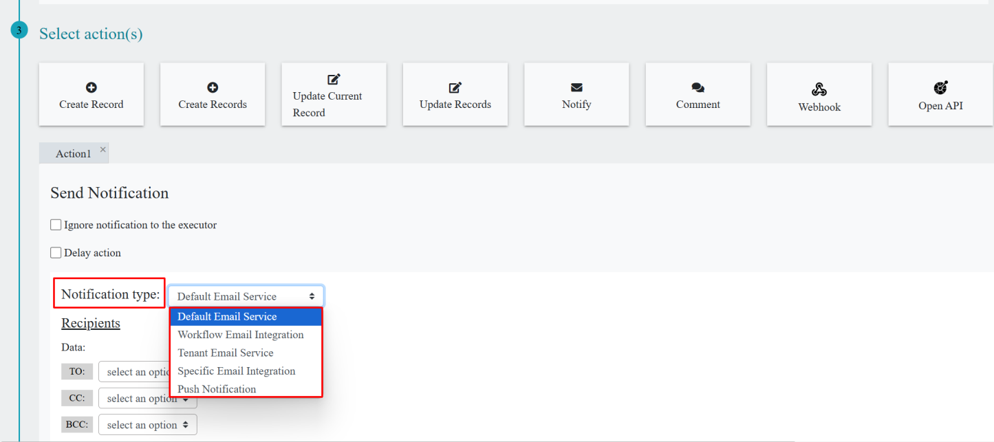
- Wbots support various notification types, which include:
- Default Email Service
- Workflow Email Integration
- Tenant Email Service
- Specific Email Integration
- Push Notification
- You can select the notification type in Wbots by following these steps:
- Click on the Profile icon.
- Open Design Tools.
- Go to the Apps, pick the app you want, and click on the three dots.
- From the three-dot menu, choose Wbots.
- After selecting the Wbots option, you will be directed to the Wbots Configuration page.
- Click on the Create button.
- In Select action(s), select Notify.
- In the Notification type, you can choose the desired notification type based on your requirements.
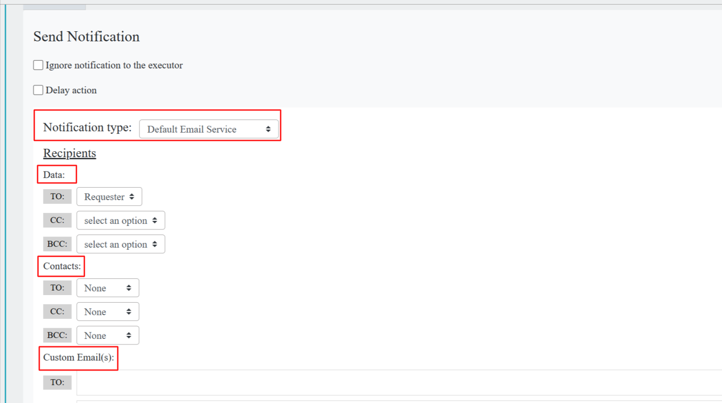
Default Email Service:
- For the Default Email Service, there is no need to set up specific email integration.
- You can select recipients for To, CC, and BCC from the Data, and also choose individual users or groups from the Contacts section.
- Notifications can also be sent to users who are not part of the Wavity platform by entering their email addresses in Custom Email(s). If you want to notify a specific user, you can include them in the Custom Email field.
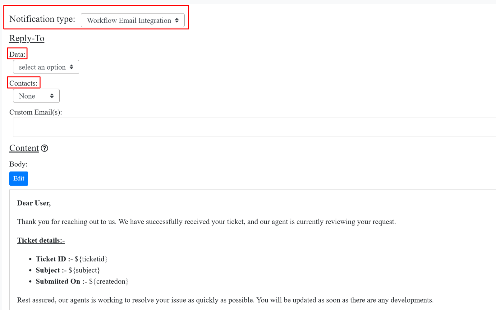
Workflow Email Integration:
- Workflow Email Integration is triggered when a ticket is created via email and sends a notification to the requester.
- When a sender creates a ticket via email, and includes someone in CC or BCC, those recipients will also receive a notification indicating that the ticket has been created.
- There is no option to select Contacts or Data Forms within the Workflow Email Integration.
- However, you can select Contacts and Data Forms in the Reply To section, and also enter custom email addresses.
- You can then enter the desired email body and save it.
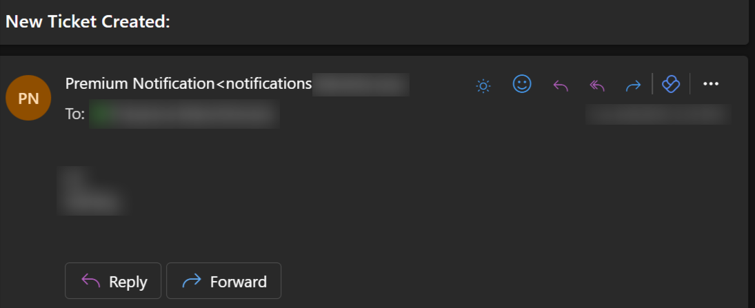
Tenant Email Service:
- When you select Tenant Email Service, all notifications related to ticket creation, updates, and other actions will be sent on behalf of the tenant name.
- For Tenant Email Service, you need to select the recipients from Data or Contacts based on your requirements.

- For example, if your tenant name is Premium, the notifications will appear to come from Premium Notification<notification> as shown in the image below.
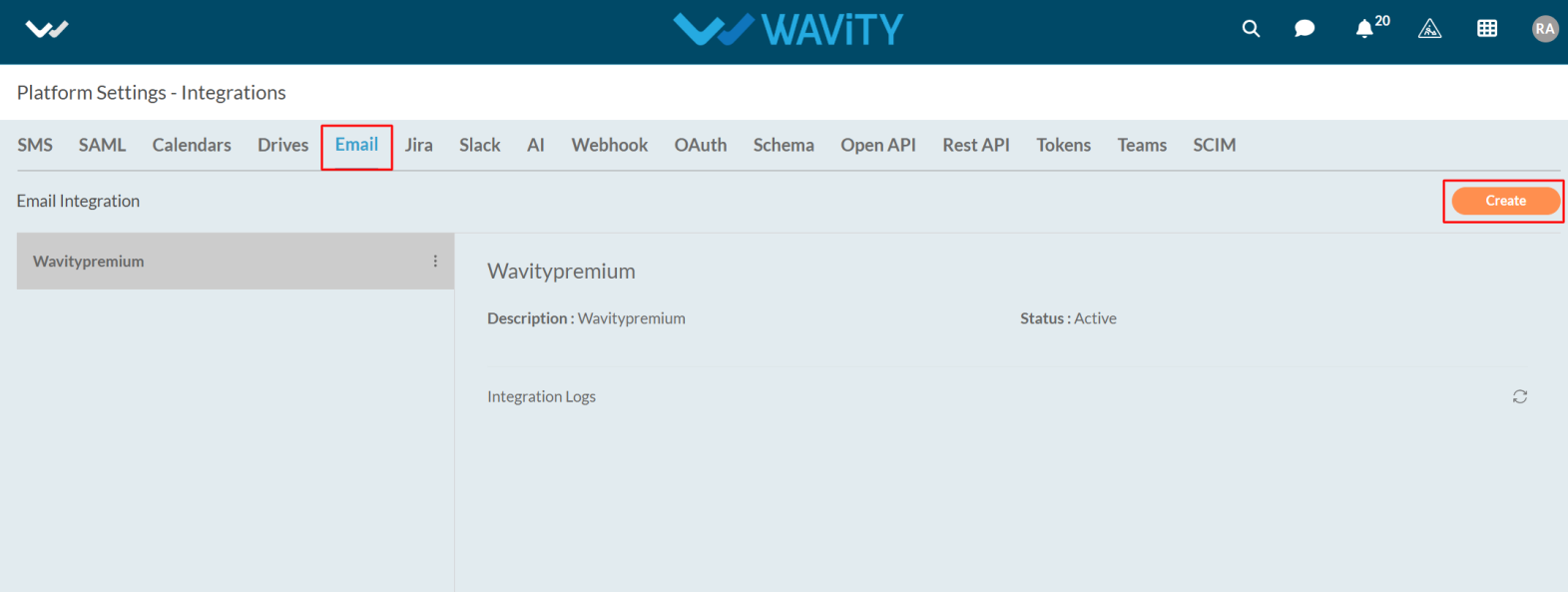
Specific Email Integration
- The Wavity Platform ,you can give specific Email Integration to integrate with platform to notify the users
- To begin, click on your Profile Icon, then select Integrations.
- In the Email section, click the Create button located at the top-right corner.
- Enter the Name and Description as required.
- Select the Type of Email Integration as shown in the image below, and then click on Click to Link Your Account.

- After clicking, you'll be prompted to enter the email address and its password.
- Once the credentials are verified, you’ll receive a notification confirming: Your account has been linked successfully and click on the save button.
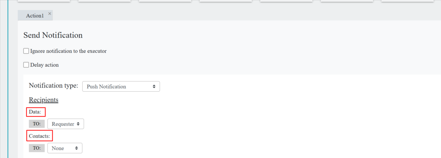
Push Notification
- Push Notifications allow users to receive alerts on their mobile devices when a ticket is created or updated.
- Notifications are sent to both moderators and the end user who created the ticket.
- In Wavity Platform, we can get the notification in Mobile also.
- For Push Notification, you need to download the Wavity App from Play store or app store.
- After installing the Wavity app, enter the tenant details as well log in to your account by entering your username and password.
- Once the tenant details are entered, you'll be directed to the default landing page.
- By default, Push Notification will be enabled in open app designer > Advanced settings.
- When you select Push Notifications in the Notification Type, you need to choose the recipients from Data and Contacts.
- After selecting the recipients, make sure to save the changes.
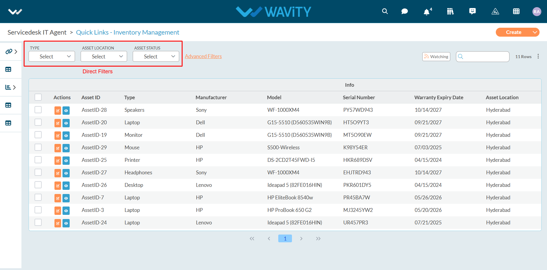
Configuring Filters in App Designer
- Applying filters in the Wavity platform is a simple process that can be done for any lists or reports. There are two types of filters available: Direct Filters and Advanced Filters.
- Example to apply direct/simple filters is shown below. Direct Filters are easily accessible through dropdown boxes located beside advanced filters. These filters can be customized according to your requirements during implementation.
- Applying simple filters on the Wavity platform is a straightforward process.
- Only Admin has access to advanced settings when creating an App.
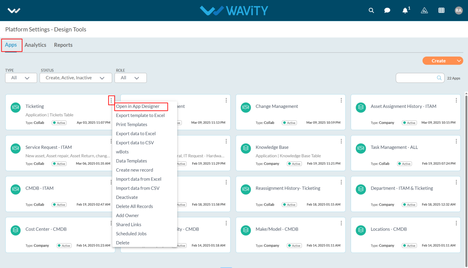
- Click on the profile icon and select Design Tools (accessible only to Admin).

- In the App section, only the Admin can see all the existing applications in the tenant.
- Select the application where you want to apply simple filters and click on the three dots.
- From the options in the three dots menu, choose Open in App Designer.
- Click the Settings icon, as shown in the image below, to view or edit the Application Settings.

- Click on Advanced settings to apply the simple filters.
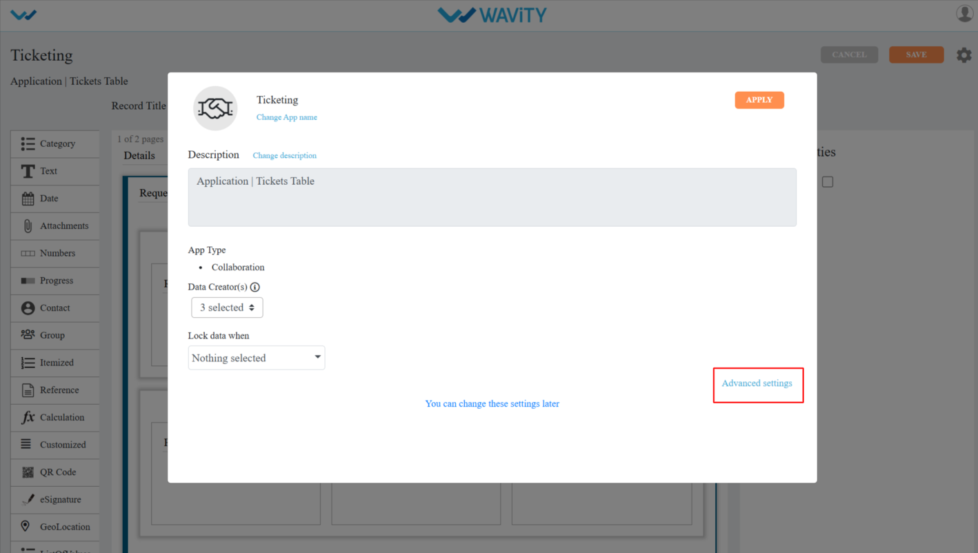
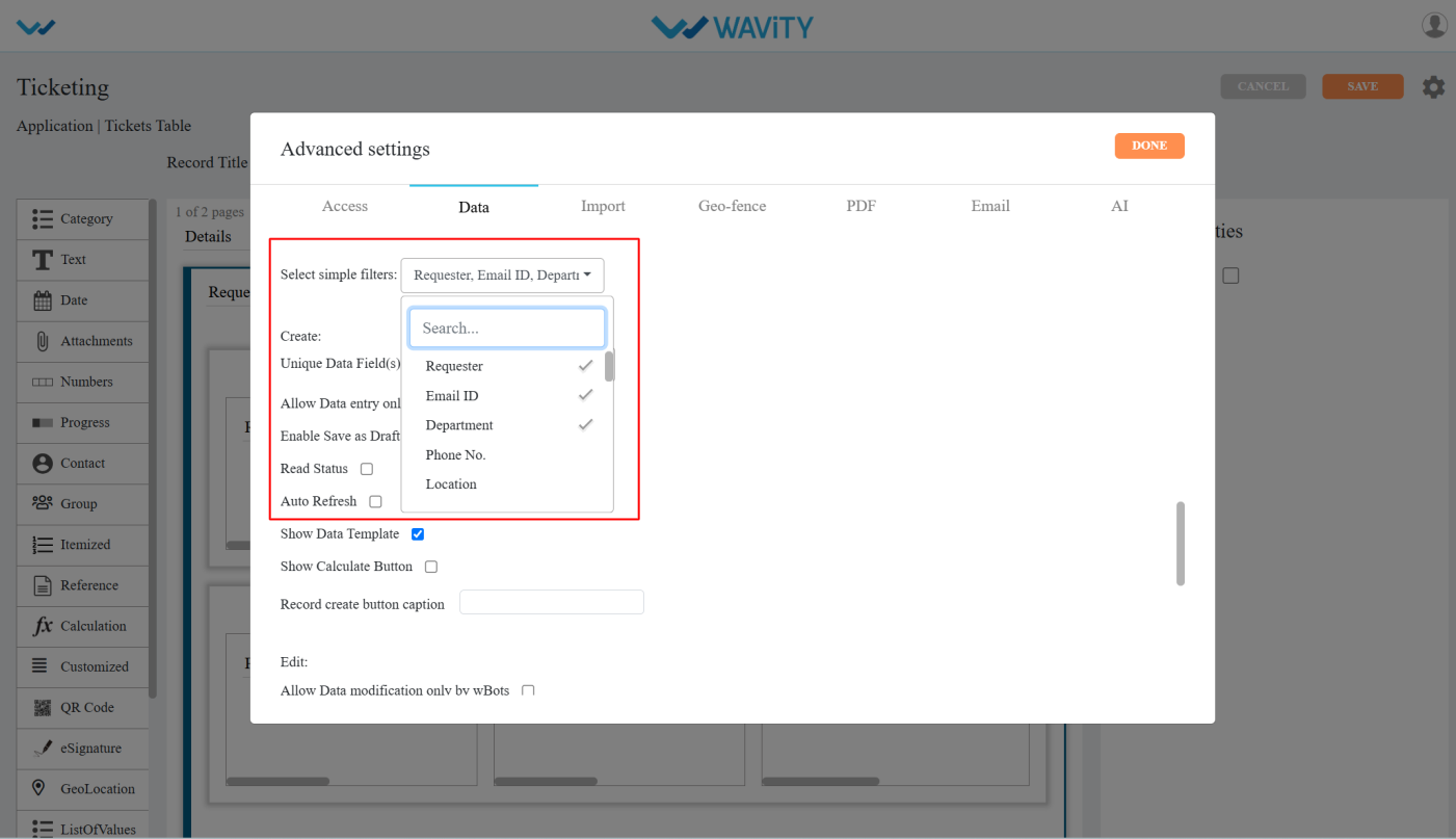
- In Advanced Settings, click on the Data tab and scroll down and you can see the select simple filters option.
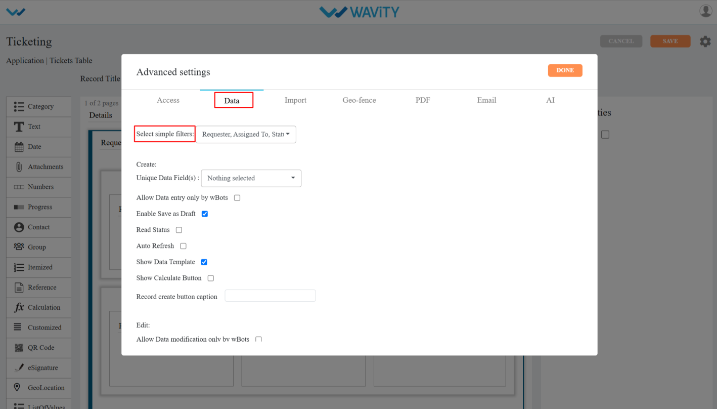
- In Simple filters dropdown’s you can select only 3 data controls/form fields which can be made visible as a simple filter on the listing page.
- After selecting the filters click on the Done & apply and click on the save button to save the filters.
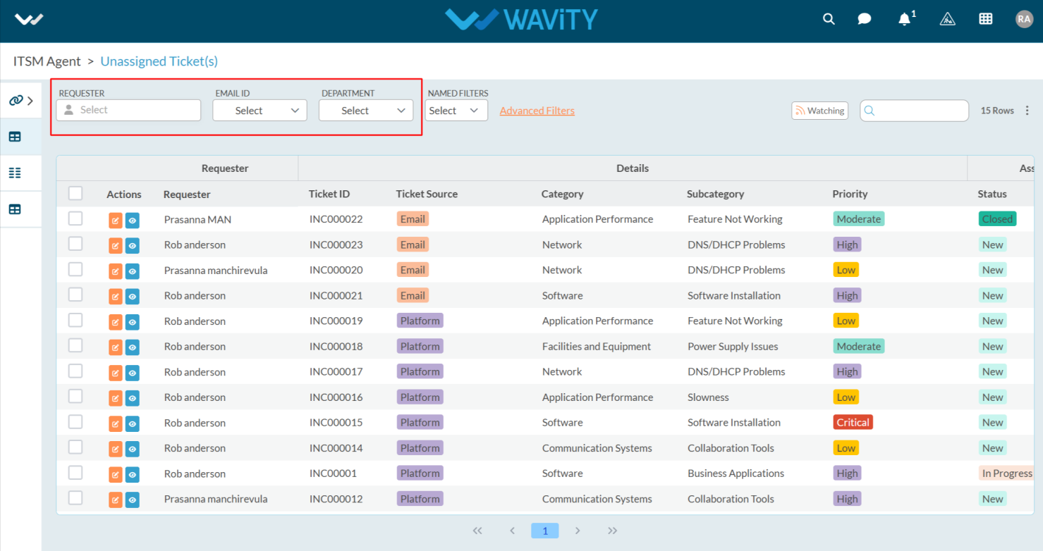
- Now you can see the applied simple filters in the Record listening page.
Configuring Comments & Activities in App Designer
- Only Admin have access to edit or apply advance settings while creating an App.
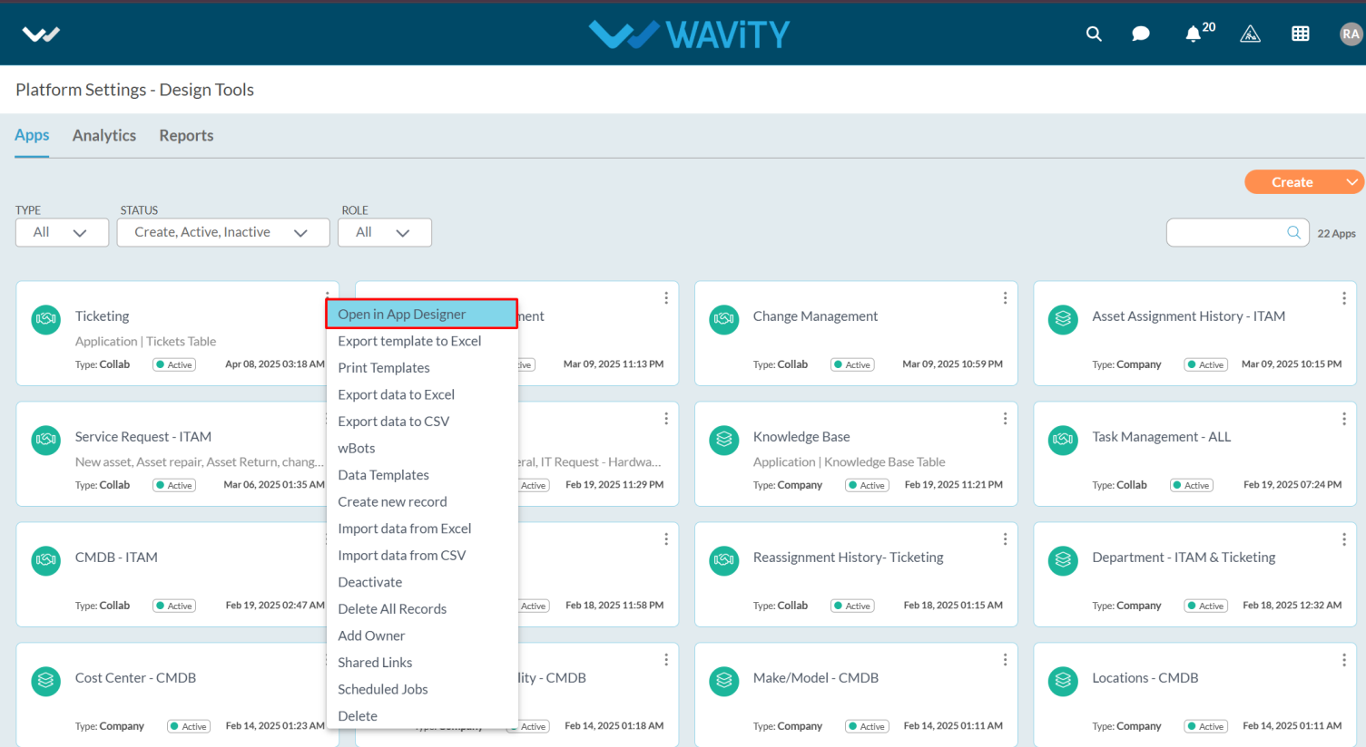
- Click on profile icon and select “Design Tools” (only admin can view and select Design Tools) as shown below.
- Select the application which you want to make change settings and click on three dots.
- From the options in the three dots menu, choose "Open in App Designer"
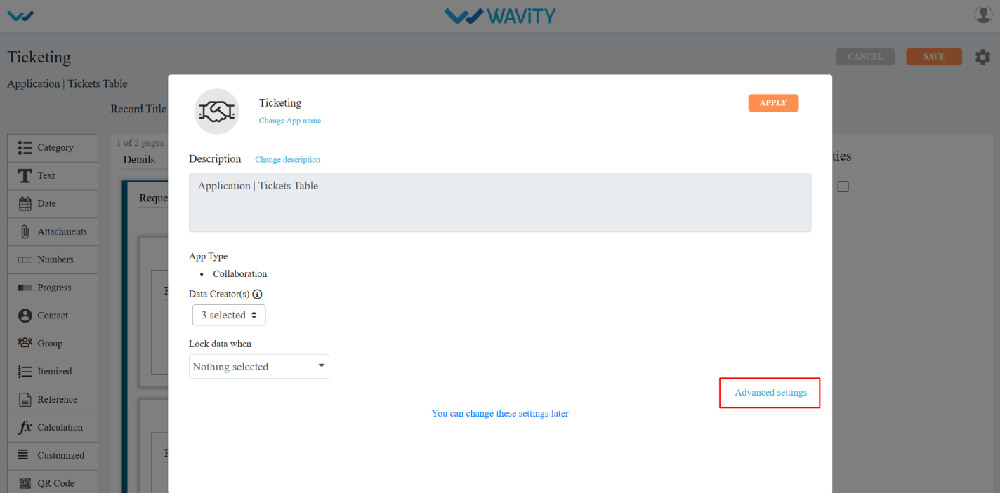
- Click on the settings icon as shown in the screenshot below to view or edit the Application setting.
- Click on “Advance settings” as shown below to view or edit advance settings of application.
- In Advanced Settings, click on the “Data” tab and scroll down and you can see the Comments & Activities.
- Disable activities: When you enable Disable activities, it disables the activity stream for records created or modified in that app
- Hide Comments & Activities: When you enable Hide Comments & Activities, it disables the comments and activities of the record in the app.
- Synchronized Save helps avoid conflicts by showing an alert when two users edit and try to save the same record at the same time.
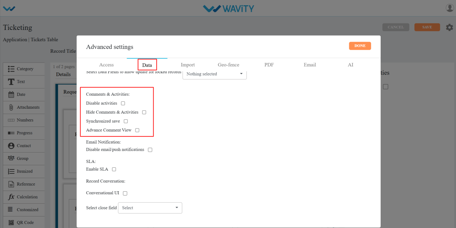
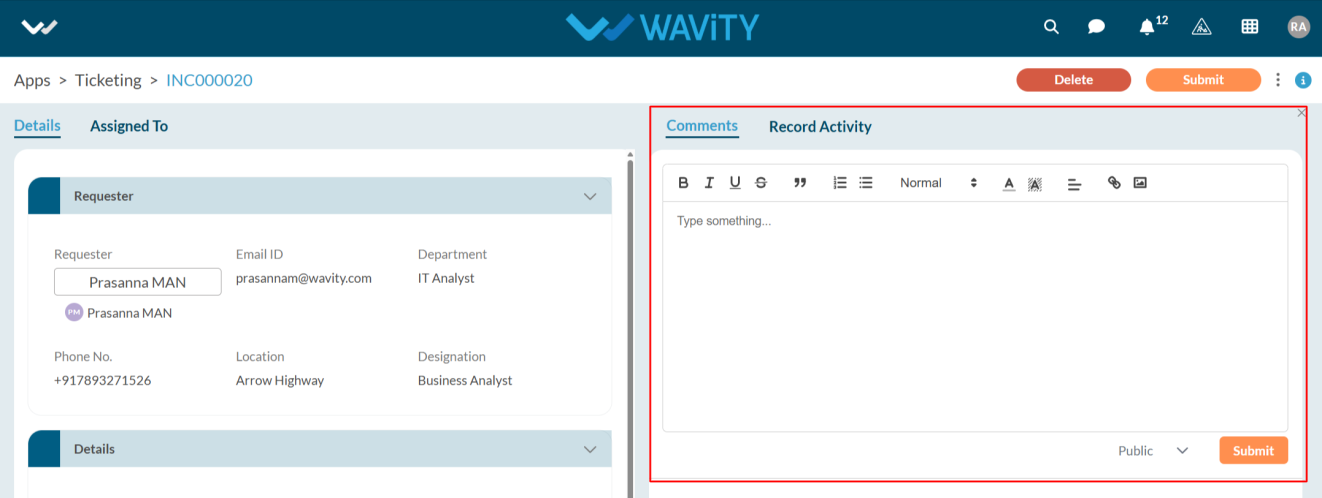
- Advance Comment View: After enabling this feature, an advanced comment box will appear on the record creation page, as shown in the image below.
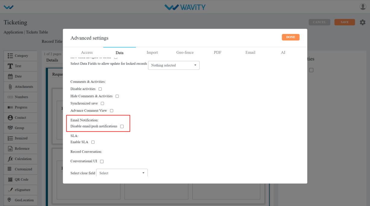
Managing Email and Push Notifications
- Email Notifications/Push Notifications allow users to receive alerts on their mobile devices when a ticket is created or updated.
- Notifications are sent to both moderators and the end user who created the ticket.
- To disable notifications on mobile, follow these steps:
- Only Admin users have the permission to enable or disable this feature.
- Click on the Profile icon.
- Open Design Tools.
- Go to the Apps, pick the app you want, and click on the three dots.
- From the three-dot menu, choose Open App Designer.
- Click the Settings icon.

- Click on Advanced settings.
- Click on the Data section and scroll down. Under Email Notification, you will find the option Disable email/push notification.

- When you enable this feature, notifications will be sent to mobile devices when a ticket is created or updated, based on the recipients selected in the Wbots, as shown in the image.
Enabling and Configuring Conversational UI
- With Conversational UI, agents can interact directly and send messages with end users while managing and resolving a ticket.
- Only admin of your organization can enable this feature in Wavity.
- Click the Profile icon to enable this feature.
- Open Design Tools.
- Go to the Apps, pick the app you want, and click on the menu (three dots).
- From the three-dot menu, choose Open App Designer.
- Click the Settings icon.
- Click on Advanced settings.
- Click on the Data section and scroll down.
- You will find Conversational UI under Record Conversation, as shown in the image below.
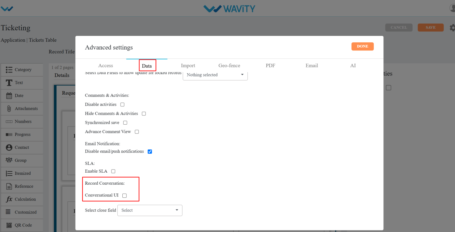
- Conversational UI: Enabling this feature will display the record in a Conversational UI format.
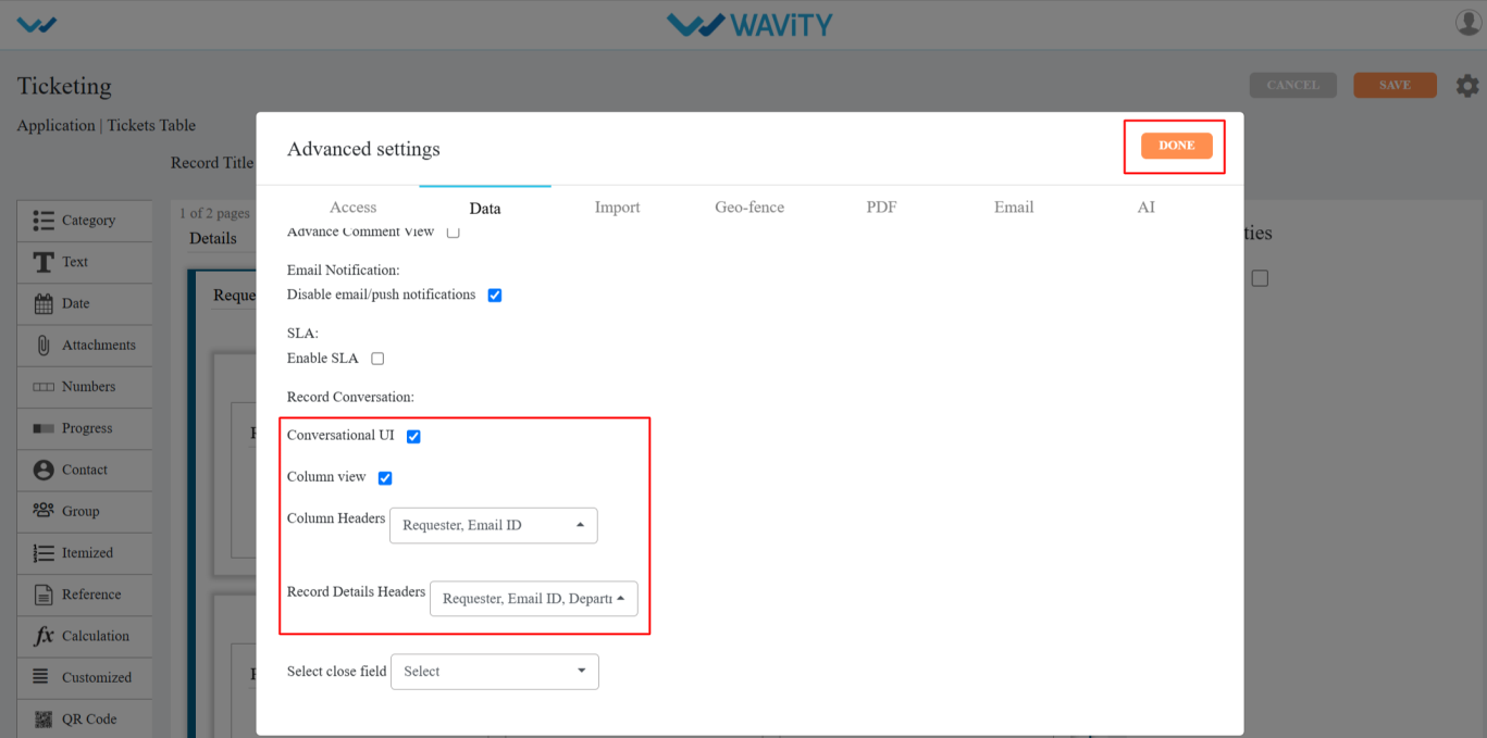
- After enabling this feature, a Column View option will appear. When you select it, you’ll see two more options: Column Headers and Record Details Headers.
- In the Column Headers dropdown, you can select up to two data controls. In the Record Details Headers, you can choose as many data controls as needed and click on the done and save the changes.
- Go to the dashboards and select a ticket from the Table widget by clicking the blue eye icon.
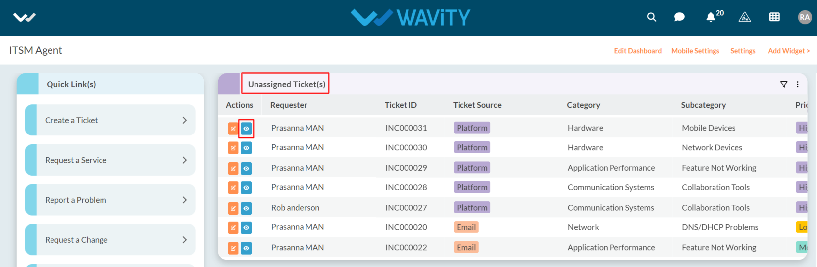
- At this stage, the ticket appears in the Conversational UI format for easier interaction as shown in the below image.

Enabling and Using AI for Ticket Categorization
- Wavity AI Assignment feature automatically categorizes tickets by analyzing the content of the email body or description of ticket, thereby streamlining the ticket management process and improving efficiency.
- The AI feature can be enabled within the App Design section of the Wavity platform.
- Only Admin users have the permission to enable this feature.
- To enable the AI feature, follow these steps:
- Click on the Profile icon.
- Open Design Tools.
- Go to the Apps, pick the app you want, and click on the three dots.
- From the three-dot menu, choose Open App Designer.
- Click the Settings icon.
- Click on Advanced settings.
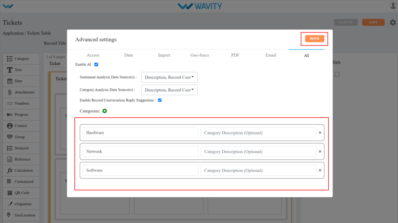
- Select the AI section; Check the box to enable the AI feature, as shown in the image below.
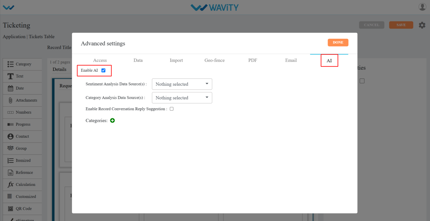
- Select the required Data Controls from the dropdowns in both Sentiment Analysis and Category Analysis to categorize tickets based on the email body or ticket description.

- Click the + icon under Category Analysis and enter the required category names.
- Click on done, then apply, and finally save the settings.
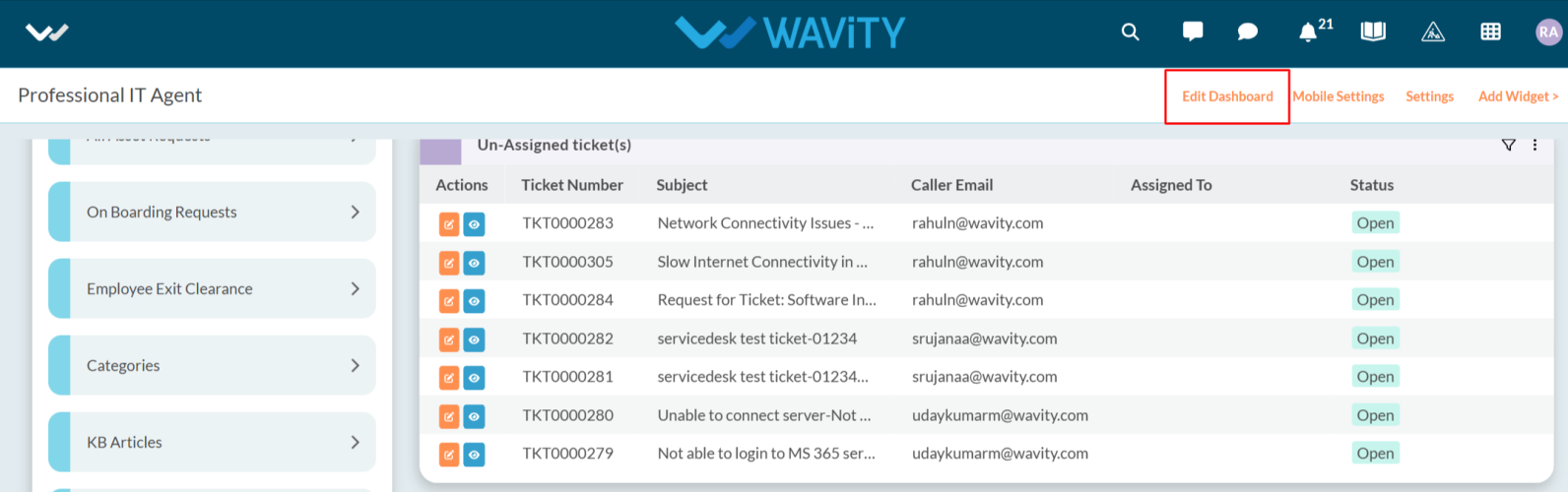
- Now, navigate through the interface and enable AI by clicking the Edit Dashboard option as shown below.
- Click on Setting Icon on the Widget as shown below.
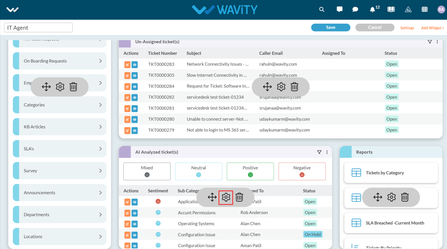
- Select Show Text Comprehend Result and click the Save button to enable AI Sentiment Analysis with "Emoji" icons in the interface.
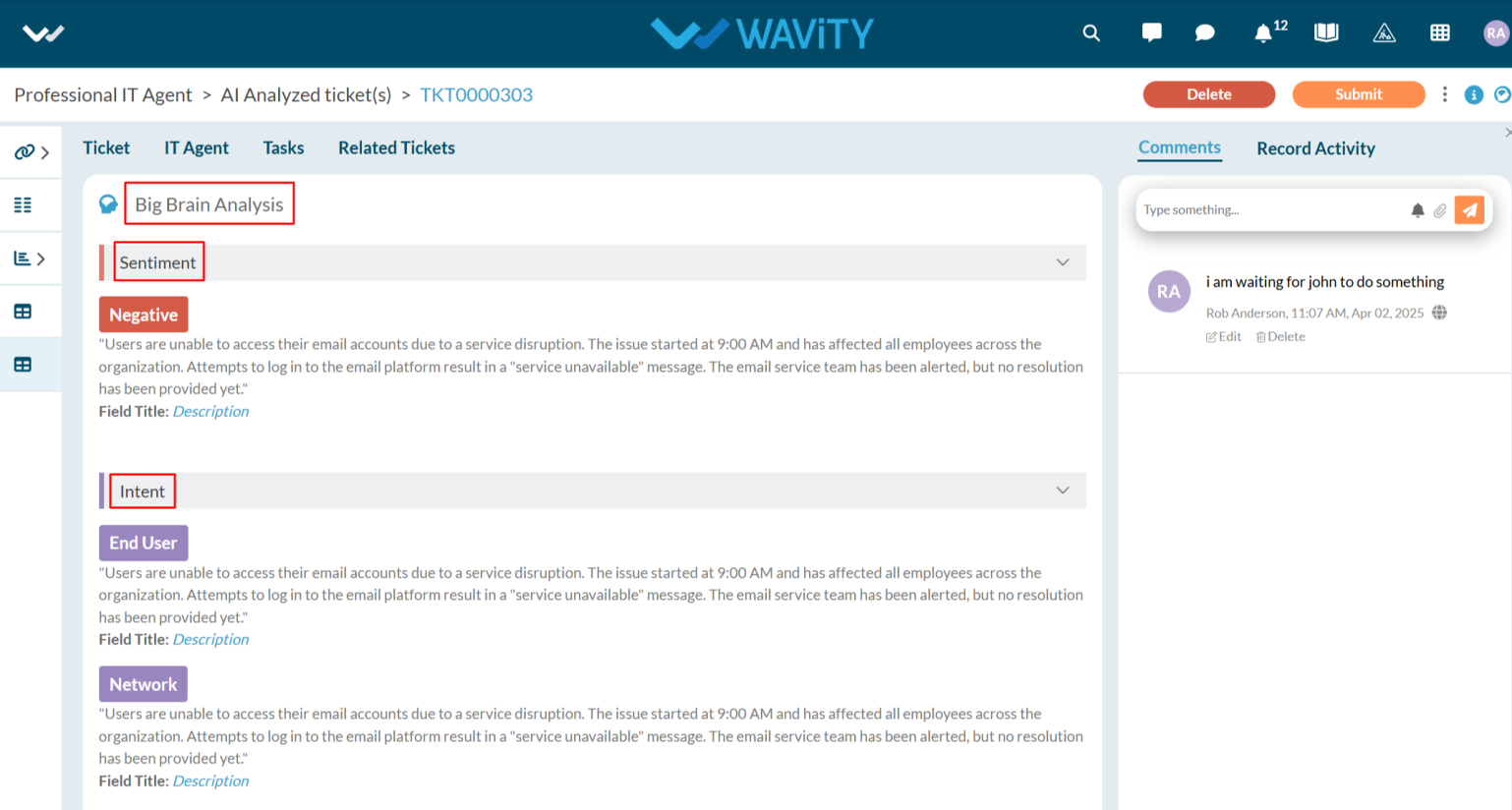
- Additionally, you can view the details of AI Ticket Categorization for each ticket by clicking on the "blue" icon, as shown in the image below.
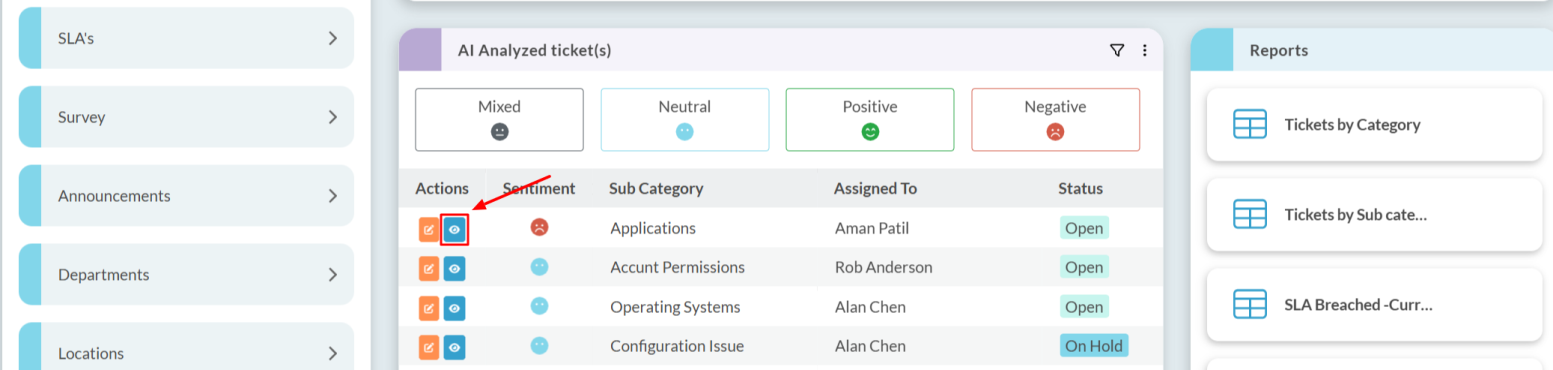
- Click on Big brain Analysis.

- This section displays the sentiment of the user who created the ticket, along with the AI-generated ticket categorization under the Intent category. Based on the category identified in the Intent, AI can automatically assign the ticket to the appropriate agent.
Setting up Scheduled Reports
- In the Wavity platform, reports can be automatically sent to users via email at a specific time or on a specific day using schedulers.
- Only Admin users have access to create scheduled reports.
- To create a scheduled report:
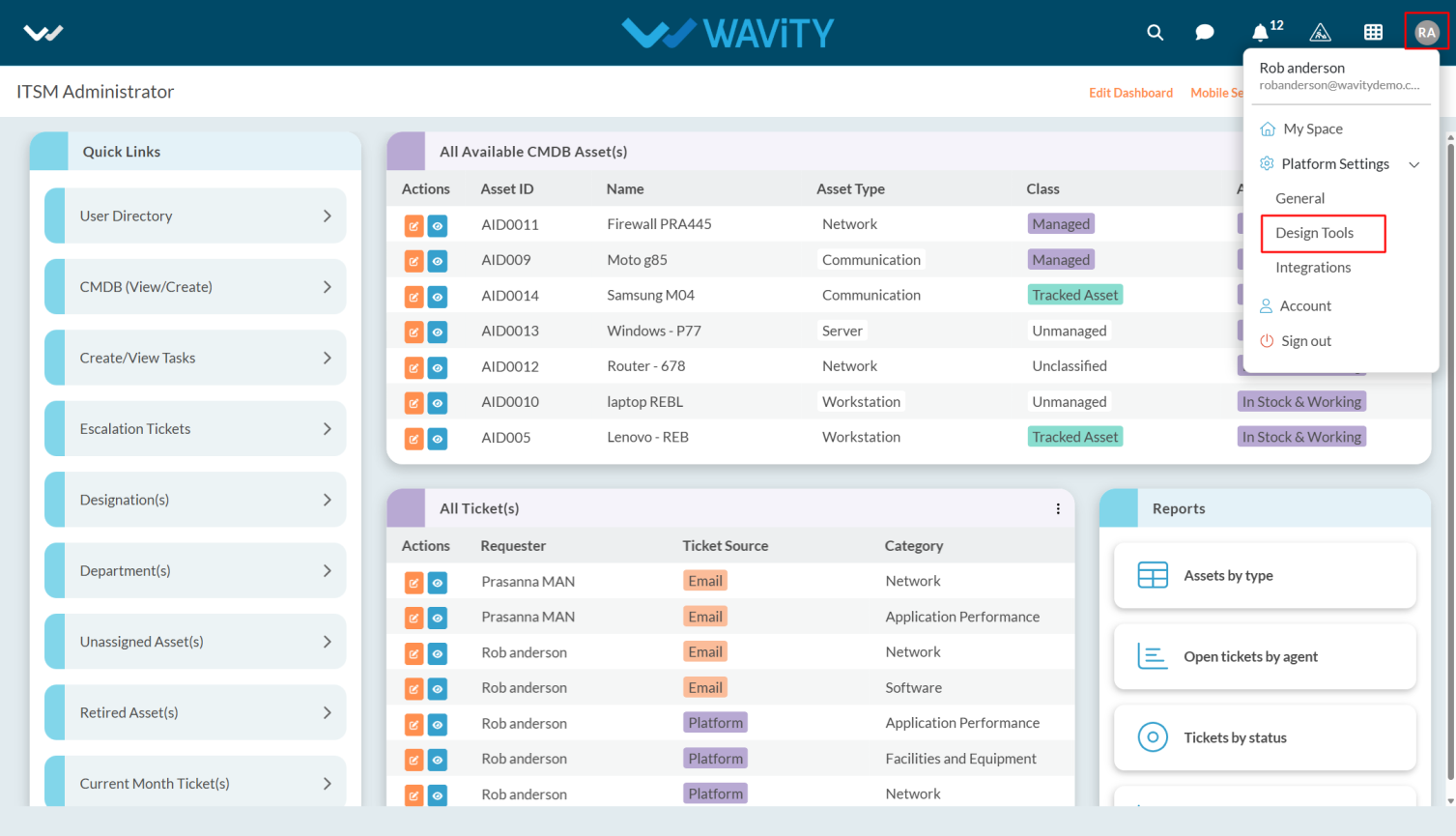
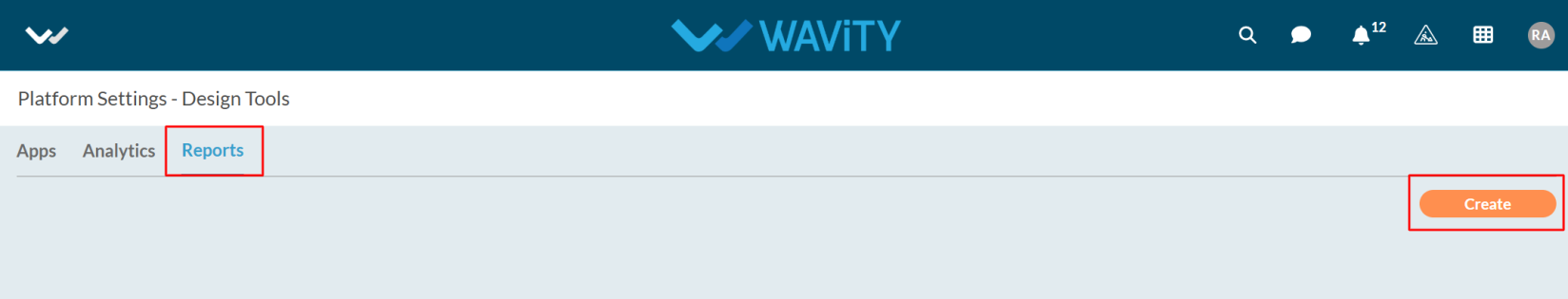
- Click on the Profile icon and Select Design Tools.
- Click on the Reports tab, and then click the Create button as shown in the image below.
- Enter the Title and Description for the report.
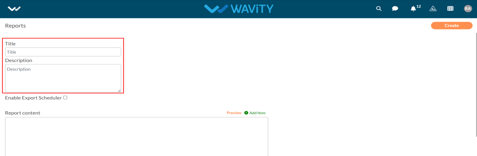
- Now, enable the Export Scheduler.
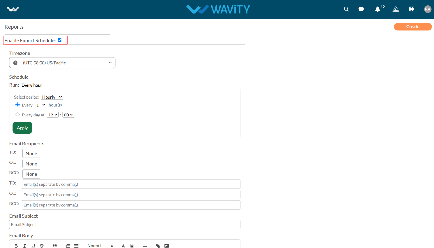
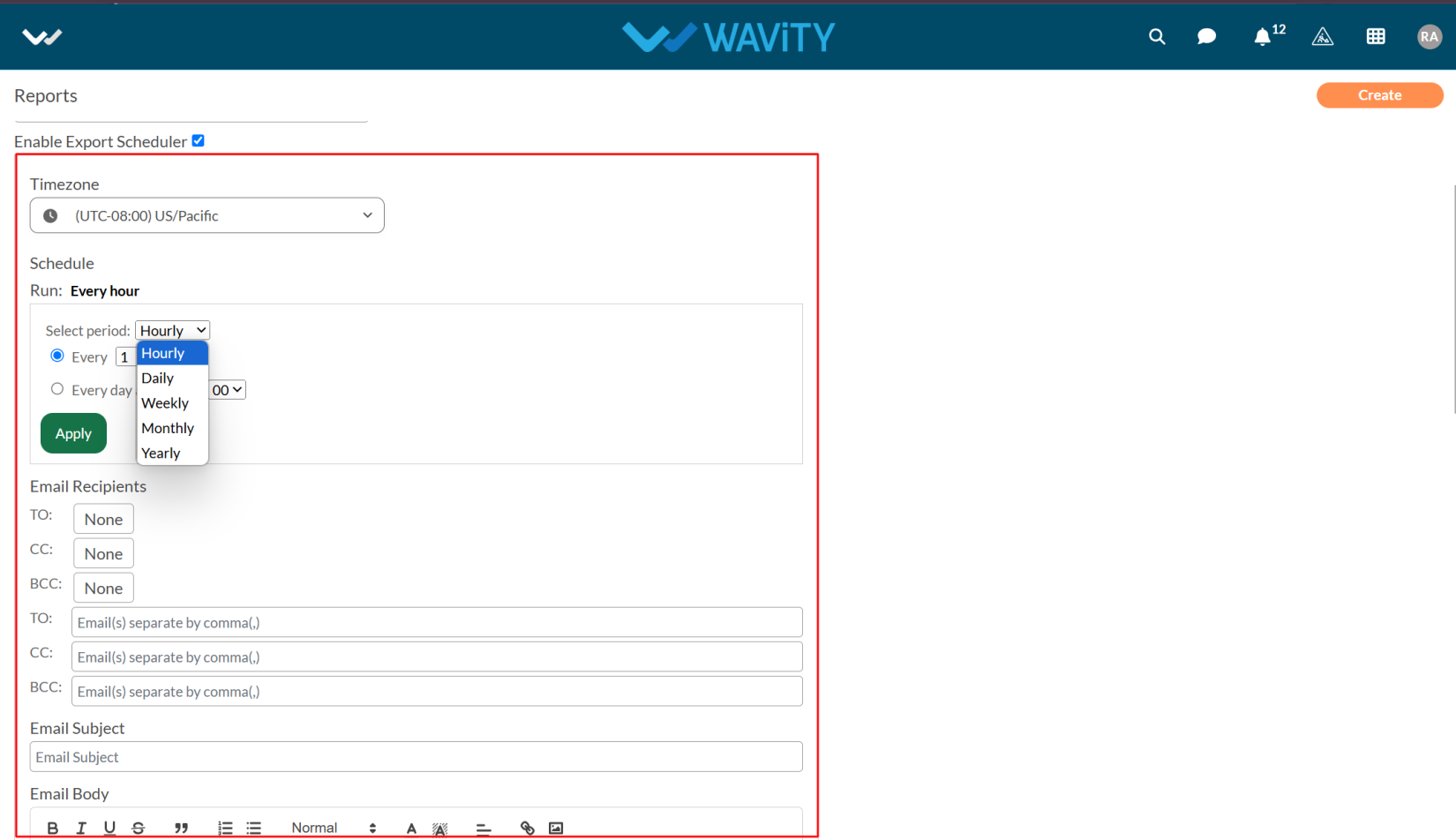
- Now select the time zone and period and fill up the required details in Email Recipients.
- After entering the details, scroll down to view the Report Content section.
- Click on the Edit as shown in the below image.
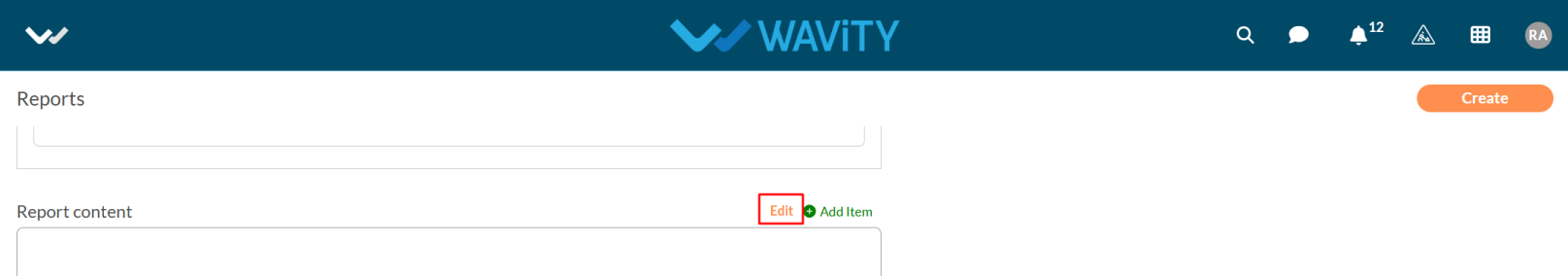
- Click on the Add item and select the report as you want.
- You can select report in Text, Image, Table and Analytics.
- For Table and Analytics reports, you need to select the application from which you want to generate the reports.
- Now click on the create button & Report will be active.
Setting Up a Customer Self-Service Portal
- A customer self-service portal allows users to manage their support requests, track ticket statuses, and submit new issues all in one place. It also integrates with the knowledge base, offering relevant articles, FAQs, and troubleshooting tips based on the customer’s queries.
- Only an Admin of your organization has the ability to set up and configure the customer portal.
- To begin, click on the Portal icon as shown in the image below.
- Click on Admin, as you’ll be configuring the portal settings.
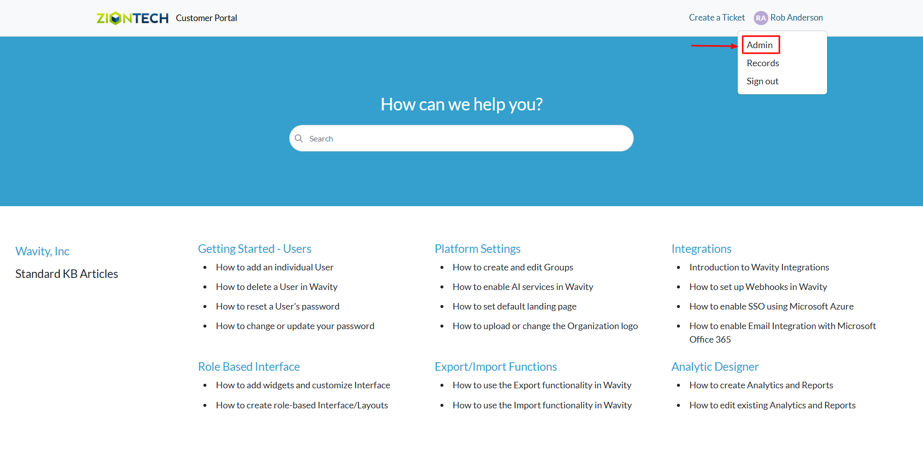
- The Customer Portal Admin Page will open, displaying any currently active portals. From here, you can also choose to edit an existing portal.
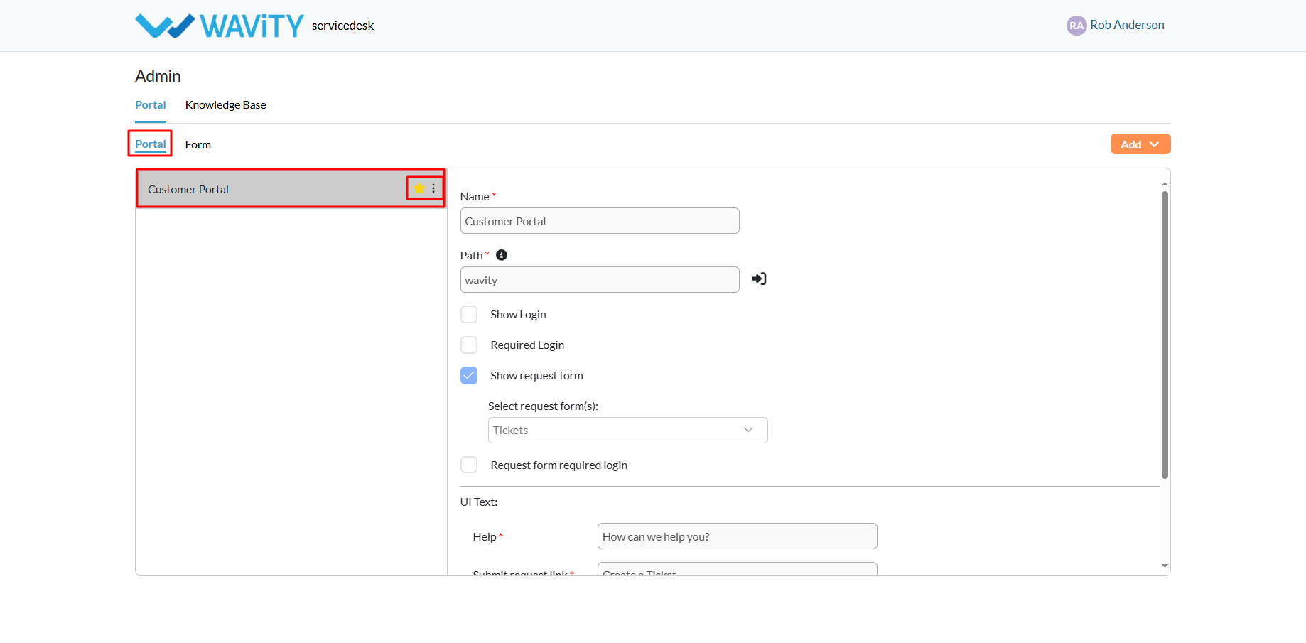
- Click on the Add button and choose Portal to start setting up a new one.
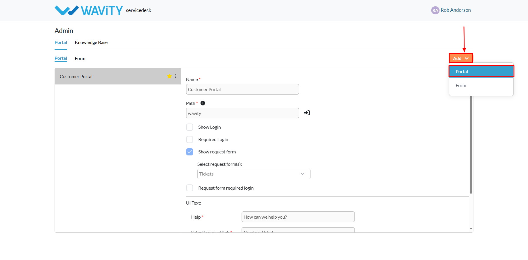
- Enter a name for your portal.
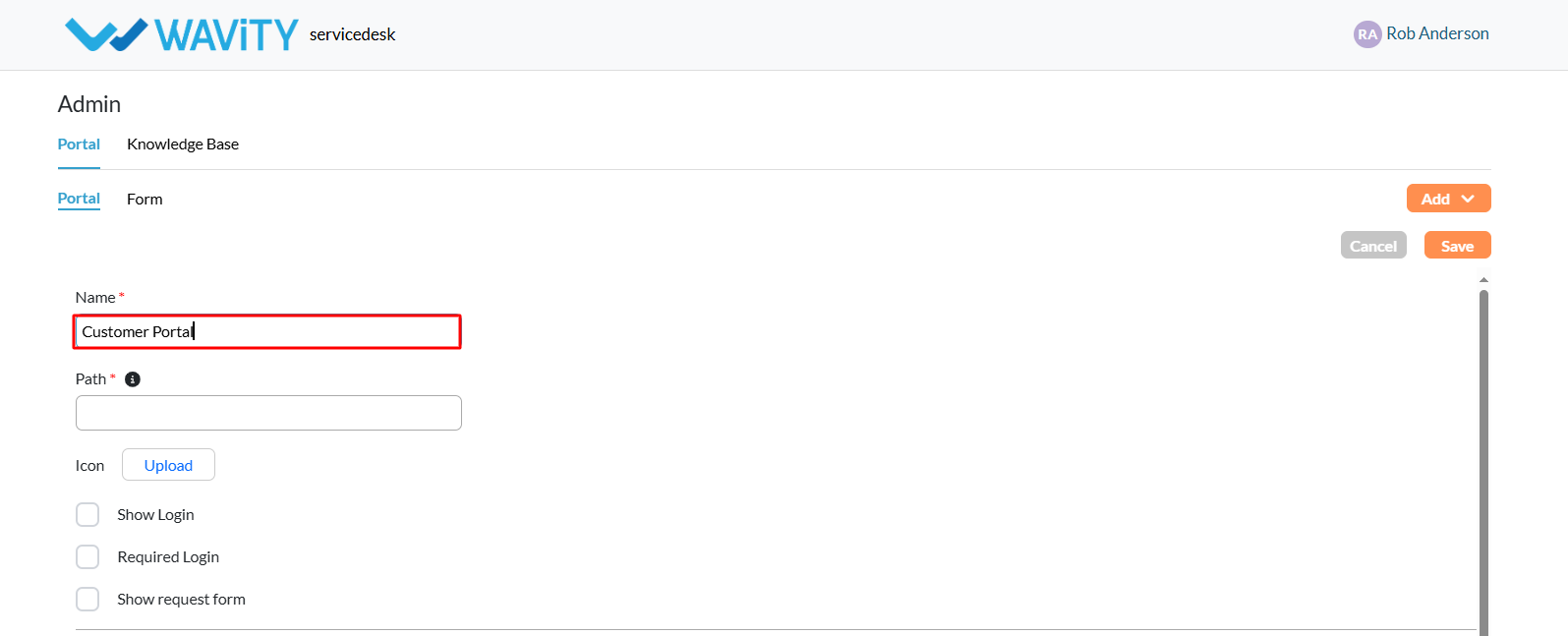
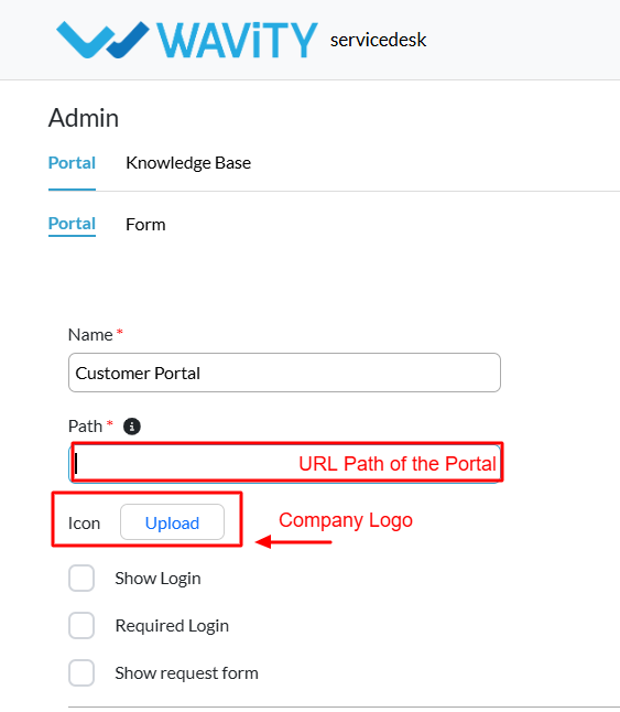
- Specify the URL path for the portal. Note: only letters and numbers are allowed in the URL, but the path cannot consist of numbers alone.
- Upload your company logo by attaching the appropriate icon as shown.
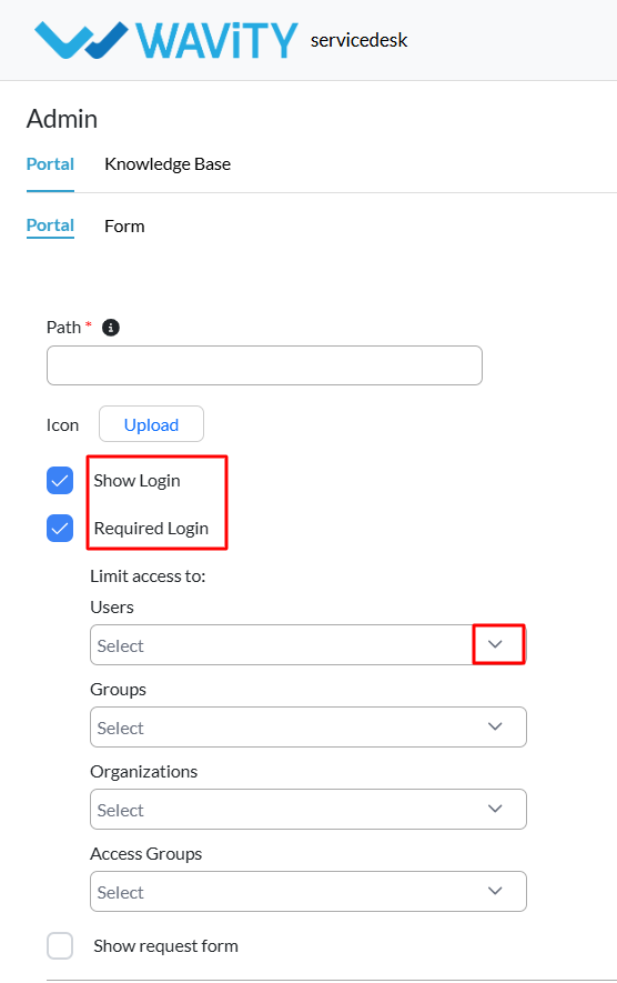
- Define user access settings: To require users to log in before accessing the portal, enable both “Show Login” and “Required Login."
- After selecting “Required Login,” you’ll be prompted to choose specific users, groups, organizations, or access groups from the Wavity tenant who should have access to the portal.
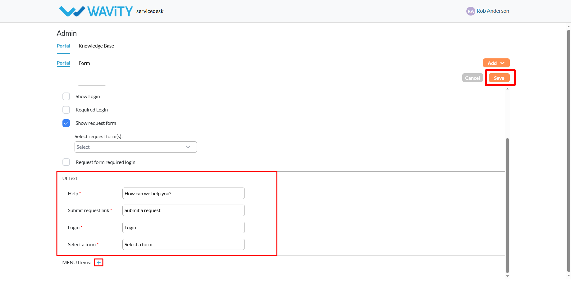
- To allow users to submit requests: Enable the “Show Request Form” option.
- Select an existing form from your portal. You can also edit forms via the Form section.
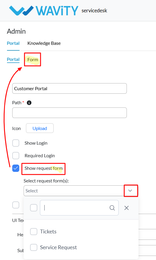
- Edit or update the UI text that users see when interacting with the portal.
- Add menu items to organize and categorize the portal content more effectively.
- Click the “Save” button to complete your portal setup.
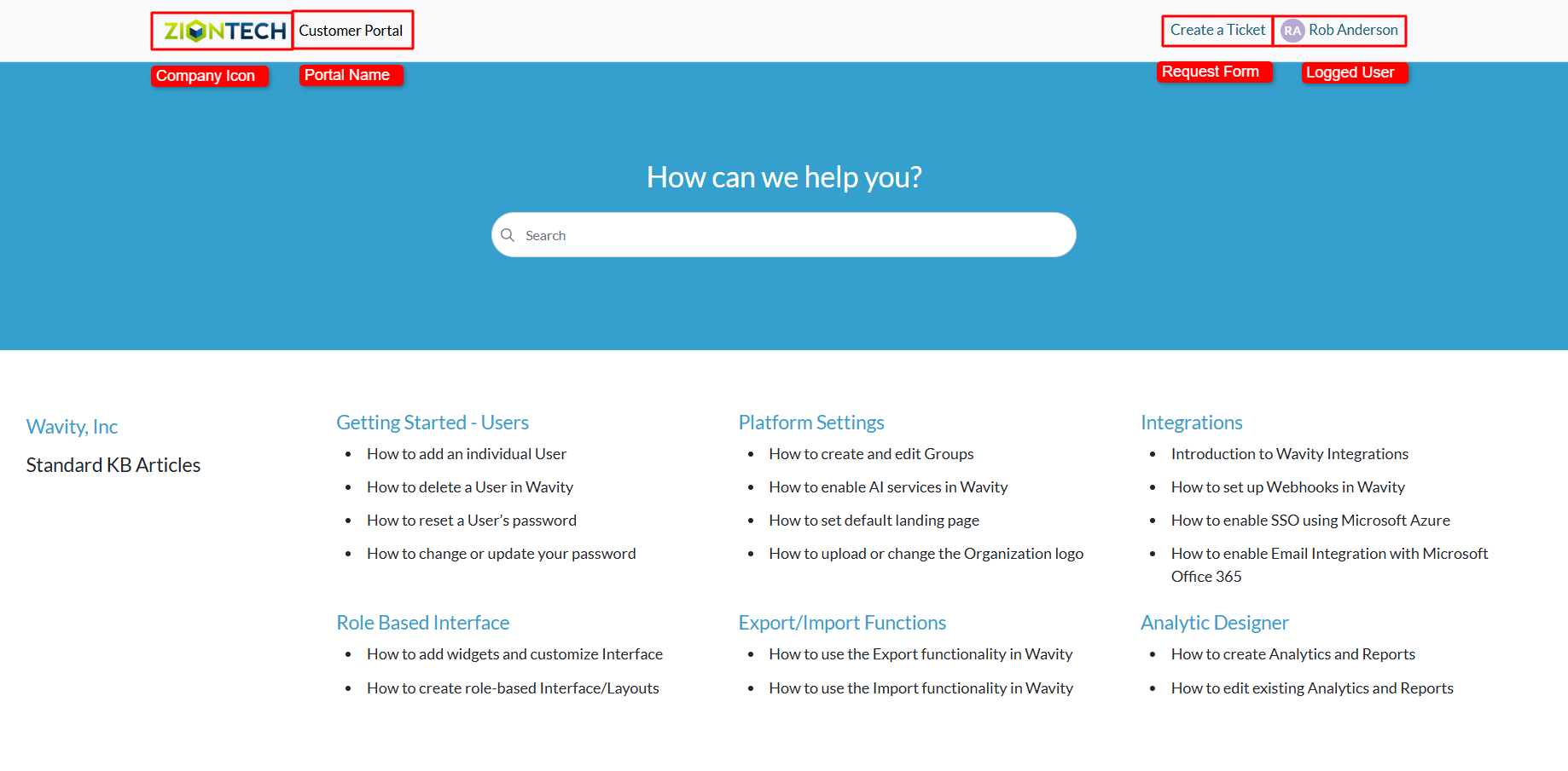
- An example of a fully configured portal is shown below, featuring a company logo, portal name, request form, and a logged-in user interface.
Creating a Request Form in the Customer Self-Service Portal
- A customer self-service portal allows users to manage their support requests, track ticket statuses, and submit new issues all in one place. It also integrates with the knowledge base, offering relevant articles, FAQs, and troubleshooting tips based on the customer’s queries.
- Only an Admin in your organization can create or configure a request form in the portal.
- To begin, click on the Portal icon as shown in the image below.
- Select Admin since you’ll be setting up the request form.
- The Customer Portal Admin Page will open, showing any existing request forms. You can edit these or create a new one.
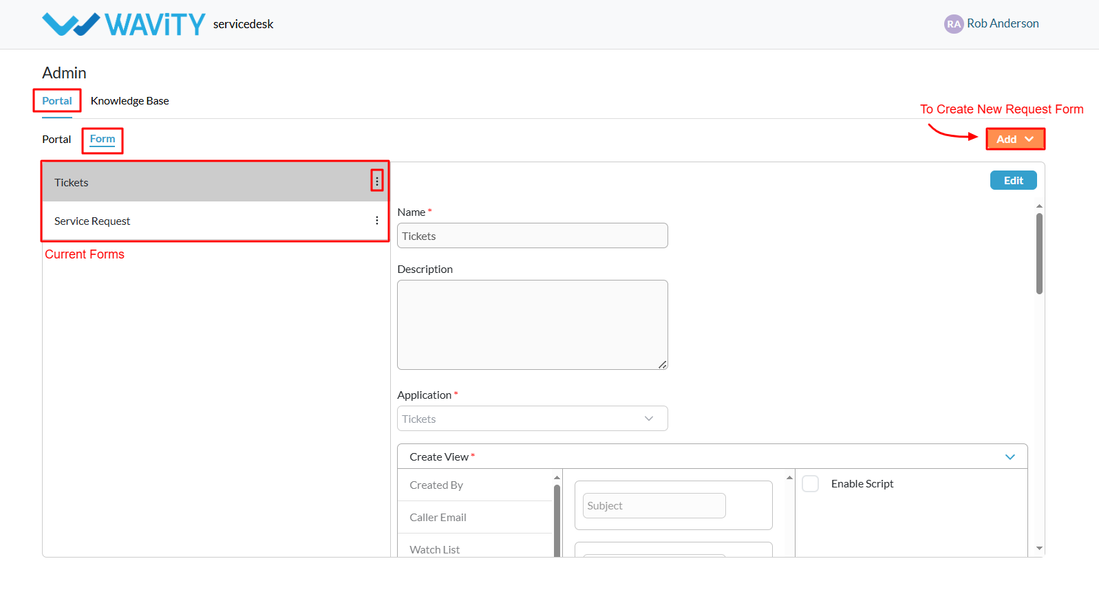
- Click on the Add button and choose Form to begin creating a new request form.
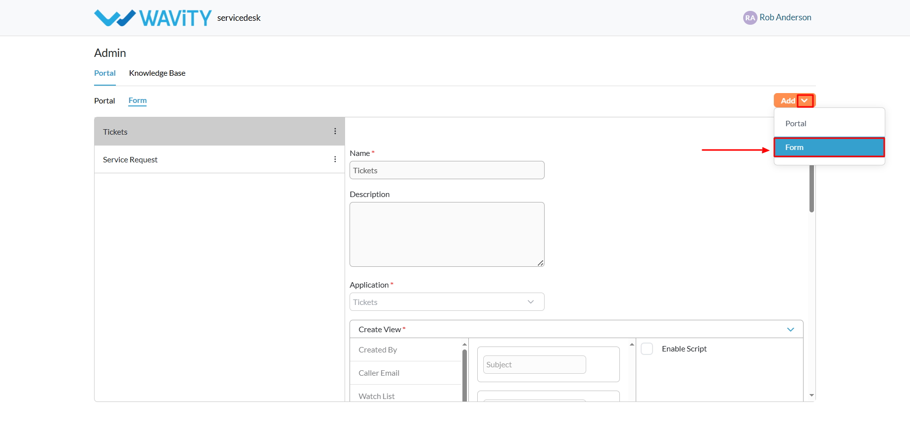
- Provide a name and description for the form.
- Select the appropriate application from the Wavity tenant.

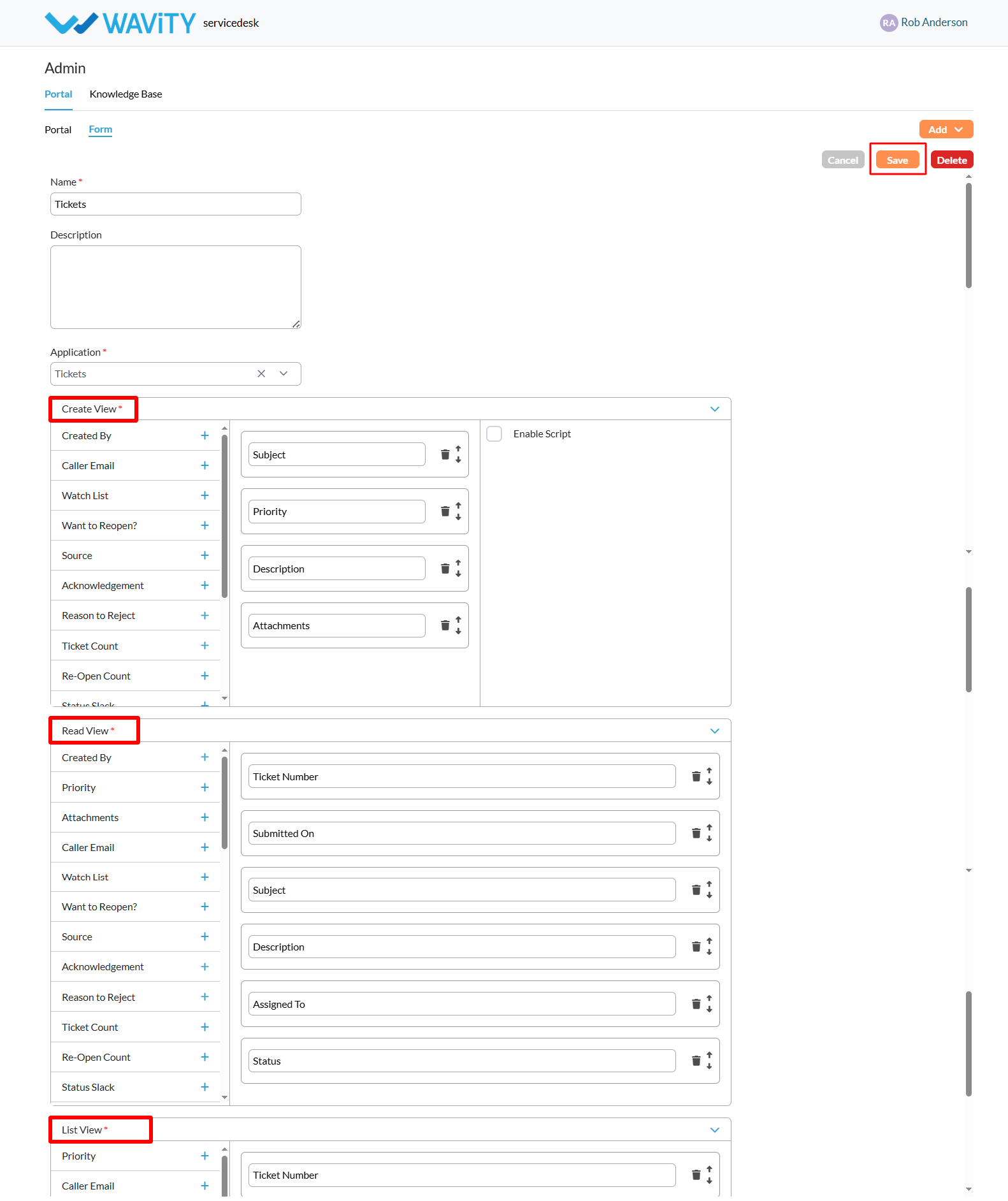
- Once an application is selected, the Create View will appear. This is where you configure the fields that users must complete when submitting the form.
- All available fields from the chosen application will be listed on the left. Click the “+” icon to add the desired fields to your request form.

- Added fields will appear in the center section. You can rearrange them as needed by dragging and dropping.
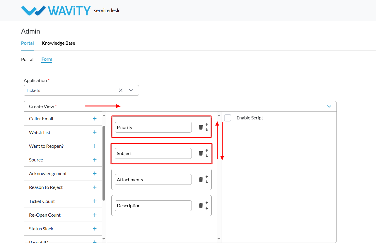
- You can also configure how the fields appear in Read View and List View, ensuring consistency across the portal
- Once everything is set up, click the “Save” button to finalize and publish your request form.
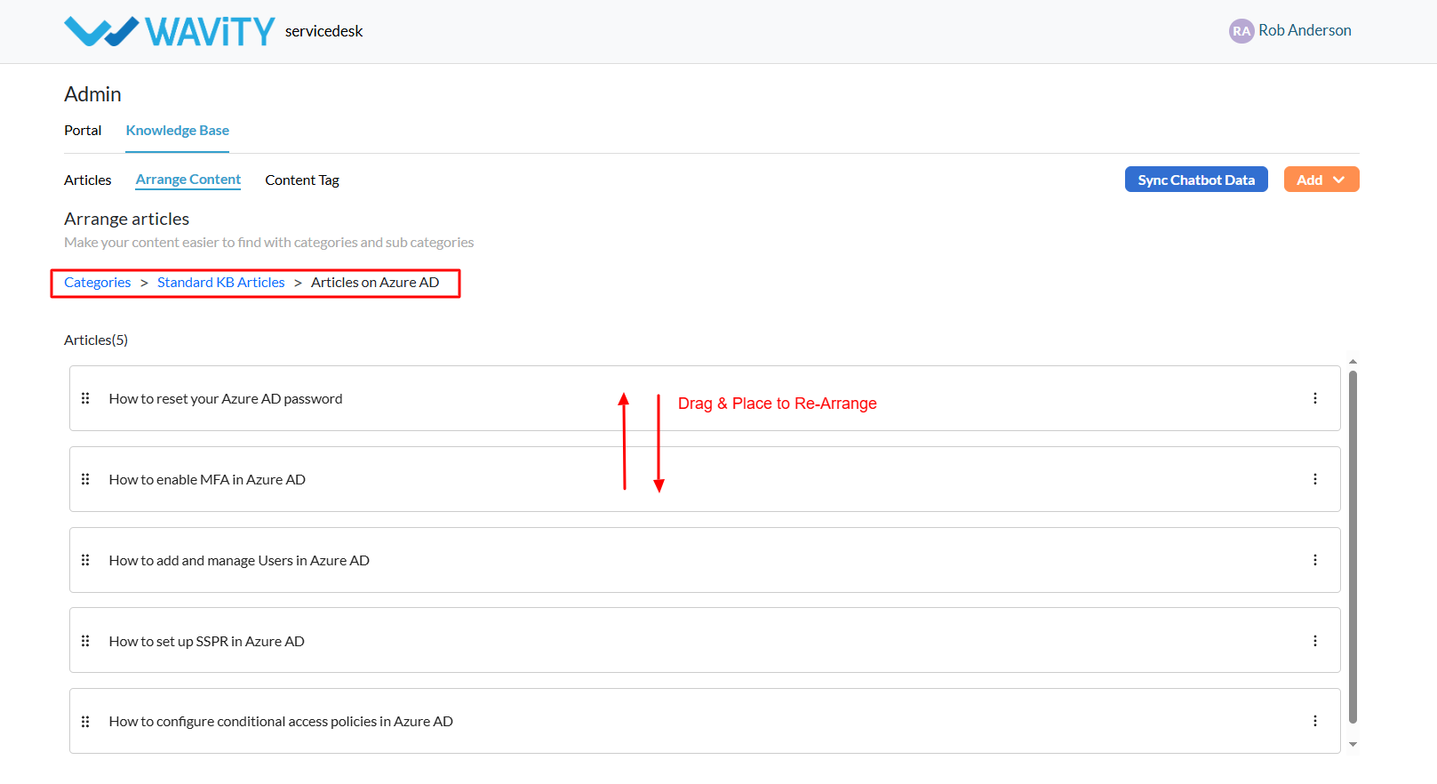
Re-Arranging Knowledge Base (KB) Articles
- A customer self-service portal allows users to manage their support requests, track ticket statuses, and submit new issues all in one place. It also integrates with the knowledge base, offering relevant articles, FAQs, and troubleshooting tips based on the customer’s queries.
- Only an Admin in your organization can create and manage Knowledge Base (KB) articles in the portal.
- To begin, click on the Portal icon as shown in the image below.
- Select Admin, since you’ll be re-arranging knowledge base articles.
- In the admin panel, go to the Knowledge Base section and select Arrange Content.
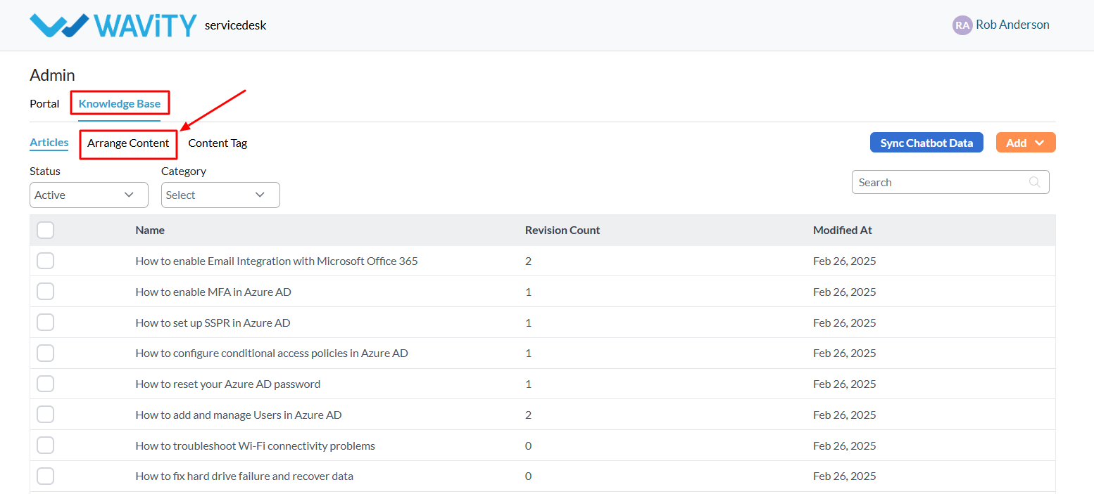
- On the Arrange Content page, you can drag and drop KB categories to reorder them as needed.
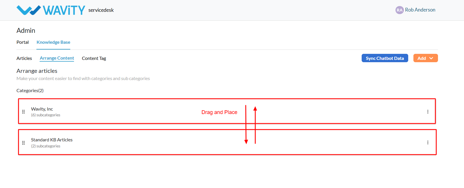
- Use the three-dot menu (⋮) next to each category to: Edit, Move to top, Move up & Move down.

- Click on a Category to view its sub-categories and articles.

- You can also navigate between categories and their articles using the menu on this page.
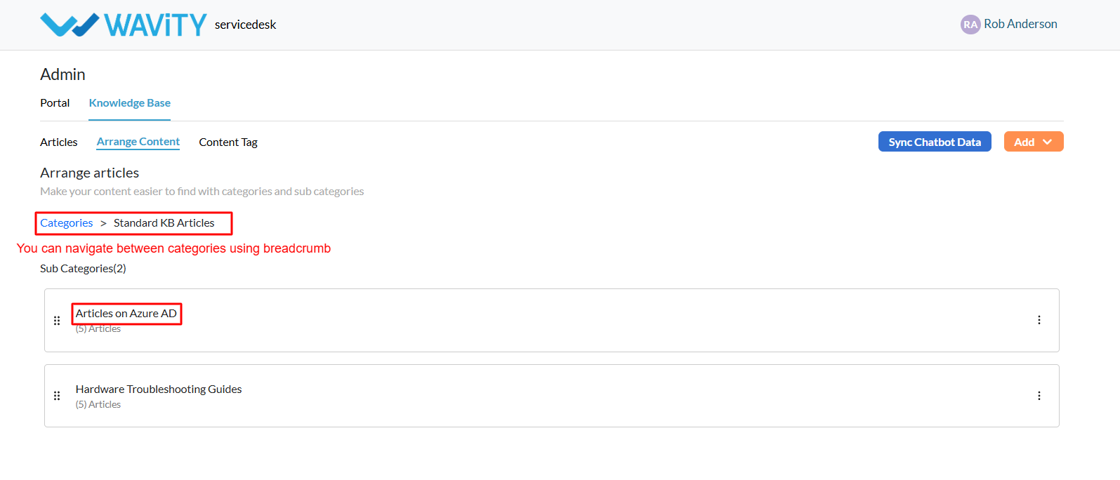
- Similar to categories, articles within a sub-category can be reordered using the drag-and-drop feature or the three-dot menu for additional options.
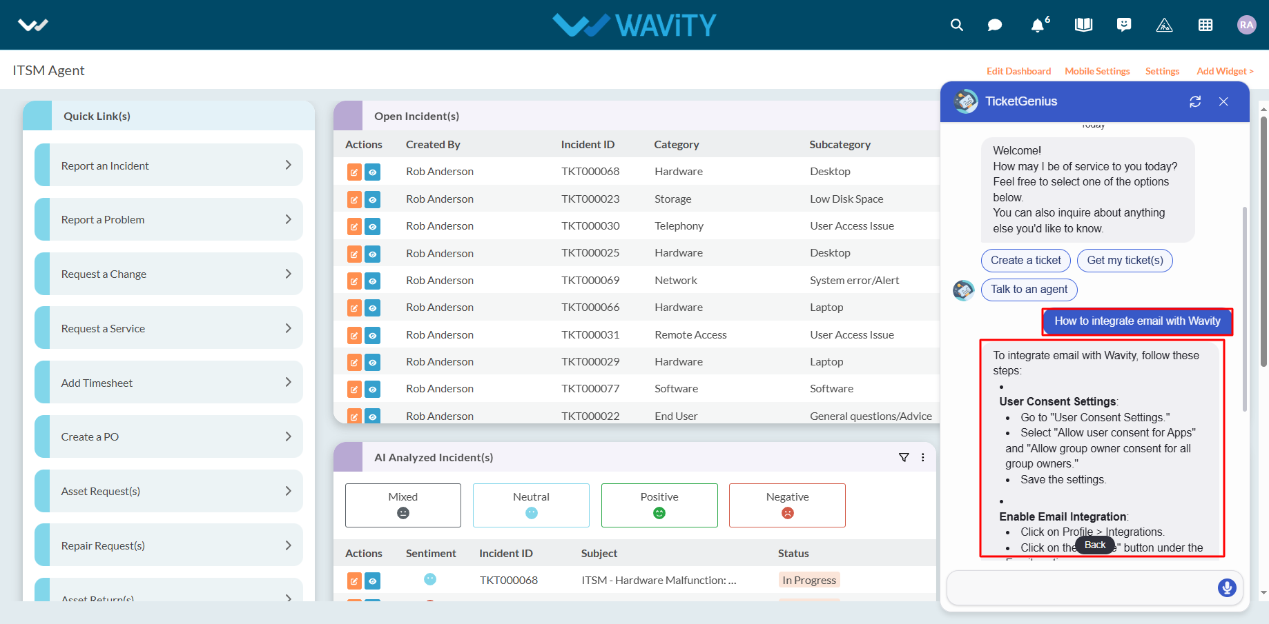
Syncing KB Articles with the AI Chatbot
- A customer self-service portal allows users to manage their support requests, track ticket statuses, and submit new issues all in one place. It also integrates with the knowledge base, offering relevant articles, FAQs, and troubleshooting tips based on the customer’s queries.
- Only an Admin in your organization can create and manage Knowledge Base (KB) articles in the portal.
- To begin, click on the Portal icon as shown in the image below.
- Select Admin, since you’ll be syncing KB articles with Wavity’s AI Chatbot.
- In the admin panel, go to the Knowledge Base section and select Articles.
- A list of all existing knowledge base articles in the portal will be displayed.
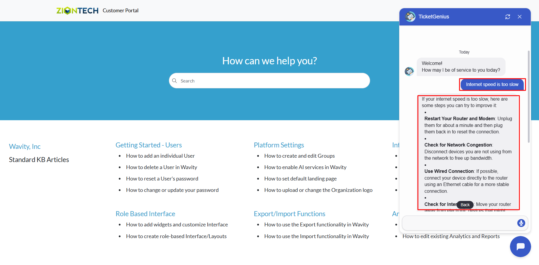
- Click the Sync Chatbot Data button.This syncs the current KB articles with Wavity’s AI Chatbot (TicketGenius).
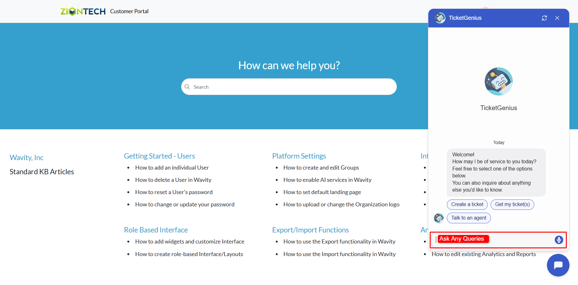
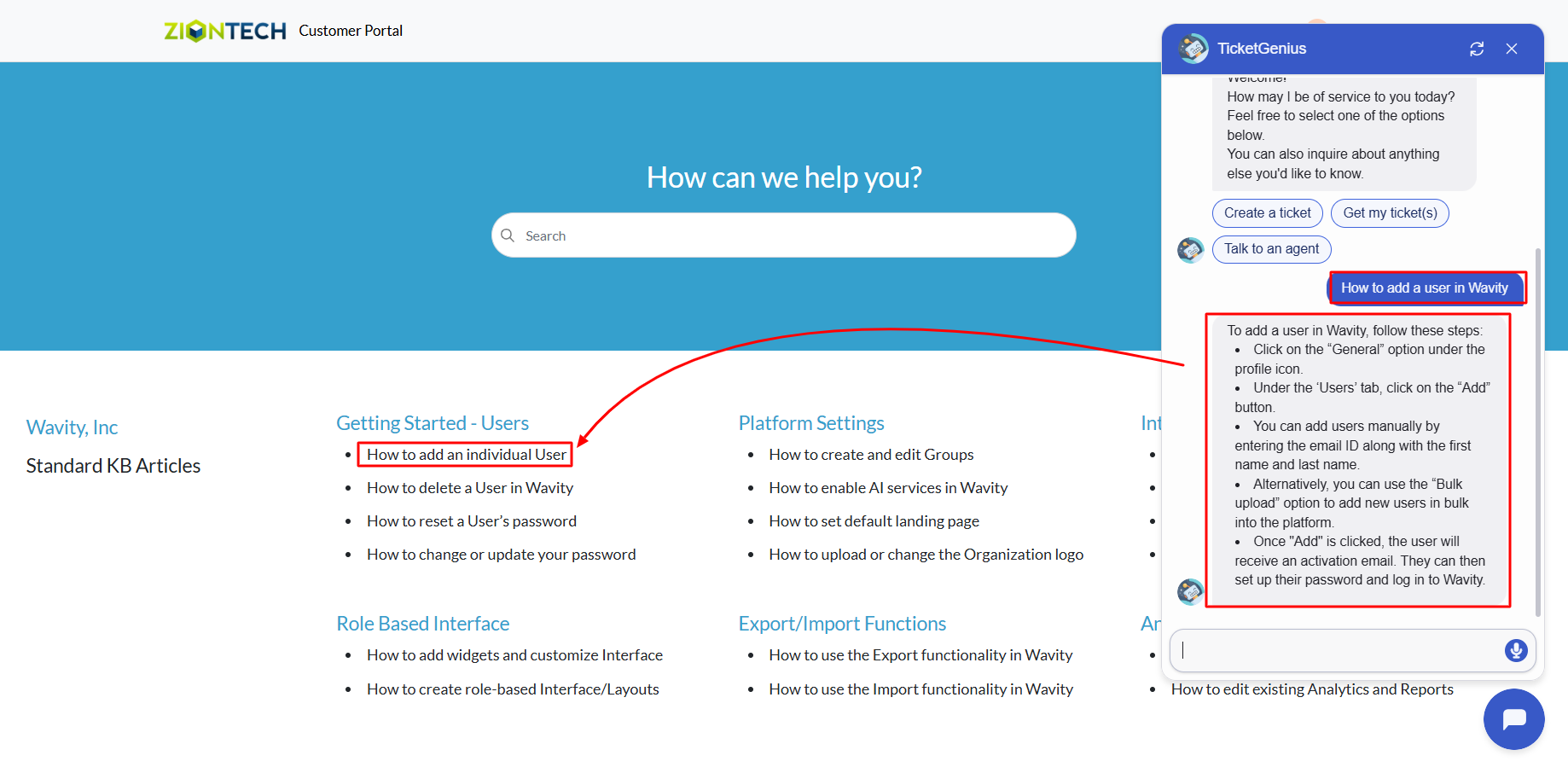
- After syncing, when a user interacts with TicketGenius and submits a query, the chatbot will automatically check the Knowledge Base for relevant articles. If a matching article is found, the chatbot will respond with a helpful, summarized version of the content.

- Launch the AI Chatbot from any supported interface.
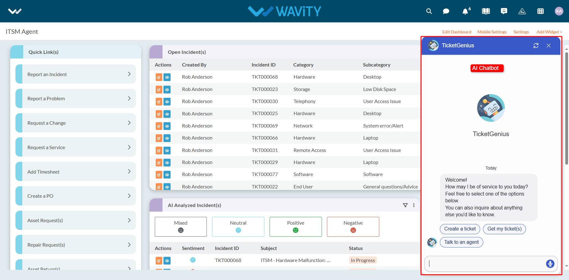
- As shown in the example below, when a user asks a question, the chatbot responds by referencing the appropriate Knowledge Base article.
Customer Portal – Track your Request
- The Wavity customer self-service portal provides users with a centralized platform to manage support requests, track the status of existing tickets, and submit new issues. It also integrates seamlessly with the Knowledge Base, offering relevant articles, FAQs, and troubleshooting tips based on user queries.
- Sign in using your email ID and password.

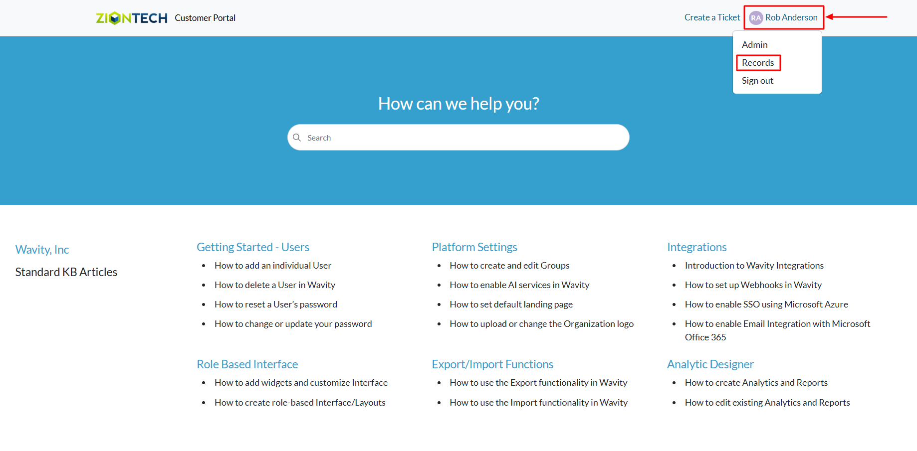
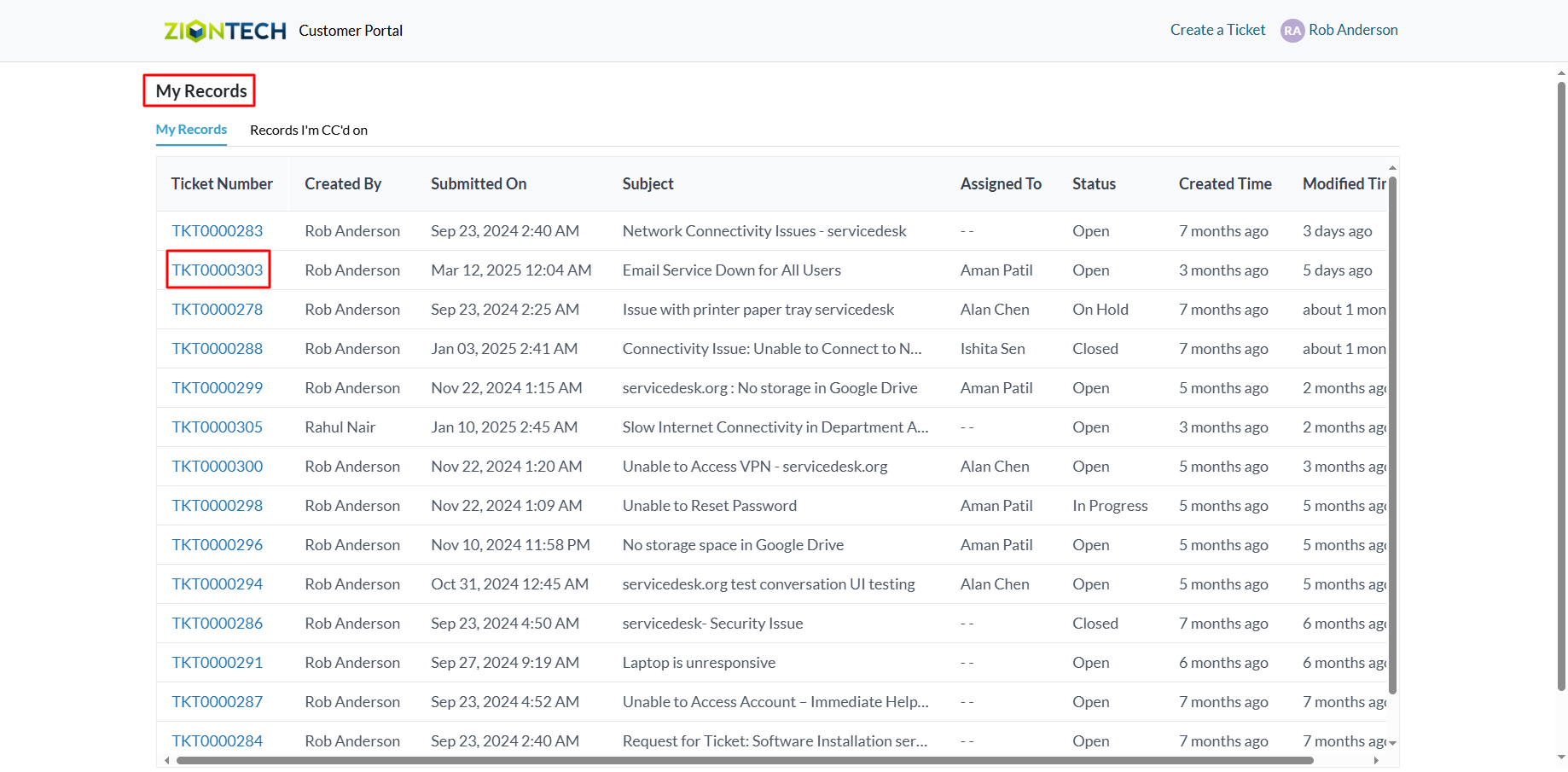
- Viewing Your Tickets (Requests): On the Customer Portal homepage, click the profile icon in the top corner. From the dropdown menu, select “Records” to view all of your submitted tickets (also called Requests).
- Interacting on a Ticket: Click on any Ticket Number to open its detailed view.
- The ticket page is divided into two sections: Left Section: Displays the full conversation history. Right Section: Shows ticket details such as status, priority, and other data.
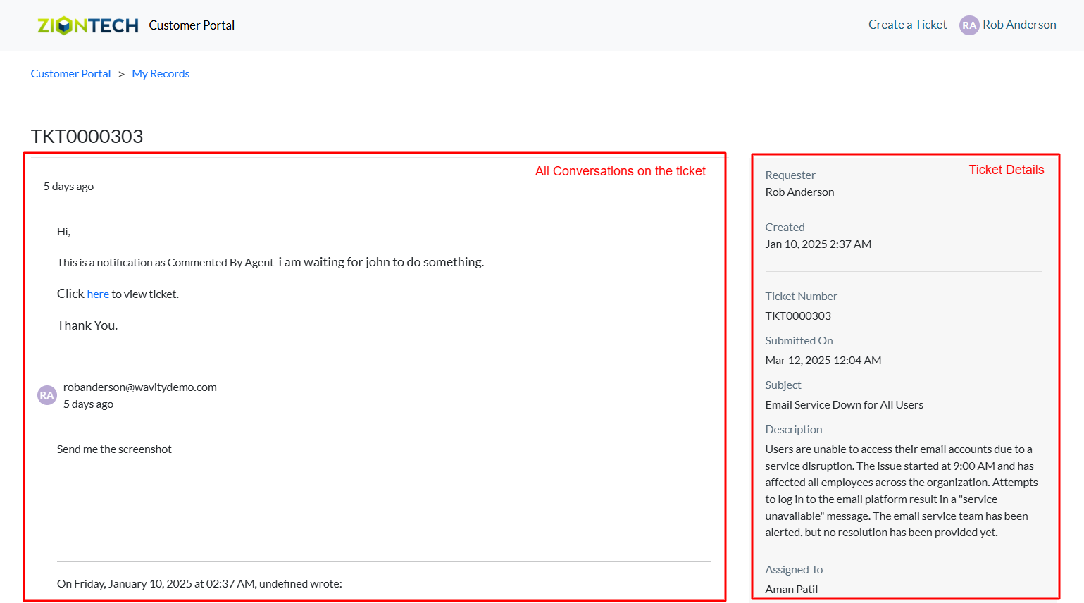
- To respond or add a comment: Scroll to the bottom of the page, Enter your response in the provided field, Click Submit to update the ticket.

Creating Tickets via Customer Self-Service Portal
- The Wavity customer self-service portal provides users with a centralized platform to manage support requests, track the status of existing tickets, and submit new issues. It also integrates seamlessly with the Knowledge Base, offering relevant articles, FAQs, and troubleshooting tips based on user queries.
- Sign in using your email ID and password.
- If enabled by an administrator, the portal can also be accessed publicly via a shared URL—no login required.
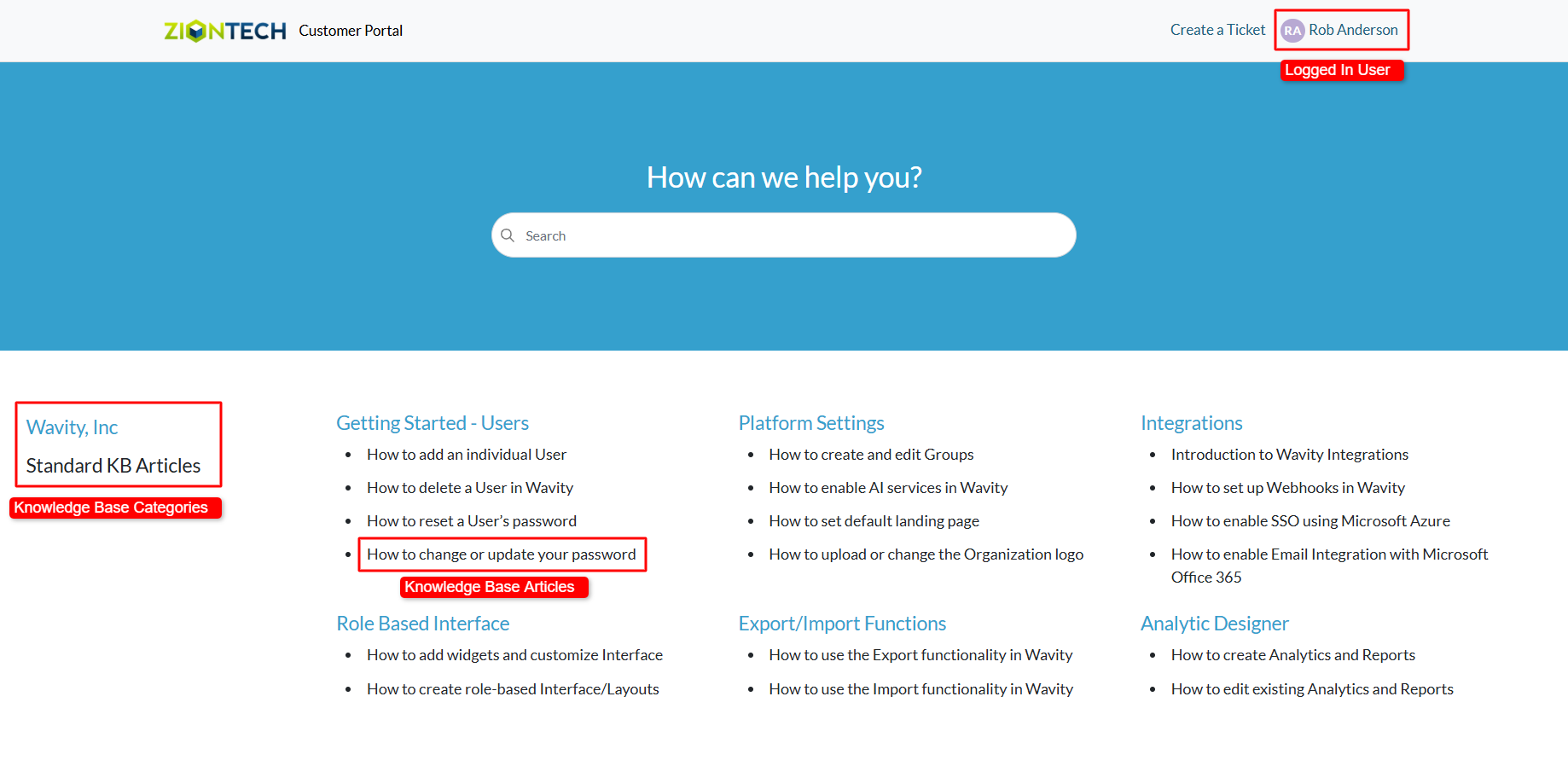
- Below image shows a customer portal with all Knowledge base articles as a reference.
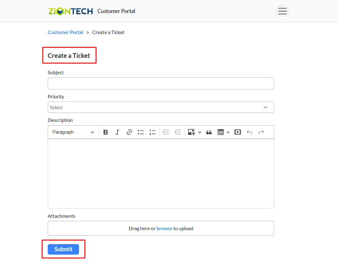
- On the customer portal homepage, locate and click the “Create a Ticket” button.

- A request form will appear. Fill out the necessary details and click Submit to create a new support ticket on the Wavity platform.
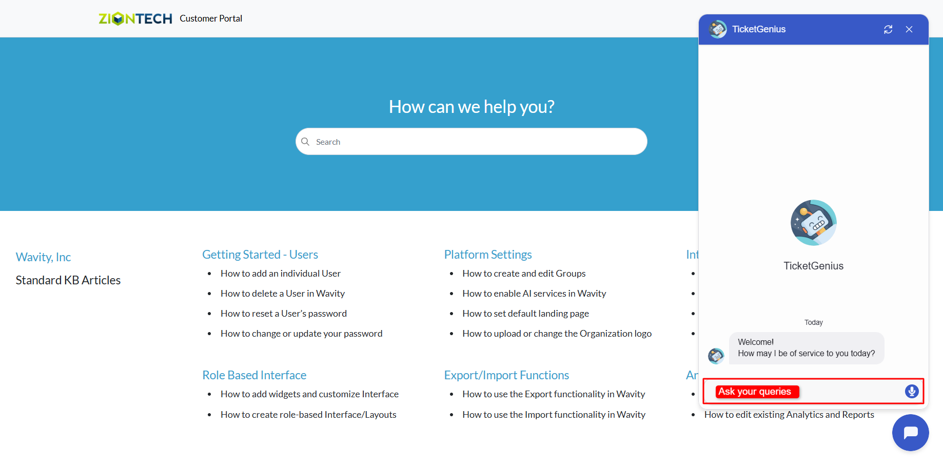
- Creating a Ticket via the AI Chatbot. Click on the AI Chatbot icon located at the bottom-right corner of the screen.
- Within the chatbot interface, select “Create a Ticket.”
- Follow the prompts to provide the required information and complete the ticket creation process.
Archiving & Restoring KB Articles
- A customer self-service portal allows users to manage their support requests, track ticket statuses, and submit new issues all in one place. It also integrates with the knowledge base, offering relevant articles, FAQs, and troubleshooting tips based on the customer’s queries.
- Only an Admin in your organization can create and manage Knowledge Base (KB) articles in the portal.
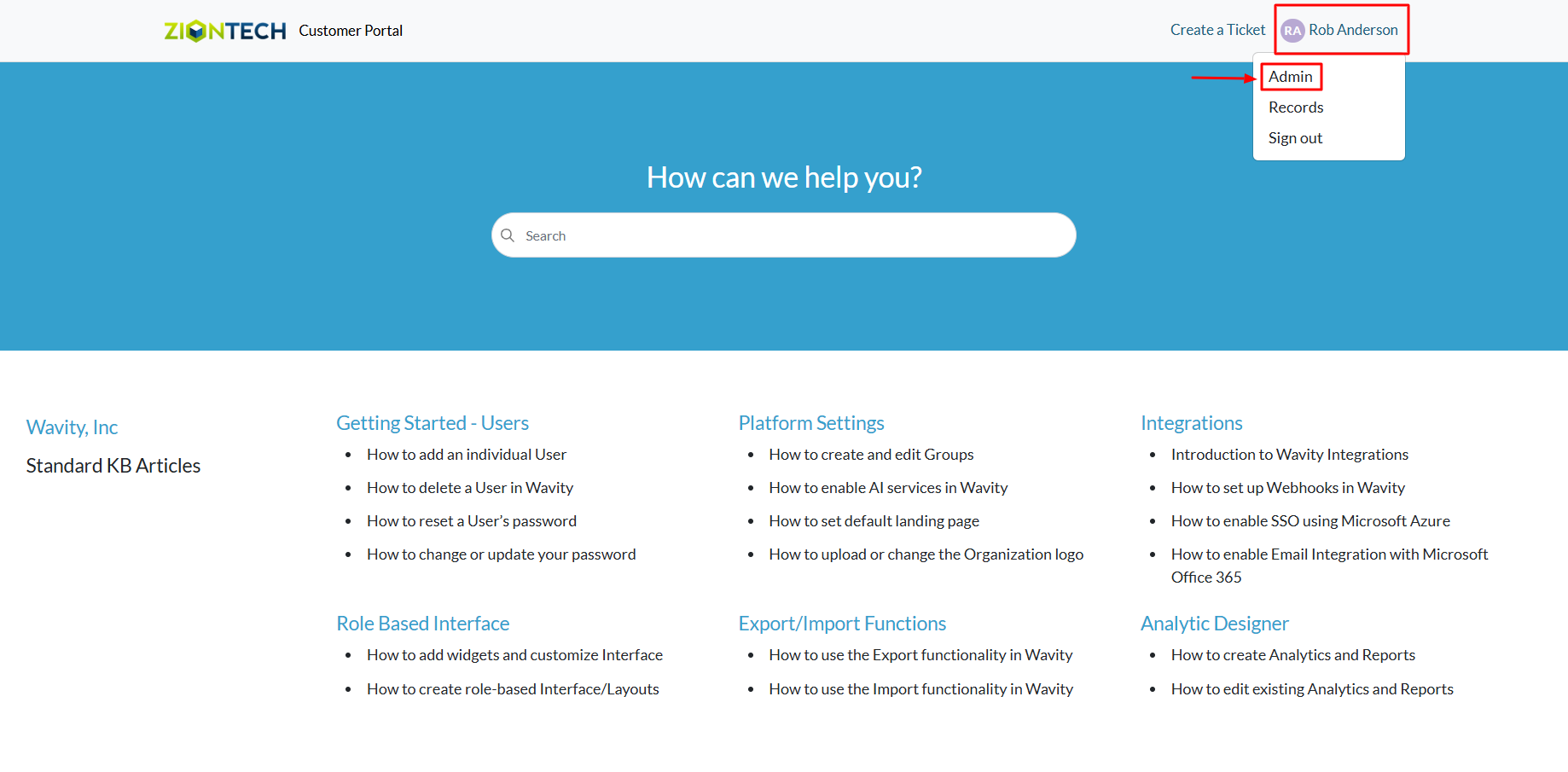
- To begin, click on the Portal icon as shown in the image below.
- Select Admin, since you’ll be archiving and restoring KB articles.
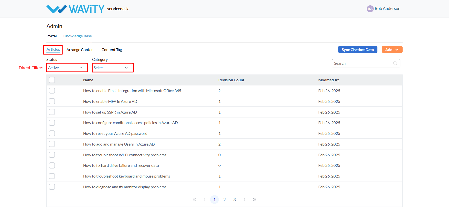
- In the admin panel, go to the Knowledge Base section and select Articles.
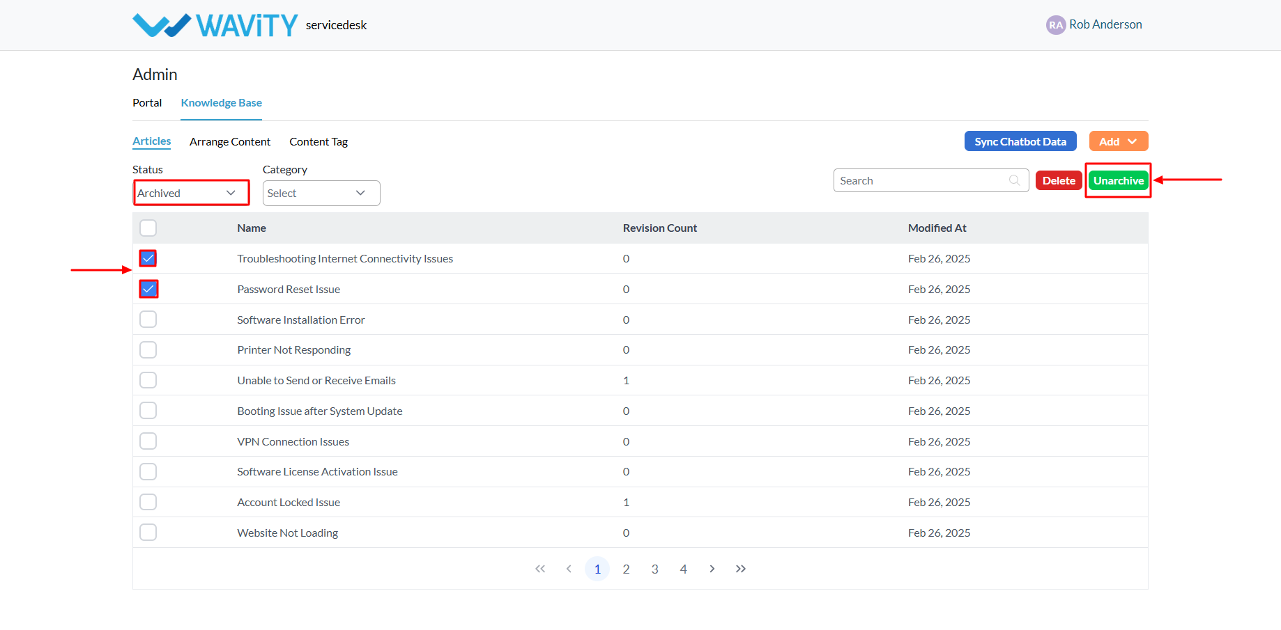
- Use the available filters to: View Active or Archived articles and Filter articles by Category.
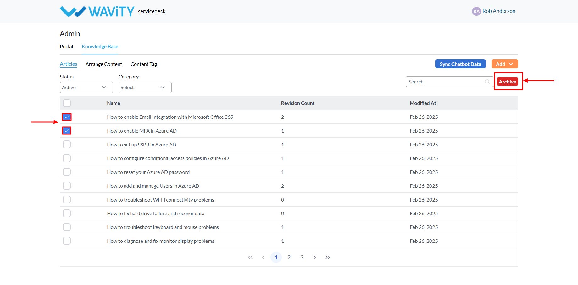
- To Archive articles: Select the active article(s) you want to archive. Click the Archive button. Once archived, these articles will no longer be visible in the customer portal.
- To Restore (Unarchive) an Article: Switch the filter to view Archived articles. Select the article(s) you want to restore. Click the Unarchive button to make them visible again in the portal.
Creating Content Tags for KB Articles
- A customer self-service portal allows users to manage their support requests, track ticket statuses, and submit new issues all in one place. It also integrates with the knowledge base, offering relevant articles, FAQs, and troubleshooting tips based on the customer’s queries.
- Only an Admin in your organization can create and manage Knowledge Base (KB) articles and Content tags in the portal.
- To begin, click on the Portal icon as shown in the image below.
- Select Admin, since you’ll be creating a new content tags.
- In the admin panel, go to the Knowledge Base section and select Articles.

- A list of all existing knowledge base articles in the portal will be displayed.
- Click on the Add button and choose Content Tag.

- Provide a name for the new content tag, then click Save. You can now assign this tag to multiple articles for easier organization and searchability.

Setup Guide : Network-Based Asset Discovery Tool
Wavity offers a Network-Based Asset Discovery tool designed to help you automatically detect devices connected to your network. By scanning your network, the tool identifies all devices and creates or updates corresponding asset records within the Wavity application.
It achieves this by utilizing the MAC address of each device, which serves as a unique identifier, allowing the system to accurately track and manage assets. This ensures that the information within the Wavity platform stays current and reliable, helping you maintain an up-to-date inventory of all devices across your network for better visibility and management.
This guide walks you through the process of setting up and using the Network-Based Asset Discovery tool, so you can efficiently manage your network assets.
Prerequisites
Before beginning the setup, ensure you have the following:
1. Host Machine: A Linux machine (or compatible environment) to run the Wavity Discovery utility.
2. Docker Installation: Docker must be installed on the host machine.
3. Wavity Network Utility Docker Image: Download the image from Docker Hub (Wavity Network Utility).
4. Defined IP Address Range: Determine the IP range for scanning, targeting the specific network segments where your assets reside.
Step 1: Running the Docker Image for the Network Scan
Before starting the scan, confirm that you have already configured the mapping of network scan results to the appropriate fields in your Wavity environment (see Step 2).
Execute the following command to launch the scan:
docker run \
--network host \
--env TENANT_URL="https://{tenant_url}/oneteam/customer/shared/devices" \
--env SCAN_INTERVAL="5" \
--env SCAN_NETWORK="<IP Address range>" \
--env SCAN_MAX_RETRIES="0" \
--env SCAN_HOST_TIMEOUT="5" \
--env SCAN_VERBOSE="true" \
--env SCAN_EXTRA_OPTIONS="-Pn" \
wavity/netscan:2.0.0-SNAPSHOT
Key Parameters:
• TENANT_URL: Your unique Wavity link (e.g.,
https://acme.wavity.com/oneteam/customer/shared/devices).
• SCAN_INTERVAL: The interval between scans, for example, 5 seconds.
• SCAN_NETWORK: The target IP range to scan (e.g., 192.168.32.0/24).
This command searches your network, automatically adding new devices as assets and updating existing ones based on their MAC addresses.
Step 2: Mapping Network Scan Results to Wavity
To ensure discovered devices are stored correctly in Wavity, complete this one-time configuration:
1. Access the Asset Discovery Section:
- Log into Wavity and navigate to the General Settings page.
- Locate the Asset Discovery section (Note: This page is accessible only by administrators).
2. Configure Application and Field Mapping:
- Select the Wavity application where the devices should be recorded.
- Map the relevant fields (such as asset type, MAC address, and IP address) to ensure accurate data capture.
- Click Save to finalize the configuration.
This setup guarantees that scan results are correctly integrated into your asset management system.
Step 3: Managing Scan Results and Assets
After the scan completes, the Network-Based Asset Discovery Tool automatically manages your assets:
- New Assets: Any devices discovered during the scan are added as new assets.
- Updated Assets: Existing devices are updated with the latest information
This automated process ensures that your asset management is always up-to-date, eliminating manual data entry and reducing the chances of errors.
Creating a Knowledge Base Article
- A customer self-service portal allows users to manage their support requests, track ticket statuses, and submit new issues all in one place. It also integrates with the knowledge base, offering relevant articles, FAQs, andtroubleshooting tips based on the customer’s queries.
- Only an Admin in your organization can create and manage Knowledge Base (KB) articles in the portal.
- To begin, click on the Portal icon as shown in the image below.
- Select Admin, since you’ll be creating a new knowledge base article.
- In the admin panel, go to the Knowledge Base section and select Articles.
- A list of all existing knowledge base articles in the portal will be displayed.
- Click on the Add button and choose Article.
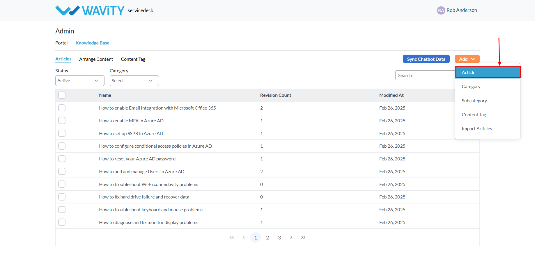
- Enter the title and body of the article. You can easilycopy and paste content from Word, PDF, or other file formats.
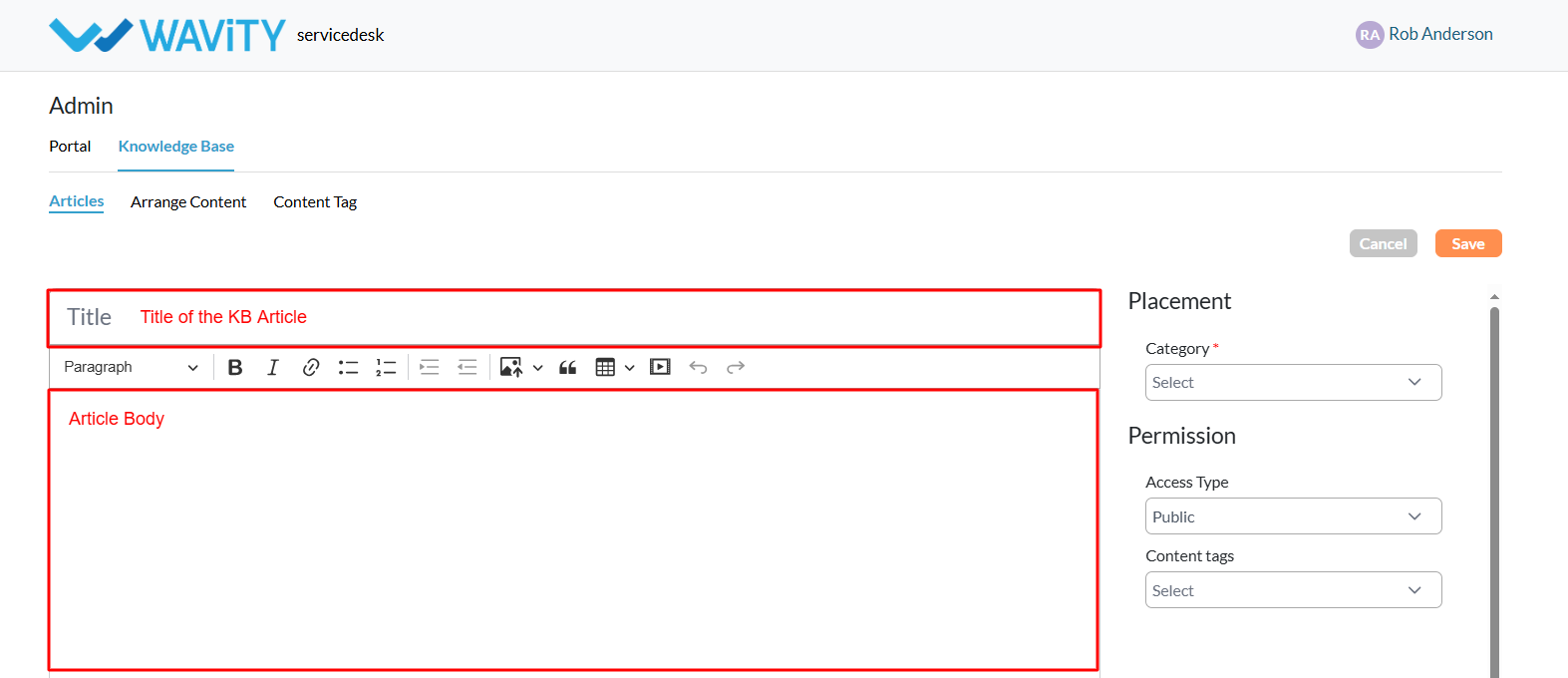
- To properly categorize your article within the portal, select a Category and a Subcategory. The subcategory options will populate based on the category you choose.

- Define who can view the article.
- To make it accessible to all users, including external users, set theaccess type to Public.
- If you choose Private, you’ll be prompted to specify which users, groups, organizations, or access groups from your Wavity tenant can viewthe article.
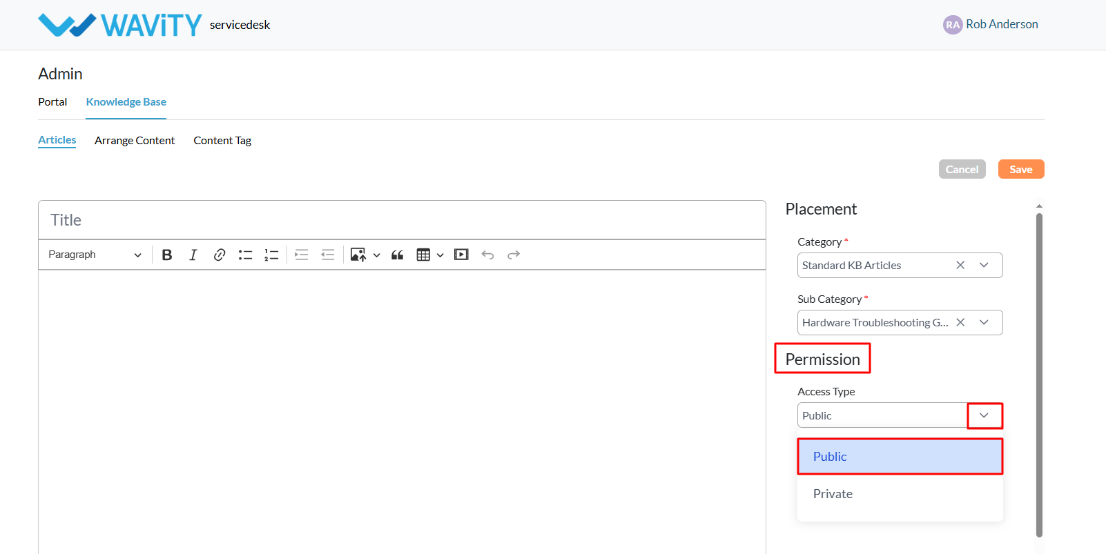
- After selecting “Private” as access type, you’ll be prompted to choosespecific users, groups, organizations, or access groups from the Wavity tenant who should have access to the KB article.
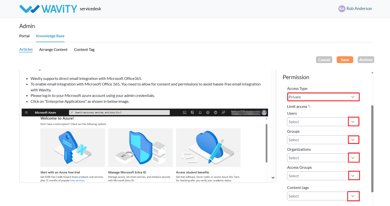
- Click the “Save” button to complete the creation and publishing of your knowledge base article.
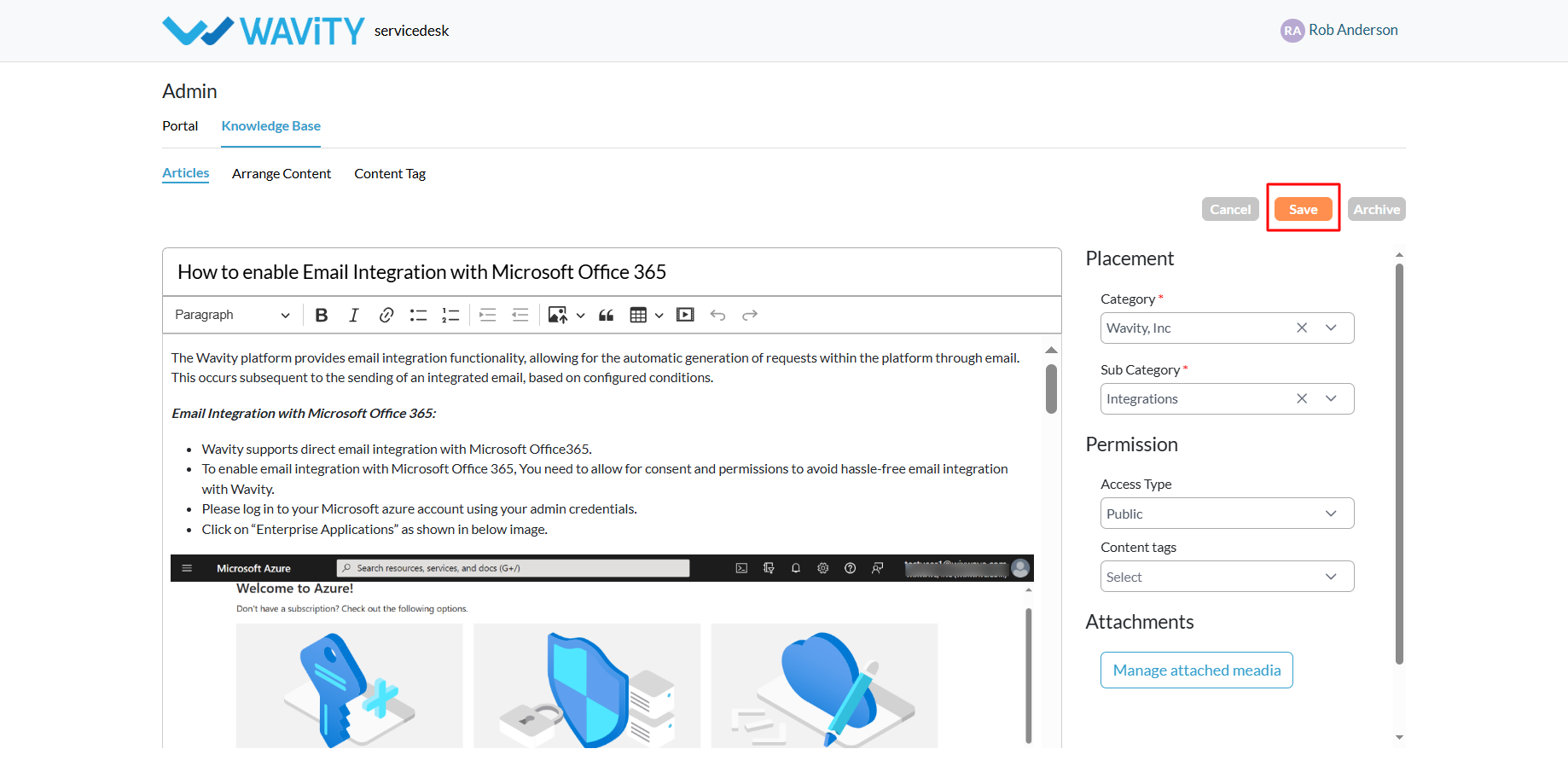
Creating Knowledge Base Articles via Import
- A customer self-service portal allows users to manage their supportrequests, track ticket statuses, and submit new issues all in one place. Italso integrates with the knowledge base, offering relevant articles, FAQs, andtroubleshooting tips based on the customer’s queries.
- Only an Admin in your organization can import Knowledge Base(KB) articles into the portal.
- To begin, click on the Portal icon as shown in the image below.
- Select Admin, since you’ll be using the import feature to add new KB articles.
- In the admin panel, go to the Knowledge Base section and select Articles.
- A list of all existing knowledge base articles in the portal will bedisplayed.
- From the Add dropdown menu, select Import Articles.
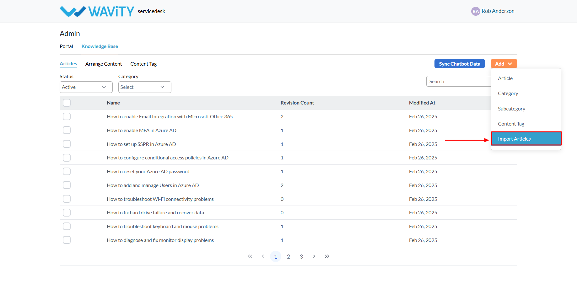
- Choose the Default Location where the imported articles will beplaced within the portal.
- Define access permissions: Select Public to make the articles accessible to allusers.
- If you choose Private, you’llneed to specify the users, groups, organizations, or access groups fromyour Wavity tenant who shouldhave access to the articles.
- Select the file from your system that contains the articles to beimported. You may refer to the sample article import template if neededfor formatting guidance.
- Once the file is selected, click the “Save” button to complete theimport process and add the KB articles to your portal.
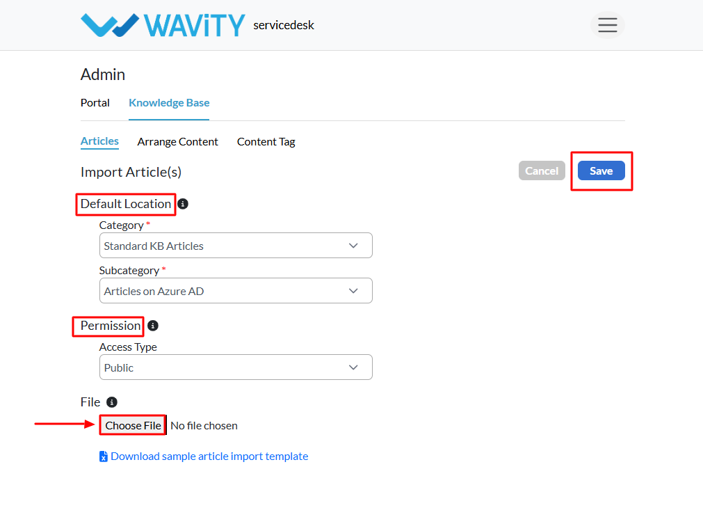
Creating Knowledge Base Category
- A customer self-service portal allows users to manage their support requests, track ticket statuses, and submit new issues all in one place. Italso integrates with the knowledge base, offering relevant articles, FAQs, andtroubleshooting tips based on the customer’s queries.
- Only an Admin in your organization can add Knowledge Base (KB) categories to the portal.
- Click on the Portal icon as shown in the image below.
- Select Admin, since you'll be setting up a new category in the Knowledge Base.
- In the admin panel, go to the Knowledge Base section and select Articles.
- A list of all existing knowledge base articles in the portal will be displayed.
- From the Add menu dropdown, select Category.

- Enter the name of the new category and an optional description.
- Click the Save button to create and add the new category to the portal.
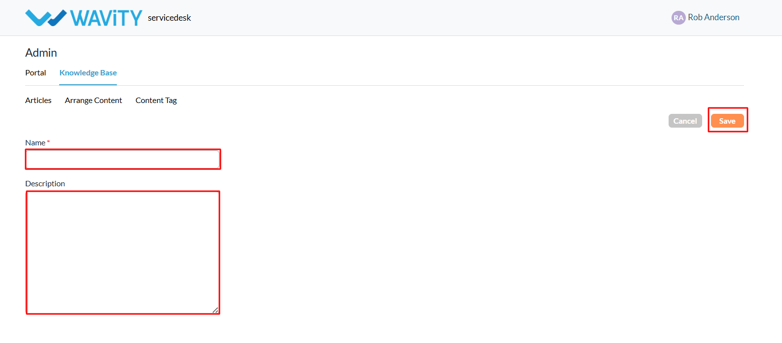
- An example of a configured portal is shown below, illustrating how the category, sub-category, and KB article title will appear to users.
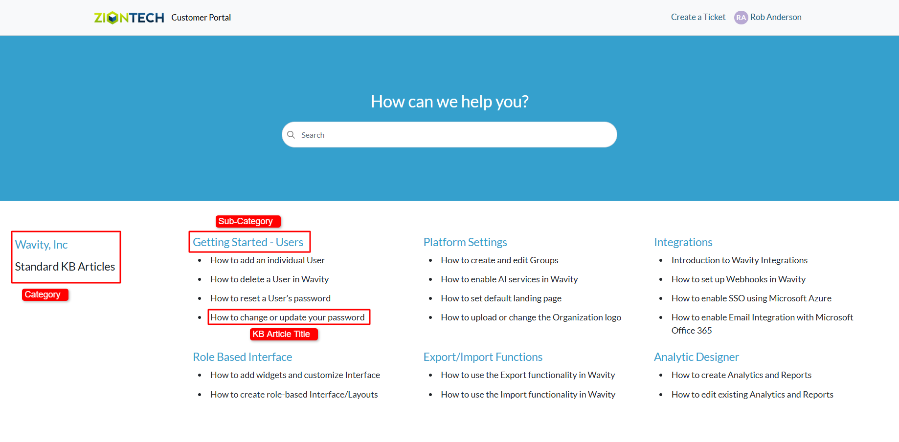
Creating Knowledge Base Sub-Category
- A customer self-service portal allows users to manage their supportrequests, track ticket statuses, and submit new issues all in one place. Italso integrates with the knowledge base, offering relevant articles, FAQs, andtroubleshooting tips based on the customer’s queries.
- Only an Admin in your organization can add Knowledge Base (KB) Sub-Category to the portal.
- Click on the Portal icon as shown in the image below.
- Select Admin, since you'll be setting up a new Sub-Category in theKnowledge Base.
- In the admin panel, go to the Knowledge Base section and select Articles.
- A list of all existing knowledge base articles in the portal will bedisplayed.
- From the Add menu dropdown, select Sub-Category.
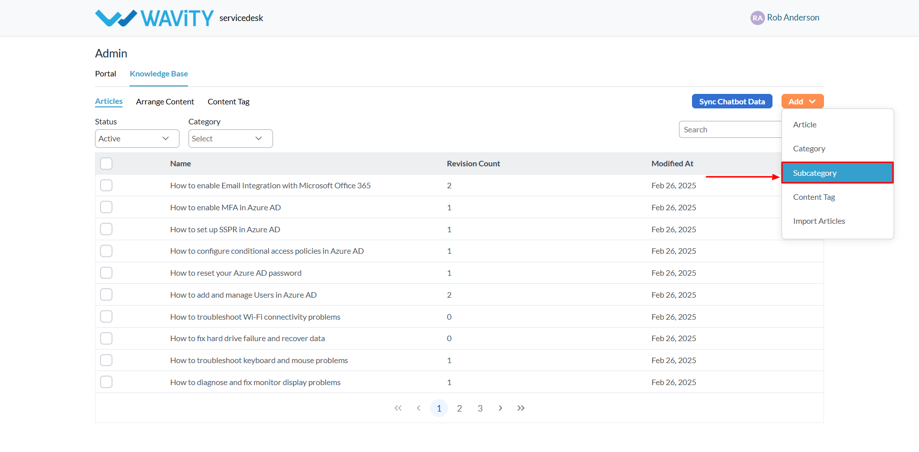
- Enter the name of the new sub category.
- Select he Category under which the Sub-Category will appear.
- Click the Save button to create and add the new Sub-Category tothe portal.
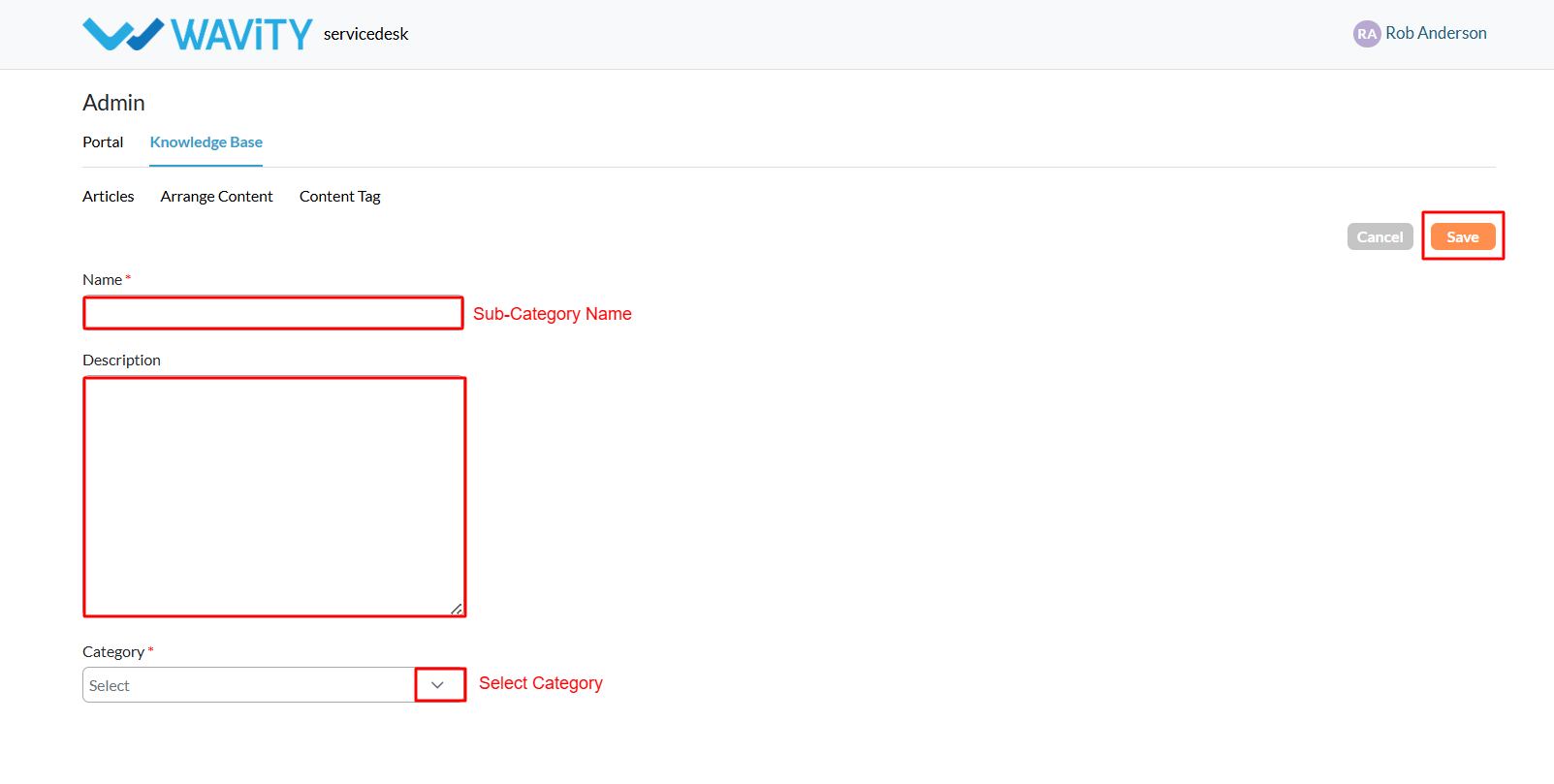
- An example of a configured portal is shown below, illustrating how the category, sub-category, and KB article title will appear to users.
How to enable Slack Integration
- Only Admin of your organization can enable Slack integration by entering the appropriate configuration details in 'Integrations’ settings.
- Wavity platform supports Slack integration functionality, enabling notifications to be sent via Slack based on specified parameters and conditions.
- It's recommended to create a new workspace in Slack for linking with Wavity. Additionally, ensure you are logged into the Slack workspace.
- Navigate to Slack Integration settings. Go to Platform settings> Integration > Slack
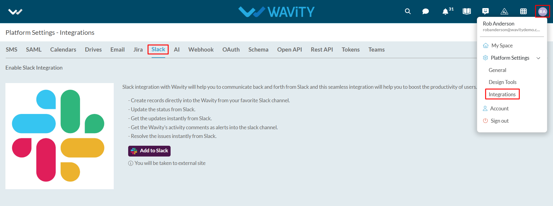
- Click on “Add to Slack”

- A new window will appear. Click on “Allow” to complete the linking process.
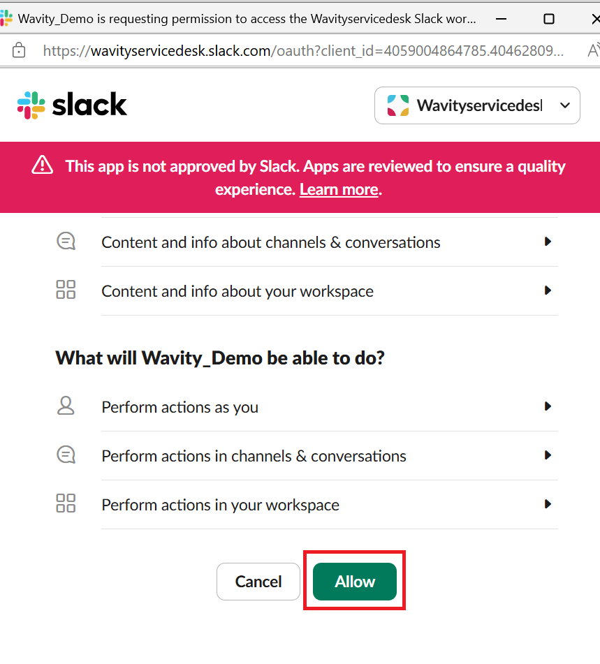
- Next, to map Wavity Applications to Slack, click on the ‘Create’ button.
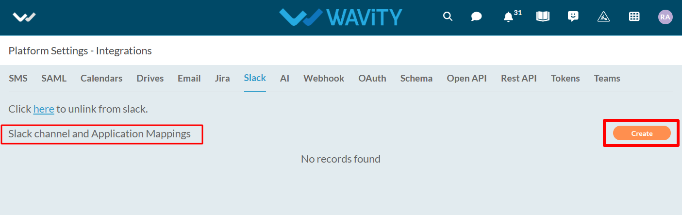
- Select the Slack channel from the workspace that is linked to Wavity.

- Choose the Wavity application you want to link with Slack and set the appropriate parameters according to your requirements. Click on the ‘Save’ button to finish the setup.
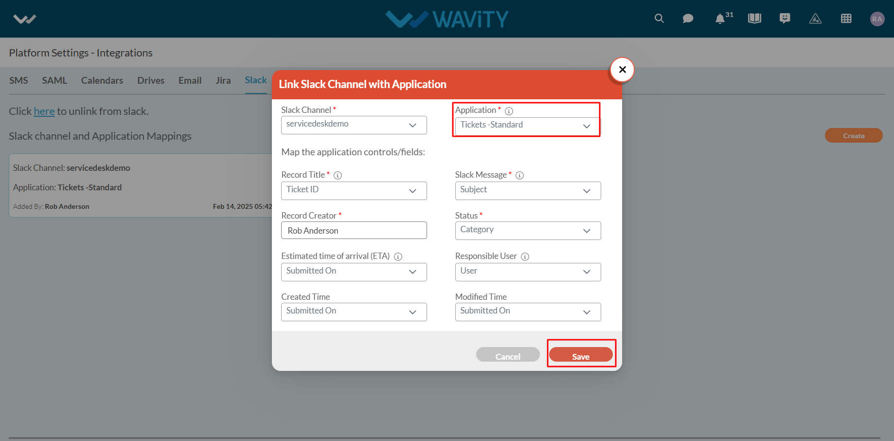
- Your Slack channel is now successfully linked to Wavity. You can edit or remove the channel if needed.
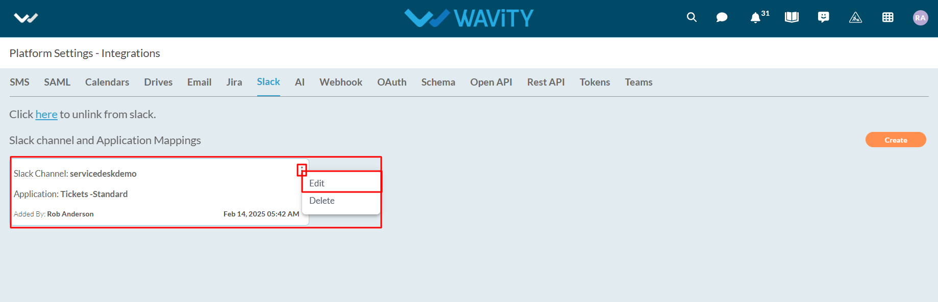
Managing Helpdesk Tickets via Slack Commands
- Available commands in Slack:
- /create: creates a helpdesk ticket.
- /get: gets ticket details.
- /comment: adds a comment to your ticket.
- /complete: closes the ticket.
Create a New Ticket: In the message box, type “/cre” and select the /create command from the dropdown (as shown in the image below).

- Enter Ticket Subject: Type in the subject for your ticket and press Enter to create a new ticket.

- Ticket Created: A new ticket is created with the status set to “open.”
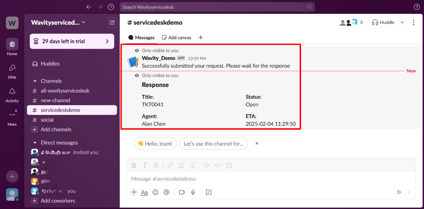
- Access Ticket in Wavity Platform: Open the newly created ticket in Wavity platform.
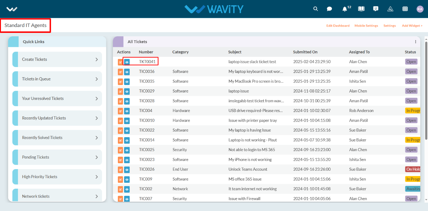
- Update Ticket Status: Change the status of the ticket to “In Progress” and click Save to update the record.

- Automated Slack Notification: A notification will automatically appear in Slack, showing the updated status of the ticket.
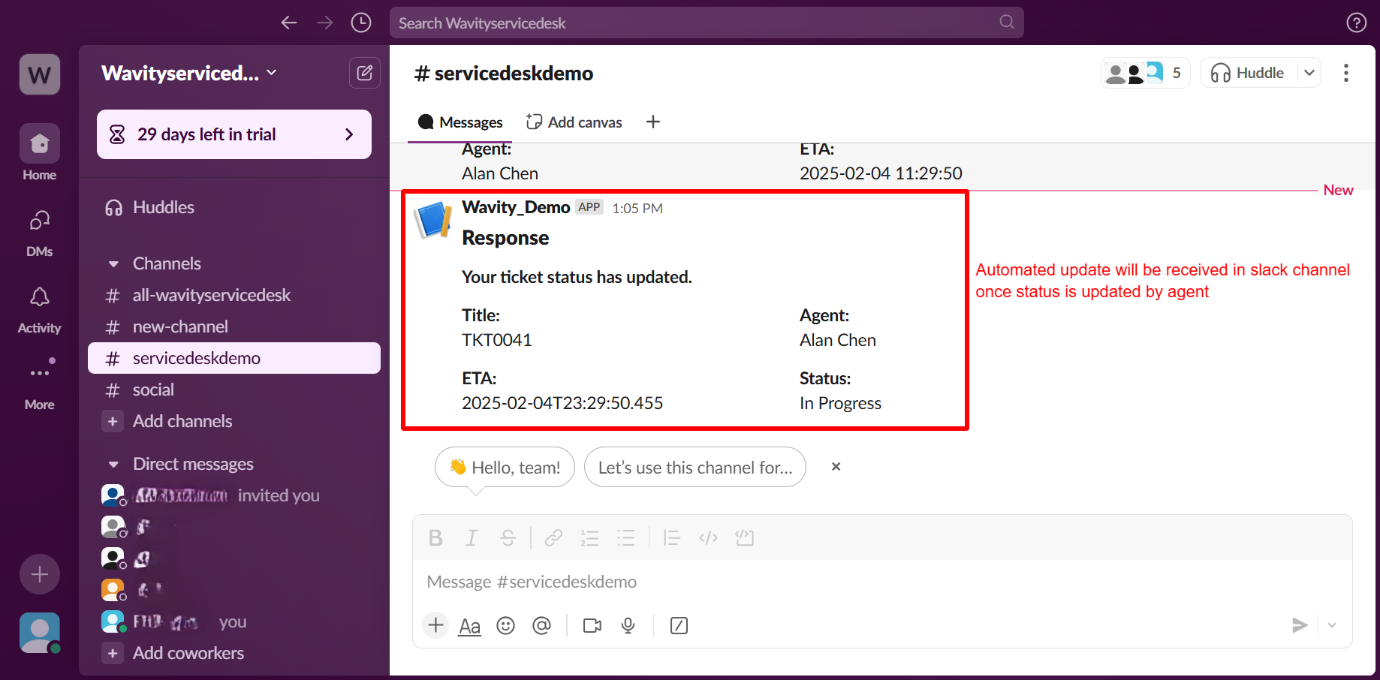
- Add a Comment to the Ticket: A comment will be added to the newly created ticket within the Wavity platform (see the image below for reference).

- Slack Notification for Comment: An automated Slack notification will display when a comment is added to the ticket.

- Add a Comment via Slack: In the Slack message box, type “/com” and select the /comment command. Enter the ticket ID, write the comment, and press Enter.
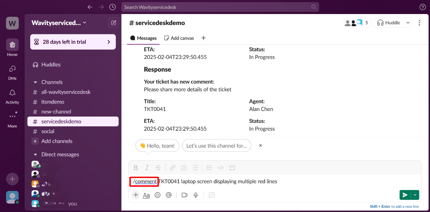
- Comment Reflected on Platform: The comment made in Slack will appear on the platform, as shown in the image below.
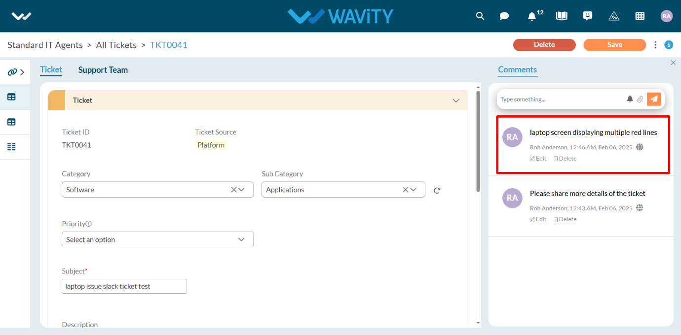
- Use Additional Slack Commands: You can also use the /get command to retrieve ticket details. In the Slack message box, type “/get” and select the /get command, then enter the ticket ID and press Enter.
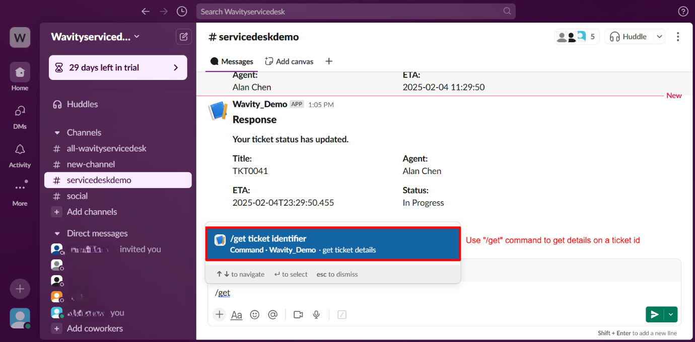
How to Use the Import Functionality in Wavity?
- Wavity offers Export and Import functionalities within its platform.
- Using the Import function, you can upload data from an Excel sheet into an existing application or an empty application.
- Log in to the Wavity platform. Based on your role, you will have access to your dashboard.
- From the quick Links, click on the application (e.g., "Inventory Management") that you want to add data by importing. Refer to the image below for guidance.
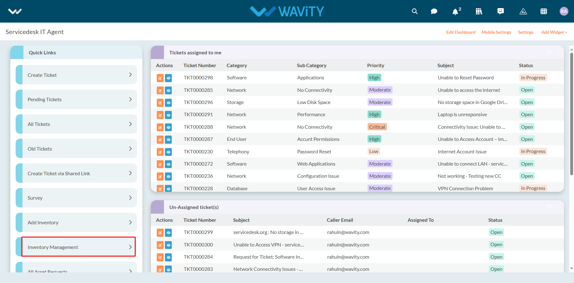
- Before importing data, it is recommended to export the template to ensure the data matches the required format.
- Export Template: Use this feature to download the application's template in Excel format.
- Click on "Export Template to Excel."
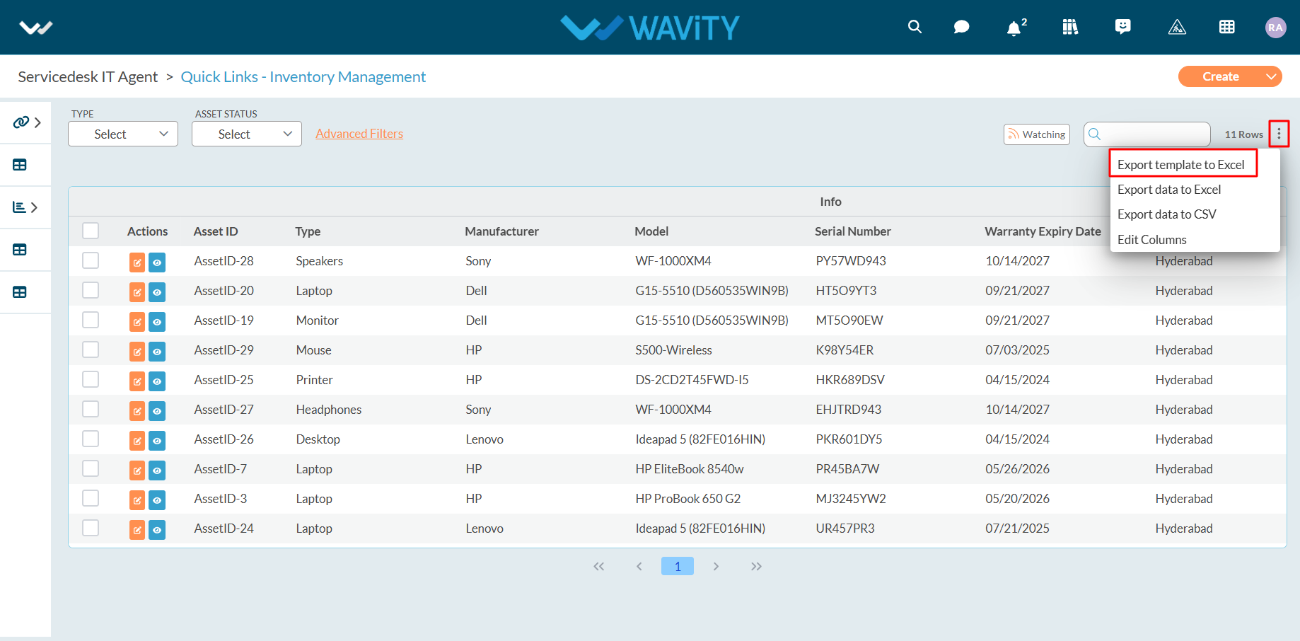
- If needed, select "Ignore Reference Applications" and then click "Export."
- Ignore Reference Applications: Check this option to exclude reference applications from the export. Leave it unchecked to include reference applications in the exported template.
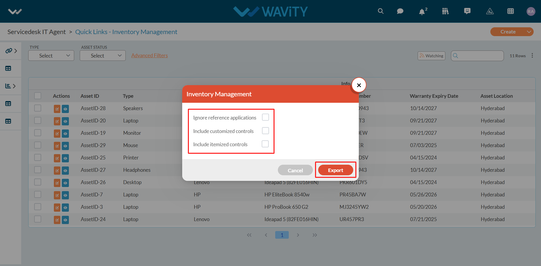
- Once you click on "Export," Excel sheet containing the template will be downloaded to your system.
- Refer to the image below for an example of the downloaded Excel sheet.

- To import data, click on the Create tab located in the top-right corner and select From Excel to upload data from Excel sheets. Refer to the image below for guidance.
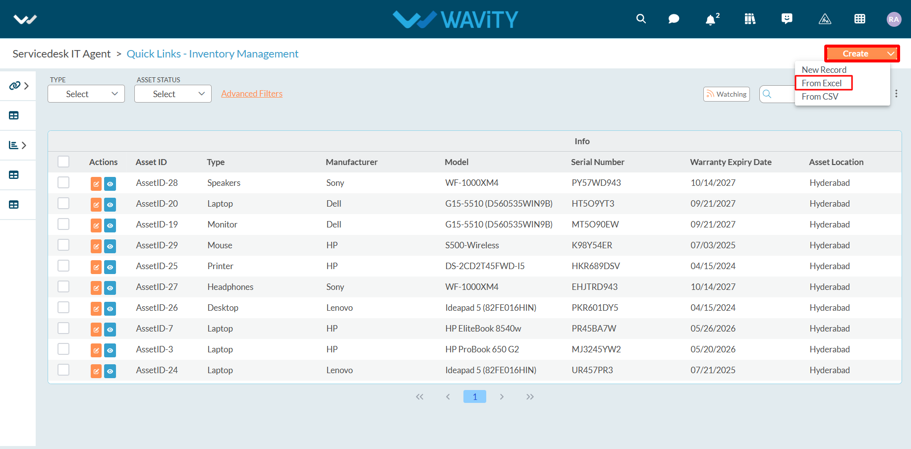
Select the file from your system to be uploaded (imported) into the application.
Once the import is completed successfully, a confirmation message will appear: "Import Data request has been submitted successfully."
If the import fails due to an incorrect file, you will receive a notification stating "Records import failed"
To avoid import failure, ensure the following conditions are met:
- All data and templates must match the selected application.
- All required fields should be filled in the correct formats.
- The column data must align with the corresponding template columns.
- The first row of data should match the first row of the template sheet.
Advanced settings for import function can only be executed by the Admin of your organization. It is recommended to consult the Wavity team before making any changes to the advanced settings.
- To access advanced settings, firstly navigate to design tools as shown in below image.
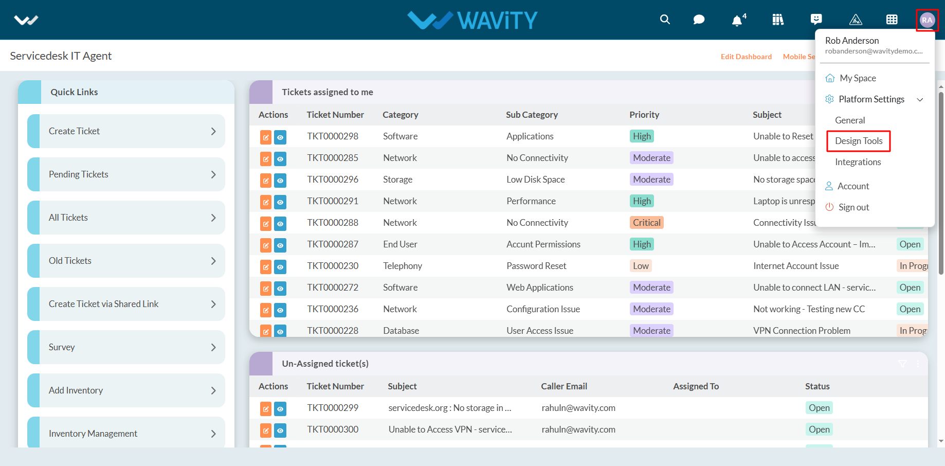
- Click on the three vertical dots in the top-right corner of the application for which you want to set import conditions.
- Select "Open in App Designer".
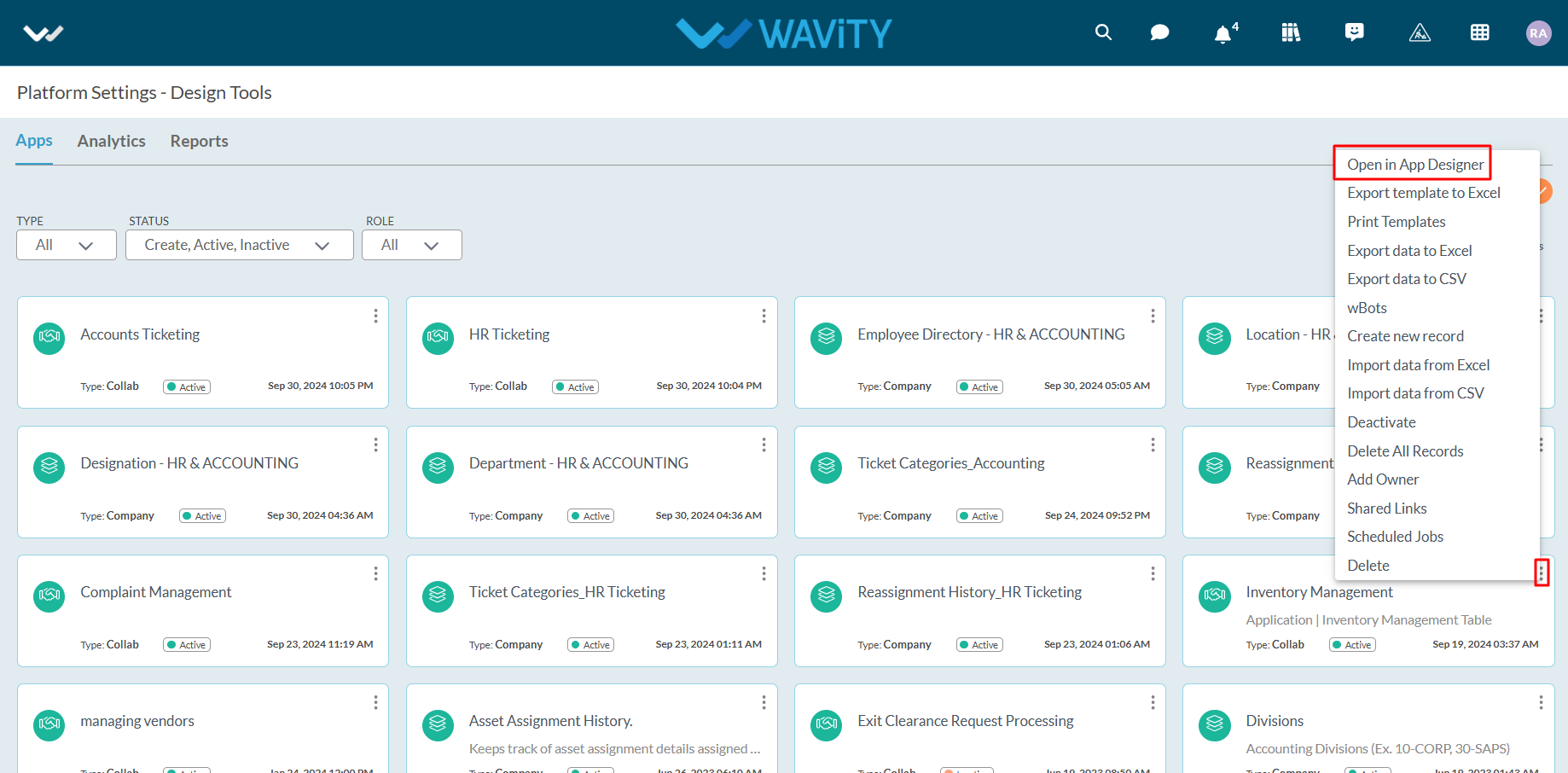
- Click on the icon as indicated in the image below.
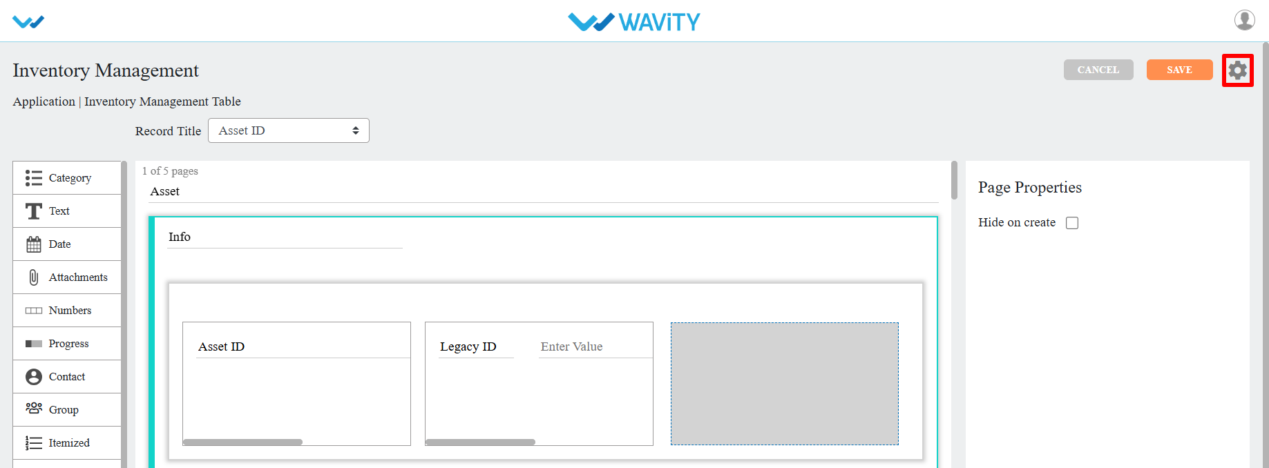
- Navigate to and select "Advanced Settings" as shown.
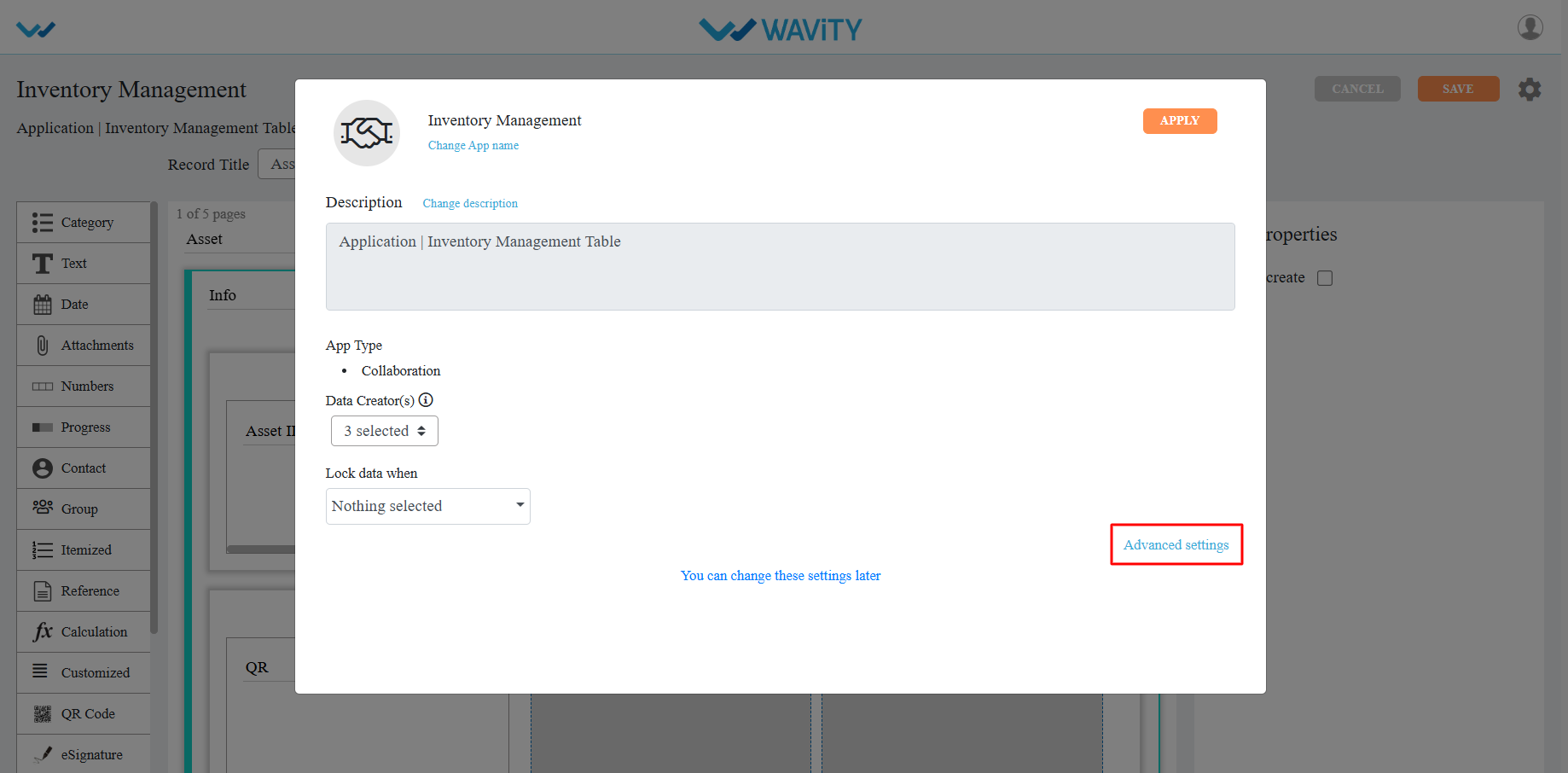
- Select the Import tab. Advanced settings for imports on any application can be configured here.
- To enable bots for the application during the import function, click on Enable wBots (If required).
- In the Import Rules section, choose one of the following options:
- Create Only: This option will only create new records.
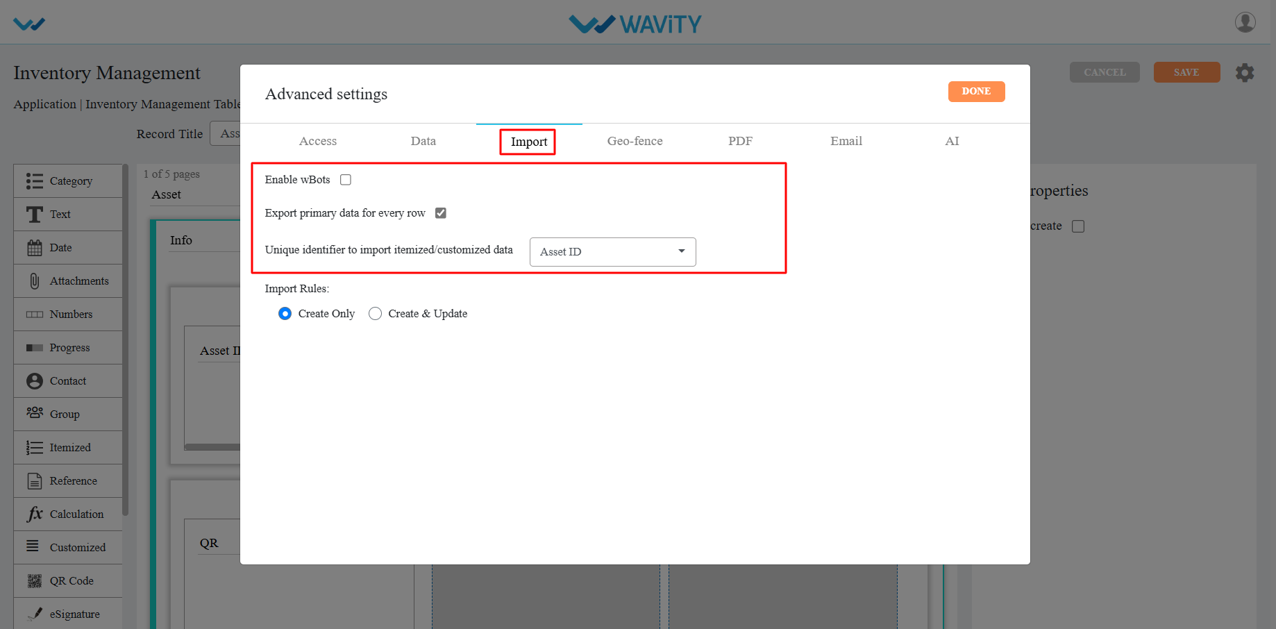
- Create & Update: This option will both create new records and update or overwrite existing records.
- When selecting the Create & Update tab, you can define update rules as follows:
- Identified by: This checks whether a record exists based on the selected control.
- Create New/Overwrite: If the record exists, its values will be overwritten; otherwise, a new record will be created.
- Overwrite: If the record exists, its values will be overwritten.
- Skip: If the record exists, it will be skipped; otherwise, a new record will be created.
- Click on ‘Done’ if the import rules match your requirements.
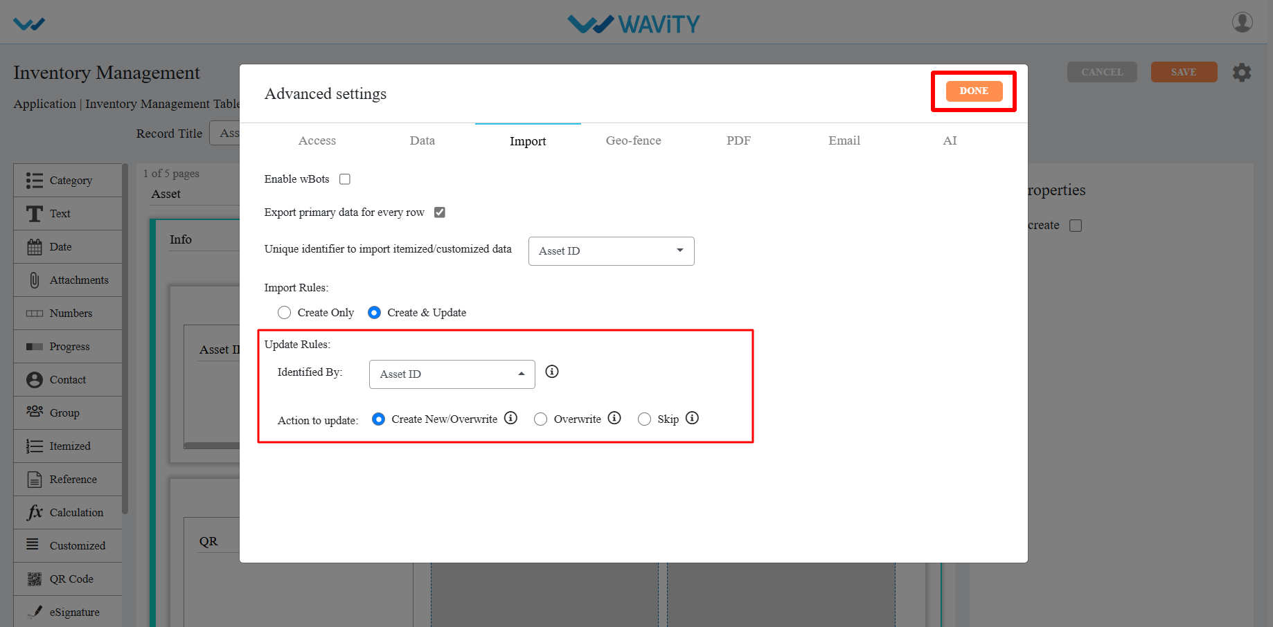
- Click on ‘Save’ to complete the update process of the application.
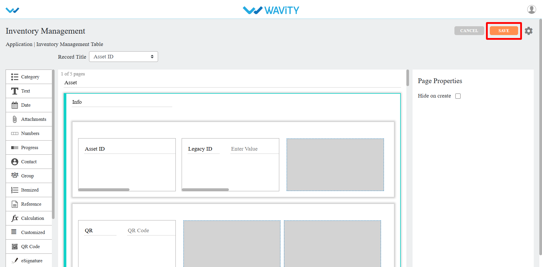
How to Use the Export Functionality in Wavity?
- Wavity provides Export and Import functions within its platform
- The Export functionality allows you to export all fields from any application, including templates and data, into Excel sheets or PDF documents.
- Follow the steps below to perform Export functions in the Wavity platform.
- Log in to the Wavity platform. Based on your role, you will have access to your dashboard.
- From the quick Links, click on the application (e.g., "All Tickets") that contains the data you want to export. Refer to the image below for guidance.
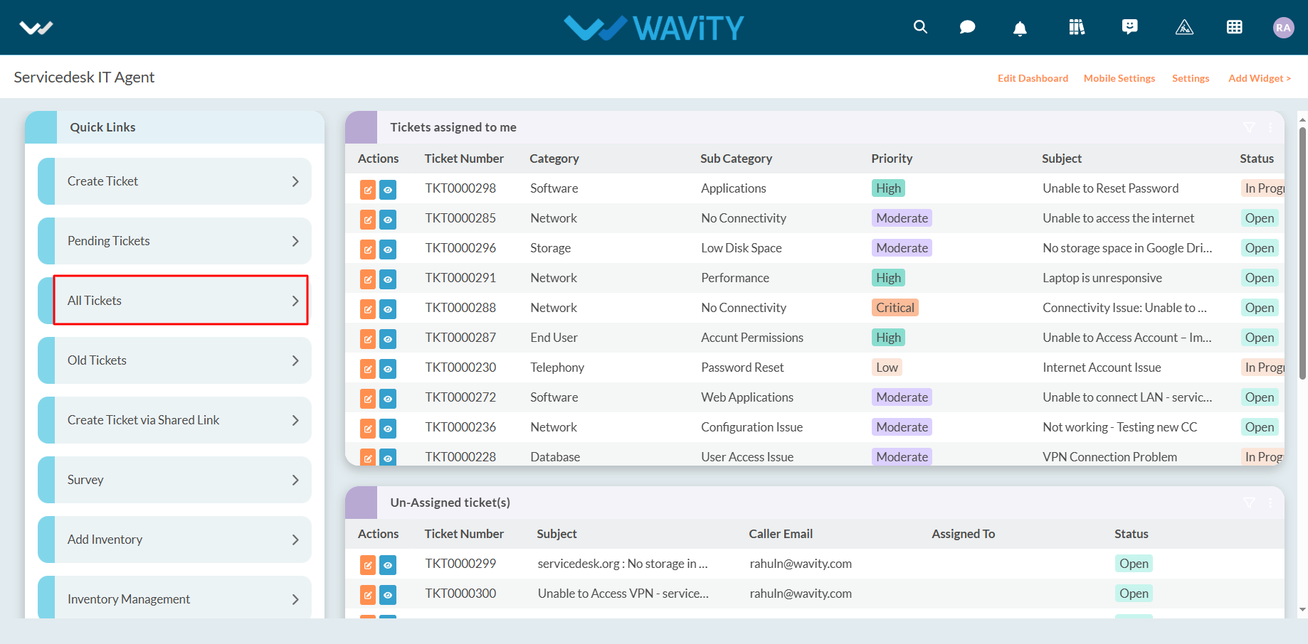
- Export Template to Excel: Use this function to export the application's template in Excel format.
- Click on "Export Template to Excel".
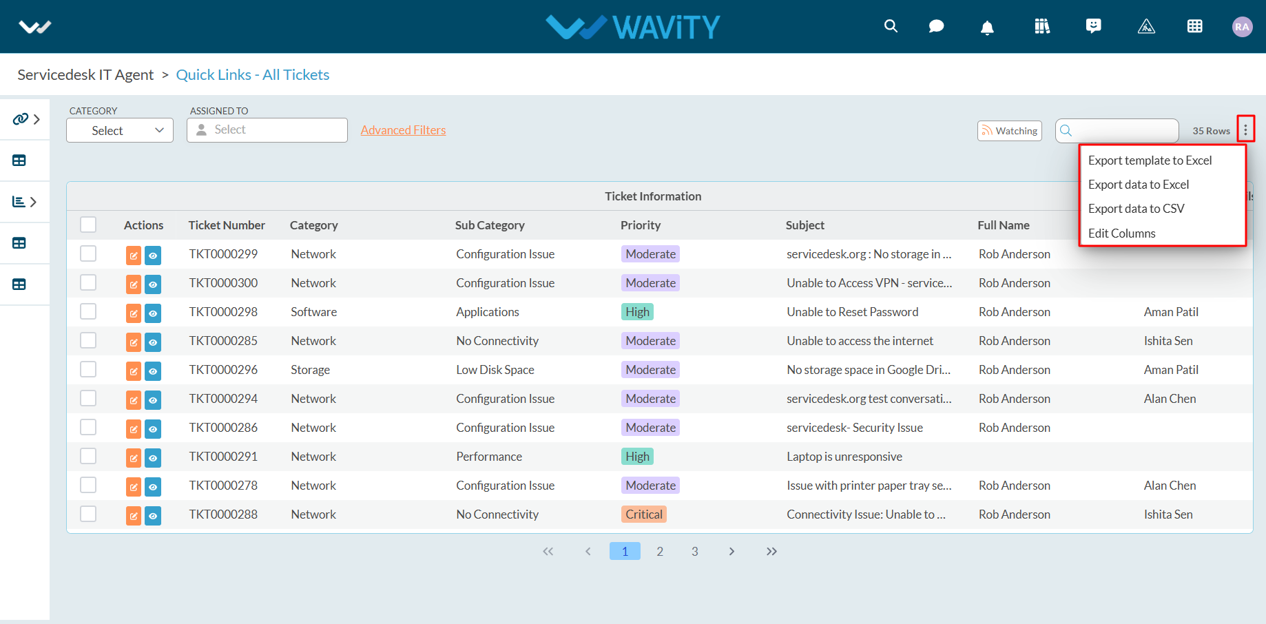
- Select "Ignore Reference Applications" if needed and click "Export."
- Ignore Reference Applications: Check this box to exclude reference applications from the export. If unchecked, reference applications will be included in the exported template.
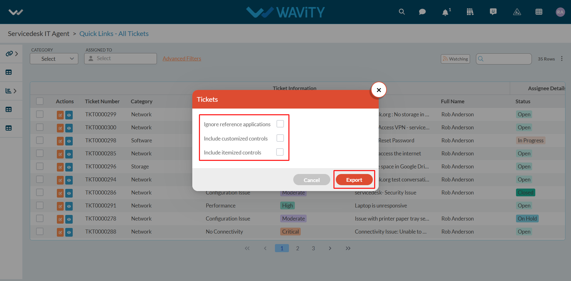
- Once you click on "Export," the Excel sheet containing the template will be downloaded to your system.
- Refer to the image below for an example of the downloaded Excel sheet.

- Export Data to Excel: Use this function to export all the data from the application in Excel format.
- Before exporting data to Excel, you can modify the columns or data fields you wish to include in the export.
- To do this, click on ‘Edit Columns’ and make the necessary adjustments to the data fields.

- All available data fields will be displayed in the dropdown.
- The currently selected data fields will have a tick mark indicating they are included in the export.
- Select the data fields you want to include in the export and deselect any fields that are not needed.
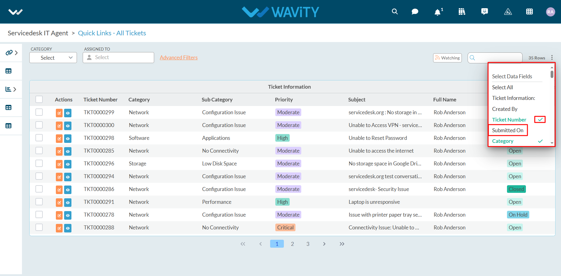
- Once you select the data fields, they will immediately appear in the list.
- Review the selected data fields to ensure the correct fields are included before exporting the data to Excel.
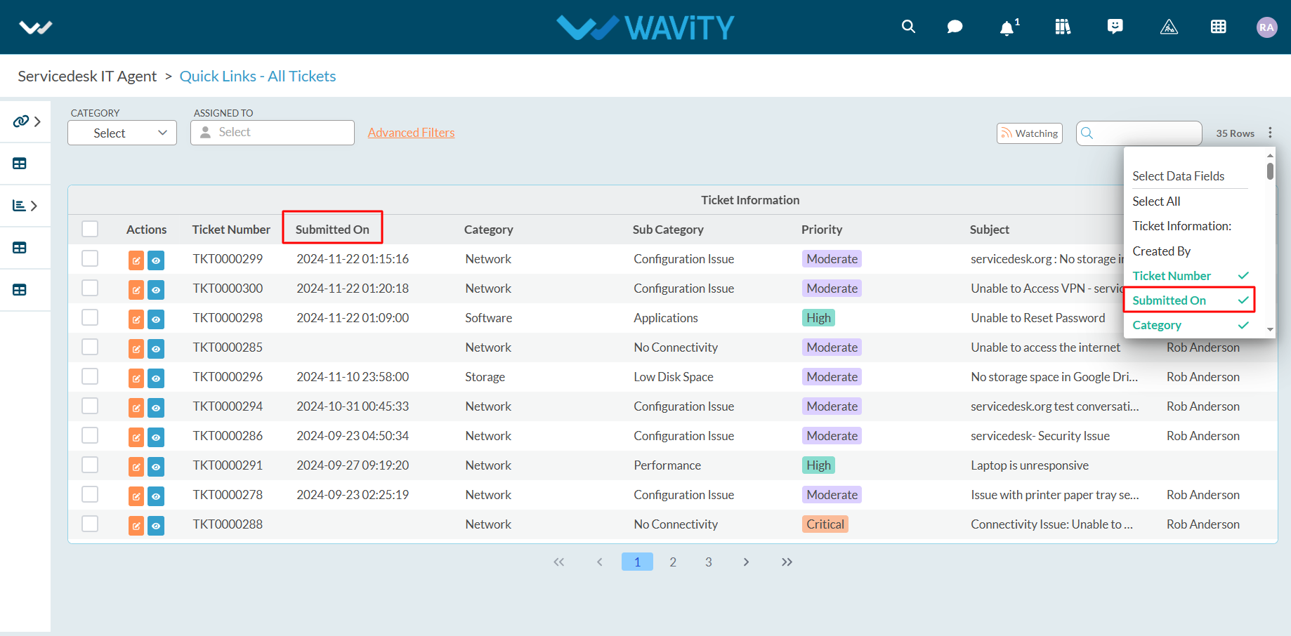
- Click on "Export Data to Excel" as shown below.
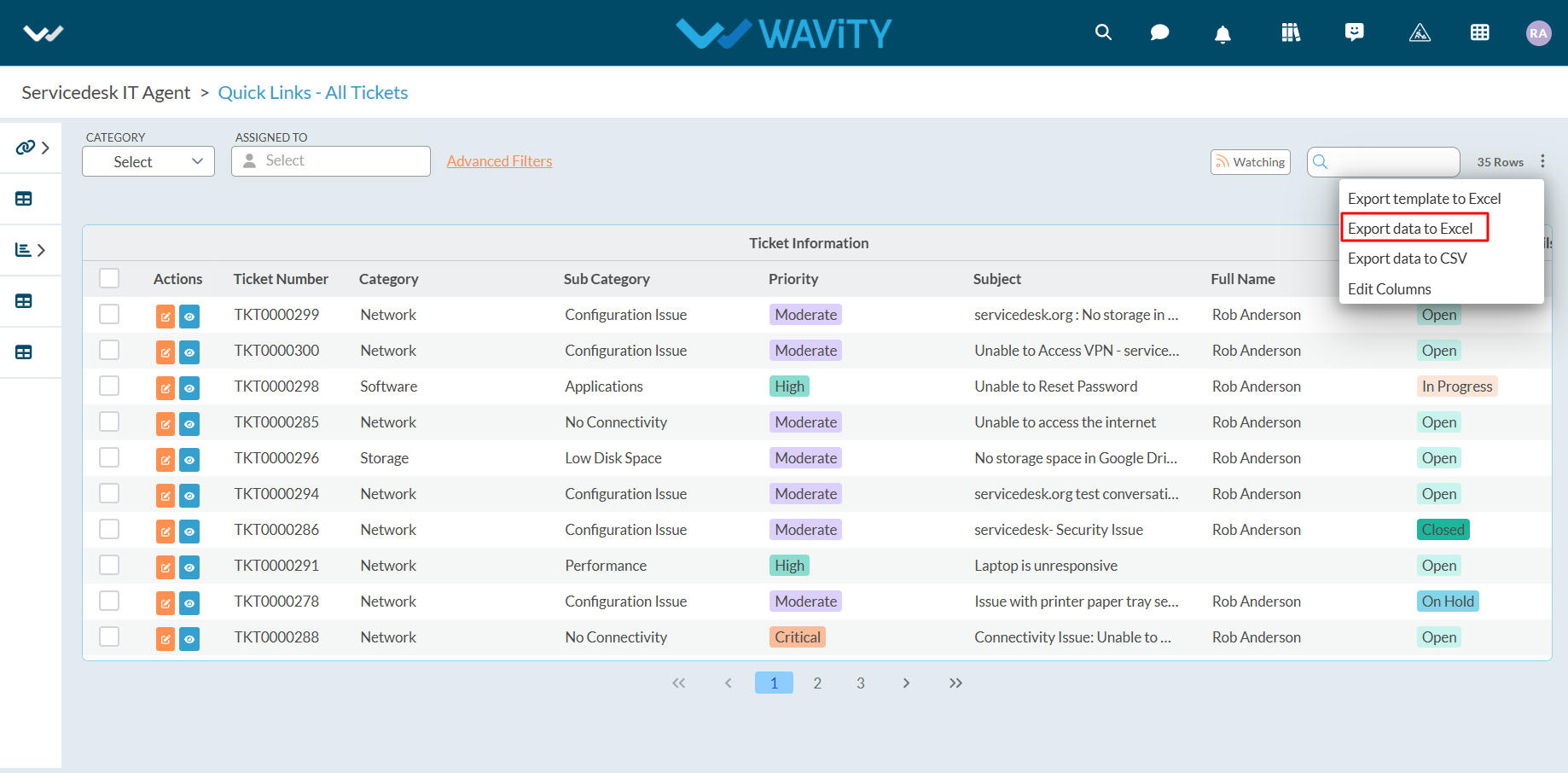
- Select your organization's time zone from the dropdown menu. For example, if your organization uses the PST time zone, select "US/Pacific" as shown below.
- Click "Export" after selecting the time zone.
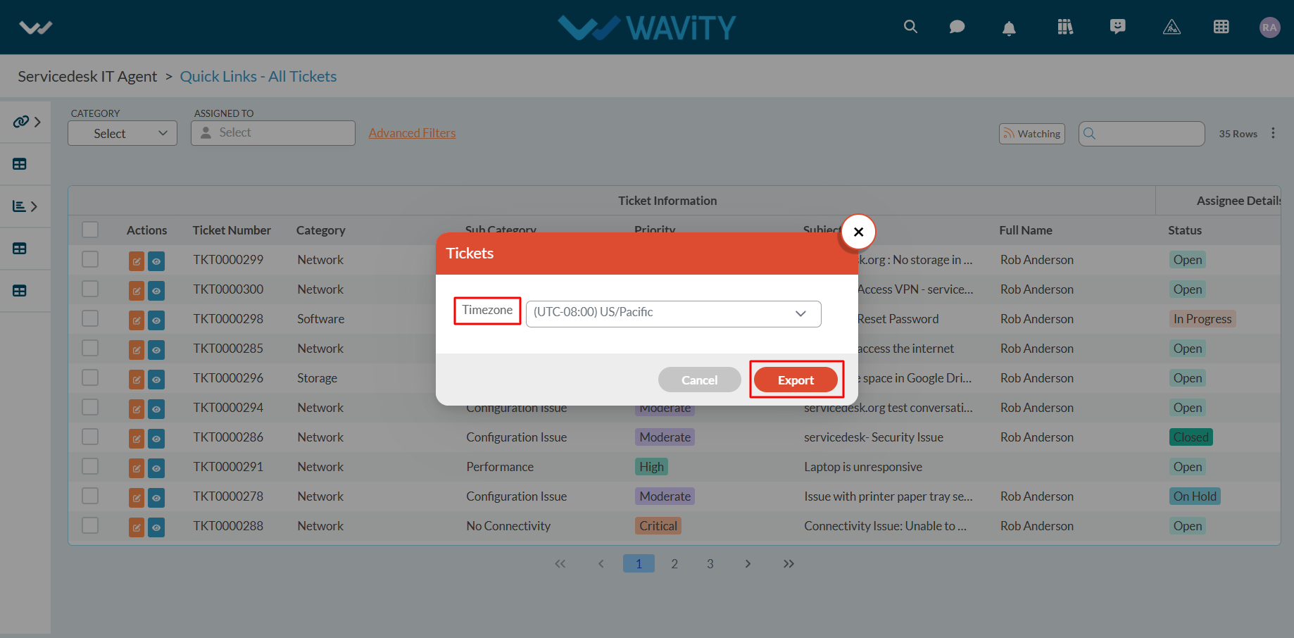
- Upon successful completion of the export, a confirmation message will appear: "Export Data request has been submitted successfully."
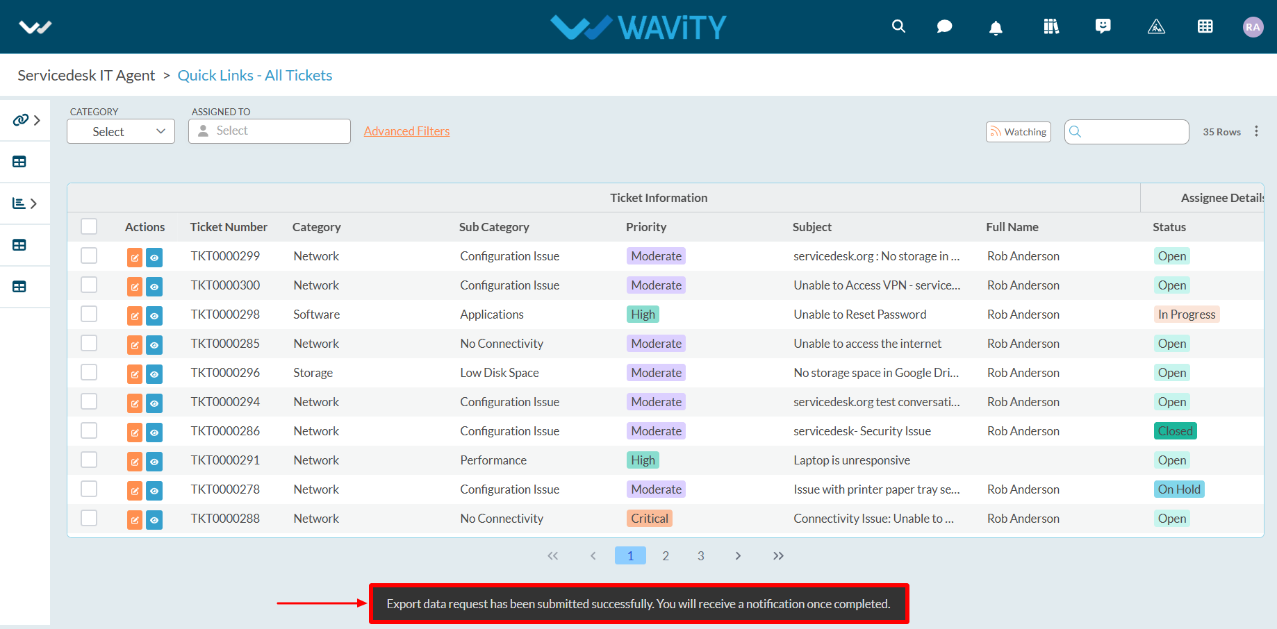
- Click on the bell icon in the top-right corner to view all notifications.
- Locate the notification for the export request and click on the blue link to download the Excel sheet.
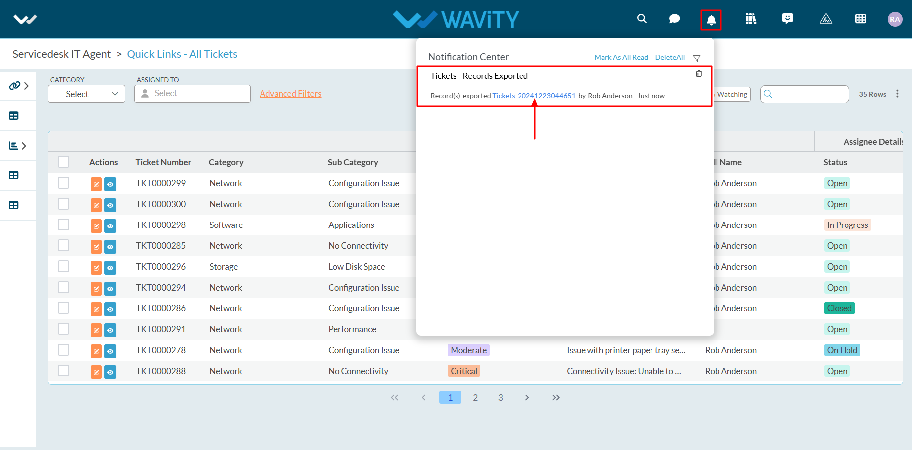
- After clicking the link, the Excel sheet containing the data and template will be downloaded to your system. Refer to the image below for reference.
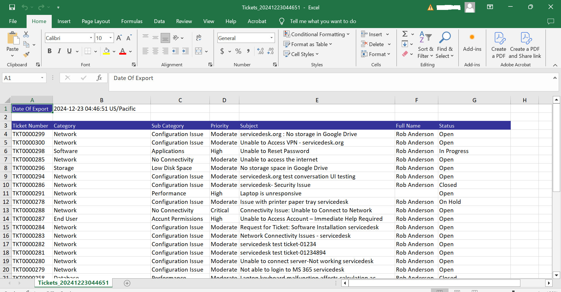
- Export of Selected data to Excel: This function allows you to export only the selected data from an application into a new Excel sheet.
- Check the required data (using the left corner selection boxes) and click "Export Data to Excel."
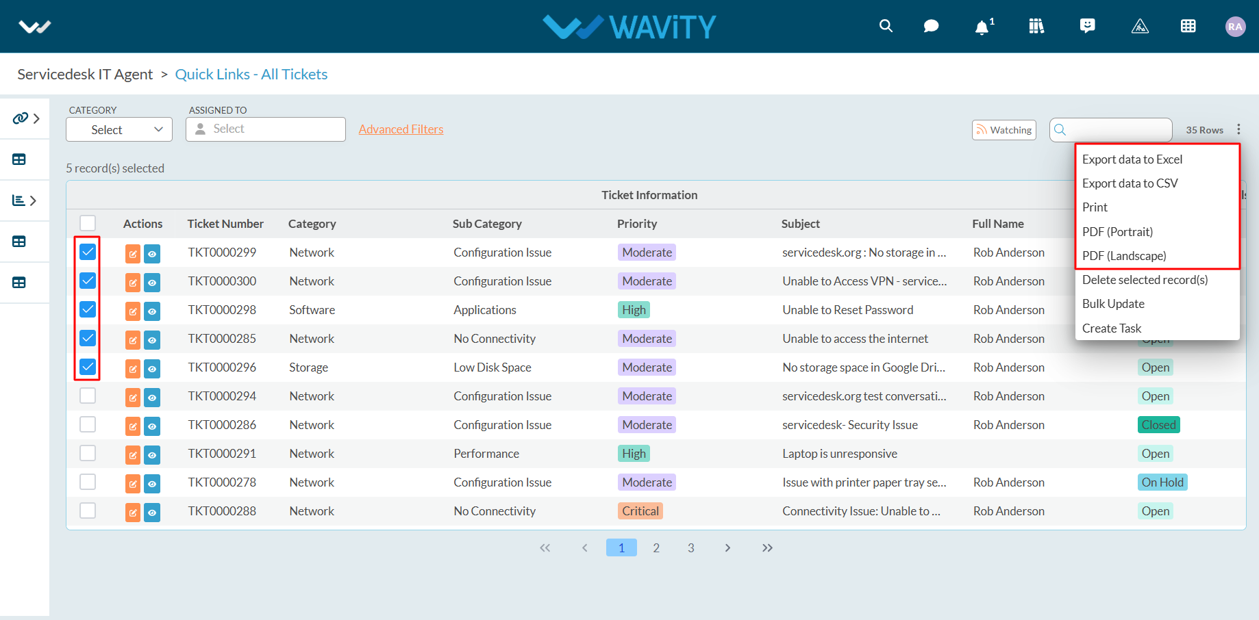
- Select your organization's time zone from the dropdown menu. For example, if your organization uses the PST time zone, select "US/Pacific" as shown below.
- Click "Export" after selecting the time zone.
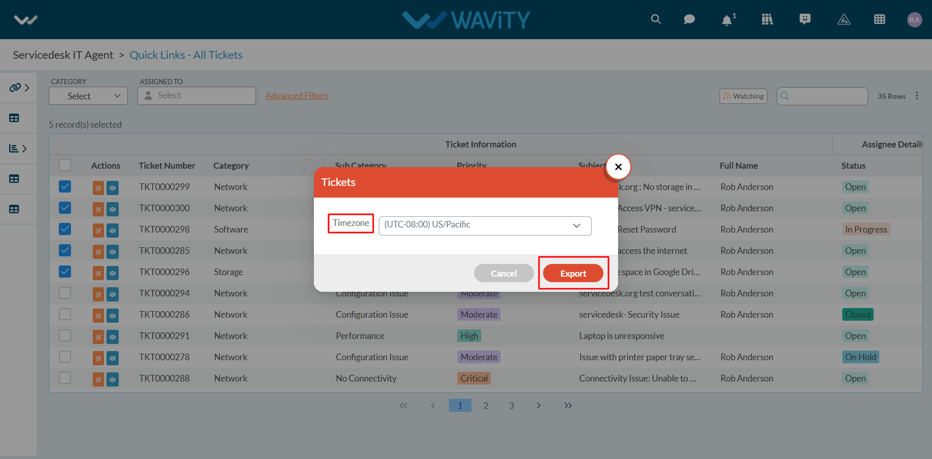
- Once the export is successfully completed, you will see a confirmation message: "Export Data request has-been submitted successfully."
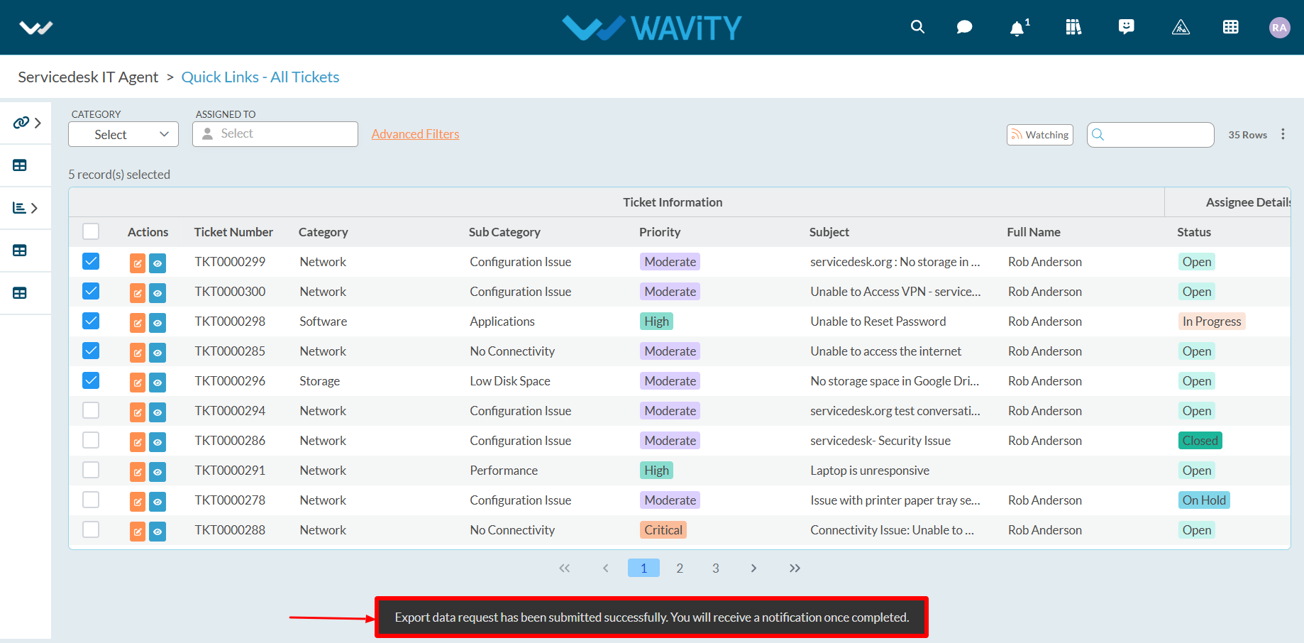
- Click on the bell icon in the top-right corner to access notifications. Locate the notification and click the blue link to download the Excel sheet with the selected data.
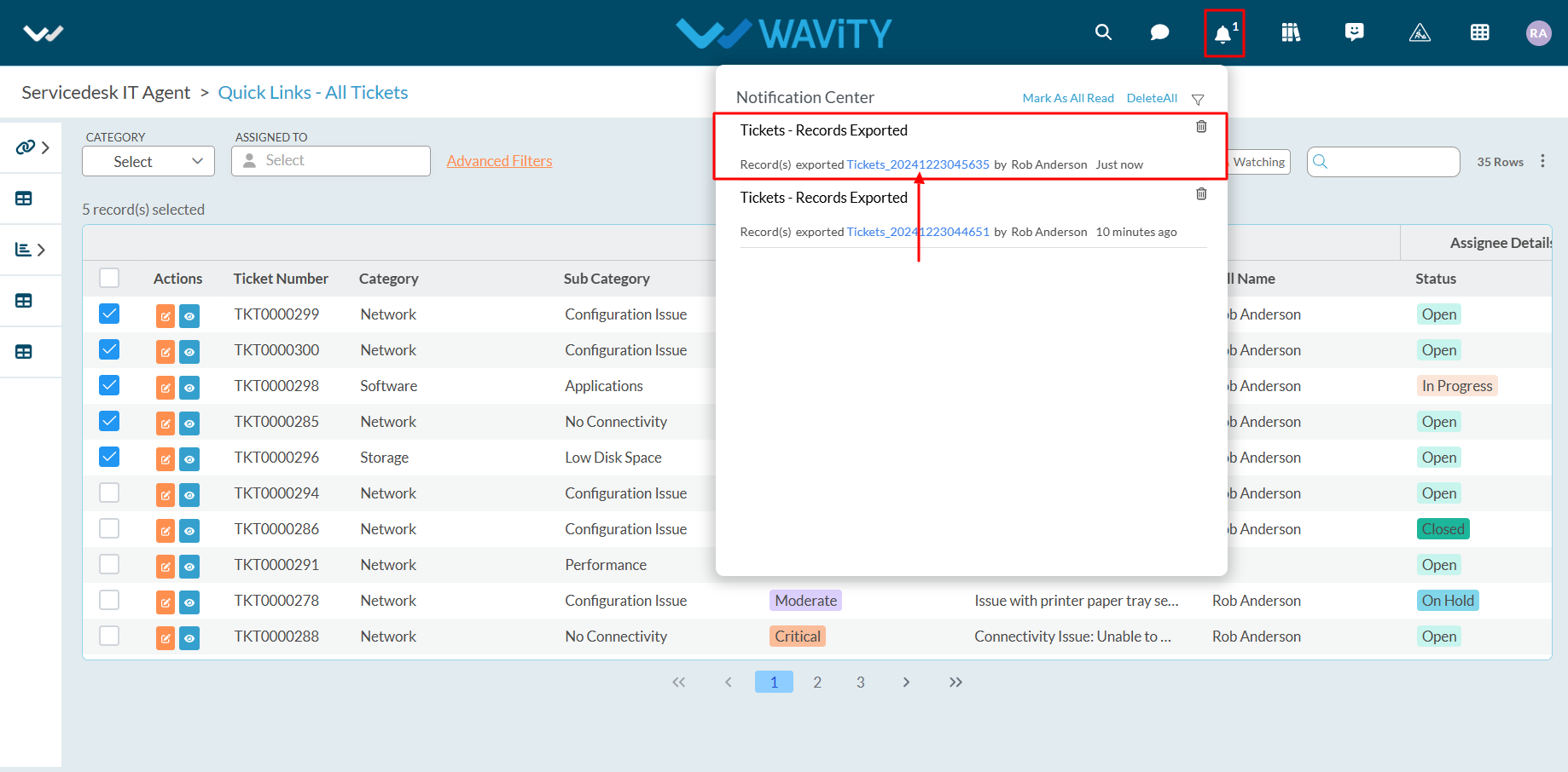
- After downloading, the Excel sheet containing the selected data will be available on your system. Refer to the image below for reference.
- Similar steps can be followed to export data to CSV, PDF, and other formats.

How to enable SMS Integration
- Wavity platform includes SMS integration functionality, enabling notifications to be sent via SMS based on specified parameters and conditions.
- Currently, SMS integration in Wavity is supported exclusively through Twilio using a USA phone number.
Set up API key from Twilio:
To enable SMS integration with Twilio Account, You will need the following details:
- Twilio Phone Number (USA Based)
- Twilio Account SID
- Twilio API Secret
- Twilio API Key
Create API Keys in the Twilio Console by following the steps below, or refer to the following link for detailed guidance: https://www.twilio.com/docs/iam/api-keys
- Click on Account in the top right-hand corner.
- Under Keys & credentials, click on API keys & tokens.
- On the API keys & tokens page, click on the Create API Key button.
- On the Create new API key page, enter a Friendly name for the API Key.
- Select the key type: Restricted, Standard, or Main.
- Click the Create API Key button.
- On the Copy secret key page, Copy the Secret and store it somewhere secure.
- Click on the Got it! checkbox and click Done.
Enable SMS Integration in Wavity
- Only Admin of your company can setup or enable SMS Integration. Click on Profile > Integration.

- Click on ‘Create’ button.

- Enter Integration name and description as required.
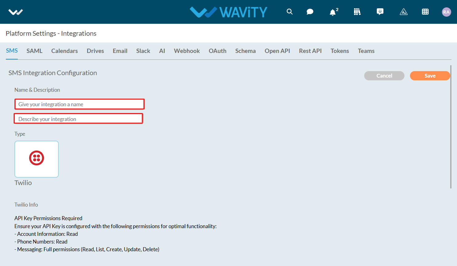
- While setting up SMS integration with Twilio, Please ensure your API key is configured with the following permissions for optimal functionality.
- Account information: Read
- Phone Numbers: Read
- Messaging: Full permissions (Read, List, Create, Update, Delete)
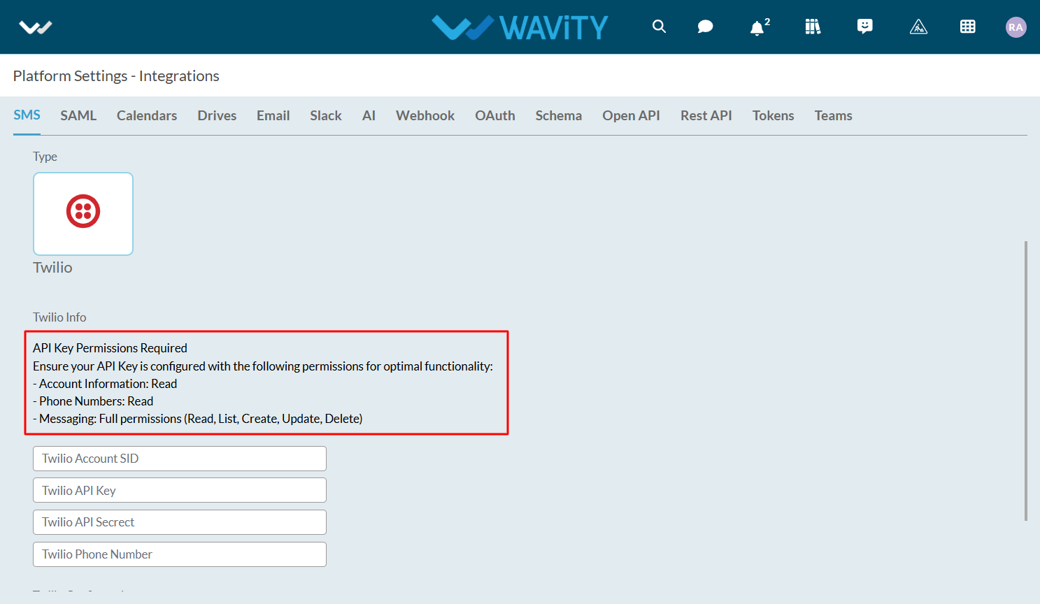
- Enter details such as Twilio Account SID, Twilio API Key, Twilio API Secret & Twilio Phone Number.
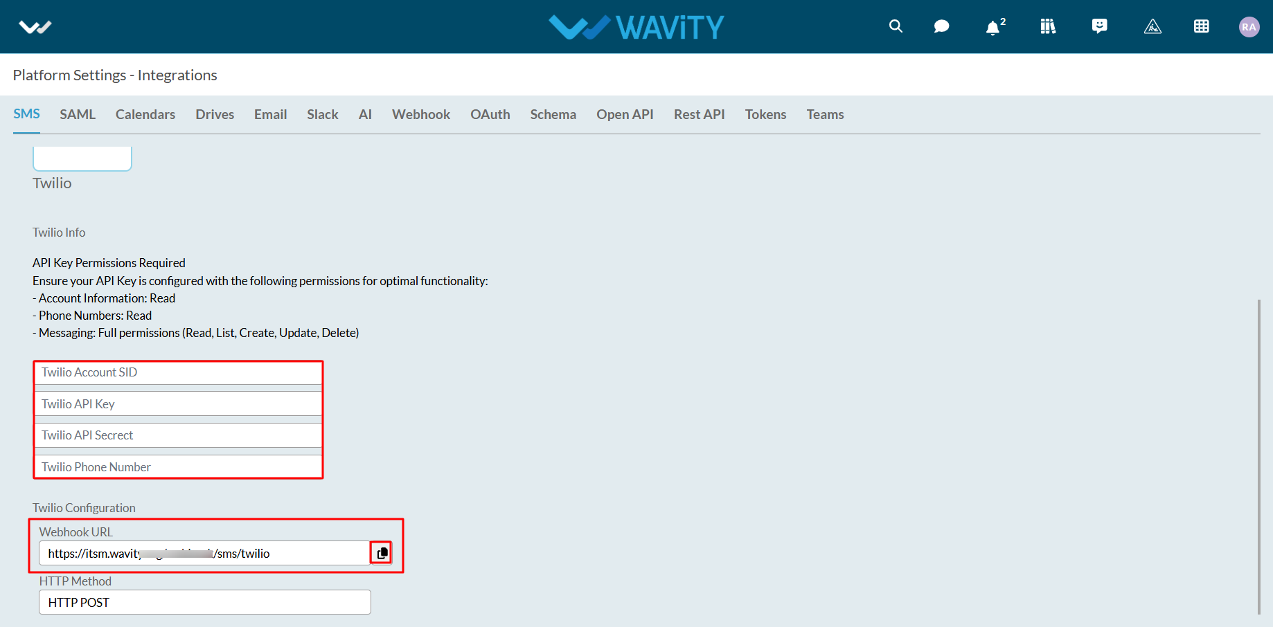
- Click on ‘Save’ button to complete the process.
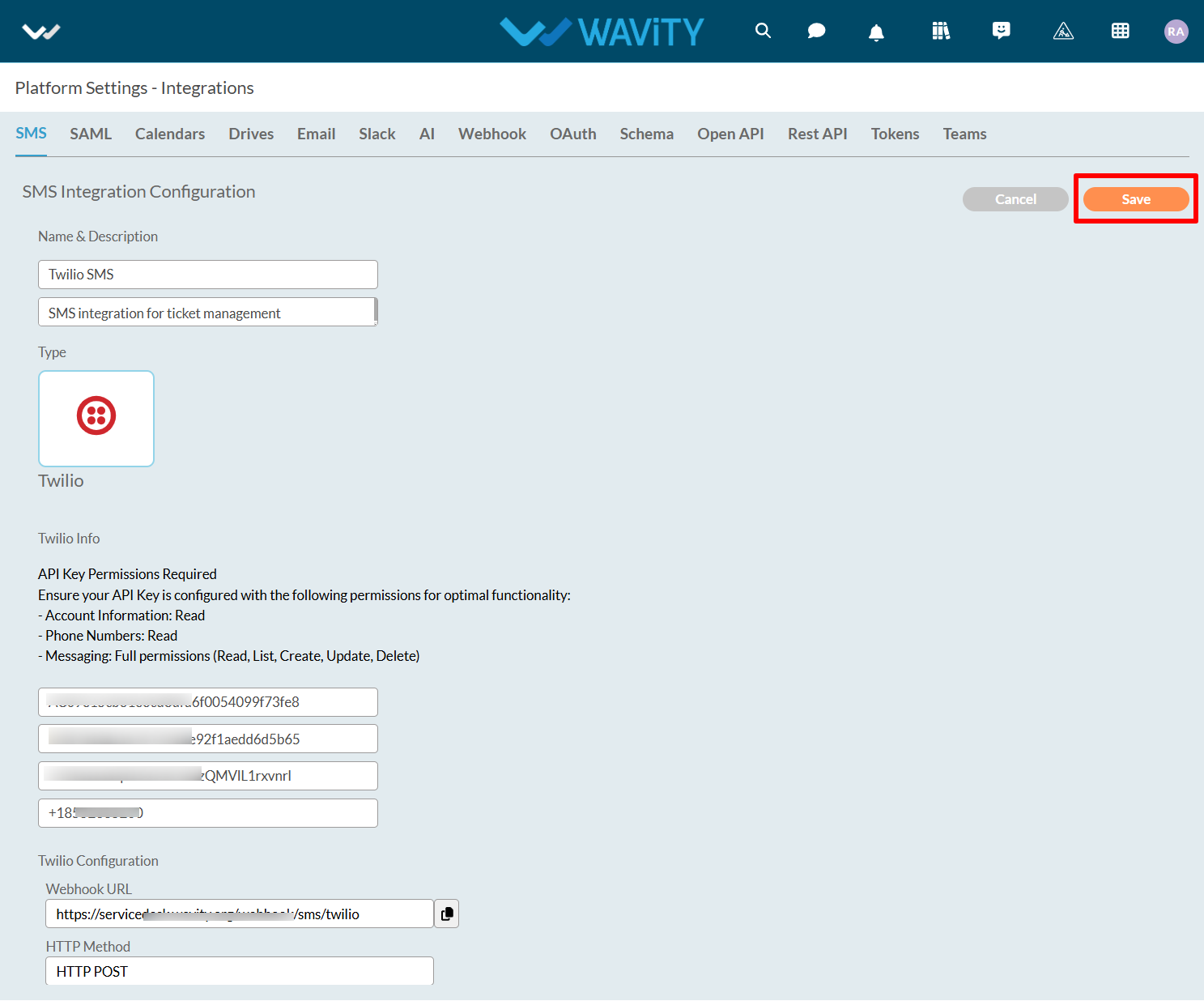
- You can also check the status of the SMS integration as shown in the image below.

How to edit existing Analytics & Reports?
- Only Admins have the authority to edit existing analytics in the platform.
- To begin, click on Design Tools, as shown below.
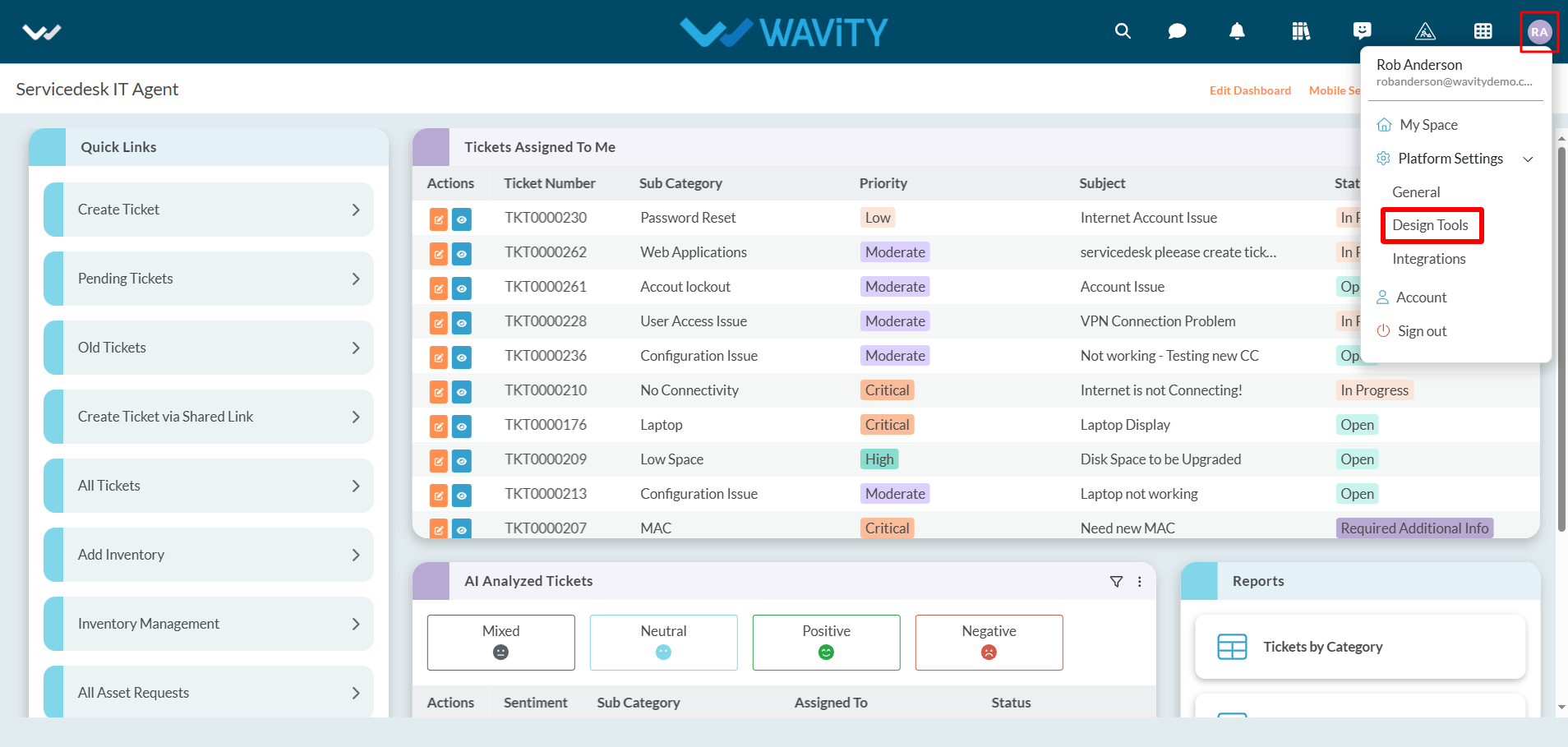
- In “Analytics” section, All the existing analytics of the platform will be displayed for the admin.
- Click on “3 dots” icon to carryout multiple functions of the existing analytics such as editing, deleting or adding owner as shown below.
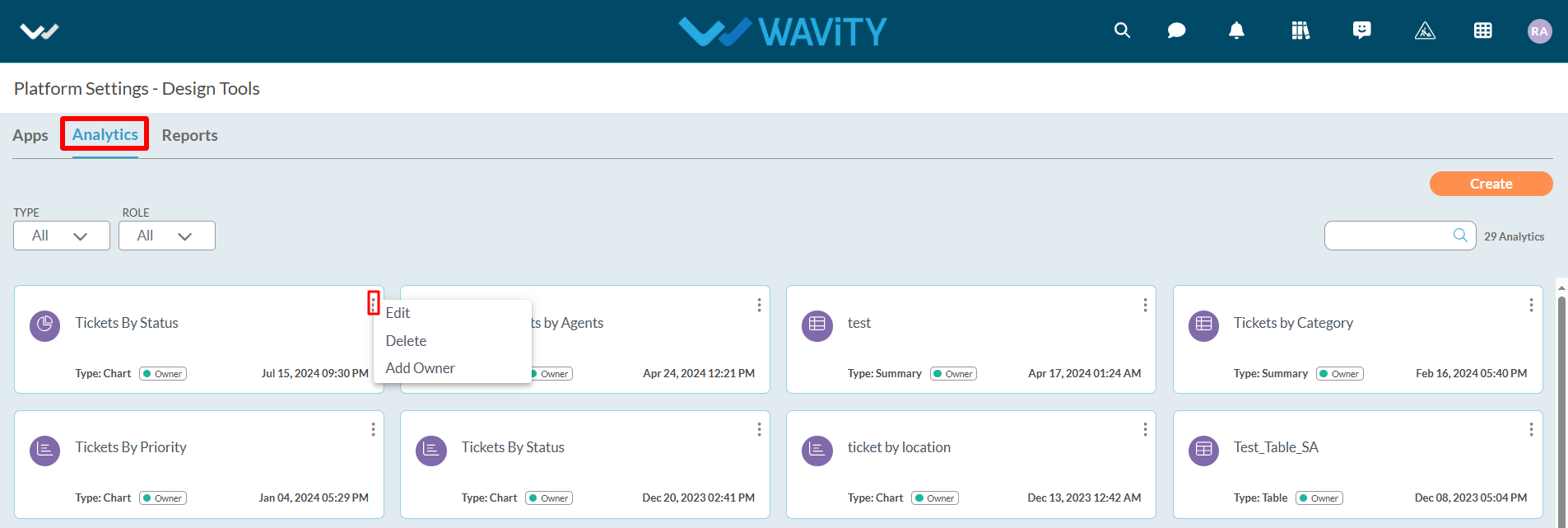
- Click on “Edit” as shown in below image.
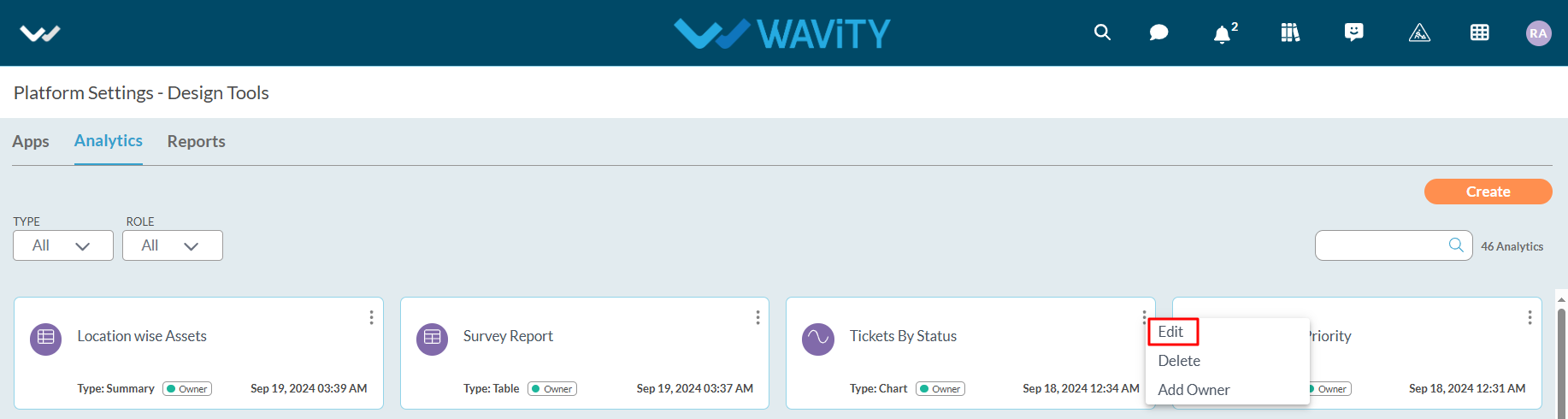
- Edit or update details like the title and description of the analytics for future reference.
- Additionally, specify or add users who will have owner access. You can also include other users or groups with view-only access to the analytics.

- Select or add the data source application from which you can include attributes and values for the X and Y axis to generate analytics and reports based on your requirements.
- Multiple data source applications can be selected if needed.
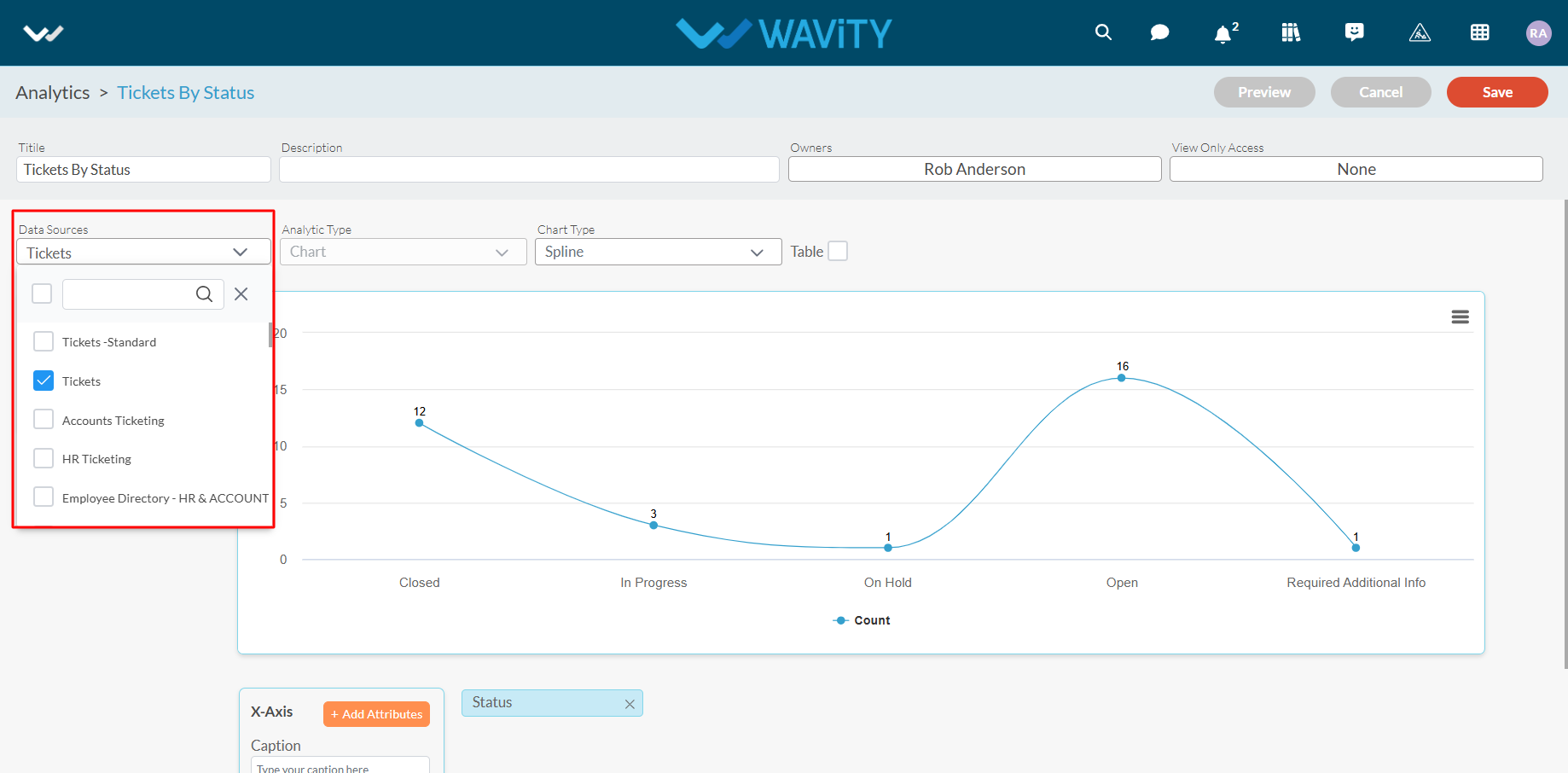
- You can also change the chart type if needed by selecting a different option from the dropdown, as shown below.

- Now, you can add more values and attributes based on your requirements. For more information on adding values and attributes, please refer to the following link: How To Create Analytics & Reports ? | Wavity
- Click the “Save” button to complete the process of editing the existing analytics.
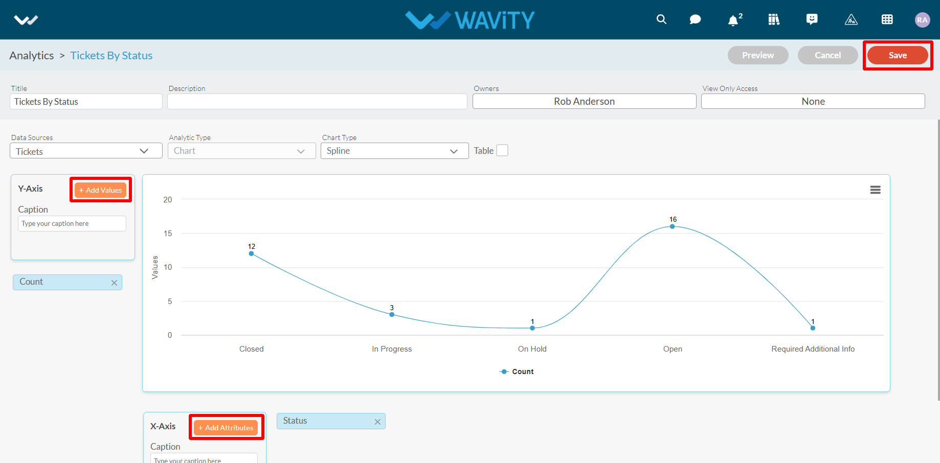
How to enable Email Integration with Gmail
- The Wavity platform provides email integration functionality, allowing for the automatic generation of requests within the platform through email. This occurs subsequent to the sending of an integrated email, based on configured conditions.
- Only Admin of your company can setup or enable Gmail Integration.
- Navigate to the Integrations settings: Go to Profile > Integrations in the Wavity platform.
- On the Integrations page, click the Create button under the Email section, as shown in the image below.

- Provide a name for your email integration and any relevant details in the description field for reference.
- Choose Gmail as the integration type.
- Select the integration type you wish to enable (inbound, outbound, or both).
- Click on Click to link your account to start the process of linking your Gmail account to Wavity.
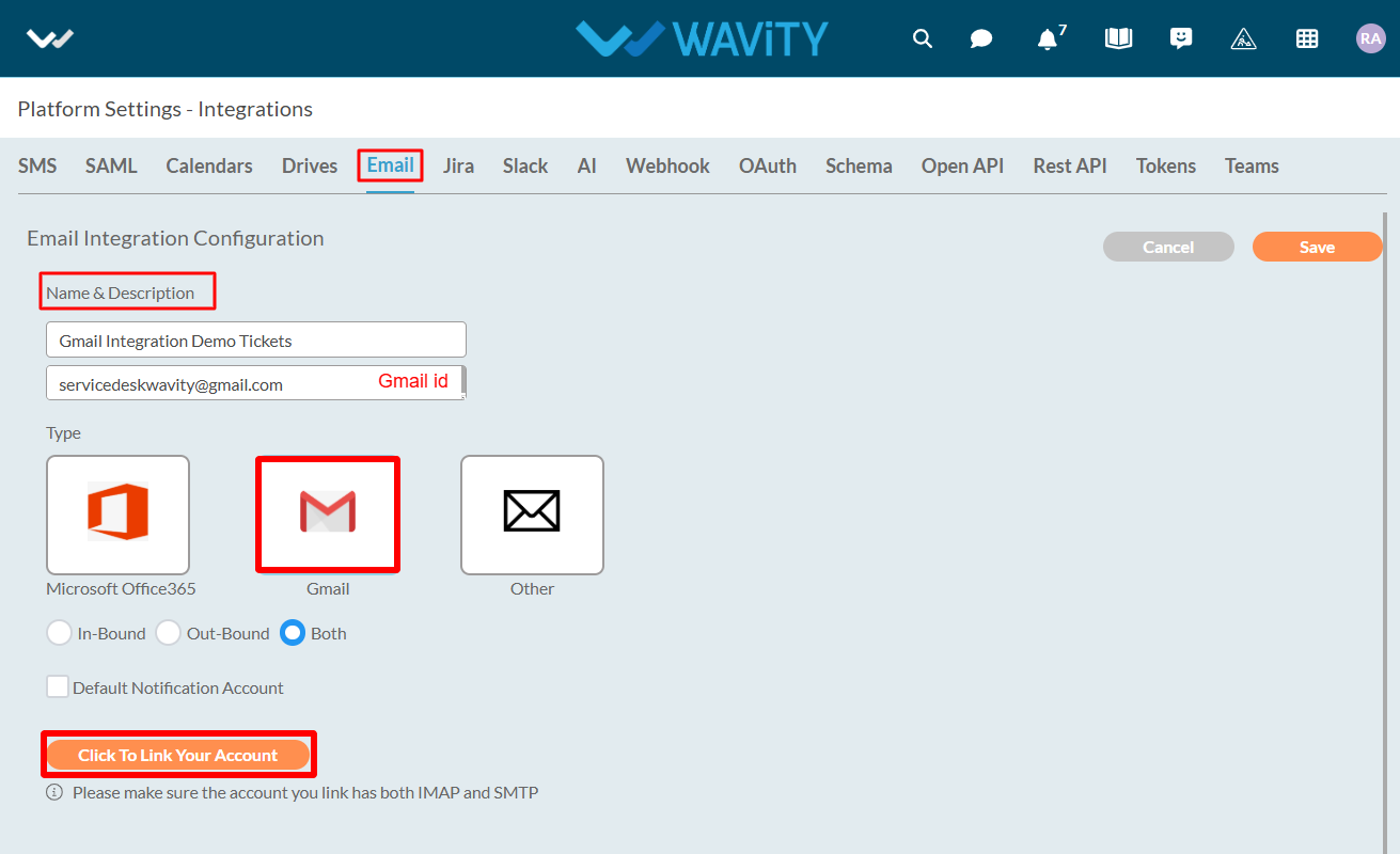
- A pop-up will appear where you can log in to the Gmail account you wish to link with Wavity.
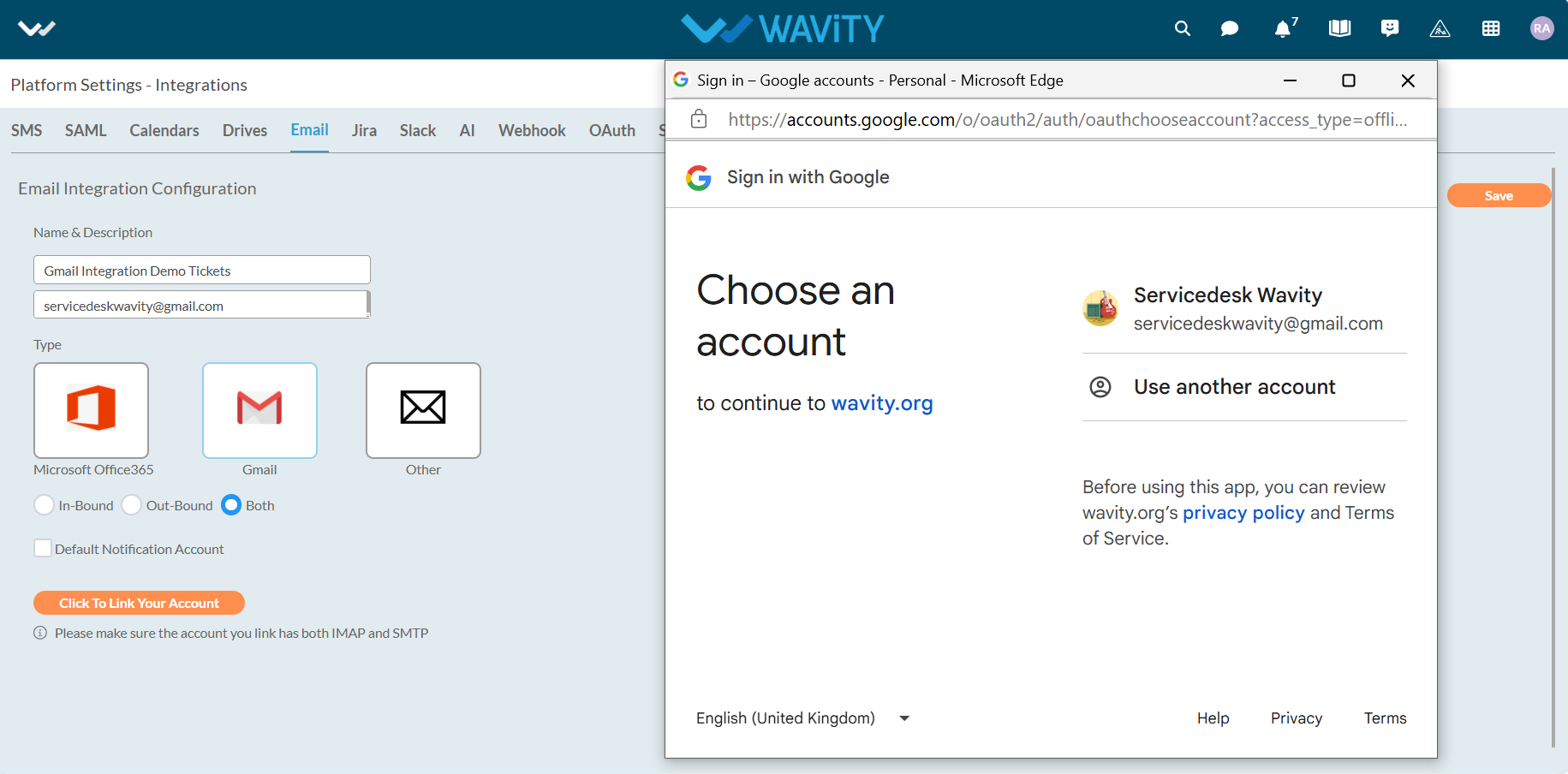
- Click Continue to finalize the linking process.
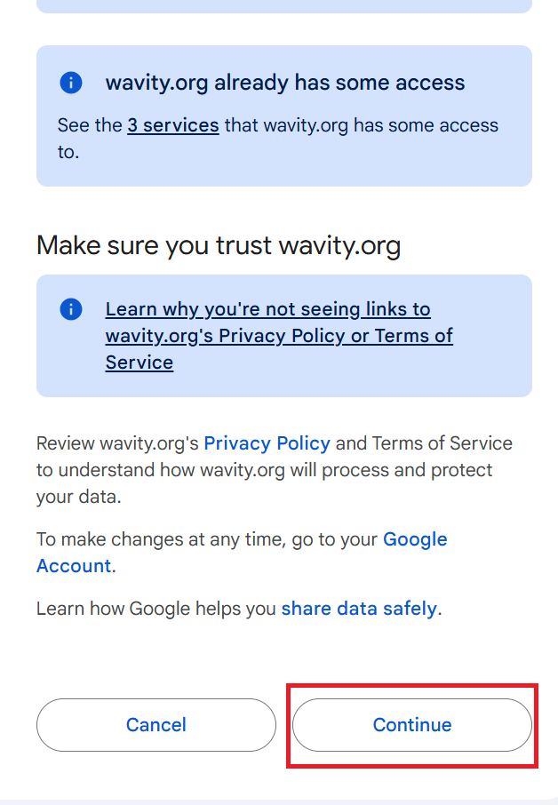
- A new pop-up will briefly appear confirming that your instance has been successfully linked to Gmail.
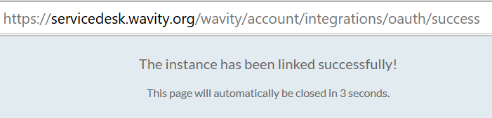
- Once your Gmail account is linked, you can unlink it at any time if needed. Click Save to complete the integration.
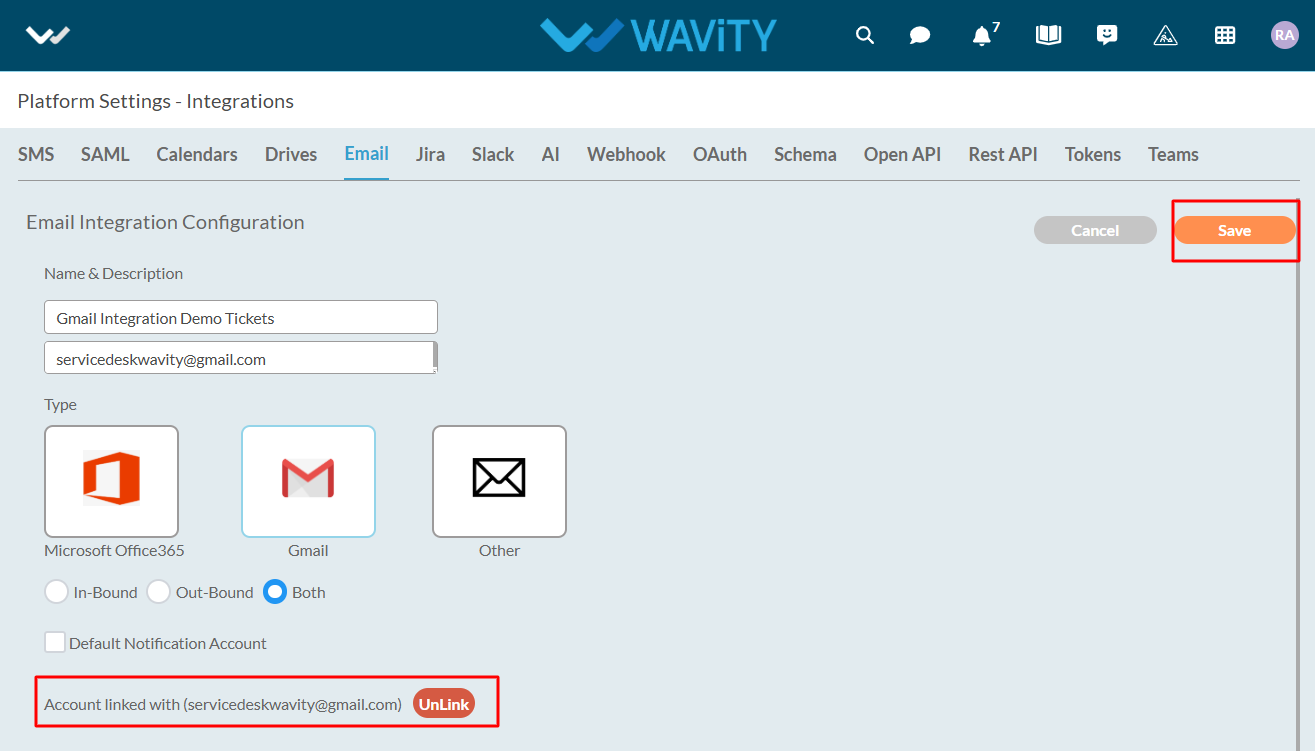
- As shown in the image below, the Gmail account is successfully linked to Wavity, and its status will be displayed as Active.
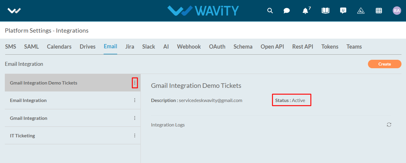
Overview: Wavity Open API
Wavity's Open APIs follow theREpresentational State Transfer (REST) architecture, enabling you to perform standard operations such as reading, updating, adding, or deleting data from your helpdesk system.
What can I do with the Wavity Open API?
With Open APIs, you can do the following:
· View and explore tickets and its details.
· Create new tickets and update the details of existing ones.
· Apply Filters and get only the data that you want.
· Add or view comments for a given ticket.
API Endpoints and SSL:
API endpoints are mapped to your account domain:
https://{tenant}.wavity.domain/openapi
Authentication:
How does it work? Who can access my helpdesk? Can everybody see my data?
Authentication is required to access our Open APIs. Before you can set the priority of a ticket or create a new ticket or use any of the APIs listed above, you need to "authenticate your ID" or "login" in the same way as you login into your helpdesk's web portal.
Wavity supports four types of authentication mechanisms for APIs: Bearer, OAuth 2.0 Grant Types authentication (including Authorization Code, Client Credentials & Password Credentials).
How to create a Bearer Token in Wavity?
Creating a Bearer Token in Wavity
1. Log into Wavity application
2. Click on the profile picture

3. Choose Integrations

4. Navigate to token section and click on create.

5. Enter title, Select user and expiration and click on create button.
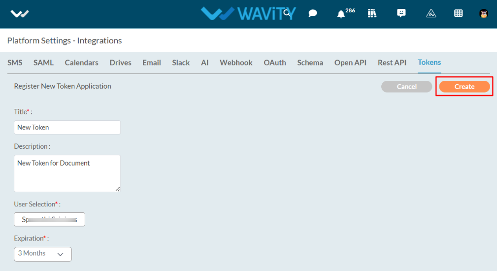
6. Token will be generated in the token field. You can copy the bearer token by clicking on the ‘Copy’ symbol as shown in below image.
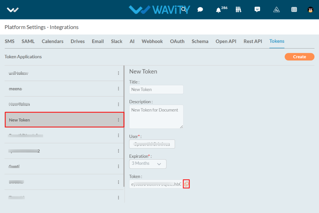
How do I access the information? What are the resources available via the API?
Every piece of information or data—such as a customer's ID or the priority of a specific ticket—is assigned a unique identifier, or "URI." To access this data from your helpdesk, whether through your smartphone app or a third-party service, you will need this unique identifier.
All URIs follow a specific format and that format is:
http://your_helpdesk_domain_name/openapi
For example: If you are Rob Anderson and you are managing tickets via your Wavity portal "techie.wavity.com",
For tickets, it would be: techie.wavity.com/openapi/tickets
Note:
We have shortened API resource URL throughout this document. Prefix your support domain name to the resource handle.
Example: /tickets is actually ---> http://{tenant}.wavity.{domain}/openapi/Tickets
What API commands are used by Wavity?
Wavity APIs have been implemented as plain XML or JSON over HTTP and use the following REST Commands:
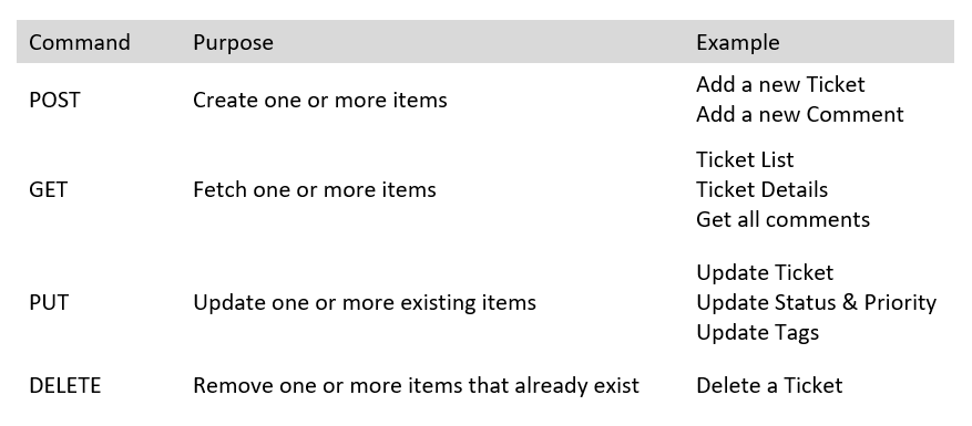
Will everyone have the same access rights?
No, everyone will not have the same access rights. Your ability to access data depends on the permissions available for your Wavity profile. If your Wavity Agent Role is "Newbie Agent" who is not allowed to answer to tickets, but is only allowed to view them, then the APIs will restrict you from answering and you'll only be able to view the tickets.
Pagination:
Responses for API that return a list, like ticket listing are paginated. To scroll through the responses, add GET request parameter page=[number] to your request. Page number starts with 1.
Ticket:
This section lists all API that can be used to create, edit or otherwise manipulate tickets. If you wish to create Tags to better identify tickets, this section also lists the APIs for creating and manipulating those tags.
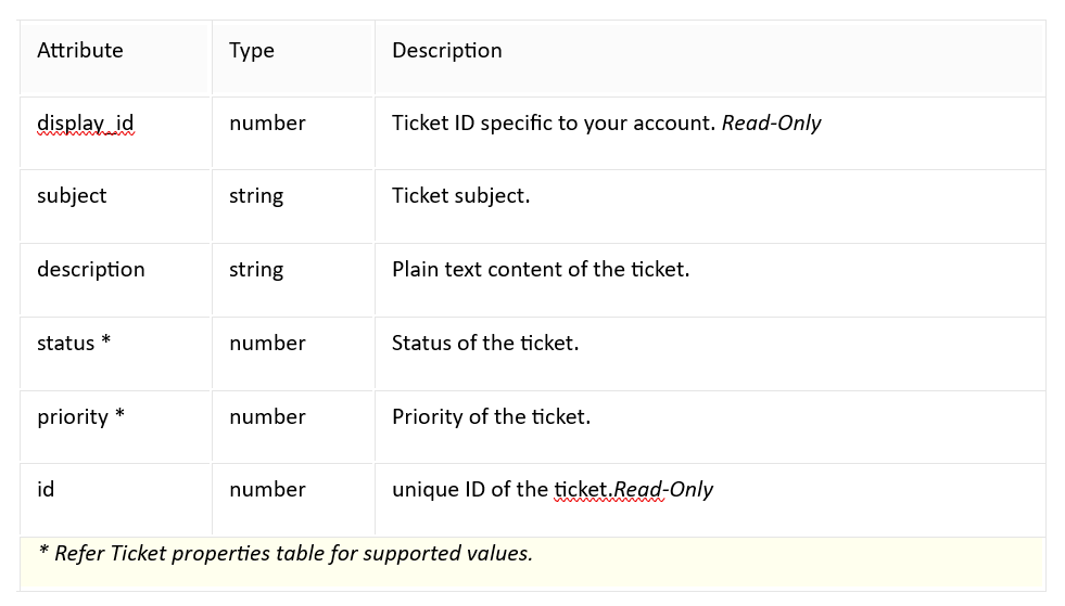
Create a Ticket:
This API helps you to create a new ticket in your help desk.
post: /tickets
Request
{
"subject": "Issue with my laptop",
"description": "Not booting",
"status": "New",
"priority": "High",
"Tags": "Issue"
}
Response
{
"id": "TKT101",
"subject": "Issue with my laptop",
"description": "Not booting",
"status": "New",
"requester": "John",
"createDate": 1711090628526,
"priority": "High",
"resolution": "Resolved",
"eta": 1711090628526,
"agent": "Taylor",
"closeDate": 1711090628526,
"tags": "tkt",
"category": "Incident"
}
View a Ticket
This API lets you retrieve to view a specific ticket and all conversations related to it in your helpdesk.
get : /tickets/{ticketID}
Response
{
"id": "TKT101",
"subject": "Issue with my laptop",
"description": "Not booting",
"status": "New",
"requester": "John",
"createDate": 1711090628526,
"priority": "High",
"resolution": "Resolved",
"eta": 1711090628526,
"agent": "Taylor",
"closeDate": 1711090628526,
"tags": "tkt",
"category": "Incident"
}
Update a Ticket
This API lets you make changes to the parameters of a ticket from updating statuses to changing ticket type.
put: /tickets/{ticketId}
Request
{
"subject": "Issue with my laptop",
"description": "Not booting",
"status": "New",
"priority": "High",
"tags": "Issue"
}
Response
{
"id": "TKT101",
"subject": "Issue with my laptop",
"description": "Not booting",
"status": "New",
"requester": "John",
"createDate": 1711090628526,
"priority": "High",
"resolution": "Resolved",
"eta": 1711090628526,
"agent": "Taylor",
"closeDate": 1711090628526,
"tags": "tkt",
"category": "Incident"
}
Add a New Comment
This API lets you add a new comment for a given ticket
post:/tickets/{ticketId}
Request
{
"ID":"commentID101",
"comment": "This is my first comment"
}
Response
{
"id": "TKT101",
"subject": "Issue with my laptop",
"description": "Not booting",
"status": "New",
"requester": "John",
"createDate": 1711090628526,
"priority": "High",
"resolution": "Resolved",
"eta": 1711090628526,
"agent": "Taylor",
"closeDate": 1711090628526,
"tags": [
"urgent",
"backend",
"issue"
],
"category": "Incident",
"ext_properties": {
"resolved_date": 1711090628526,
"requester_email": "john@xyz.com",
"requester_name": "john",
"channel": "email",
"resolution_notes": "ticket has been resolved",
"attachments": "Base64 format of the attachment",
"sub_category": "Ticket",
"assigned_date": 1711090628526,
"close_notes": "Ticket has closed in shorttime",
"count": 5,
"manager": "Jackson",
"manager_approved_date": 1711090628526,
"manager_status": "Approved",
"sla": "3 Hours",
"kb_article": "Link to the article",
"resolution_interval": 45,
"close_interval": 50,
"interval": 20,
"submission_date": 1711090628526,
"resolution": "ticket closed",
"due_date": 1711090628526,
"phone_num": "+919999999999"
}
}
Get all Comments
This API lets you gets all comments for a given ticket
Get: /tickets/{ticketId}
Response
{
"start": 0,
"row": 0,
"numfound": 0,
"response": [
{
"ID": "commentID101",
"comment": "This is my first comment"
}
]
}
Update Tags
This API lets you update tags by ID
put: /tickets/{ticketId}
Request
{
"tags": [
"urgent",
"follow-up"
],
"action": "update"
}
Response
{
"id": "TKT101",
"subject": "Issue with my laptop",
"description": "Not booting",
"status": "New",
"requester": "John",
"createDate": 1711090628526,
"priority": "High",
"resolution": "Resolved",
"eta": 1711090628526,
"agent": "Taylor",
"closeDate": 1711090628526,
"tags": [
"urgent",
"backend",
"issue"
],
"category": "Incident",
"ext_properties": {
"resolved_date": 1711090628526,
"requester_email": "john@xyz.com",
"requester_name": "john",
"channel": "email",
"resolution_notes": "ticket has been resolved",
"attachments": "Base64 format of the attachment",
"sub_category": "Ticket",
"assigned_date": 1711090628526,
"close_notes": "Ticket has closed in shorttime",
"count": 5,
"manager": "Jackson",
"manager_approved_date": 1711090628526,
"manager_status": "Approved",
"sla": "3 Hours",
"kb_article": "Link to the article",
"resolution_interval": 45,
"close_interval": 50,
"interval": 20,
"submission_date": 1711090628526,
"resolution": "ticket closed",
"due_date": 1711090628526,
"phone_num": "+919999999999"
}
}
How to Set Up Webhooks in Wavity?
Wavity offers seamless integration with third-party software applications via webhooks. This capability allows Wavity to interact with external systems by sending and receiving real-time data and notifications. By leveraging webhooks, you can automate workflows, synchronize data, and enhance the functionality of both Wavity and other connected applications.
There are 2types of Webhooks in Wavity, they are:
1. Inbound Webhook – to create data in Wavity from other apps and services.
2. Outbound Webhook – to create data in other apps and services from Wavity.
Setting Up Inbound Webhook in Wavity:
To configure the Inbound Webhook in Wavity, simply follow these steps:
- Login to the Wavity admin account.
- Click on the Profile icon and select 'Integrations’.
- Click on the Webhook Tab and click on the “Create" button to create a inbound Webhook.
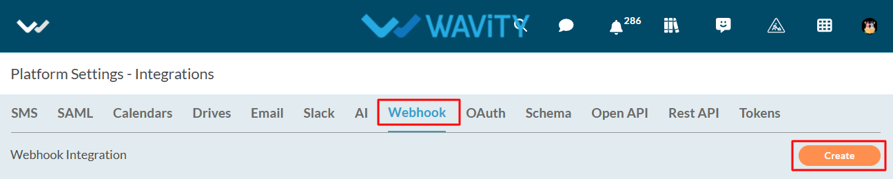
- Specify a name for the webhook in the Name field.
- Enter the description for the webhook in the Description field.
- Choose Inbound in the Type field.
- URI will be automatically generated under the Inbound section in URI field.
- Choose a created schema in the Payload field. (Creation of Schema Document)
- Choose the created ticketing application in Application field.
- Choose the active wBot which will create data in Wavity from another service.
- Click on the “Save” button.
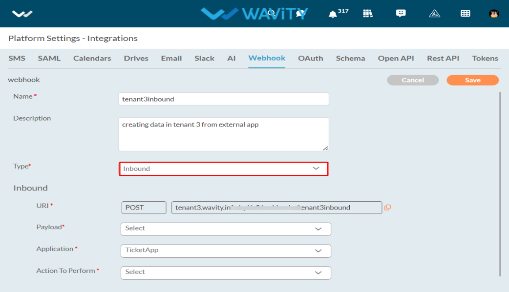
- That’s it! You have successfully added an inbound webhook to the Wavity account.
Setting Up Outbound Webhook in Wavity:
- Login to the Wavity admin account.
- Click on the Profile icon and select 'Integrations’.
- Click on the Webhook Tab and then click on the “Create" button to create a new outbound webhook.
- Specify a name for the webhook in the Name field.
- Enter the description for the webhook in the Description field.
- Choose Outbound in the Type field.
- Enter the Webhook URI of the application or service to which Wavity is sending data in Webhook URI field.
- Select POST/PUT/PATCH in HTTP method field.
- Choose a created schema in the Payload field.
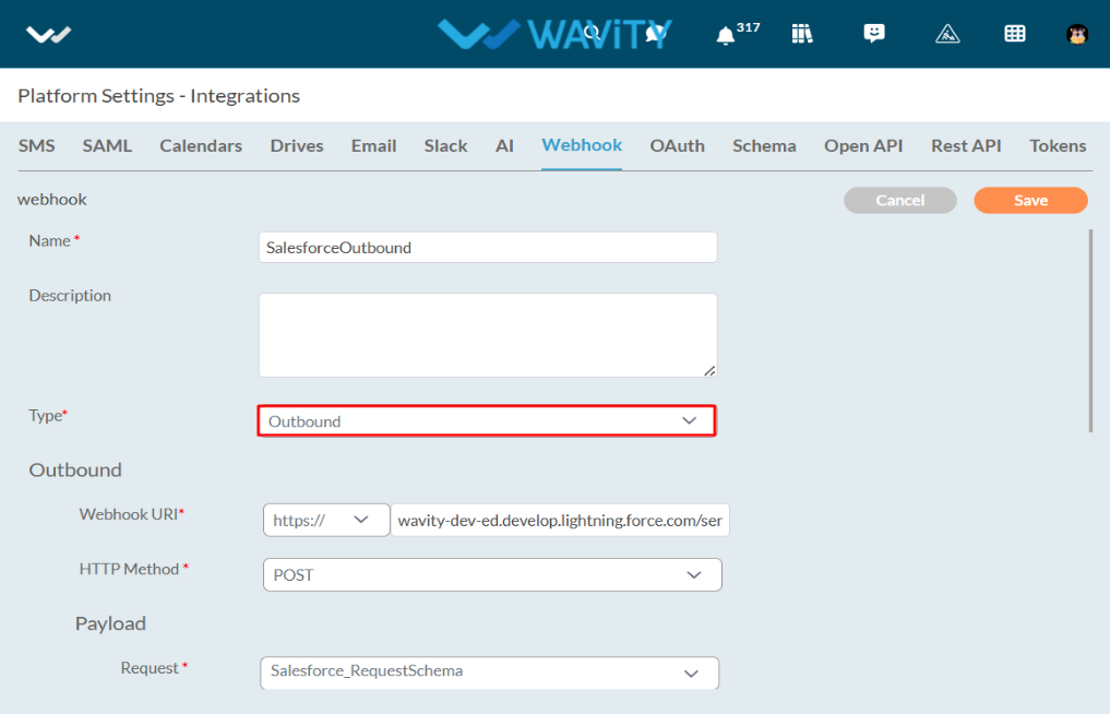
Authentication types provided in Webhooks:
- With Authentication
- HTTP authentication
- Basic (Authorization header - Outbound only)
- Bearer or token authentication (Authorization header with bearer token)
- OAuth2.0 authentication with the following Grant Types:
- Authorization Code
- Client Credentials
- Password Credentials
- HTTP authentication
- Without Authentication (Outbound only)
The following sections provide a comprehensive overview of the different types, each accompanied by a detailed explanation of the steps involved in their execution.
With Basic Authentication:
- Turn-on the Requires Authentication Toggle button.
- Choose Basic Authentication in Auth Type.
- Enter the username of the application or service to which Wavity is sending data.
- Enter the password of the application or service to which Wavity is sending data.
- Click on the Authorize button.
- Click on the Save button.
- That’s it! You have successfully added an outbound webhook with Basic Authentication to the Wavity account.
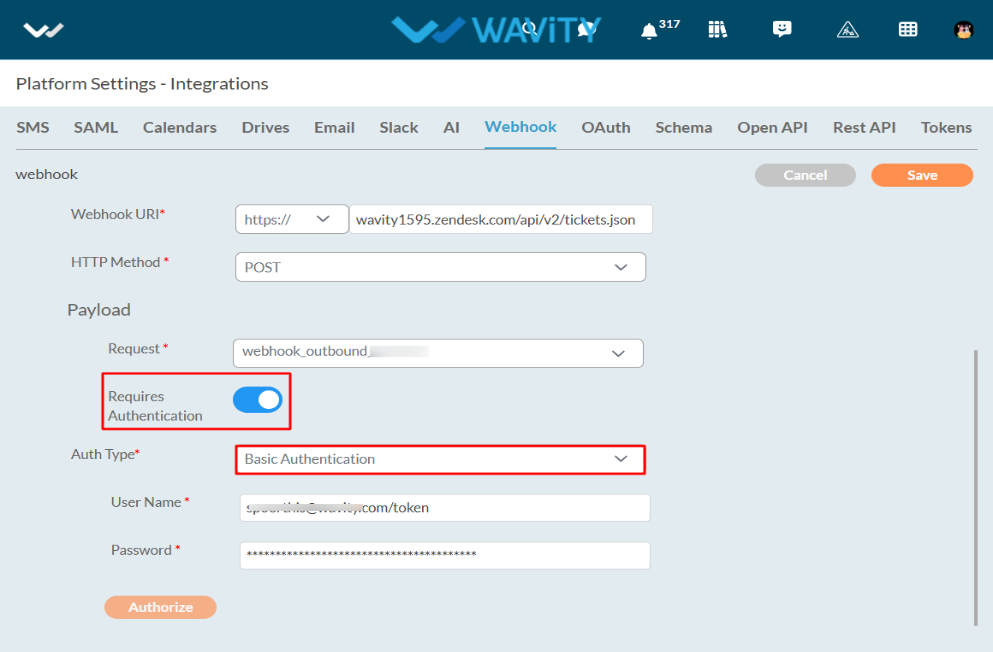
With Bearer Authentication:
- Turn on the Requires Authentication Toggle button.
- Choose Bearer Authentication in Auth Type.
- Enter the bearer token of the application or service to which Wavity is sending data.
- Click on the Save button.
- That’s it! You have successfully added an outbound webhook with Bearer Authentication to the Wavity account.
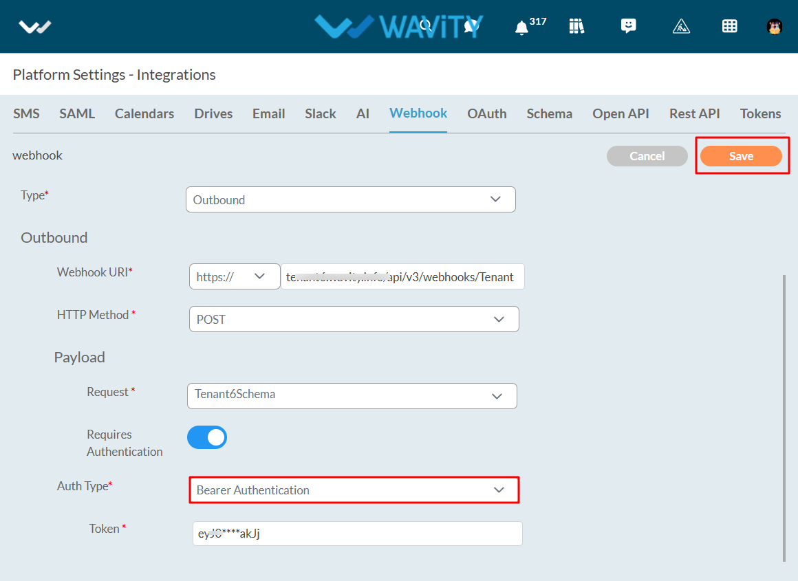
With OAuth2.0 and Grant Type – Authorization Code:
- Turn on the Requires Authentication Toggle button.
- Choose OAuth 2.0 in Auth Type.
- Choose Authorization Code in Grant Type.
- Enter the Client Id of the application or service to which Wavity is sending data.
- Enter the client code of the application or service to which Wavity will be transferring data.
- Enter the Authorize URI of the application or service to which Wavity is sending data.
- Enter the Token URI of the application or service to which Wavity is sending data in Token URI field.
- Enter scope of the application or service to which Wavity is sending data in Scope field.
- Redirect URI will be automatically generated in the Redirect URI field.
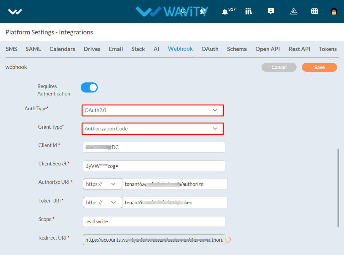
- Enter the refresh token URI of the application or service to which Wavity is sending data.
- Click on the Authorize button.
- Click on the save button.
- That’s it! You have successfully added an outbound webhook with OAuth2.0and Grant Type - Authorization Code to the Wavity account.
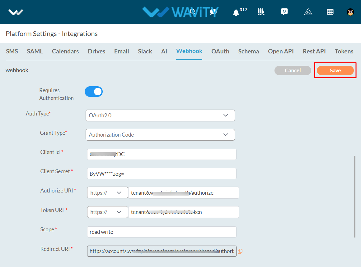
With OAuth2.0 and Grant Type – Client Credentials:
- Turn on the Requires Authentication Toggle button.
- Choose OAuth 2.0 in Auth Type.
- Choose Client Credentials in Grant Type.
- Enter the Client Id of the application or service to which Wavity is sending data.
- Enter the client code of the application or service to which Wavity is transferring data.
- Enter the Token URI of the application or service to which Wavity is sending data.
- Enter scope of the application or service to which Wavity is sending data in Scope field.
- Redirect URI will be automatically generated in the Redirect URI field.
- Enter the refresh token URI of the application or service to which Wavity is sending data in Refresh Token URI field.
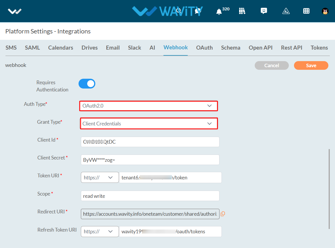
- Click on the Authorize button.
- Click on the save button.
- That’s it! You have successfully added an outbound webhook with OAuth2.0and Grant Type – Client Credentials to the Wavity account.
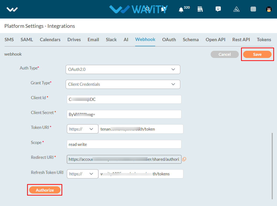
With OAuth2.0 and Grant Type – Password Credentials:
- Turn on the Requires Authentication Toggle button.
- Choose OAuth 2.0 in Auth Type.
- Choose Password Credentials in Grant Type.
- Enter the Client Id of the application or service to which Wavity is sending data.
- Enter the client code of the application or service to which Wavity is sending data.
- Enter the Token URI of the application or service to which Wavity is transferring data.
- Enter scope of the application or service to which Wavity is sending data in Scope field.
- Redirect URI will be automatically generated in the Redirect URI field.
- Enter the refresh token URI of the application or service to which Wavity is sending data in Refresh Token URI field.
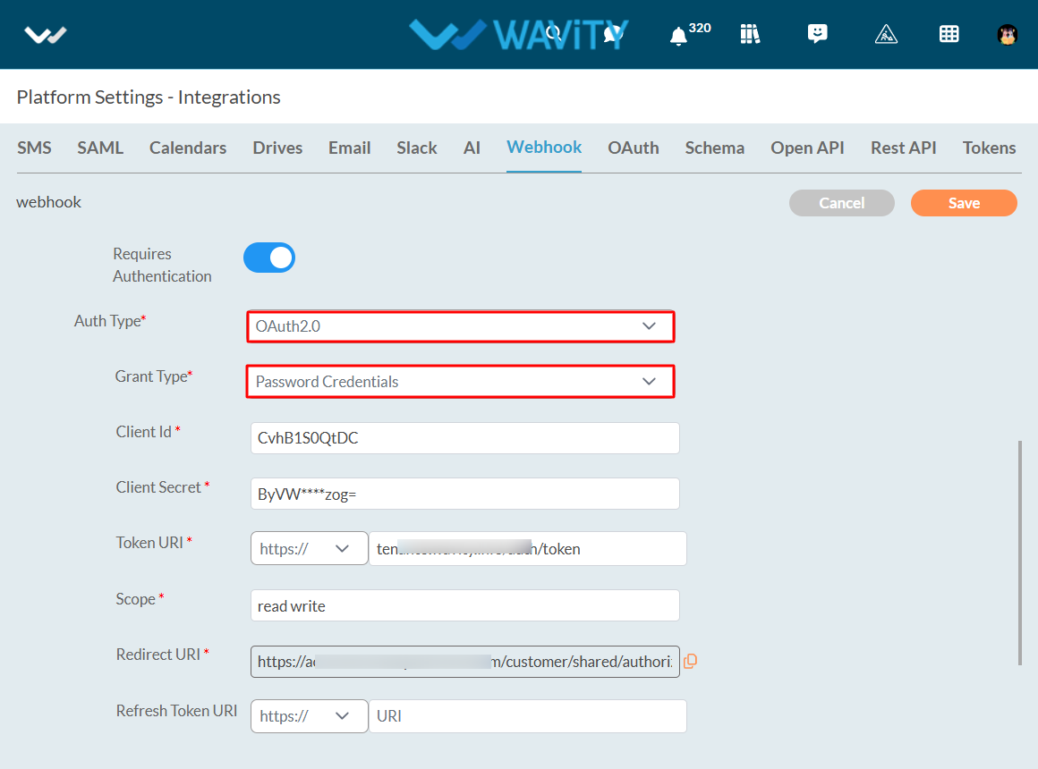
- Enter the username of the application or service to which Wavity is sending data.
- Enter the password of the application or service to which Wavity is sending data.
- Click on the Authorize button.
- Click on the save button.
- That’s it! You have successfully added an outbound webhook with OAuth2.0and Grant Type – Password Credentials to the Wavity account.
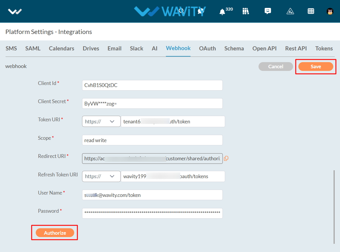
Without Authentication:
- Turn off the Requires Authentication Toggle button.
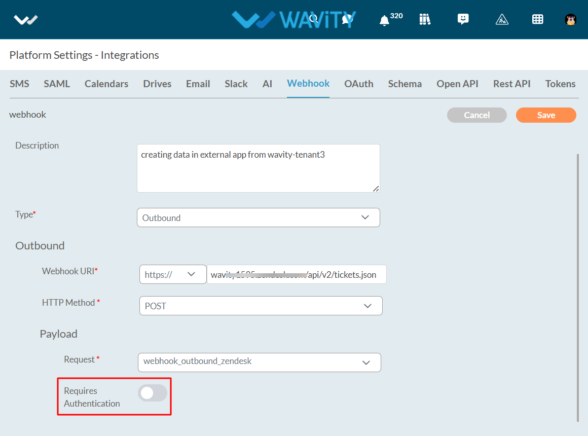
- Click on the save button.
- That’s it! You have successfully added an outbound webhook without Authentication to the Wavity account.
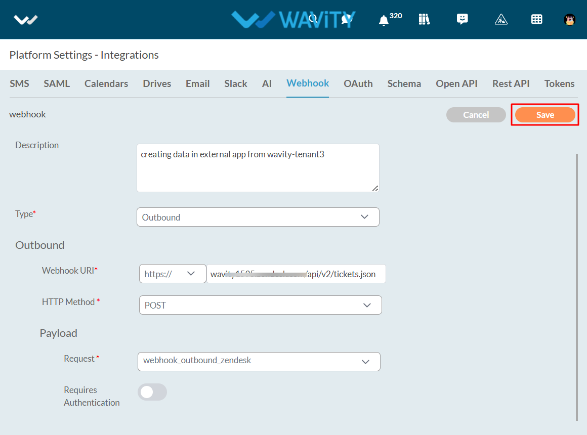
Schema Overview:
In Wavity, a schema acts as a structured framework for transmitting data between Wavity and various external applications or services. It defines the format, organization, and type of data being exchanged, ensuring that both the sending and receiving systems can accurately interpret and process the information.
The schema essentially defines the organization of the data, detailing its fields, datatypes, and relationships. This structured format enables smooth integration and communication between different platforms. By adhering to a standardized schema, data transfer becomes more consistent and accurate, minimizing errors and enhancing compatibility between Wavity and other systems.
Creating Schema in Wavity
To create aSchema in Wavity, simply follow these steps:
- Login to the Wavity admin account.
- Click on the Profile icon and select 'Integrations’.
- Click on the Schema Tab, and then click on the "Create" button under Schema.
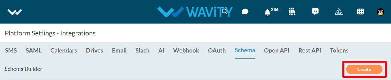
- Provide the title and description of Schema.
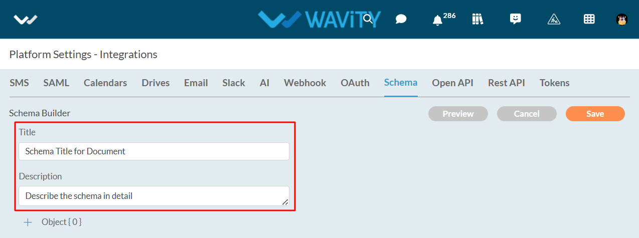
- Click on ‘+’ icon to add objects. Now, you can name the title of object and select object values as shown in below image.
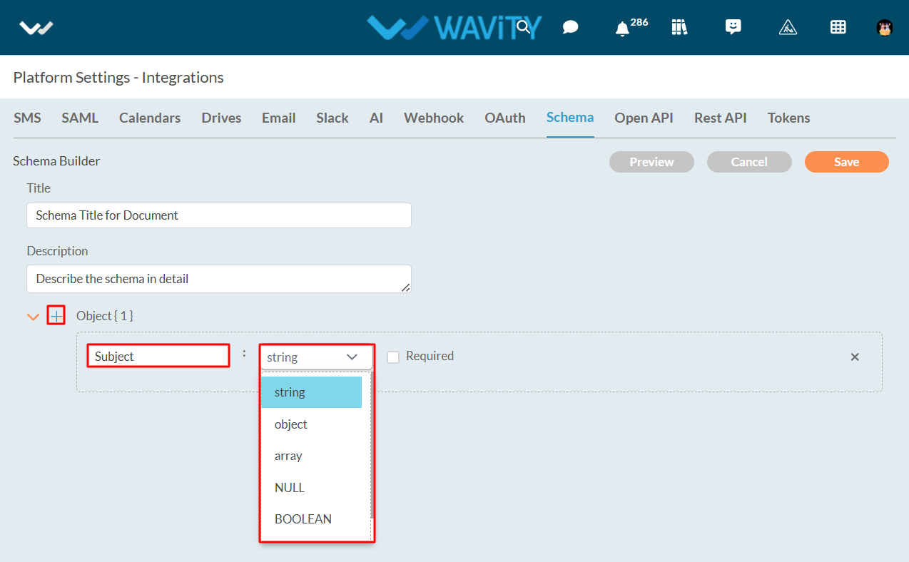
- Add multiple objects as per your requirement. Click on “Save” button to create a new schema. You can add the Schema to any of your Webhook Integration and API Integration as a payload.
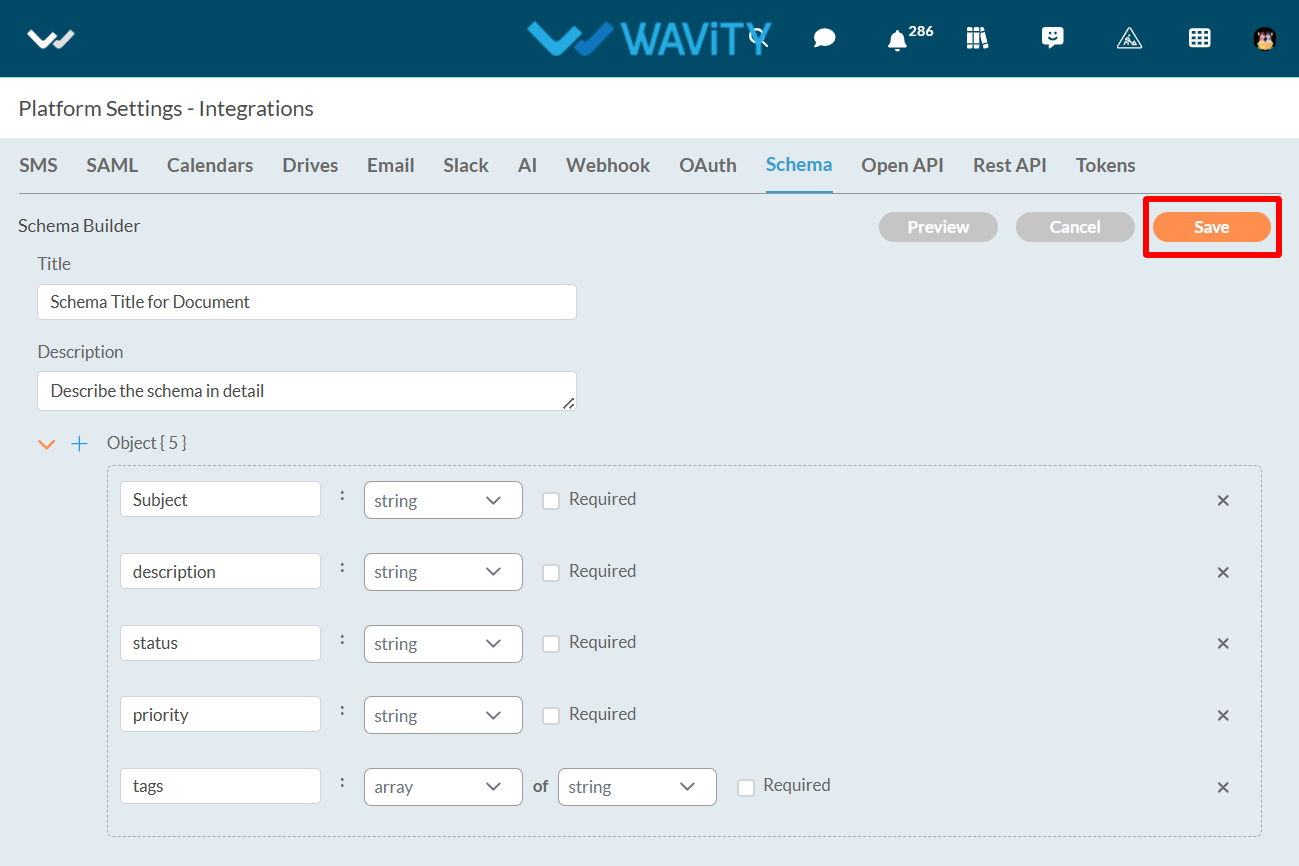
Wavity platform offers seamless integration with a variety of third-party software applications through multiple methods, ensuring flexibility and ease of use. These integration options include:
- Open API: Wavity's Open APIs follow the REpresentational State Transfer (REST) architecture, enabling you to perform standard operations such as reading, updating, adding, or deleting data from your helpdesk system.
- REST API: The REST API provides a robust way to connect Wavity with other software applications. It follows standard REST principles, allowing for efficient communication and data exchange. This method is ideal for integrating with cloud-based applications, ensuring real-time data synchronization and streamlined workflows.
- Webhooks: Wavity offers seamless integration with third-party software applications via webhooks. This capability allows Wavity to interact with external systems by sending and receiving real-time data and notifications. By leveraging webhooks, you can automate workflows, synchronize data, and enhance the functionality of both Wavity and other connected applications.
The chart below provides a concise overview of the integration workflows supported by Wavity.
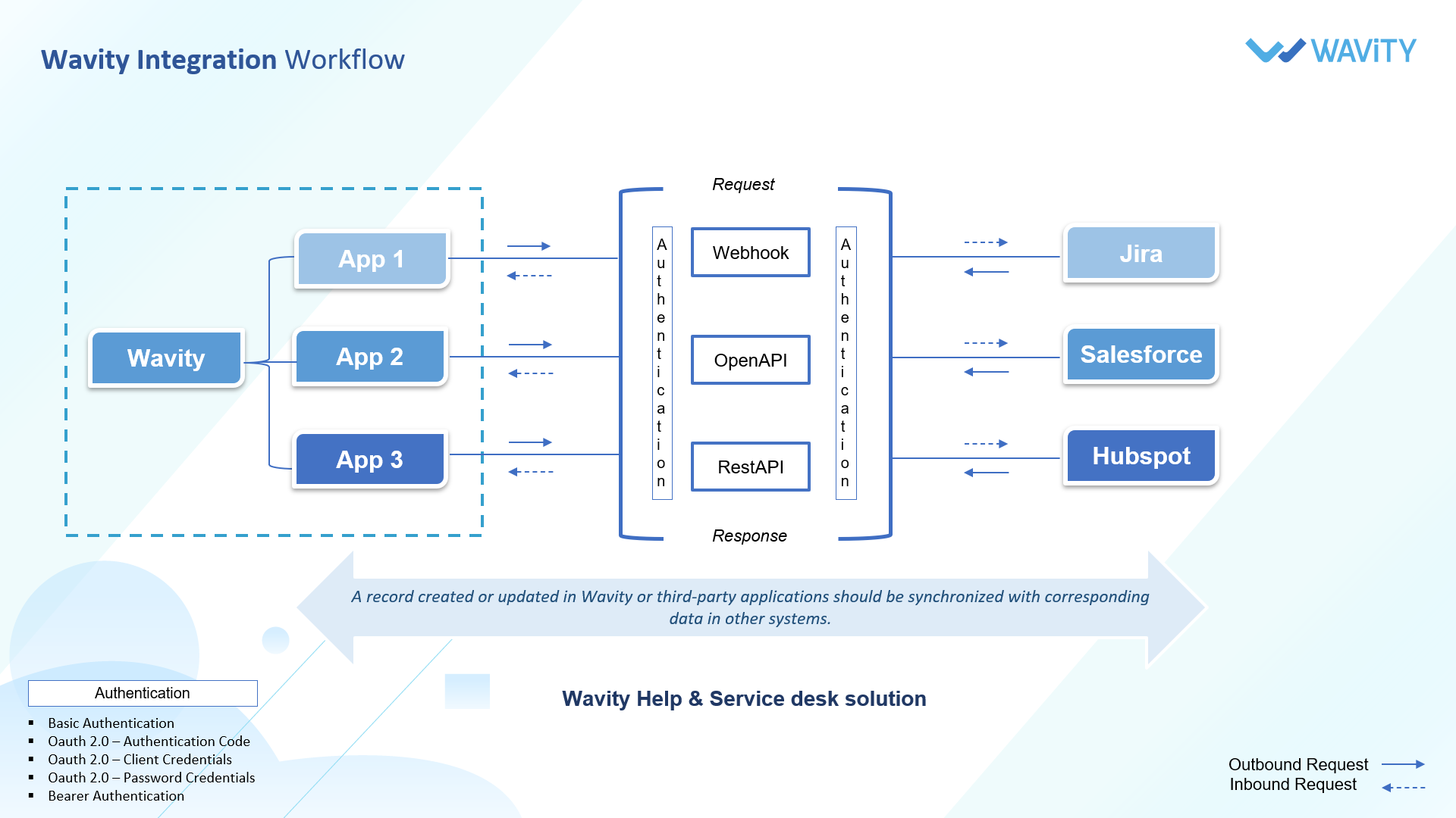
How to execute a new Macro?
- The Wavity platform provides Macros functionality which is a set of predefined sequences of actions or commands that can be executed automatically to perform repetitive tasks efficiently. They help streamline workflows, reduce manual effort, and ensure consistency in handling routine processes.
- Wavity Macros offer full customization, allowing you to tailor them to your specific needs and workflow. Whether it's inserting predefined responses, updating ticket statuses, or assigning tickets to the right team members, Wavity Macros can be customized to optimize your ITSM processes.
Executing Macro:
- To execute a macro, macros need to be enabled in the interface by the Admin/Solution Owner.
- Click on ‘Edit Dashboard’.
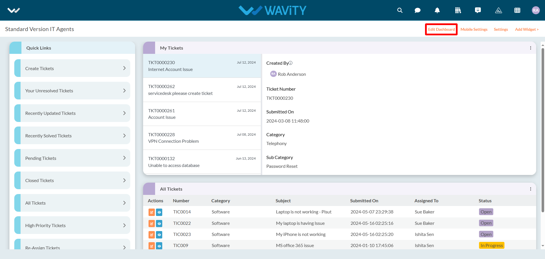
- Click on ‘Configure’ icon as shown in the image below.
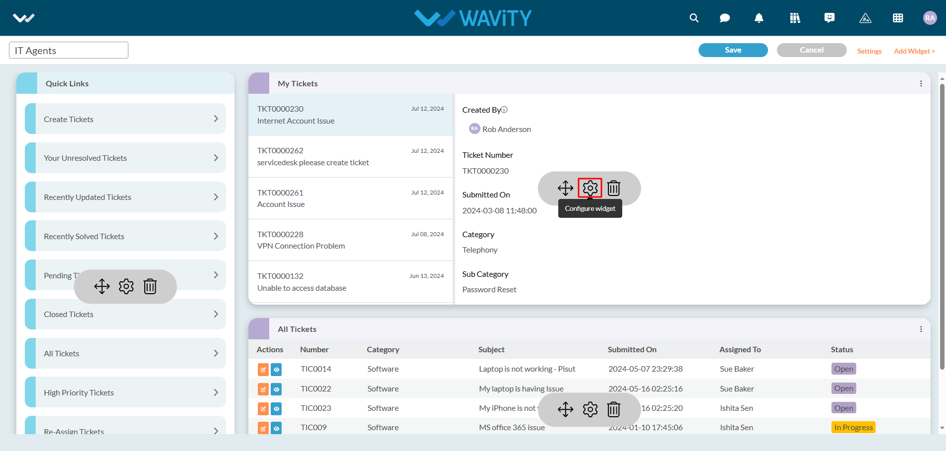
- Enable "Conversational UI" and click on the "Save" button. Now macros are enabled for use by users who have access.
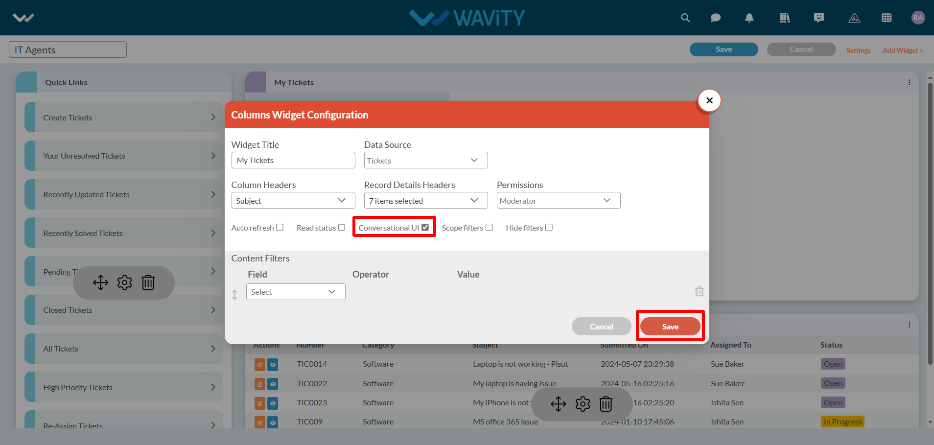
- Click on title of the widget in the interface.
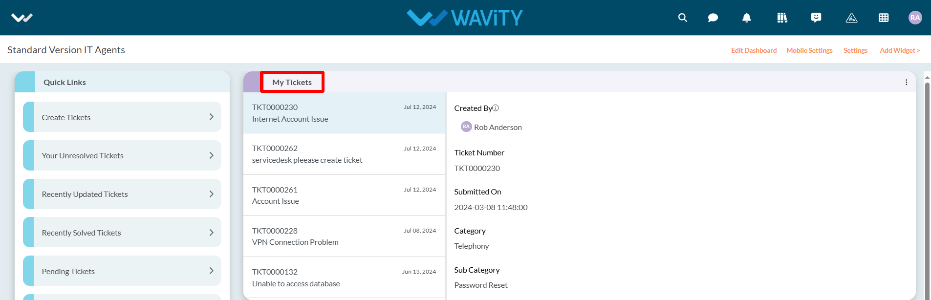
- Click on “Execute Macro” as shown in below image. All the Macro accessible by the current user will be displayed.
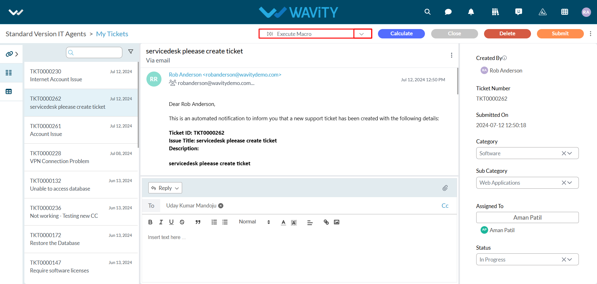
- Click on the Macro title you want to execute.
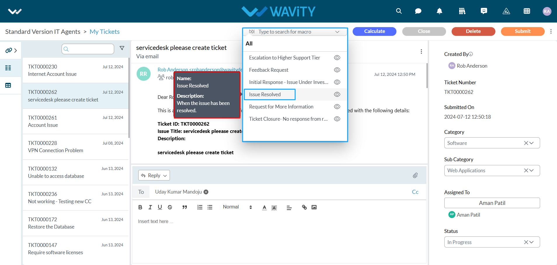
- Upon execution, all action items will be applied simultaneously. As in this example, the status value is changed, the Reply button is enabled, and the comment box is auto-populated. Please refer to the image below.
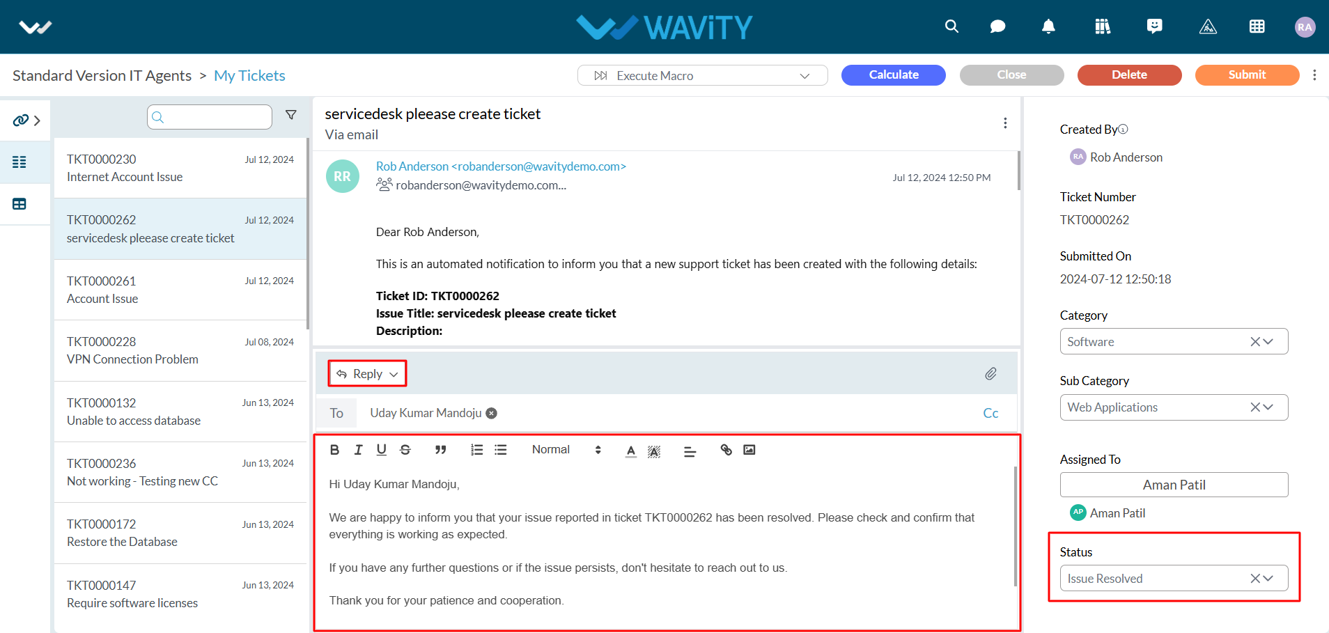
- Click on “Submit” button as the final Step.
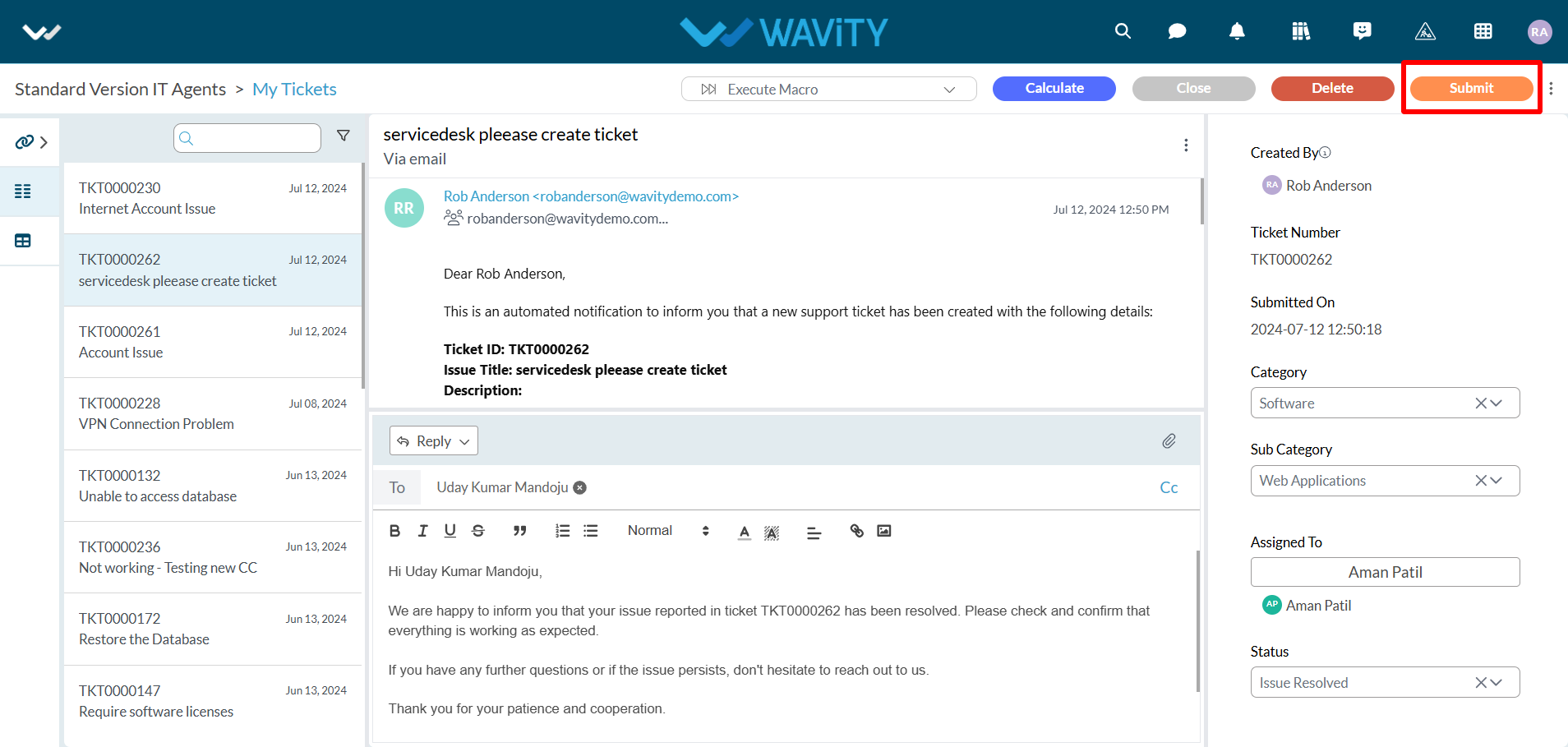
How to create a new Macro?
- The Wavity platform provides Macros functionality which is a set of predefined sequences of actions or commands that can be executed automatically to perform repetitive tasks efficiently. They help streamline workflows, reduce manual effort, and ensure consistency in handling routine processes.
- Wavity Macros offer full customization, allowing you to tailor them to your specific needs and workflow. Whether it's inserting predefined responses, updating ticket statuses, or assigning tickets to the right team members, Wavity Macros can be customized to optimize your ITSM processes.
Adding a New Macro:
- Note: Only admin can create or edit Macros in Wavity.
- Navigate to “General” as shown in below image.
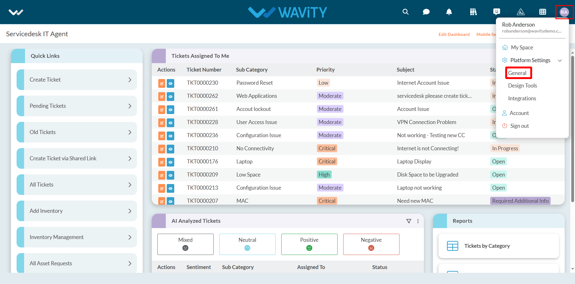
- Click on “Macros” under ‘Ticketing’ section.

- Click on “Add Macro” button as shown in below image.
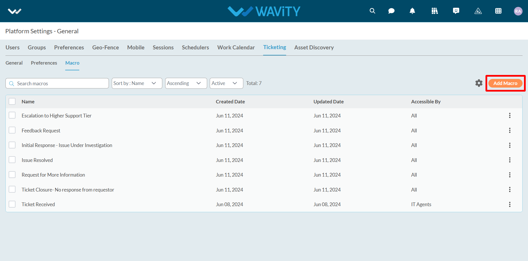
- Provide the Title and Description of the new macro.
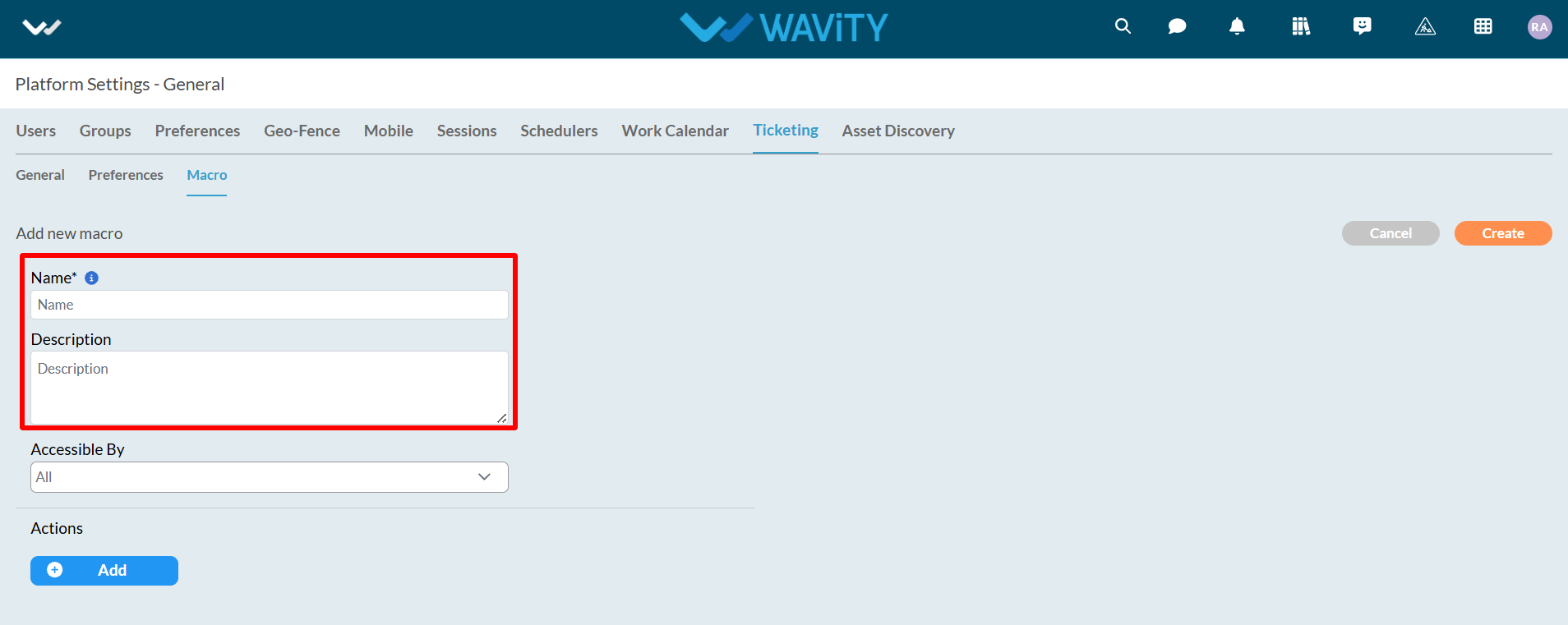
- Now, select the accessibility options from the dropdown. Accessible users will be able to execute the macros.
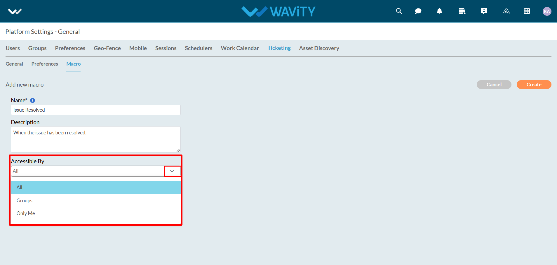
- Click on "Add" as shown below. A maximum of 5 actions can be executed for an individual macro.
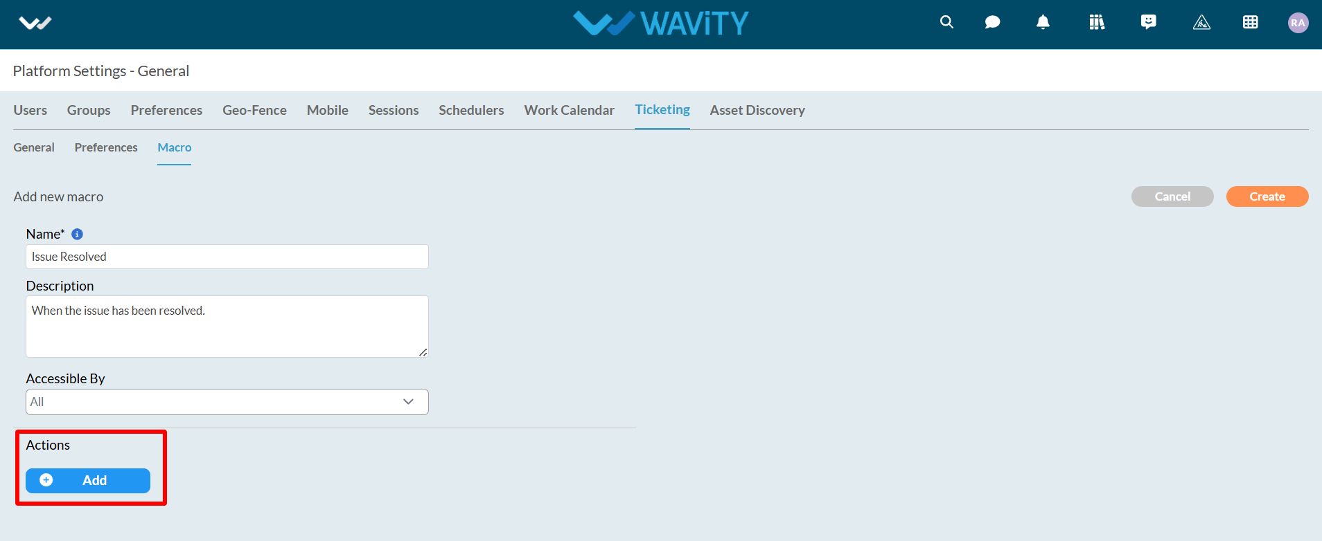
- Click on dropdown arrow to select the action type.
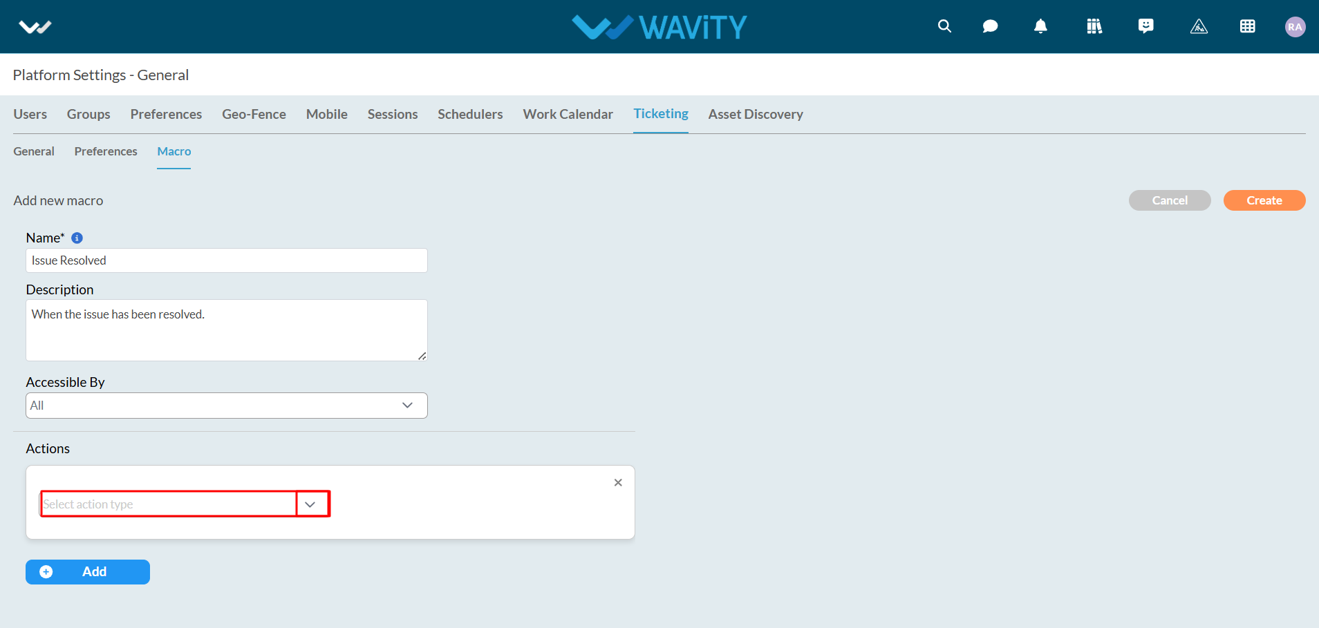
Following options will be provided under action type.
- Set Field Value: Changes or sets a new field value upon macro execution.
- Add Field Value: Adds a new field value for the selected data field.
- Remove Field Value: Removes a field value upon macro execution.
- Set Comment Value: Adds a comment during macro execution.
- Set Comment Mode: Selects the comment mode during macro execution.
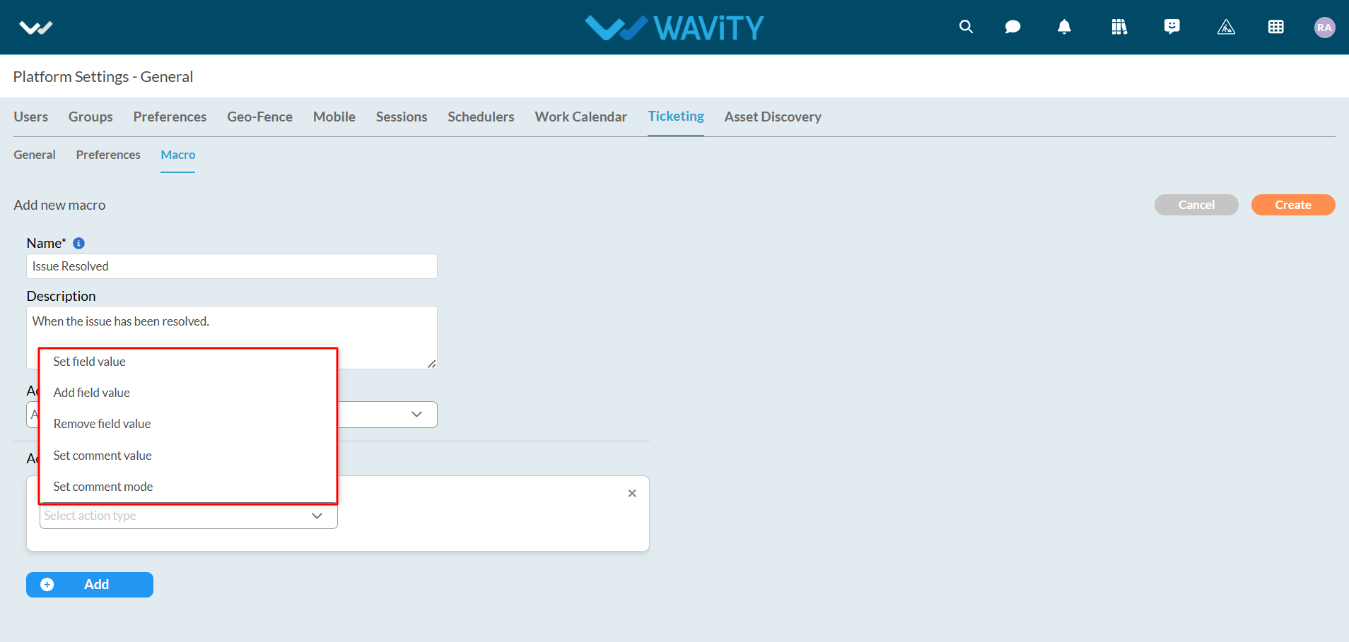
- As an example, "Set Field Value" will be used. Select "Set Field Value" and choose the data field to change, as shown in the image below.
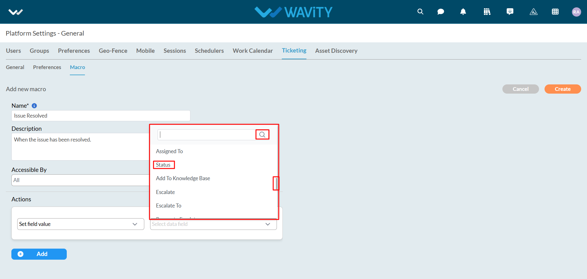
- Now, select the value to change.
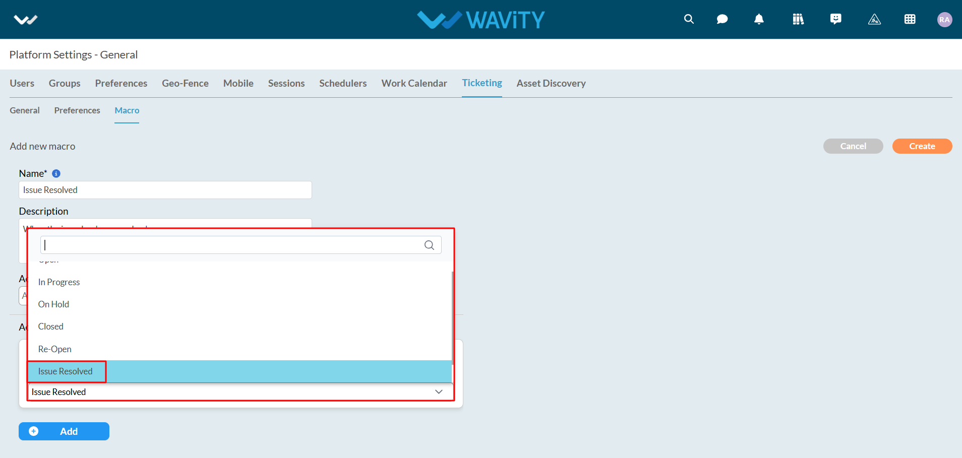
- As shown in the image below, the first action type is completed. Changes can be made if needed.

- Click on the "Add" button to add a new action. However, it is important to note that all actions will be executed simultaneously.
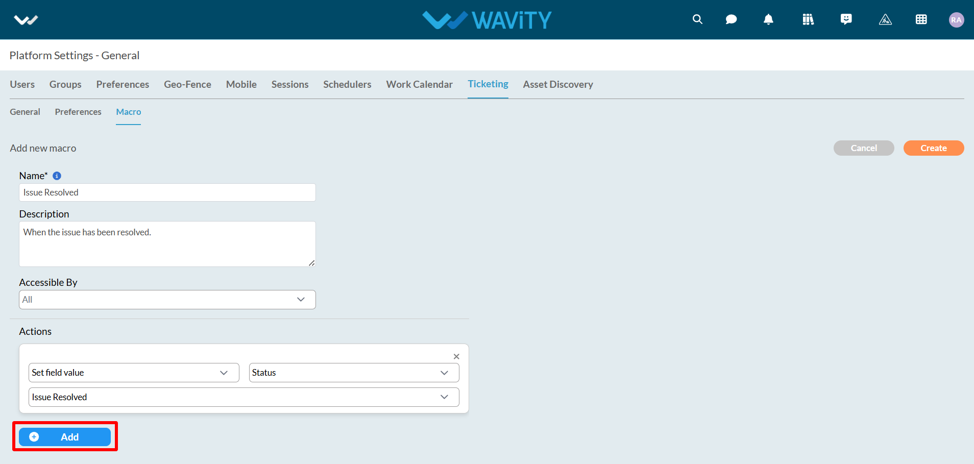
- Select "Set Comment Mode" as the action type. Two options will be provided: Reply or Note. In this example, Reply will be used.
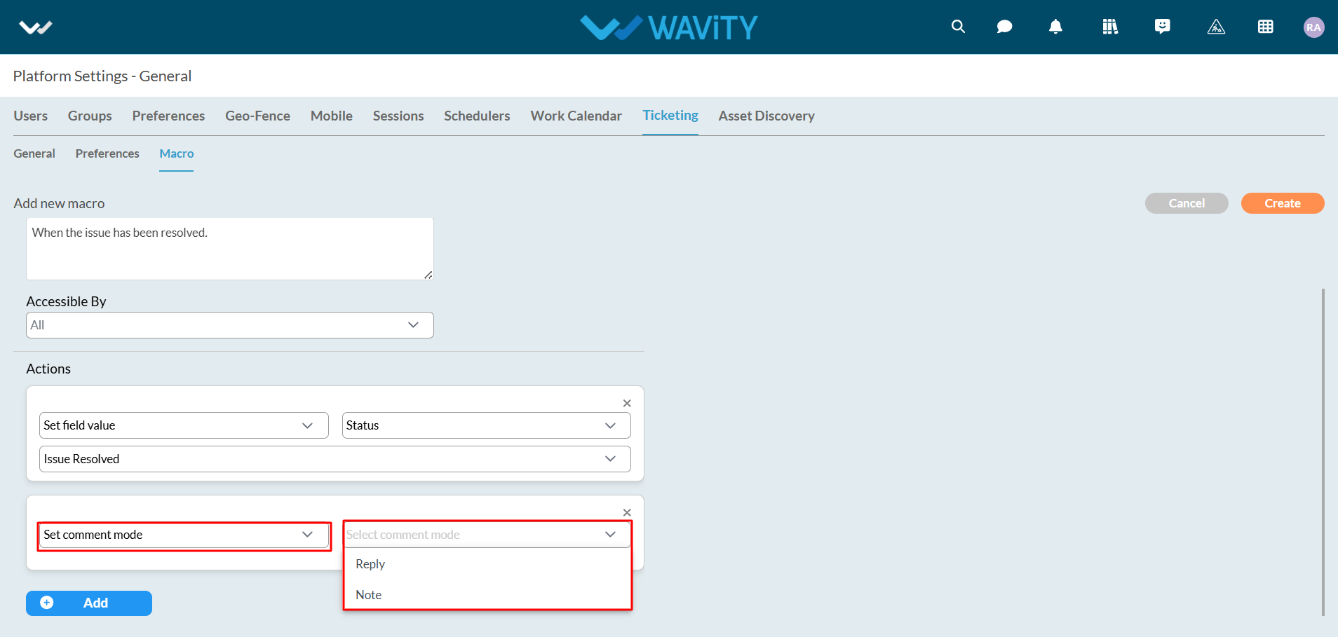
- Select "Set Comment Value" as the action type.
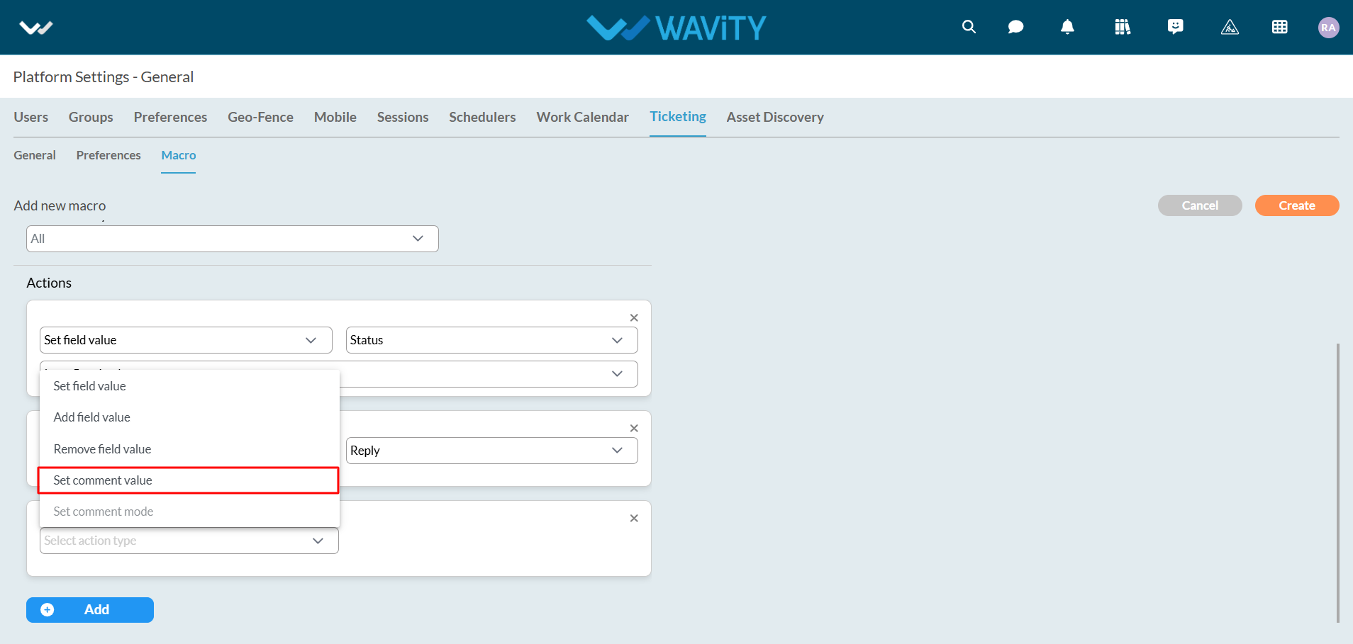
- A text box will then be displayed to enter the comment to be applied after executing the macro. When hovering the cursor over the "Question Mark" icon (refer to the image below), instructions for using the comment box will be displayed.
- The instructions are as follows: "Use the pattern${key} to insert data fields into comments. For example, Hello ${username} will be replaced with the actual username."
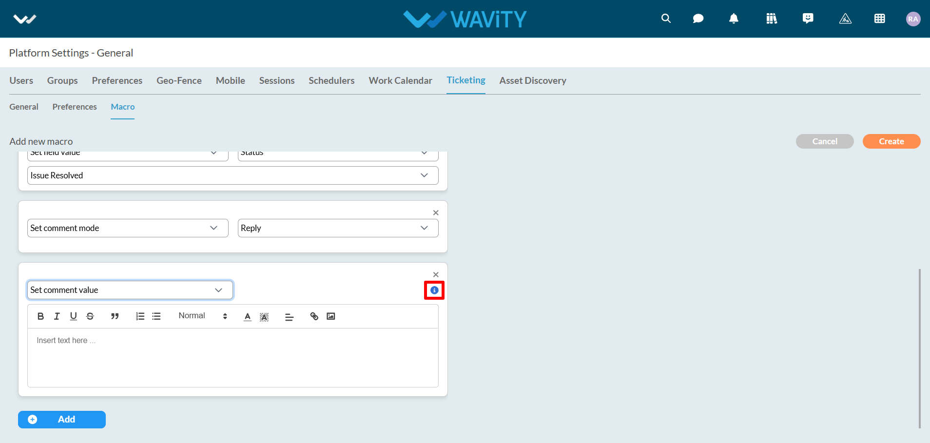
- After using the pattern as instructed above, select the appropriate data fields for mapping the data, as shown in the image below.
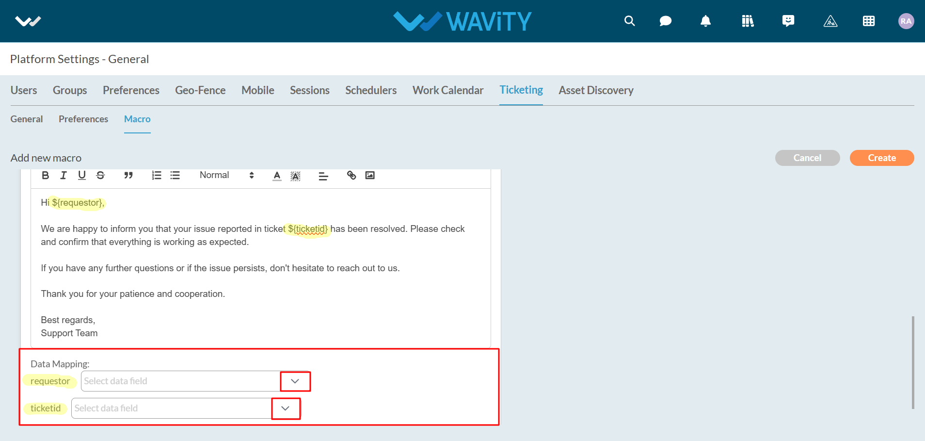
- After all actions are entered, click on the "Create" button to create and save to create a New Macro.
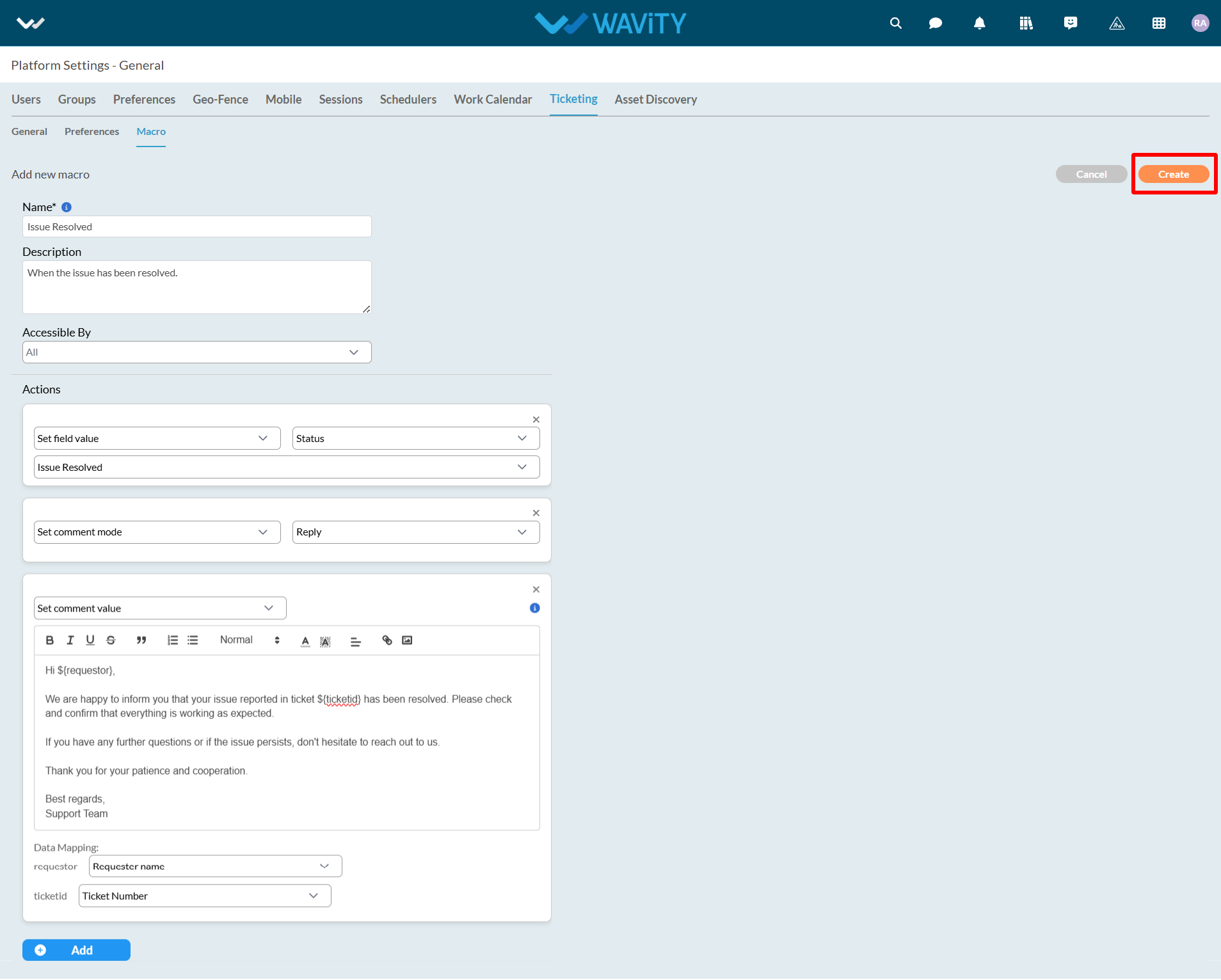
Editing an existing Macro:
- Below image displays the list of all existing Macros. Click on ‘Setting icon’ as shown in the image below.
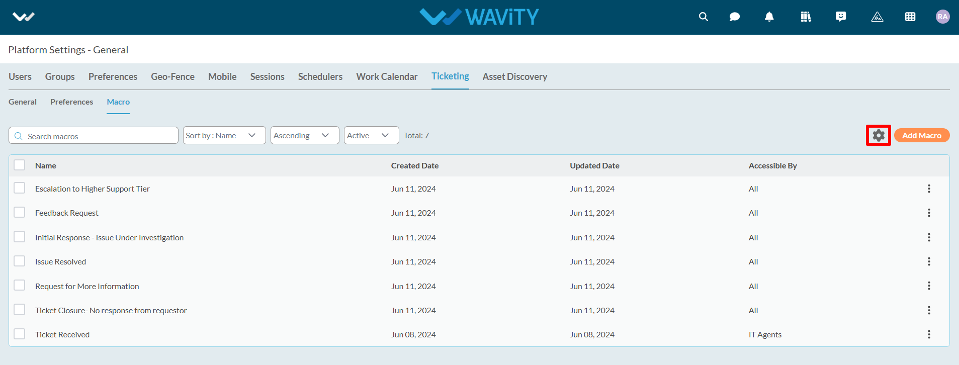
- Toggle Enable Macro as "Switched On". Click on 'Save' button.

- As shown in the following image, all macros in the current tenant are displayed in a list format. Macros can be sorted based on your needs and requirements.
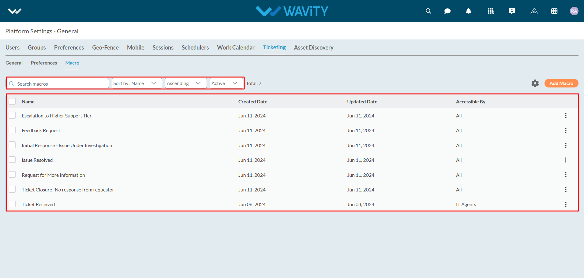
Click on the "3 dots" to display the following options:
- Edit: To edit the selected macro.
- Clone: To copy the selected macro and create a new macro.
- Deactivate: To deactivate the selected macro.
- Delete: To delete the selected macro.
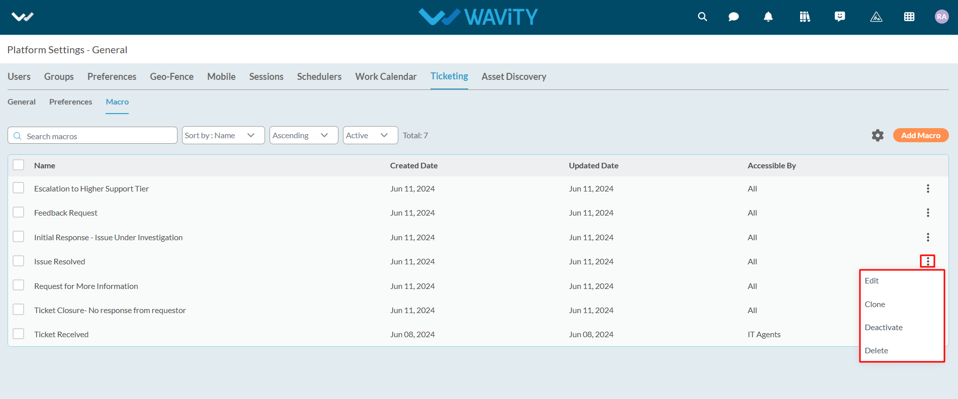
How to Add and Edit Column Widgets in Wavity
- Widgets in Wavity are interactive components or visual elements within a user interface (UI) that provide users with specific functionalities, data visualizations, or quick access to information and actions.
- Widgets can be added/edited to interfaces/dashboards in Wavity platform. This features allows you to customize dashboards based on your requirements. For more details on creation of dashboards or interface, please refer the following link: How To Create Role-Based Interface/Dashboards/Layouts | Wavity
- Only an Admin of your organization has the access to create or update widgets in Wavity.
- To create a new columns widget: Click on “Manage Widget”.
- The Widget Settings pop-up will be displayed. As shown in the image below, all existing active widgets in the layout are listed. To create a new widget, click the ‘Create New’ button.
- You can create various types of widgets such as Reports, Analytics, Table, Links, Bulletin & Columns in the layout.
- To create a new Column widget, click on "Columns".
- Choose a color for the widget to customize its appearance.
- Enter a title for the widget to identify it clearly.

- Select the appropriate data source or application from which the data will be displayed.

- Under ‘Column headers’ section, Select a maximum of 2 headers. Unique Identifier’s such as “ticket number” or “request id” will be selected by default.

- Under ‘Record headers’ section, Select any number of headers or fields as per your requirement. Preferably, Select the data headers which are a relevant part of the form.

- Click on ‘Re-order’ icon to use the drag and drop tool to rearrange the headers or fields as per your requirement.

- Under Permissions, select the appropriate user category such as End User, Approver, Manager, or Moderator, as shown below. Only users in the selected category will be able to view or edit the link to the data source application.

- In the Status Control dropdown, select the field (e.g., 'Status') that will be used to display progress in the progress bar.

- Select the features you need by checking or unchecking the options below. Common features available in Table widgets include: (Enabling Conversational UI is recommended).
- Auto Refresh: Automatically updates the data within the table at specified intervals.
- Read Status: Displays unread records in bold for easy identification.
- Conversational UI: Presents records in a conversational format, allowing users to reply interactively and also enables using macros (predefined responses).
- Show Text Comprehend Result: Displays records with AI-driven sentiment analysis.

- To apply filters: Choose the field from the data source application that you want to filter. You can apply various operators such as Equal, Not Equal, In, Empty, and Not Empty.
- Based on the selected field, all corresponding values will be displayed in the Value dropdown. Select the required value to apply the filter.
- To add more complex filtering conditions, you can use the "And" and "Or" functions: Enabling "And" will apply the filter only if all conditions are met. Enabling "Or" will apply the filter if any condition is met.
- Finally, Click on ‘Create’ to create a new table widget.

- Column Widget will be featured in the dashboard/interface as shown in below image. Click on the title of the column widget.

- Column widget with conversational UI allows users to communicate seamlessly and also to execute macros (pre-defined responses).

How to utilize Knowledge Base Management Feature
- Wavity Knowledge Base Management allows users to effortlessly add articles to their solutions. Keep track of views and revisions, while also having the option to export articles into PDFs or shareable links.
- Also, Wavity AI Chat Bot can seamlessly be integrated with Knowledge Base Management, offering users access to a repository of solutions and troubleshooting guides directly within the chat interface.
- To utilize Knowledge Base, Click on the “Knowledge base” icon as shown below.
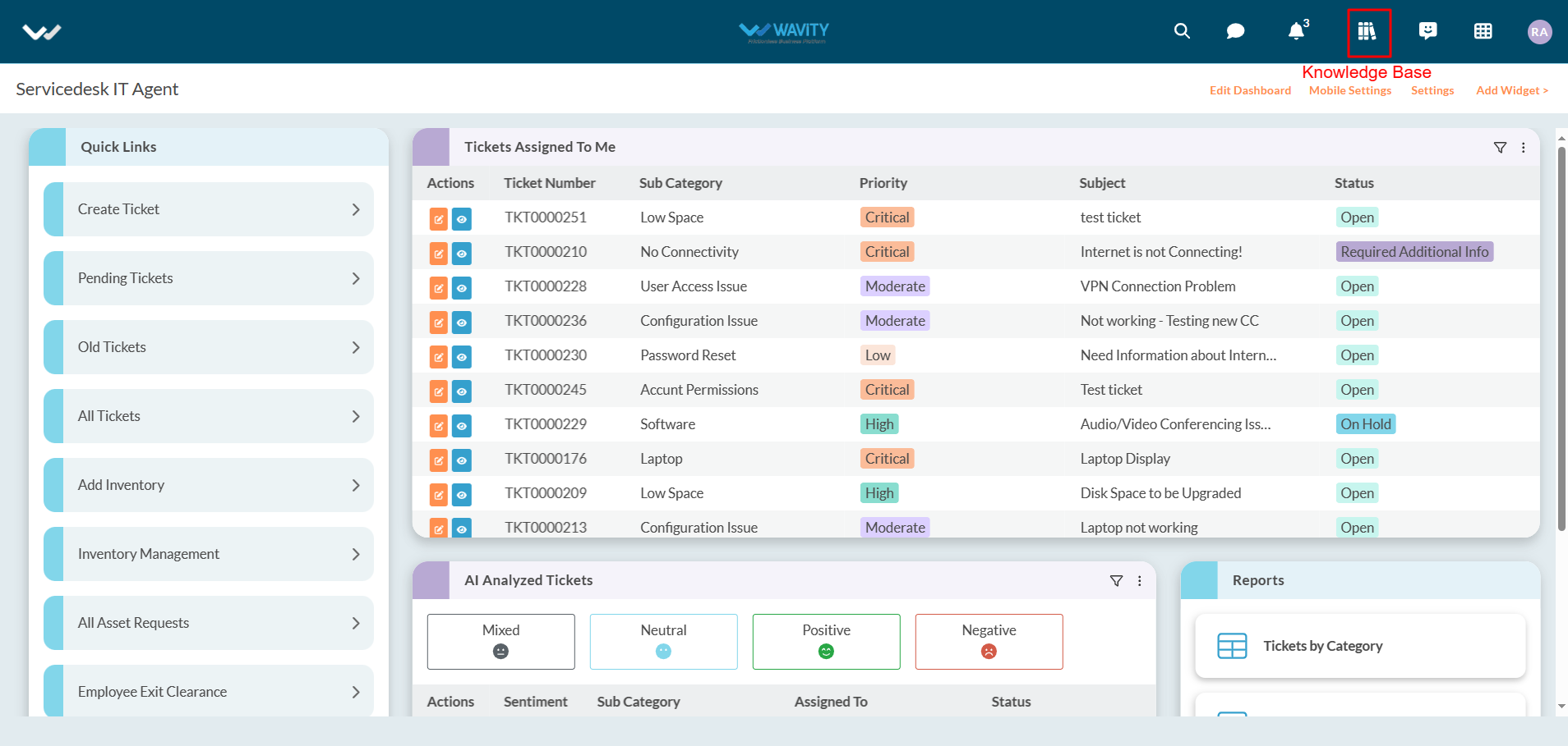
- Users can use the search box to find out articles in knowledge base. They can also view Popular and Recent articles as shown in below image.
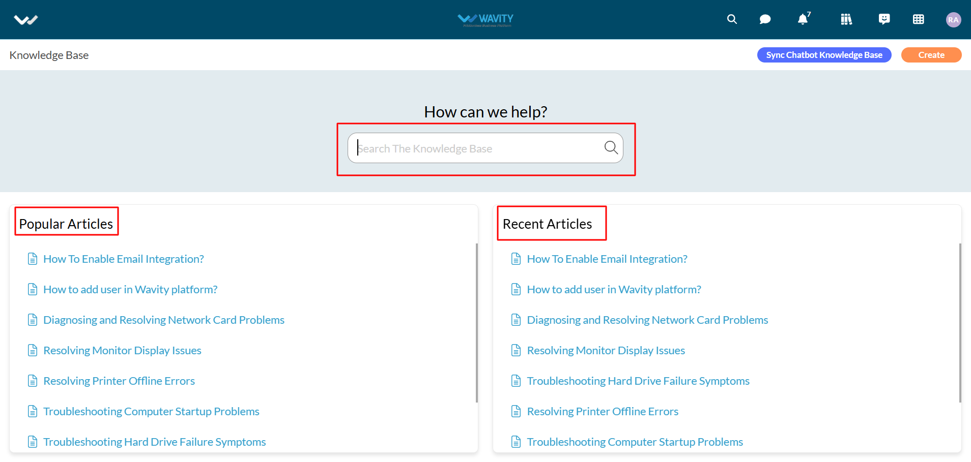
- To view/edit a Knowledge Base (KB) article, Click on any one of the articles as shown below.
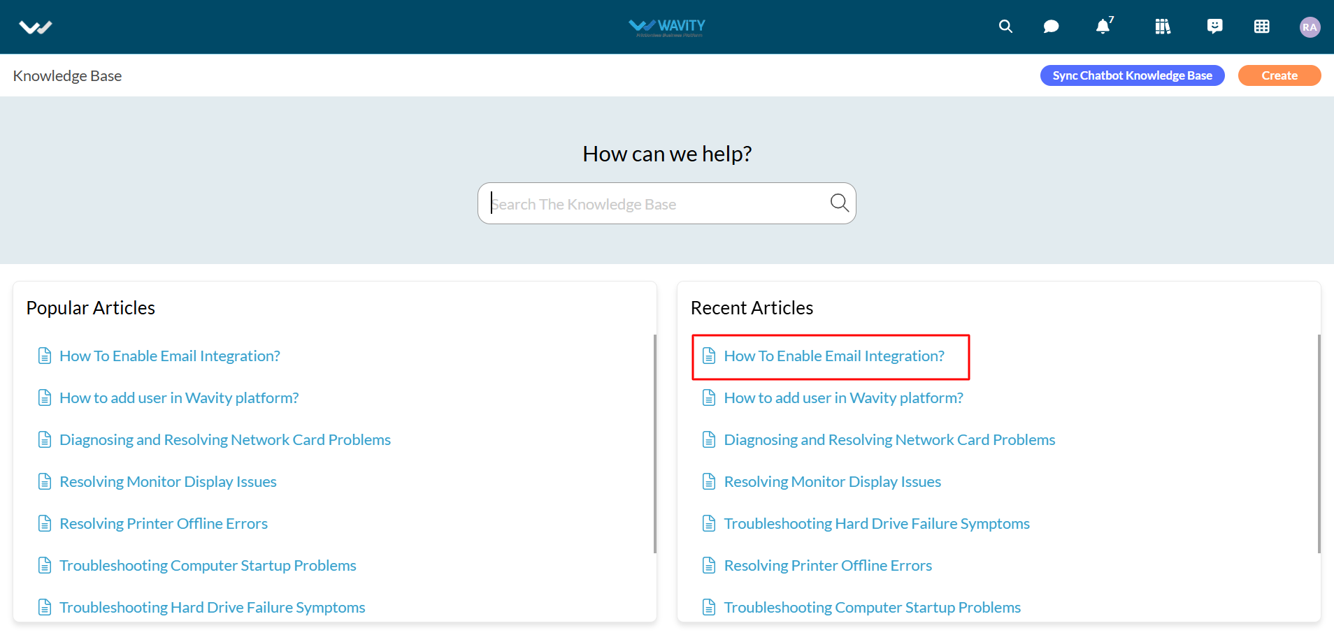
- Users/Admin can use the “Edit” button to edit the articles if needed. They can also use the “Delete” button to delete the article.
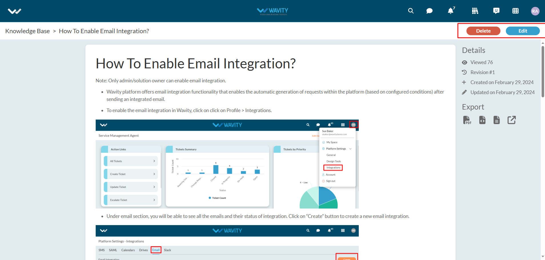
- Under details section, information such as view count, revision count, created and updated information will be displayed.
- Users can also export the KB articles to various formats such as PDF, HTML, Plaintext or Get Link as shown in below image.
- Users/Admin can create articles into the KB by clicking on “Create” button as shown in below image.

- Users/Admin can enter the Topic and Body of the article as required. They can also use the various options as shown in below image to edit the articles. Click on “Save” button on completion.
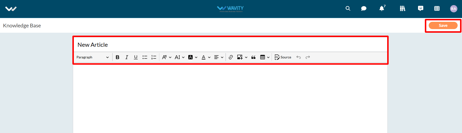
- Wavity AI Chat Bot can also be seamlessly integrated with Knowledge Base Management, offering users access toa repository of solutions and troubleshooting guides directly within the chat interface.
- You can sync chatbot with knowledgebase management by clicking on the button “Sync Chatbot Knowledge Base” as shown in below image.
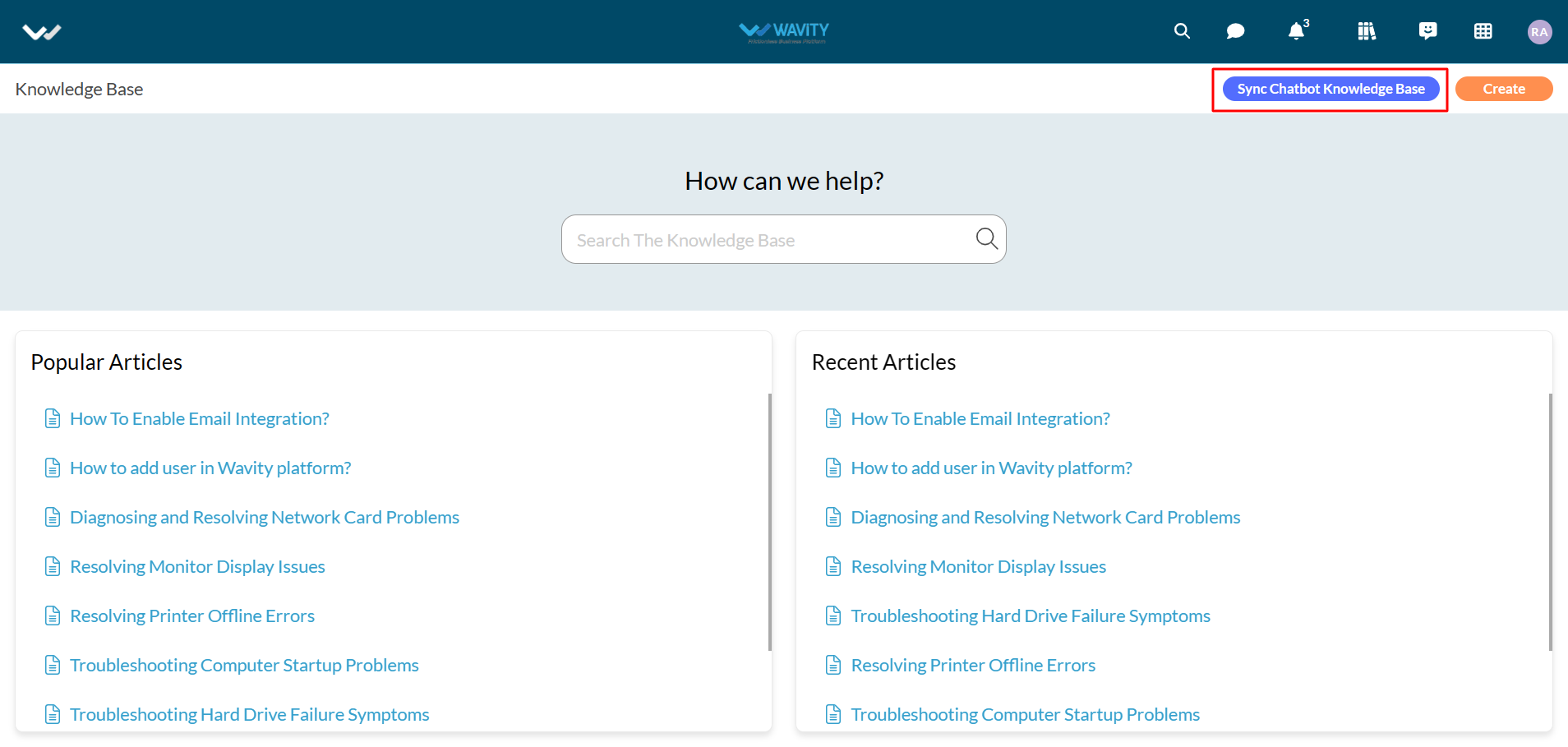
- Now, Users can ask for any queries in the chat bot. Wavity AI Chatbot will look into all the articles in the Knowledge base and give a summarized response.
- Open Chatbot, enter any queries you are having in the text box and press Enter button in your keyboard. Example shown in below image.
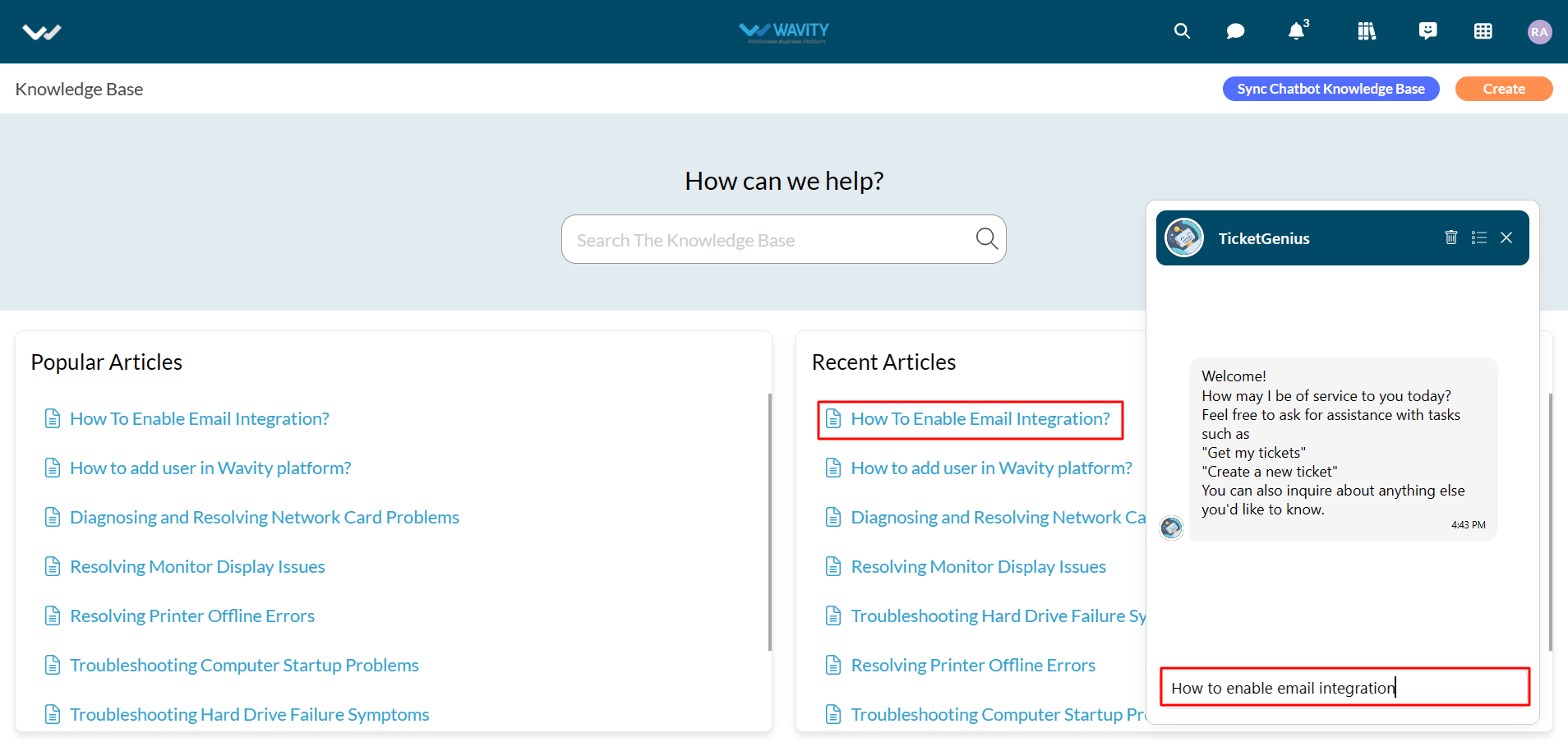
- AI Chatbot will respond accordingly to your queries as shown in below image.

How to use AI ChatBot in Wavity
All Users within Wavity platform can utilize AI Chatbot feature where ticket creation becomes effortlessly intuitive through simple command prompts.
Users can now initiate ticket creation directly within the Chat Bot interface, engaging with the bot to log their issues or requests by providing necessary details. Additionally, Users can retrieve details and real-time status updates for existing tickets.
To utilize AI Chatbot, Click on the “Chatbot” icon as shown below.
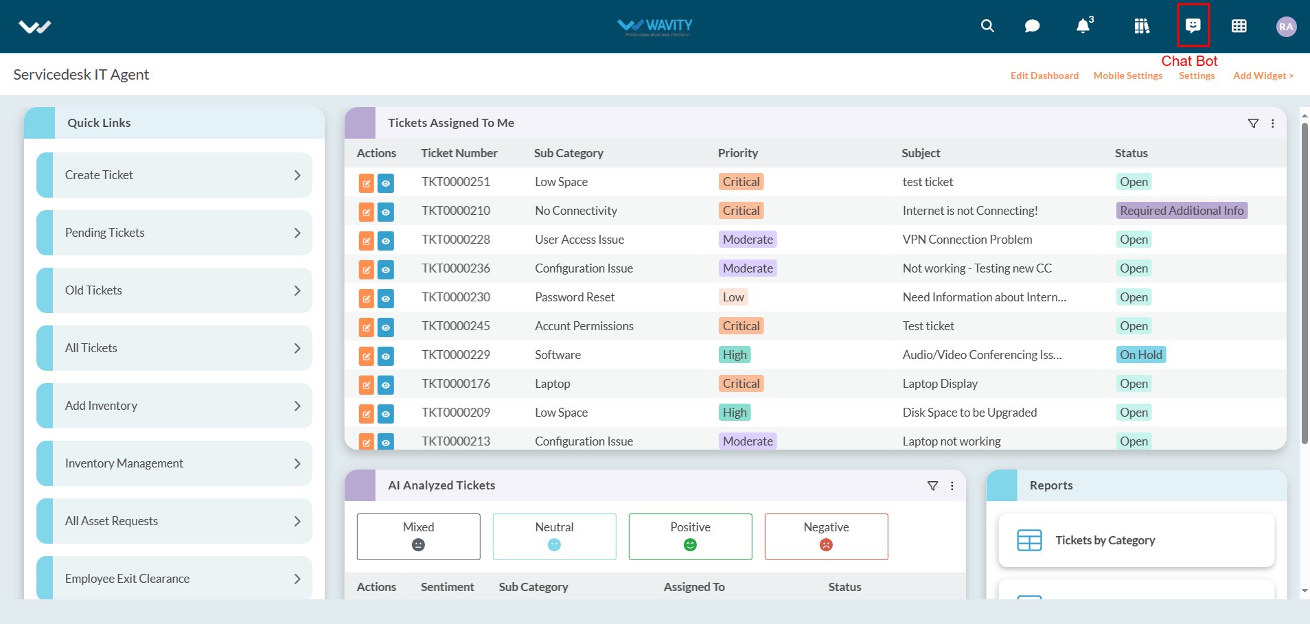
Chatbot interface will open as shown in below image.
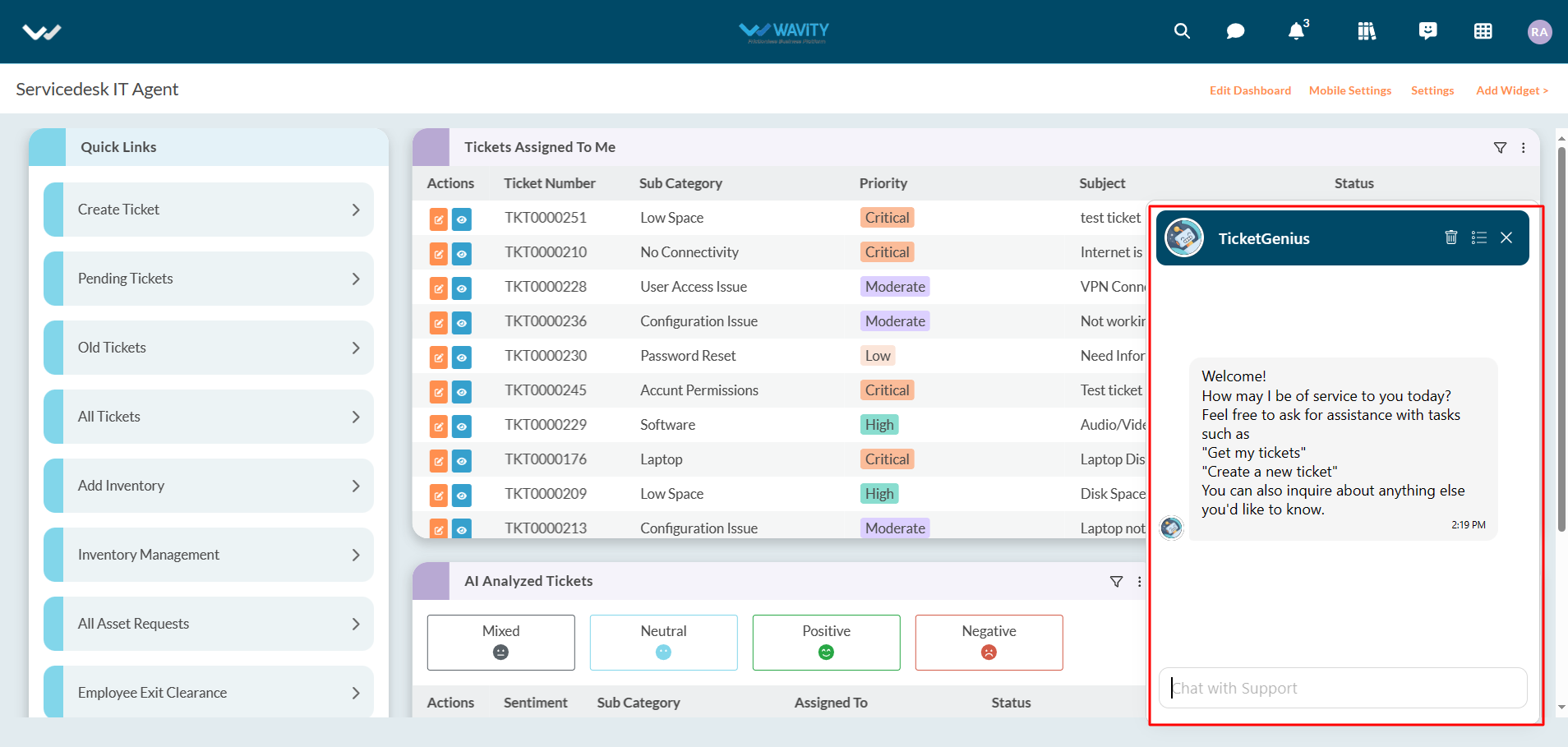
To create tickets, users can enter a comment such as “Create a new ticket” in the text box as shown below. After entering your comment, click on “Enter” button in your keyboard.
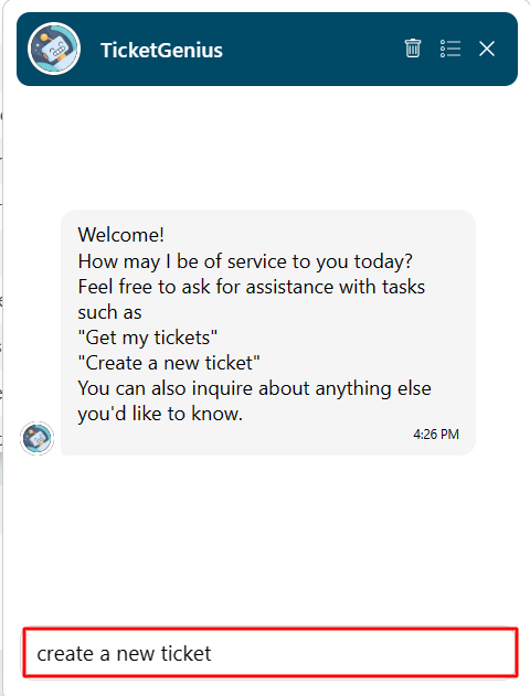
Users can provide more details about the ticket such as a subject or description of the issue as shown in below image.
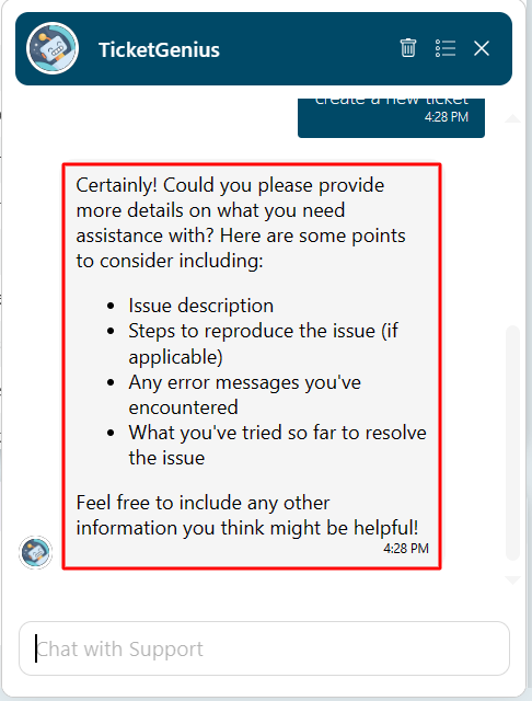
Users shall confirm or cancel to create a ticket into Wavity platform as shown in below image.
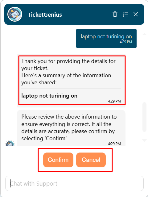
Users can also open a new chat window by clicking on the icon as shown in below image.
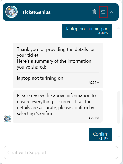
Click on “Plus” icon to open a new chat.
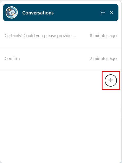
User can also retrieve any existing tickets which was raised by them. Enter “get my tickets” in the text box as shown below.
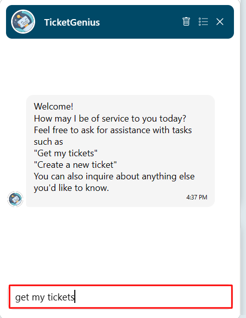
List of tickets associated with the current user will be listed below.
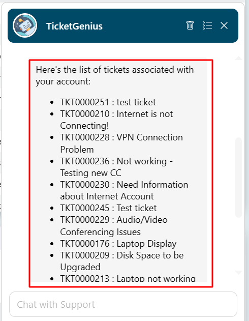
Now, Users can select the ticket number which they would like to retrieve.

Users can also click on the link to find more information on the ticket. They can also utilize the “Close” or “Update” button as shown in below image.
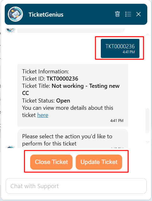
Wavity AI Chat Bot can be seamlessly integrated with Knowledge Base Management, offering users access to a repository of solutions and troubleshooting guides directly within the chat interface.
To assess Knowledge base management, Click on the icon as shown below.

You can sync chatbot with knowledge base management by clicking on the button “Sync Chatbot Knowledge Base” as shown in below image.

Now, Users can ask for any queries in the chat bot. Wavity AI Chatbot will analyze all the articles in the Knowledgebase and give a summarized response.
Open Chatbot, enter any queries you are having in the text box and press Enter button in your keyboard. Example shown in below image.

AI Chatbot will respond accordingly to your queries as shown in below image.
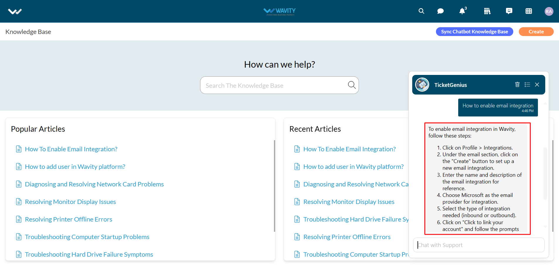
Another example of a query as shown in below images.

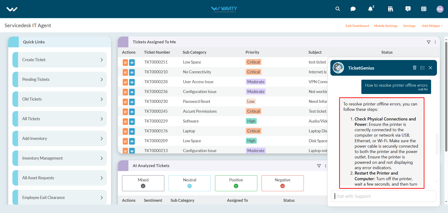
The Wavity platform offers seamless integration with cloud-based file storage services such as Google Drive, enabling direct file access and optimizing resource utilization.
Enabling Google Drive Integration in Wavity
· Only Admin/Solution owner will have authorization to enable Google drive integration with Wavity.
· To initiate Google Drive Integration within the platform, administrators must first enable it in the platform settings. Once this integration is activated, users within the same tenant can establish a connection by adding an instance to link their individual Google Drive accounts with Wavity.
· To link your Google drive with Wavity, Click on “Link to Google Drive” option under Google Drive as shown below.
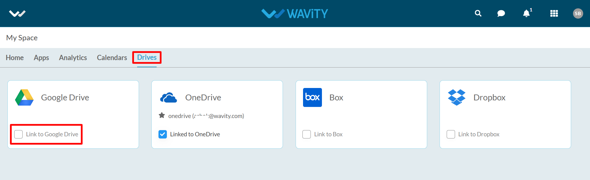
· Enter the “Instance Name” and click “Save” button to link Google drive with Wavity. Content from Google services is only visible to the user who has configured the instance.
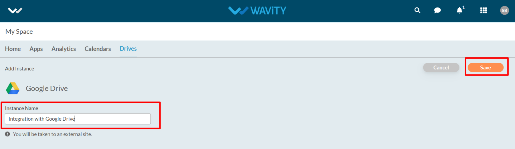
· In the pop up link, Enter your login credentials such as your email or phone number and password as shown in below image.
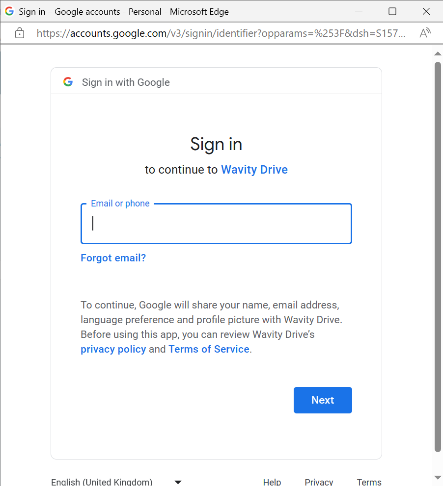
· After entering and login to your Google account. Click on “Continue” to proceed further.
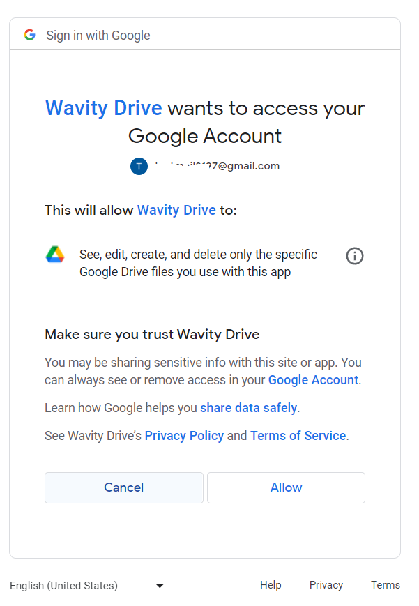
· Upon completion of linking process, a message pop up will be shown for 3 seconds with confirmation of linking Google drive with Wavity. Content from Google services is only visible to the user who has configured the instance.

Instances of Google Drive integration Usage in Wavity
· Access to Files in Google Drive from Wavity.
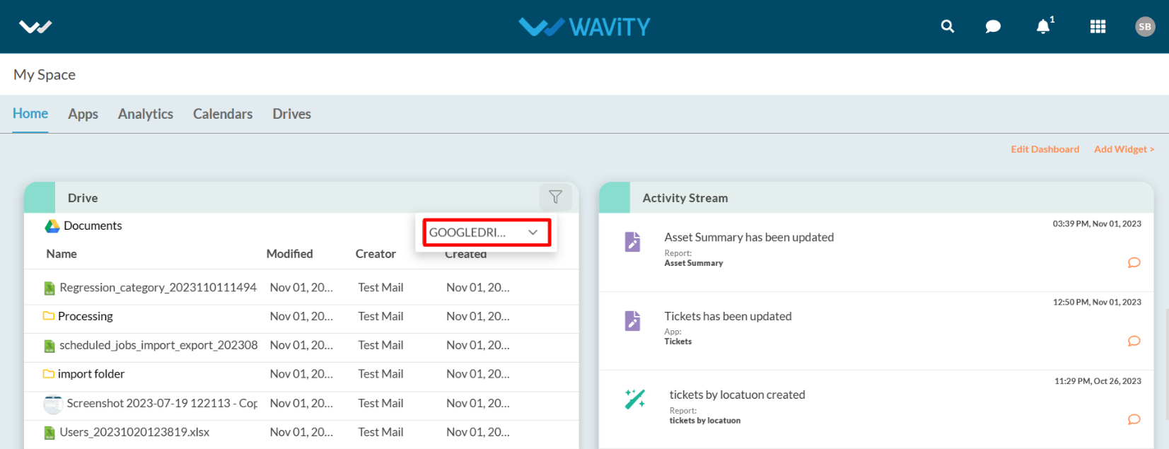
· Attach Files from Google Drive while using Message Box.
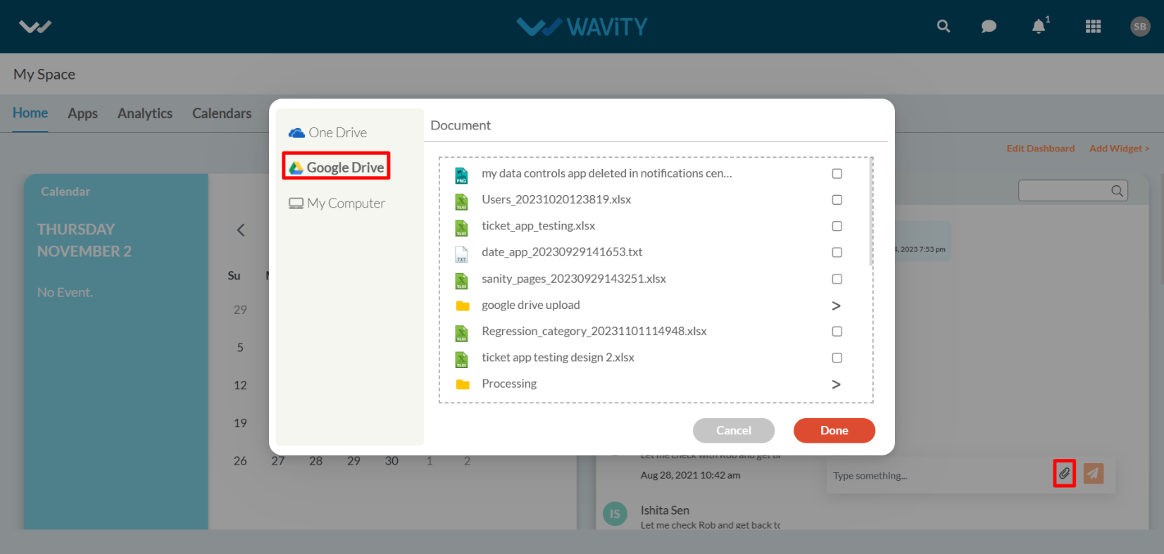
· Attach Files from Google Drive during creation of ticket/request/record in Wavity.
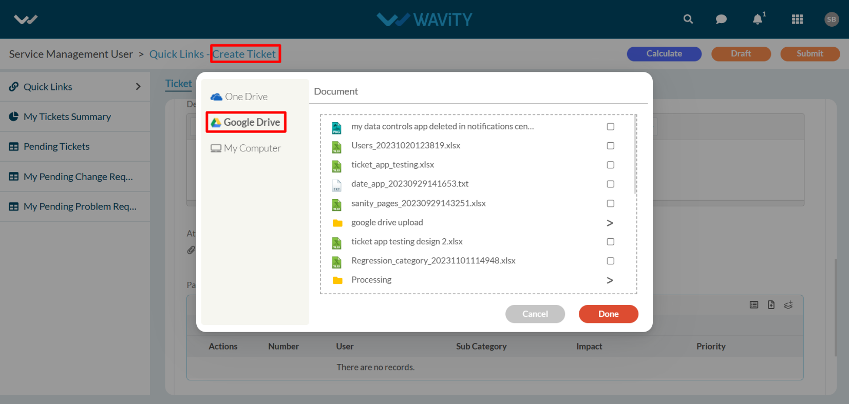
· Attach Files from Google Drive while using Comment box for each record.
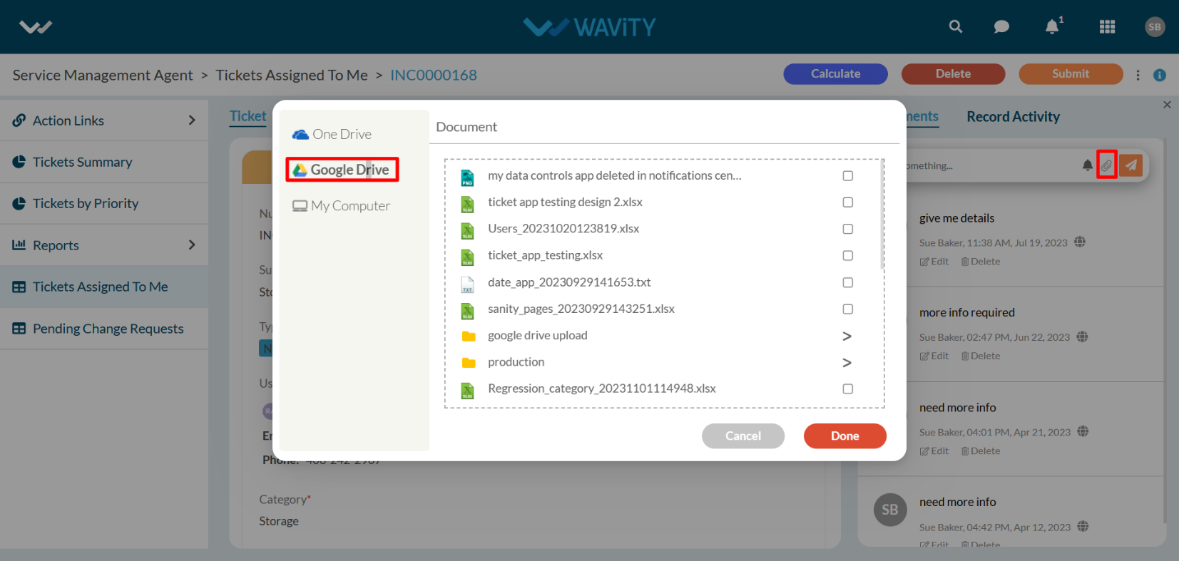
· When using the import/export functionality in Wavity, you can attach files from Google Drive as shown in below image. However, only files created using the Wavity platform will be visible and available for selection.

Procedure to Unlink an Instance
· Users also have the option to unlink an instance if they wish to do so.
· To Unlink an instance, Click on the checked box containing “ Linked to Google Drive” as shown in below image.
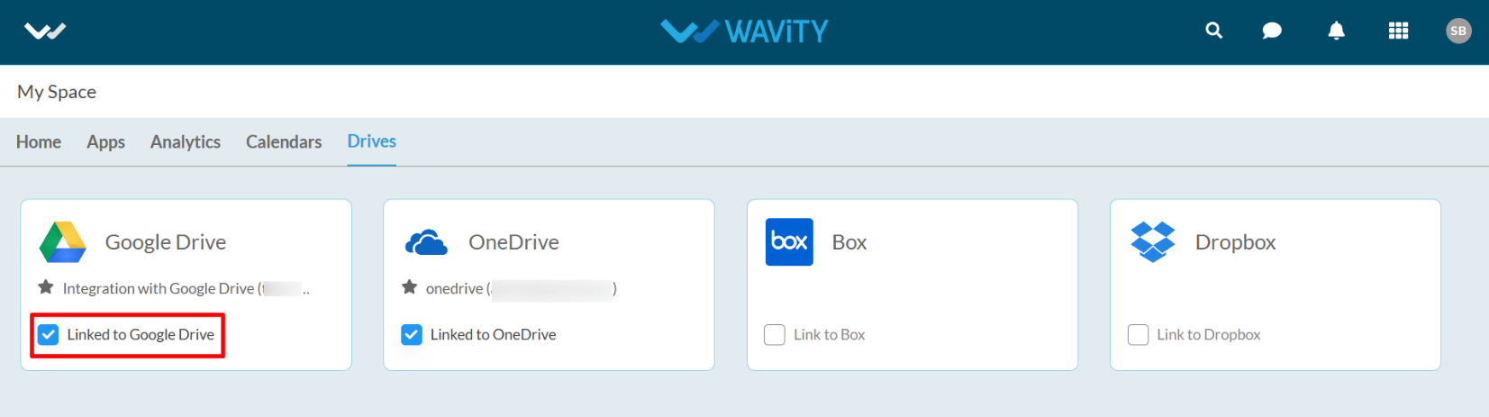
· In the message pop up, Click on “Unlink” button to unlink your instance.
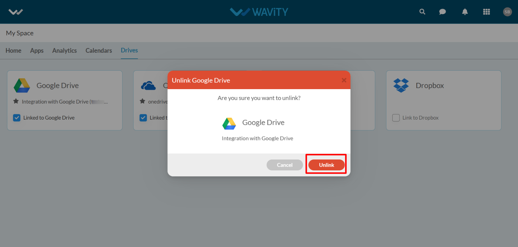
Enabling Google Calendar Integration in Wavity
· To initiate Google Calendar Integration within the platform, administrators must first enable it in the platform settings. Once this integration is activated, users within the same tenant can establish a connection by adding an instance to link their individual Google accounts with Wavity
· To link your Google Calendar with Wavity, Click on “Link to Google Calendar” option under Google Calendar as shown below. Content from Google services is only visible to the user who has configured the instance.
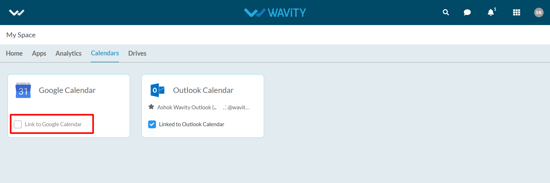
· Enter the “Instance Name” and click “Save” button to link Google Calendar with Wavity.
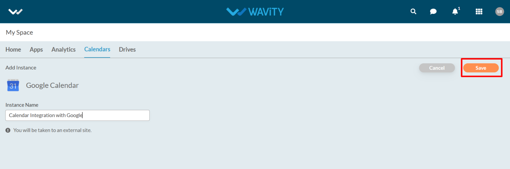
· In the pop up link, Enter your login credentials such as your email or phone and password. Select your account if you have already logged into Google as shown below.
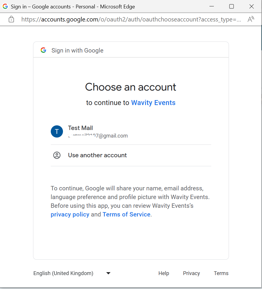
· After entering and login to your Google account. Click on “Continue” to proceed further.
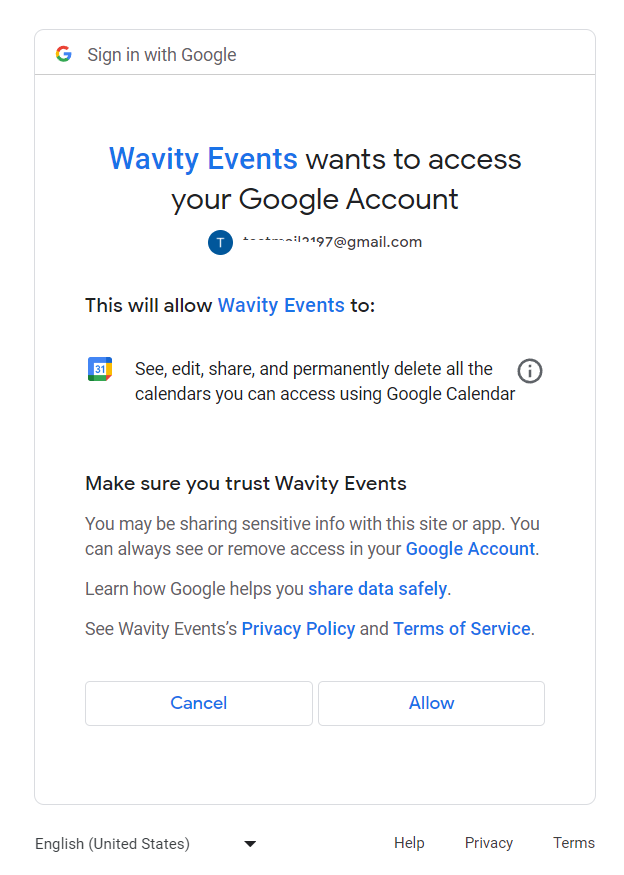
· Upon completion of linking process, a message pop up will be shown for 3 seconds with confirmation of linking Google drive with Wavity. Similar procedure can be followed by user to unlink an instance (As described earlier in Google Drive Integration).
Instances of Google Calendar integration usage in Wavity
· Direct access to Google Calendar from Wavity as shown below. To add events, Click on “Plus” symbol.

· You can add events into your calendar using Wavity Platform as shown in below image.
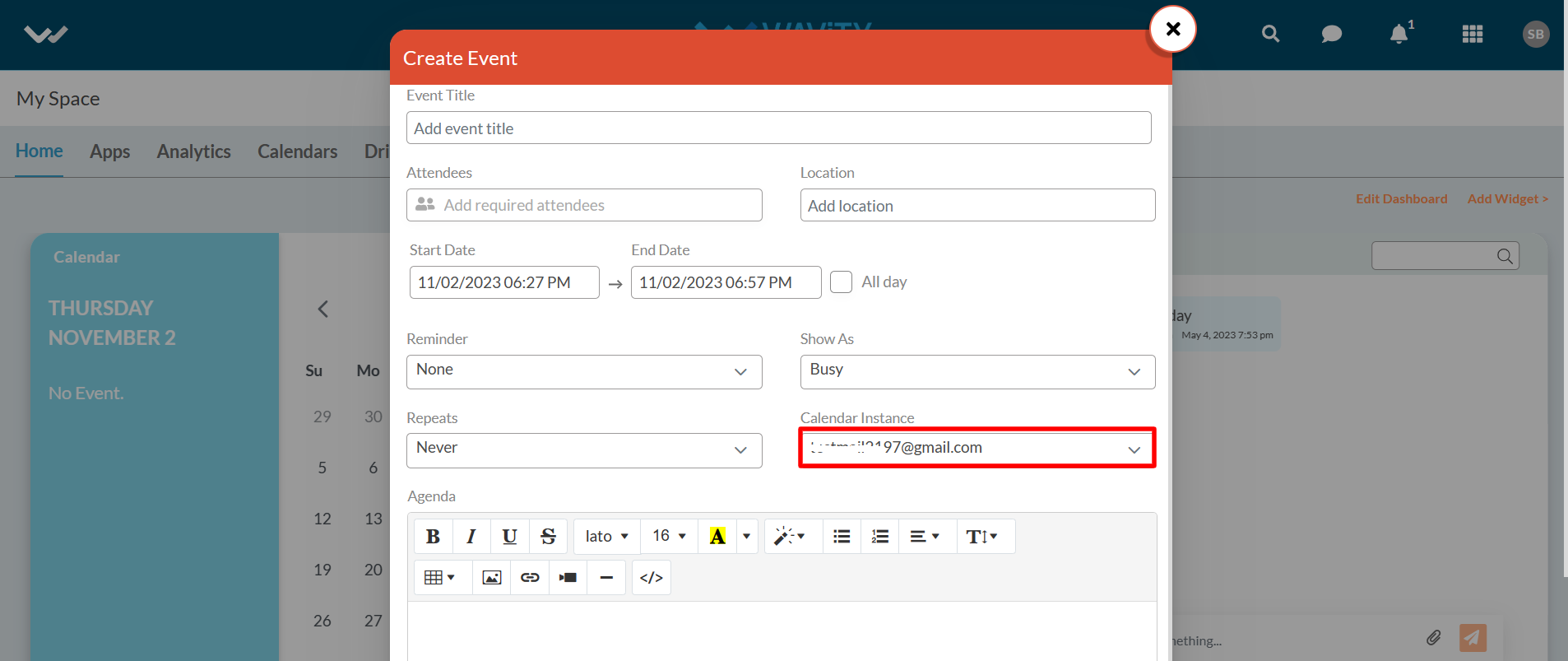
WBots / WAVITY Bots
- Using WBots / Wavity Bots you can automate all your WBots within hours and extend automation beyond your organization as well.
- Using WBots, you can move data between applications according to conditions you create.
- You can use Triggers to automate recurring actions within your tasks, for example setting a new due date when a task’s status changes.
- Make your own Custom Automations, Automations save you time and increase your productivity.
- Manual work is time-consuming and easy to overlook, take advantage of automation to focus on what really matters.
- The Admin or owner has access to enable Workflow Automation or Wbots in Wavity Platform.
Configuring WBots:
- By default, the WBots is enabled for Admin. Only Admin can manage the WBots.
- To create WBots, Click on User Avatar (Admin Profile) and click on Design Tools.

- Select the specific App and Click on the content icon right corner of the app you want to create WBots. Select WBots from the menu.
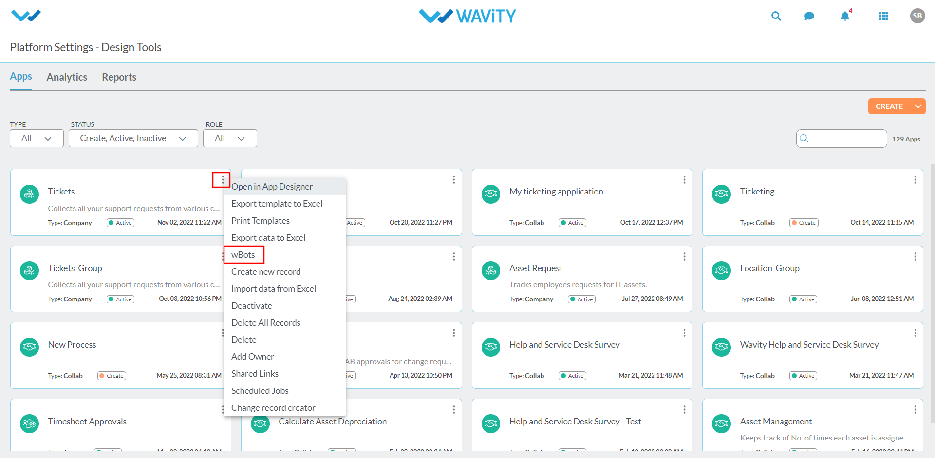
- Click on Create Button to create a WBot according to the conditions.
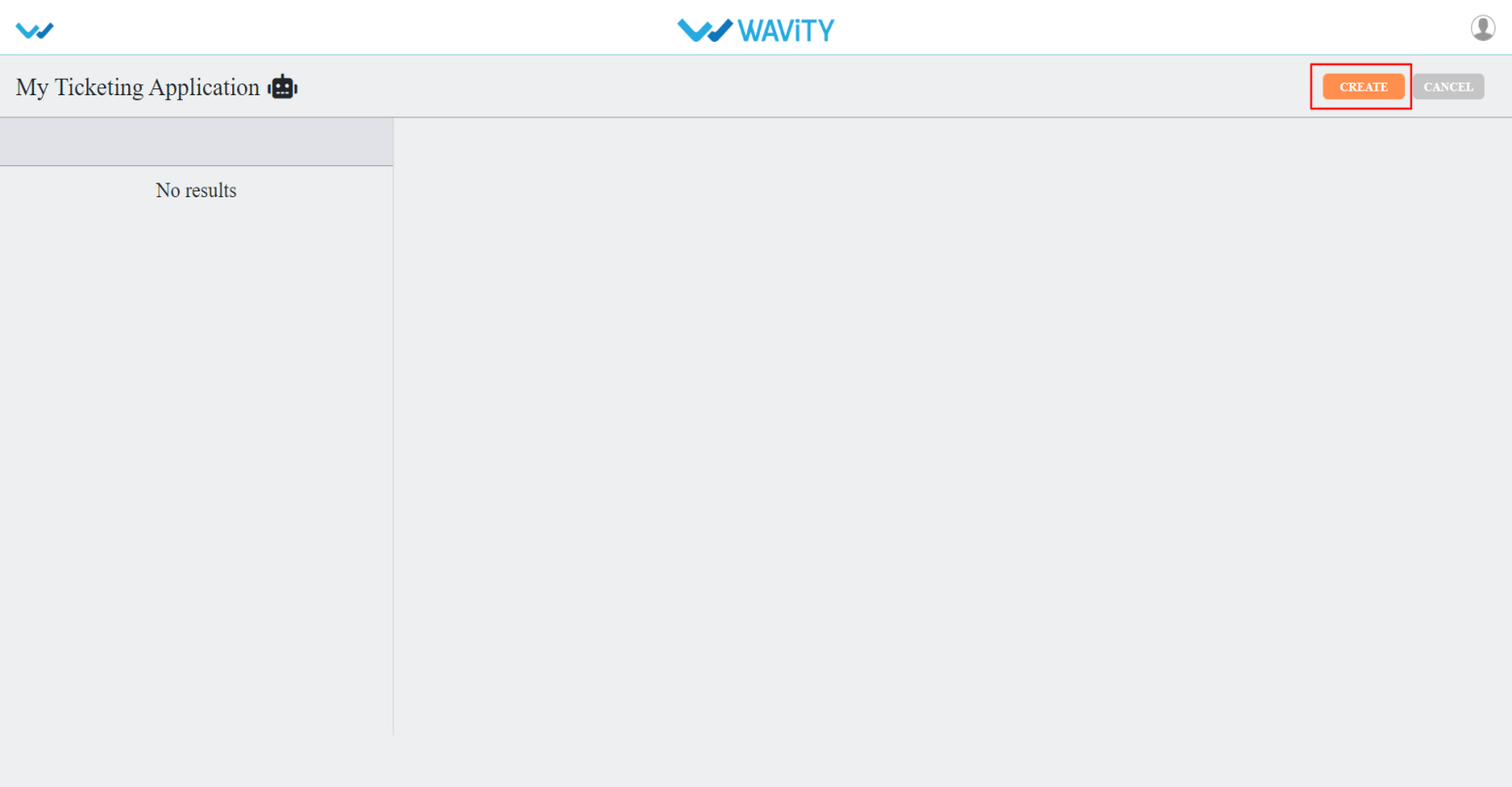
- Give a Caption & Description for your wBots as indicated in the below picture.
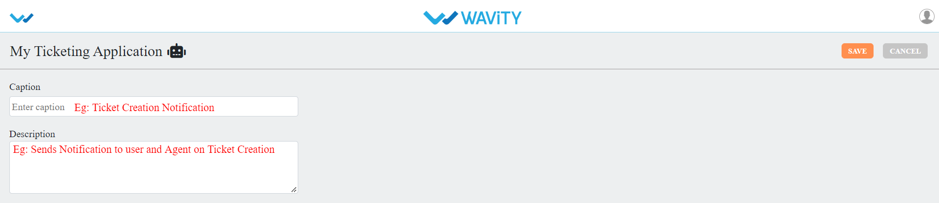
WBots are created based on record states:
- Record Created: This WBot will be executed when a new record is created.
- Record Updated: This WBot will be executed when a new record or existing records is updated.
- Scheduler Settings: This WBot will be executed based on scheduler settings.
- Email Integration: This WBot will be executed based on email integration configurations.
- Comment: This WBot will be executed when a comment is added in record.
You can click on any of the state to create a WBot.
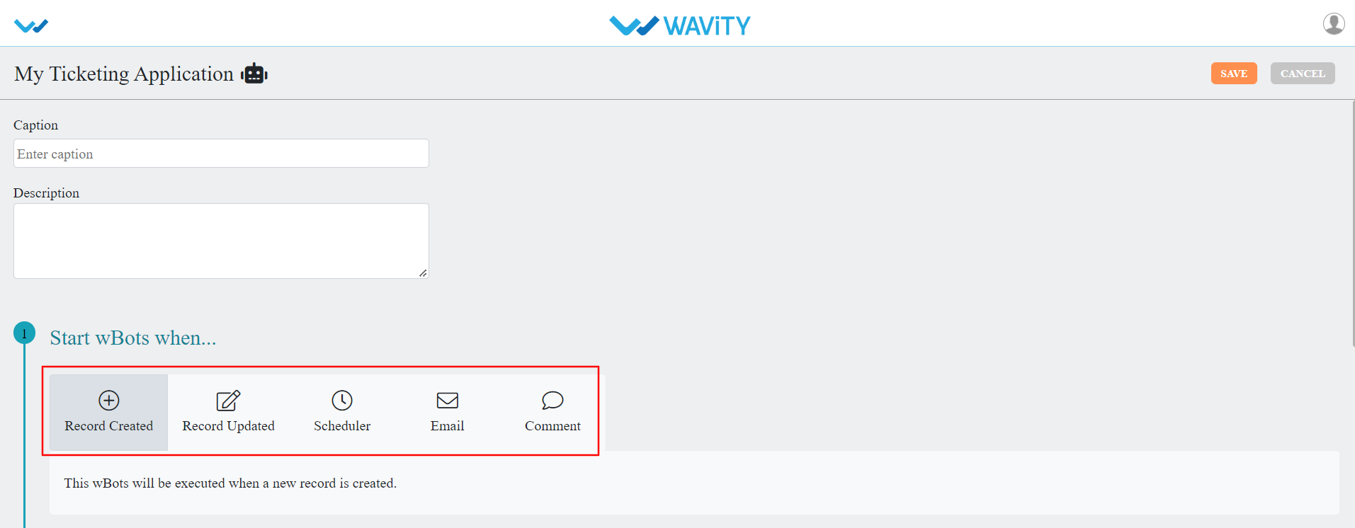
Record Created: This wbots will be executed when a new record is created.

Record Updated: This wbots will be executed when a new record or existing records are updated
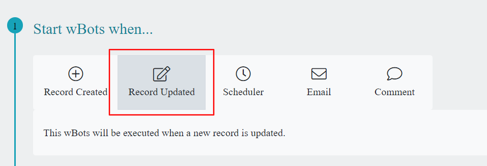
Scheduler Settings: This wbots will be executed based on scheduler settings, Like record creating or updated time, selecting work calendar, Region and Time Zone selections.
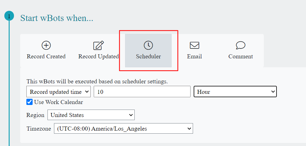
Email Integration: This WBots will be executed based on email integration configurations, Email type New or Replied.

Comment: This wbots will be executed when a comment is added in record activity.
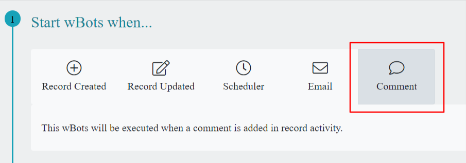
To create a WBots, we have to specify a condition. You can add a single condition or multiple conditions as per your requirement.
Info Condition: You can select the properties based on the record.
- Created by
- Modified by
- Created time
- Modified Time
- State
The fields in value(s) change as per the property you have selected.
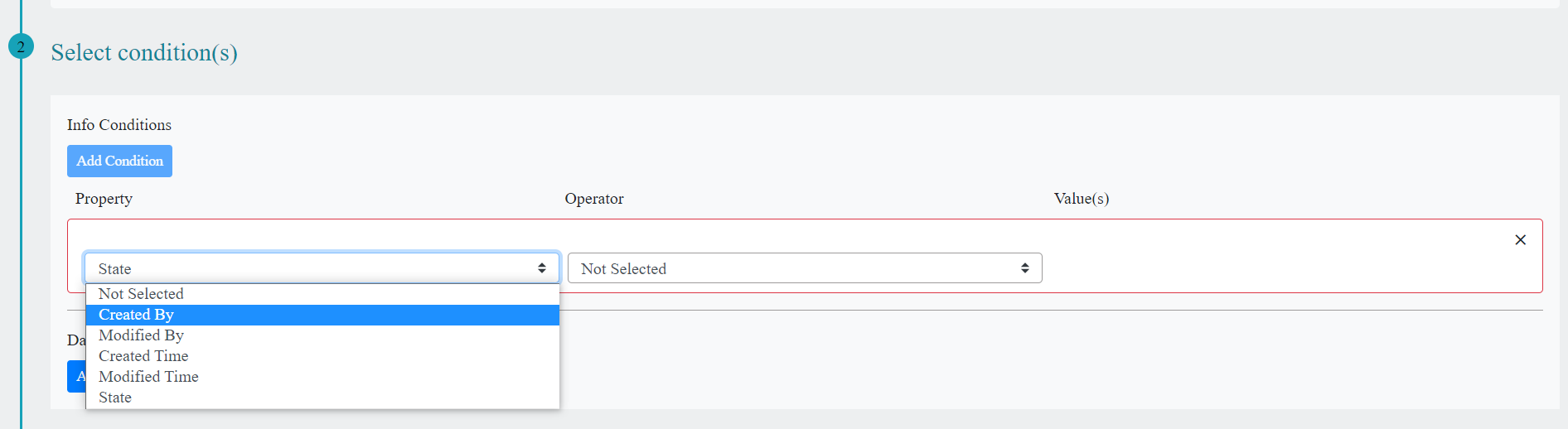
Data Condition: You can create WBots by using the data controls of the app in Property, The fields in Property and value(s) change as per the data controls in the app you have selected.
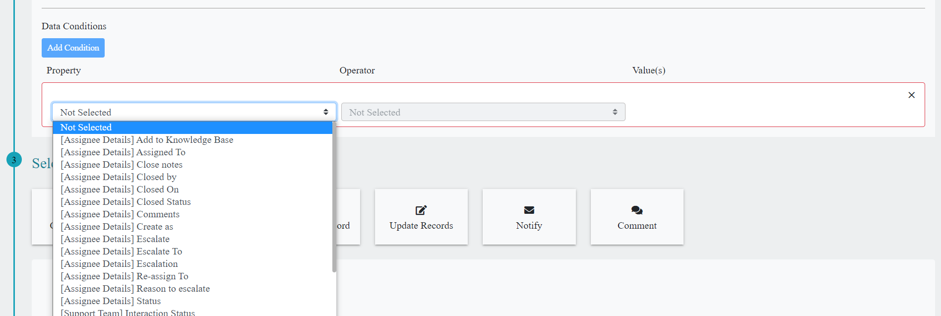
- You can also add additional Info conditions and Data conditions by clicking on Add Condition button.
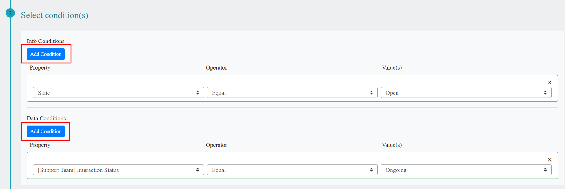
- You can also specify AND | OR for conditions, if you want to satisfy either both the conditions or any one of the conditions respectively.
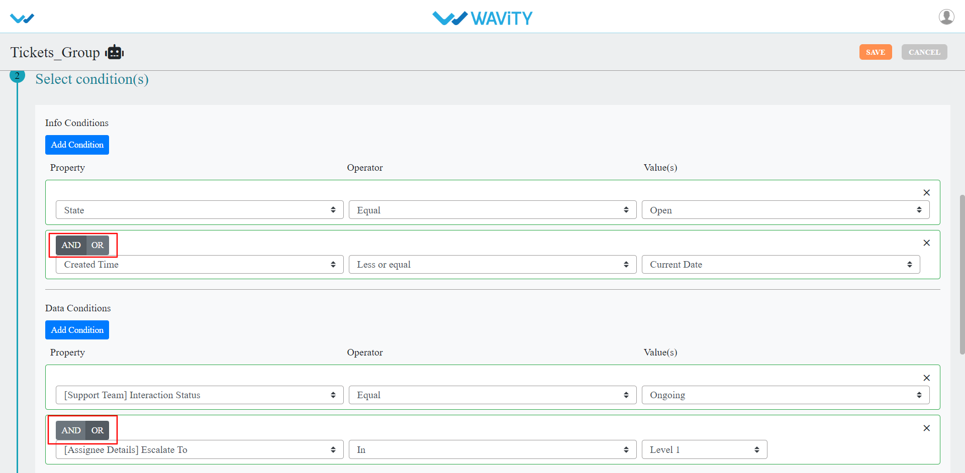
- Create Record: You can create a single record using this action.
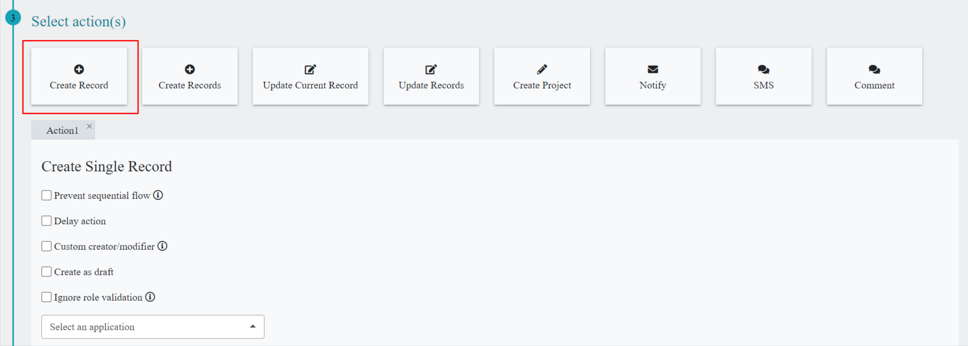
- Create Records: You can create multiple records using this action by selecting multivalue data control.
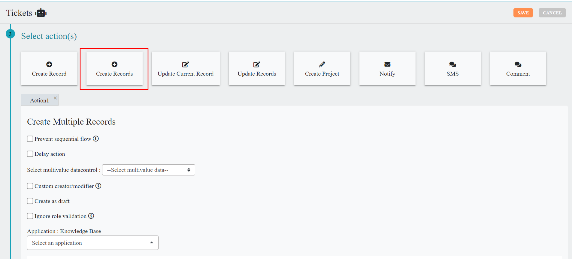
- Update Current Record: You can update current record of the same app using this action. Here you can select the record status from the dropdown as well as you can set static or dynamic data for each data control in the app. If you are not certain about the data, you can select Ignore option.
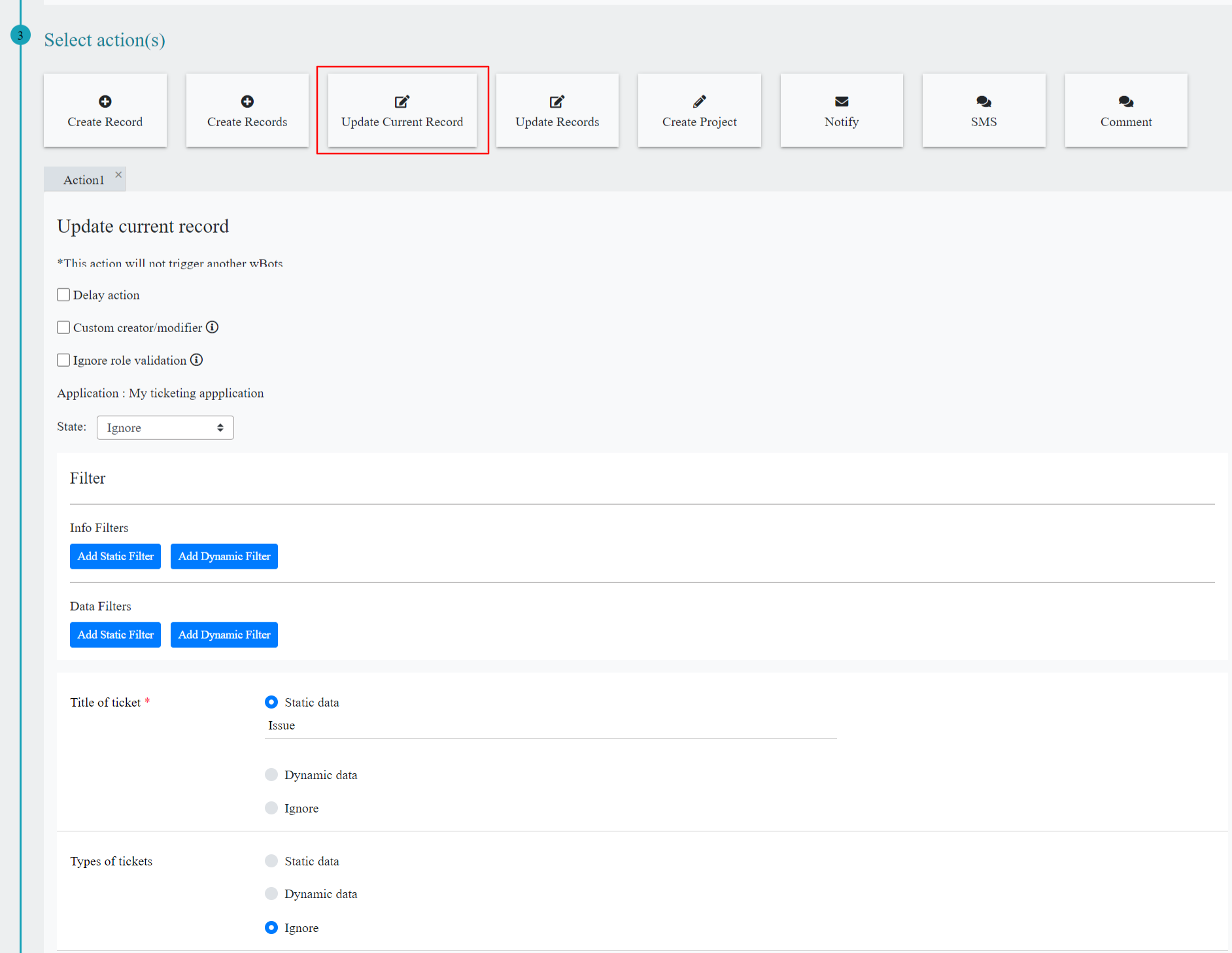
- Update Records: You can update the record in current app and the record in another app using this action. Here you can select the record status from the dropdown as well as you can set static or dynamic data for each data control in that app. If you are not certain about the data, you can select Ignore option.
- In this action you will also find Info and data filters for the application selected.
- Info filters: You can filter the records by selecting property based on user who created the record, time of record creation, record modified time, state of record. The fields in value(s) change as per the property you have selected.
- Data Filters: The fields in Property and value(s) change as per the data controls in the app you have selected.

- Create Project: You can create project using this action.
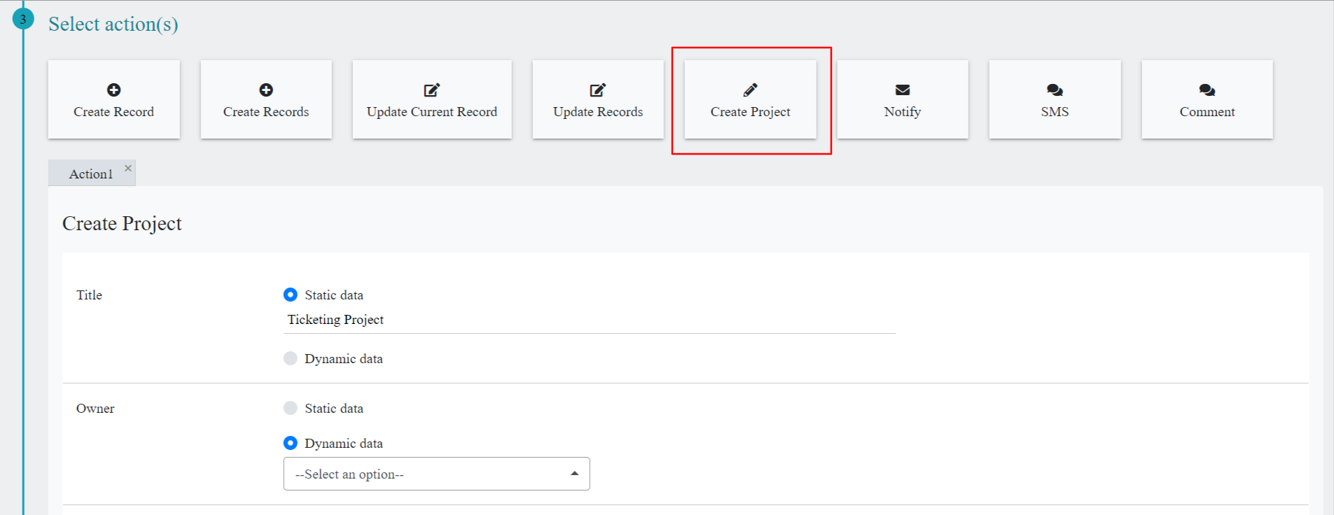
- After creating the project, you can create and monitor all tasks of the project related over here directly from the platform solutions tab.

- Notify: You can send an email-based notification on the Select condition(s) above. Recipients can be custom (anyone), users in your platform or from your app data.
- Recipients will receive email notification upon create or update of record and reply to the comments in activity stream based on properties and selected conditions.
- Email Subject and body are pre-defined can be customizable according to requirement.
- Clicking on the request link can directly land on to the Record.
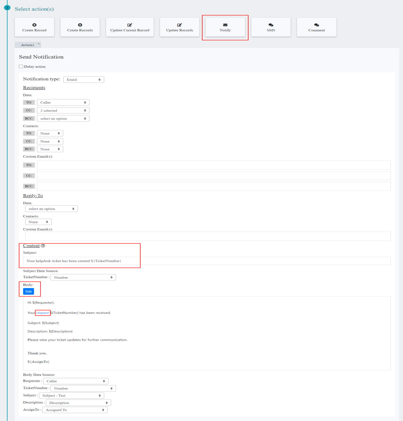
- Sms: You can send SMS to user or Group of users by adding the recipients or directly adding custom phone numbers, who are the part of the system. When the record is created or updated. You can also set delay action before staring the WBots.
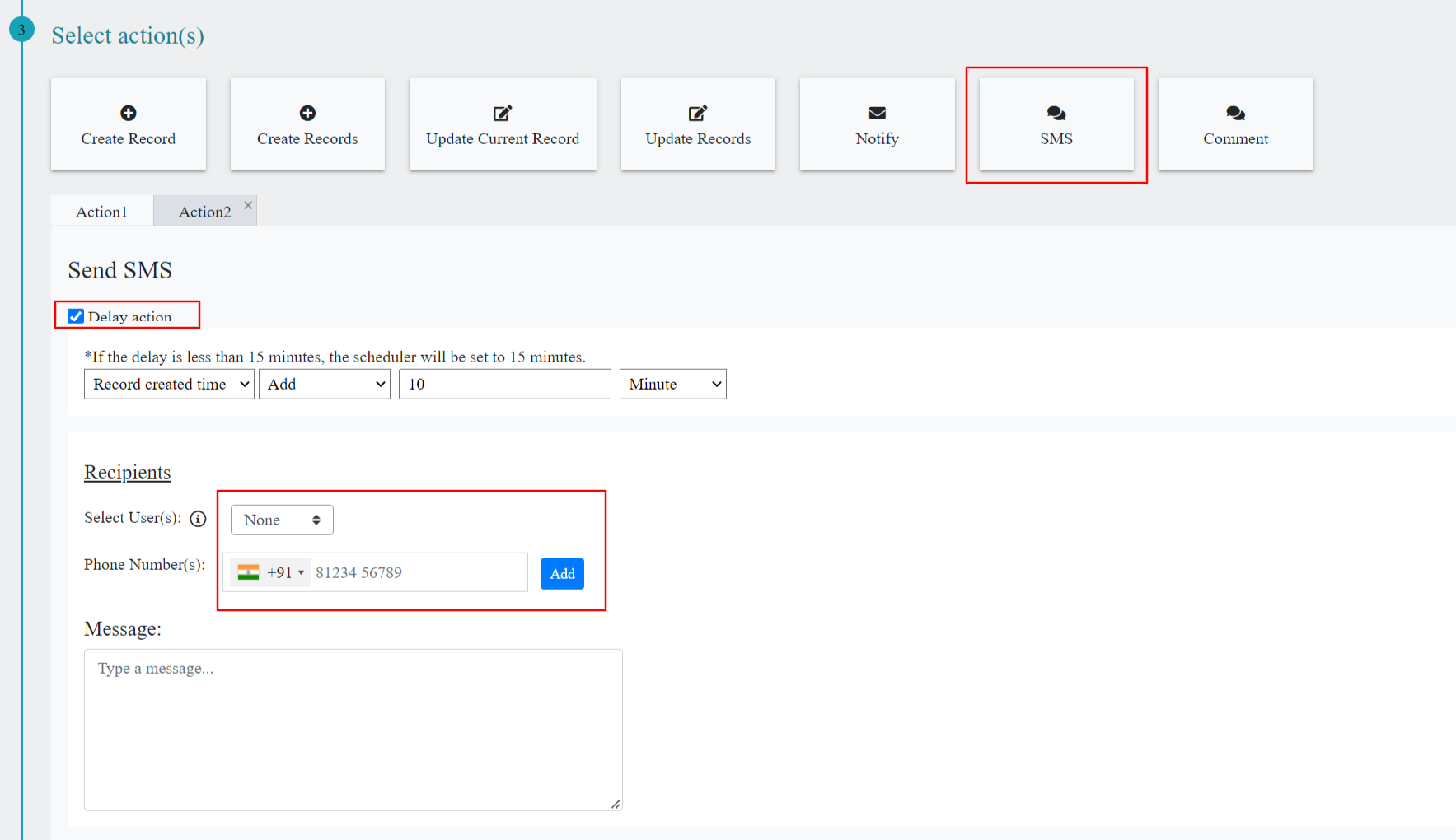
- Comment: You can add comments directly to the activity stream by creating a WBots, when the record is created or updated, comment input based on selection of a Data source Email body or Email Subject. You can also set delay action before starting the WBots.

There are different types of statuses are shown based on the Bot Triggered & Triggered Data.
- Started
- Scheduled
- Completed
- Failed
- Canceled
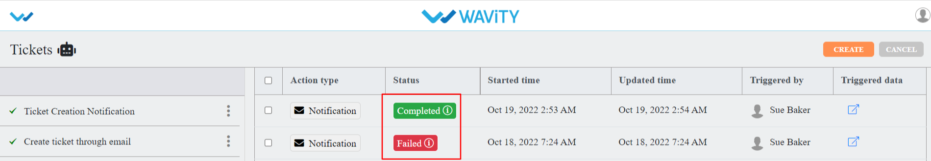
- Wbots can be Enabled / Disabled & Deleted by selecting the content icon button (Three Dots)
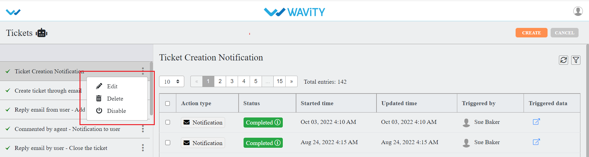
- We can filter the Wbots triggered records based on Triggered by, time, status & action Type.
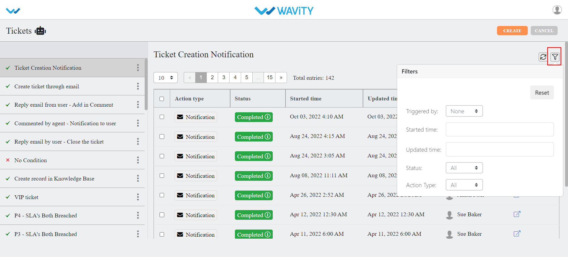
How to login with Wavity Mobile App in IOS
- ‘Wavity’ Mobile App is available to be downloaded from IOS.
- To download Wavity App, Search for Wavity in the IOS store as shown below. Click on Install.
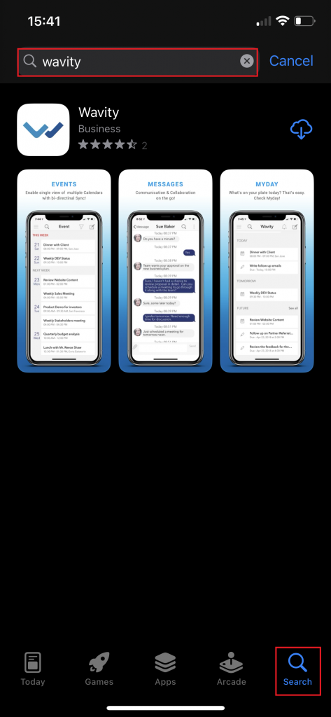
- Click on “Open” once installation of Wavity App in your mobile is complete.
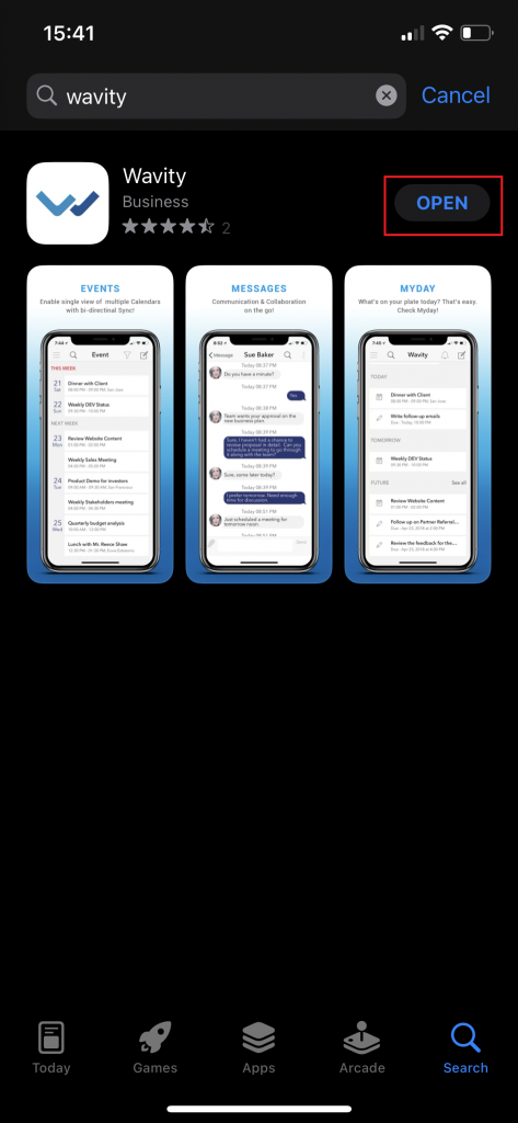
- To Sign In to Wavity App, Please mention the tenant name. (You can get the tenant name by contacting Wavity Support team). Tenant name is generally your company/organization name.
- In the dropdown list, please select wavity.io as shown below. Click on “Next”
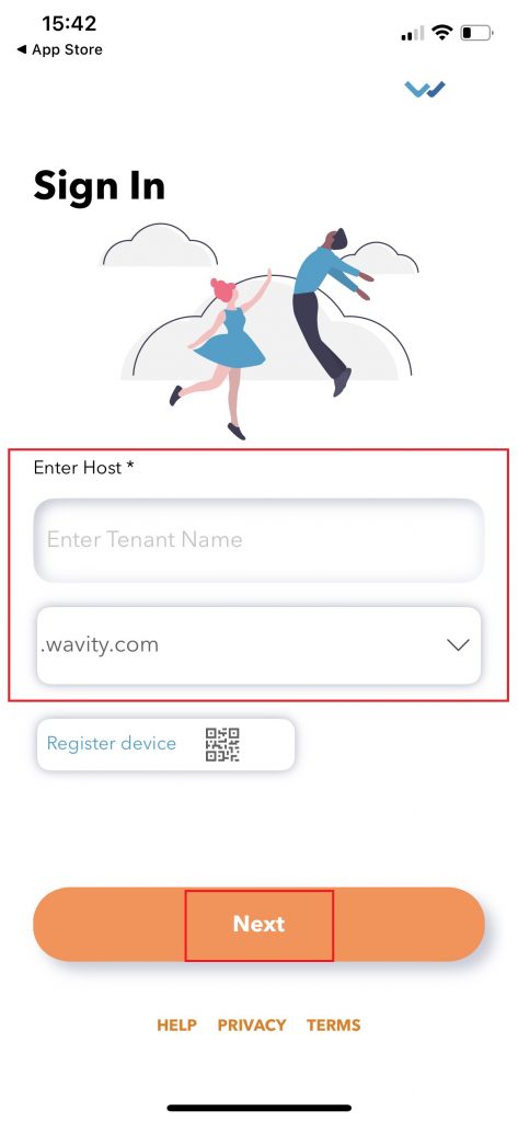
- Please enter your email id and password to “Sign In” to your Wavity account as shown below. Please check all details such as the host name and user name before signing in to Wavity.
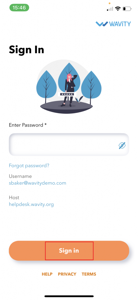
- Click on Solutions to access all features of your dashboard in Wavity mobile App.
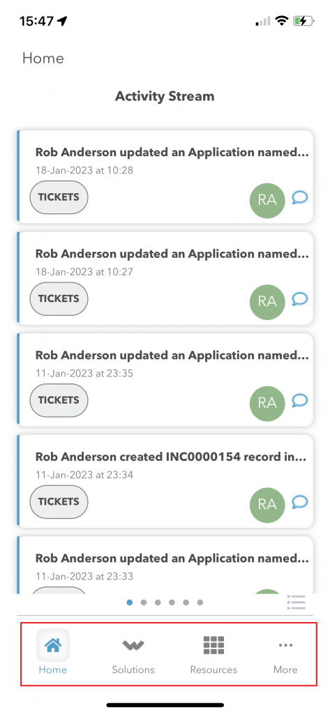
How to login with Wavity Mobile App in Android
- ‘Wavity’ Mobile App is available to be downloaded from Android Play store.
- To download Wavity App, Search for Wavity in the Play store as shown below. Click on Install.
- Click on “Open” once installation of Wavity App in your mobile is complete.
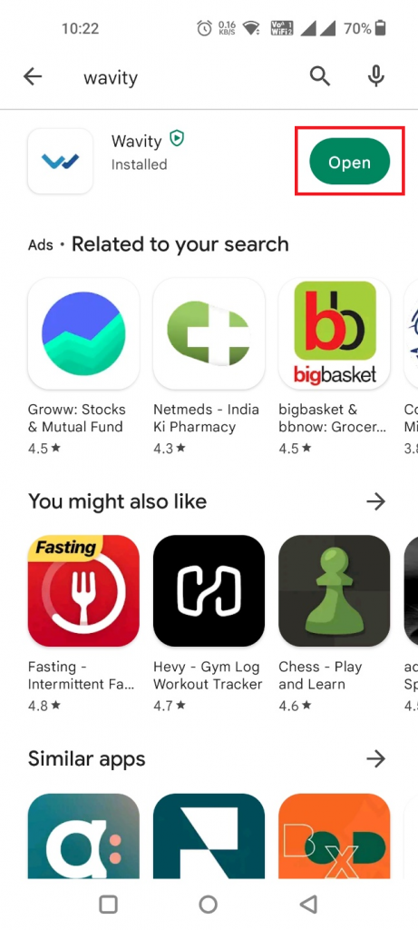
- To Sign In to Wavity App, Please mention the tenant name. (You can get the tenant name by contacting Wavity Support team). Tenant name is generally your company/organization name.
- In the dropdown list, please select wavity.io as shown below. Click on “Next”
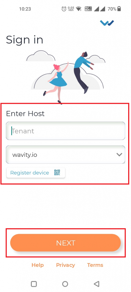
- Please enter your email id and password to “Sign In” to your Wavity account as shown below. Please check all details such as the host name and user name before signing in to Wavity.
- Click on Solutions to access all features of your dashboard in Wavity mobile App.
How to Apply Advanced Filters?
- Applying filters in the Wavity platform is a simple process that can be done for any lists or reports. There are two types of filters available: Direct Filters and Advanced Filters.
- Example to apply direct filters is shown below. Direct Filters are easily accessible through dropdown boxes located beside advanced filters. These filters can be customized according to your requirements during implementation.

- To apply Direct Filters, click on the desired filter option such as “Type” in the Inventory Application and select an Asset Type, such as “Desktop”.
- You can apply multiple options from the dropdown.
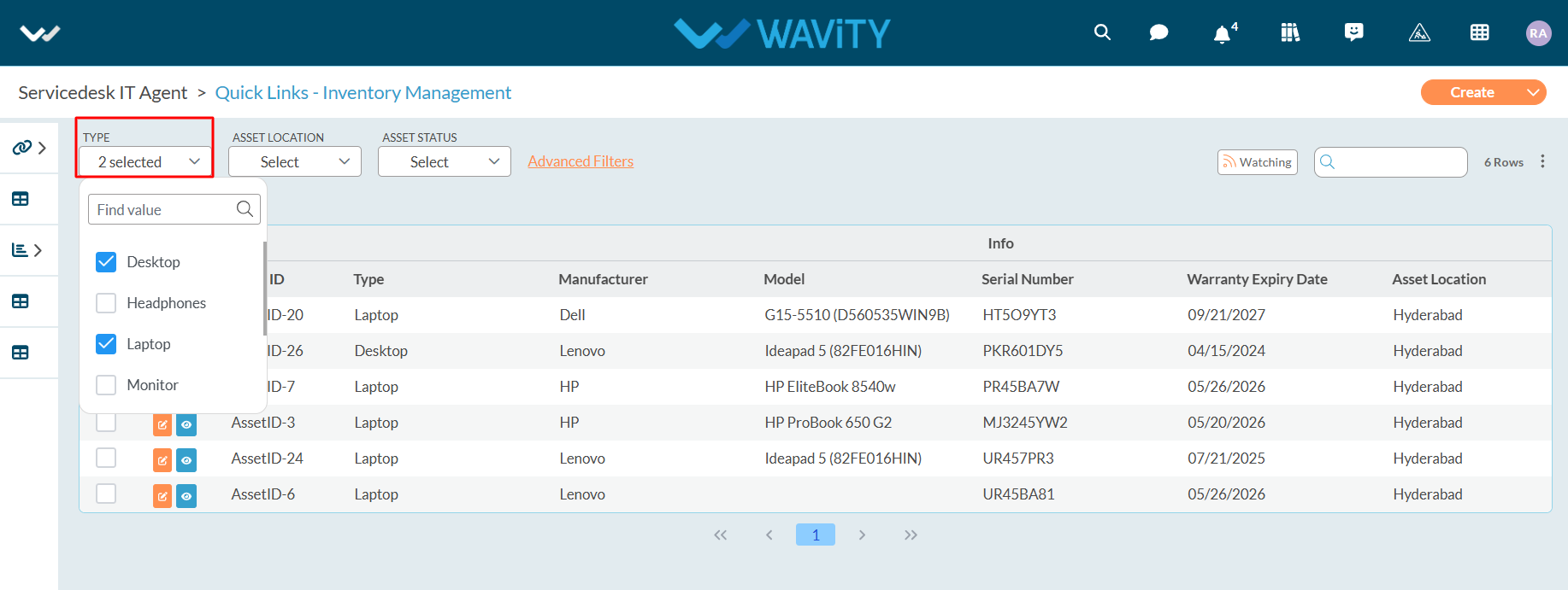
- Example for applying advanced filters is shown below. Advanced Filters offer more customization options and can be accessed by clicking on the “Advanced Filters” button.
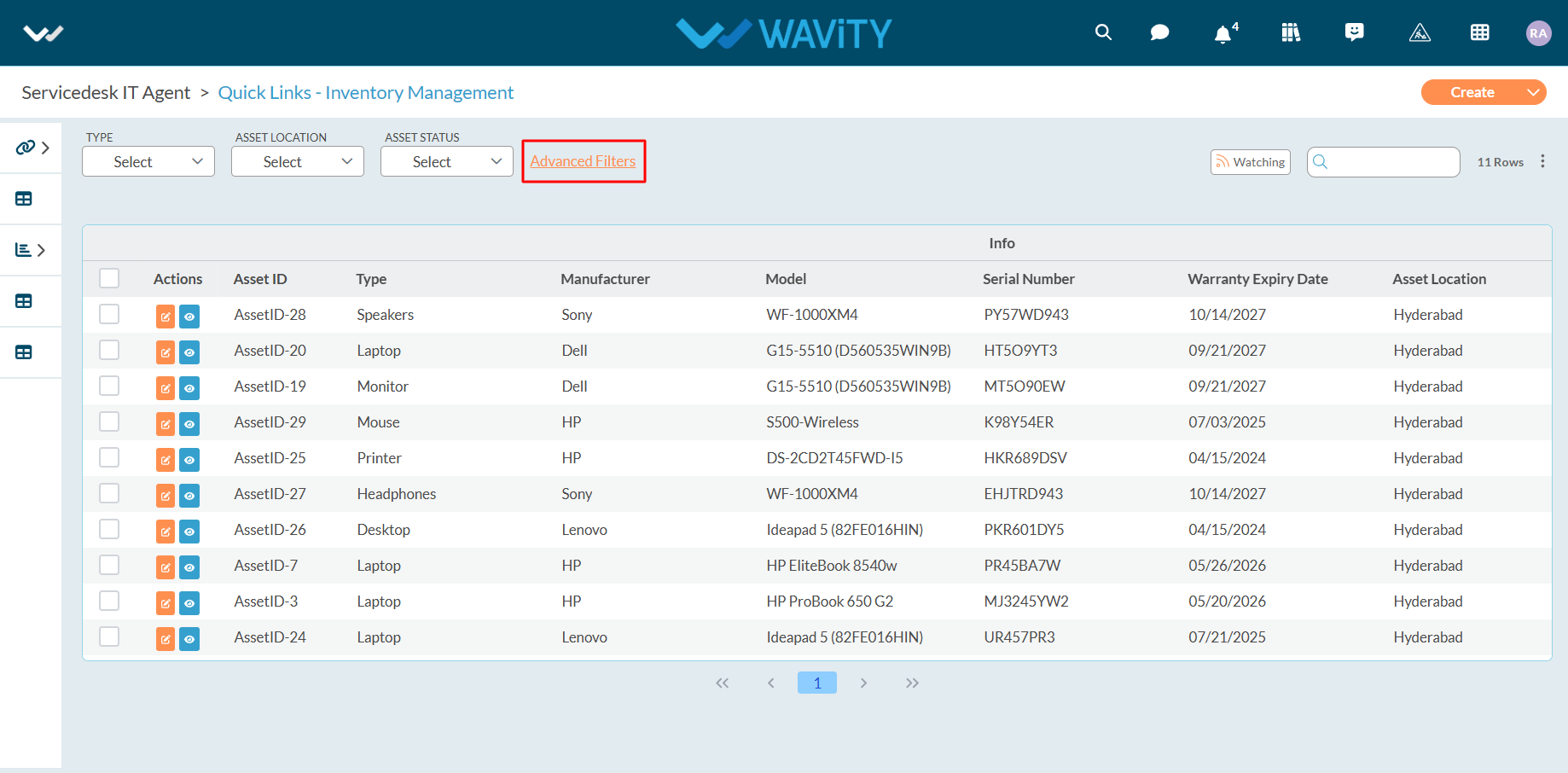
- Select the field dropdown as shown in the below image. It will show all the form fields in the current application.

- Select relevant form field to apply advanced filters
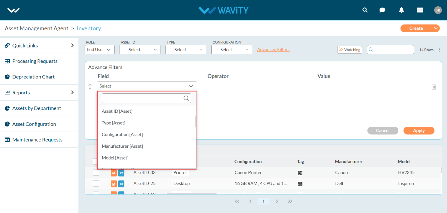
- We provide multiple operators to apply Advanced filters. Select Equal filters as shown below.
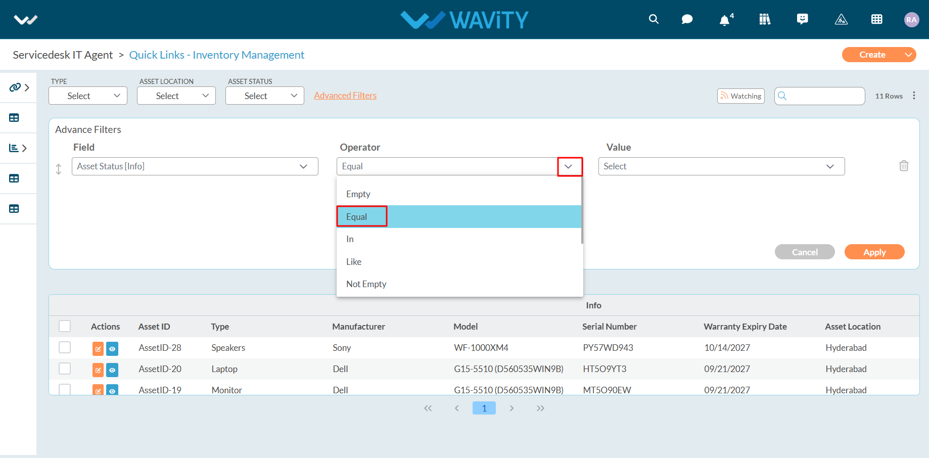
- Select ‘Value’ as shown below. So currently we have applied filters for Asset State equal to assigned.

- Now, You can also apply multiple filters with “And” & “Or” Option. “And” option can apply both filters if both conditions are satisfied. “Or” option can apply filter even if one condition is satisfied.
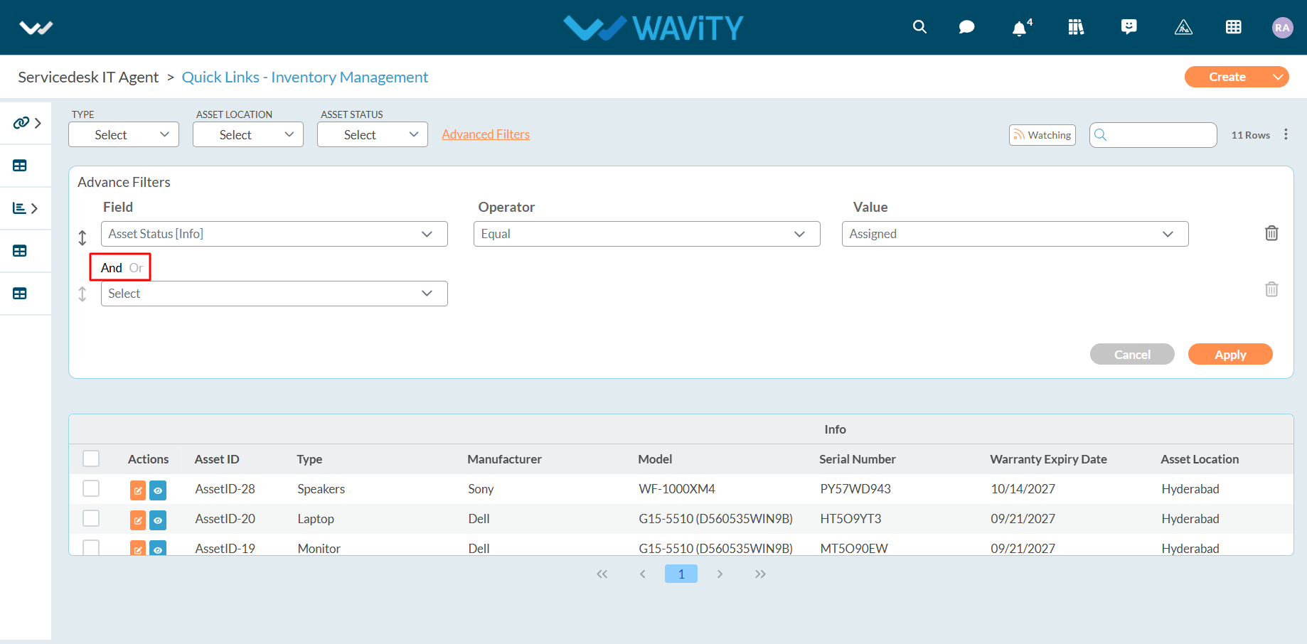
- In this example, We will be applying “And” filter. Select form field, operator and Value as shown below.
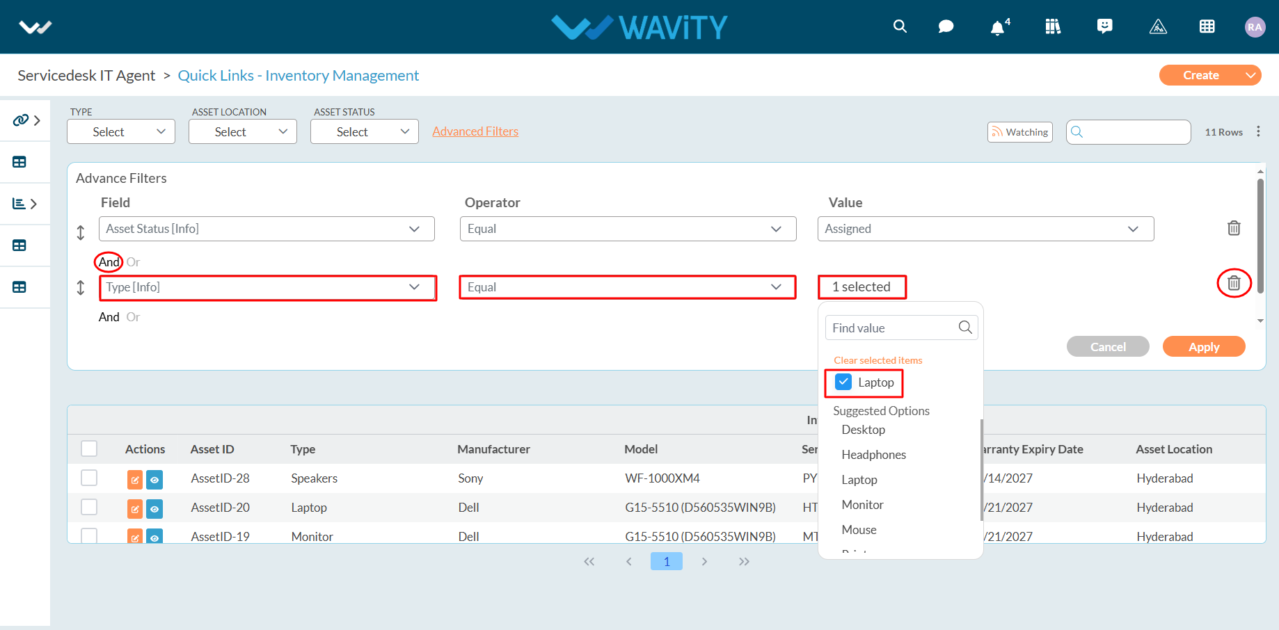
- After selecting the desired filters, click on the “Apply” button to apply the filters to the list or report.
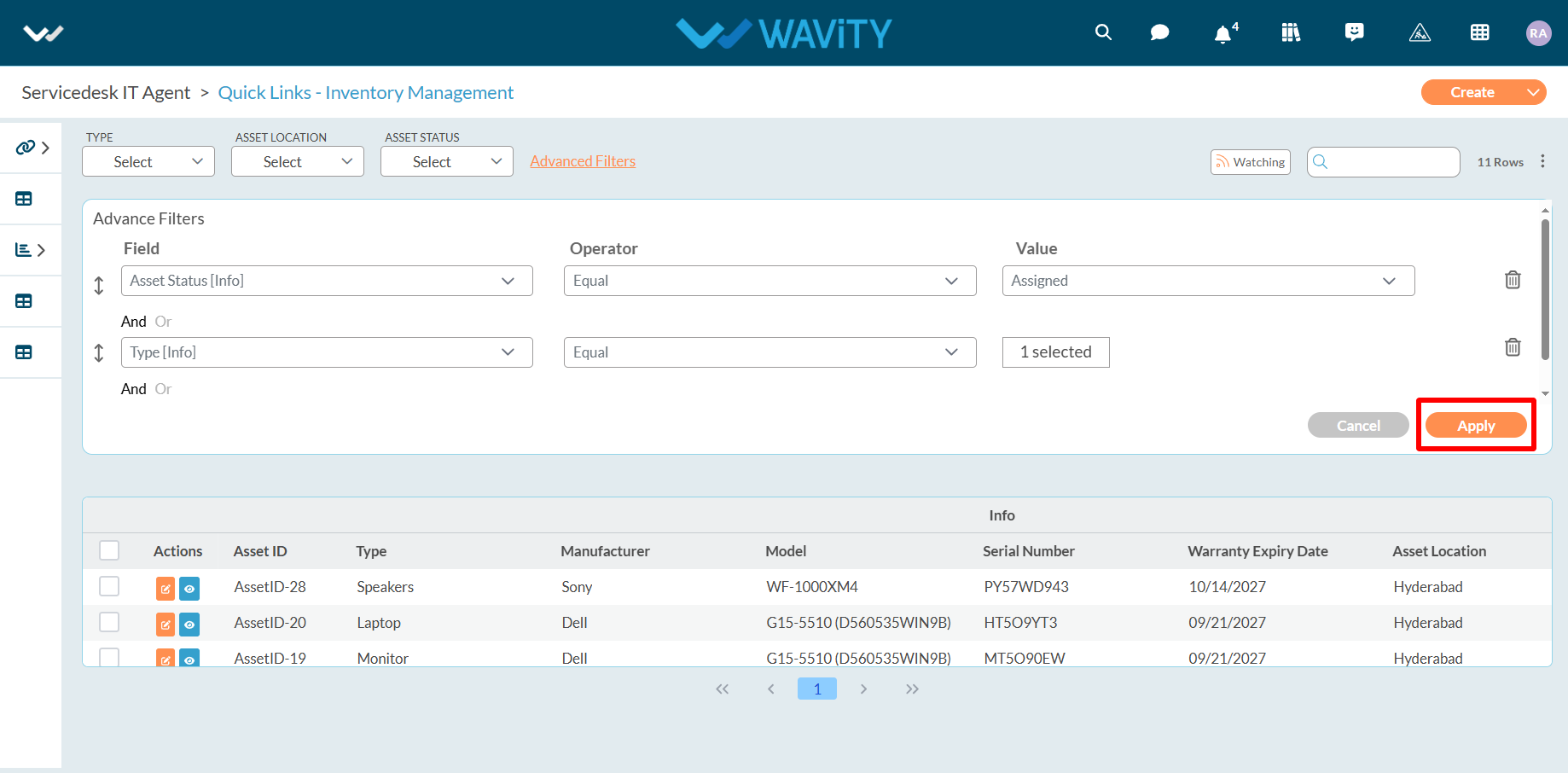
- Operator Controls and Usage.
- The Wavity platform offers various options and operators to help you customize your filters according to your needs.
- Below are description of all operators for a form field (Except date and time field):
- "Equal" displays items where the selected form field matches the selected value.
- "Not Equal" displays items where the selected form field does not match the selected value.
- " In" displays items where the selected form field matches one or more of the selected values.
- "Not In" displays items where the selected form field does not match any of the selected values.
- "Like" displays items where the selected form field matches a value or pattern.
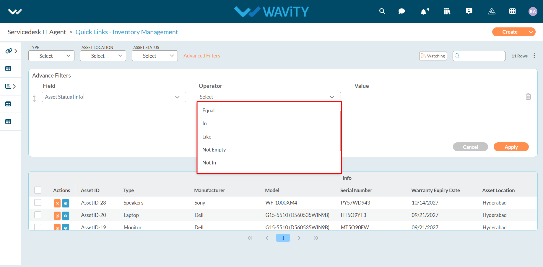
- "Prefix" displays items where the selected form field matches to the group of letters or words added at the beginning of a word.
- "Suffix" displays items where the selected form field matches to the group of letters or words added at the end of a word.
- "Empty" displays items where the selected form field is empty and has no value.
- "Not Empty" displays items where the selected form field is not empty and has a value.
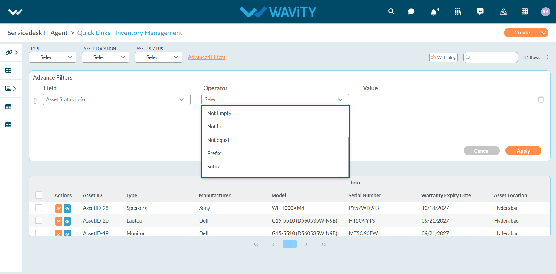
- Example below explains usage of “In” Operator. Select “In” Operator as shown below.
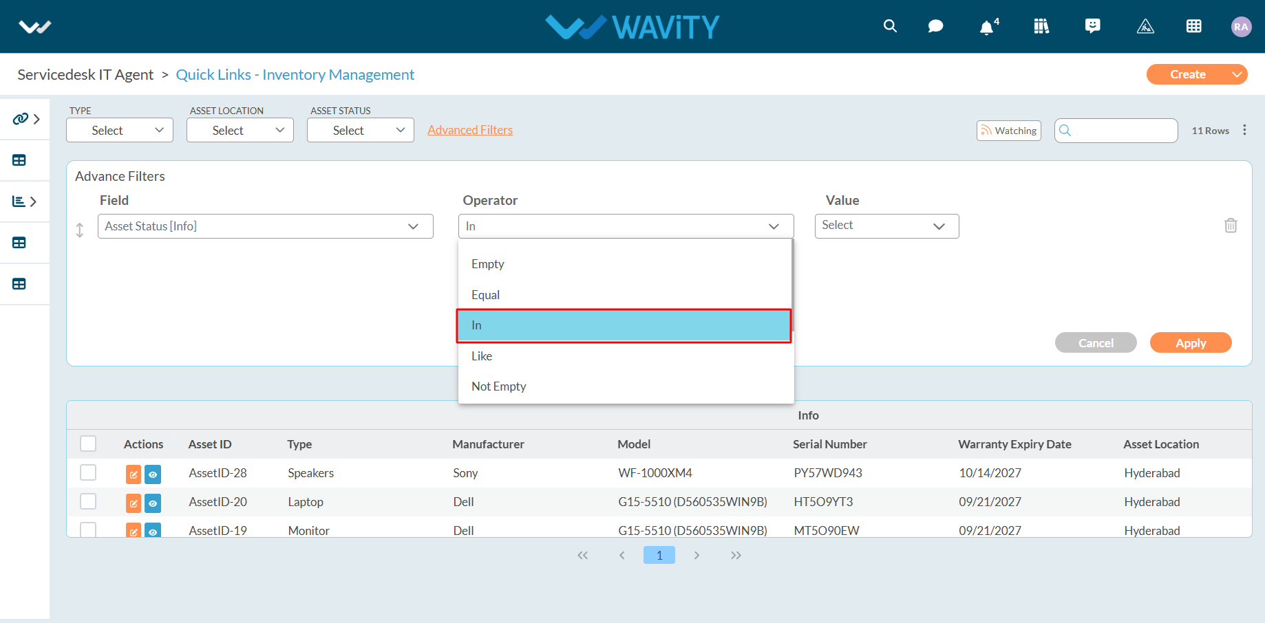
- Now you can select 2 values as shown in the below image. You can apply the filters now
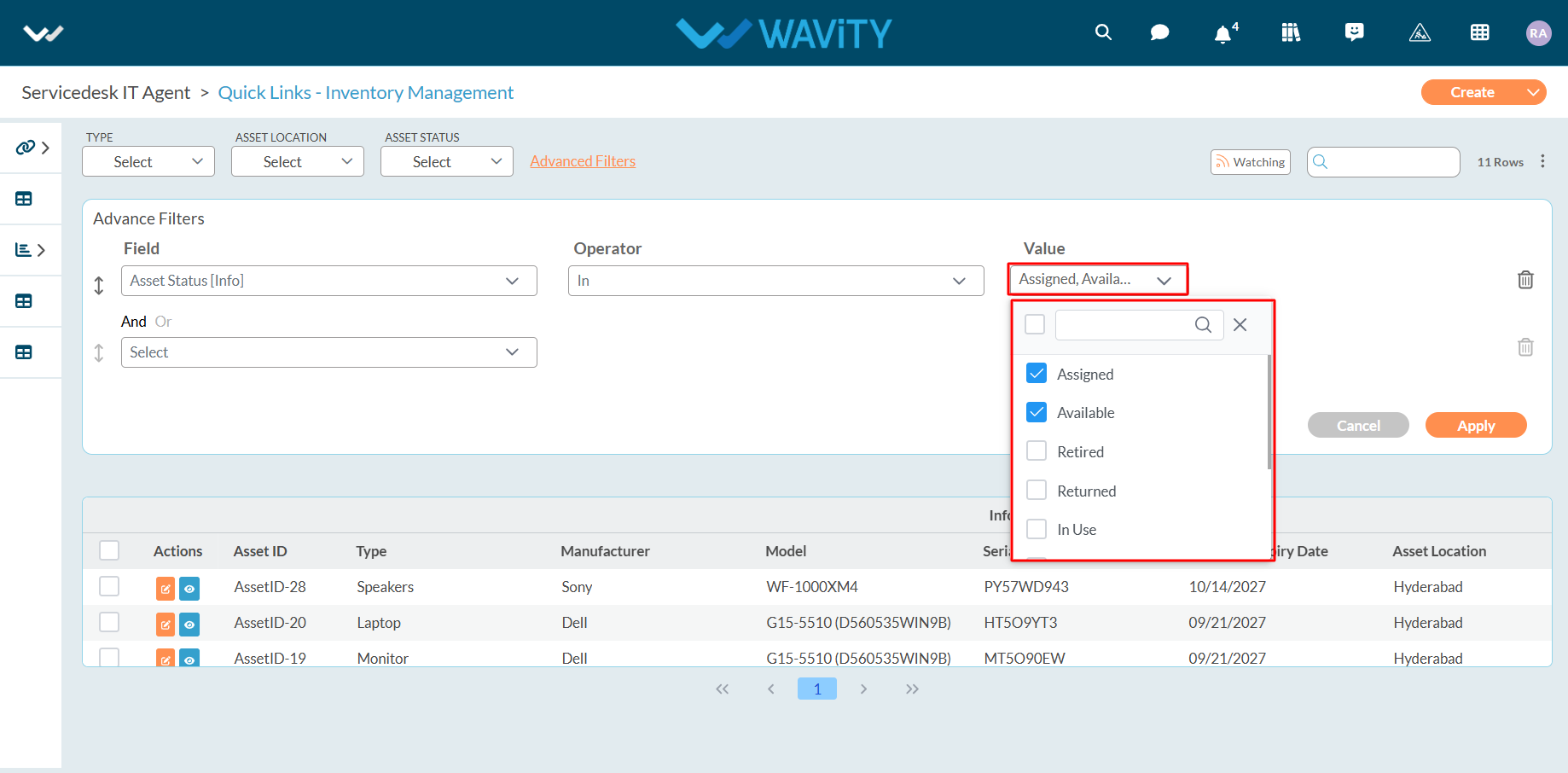
- Below are description of all operators for a form field which is a date field:
- "Equal": Selected form field matches with the selected value, such as the current day, current month, or a selected date from the calendar.
- "Not Equal": Selected form field does not match with the selected value, such as the current day, current month, or a selected date from the calendar.
- "Less Than": Selected form field is before the selected date.
- "Less or Equal": Selected form field is before or on the selected date.
- "Greater Than": Selected form field is after the selected date.

- "Greater or Equal": Selected form field matches shall be greater than or equal to the selected date.
- "Between": Selected form field shall consist of all values within the specified start and end dates.
- "In past": Selected form field shall consist of all values that occurred before the selected date.
- "Due In": Selected form field shall consist of all values due on the selected date.
- "Older than": Selected form field shall consist of all values that occurred before the selected date.
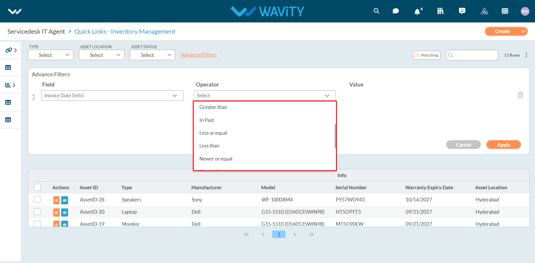
- Example below explains usage of “Equal” Operator in Date and Time Field. Select “Equal” Operator as shown below.
- You can select either value as required such as Current Date, Current Day, Current Month, Currently Month and Year, Current Year etc. and get all the values in the list after applying filter.
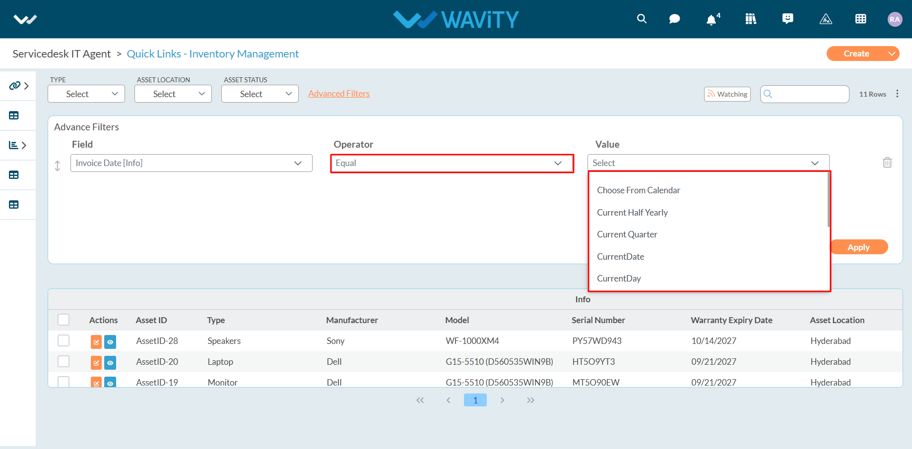
- In this example we will select the date from the calendar. Click on “ Choose from Calendar”.
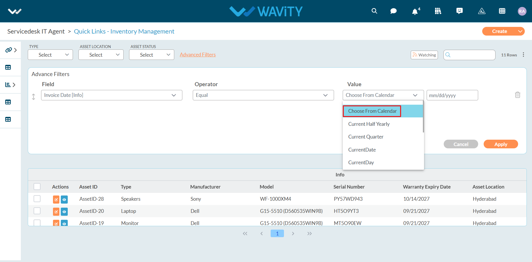
- Click on “mm-dd-y” box as shown in the below image to select the Day/Month/Year.
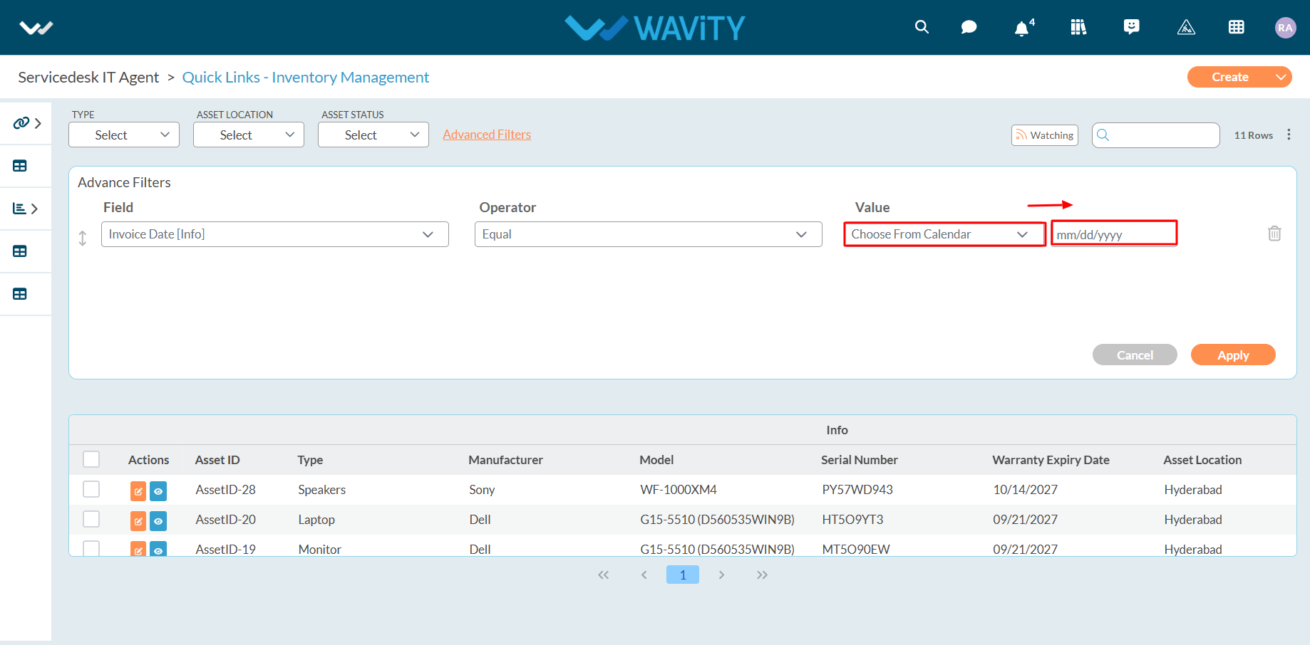
- Choose the required date from the calendar to apply the filter.
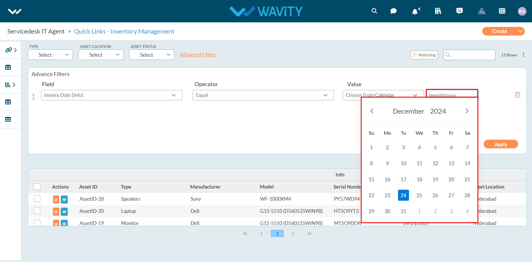
- Example below explains usage of “Between” Operator in Date and Time Field. Select “Between” Operator. Select the Date range (First Date and Last Date) from the calendar and apply filter.
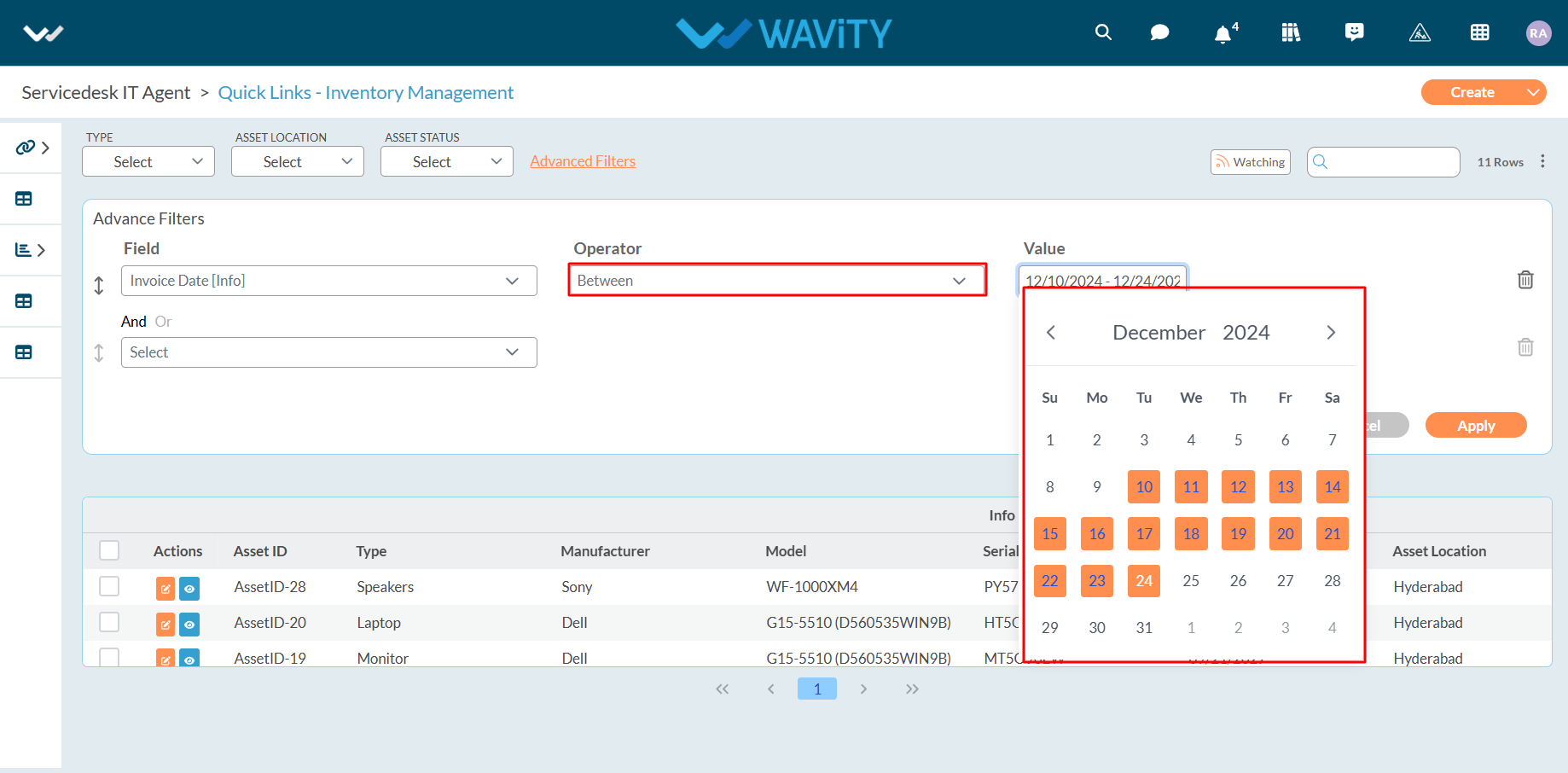
- Wavity also provides “Search bar” option as shown below to apply filters through the use of Keywords.
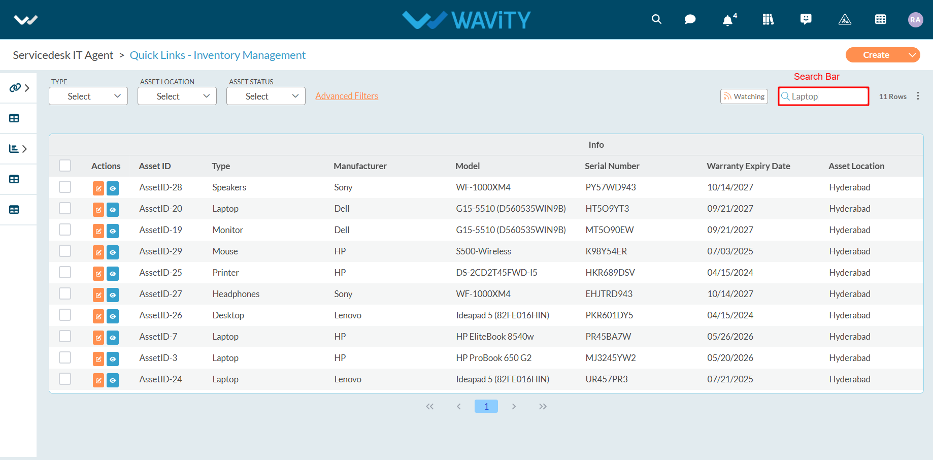
How to Add/Edit Widgets and Customize Interface/Layouts
- Widgets in Wavity are interactive components or visual elements within a user interface (UI) that provide users with specific functionalities, data visualizations, or quick access to information and actions.
- Widgets can be added/edited to interfaces/layouts in Wavity platform. This feature allows you to customize layouts based on your requirements. Only Admin of your company has the authority to create or edit widgets in the platform. For more details on creation of dashboards, please refer the following link: How To Create Role-Based Interface/Layouts | Wavity
- Existing layouts can be edited or updated in The Platform by the admin. Click on the “Personalize Layout” icon to drag, drop, or resize widgets.
- Use the drag widget icon to drag and drop widgets as per your requirements. Also, you can use the widget borders to resize the widgets.

- Click on ‘Save’ button to update the layout.
- You can use the Refresh icon to update the data in the table widget. Additionally, by clicking the three-dot menu, you have the option to export the data. A filtering feature is also available, as illustrated in the image below.

- Administrator of your company can add/ edit/ delete the widgets at any point of time. Click on “Manage Widget” from the layout.
- The Widget Settings pop-up will be displayed. As shown in the image below, all existing active widgets in the layout are listed. To create a new widget, click the ‘Create New’ button.
- You can create various types of widgets such as Reports, Analytics, Table, Links, Bulletin & Columns in the layout.
- To create a new link widget, click on "Links".
- Choose a color for the widget to customize its appearance.
- Enter a title for the widget to identify it clearly.
- Provide a title for the individual link, as shown below. Then, select the appropriate data source or application from which the data will be displayed.
- Choose the type of view to display in the widget when the title link is clicked:
- Selecting "Create" will open a new form with fields to be filled out.
- Selecting "List" will display all existing records from the selected data source or application/forms.
- Select the icon from the dropdown as shown in below image.
- Select the ‘Box’ icon to select the form fields as per your requirements. You can select or deselect any of the fields asper your requirement. Only the selected data fields will be displayed after clicking the link.
- Similarly, you can add more links as needed. To apply a filter, click the ‘Filter’ icon.
- Under Permissions, select the appropriate user category such as End User, Approver, Manager, or Moderator, as shown below. Only users in the selected category will be able to view or edit the link to the data source application.
- Choose the field from the data source application that you want to filter. You can apply various operators such as Equal, Not Equal, In, Empty, and Not Empty.
- Based on the selected field, all corresponding values will be displayed in the Value dropdown. Select the required value to apply the filter.
- To add more complex filtering conditions, you can use the "And" and "Or" functions: Enabling "And" will apply the filter only if all conditions are met. Enabling "Or" will apply the filter if any condition is met.
- Finally, click the "Apply Filters" button, as shown below.
- Click on “Create” button to create a new link widget.
- An example of a link widget is shown below for your reference.
- Similarly, you can custom create various widgets such as Reports, Analytics, Table, Bulletin and Columns in the layout, as needed.

- You can add a global widget if needed by simply toggling the Global Widget switch on or off.
- Similarly, you can choose which widgets should appear in the Wavity Mobile App by simply toggling the desired widgets on or off within the layout.
- All existing active widgets can be edited or updated as needed. Once the changes are made, click Save to apply the updates in real time to the role based interface or layout.
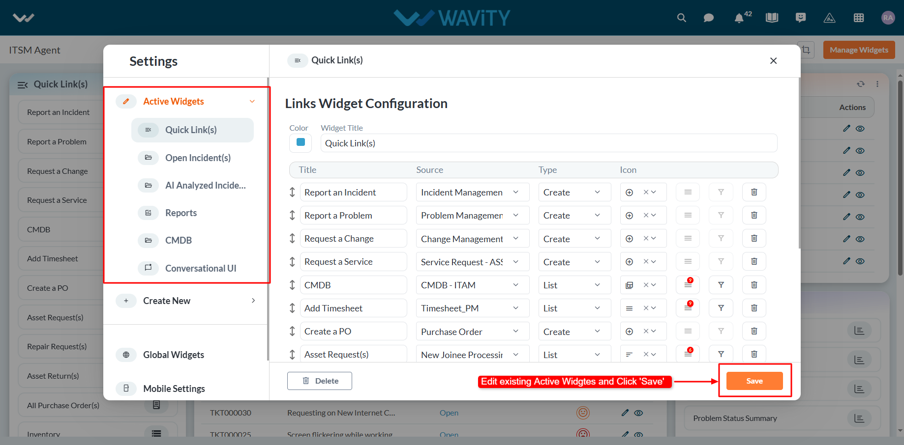
How to Create Role-Based Interface/Layouts
- Wavity platform supports the easy creation of role-based interfaces based on groups added into the platform. Only the admin of your organization has the authority to create new role-based interfaces/layouts.
- You can create your own interface with quick links, analytics, reports, and table widgets from scratch. Click the ‘9 dots’ image to view all existing role-based interfaces in your tenant.
- Then, click on “More from Wavity” below the 9 dots to create new interfaces.

- The Wavity Warehouse will be displayed with all the solutions in your tenant. A green tick will indicate whether an interface/dashboard is currently active.
- To create a new solution with role based layouts, click on “Create Solution.”

- On the following page, enter the solution name, which indicates the dashboard name. You can also add a description if needed. Select and add groups, which will determine a role-based dashboard for a specific group of users.
- For more details on creation of groups, Please refer the following link: How To Create & Edit Groups | Wavity
- Click on “Save” button to create a new interface or layout.

- There is also a provision for editing the names and groups of existing dashboards. Click on the ‘3 dots’ and select the Edit option to update the dashboard name and associated groups.

- Existing layouts can be customized further. Click on the “Personalize Layout” icon to drag, drop, or resize widgets. Use the “Manage Widgets” option to create new widgets or update existing ones.

- Creating new role based interfaces/layouts and adding widgets can be performed according to your business requirements to build customized solutions in Wavity.
- For more details on adding widgets to Interface, Please refer the following link: How to Add/Edit Widgets and Customize Interface/Dashboards | Wavity
How to enable Email Integration with Microsoft Office 365
- The Wavity platform provides email integration functionality, allowing for the automatic generation of requests within the platform through email. This occurs subsequent to the sending of an integrated email, based on configured conditions.
Email Integration with Microsoft Office 365:
- Wavity supports direct email integration with Microsoft Office365.
- To enable email integration with Microsoft Office 365, You need to allow for consent and permissions to avoid hassle-free email integration with Wavity.
- Please log in to your Microsoft azure account using your admin credentials.
- Click on “Enterprise Applications” as shown in below image.
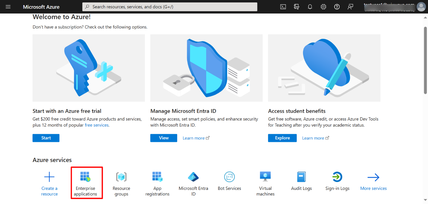
- Click on “Consent & Permissions” as shown in below image.
- Select “User Consent Settings” on the left as shown in below image.
- Select “Allow user consent for Apps” & “Allow group owner consent for all group owners” as shown in below image. Click on Save to update the settings.
- You can change the settings later back to your default settings after email integration with Wavity is complete.
Enable Email Integration in Wavity
- To enable the email integration in Wavity, click on click on Profile >Integrations.
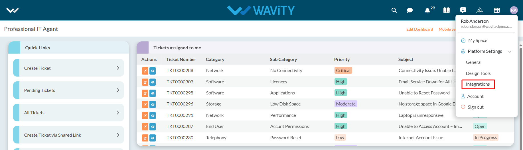
- Now, Click on “Create” button under Email section of the Integrations page as shown in below image.
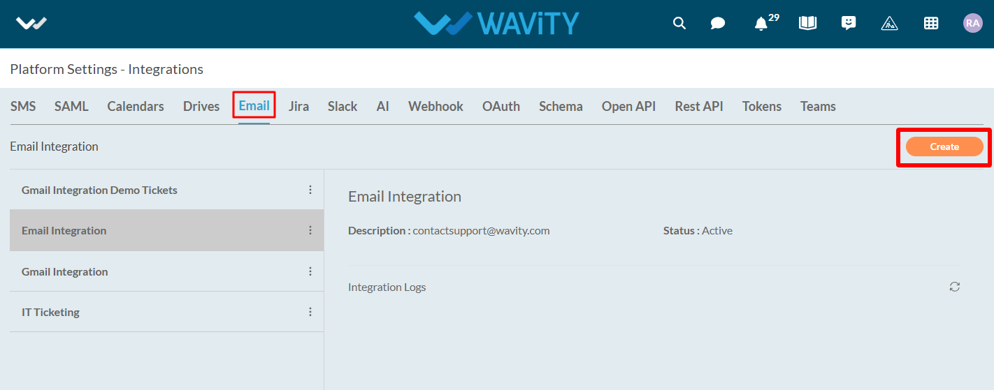
- Under name & description, you can mention the email integration name and any further details under description for reference.
- Select “Microsoft Office365” as type of integration.
- You can also enable the type of integration required such as inbound or outbound or both.
- Click on “Click to link your account” button as shown in below image.
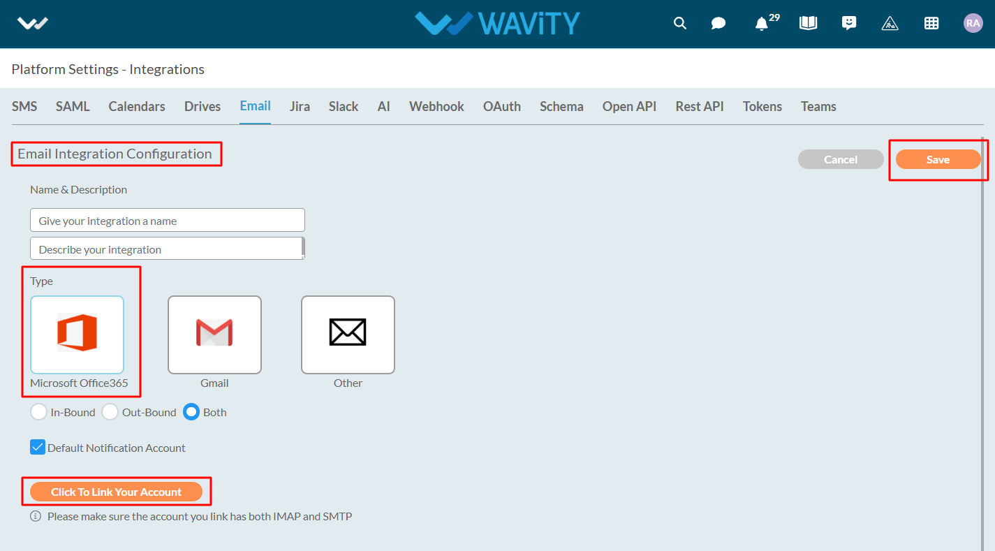
- You will receive a pop up message as shown below. Click on “Accept” to complete the process of linking your Microsoft account with Wavity.
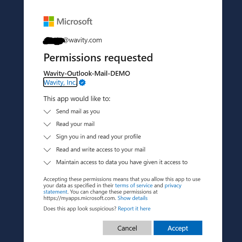
Please follow the above steps to complete the process of linking your Microsoft Office email account with Wavity.
Drive Integration
Note: Only admin can enable drive integration.
Integration with the cloud storage is used to attach files from outside of Wavity.
You can authorize Google, Drop box, One Drive, or Box account per user.
Click on the drive options which needs to be integrated (Google drive, one drive, box, drop box)
To do the drive integration click on Profile > Integrations > Drives.
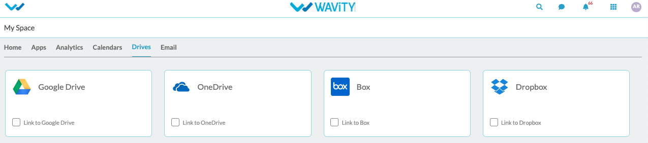
Click on the check box to enable drives.
To integrate with the drive, click on the user icon and then go to my spaces and click on the ‘Drives’.
Enable the check button for the drive which is to be integrated and enter the Instance Name for the drive and click on ‘Save’.
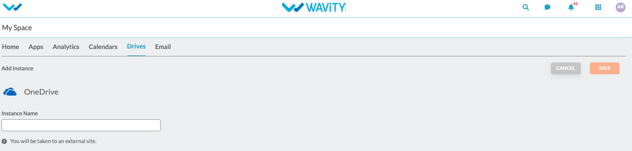
The page will redirect to the selected drive’s login page where the user needs to provide login credentials.
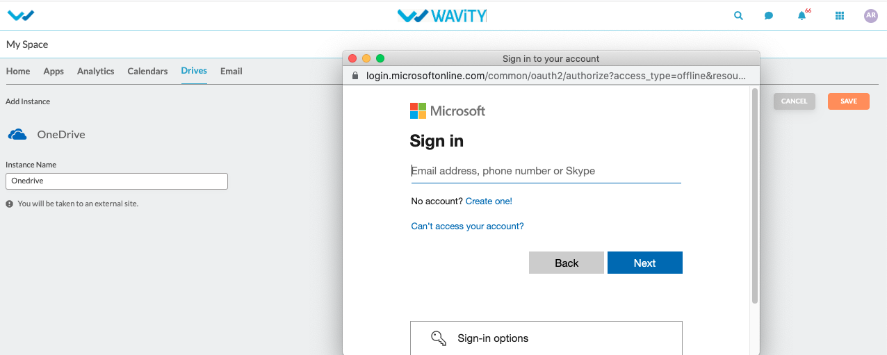
Accept all the permissions which are required and the drive will be integrated to the platform.
Calendar Integration
Note: Only admin can enable calendar integration.
You can link your Outlook and Google Calendar with Wavity, so that all your scheduled meetings, events, programs etc, can be checked here and also by default you will receive a notification based on the scheduled time before for every scheduled meeting.
Calendars keep track of changes to titles ,start dates, and due dates.
To do the calendar integration click on Profile > Integrations > Calendars.
Click on the enable Google/outlook calendars.
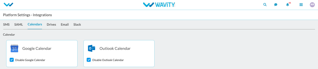
Click on the user icon and then go to my spaces and link the calendar .
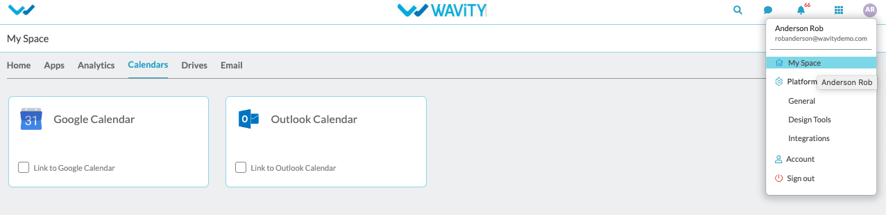
Click on the check box next to the ‘Link to outlook calendar/Link to google calendar’
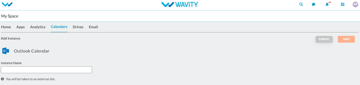
Enter the Instance Name for the calendar and click on ‘Save’.
The page will redirect to the selected calendar login page where the user needs to provide login credentials.
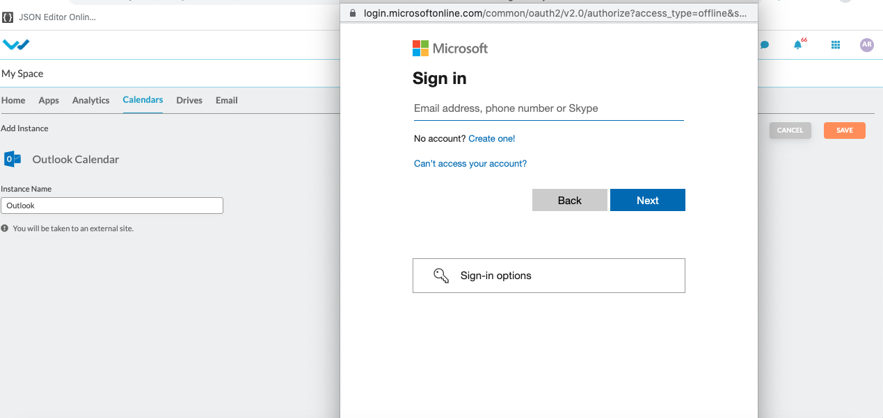
Accept all the permissions which are required and the calendars will be integrated to the platform.
SMS Integration
Note: Only admin can do sms integration.
SMS functionality can be used in message module.
To do the sms integration click on Profile > Integrations > SMS.
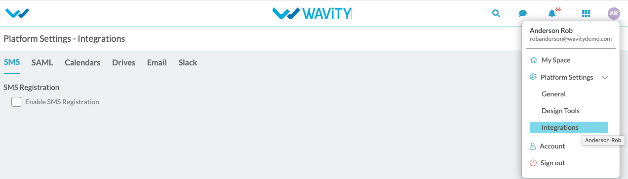
You can find check box next to ‘Enable SMS Registrations’.
Click on ‘Enable SMS Registrations’ to enable the sms notifications.
Provide the required details as shown below click on save button to enable it. Enter sender’s phone number to whom the sms notifications should be sent.
Sender Id and API Live Key is provided by the service provider.
By providing below required details only we can send or receive the messages with registered mobile number.
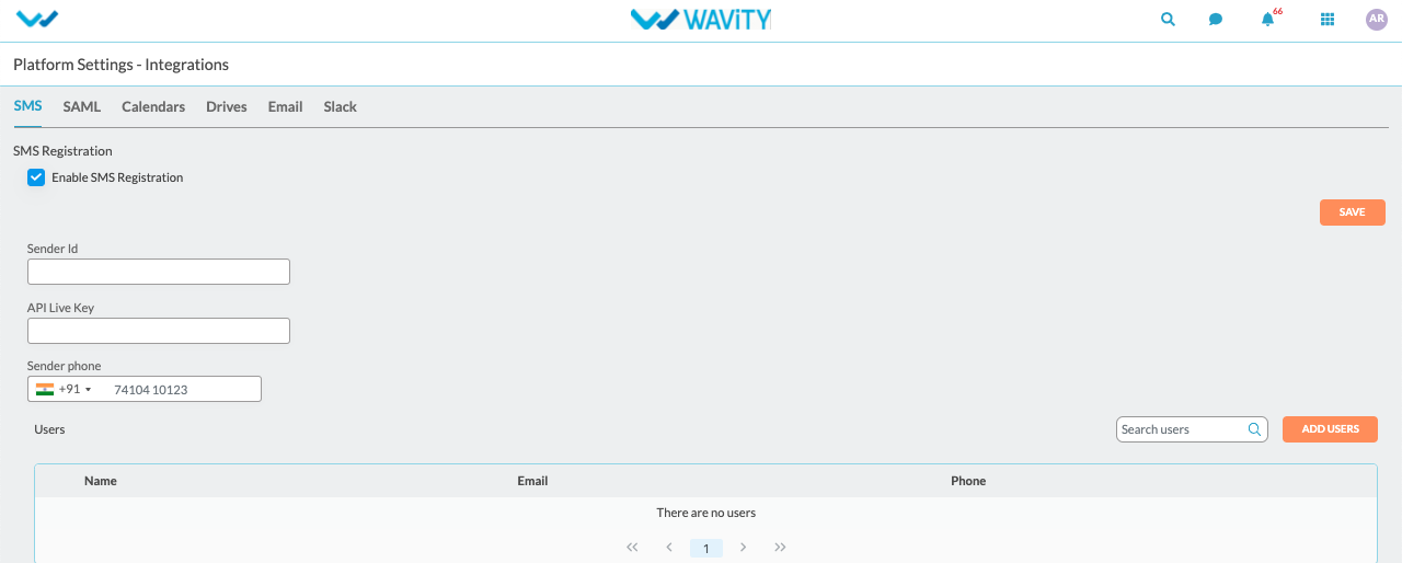
Click on “Add Users” button to add the user who can access the SMS functionality.
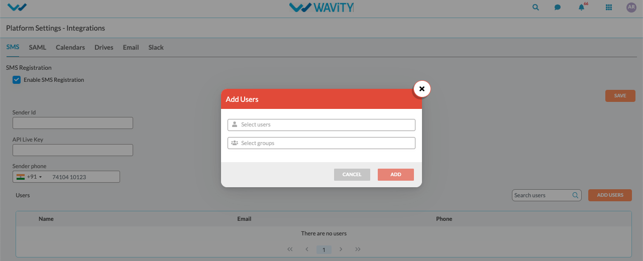
Search users and click on add.
How to enable SSO using Okta
- Only Admin of your organization can enable Single SignOn (SSO) in Wavity by entering the appropriate configuration details in 'Integrations’ settings.
- In ‘Integrations’, select the SAML option to begin the setup process.
- Click on ‘Enable SAML checkbox’’ & this will open up below options
- You will need the Service Provider information with Single Sign-On URL and Service Provider Entity ID while Integrating Wavity with Okta. Use the provided Single Sign-On URL link and Service Provider Entity ID link while setting up Okta App.
- Next step is to fill Identity provider information and map the Assertion Attributes in Wavity Platform using Okta. (Refer next image)
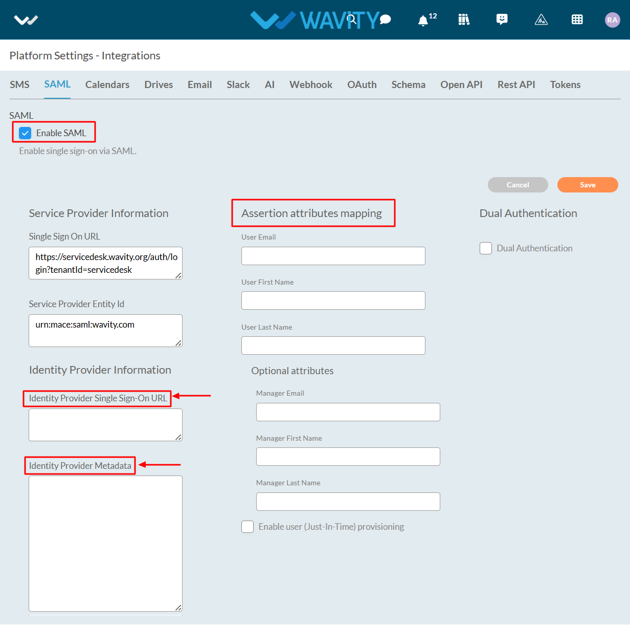
- Enter the information in the appropriate fields from the Okta App and click on Save.
Steps in Azure to set up SSO in Wavity
- Login to Okta portal with your Username &Password.
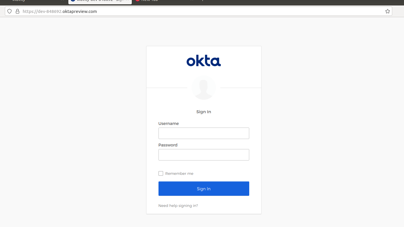
- Click on application (Left side of your browser)
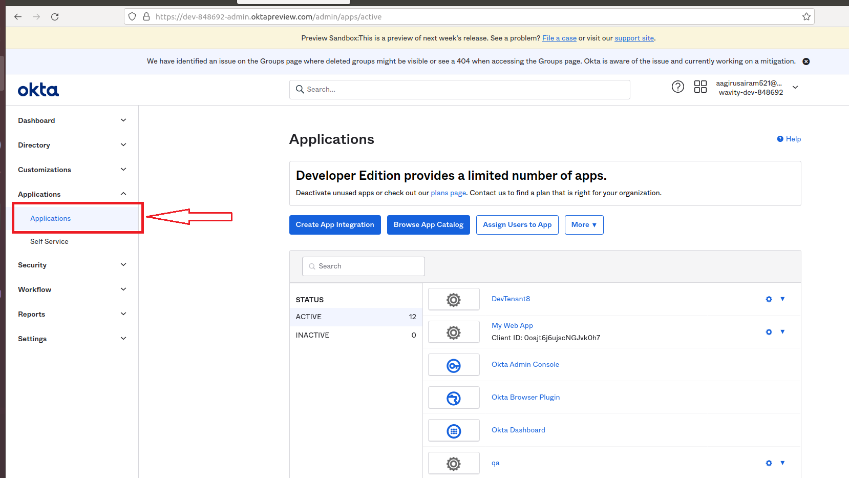
- Click on Create App Integration.
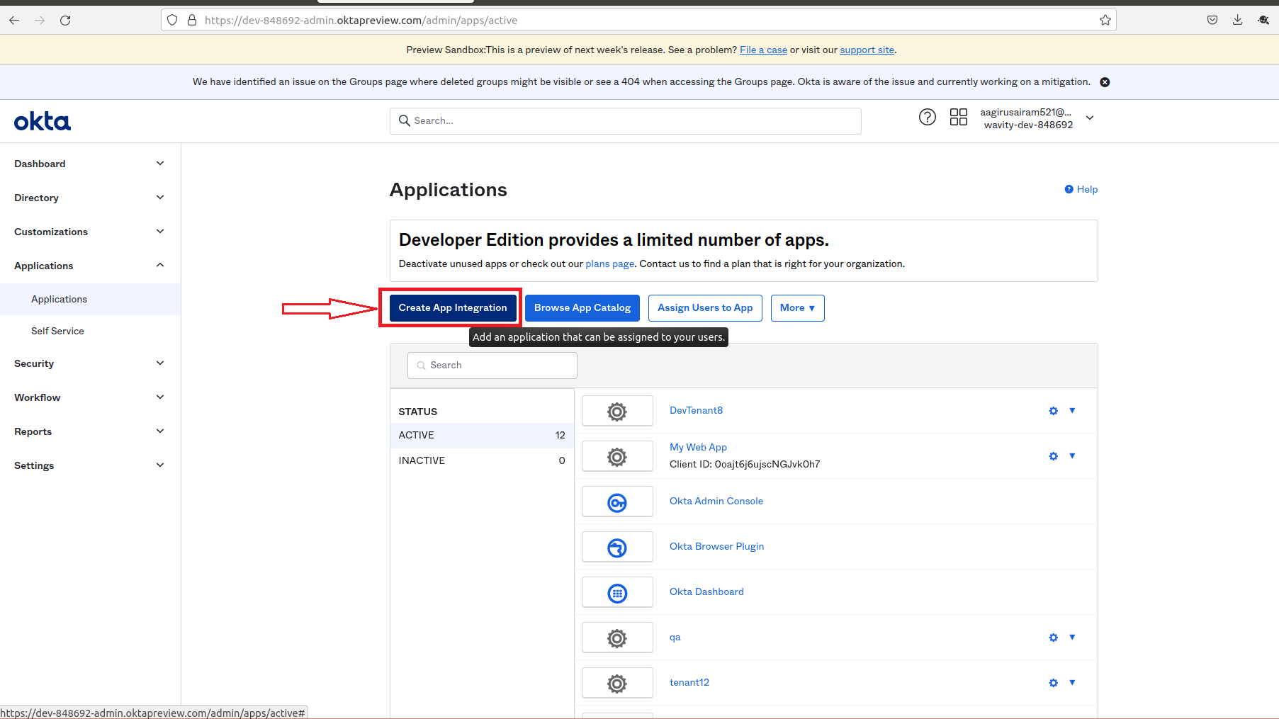
- Click on SAML 2.0. Then, click Next
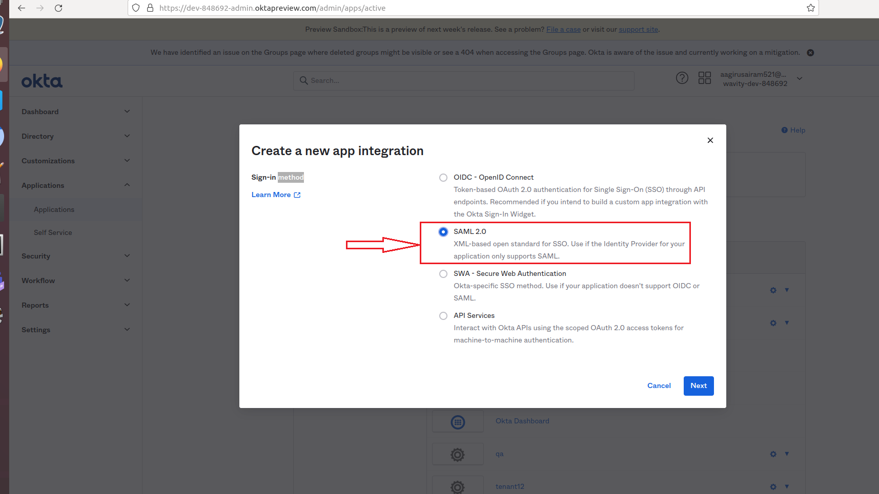
- You will be prompted to steps to create SAML Integration.
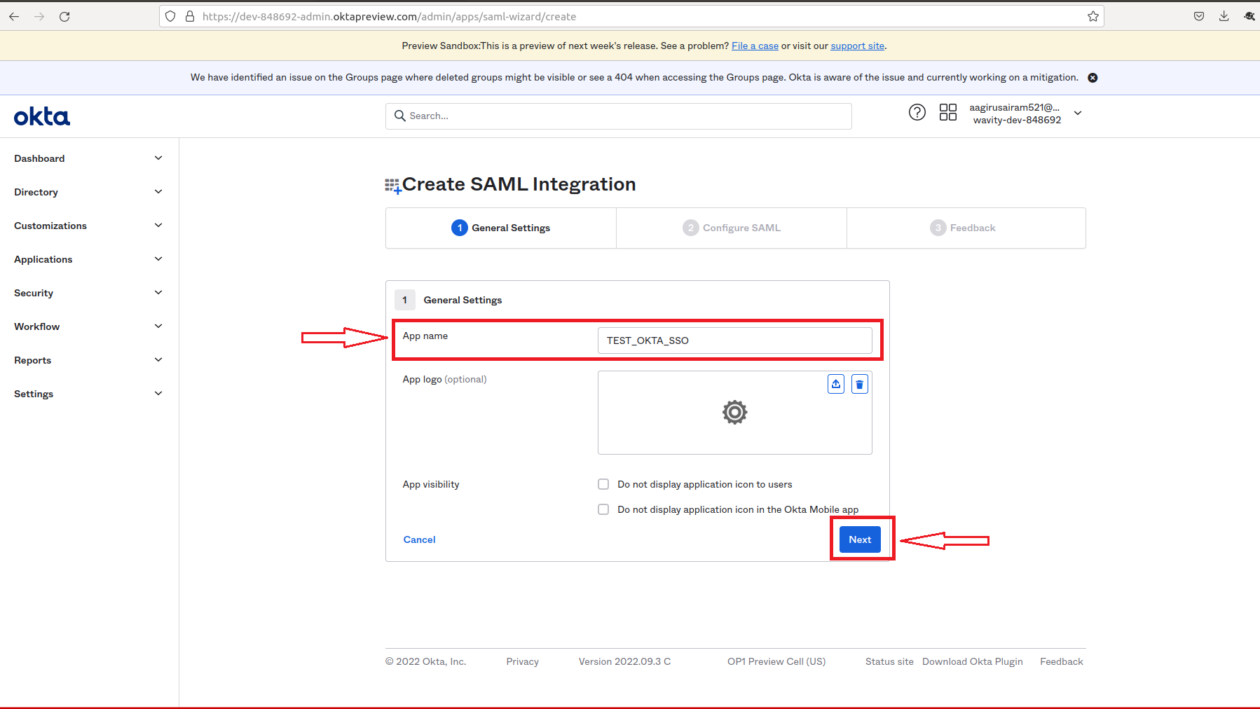
- On the following page. Fill in the following tabs Single sign in URL, Audience URI (SP Entity ID), Delay Relay state using the links from Wavity Integration setting page.

- After filling all information, you will prompted to the following page. Edit the email, firstname & lastname with the value in Attribute statements tab of the following page.
- Please copy the source attribute ‘user.email’, ‘user.firstName’ and ‘user.lastName’ to Wavity SAML Integrations setting page under section Assertion attributes mapping.
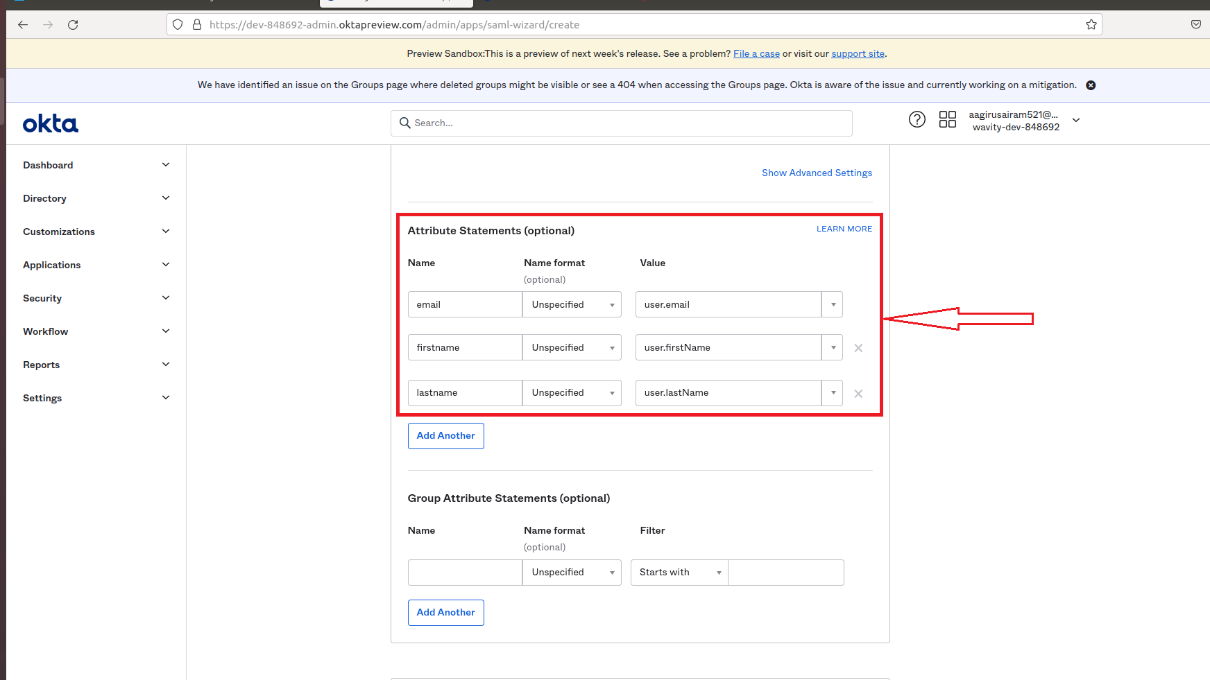
- After filling all information Name and Value tab of Attribute Statements page, Click on Next.
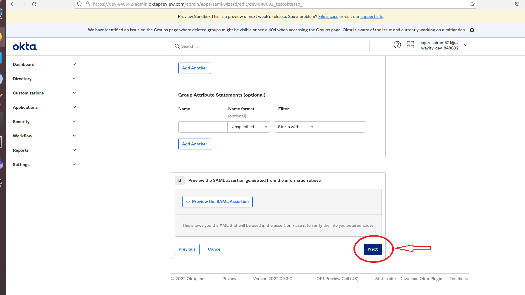
- In the following page, you can click on either toggle on the right side. Then, Click on Finish.
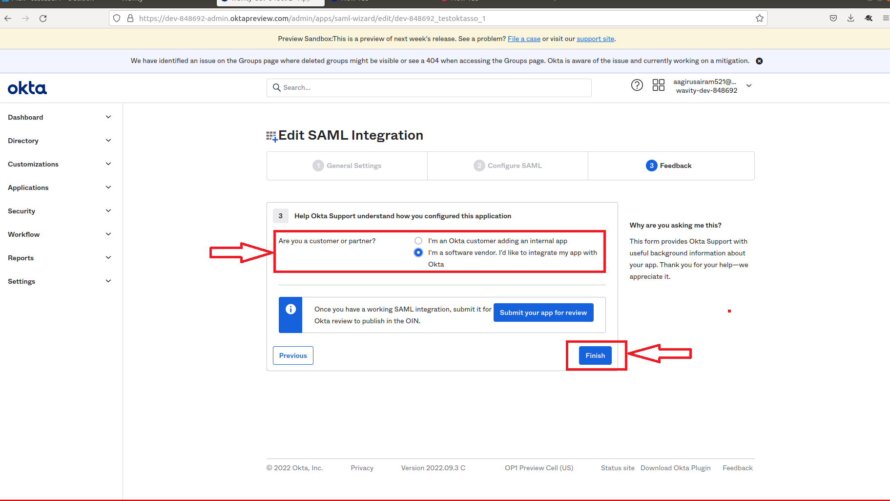
- Set-up of Okta is complete.
- Copy the link below Identity Provider Single Sign-On URL and paste it on Identity provider Single-Sign-On section on Wavity SAML Integrations setting page.
- Also copy the link below IDP Metadata-Optional Tab and paste it on Identity provider Metadata section on Wavity SAML Integrations setting page.
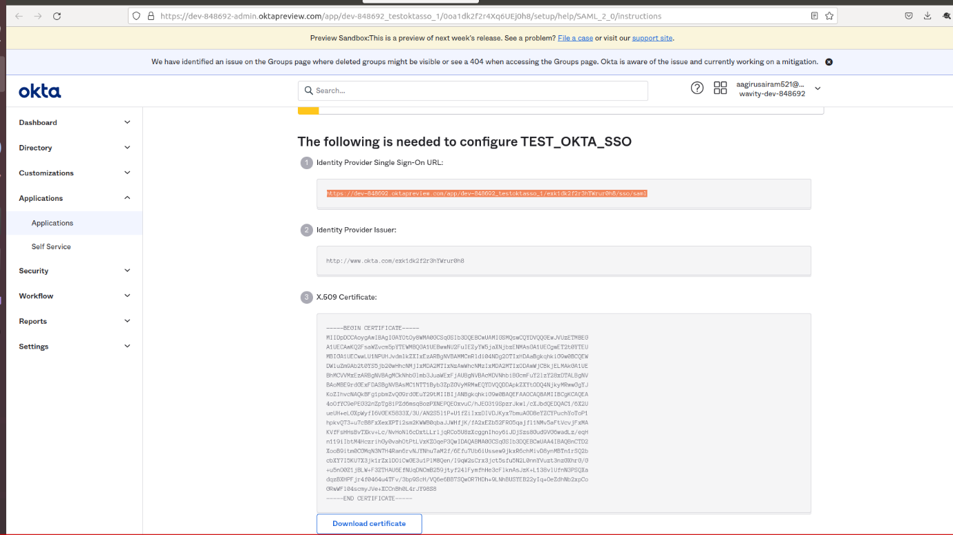
- As the last step, you will use the Okta to fill the tabs below the Identity Provider Single-Sign-On URL, Identity Provider Metadata & Assertion Attributes Mapping in Wavity.
- Please ensure the values of Attributes in Okta matches with the values in Wavity SAML Integrations setting page. Enter the information in the appropriate fields as described using Okta and click on Save. Wavity SAML Integration using Okta is complete.
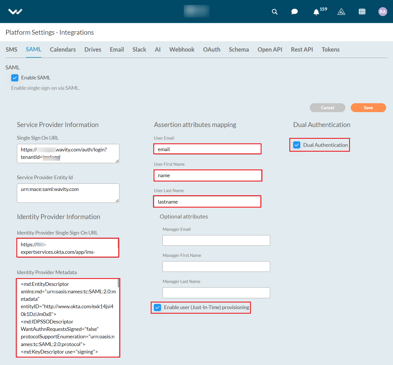
Please find below details which will be required during Set Up:
- Entity Id: urn:mace:saml:wavity.com
- Relay State: /wavity
User can now use okta SSO to sign into Wavity.
How to enable SSO using Microsoft Azure
- Only Admin of your organization can enable Single Sign On (SSO) by entering the appropriate configuration details in 'Integrations’ settings.
- In 'Integrations’, select the SAML option to begin the setup process.
- Click on ‘Enable SAML’ with below options
- You will require the Service Provider information with Single Sign On URL and Service Provider Entity ID while Integrating Wavity with Azure. Use Single Sign On URL link and Service Provider Entity ID link while setting up Azure.
- Next step is to fill Identity provider information and Assertion Attributes Mapping in Wavity Platform using Azure. (Refer next image)
- Enter the information in the appropriate fields using Azure and click on Save.
Steps in Azure to set up SSO in Wavity
- Login to Azure portal using your admin credentials. Go to https://portal.azure.com/#, and click on ‘Azure Active Directory’ in the menu to your left, then on ‘Enterprise Applications’:
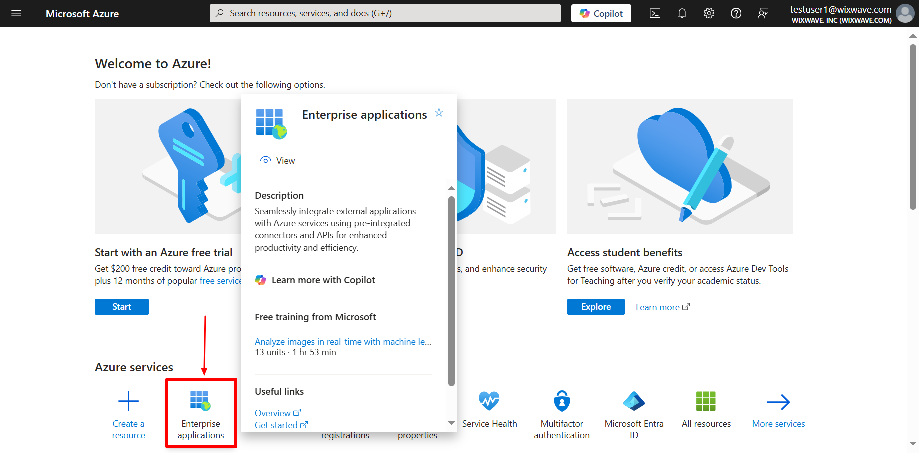
- Click on new application. Then click on create your own application.
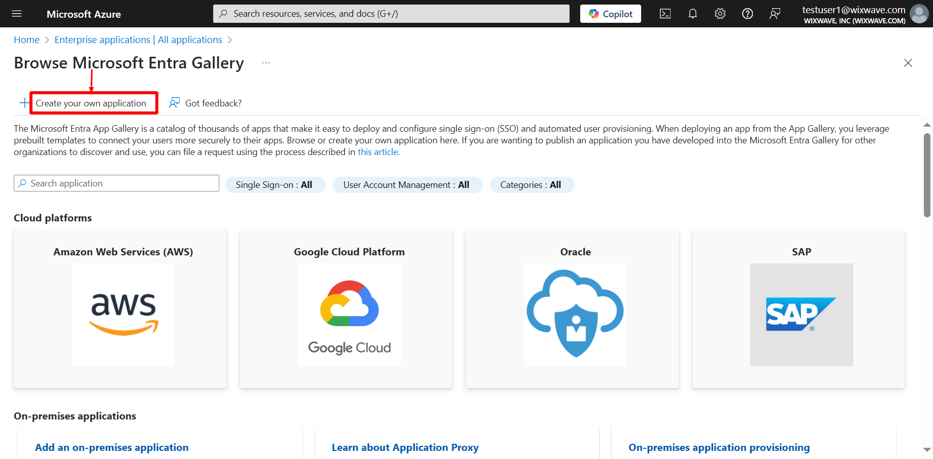
- Select the toggle which says “Integrate any other application you don’t find in the gallery.
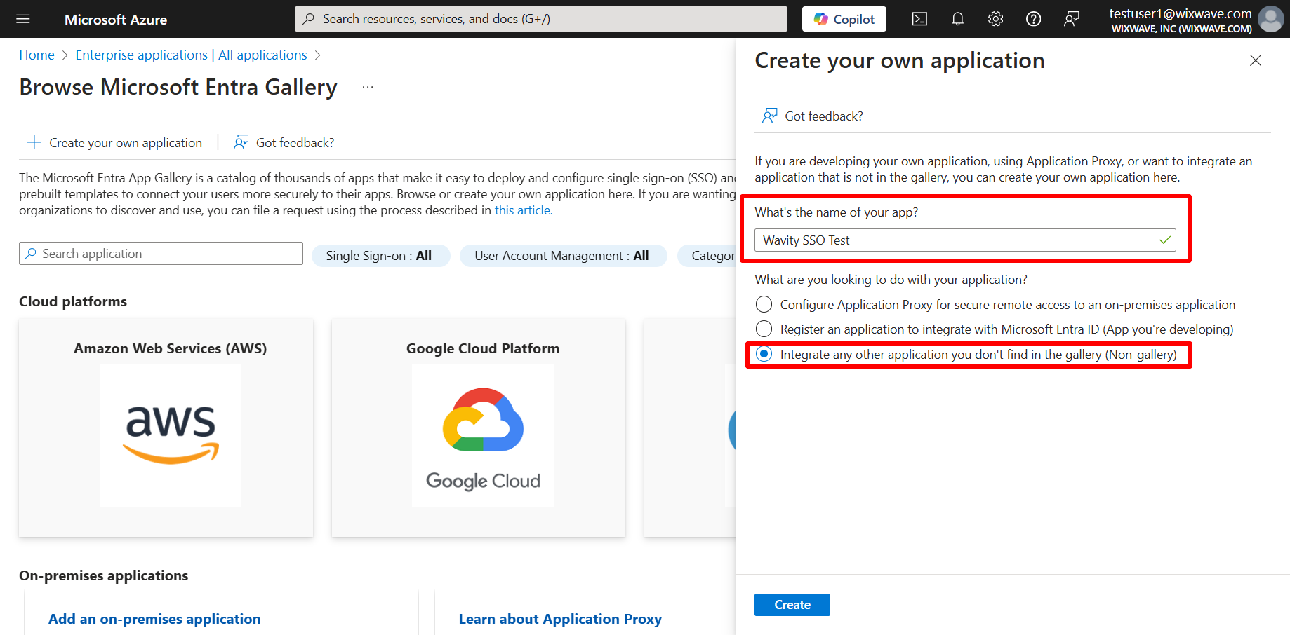
- New app has been created. Incase if you want to access again, You can always get back to it by selecting its name from the enterprise applications list you’ve already visited above.
- Click on ‘Set UP single sign-on’.
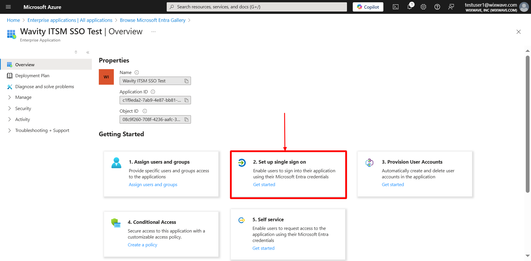
- Select single sign-on method as SAML.
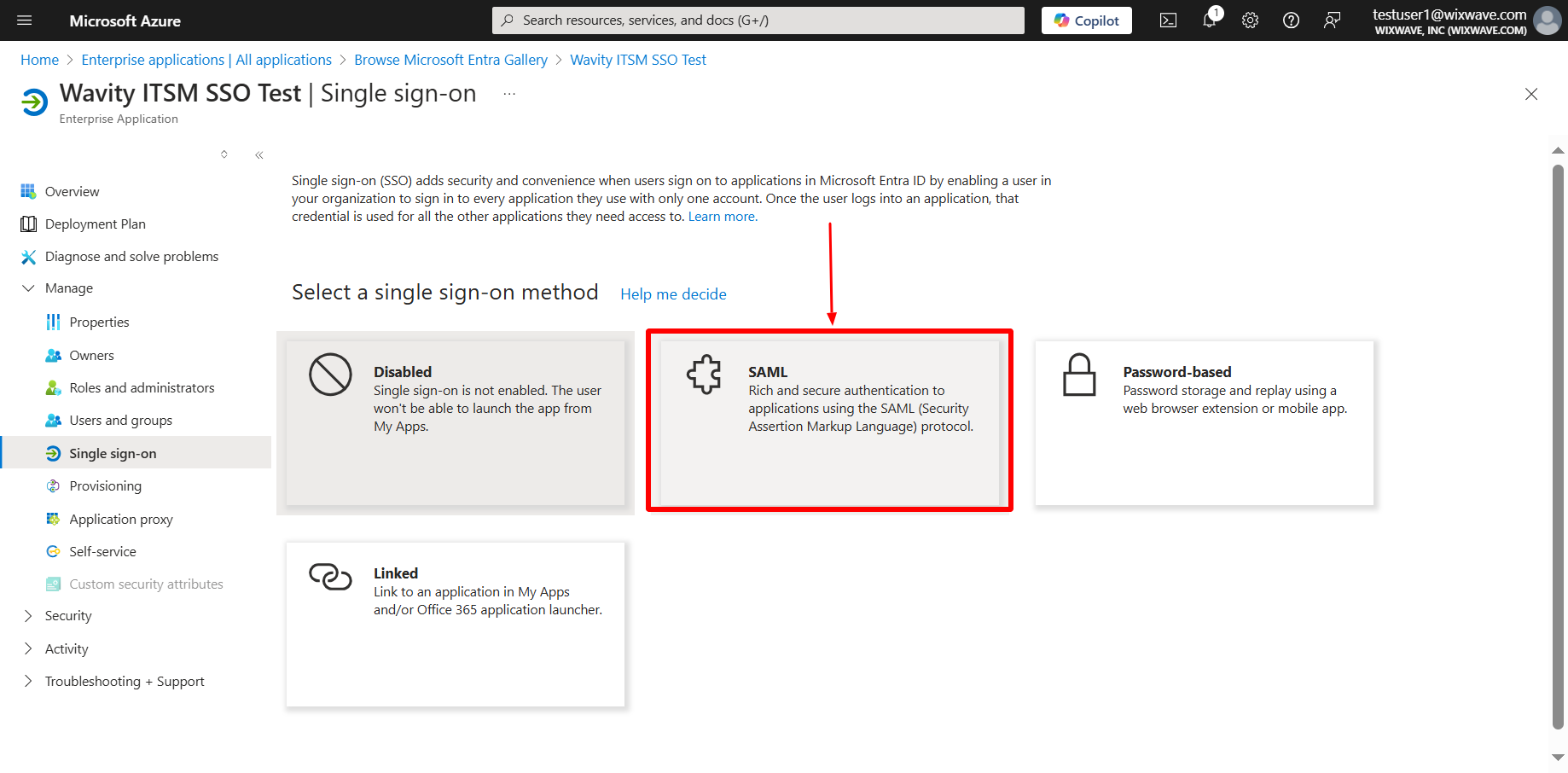
- On the next page, you find a link to a configuration guide which you can consult if you have any azure-specific questions. Or you can go straight to adding the two config parameters you need. Fill in the following tabs Identifier email ID, Reply URL, Sign on URL & Relay state using the links from Wavity Integration setting page as below.
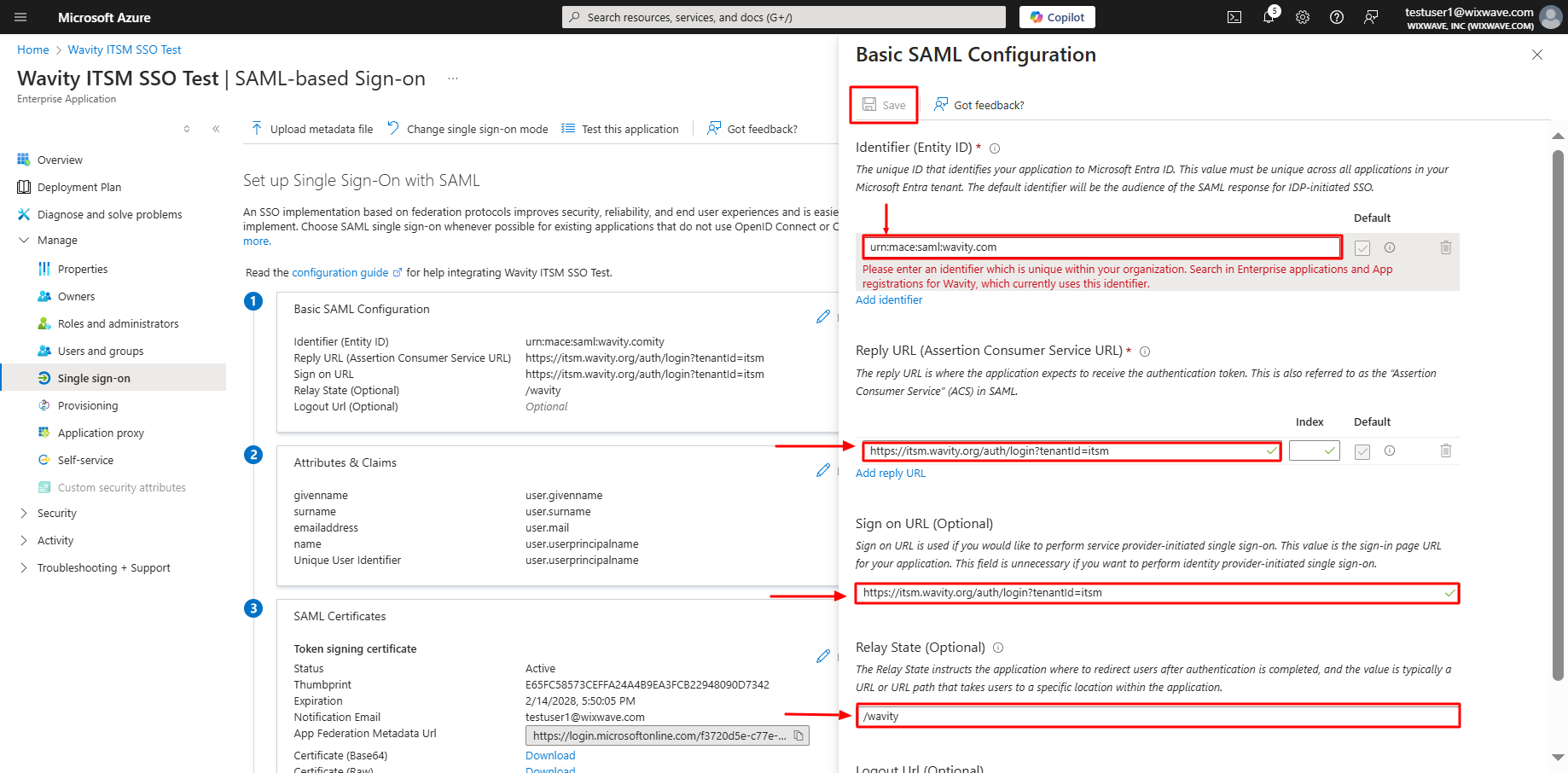
- After filling out all information, you will prompt to the following page. Click on edit option on Attributes & Claims.

- After deleting all the existing claims, Click on Add new claim in Attributes & Claims section.
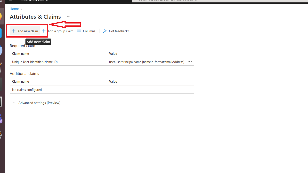
- Type Email in name tab and select source attribute as user.mail and click save. Please copy the source attribute ‘Email’ to Wavity SAML Integrations setting page under section Assertion attributes mapping. Ensure that you copy the value exactly as it appears, as it is case-sensitive.
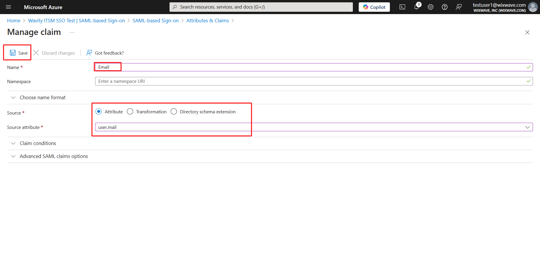
- Similarly, Type FirstName in name tab and select source attribute as user.givenname and click save. Please copy the source attribute ‘FirstName’ to Wavity SAML Integrations setting page under section Assertion attributes mapping. Ensure that you copy the value exactly as it appears, as it is case-sensitive.

- Similarly, Type LastName in name tab and select source attribute as user.surname and click save. Please copy the source attribute ‘LastName’ to Wavity SAML Integrations setting page. Ensure that you copy the value exactly as it appears, as it is case-sensitive.
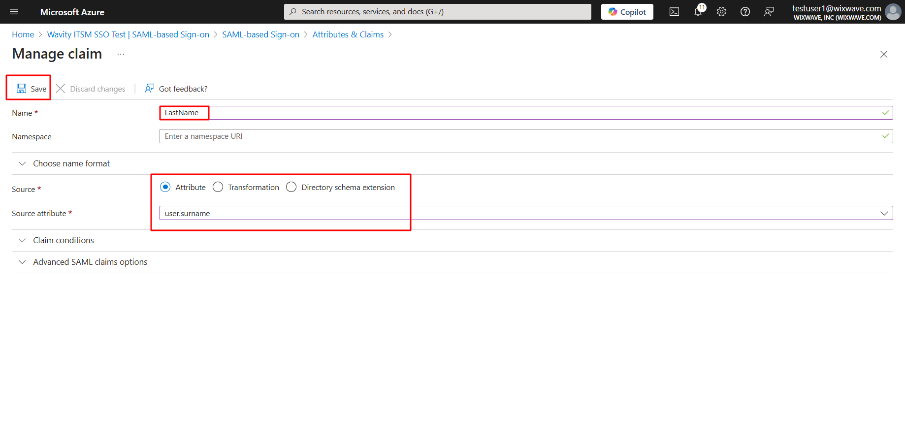
- Setup of Azure is complete. Now, click on download option of Federation Metadata XML. Copy all the details in the downloaded file and paste it on Identity provider Metadata section on Wavity SAML Integrations setting page.
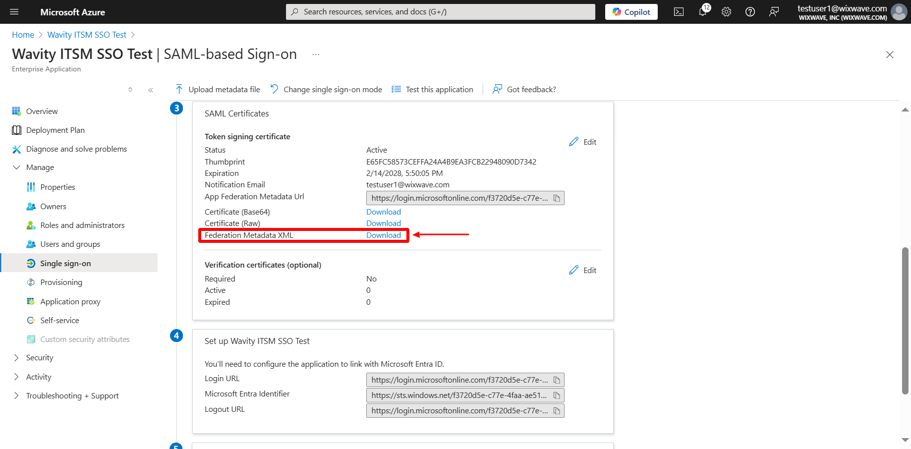
- Click on copy the link beside login URL. Paste it on Identity provider Single-Sign-On section on Wavity SAML Integrations setting page.
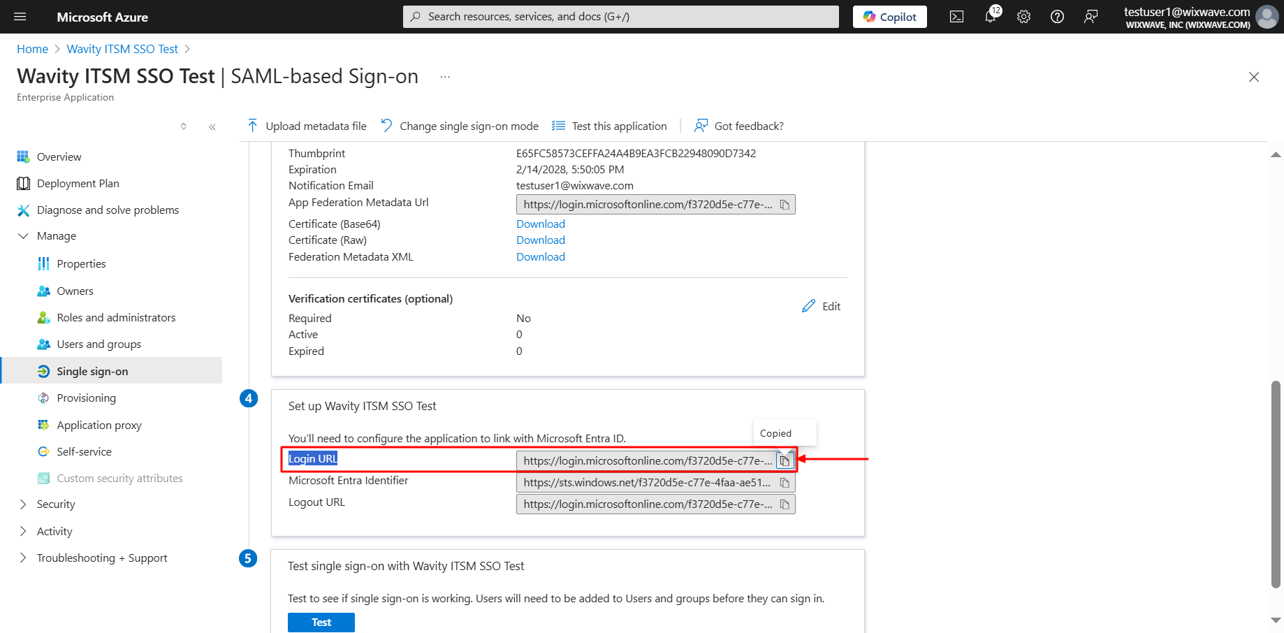
- As a final step, you will use the Azure to fill the tabs below the Identity Provider Single-Sign-On URL, Identity Provider Metadata & Assertion Attributes Mapping in Wavity. Please ensure the values of Attributes in Azure matches with the values in Wavity SAML Integrations setting page.
- Enter the information in the appropriate fields as described below using Azure and click on Save. You may also enable "Just in Time Provisioning" to add new users from your Active Directory for using Wavity as Single Sign-On (SSO). Wavity SAML Integration using Azure is complete.
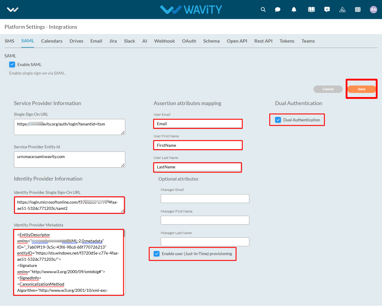
Please find below details which will be required during Set Up:
- Entity Id: urn:mace:saml:wavity.com
- Relay State: /wavity
User can now use SSO to sign into Wavity.
How to Create a New App from Scratch?
- Only the Admin of your organization has access to create new Applications in the platform.
- App/Application: A digital form within the Wavity platform.
- App Designer: An interactive, zero-code development environment for designing app layouts with form fields using data controls and properties.
- Click on “Design Tools” as shown below.
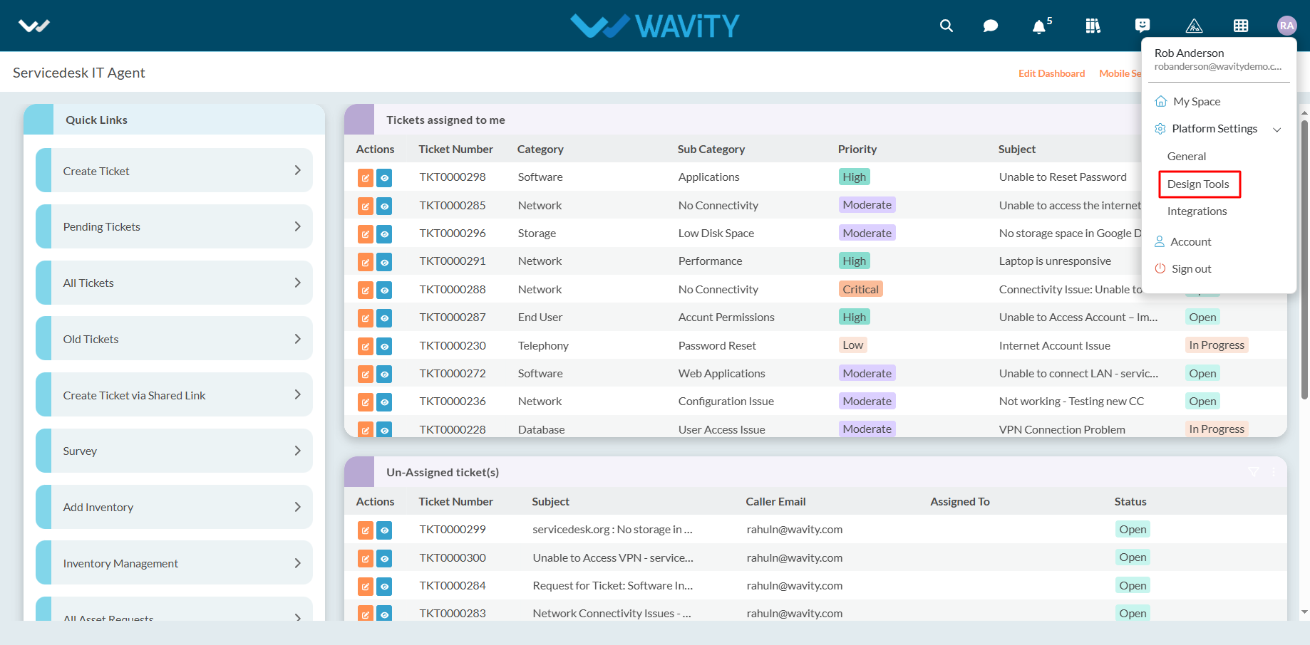
- In “Apps” section, All the existing applications of the platform will be displayed for the admin.
- Click on “3 dots” icon to carryout multiple functions of the existing application as shown below.
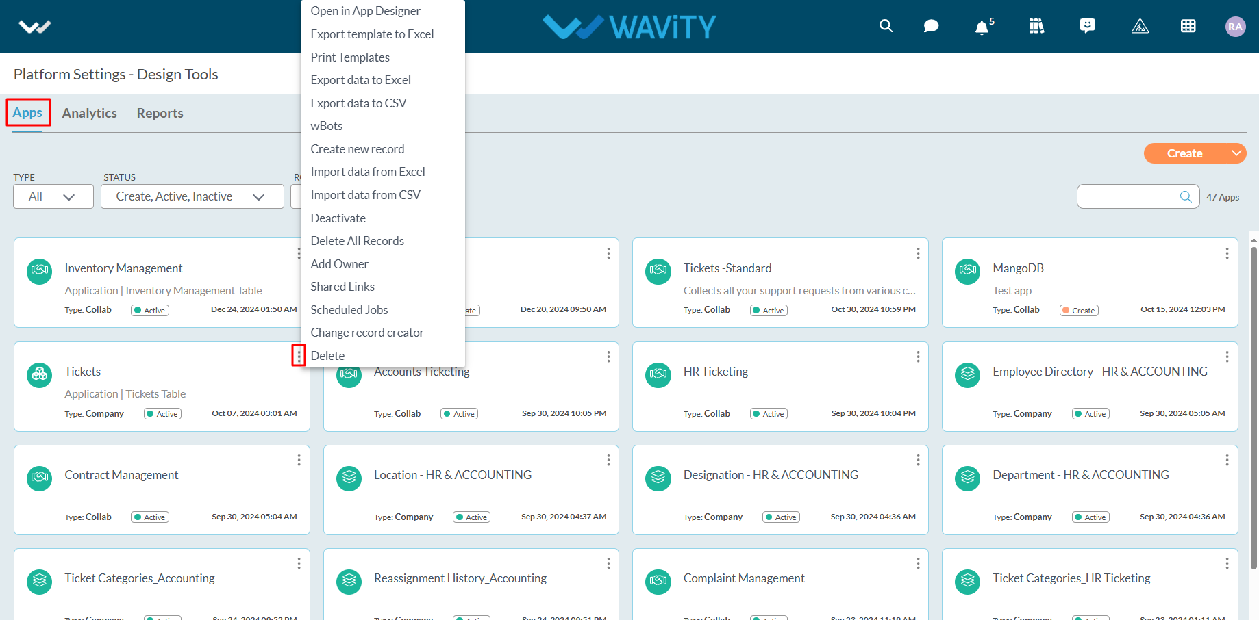
- To create an App: Click on "Create” button as shown below to create a new application. It will display 3 options such as New App, From Excel and From Template.
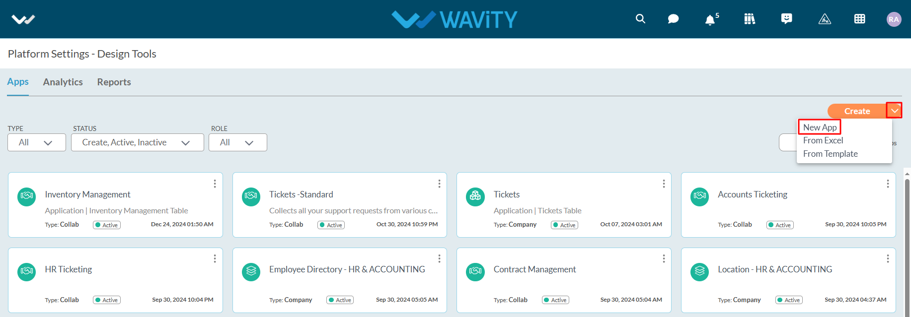
- New App: It will create new application from scratch. Click on “New App” under create button.
- Provide your Application Name and Application Type (Collaboration App, Company App, Team App) as shown below. Click on “Continue” button to land in App Designer page.
- Collaboration App: All user/groups in the app have access to view and edit all records in that particular app. For example, In Inventory Management application, all agents shall be able to view and edit all asset information only if they have the access.
- Company App: All users in the app have access to view only their records in that particular app. For example, In Ticketing application, each user shall be able to view and edit only the tickets created by them without giving any explicit access to users.
- Team App: All user/groups in the app have access to view only their records in that particular app. For example, In Ticketing application, each user shall be able to view and edit only the tickets created by them by giving access to users.
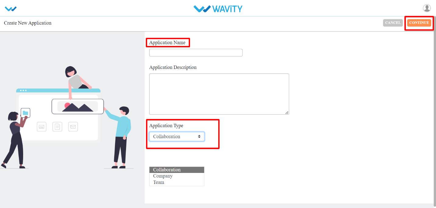
- As shown in image below (in red box) are the list of data controls which helps you to create and design an app. For detailed information on Data controls, please refer the following article: How To Use Data Controls/Form Fields? | Wavity
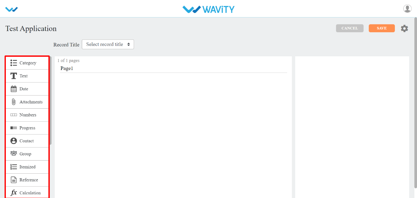
- Each of the data control has multiple sub-controls.
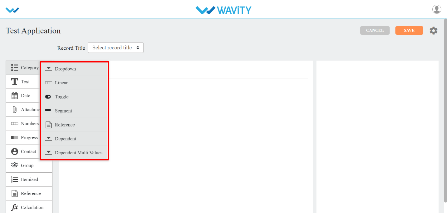
- Before getting to know each of the data control in detail, for familiar understanding you It shall be better to know few of the prerequisites.
- The Delete option as shown in below image deletes that particular data control.
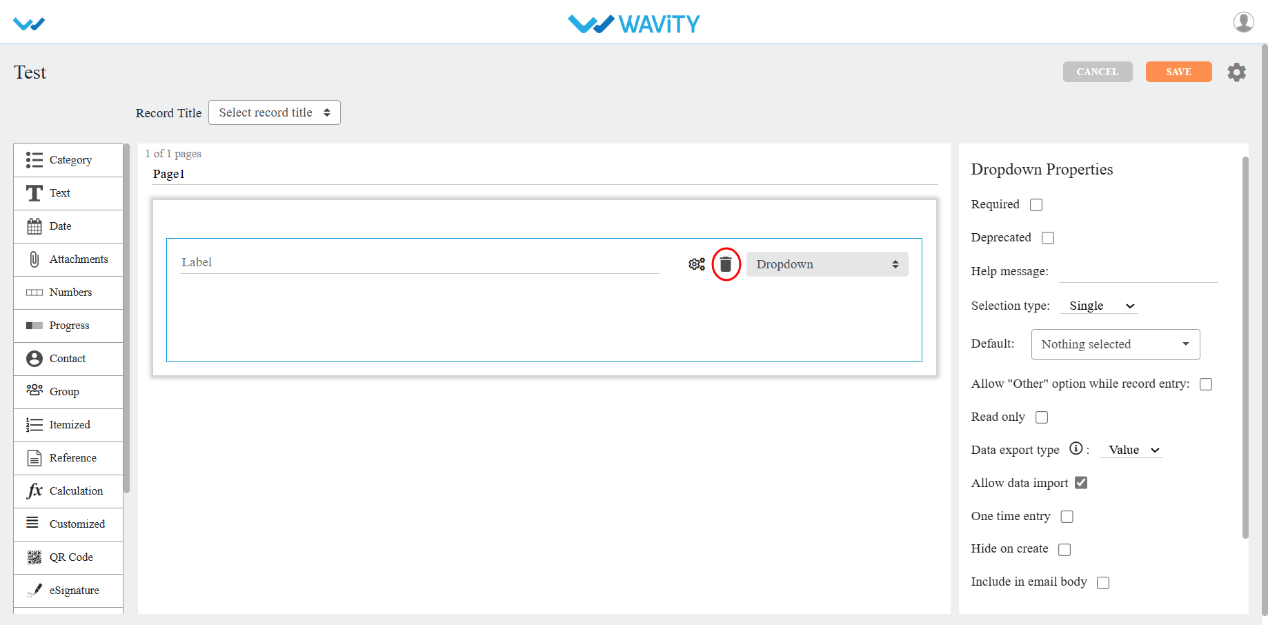
- The double arrow button in the below picture is used to move that particular data control up and down in the page.
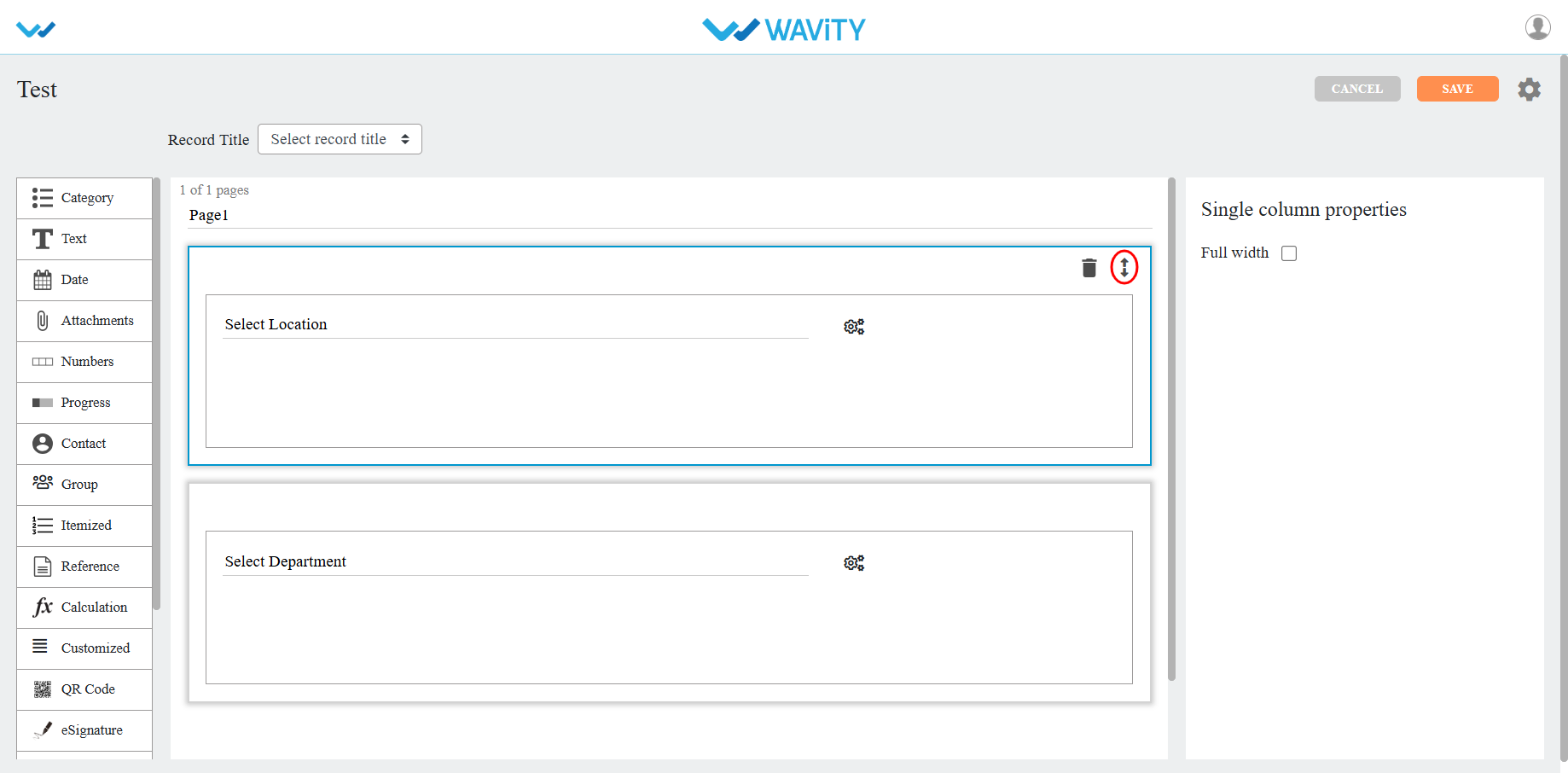
- If you click on the arrows as shown in below image, you will find all the sub controls of that particular data control you have selected.

- To add values or options in a dropdown data control, click on the icon as shown in below image.
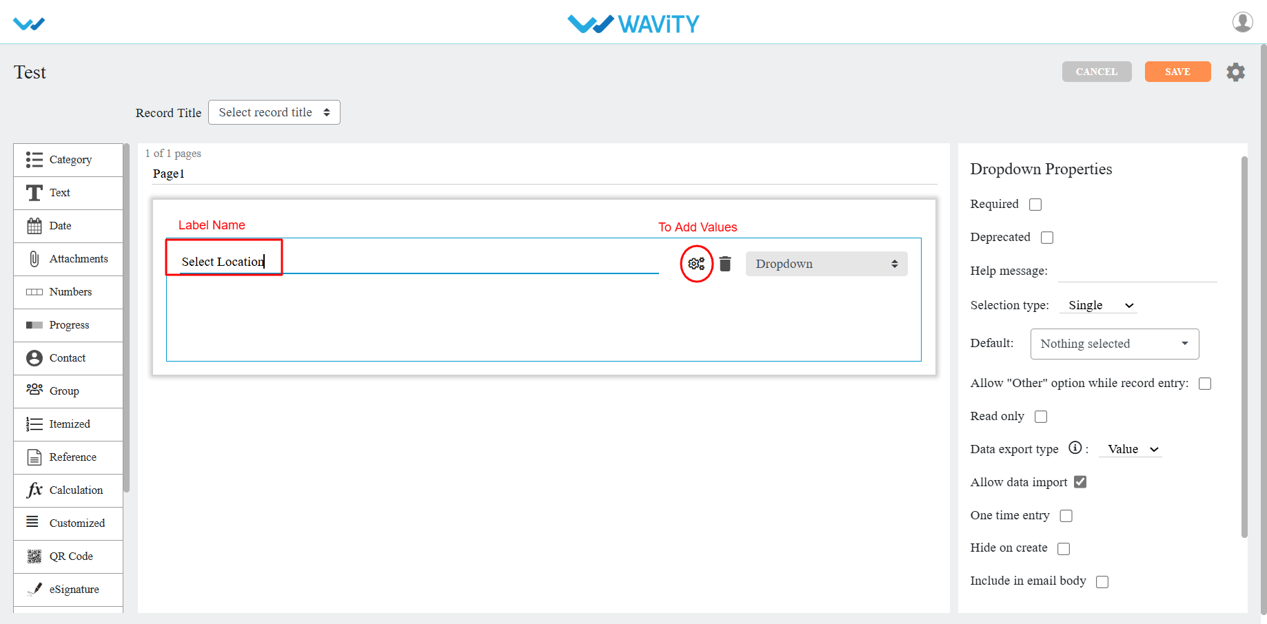
- You can all options as per your requirement for the selected dropdown. Click on Apply to save.
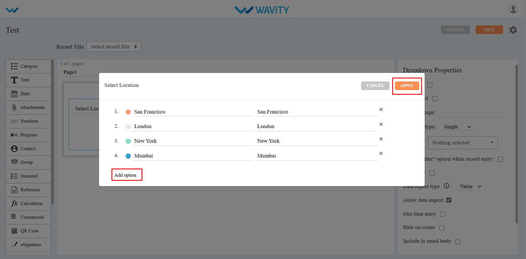
- You can find the properties of each data sub-control in the right corner as shown in image below.
- Common properties for most of the data controls are as follows:
- Required: Marks the field as mandatory.
- Deprecated: Ignores the field during record creation or editing.
- Help Message: Displays a supportive message to assist users in creating records appropriately.
- Field Placeholder: Displays predefined text, e.g., "Enter your name."
- Read Only: Prevents users from entering or editing data in the field.
- Hide: Conceals the data entered by the user in that field.
- Allow to Import Data: Enables importing data into this field using Excel.
- One Time Entry: Allows the user to enter data only once; changes are restricted after saving the record.
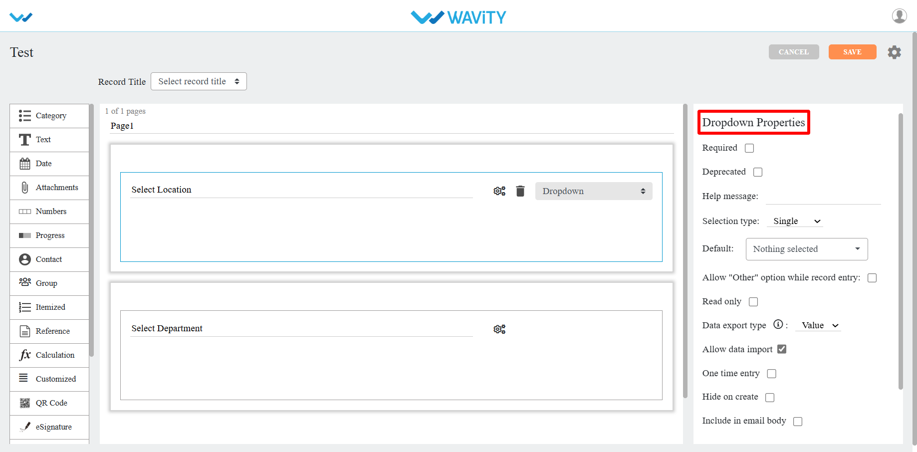
- For detailed information on Data controls, please refer the following article: How To Use Data Controls/Form Fields? | Wavity
How to Create a New App from Template?
- Only the Admin of your organization has access to create new Applications in the platform.
- App/Application: A digital form within the Wavity platform.
- App Designer: An interactive, zero-code development environment for designing app layouts with form fields using data controls and properties.
- Click on “Design Tools” as shown below.
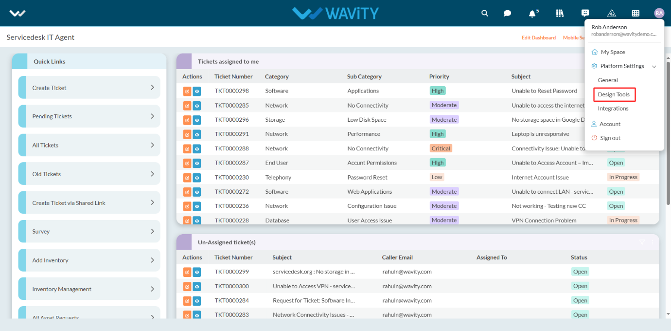
- In “Apps” section, All the existing applications of the platform will be displayed for the admin.
- Click on “3 dots” icon to carryout multiple functions of the existing application as shown below.

- To create an App: Click on "Create” button as shown below to create a new application. It will display 3 options such as New App, From Excel and From Template.
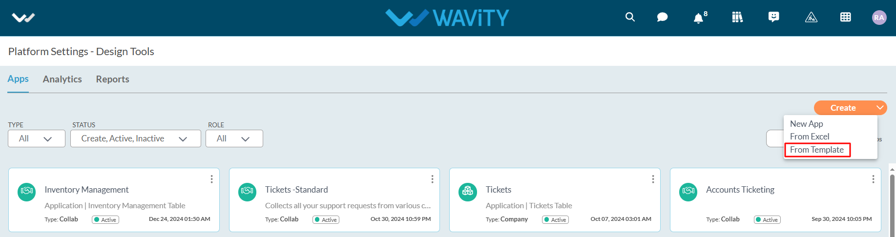
- From Template: If you have an existing app template in Excel format, you can use it to create a new app. To do so, click on the "Create" icon, then select "From Template" from the dropdown menu. Choose the desired template file from your system and click the "Open" button.
- Next, enter your Application Name and select the Application Type as shown below. Click the "Continue" button to proceed to the App Designer page.
- Collaboration App: All user/groups in the app have access to view and edit all records in that particular app. For example, In Inventory Management application, all agents shall be able to view and edit all asset information only if they have the access.
- Company App: All users in the app have access to view only their records in that particular app. For example, In Ticketing application, each user shall be able to view and edit only the tickets created by them without giving any explicit access to users.
- Team App: All user/groups in the app have access to view only their records in that particular app. For example, In Ticketing application, each user shall be able to view and edit only the tickets created by them by giving access to users.
- All the form fields from the exported template will be displayed in the App Designer (in the center).
- As highlighted in the image below (within the red box), you will find a list of data controls that assist in creating and designing the app. For detailed information on Data controls, please refer the following article: How To Use Data Controls/Form Fields? | Wavity

- Each of the data control has multiple sub-controls.

- Before getting to know each of the data control in detail, for familiar understanding you It shall be better to know few of the prerequisites.
- The Delete option as shown in below image deletes that particular data control.
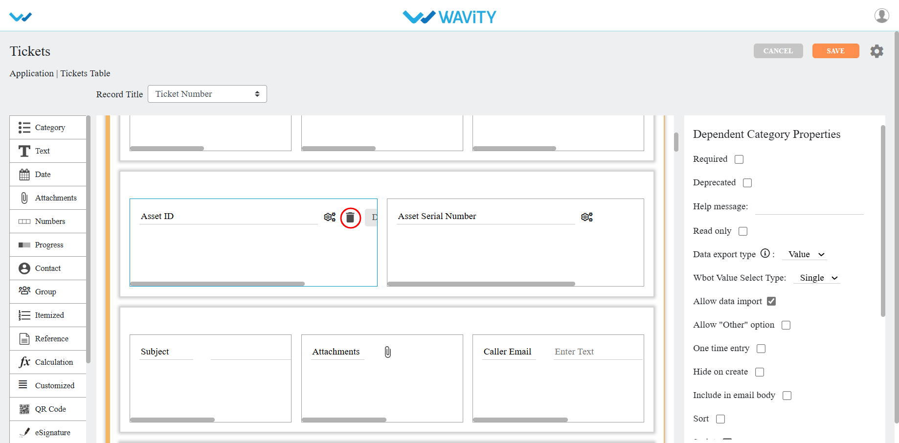
- The double arrow button in the below picture is used to move that particular data control up and down in the page.
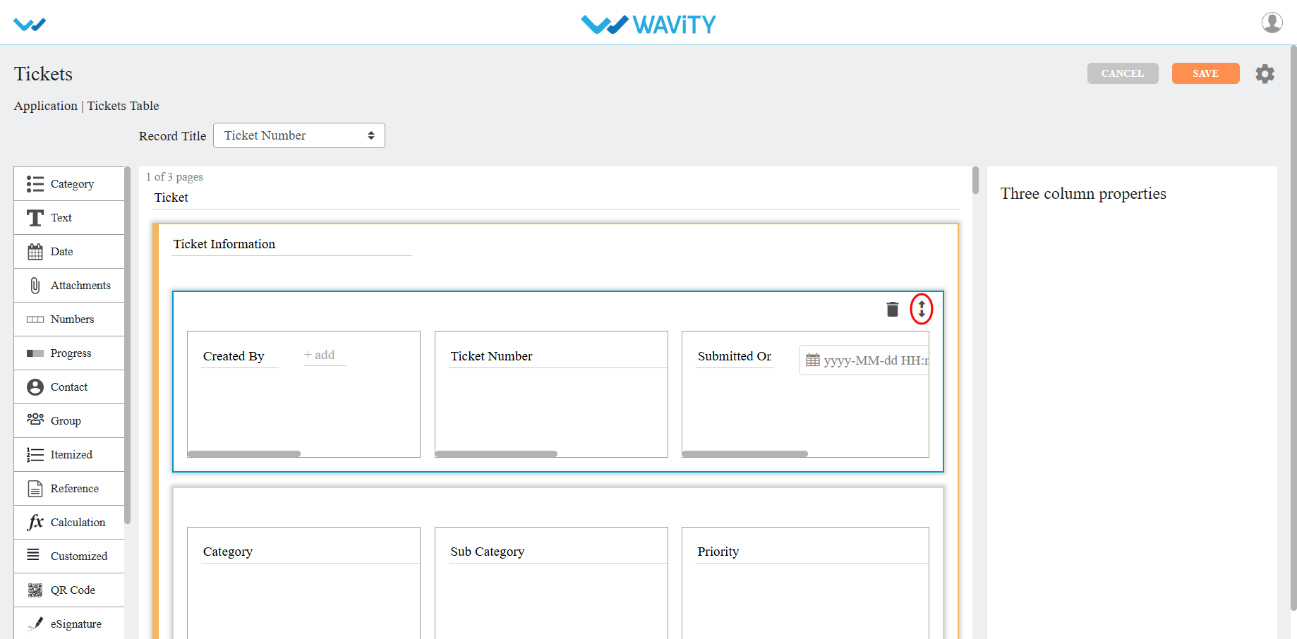
- If you click on the arrows as shown in below image, you will find all the sub controls of that particular data control you have selected.
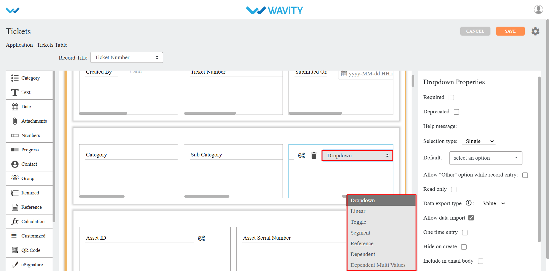
- You can find the properties of each data sub-control in the right corner as shown in image below.
- Common properties for most of the data controls are as follows:
- Required: Marks the field as mandatory.
- Deprecated: Ignores the field during record creation or editing.
- Help Message: Displays a supportive message to assist users in creating records appropriately.
- Field Placeholder: Displays predefined text, e.g., "Enter your name."
- Read Only: Prevents users from entering or editing data in the field.
- Hide: Conceals the data entered by the user in that field.
- Allow to Import Data: Enables importing data into this field using Excel.
- One Time Entry: Allows the user to enter data only once; changes are restricted after saving the record.

- For detailed information on Data controls, please refer the following article: How To Use Data Controls/Form Fields? | Wavity
How to use Data controls/Form fields?
- Admin shall have access to create new applications in the platform.
- App/Application: It is a digital form in Wavity platform.
- Data Control: Each field in the App is called a Data Control. Such as Text field, Number field etc.
- Sub Data Control: For designing purpose each Data Control is divided as Sub Data Control. E.g.: Text field is divided into Text block, Two fields, Three fields etc.
- In the picture below (in red box) are the list of data controls which helps you to create and design an app.
- Each of the data control has multiple sub-controls.
- Before getting to know each of the data control in detail, for familiar feel you should get to know few of the prerequisites.
- The Delete option shown in below picture deletes that particular data control.
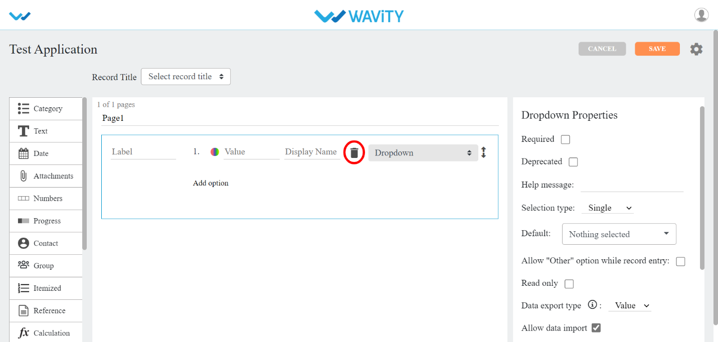
- The double arrow button in the below picture is used to move that particular data control up and down in the page.
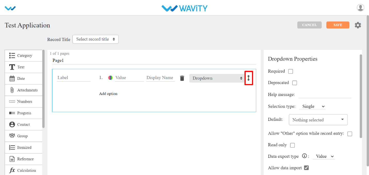
- If you click on the arrows in the below picture, you will find all the sub controls of that particular data control you have selected.
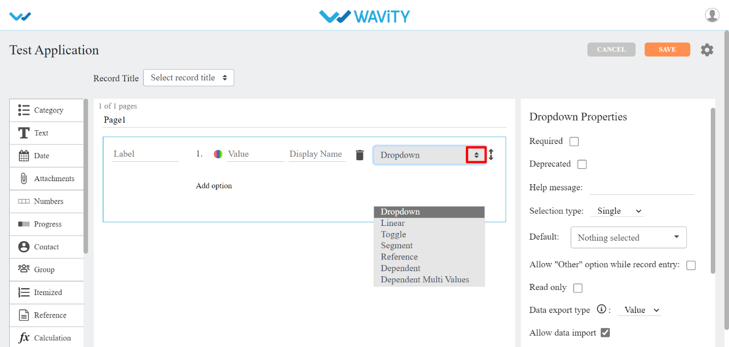
- You can find the properties of each data sub-control in the right corner as shown in picture below.
- Common properties for most of the data controls are as follows:
- Required: If you checkbox this property, which means this field is mandatory.
- Deprecated: If you checkbox this property, which means this field is ignored at the time of record creation/editing.
- Help message: You can write a help message in this field, which helps user to create record with supported text accordingly.
- Field Place Holder: If you want any data to be displayed, you can use this property. E.g. Enter your name.
- Read Only: If you checkbox this property, which means you cannot enter any details in this field at record creation/edit time.
- Hide: If you checkbox this property, which means you can hide the data the user has entered in that particular field
- Allow to import data: If you checkbox this property, which means you can import data using Excel into this field.
- One Time Entry: If you checkbox this property, which means you can allow the user to enter the data only once. If the user wants to change the data after s(he) saves the record, the system does not allow them.
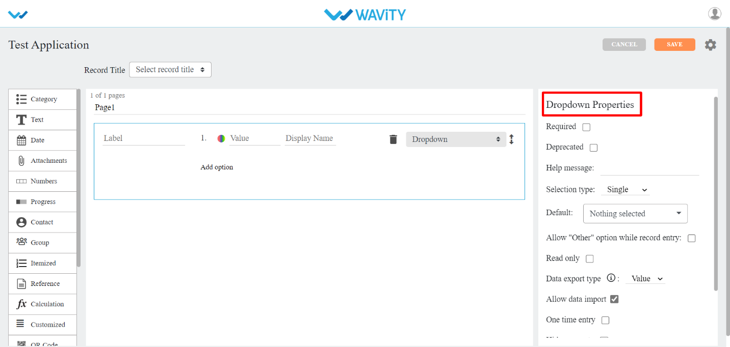
- Script: If you checkbox this property, data will record in that field as per the condition specified in the script. This property is used mainly for UI validations. Click on the Validate button After writing the script, it will validate the written script if it is error free.
- On Change: when this option is checked then the script will execute when user edit the data for the particular data control in record create and record edit page.
- On Save: When this option is checked then the script will execute when user save the record or click on “Save” button.
- On Open: When this option is checked then the script will execute when user open a record create page or open an existing record.
- Control List: Click on this option, it will show all the Data controls IDs which you can use in the script to transfer the data or validate the data.
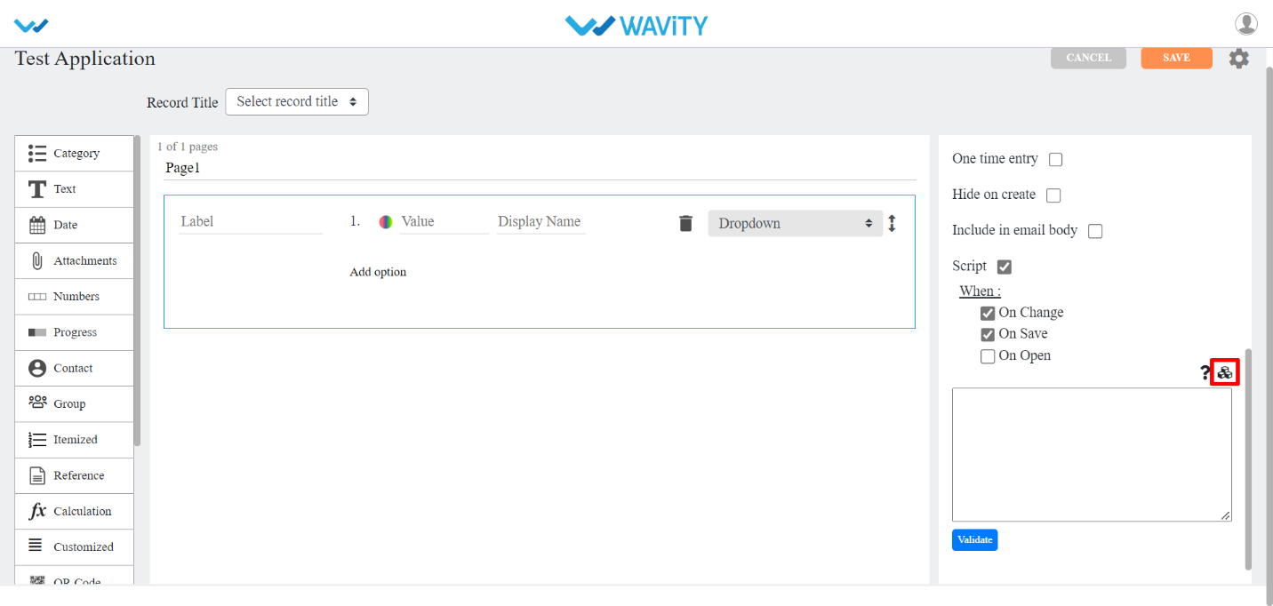
- Category Control
- There are seven types of sub-data controls for this category. Each of them are described below with their properties.
- Other properties that include for most of category Sub-data controls are:
- Selection Type: Here you can select Single or Multiple values in the dropdown.
- Default: You can also assign default value for the field if nothing is selected.
- Allow “other” option while record entry: You can check box this option if users wanted to enter option other than the one given in dropdown list.
- Data export type: You can select either value or display name to appear in the drop down.
- You can click on Add option button to add more value/display names.
- Dropdown: This sub-data control is used when you want values to be displayed in dropdown format.

- Linear: This sub-data control is used when you want values to be displayed in line format.
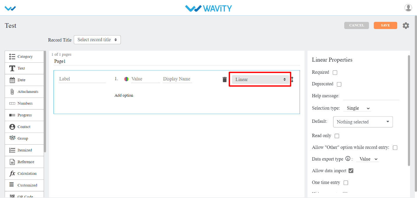
- Toggle: This sub-data control is used when you want to record data in on/off or yes/no format.
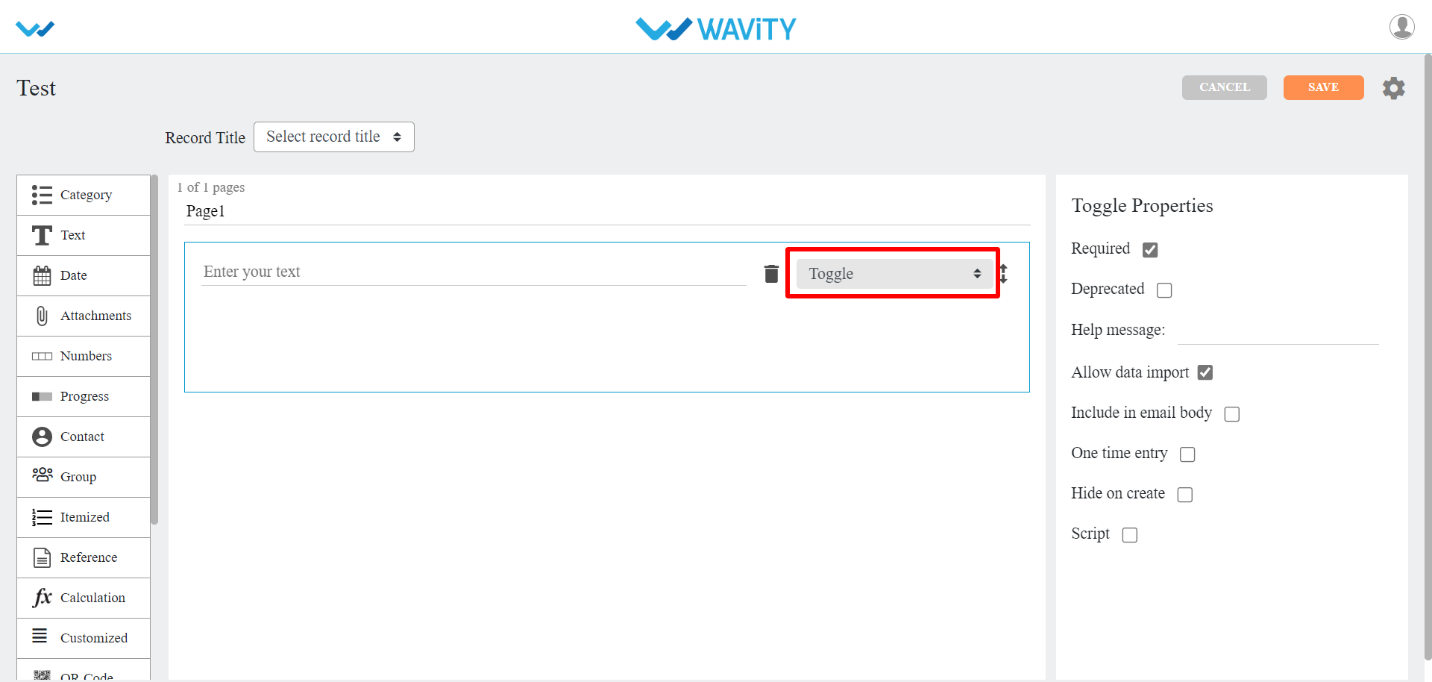
- Segment: This sub-data control is used when you want values to be displayed in line format.
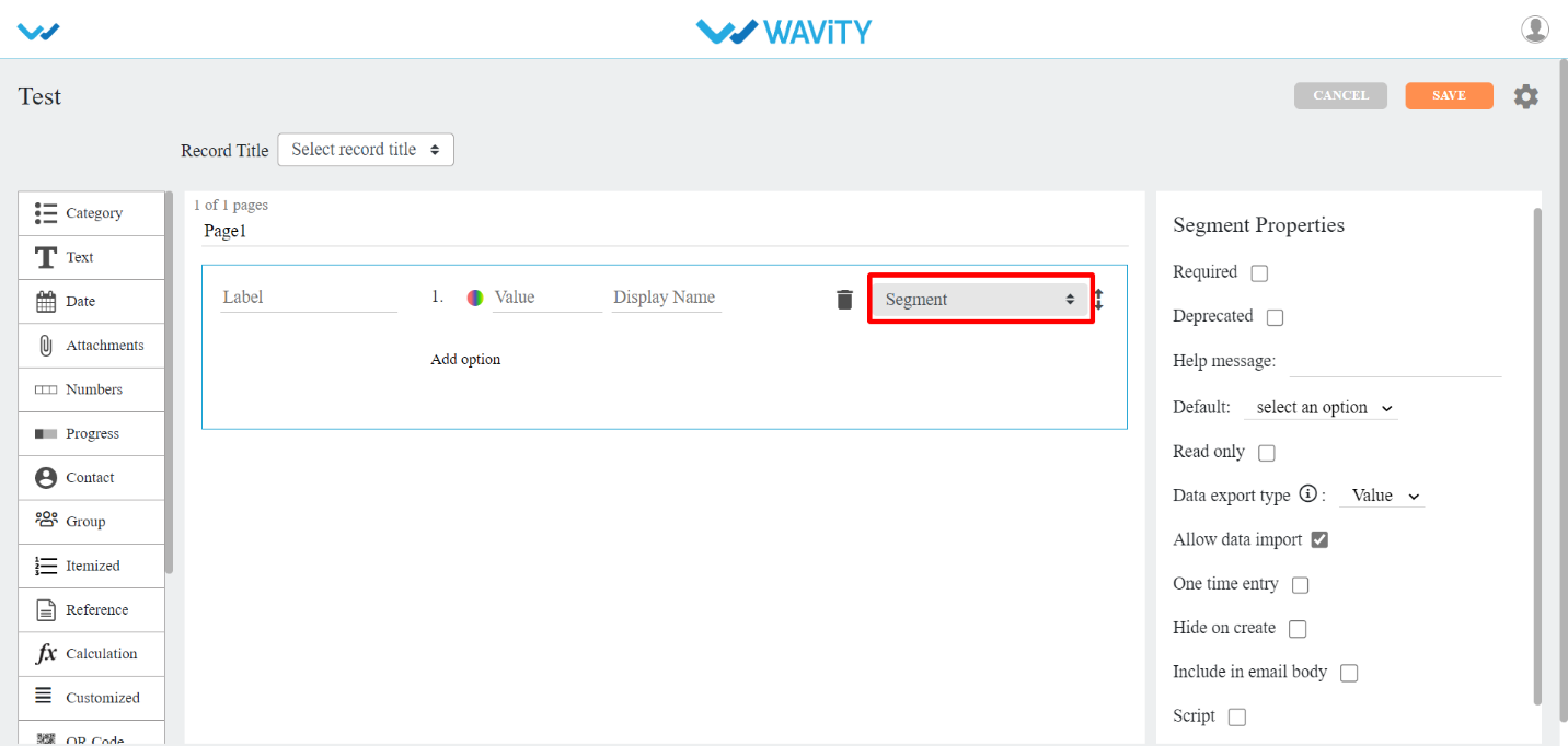
- Reference: This sub-data control is used when you want values to be displayed from another or same application. Here you can select the application on the basis of want values you want and what values to be displayed in options. You can add filters to get records by specific user/time.
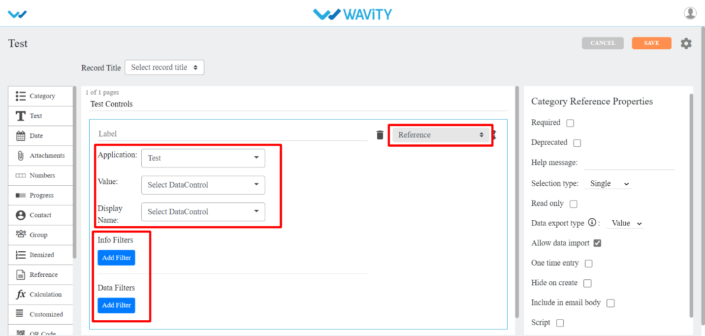
- Dependent: This sub-data control is used when you want values to be displayed from another or same application based on a match in both the selected applications. You can also add filters to get records by specific user/time.
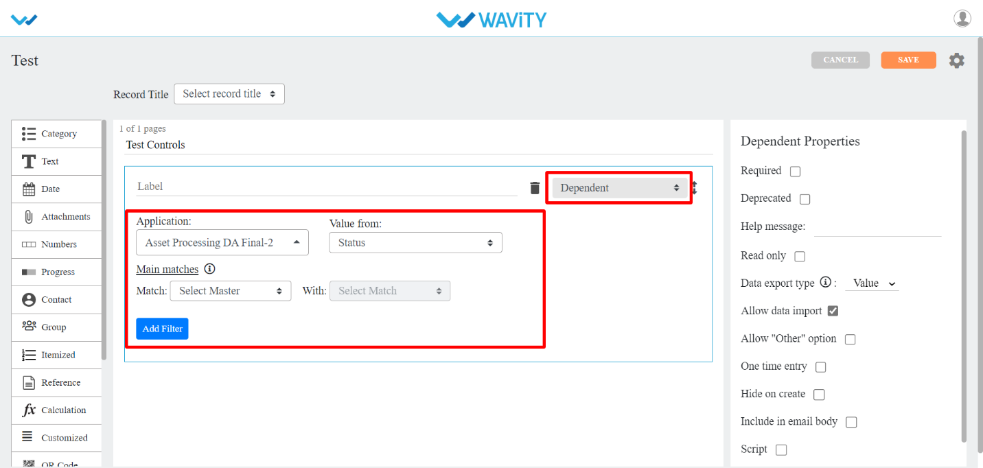
- Dependent multi values: This sub-data control is used when you want values from another or same application based on a match in the application selected. Here you can select single or multiple values. These selected values will be displayed only in record detail and at edit time.

- Text Control
- There are six types of sub-data controls for this category. Each of them are described below with their properties.
- The properties that are common for Text Sub-data controls are:
- Input field type: The text input field type can be None, Alphabet, Alphanumeric, Url, Email, and custom format.
- If you select custom format as input field type, then you have to Specify the format with the help icon beside it.
- Max length: Maximum length that you can enter in the text field.
- Plain: This sub-data control is used when you want text to be displayed in plain format. There are different Input Field Types to use. They are Alphabet, Alphanumeric, Email, Url, Phone Number, Custom Format (Eg: Can be used for Bank Account No.), QR Code and Bar Code to scan from Mobile app and input the code into platform.
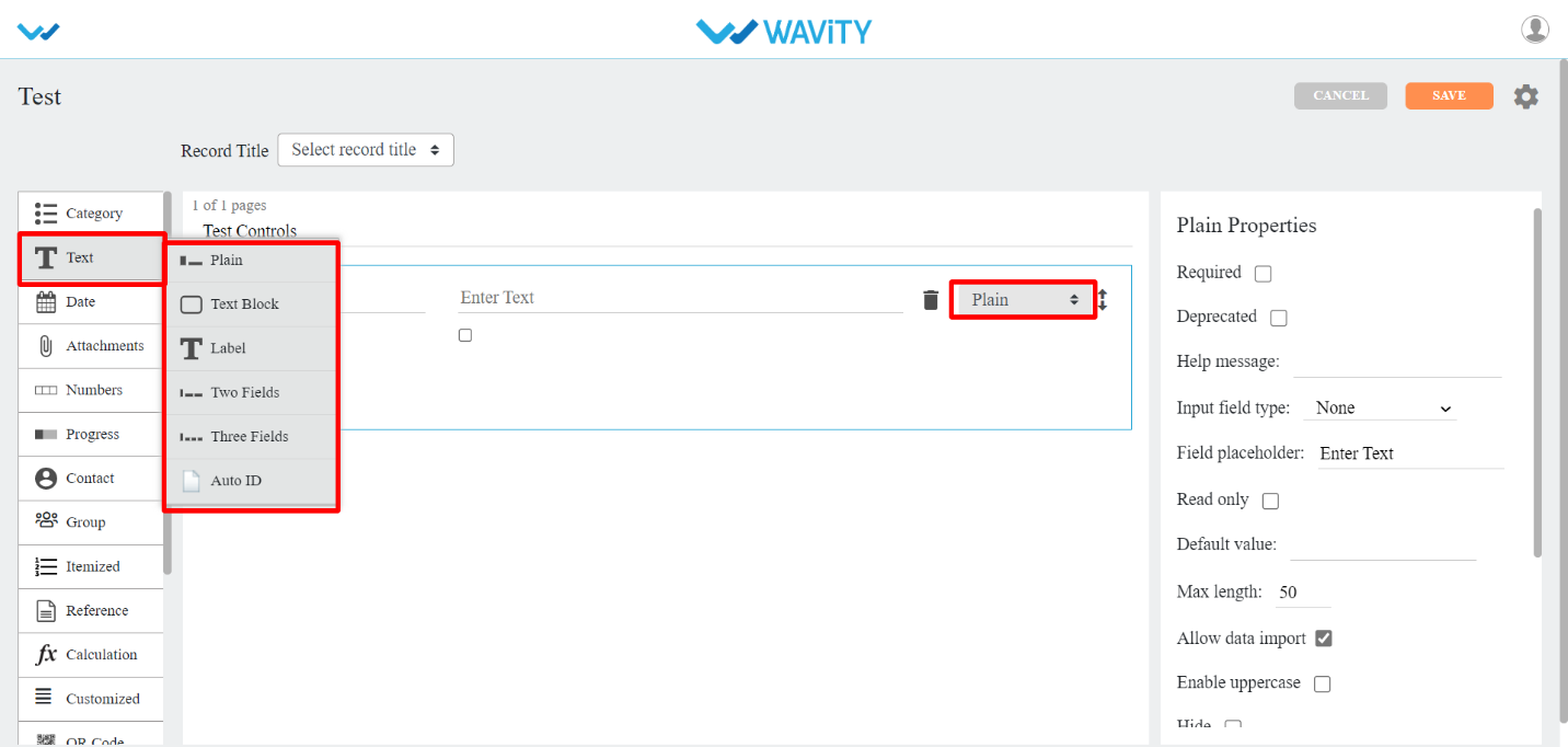
- Text Block : This sub-data control is used when you want text to be displayed in block format .
- Other properties that include for this Sub-data control are:
- Editor: This property rich and plain text options. Rich text option allows the user to modify the color, font, size of text etc. In Rich Test option, User can attach links, pictures, videos in Text Box. Where as plain text option is just the text that we typed and no editing is possible.
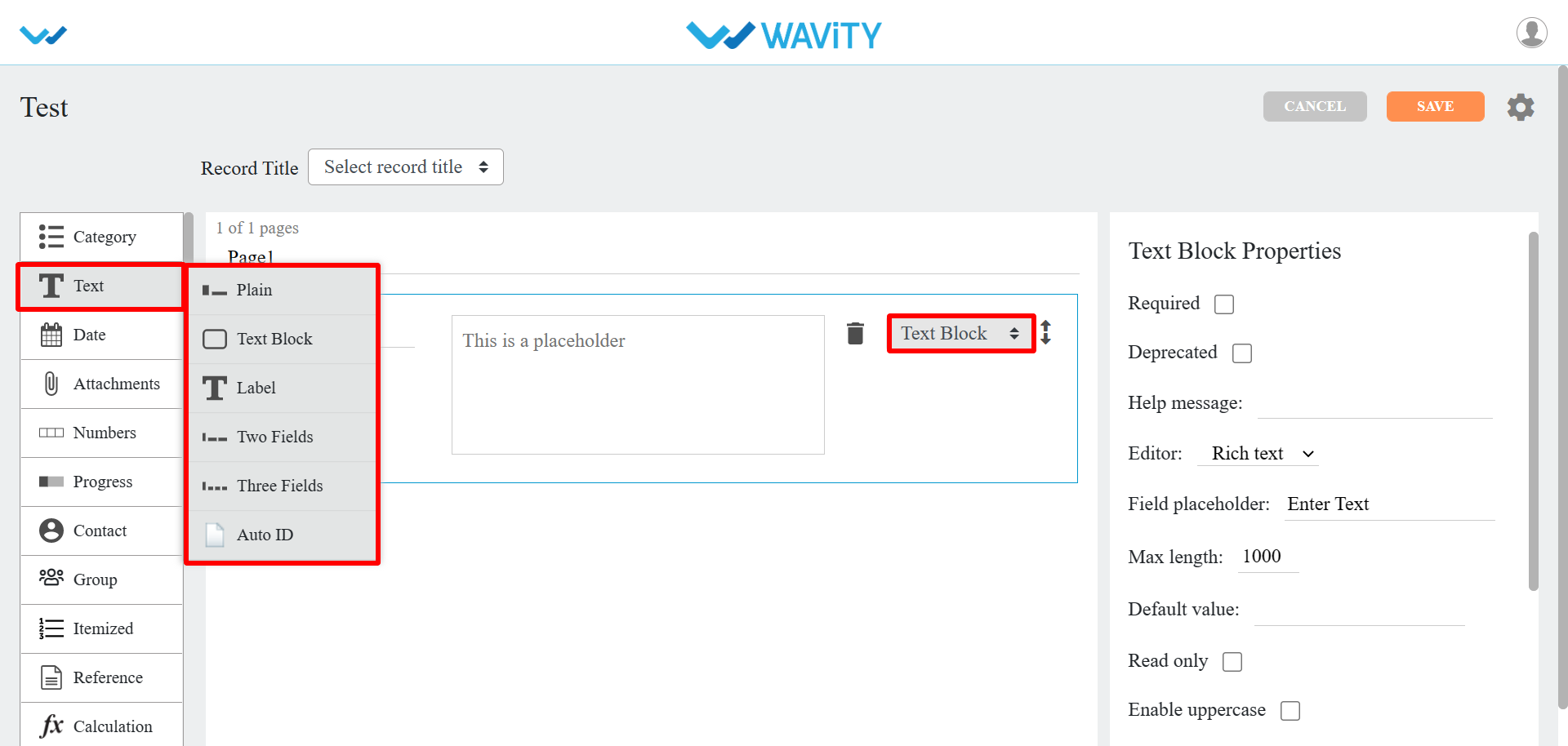
- Label: This sub-data control is used when you want labels in your app.
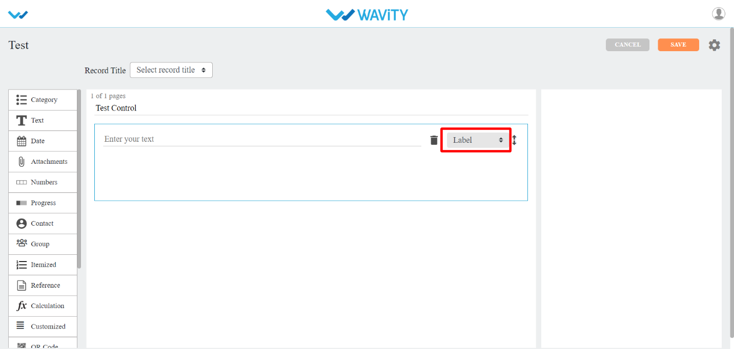
- Two Fields: This sub-data control is used when you want text to be entered in two fields.
- This is similar to plain text with two different fields in it.
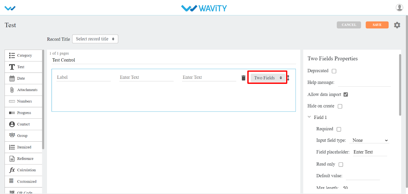
- Three Fields: This sub-data control is used when you want text to be entered in three fields.
- This is similar to plain text with three different fields in it.
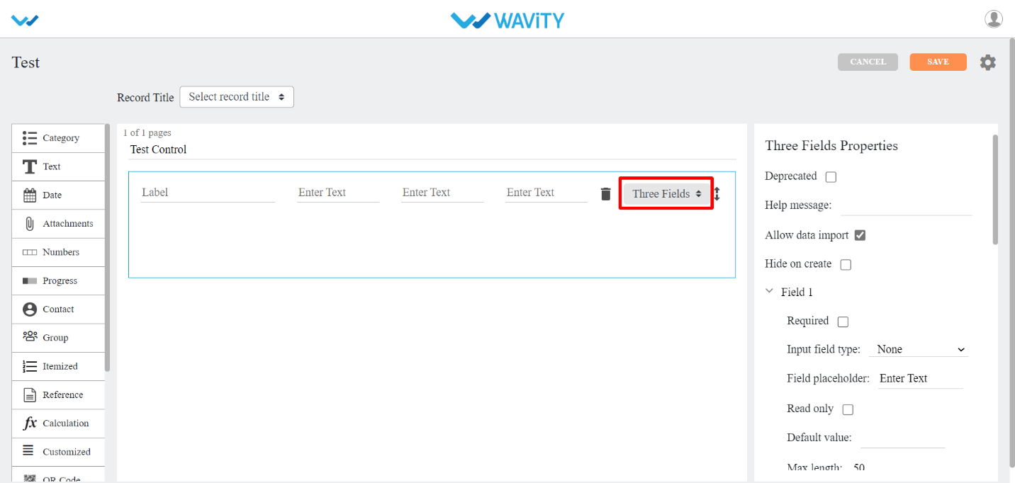
- Auto Id: This sub-data control is used when you want to generate auto ID for a record in your app.
- Other properties that include for this Sub-data control are:
- Prefix: You can set Prefix for auto generated ID using this property.
- System date as prefix: You can checkbox this property, if you want system date as prefix.
- Prefix separator: You have different options such as Underscore, Hyphen, Number sign, Colon, Group to separate ID from prefix.
- Suffix: You can set Suffix for auto generated ID using this property.
- System date as suffix: You can checkbox this property, if you want system date as suffix.
- Suffix separator: You have different options such as Underscore, Hyphen, Number sign, Colon, Group to separate ID from suffix.

- Date Control
- There are eleven types of sub-data controls for this category. Each of them is described below with their properties.
- The properties that are common for Date Sub-data controls are:
- Disable past dates/time: Past dates/time cannot be used if you checkbox this property.
- Default date: It is of two types.
- System Date: If you select it, you will get system date by default.
- Custom Date: If you select it, you will get to select a date from calendar.
- Date Format: You can select different date formats that we support as and when required. Eg: MM-DD-YYYY, DD-MM-YYYY, DD/MM/YYYY and so on.
- Time Format: You can select either AM/PM or 24hrs format.
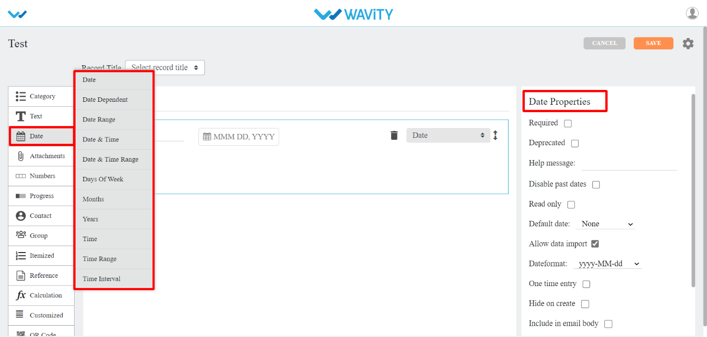
- Date: This sub-data control is used when you want date field in your app.

- Date Dependent: This sub-data control is used when you want to use date from same or another application. You can also apply filters here.
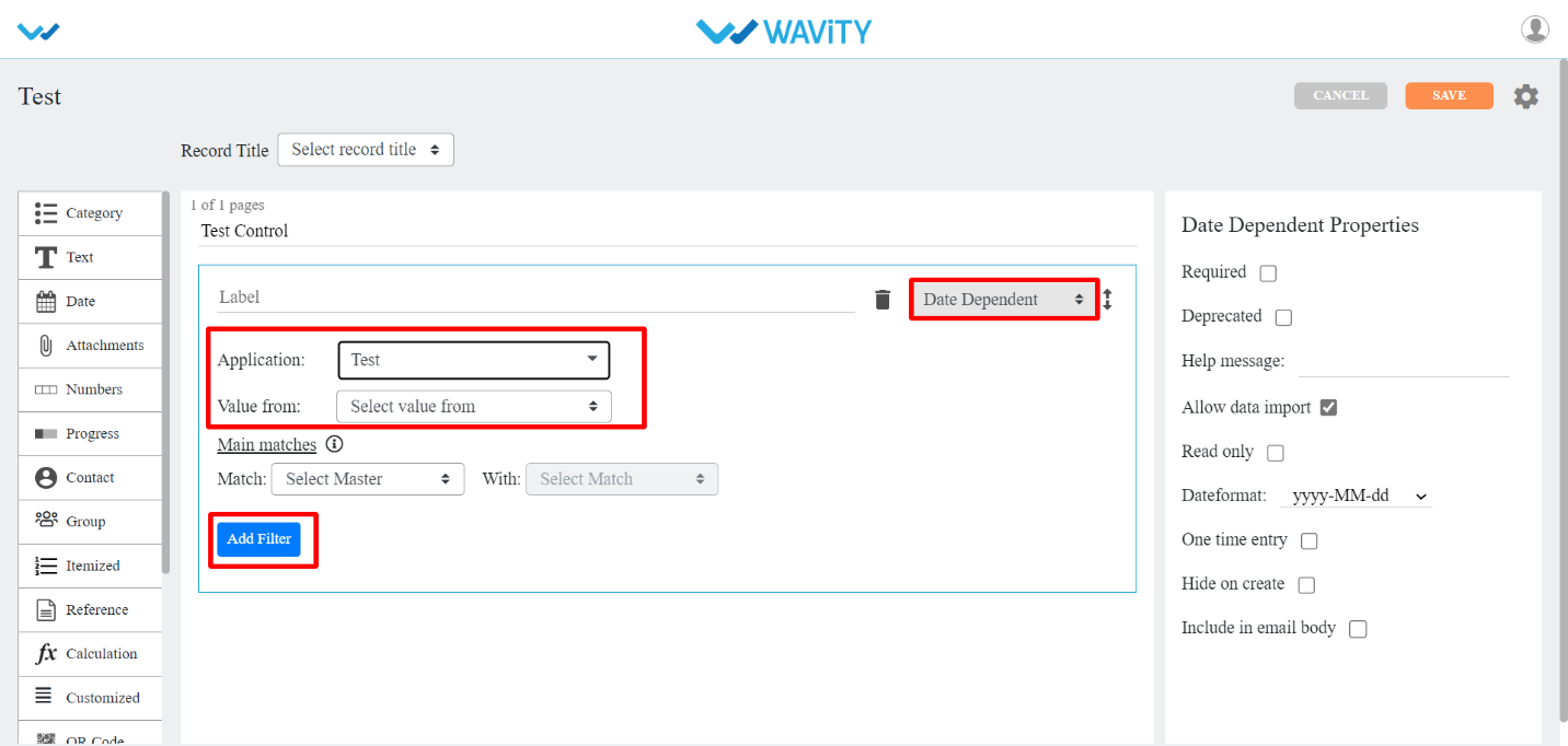
- Date Range: This sub-data control is used when you want to select date range in your app.
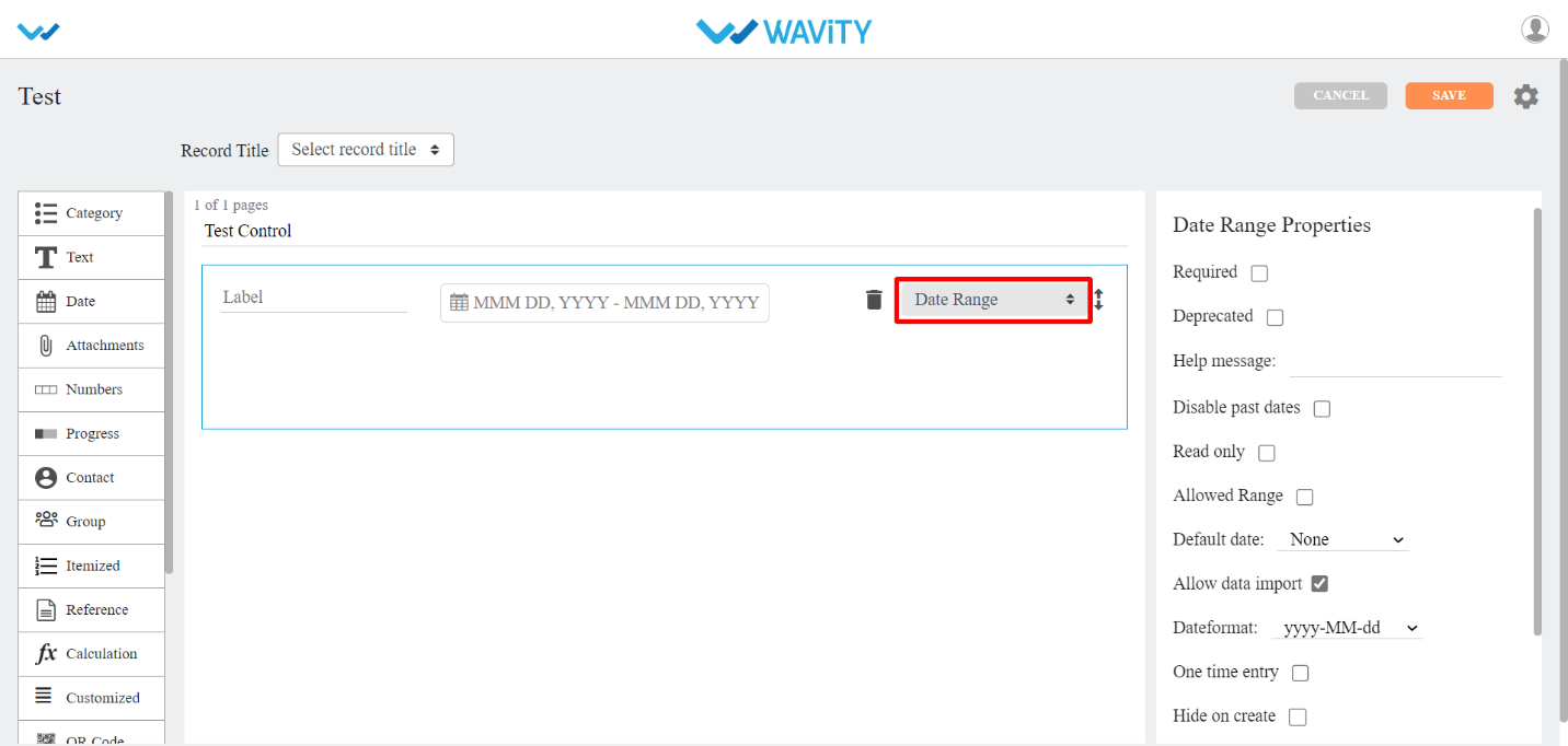
- Date and time: This sub-data control is used when you want date and time in your app.
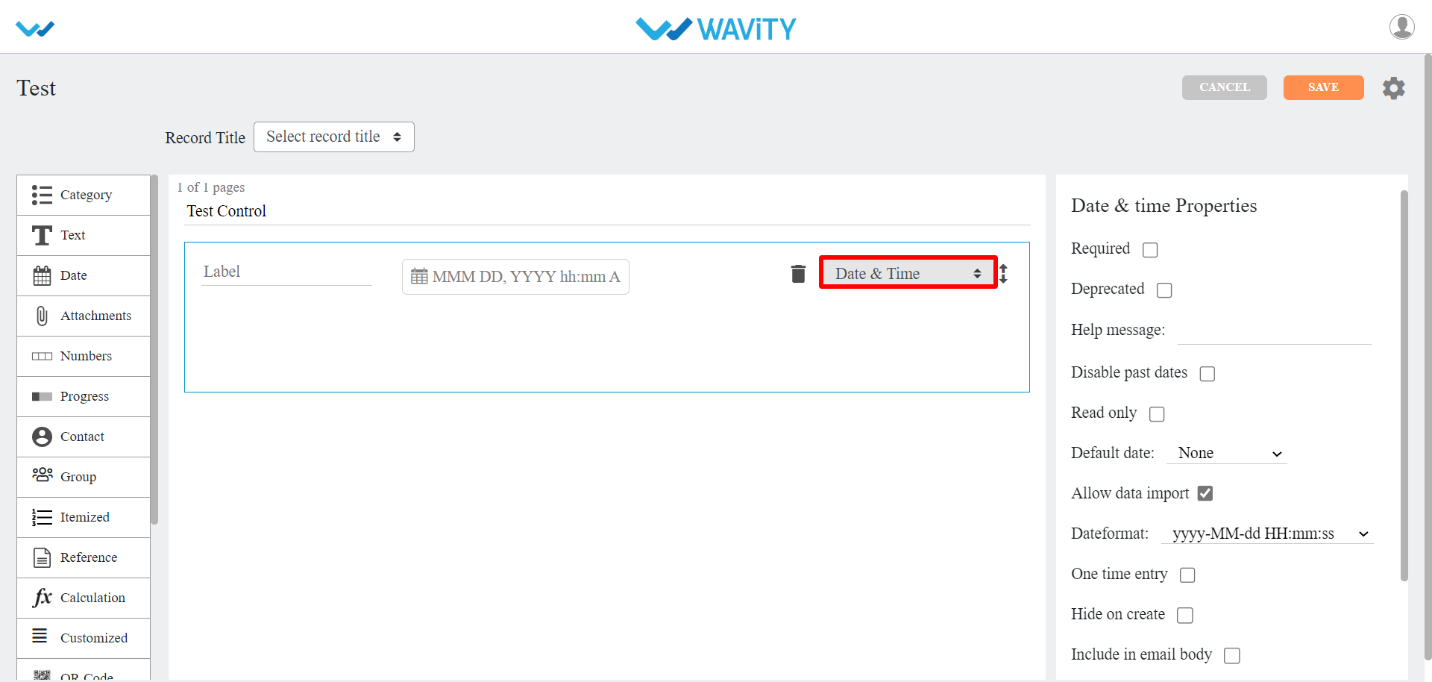
- Date and time Range: This sub-data control is used when you want to select date and time range in your app.
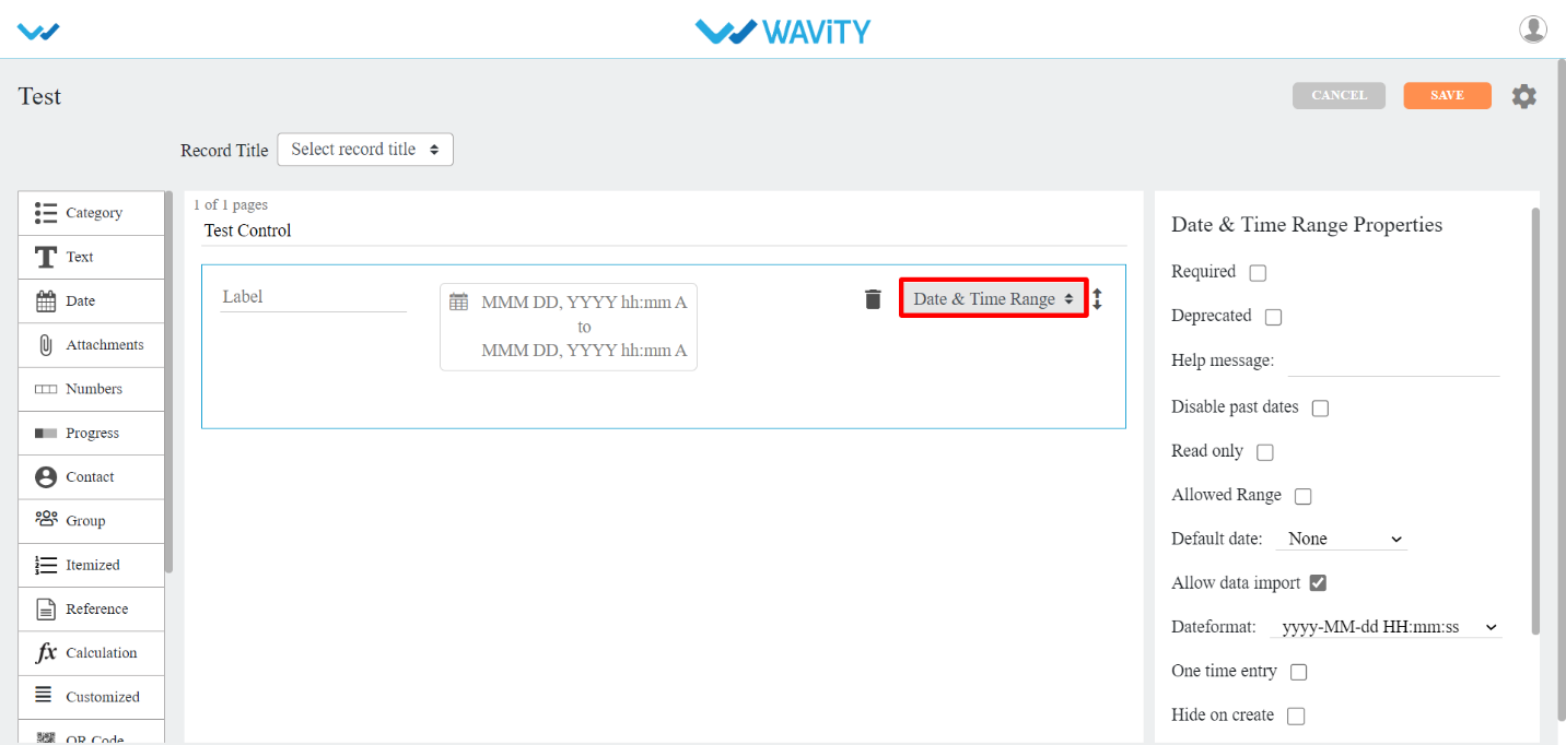
- Days Of Week: This sub-data control is used when you want to select days of week in your app. Display property type can be inline/dropdown. Selection property type can be single /multiple.
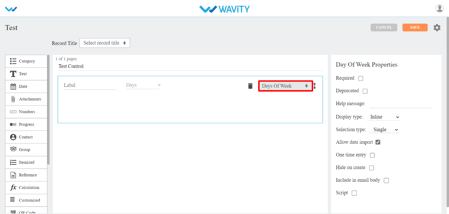
- Months : This sub-data control is used when you want to select months in your app. Display property type can be inline/dropdown. Selection property type can be single /multiple.
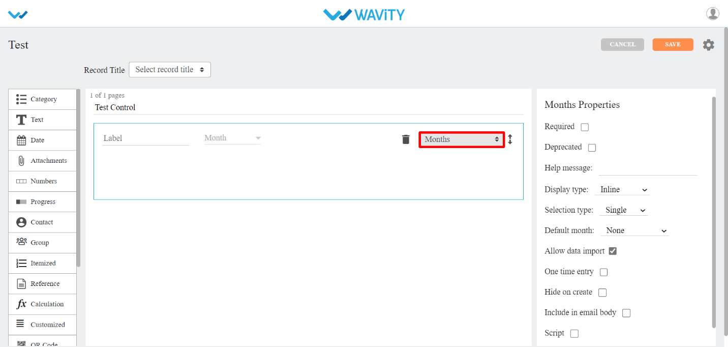
- Years: This sub-data control is used when you want to select years in your app. You can define start and end of the year value. Selection property type can be single /multiple.

- Time: This sub-data control is used when you want time field in your app.
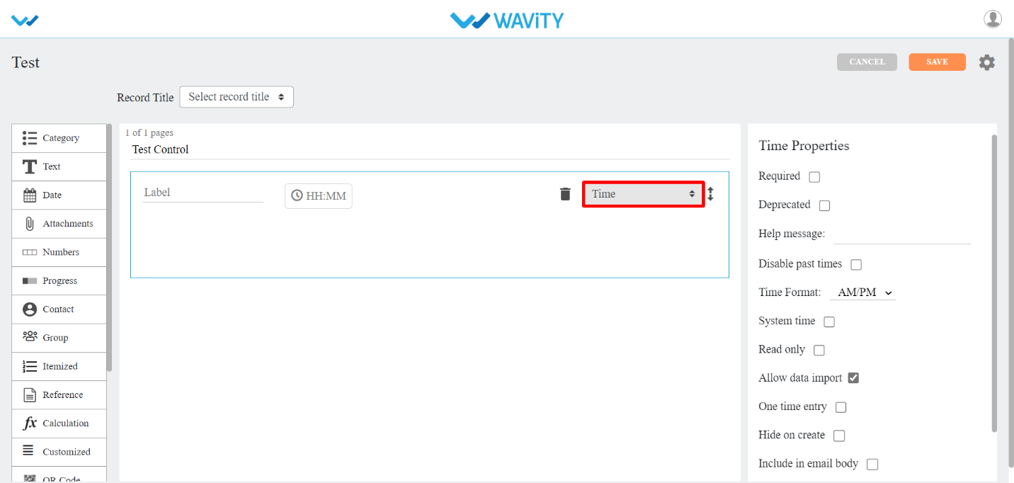
- Time Range: This sub-data control is used when you want to select time range in your app.
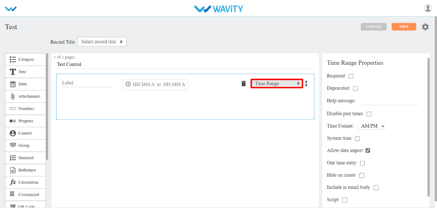
- Time Interval: This sub-data control is used when you want to set time interval in your app. You can select unit value such as Minute, Hour, Day, Week, Month and Year. You can also define minimum and maximum selection.
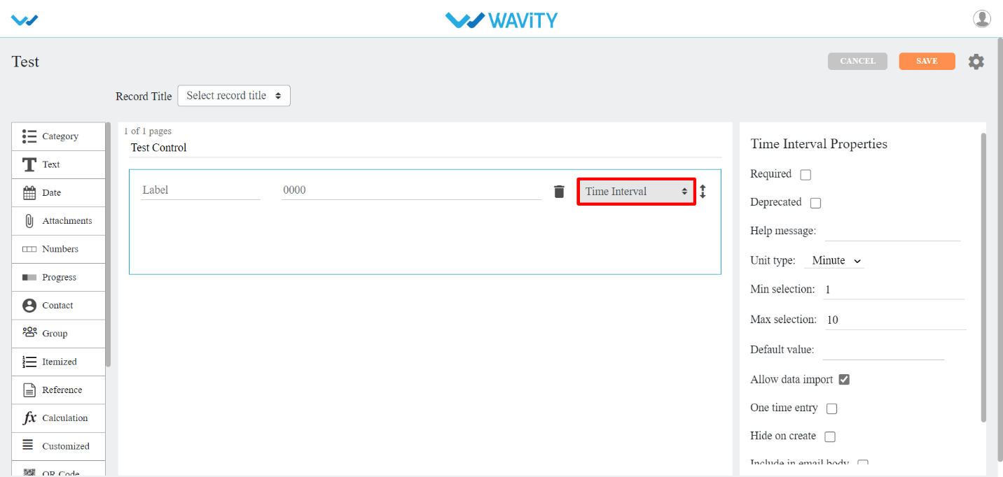
- Attachment Control
- There are three types of sub-data controls for this category. Each of them are described below with their properties.
- The properties that are common for most of the attachments Sub-data controls are:
- Allowed Extensions: You can select any extensions for the attachments in the dropdown provided.
- Max file size: You can set maximum upload file size limit.
- Max no. of files: You can set limit for maximum no. of files for upload.
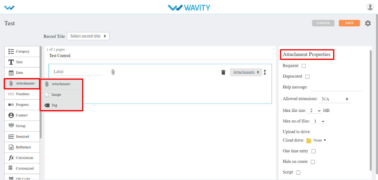
- Attachments: This sub-data control is used when you want attachments field in your app. Here while uploading you can allow the user to upload the attachments into their drives.
- Image: This sub-data control is used when you want images field in your app . You can also checkbox Only selfie option, if you want only selfie image.
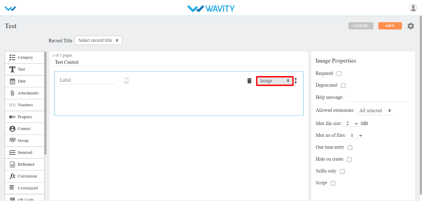
- Tag: This sub-data control is used when you want tags in your app. You can set maximum no of tags by selecting a number from Max no. of tags option.

- Numbers Control
- There are three types of sub-data controls for this category. Each of them is described below with their properties.
- The properties that are common for most of the numbers Sub-data controls are:
- Number type: You can select Real or Integer number from dropdown.
- Placeholder: Instead of Enter Value, you can enter any other text in its place.
- Scale: You can set no. of decimal places using this property dropdown.
- Allow negative: You can allow using negative numbers by check boxing this property.
- Set value range: You can select a range of values using this property.
- Default value: You can set default value at record entry time by using this property.
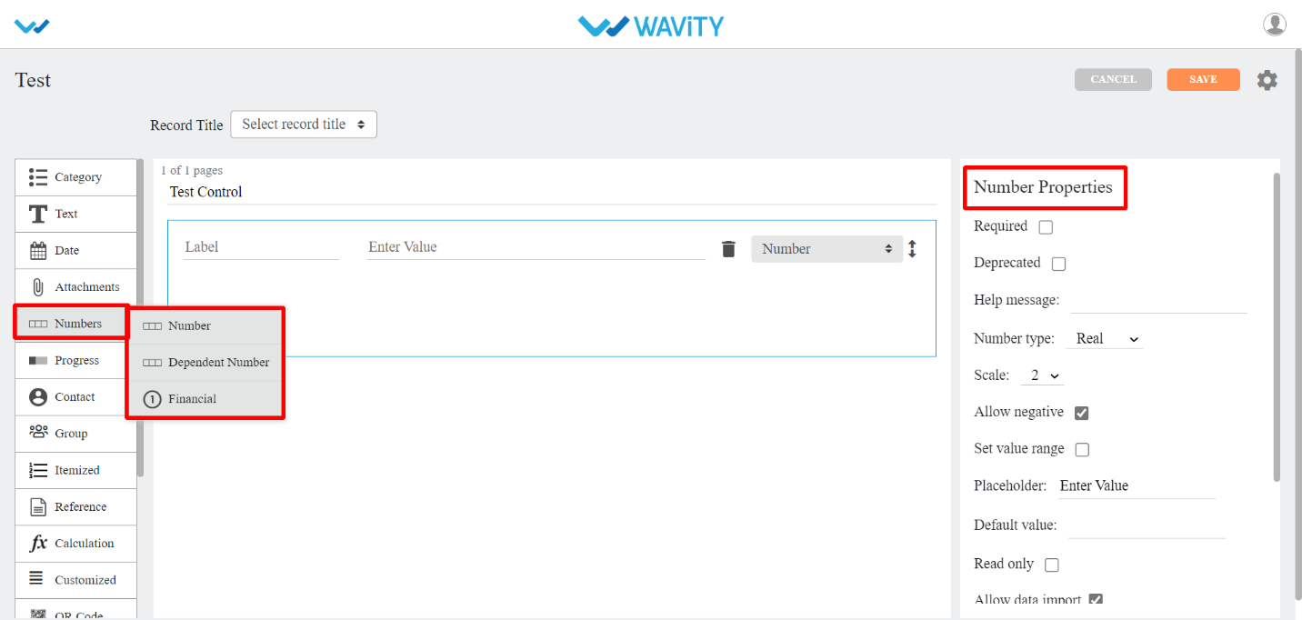
- Number: This sub-data control is used when you want numbers field in your app .

- Dependent Number : This sub-data control is used when you want numbers from same or another application. You can also add match filters from the application selected.

- Financial: This sub-data control is used when you want financial field in your app . You can select currency from dropdown in Currency type property.
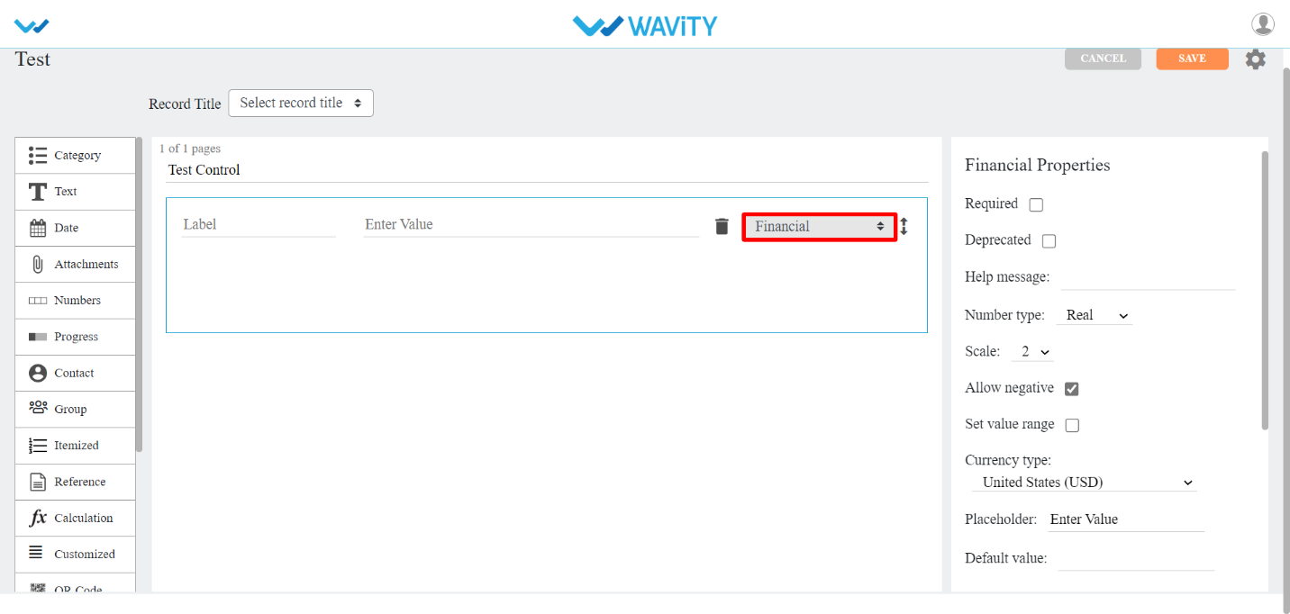
- Progress Control
- There are two types of sub-data controls for this category. Each of them are described below with their properties.
- The properties that are common for most of the progress Sub-data controls are:
- Number type: You can select Real or Integer number from dropdown.
- Progress type: You can select percentage or value by using this property.
- Step value: You can select each step value using this property from dropdown provided.
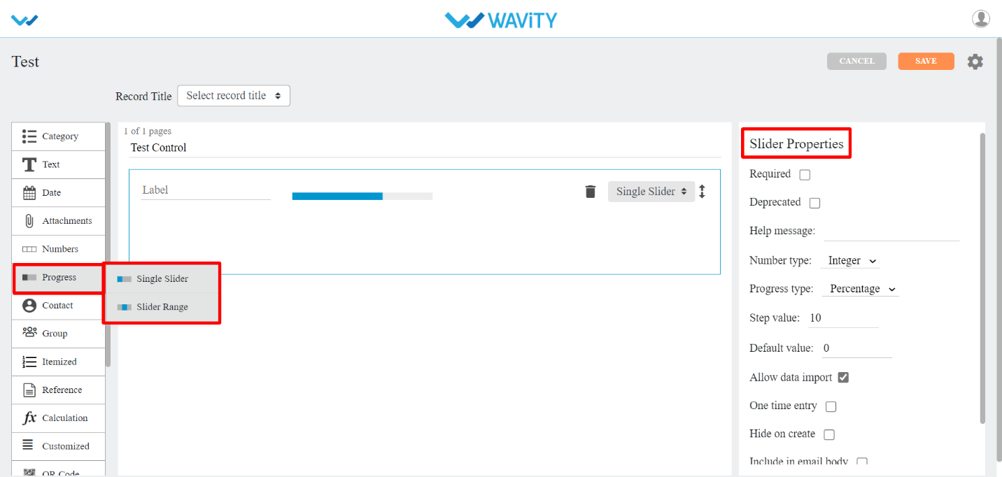
- Single Slider: If you wanted to use sliding for numbers, You can use this sub-data control.

- Slider Range: If you wanted to use sliding for number range, You can use this sub-data control. You can also use Default start value and Default end value options for selecting number range.

- Contact Control
- Contacts: This data control is used when you want to add contacts from the users/groups in this tenant.
- The common properties for this data control are:
- Auto select by the system: If you checkbox this property, system will select the user/group from this tenant or you can select any user/group from the dropdown provided.
- Show user details: In this property, you can select a user details such as Manager, Phone, Email, Locality, Street address, Region, Postal code, Country to show in the app.
- System user: If you checkbox this property, login user will be the system user and you don’t have to select any other user for contact.
- Selection type: You can select Single or Multiple users in contact. Also you can set minimum to maximum number of users by using this property.
- Restrict by Spaces: You can restrict to display specific groups in contact field by using this property.
- Default user: By using this property you can set default user for the contact field in the app.
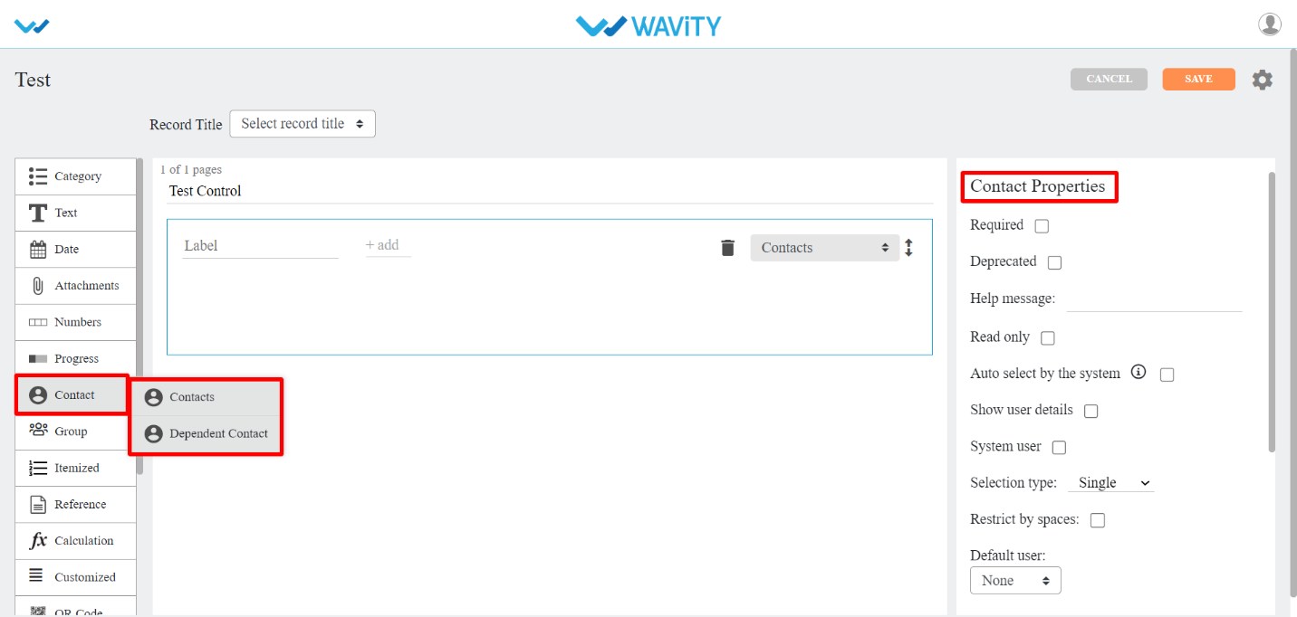
- Dependent Contacts: This sub-data control is used when you want contacts from same or another application. You can also add match filters from the application selected.
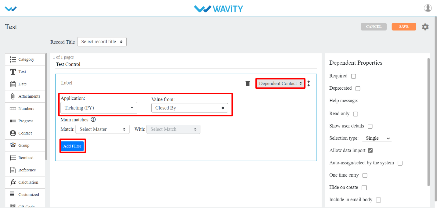
- Reference Control
- Reference: This data control is used when you want to refer data from one application to another.
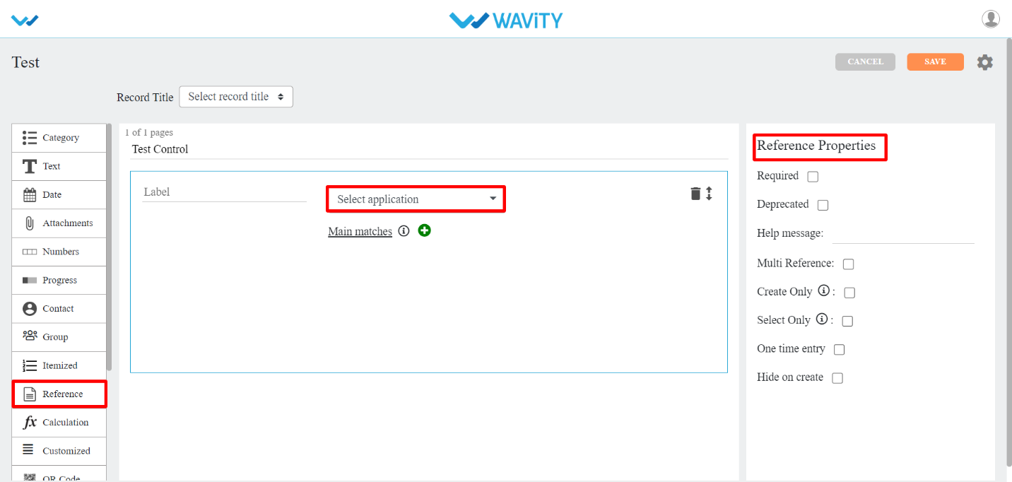
- Calculation Data Control
- Calculation: This data control is used when you want any calculations to be done in your app. To know how this data control is used, You can make use of help (?) icon in the data control.
- The properties for this data control are:
- Scale: You can set no. of decimal places using this property dropdown.
- Allow override: If you want to edit the calculated value then you can checkbox this property.
- Enable Scripting: You can enable the scripting part in Calculation data control with the help of this property. You can use Plain, Category DropDown, Category Linear, Category Reference, Category Dependent, Days of Week, Month, and Year data controls in the Calculation data control with the help of this property and you can write a script and return some numerical values.
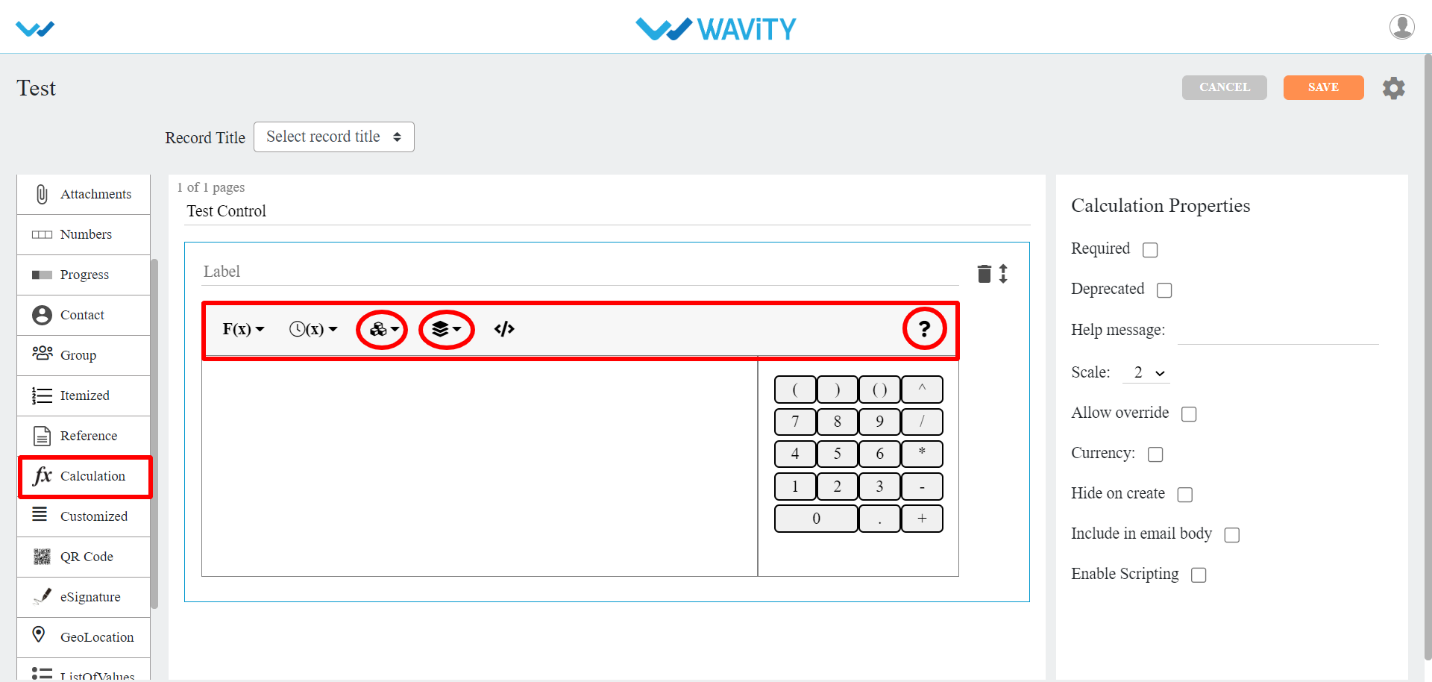
- F(x): It has math functions.
- (x): It has time functions.
- 3rd Icon (Red circled): It has all the data controls (related to Number and Date) from current app.
- 4th Icon (Red circled): it has all the apps with data controls from the current tenant.
- QR Code Control:
- QR CODE: This data control is used to auto generate QR Code for each of the record created.

- eSignature Control
- eSignature: This data control is used when you want eSignature for each of the record created.
- Geolocation Control
- Geo Coordinate: This data control is used when you want Latitude and Longitude positions to be entered in the record.
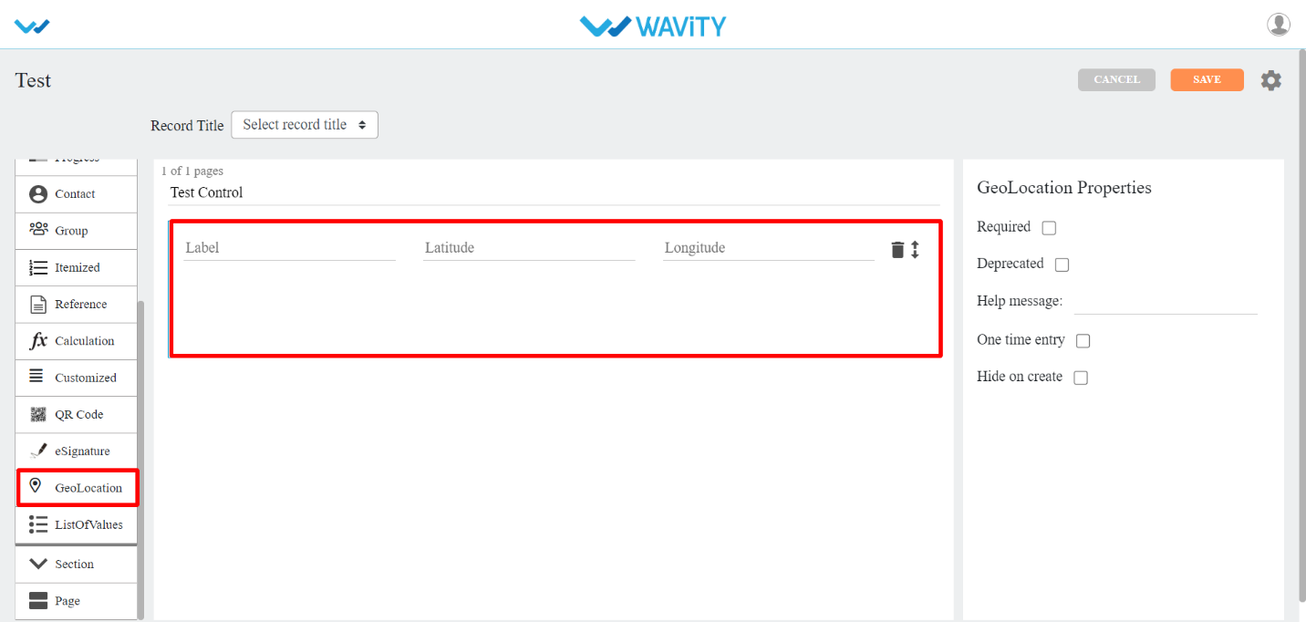
- List of Values (LOV) Control
- ListOfValues: This data control is used when you want to list few or all the values from another application based up on certain match if required.
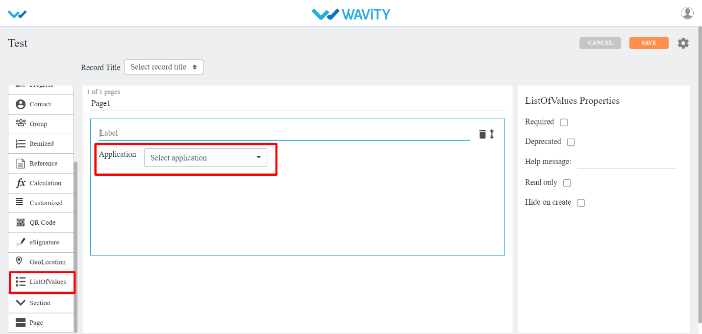
- Section Control:
- This data control allows grouping of fields and optionally it can be restricted based on roles.
- There are four types of sub-data controls for this category. Each of them is described below with their properties.
- The properties that are common for most of the Section Sub-data controls are:
- Color: You can select the color of the section using this property.
- Show to all: If you checkbox this property, every user can view Approver section.
- Enable sequential flow: If you checkbox this property, each approver will approve the record as per their given sequence number.
- Flow index: Record approving sequence number is given using this property.
- Section Approver(s): With this property, you can select the user/group to approve the record.
- End User: This Sub-data control is used when when you want to give access to specific user/group to edit the record in that particular End User section.
- Moderator: This Sub-data control is used when you want to give access to specific user/group to edit the record in that particular Moderator section.
- Approver section: This Sub-data control is used when you want to give access to specific user/group to approve the record in that particular Approver section.
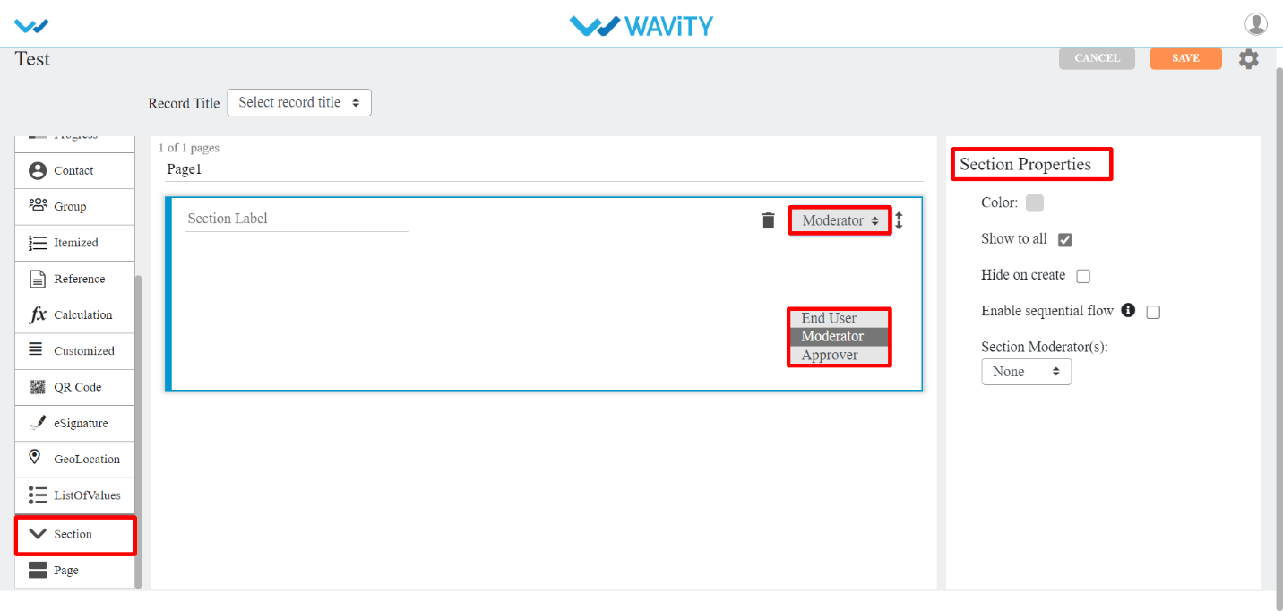
- Page Control
- This data control is used when you want your app to look neat in the form of pages. It allows grouping fields in a page format.
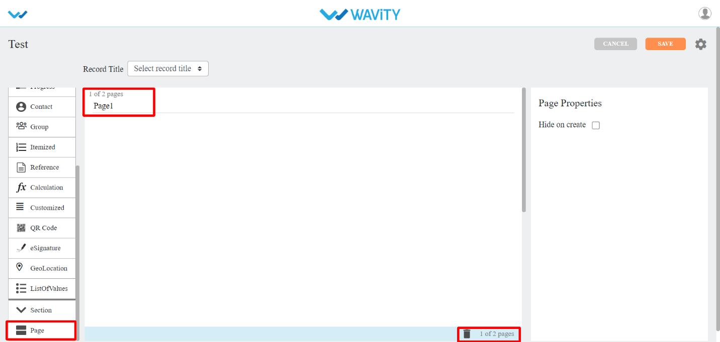
- Itemized Control
- This data control is used when you want other information in rows and columns for each record. Refer the pictures below for clear understanding.
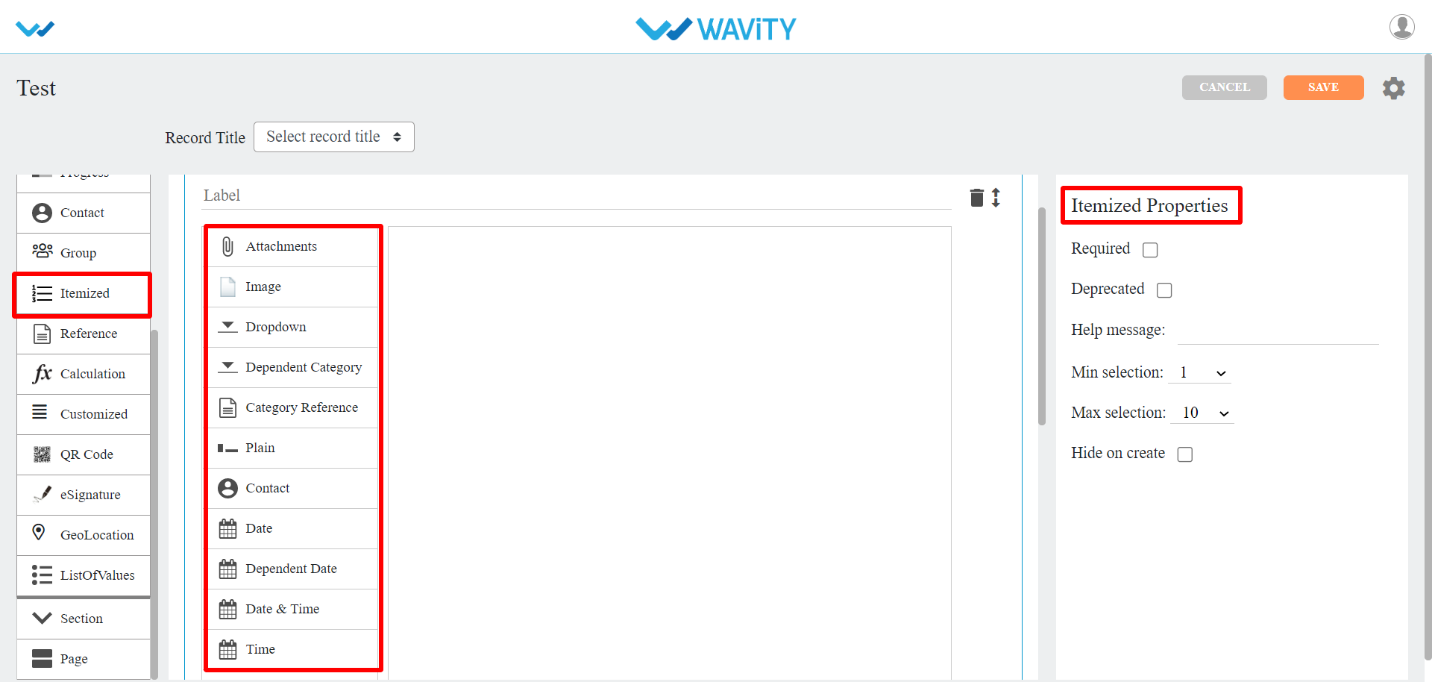
- You can drag and drop the values from left to right as shown below.
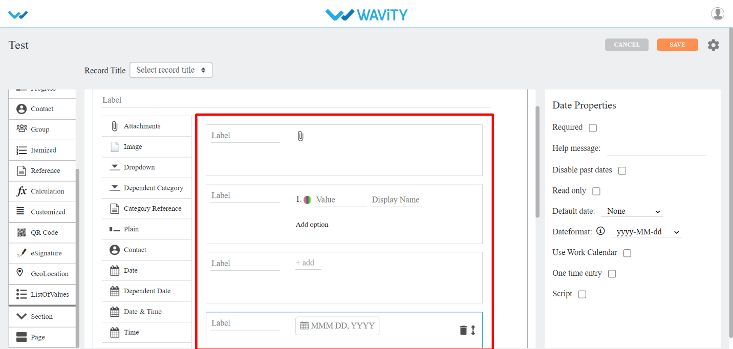
- It will be displayed in the following format after the saving the application.
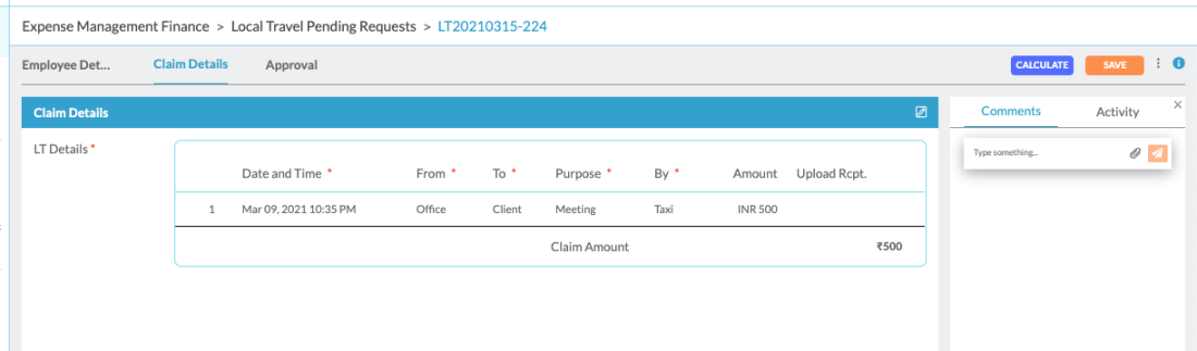
- All the Itemized data controls are same as the data controls explained from start. Itemized Reference is the additional data control that got added in Itemized data control.
- Itemized Reference: This sub data control is used when you want to refer any data control in that particular application. Min selection and Max selection are the properties used to allow the field to restrict rows in it.

- Final Summary: Calculation summary of all the rows in each record can be shown using this sub-data control.
- Additional Summary: If you want any other calculation summary other than Final Summary, Then you can use this sub-data control.
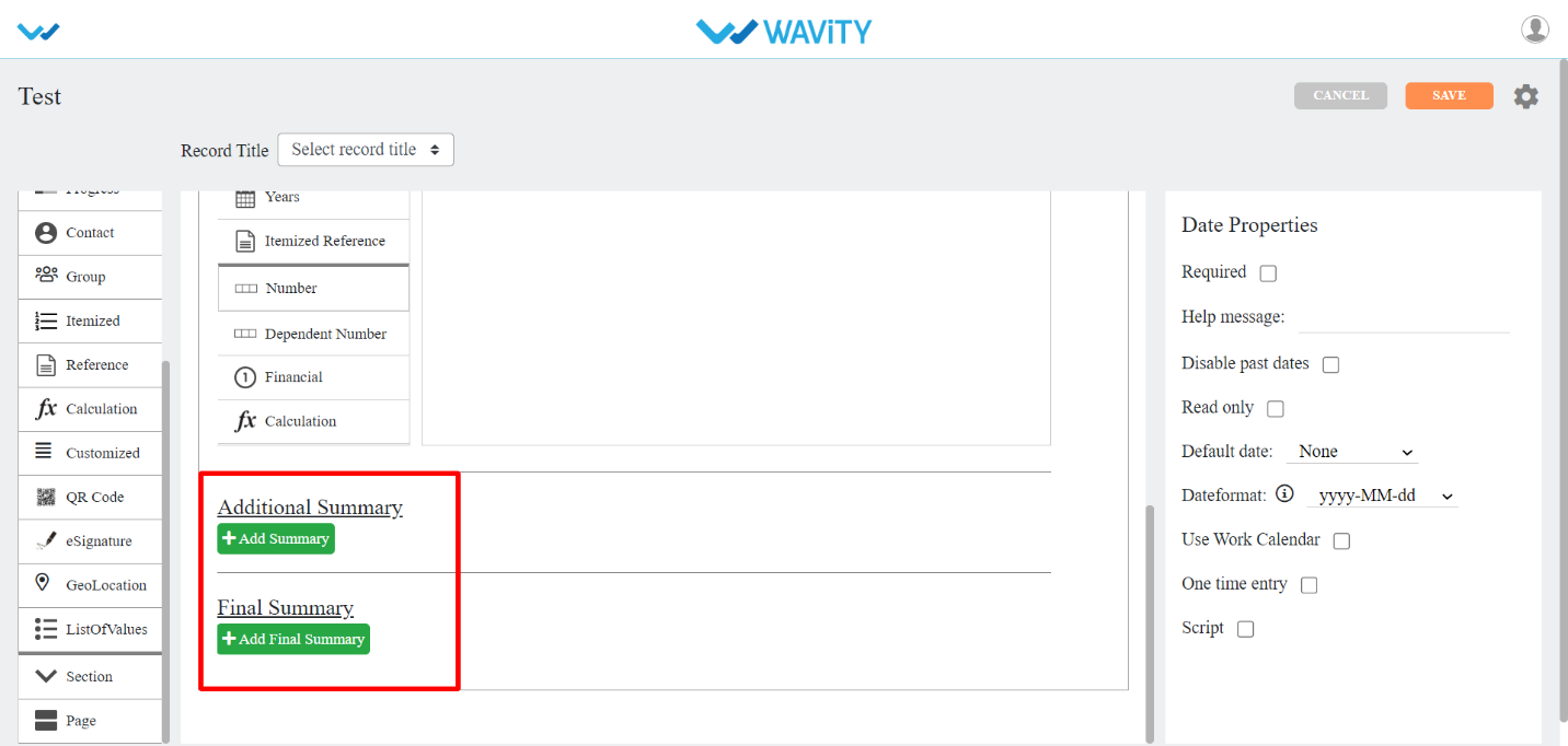
- Customized Control:
- This data control is used when you want other information in multiple rows for each record. There are no sub-controls related to calculation. You can also make use of this control as Itemized by check boxing Grid View in properties.

How to Create a New App from Excel?
- Only the Admin of your organization has access to create new Applications in the platform.
- App/Application: A digital form within the Wavity platform.
- App Designer: An interactive, zero-code development environment for designing app layouts with form fields using data controls and properties.
- Click on “Design Tools” as shown below.
- In “Apps” section, All the existing applications of the platform will be displayed for the admin.
- Click on “3 dots” icon to carryout multiple functions of the existing application as shown below.
- To create an App: Click on "Create” button as shown below to create a new application. It will display 3 options such as New App, From Excel and From Template.

- From Excel: If you have an existing file with data in Excel format, you can use it to create a new app including data. To do so, click on the "CREATE" icon, then select "From Excel" from the dropdown menu.
- Select the required excel file and click on ‘Continue’ button.
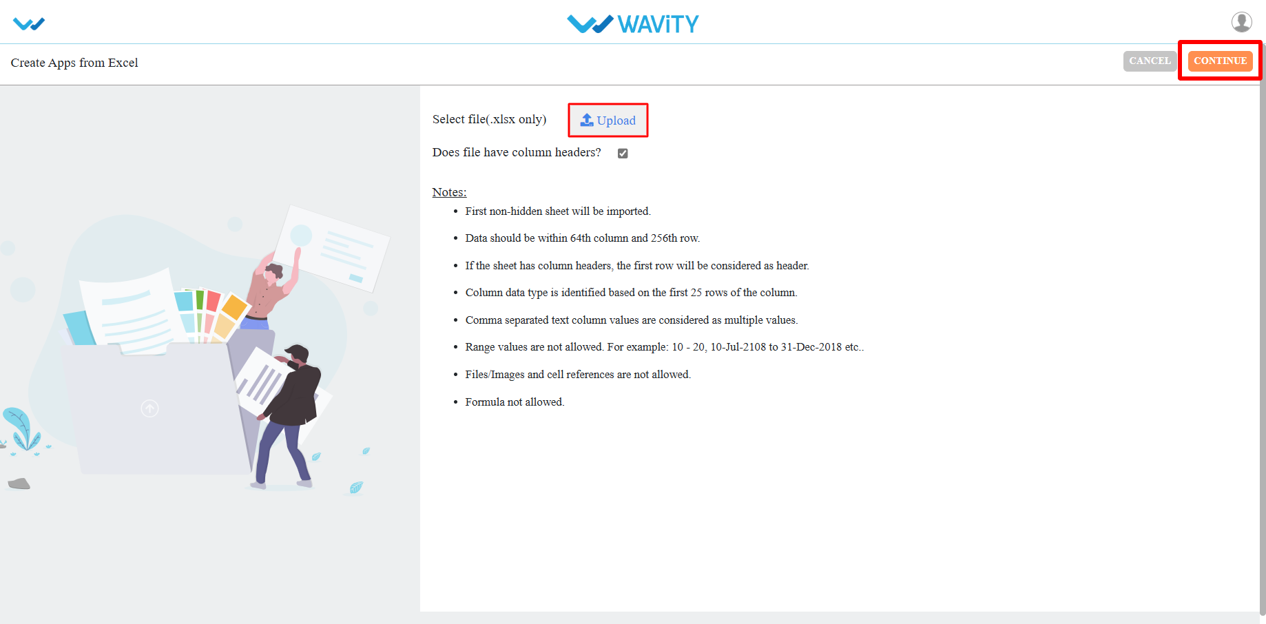
- Next, enter your Application Name and select the Application Type as shown below. Click the "Continue" button to proceed to the App Designer page.
- Collaboration App: All user/groups in the app have access to view and edit all records in that particular app. For example, In Inventory Management application, all agents shall be able to view and edit all asset information only if they have the access.
- Company App: All users in the app have access to view only their records in that particular app. For example, In Ticketing application, each user shall be able to view and edit only the tickets created by them without giving any explicit access to users.
- Team App: All user/groups in the app have access to view only their records in that particular app. For example, In Ticketing application, each user shall be able to view and edit only the tickets created by them by giving access to users.
- All the form fields from the exported template will be displayed in the App Designer (in the center).
- As highlighted in the image below (within the red box), you will find a list of data controls that assist in creating and designing the app. For detailed information on Data controls, please refer the following article: How To Use Data Controls/Form Fields? | Wavity
- Each of the data control has multiple sub-controls.
- Before getting to know each of the data control in detail, for familiar understanding you It shall be better to know few of the prerequisites.
- The Delete option as shown in below image deletes that particular data control.
- The double arrow button in the below picture is used to move that particular data control up and down in the page.
- If you click on the arrows as shown in below image, you will find all the sub controls of that particular data control you have selected.
- You can find the properties of each data sub-control in the right corner as shown in image below.
- Common properties for most of the data controls are as follows:
- Required: Marks the field as mandatory.
- Deprecated: Ignores the field during record creation or editing.
- Help Message: Displays a supportive message to assist users in creating records appropriately.
- Field Placeholder: Displays predefined text, e.g., "Enter your name."
- Read Only: Prevents users from entering or editing data in the field.
- Hide: Conceals the data entered by the user in that field.
- Allow to Import Data: Enables importing data into this field using Excel.
- One Time Entry: Allows the user to enter data only once; changes are restricted after saving the record.
- For detailed information on Data controls, please refer the following article: How To Use Data Controls/Form Fields? | Wavity
App Design Settings and Advanced settings:
- Only Admin shall have access to edit or apply advanced settings while creating an App
- Click on profile icon and select “Design Tools” (only admin can view and select Design Tools) as shown below.

- In “Apps” section, all the existing applications of the tenant will be displayed for the admin.
- Choose an Application which you want to make change settings and Click on “3 dots” icon. Select the option “Open in App Designer”.
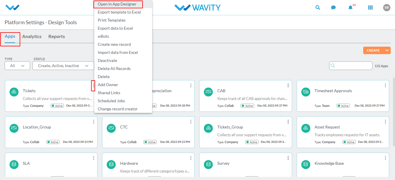
- Click on the “Settings Icon” as shown in the screenshot below to view or edit the Application settings.
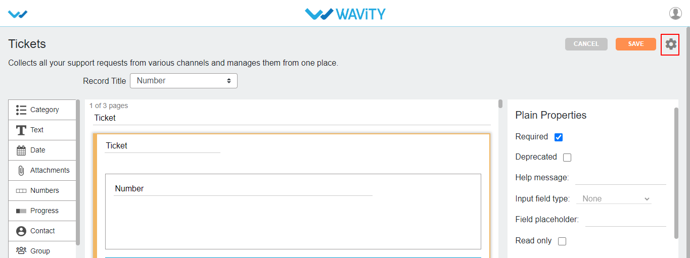
Application Settings:
- You can change the name of the application by clicking Change app name.
- You can change the description of application by clicking on Change description.
- You can select the Data creators for the application based on the requirement.
- You can lock created record data when certain conditions are met. Each created record can be locked at any state by selecting an option from dropdown of Lock Data when feature. Here we have four different states to lock record Data.
- Open: When this state is selected each record in the selected app will be locked as soon as it is created.
- Closed: When the record state is closed, then record will be locked.
- Approver Accepted: When the approver accepts the request, record will be locked.
- Manager Accepted: When the manager accepts the request, record will be locked.
- You can select multiple states from dropdown option at a time to lock record data.
- If manager/approver wants to edit the record even after record is locked, you can select or check the box to allow approver(s)/manager(s) to edit.
- Note: After editing the app if any settings are changed then you should click on “Apply” button.
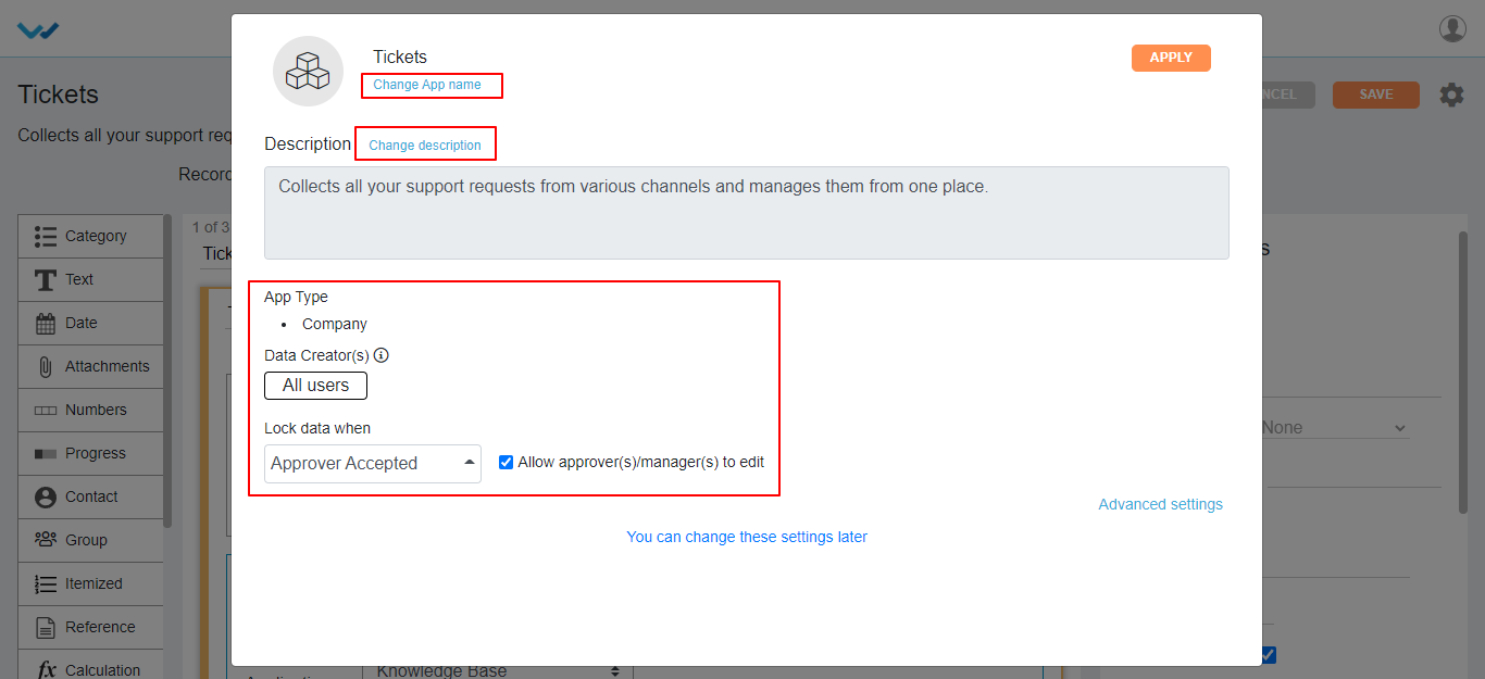
Application Advanced settings:
- Click on “Advanced Settings” as shown below to view or edit advance settings of application.
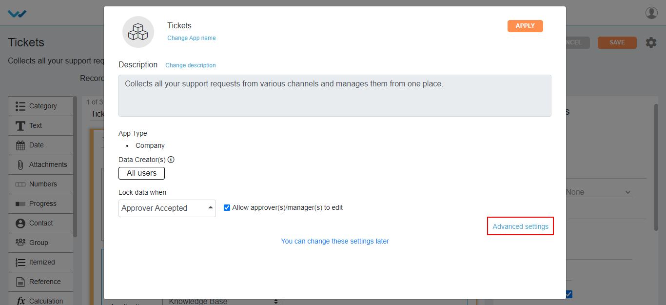
- Under Access tab in advance settings, you can select user(s) and group(s) for App Owner/Admin, Approver(s), Moderator(s) and Designer(s) for access to the application. You can also tag applications in categories, just click on Add and selecting the application names.
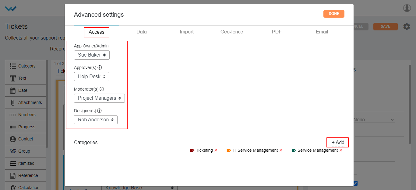
- You can edit the Owner/Admin for a particular app by selecting and deselecting user(s) and group(s) in the drop down.
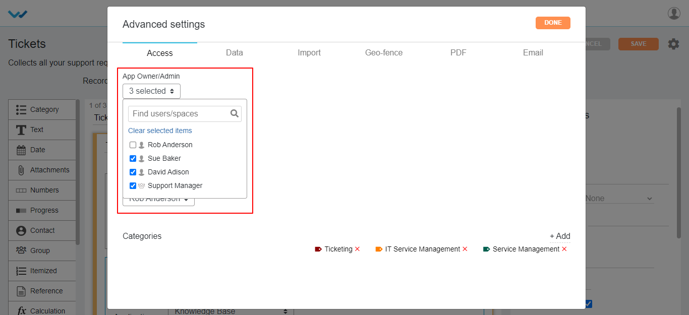
- Here you can select single/multiple users and groups for Approver field, who can update the status or approve the record information in the app.
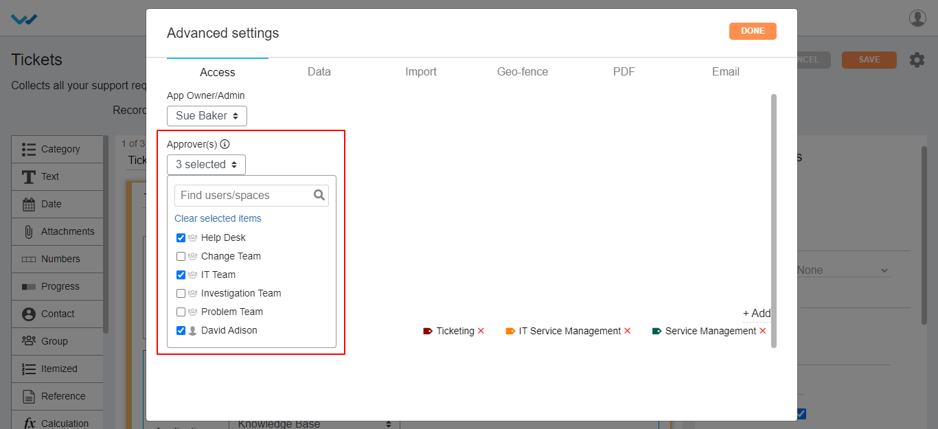
- Here you can select single/multiple users and groups to view/update the record data for Moderator Section of the application.
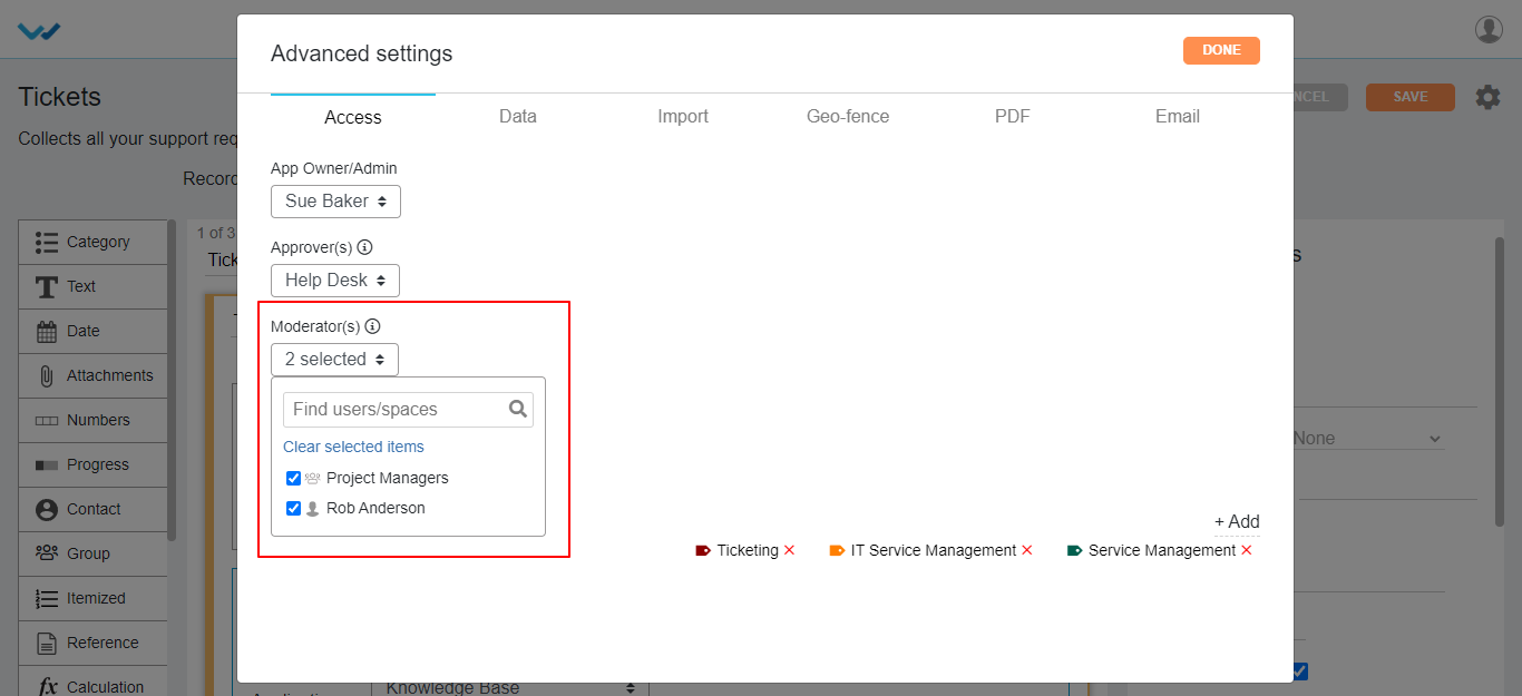
- Admin can give access for App Designer part for selected application, by selecting the single/multiple users and groups in the Designer option of advanced settings of application.
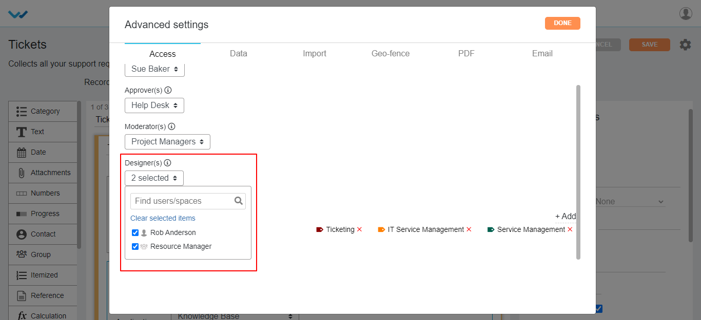
- If only App owner/Admin should view the application in the app page, then you can select and check box as selected as shown below.
- This feature is available only for company catalogue app type.

- To know the reference applications of this particular app, you can tag single/multiple applications by simply selecting +Add option in the category.
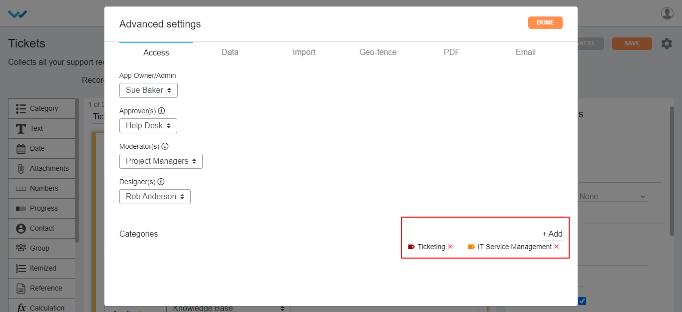
Under Date Tab in advance settings you can make changes for Record listing page:
Data Tab
- In this tab, you can edit the record list view, columns to be displayed in the app.

- Here you can select and deselect the columns to be displayed in the record list view for application. At least two fields should be selected.
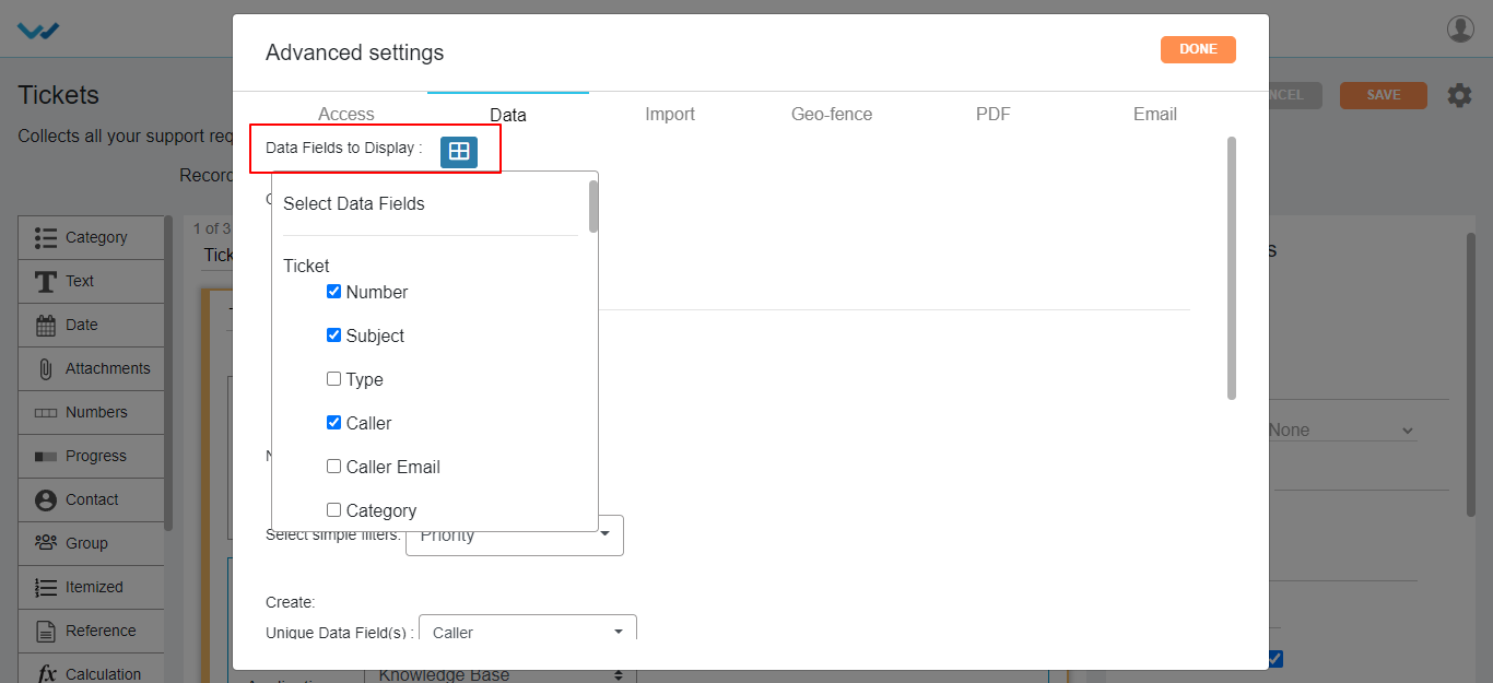
Contributor Filters under Data Tab of Advanced settings of Application:
Contributor Filters classified into two different type filters
- Info Filters: Filters are based on Record
- Data Filters: Filters are based on Data controls of the application Design
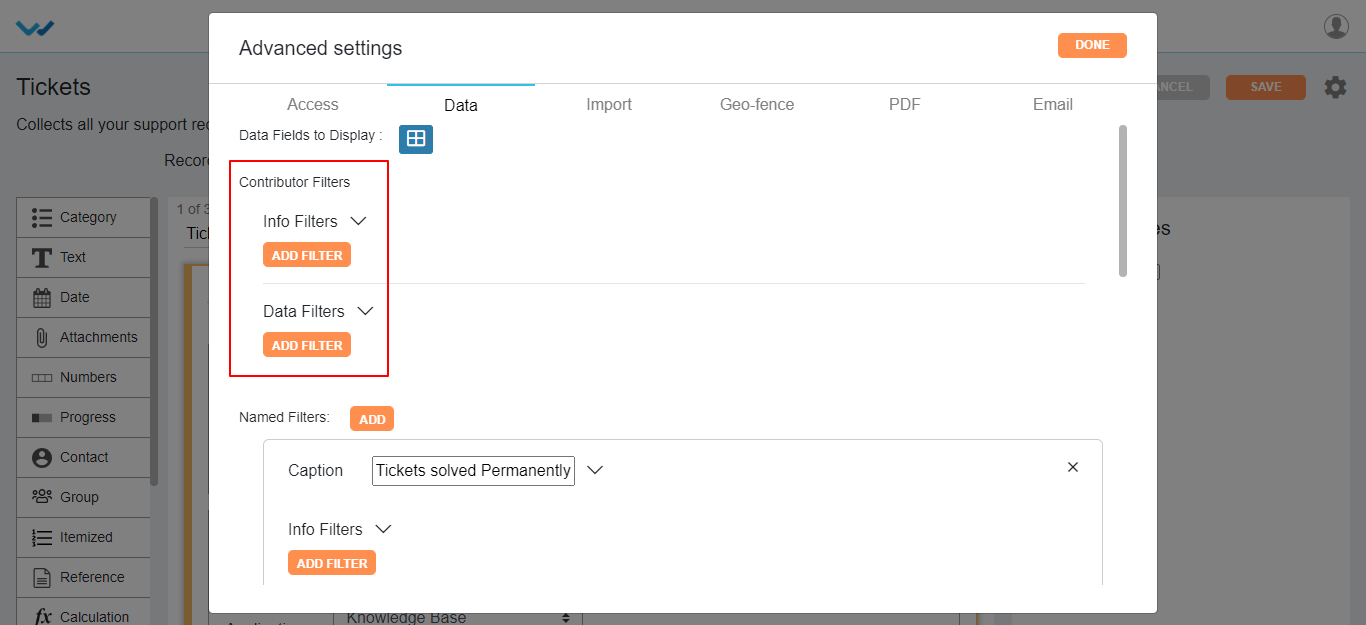
Info filters:
- You can filter the records by selecting property based on user:
- Created by
- Modified by
- Created Time
- Modified Time
- Status of record
- The fields in value(s) change as per the property you have selected.
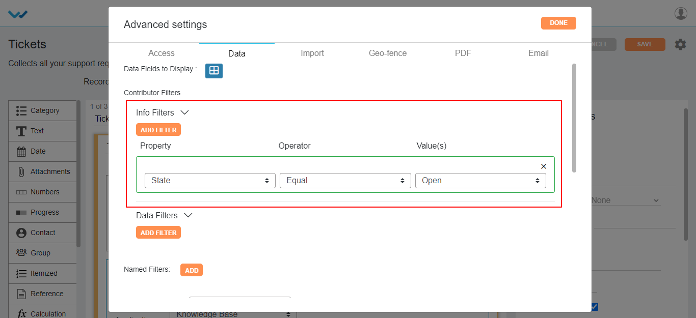
- You can also add multiple additional filters by clicking on Add Filter button.
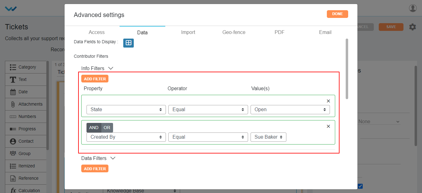
- You can also specify AND | OR for filters if you want to satisfy both the Filters and any one of the Filter respectively.
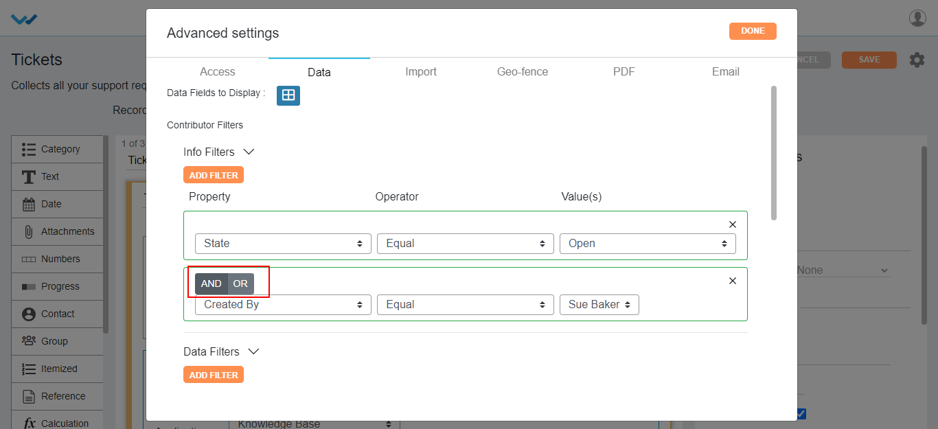
Data Filters:
- The fields in Property and value(s) change as per the data controls in the app you have selected.

- Here you can select multiple Data Filters and also you can specify AND | OR for filters similar to info filters.
- Here you can add customized filers by clicking on Named Filters button and give a caption as per required.
- You can apply Info and data filters similar to contributor filters.
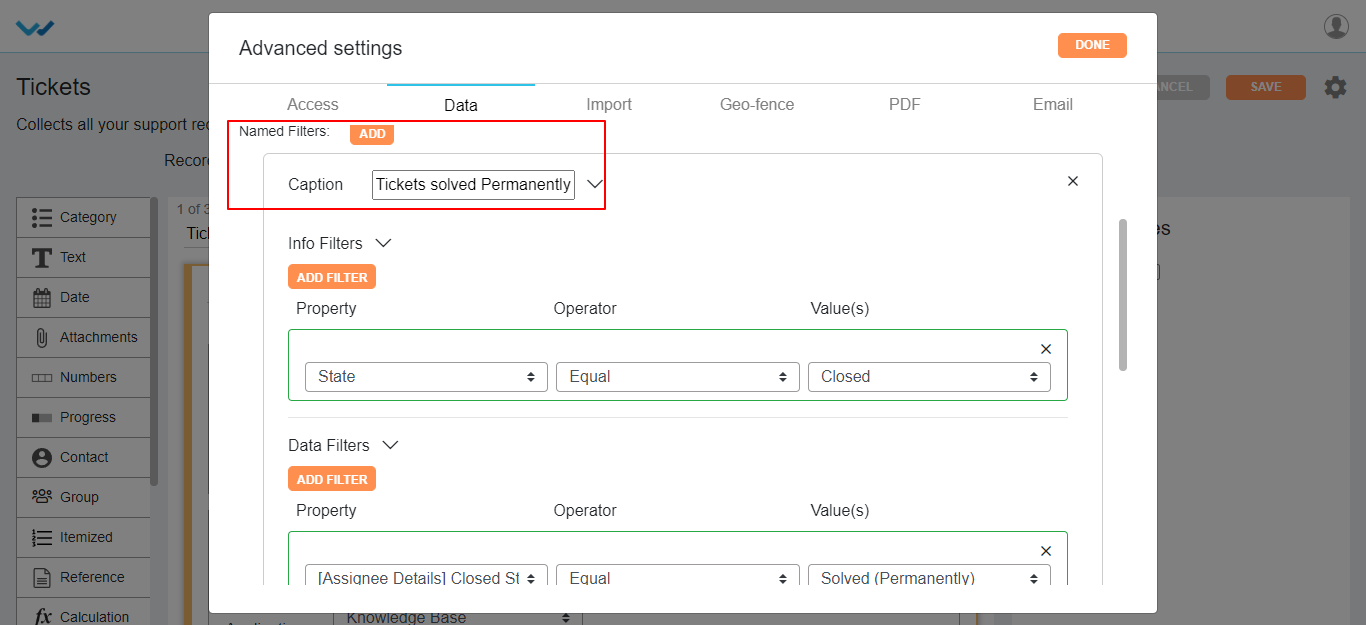
- Here we also have one more filter naming “select simple filter” without any conditions. On selection of this feature in the dropdown displays the label name of data controls of the app you have selected.
- Maximum you can select three fields.
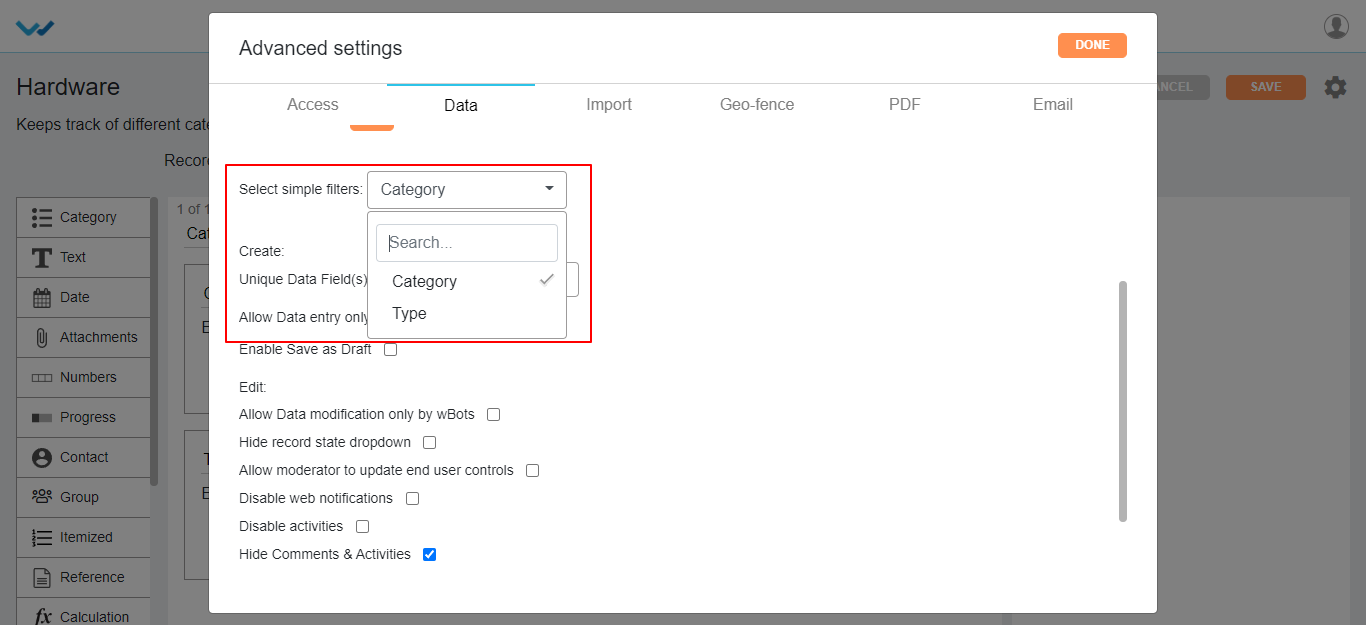
Create-Record Features:
- For record uniqueness and to avoid duplication of records, you can select the data control of that app from dropdown of Unique data Field(s). Select data controls to define uniqueness at record level.
- You can select single or multiple data controls for uniqueness of record.
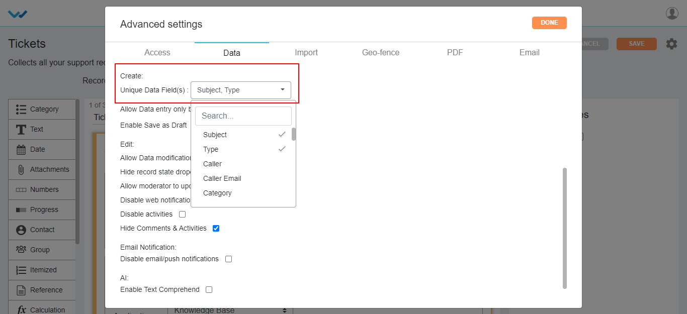
Allow Data entry only by WBots:
- If you enable this feature, the records in the application are created only through Wbots workflow automation.
- You cannot create records manually in the application.
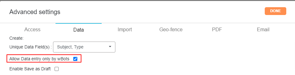
- After a record creation is started and you may don’t want to submit the record half filled, then you can save the record as draft. For this option you can check box Enabled Save as Draft.
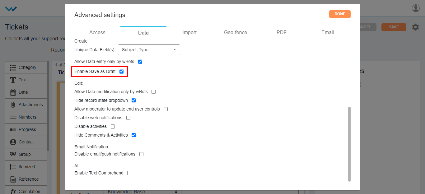
- A record can be updated only by the system in particular app. For this option you can checkbox Allow Data modification only by wBots.

- Hide Record state dropdown: Disables the record state dropdown in record creation page.
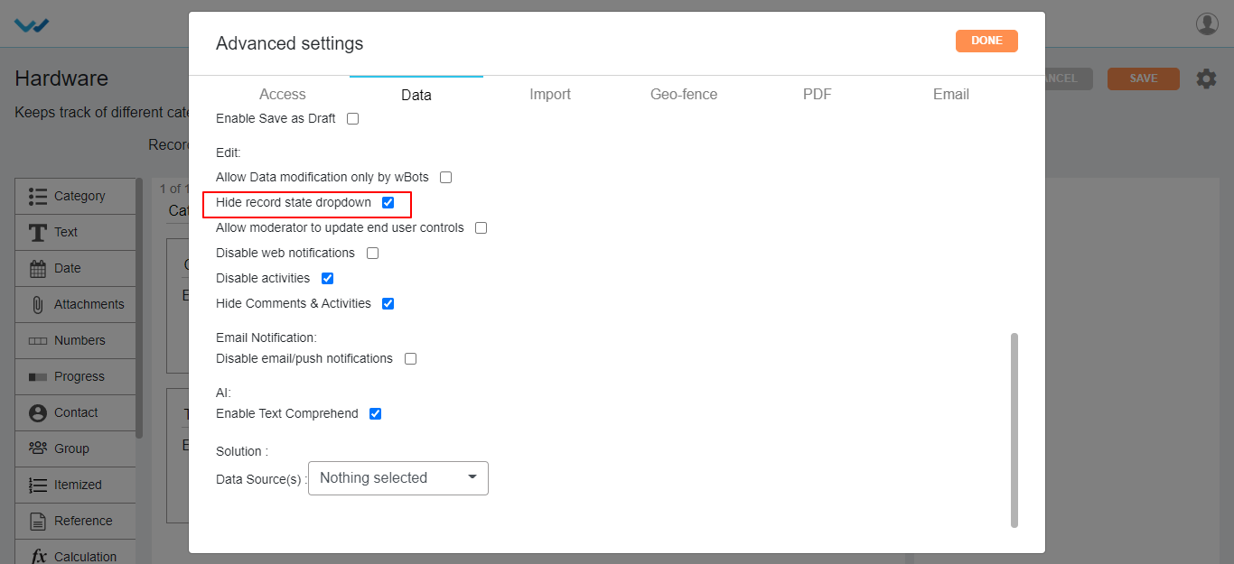
There are some more features of application advanced settings listed below:
- Allow moderator to update end user controls: Enabling this feature will give access to edit end User data to the moderator.
- Disable Web Notifications: This feature disables the web notifications, when the record is created or modified in the application level.
- Disable activity: Disables activity stream notifications, when the record is created or modified and commented to the record of that app.
- Hide comments & activities: This feature is also similar to the Activity feature which disables the record activities of that app.
- Email Notification: Enabling this feature will disable the all the notification emails and push notifications of that app created by using Wbots Workflow.
- AI (Enable Text Comprehend): Enabling this feature shows the sentimental analysis of the record in table widgets of that app.
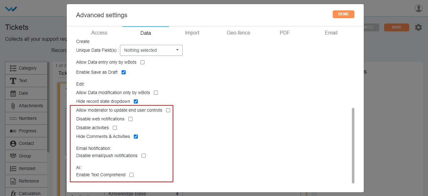
Data Import Settings:
- Enable wBots: Enabling this feature will trigger the Wbot workflow while importing the data into the app.
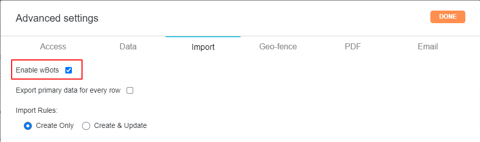
- You can import the data into particular app using Data import settings.
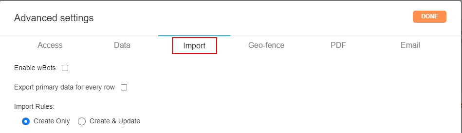
Import rules:
- Create: You can select the actions such as Create which creates new record at the data import time.

- Create & Update: on selecting the Create & Update option in importing rules, you will get Update Rules section under it.
- Select the data controls from dropdown to be created/updated.
- Select the action to update based on requirement, wheatear the data to be created New/overwrite, overwrite, skip.
- Where you have to select from the dropdown provided and select an action for the same with the help icons provided on the page.
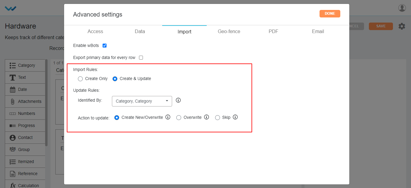
Geo Fence Settings:
- You can enable or disable Geo Fence for the app in Geo Fence settings.
- You can make use of Geo Fence by check boxing Enabled Geo Fence option and select the fence name from dropdown and click on Done button.
PDF Settings: Pdf Settings mainly used for the printing the record of that app.
- Based on selection of pdf settings, the record page will be printed in the pdf format.
- We can secure the record by the password option for either single record or bulk records in the pdf settings of that app.
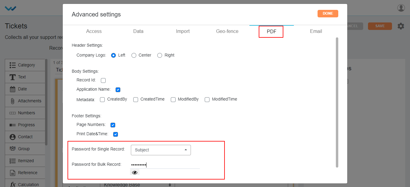
Email: You can select Integrated Email directly from Email feature for the particular app from the advanced settings.
- Select the integrated Email from the dropdown for that app, for creating the records in that app by using Email.

How to make changes in an existing application design?
- Admin shall have access to make changes in an existing application design.
- Suppose you want to remove and add new fields in the Tickets application. Click the ‘Blue’ icon to view all the form fields.
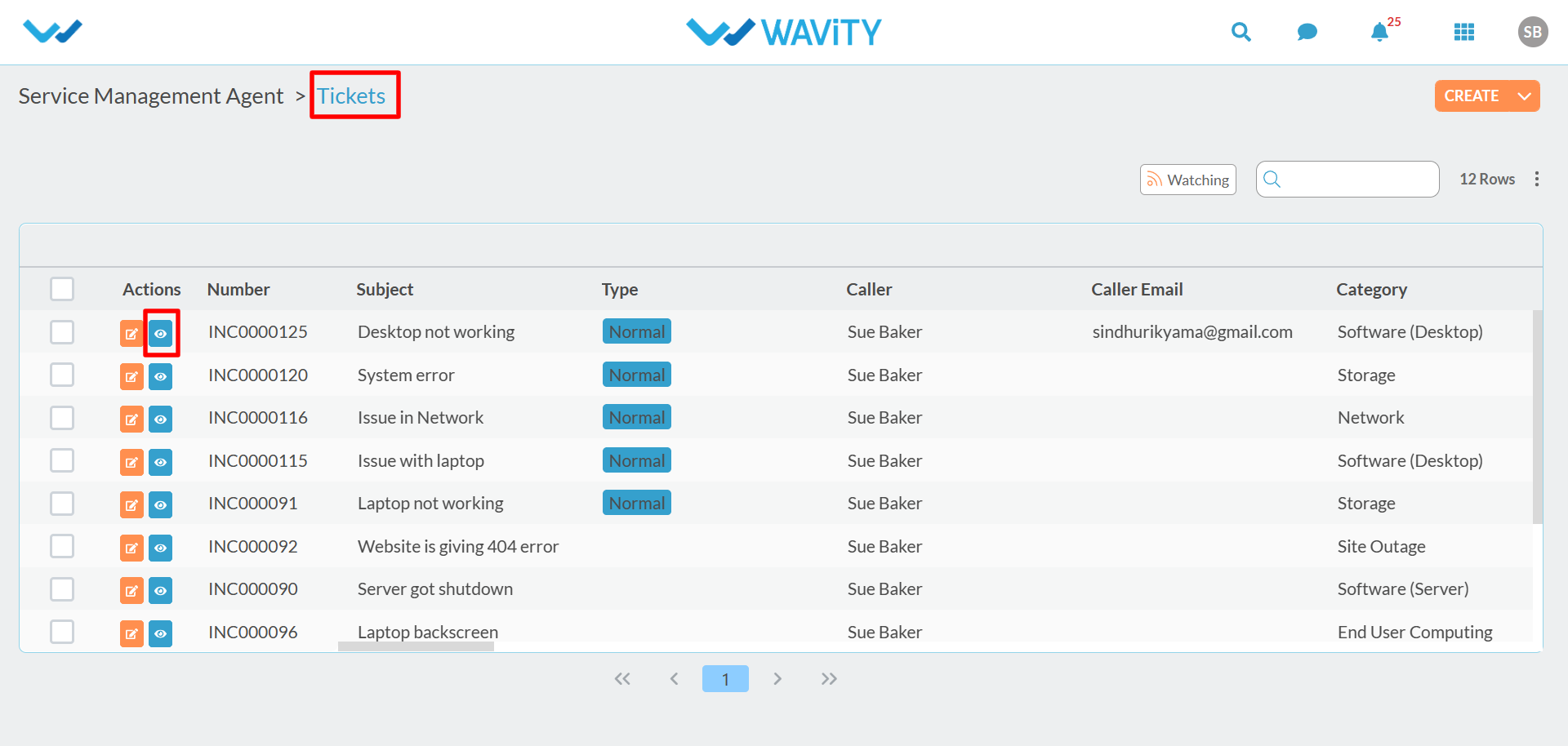
- In the following image, suppose you want to remove ‘configuration Item’ form field and instead you want to add ‘Office location’ form field in the “Tickets” Application.
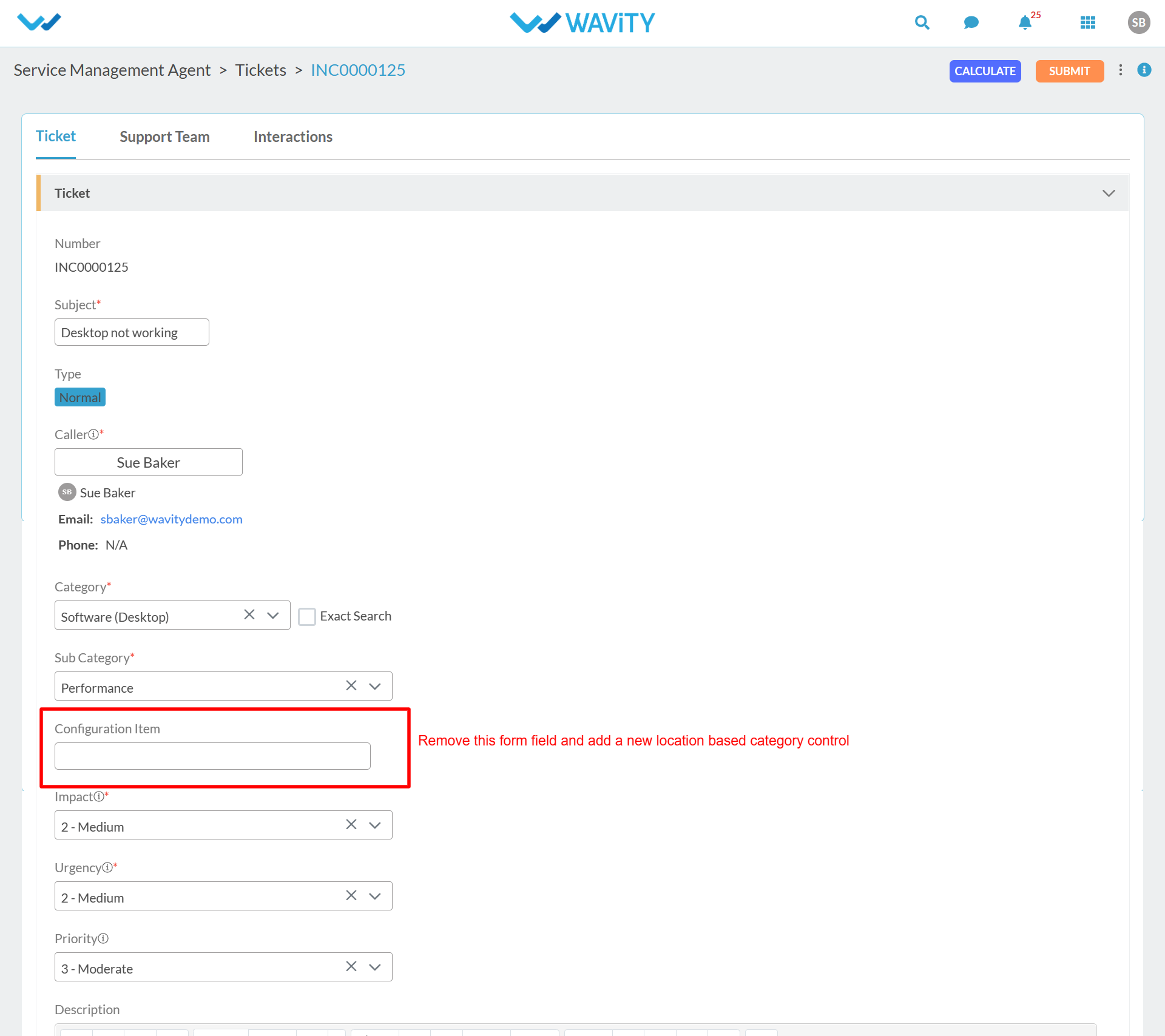
- To the make the changes in an existing application design. First step is to open the ‘App designer’ of the “Tickets” application. Click on “Design tools” as shown below.

- In the following image, Editing of the existing form fields can be done in the middle section.

- Since you want to remove the ‘Cofiguration Item’ form field, You can click on the “Delete” icon as shown below.
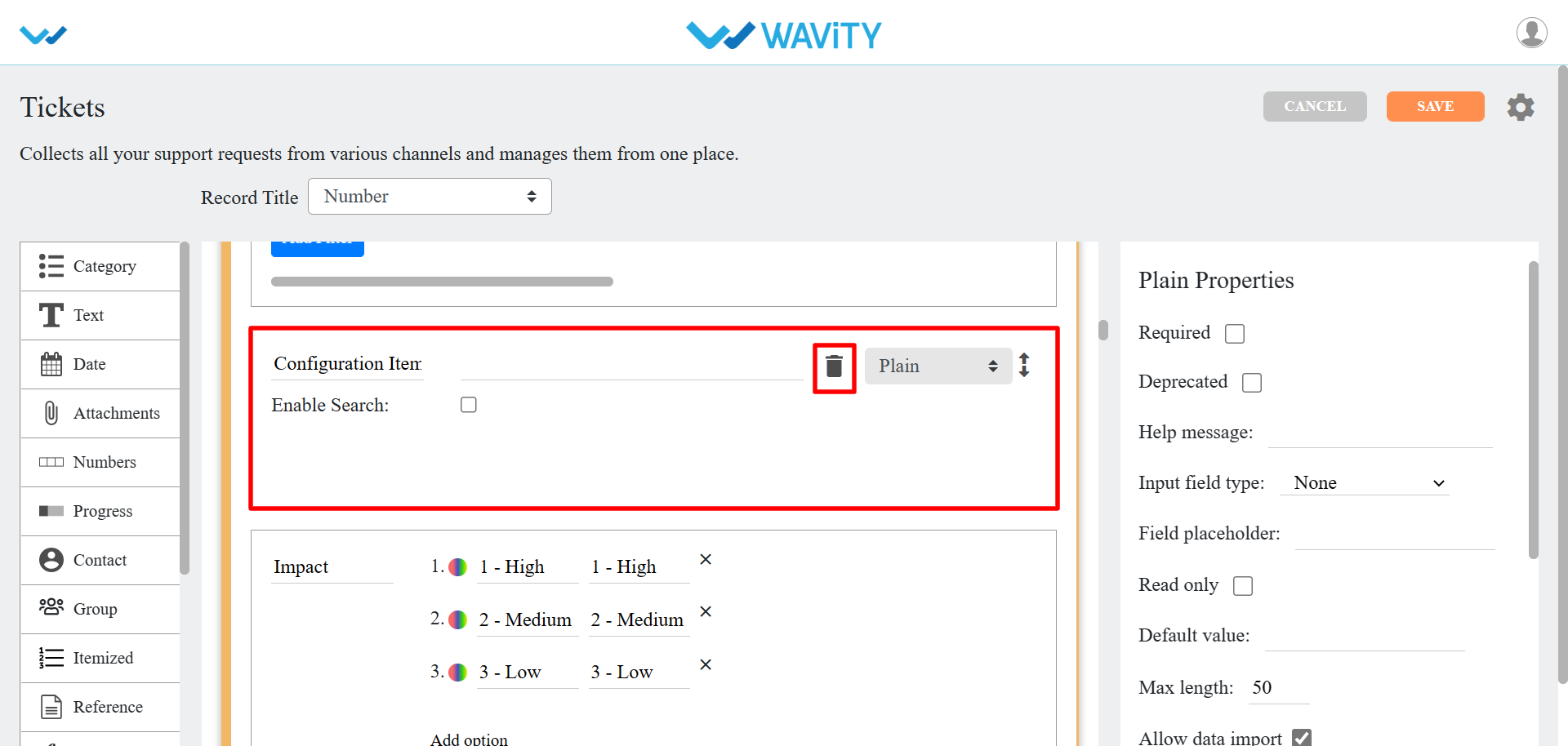
- Since you are looking to add a new form field (Eg: Office Location) in the Existing application. You can drag and drop the ‘Dropdown’ sub-data control in the designer section.
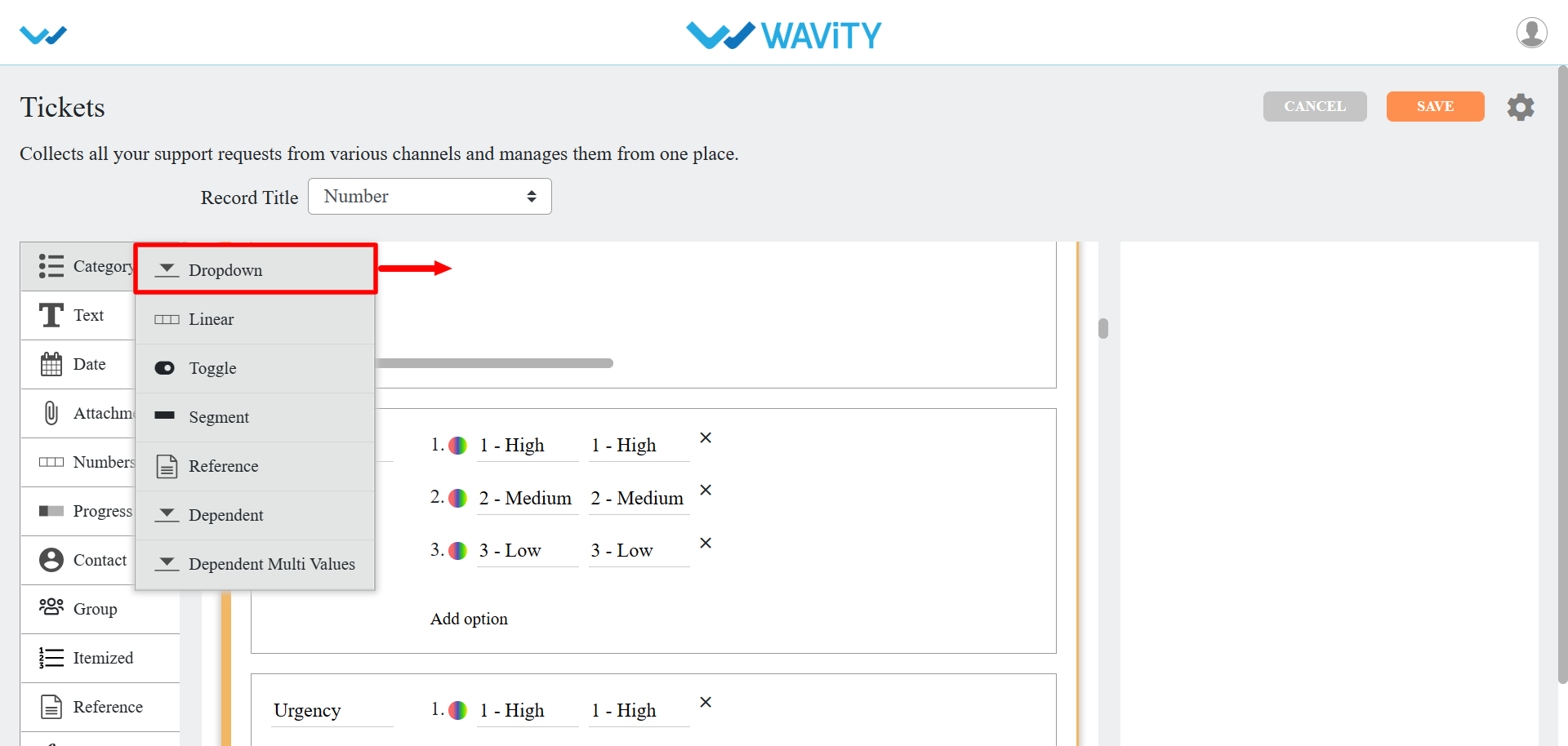
- After adjusting the exact location of the new form field as per your requirement, You can edit the form filed by editing the label name, adding options as shown below.
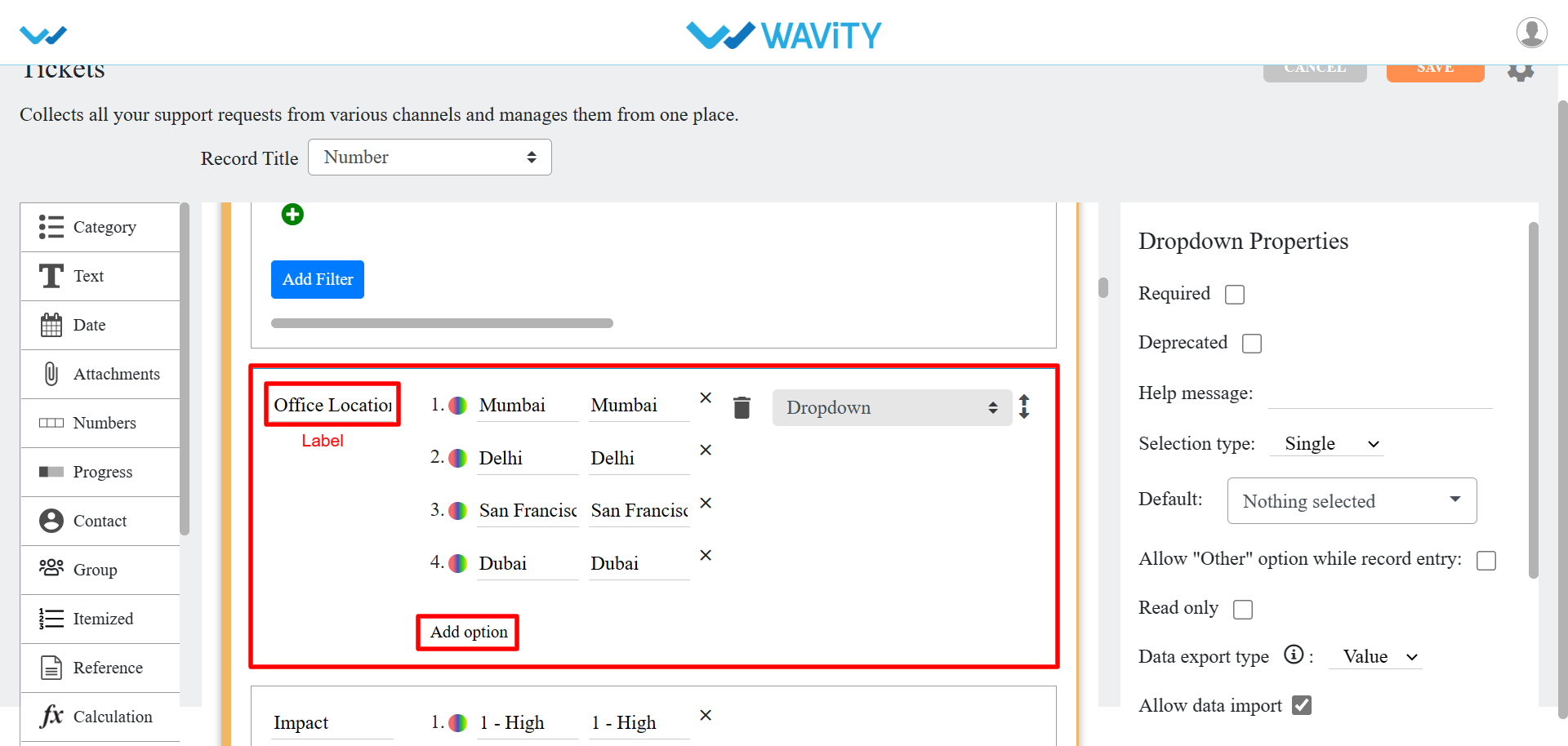
- You can also update and check any of the properties of the form field as per your requirement.
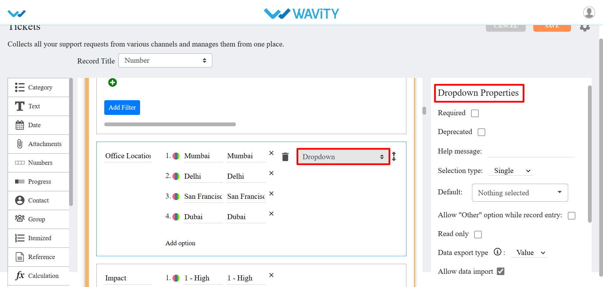
- Click on “Save” button to update the existing application
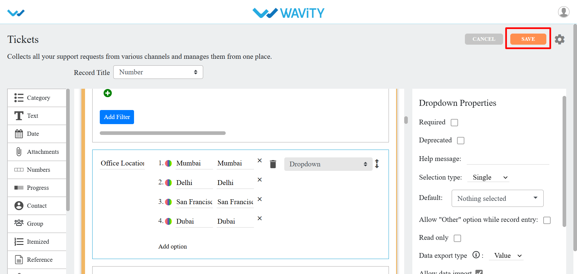
- Click on “Ok” button to confirm of making changes to the existing application
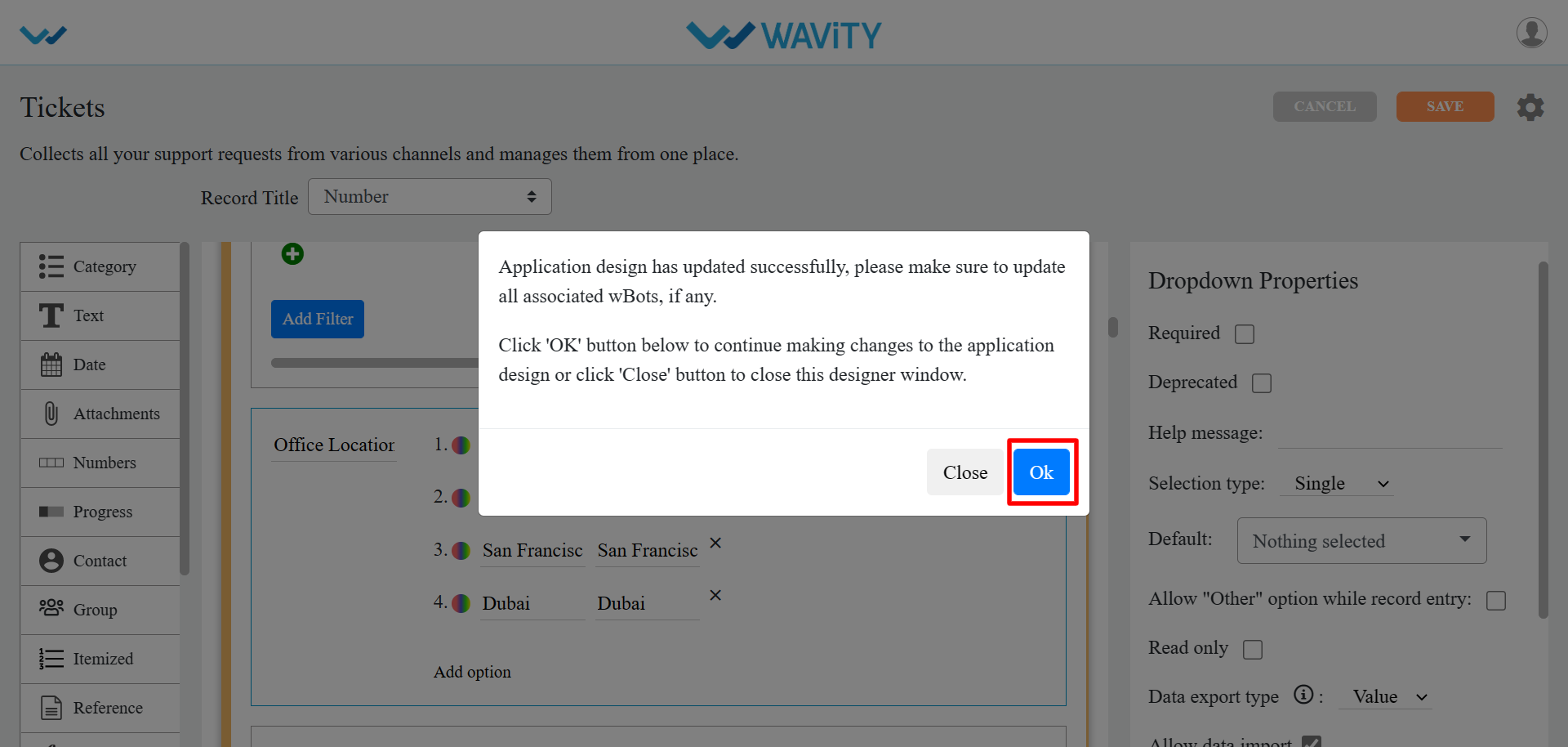
- As the changes are applied, You can click on the existing application form fields and check whether the changes are updated.
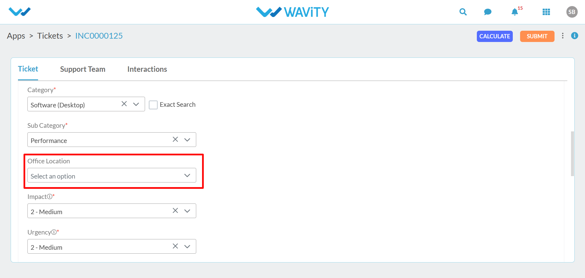
- As shown in the above images, Making changes in an existing application design can be performed as per your business requirement to build customized solutions in Wavity Platform.
How to create Analytics & Reports?
- Only Admins have the authority to create new analytics in Wavity platform.
- To begin, click on "Design Tools" as shown in below image.
- In “Analytics” section, All the existing analytics of the platform will be displayed for the admin.
- Click on the "3 dots" icon to perform various functions for existing analytics, such as editing, deleting, or adding an owner, as shown below.
- To create a new Analytic: Click on “Create” button as shown below.
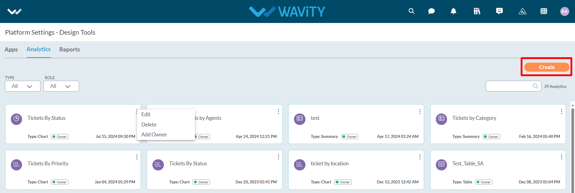
- Provide details such as the Title and Description of the analytics for future reference.
- Additionally, specify the users who will have owner access. You can also add users or groups who will have view-only access to the analytics.
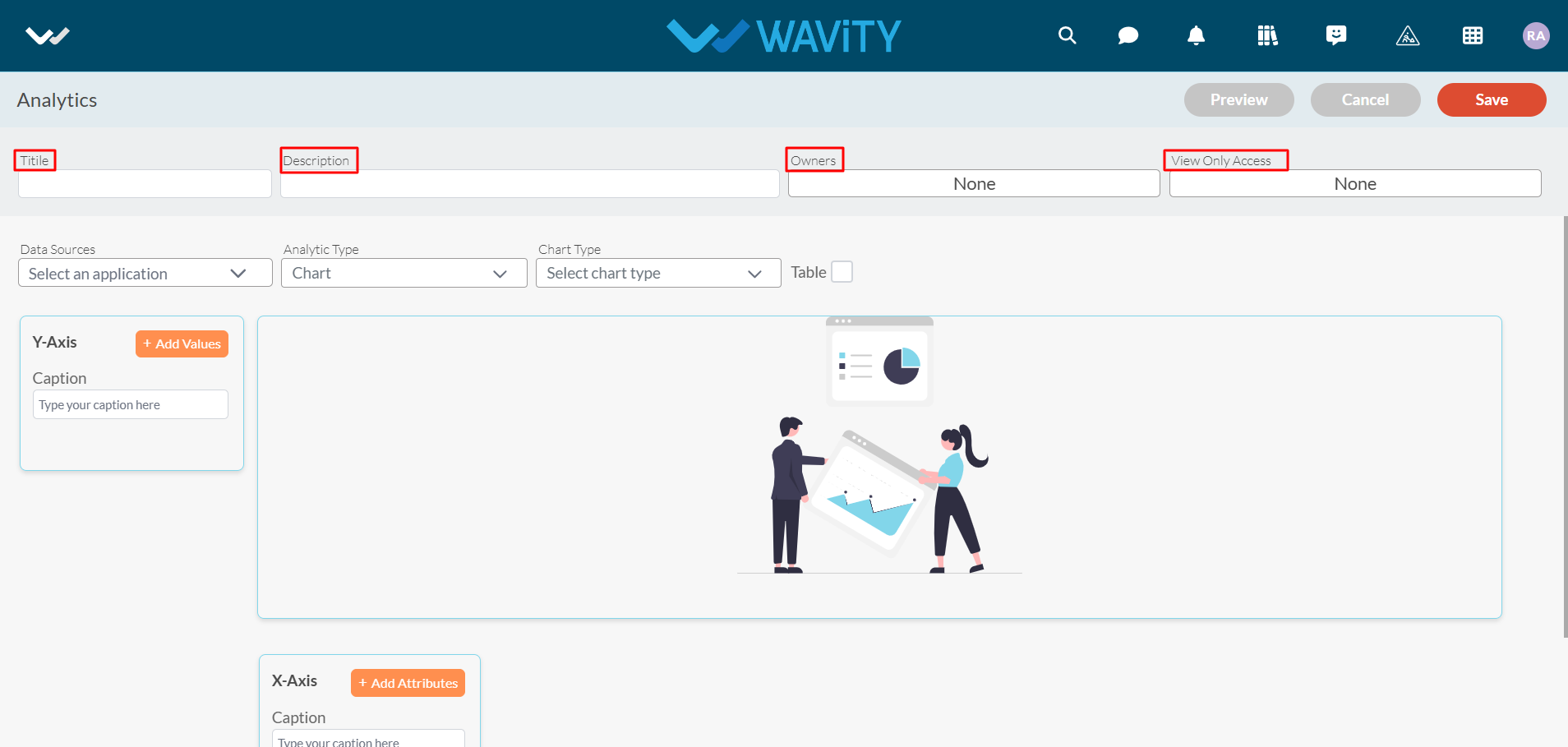
- Select the Data Source Application (From which you can add attributes & values in X & Y axis to generate analytics & reports based on your requirement).
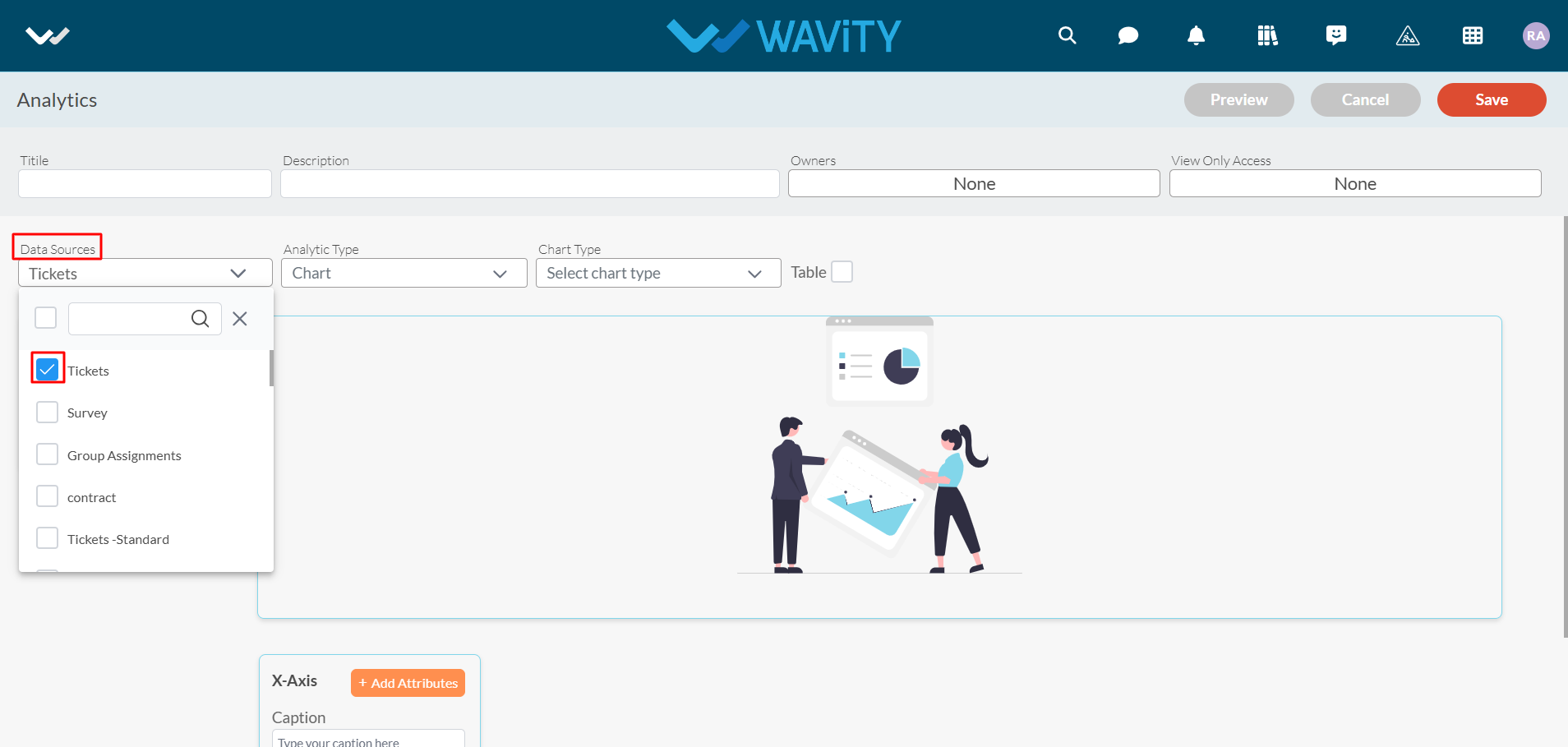
- You can select the Analytic type from the dropdown as shown in below image.
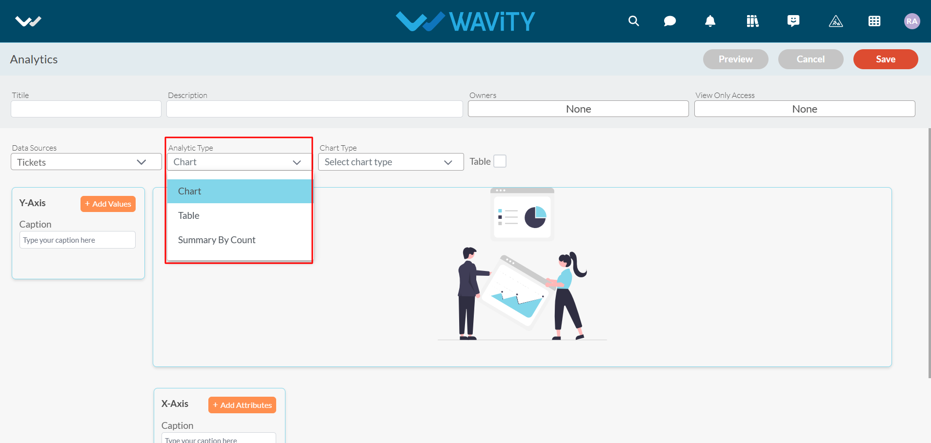
- Upon selecting 'Chart' as the Analytic type, choose the desired chart visualization type from the dropdown menu, as shown in the image below.
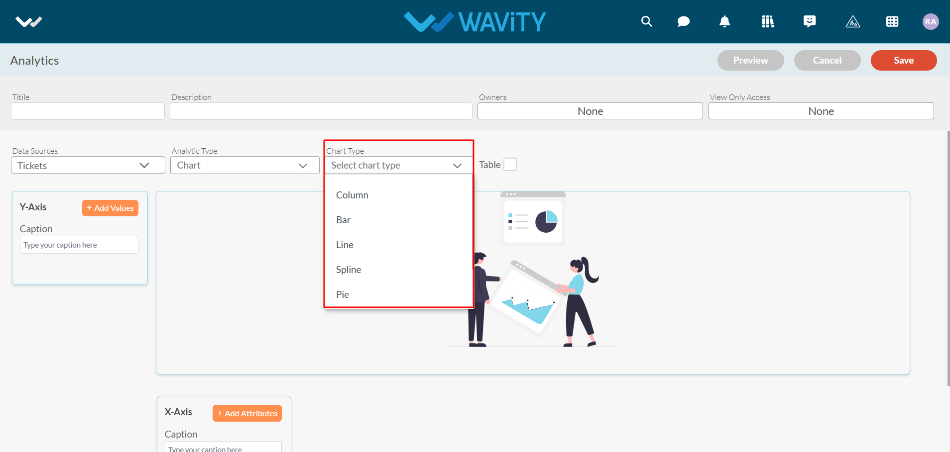
- Now, you can “Add Values” and “Add Attributes” into Y-axis and X-axis to generate an Analytics based on the data in the platform.
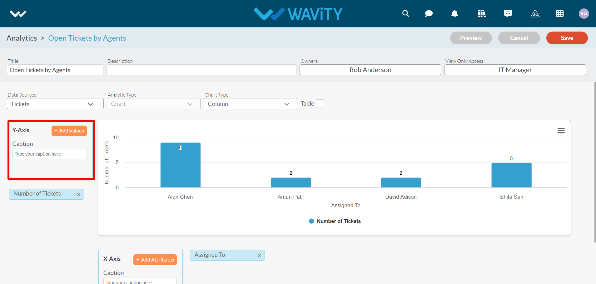
- To add values or attributes, enter the title of the value and select the corresponding data field from the source application, as shown in the image below.
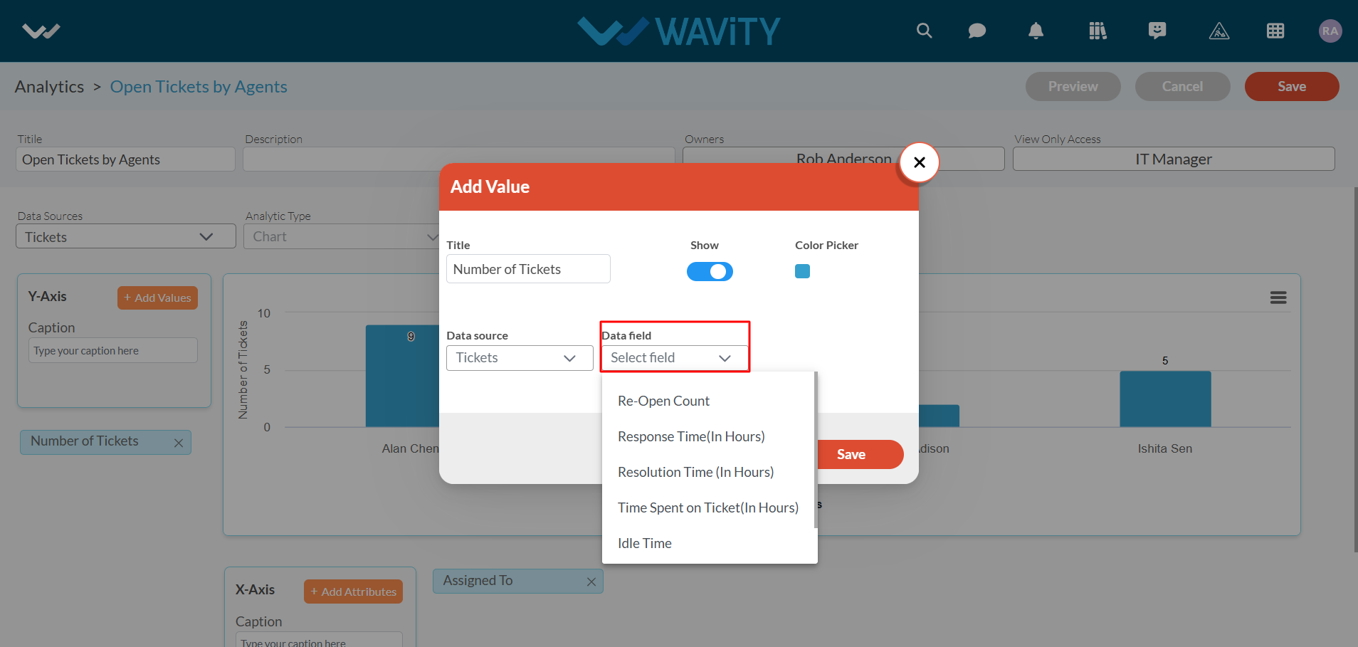
- Click on “Save" button to complete the process.
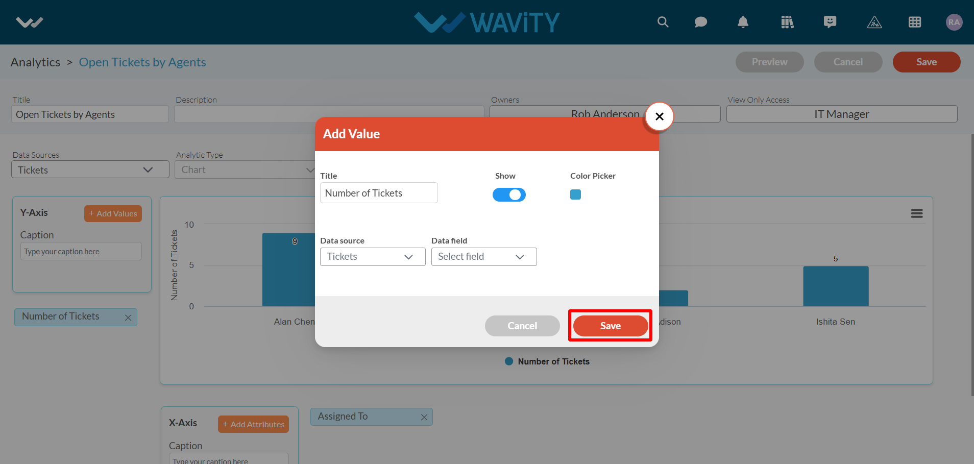
- Wavity currently supports three types of analytics: Chart, Table, and Summary by Count.
- Chart: This type includes sub-visualization options such as Bar, Column, Pie, Donut, Spline, Line, and Funnel. Below is an example of Chart Analytics.
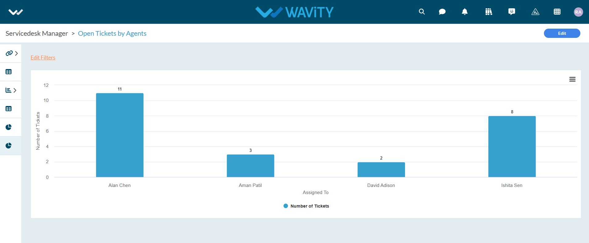
- Table – You can see the analytic Widget in the form of table with as many no. of rows and columns you wanted. Below is an example of Table report.
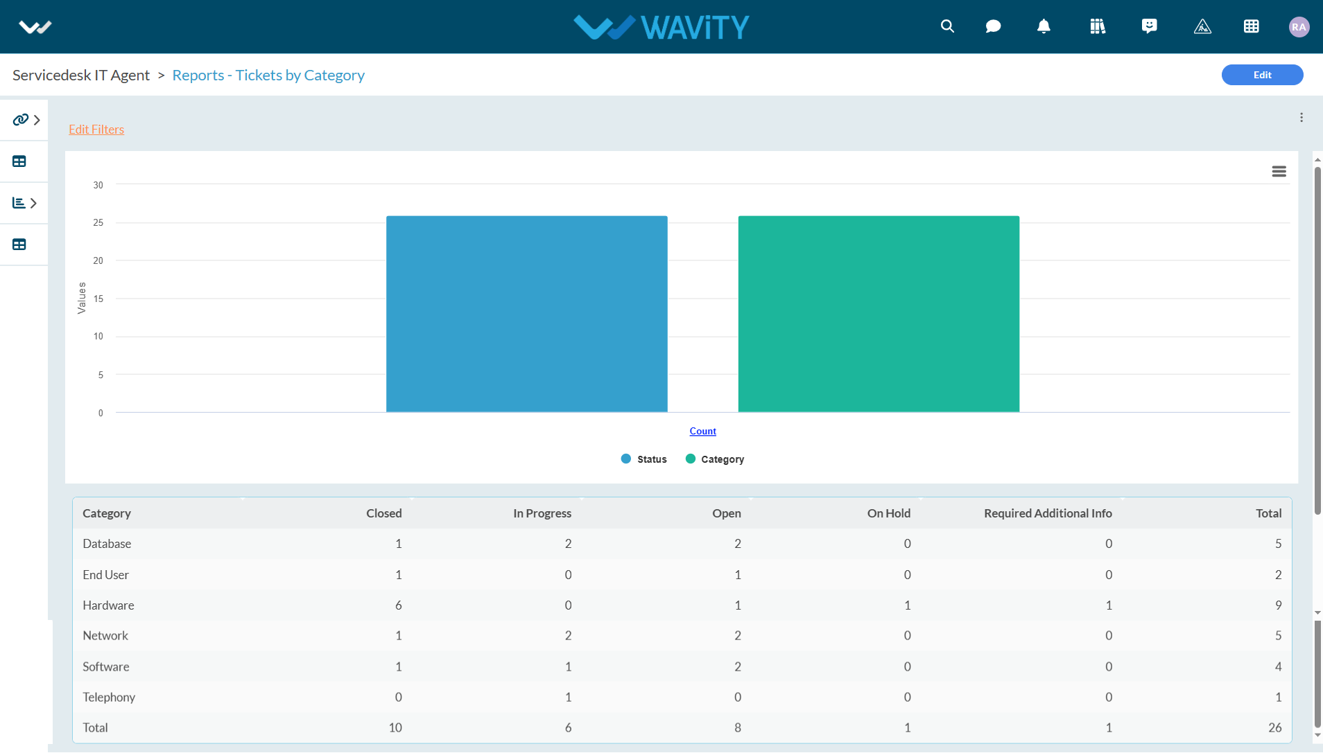
- Summary By Count – In this type, you will have to select single attribute and single value to create analytic. Below is an example of Summary by Count report.
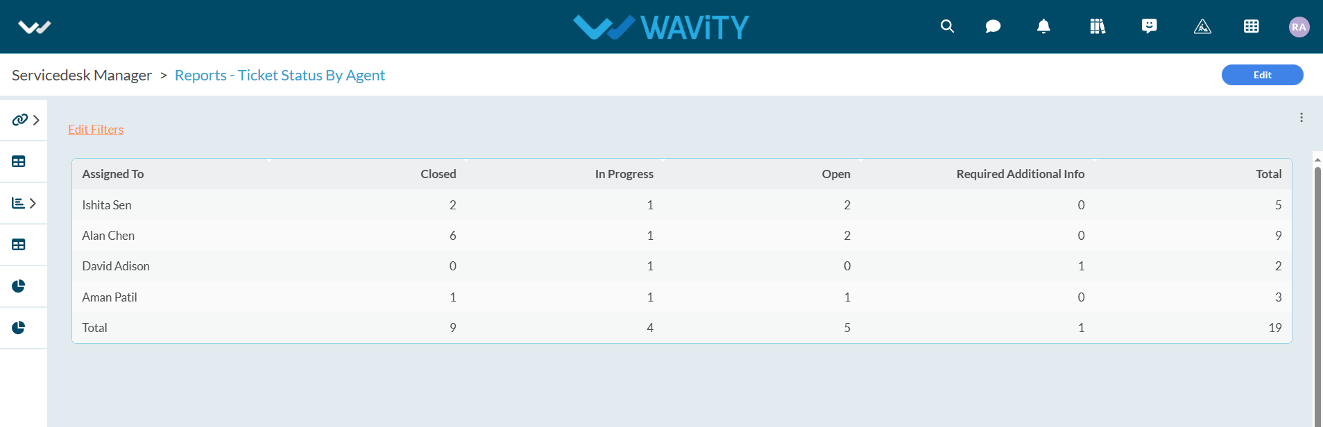
- For more details on how to add analytics and reports to role-based user interfaces or dashboards, please refer to the following link: How to Add/Edit Widgets and customize Interface/Dashboards | Wavity
Platform Settings for Admin
- Only Admins have access to Platform Settings within the platform. To access it, click on the ‘Profile’ icon in the top-right corner of your dashboard, as shown below.
- In Platform Settings, three options will be displayed: General, Design Tools, and Integrations.
- Click on General from the Platform Settings menu.
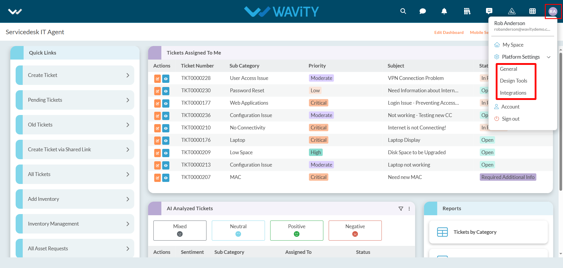
- In platform settings – general page, there are sections such as Users, Groups, Preferences, Geo-Fence, Mobile, Sessions, Schedulers, Work Calendar, Ticketing & Asset Discovery. Basic functions of each section are shown below.
- Users: To add Users in the platform
- Groups: To edit groups and add users in an individual groups.
- Preferences: It contains provisions to update logo of the tenant, set time zones, set data restrictions, set landing pages and set password preferences.
- Geo Fence: It contains provisions to enable Geo-Fence to enable/restrict usage of platform based on geographical locations.
- Mobile: It contains provisions to enable mobile restrictions for individual users or groups.
- Sessions: It will display currently logged users in the platform.
- Schedulers: It contains provisions to enable or disable schedulers. Schedulers shall be used to generate regular follow-up emails which will be triggered automatically based on required details and conditions.
- Work Calendar: It contains the provision to set your working hours of an organization. It will enable automation emails to be triggered based on work calendar settings.
- Ticketing: It contains options to set up and define Macros, Auto signature, AI Chat bot settings.
- Asset Discovery: It contains options to configure inputs for Network based Asset Discovery tool.
- Formore details, please refer the following link: Help Docs | Resources | Wavity and navigate to the ‘Platform Settings’ section under ‘Getting Started’ section.
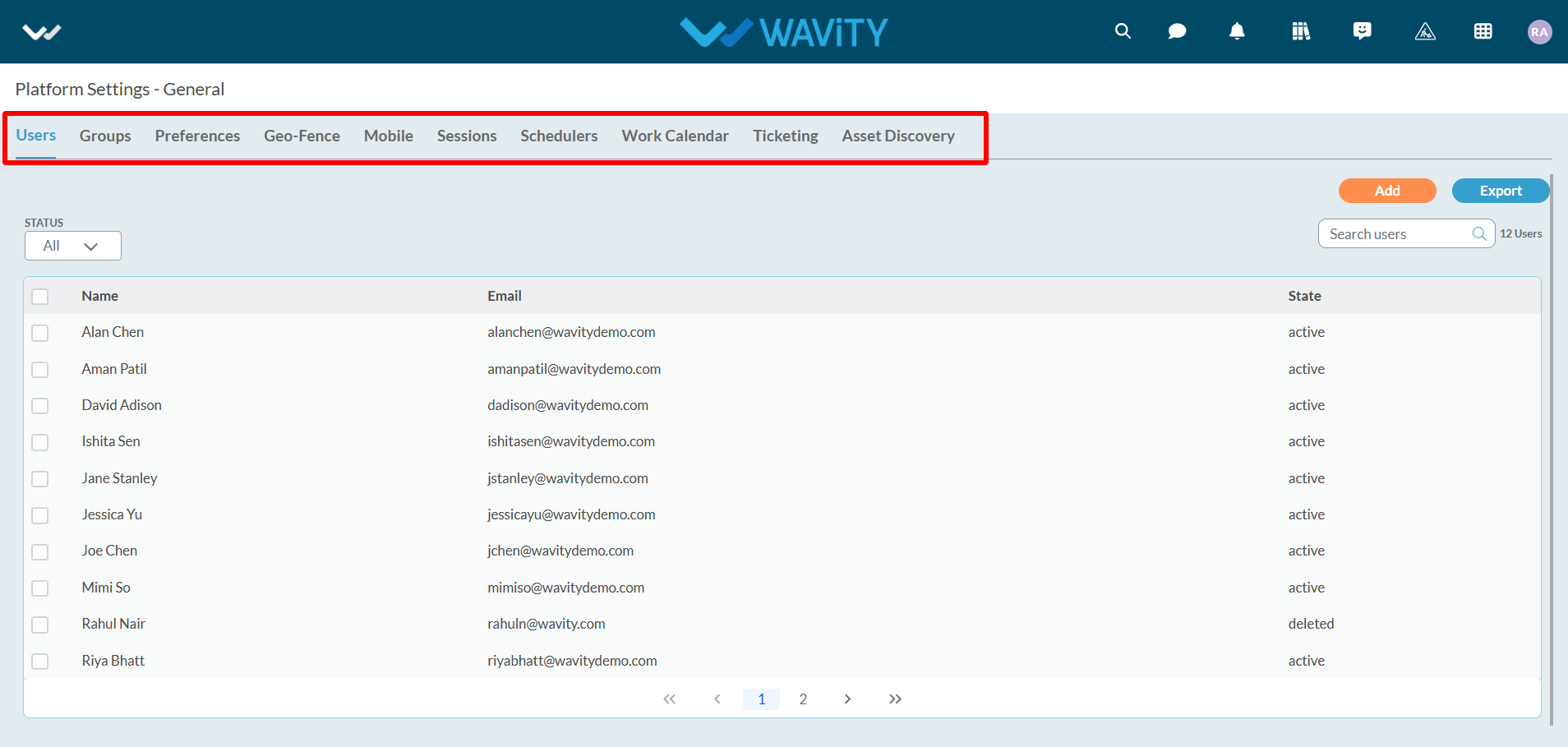
- Click on “Design tools” as shown below.
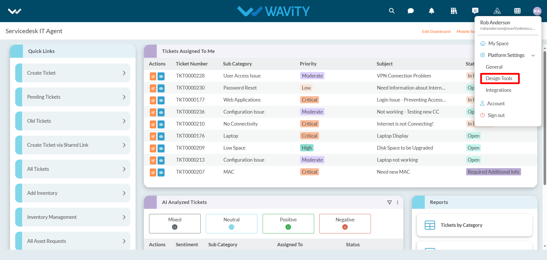
- In “Apps” section, All the existing applications of the platform will be displayed for the admin.
- Click on “3 dots” icon to carry out multiple functions of the application as shown below.
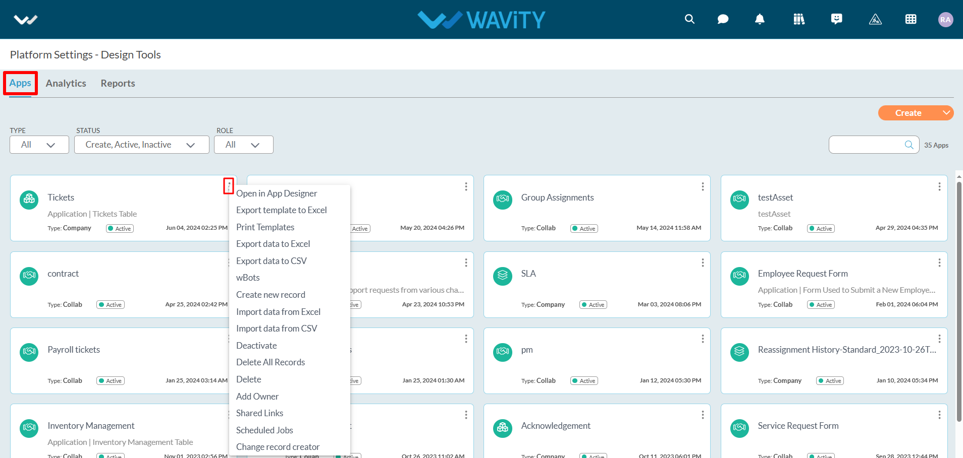
- Click on “Create” button as shown below to create a new application. It will display 3 options such as New App, From Excel and From Template.
- New App: It will create new application from scratch. Click on the following link for more information: How To Create A New App From Scratch? | Wavity
- From Excel: It will create new application from excel sheets along with data. Click on the following link for more information: How To Create A New App From Excel? | Wavity
- From Template: It will create new application from excel sheet template. It will ignore the data in the excel sheet. Click on the following link for more information: How To Create A New App From Template? | Wavity
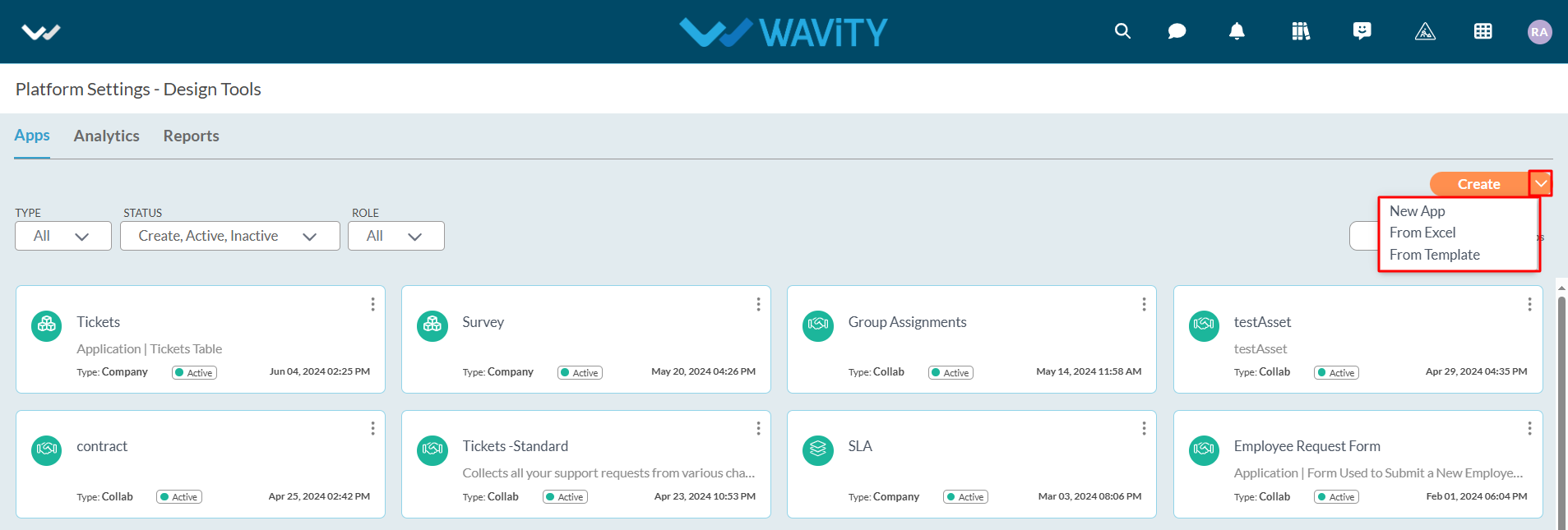
- By clicking on “Analytics” section, It will display all the existing Analytics of the platform.
- Click on “3 dots” icon to edit, add owner and delete existing Analytics.
- Click on “Create” button to generate new Analytics in the platform.
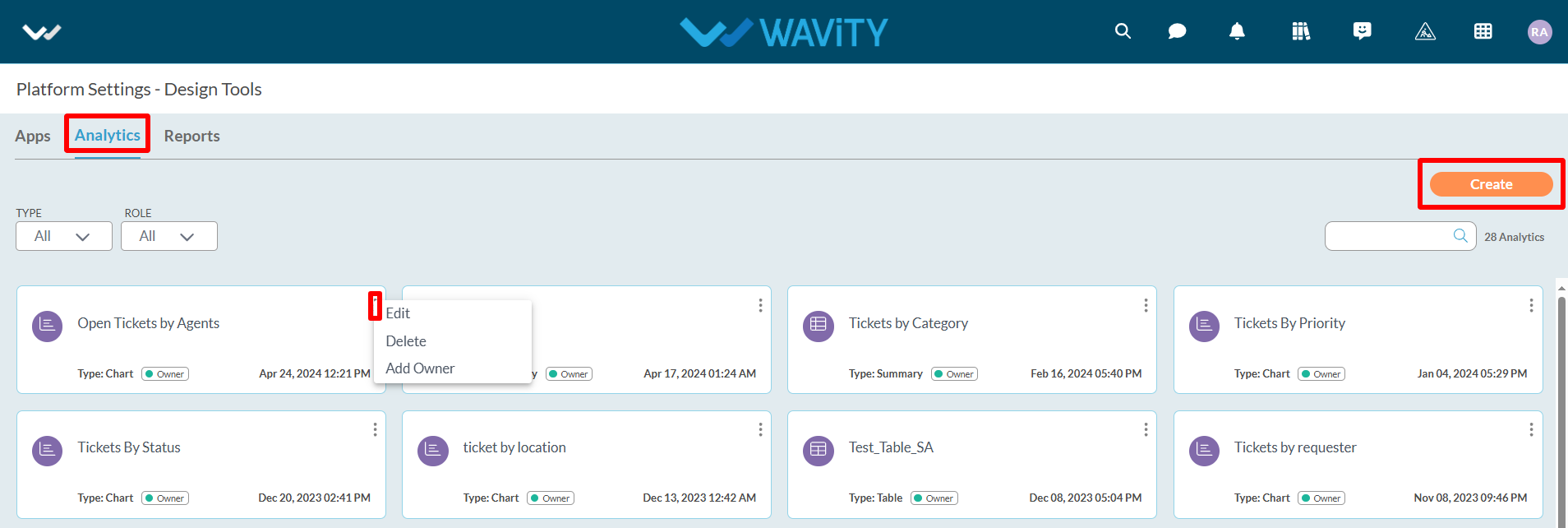
- Under Platform settings, Click on “Integrations” as shown below.
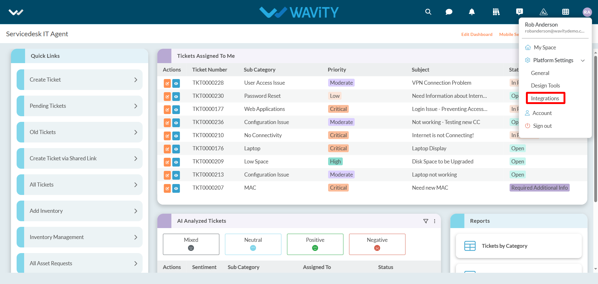
- It will display all the integration options in your tenant. Integration types such as SMS, SAM integration for Single-Sign-On (SSO), Calendars, Drives, Email Integration, Slack Integration, AI, Webhooks, OAuth, Schema, Open API, Rest API, Tokens and Microsoft Teams.
- For more details, please refer the following link: Help Docs | Resources | Wavity and navigate to the ‘Integration’ section under ‘Getting Started’ section.
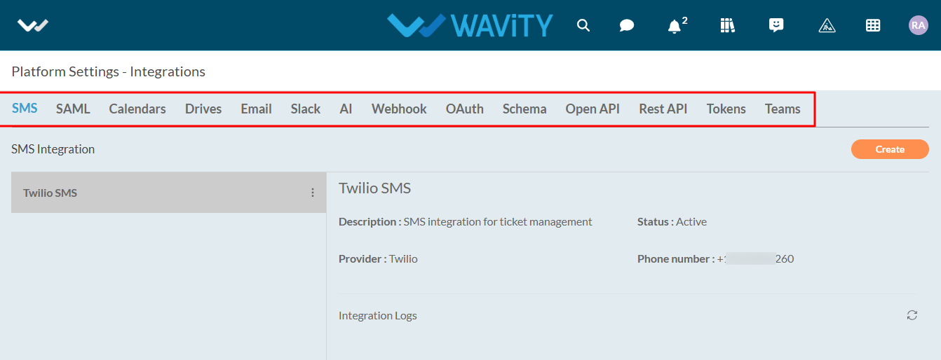
How to Activate/Deactivate an App
- Only Admin have the authority to create a new app or activate/deactivate an app or form.
- To access, click on Apps under the Design Tools section.
- For additional functions and options, click the "3 dots" icon in the top-right corner of each app as shown in below image.
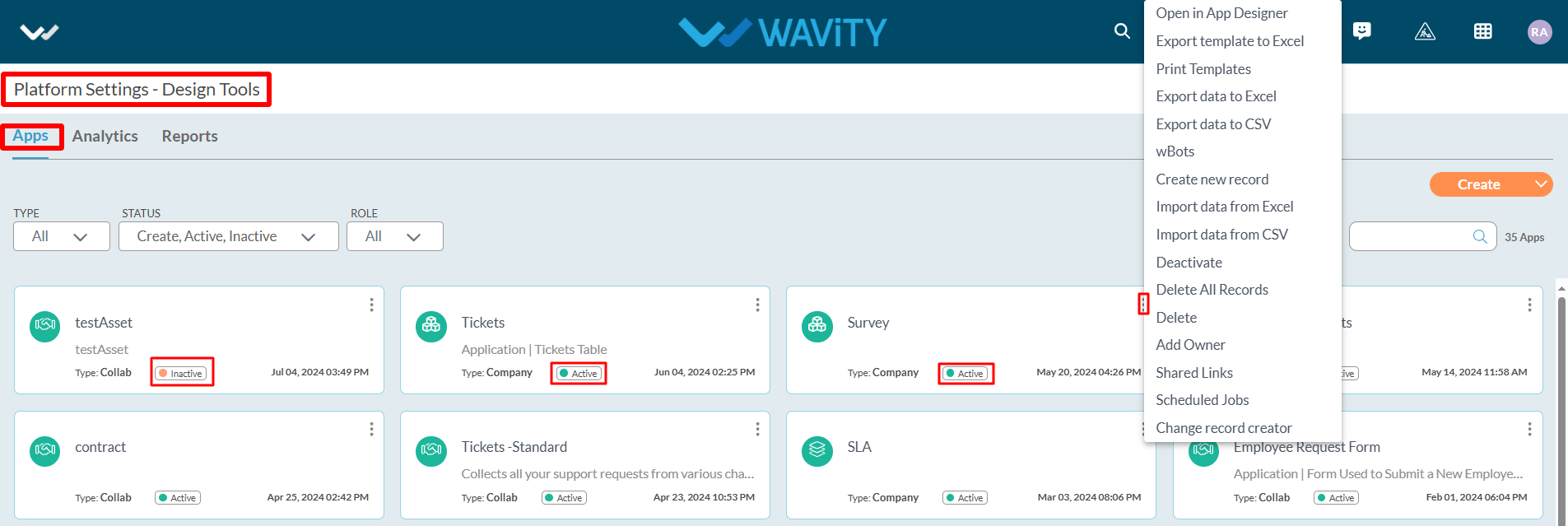
- Open in App Designer: Use this option to edit and customize the design of an existing app.
- wBots: Wavity Bots (wBots)enables you to automate all the workflow automation within hours and extend automation beyond your organization as well. Using wBots, you can move data between applications according to conditions you create. Admin or App Owner shall have access to configure Wbots. For more information
- Deactivate: Tode-activate the selected app.
- Export template to Excel: Download an Excel template to add records. Once populated, you can import the data back into the app using the "Import data from Excel" option.
- Export dataExportdata to Excel: Export all app records in Excel format using this option.
- Delete: Delete the selected app from the platform.
- Add Owner: Assign other users as Owners of the selected app using this option.
Glossary of Major Keywords:
App/Application: It is a digital form in Wavity platform.
Data Control: Each field in the App is called a Data Control. Such as Text field, Number field etc.
Sub Data Control: For designing purpose each Data Control is divided as Sub Data Control. E.g.: Text field is divided into Text block, Two fields, Three fields etc.
Record: Each row in the App is called a record.
End User: S(he) is the one who can view and add the records to Apps if they have access.
Approver: S(he) is the one who can view and edit the records to particular approver section in Apps if they have access.
Manager: S(he) is the one who can view and approve the records of their subordinates.
Moderator: S(he) is the one who can view and edit the records created by end users if they have access.
Admin: S(he) is the one who does administration work such as adding users, groups, enabling settings etc. Admin also has the provision to edit or update application using App Designer or Wbots.
Solution Owner: S(he) is the owner of the solution or use case such as Ticketing solution or Asset Management solution.
Widgets: Widget is a component in the dashboard, that enables a user to perform a function or to navigate quickly to reports, analytics, table, links & bulletin.
Wbots: Wavity Bots (Wbots) enables you to automate all the workflow automation within hours and extend automation beyond your organization as well. Using WBots, you can move data between applications according to conditions you create. Admin or App Owner shall have access to configure Wbots.
App Designer: App Designer is an interactive development environment for designing an app/application layout with form fields. It is a zero code designer used to design an application from scratch by usage of data controls and its properties.
Collab app: All user/groups in the app have access to view and edit all records in that particular app. For example, In Inventory Management application, all agents shall be able to view and edit all asset information only if they have the access.
Company app: All users in the app have access to view only their records in that particular app. For example, In Ticketing application, each user shall be able to view and edit only the tickets created by them without giving any explicit access to users.
Team app: All user/groups in the app have access to view only their records in that particular app. For example, In Ticketing application, each user shall be able to view and edit only the tickets created by them by giving access to users.